

cemagraphics/E+ via Getty Images
This article was first released to Systematic Income subscribers and free trials on June 27.
In this PIMCO CEF update, we take a closer look at valuations across the PIMCO taxable suite and highlight some of its interesting dynamics, both within the suite as well as relative to the broader CEF space.
Let’s kick off with a look at the average valuation in the taxable suite at the moment (red line in the chart below).
Systematic Income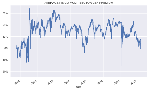
The chart shows that the average premium of the suite is about 5%, having risen from a level of zero it briefly hit in June. This current level was only exceeded convincingly in the last 15 years during the GFC and the COVID drawdown, though only very briefly in the latter case.
The fact that CEF discounts have widened sharply, as the following chart shows, has not escaped a lot of income investors so some weakness on the part of PIMCO funds is to be expected.
Systematic Income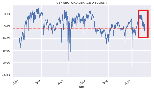
However, even if we compare the differential of PIMCO taxable CEFs versus the overall CEF average we see that PIMCO valuations have compressed even more than the average CEF relative to its history. For instance, the average PIMCO taxable CEF trades at a 12% higher valuation than the average CEF whereas historically it has traded closer to a 15-25% higher valuation.
Systematic Income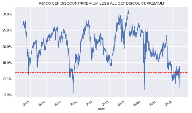
What’s driving this weakness in PIMCO CEF valuations?
First, it has to be said that the PIMCO taxable CEF population has not remained the same over time. Specifically, in the last couple of years two funds were lost in the PDI merger (PKO and PCI) and two additional funds were introduced (PDO and PAXS). The recently introduced funds are trading at much wider discounts than the average fund. This is likely due to the investors’ lack of familiarity with them as well as lock-up expirations in a difficult market environment, causing investors to dump the positions.
The second reason that PIMCO taxable CEF valuations have compressed relative to the broader CEF space is that PIMCO funds have been cutting distributions over time. All else equal, a lower distribution tends to lead to a lower premium or a wider discount and the impact will be larger for funds trading at a higher valuation such as the PIMCO funds. A good example of this is the steady deflation in the PGP premium in response to cuts. More recently, PTY, PFL and PFN have all seen significant reductions in their traded premiums as a result of their cuts last year with PTY now trading at a 15% premium versus a peak of around 52% in 2021 prior to its cut.
Systematic Income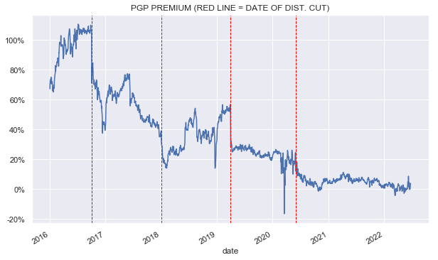
The third reason for the valuation underperformance of PIMCO funds is simply that higher-valuation funds tend to see their valuations deflate more than lower-valuation funds during drawdown periods. For example, the following chart shows that a fund trading at a 10% premium at the end of 2021 (x-axis) has seen an average drop in valuation of around 7% (y-axis) while a fund trading at a 10% discount at the end of 2021 has seen an average drop in valuation of only about 3%. The relationship is not perfect but it’s clearly there. The chart is clipped for outliers which doesn’t change the conclusion.
Systematic Income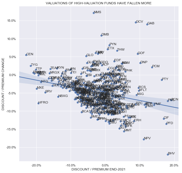
There are two additional important drivers of valuations within the PIMCO suite which are worth highlighting. The first driver that is relevant particularly in the current market of high underlying asset yields is that the differential in management fees now matters less.
Let’s first look at the simple fact that fund valuations (y-axis) roughly track management fee levels (x-axis). The lower the management fee the more yield is passed on to investors, all else equal. Therefore, to equalize yield between funds, lower management fee funds will tend to trade at higher valuations and vice-versa. Obviously there are other moving parts but the chart makes it clear that there is indeed a relationship there and it’s unlikely to be spurious.
Systematic Income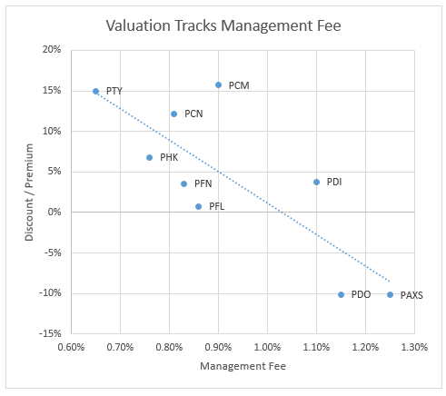
The second key point here is that the higher the underlying yields are, the less impact the management fee has on the fund’s net yield. To illustrate this let’s take a look at the net yield disaggregation charts for PTY (featuring the lowest management fee in the suite of 0.65%) and PDO (featuring the second highest management fee in the suite of 1.15%).
We use a portfolio yield level of 4.5% which is roughly where the high-yield corporate bond market traded in 2021. Portfolio yield is just what we call the yield of the fund’s assets in its portfolio. The point isn’t that this was the precise yield of the funds’ assets at the end of 2021 but that it’s a decent proxy for the kinds of assets the funds have tended to allocate to.
We use current valuation (15% PTY premium and 10% PDO discount) as well as current leverage levels (about 47% for both) and estimated leverage cost levels. The impact of management fees is highlighted in green in the two charts below. What we see is that the impact of the management fee is large – the PTY fee subtracts 1.22% from its net yield while PDO subtracts 2.16%. In short, by virtue of its lower management fee, PTY “saves” around 1% on net yield relative to PDO. The resulting net yield numbers of 3.96% for PTY and 4.12% for PDO are roughly similar because of the difference in discounts i.e. the discount differential roughly makes up for the management fee differential.
Systematic Income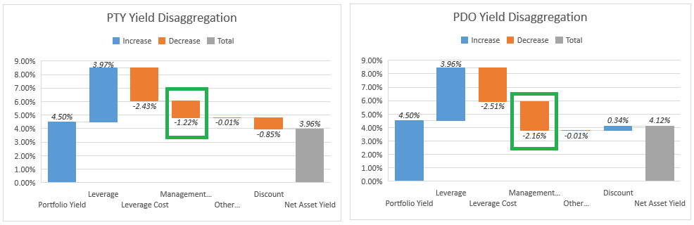
This suggests that the current 25% or so differential in valuation (i.e. a 15% PTY premium vs. 10% PDO discount) would be fair for a portfolio yield of 4.5% that we saw at the end of 2021. This is because the two funds can generate pretty similar net yields at that portfolio yield level given these valuations.
Fast forward to today when the high-yield corporate bonds are trading at a yield of 8.5% (versus around 4.5% at the end of last year). If we plug in that number into the charts what we see is the following, the two charts show that while the lower management fee for PTY still gives it a net yield advantage over PDO of about 1%, the discount differential makes a much bigger difference – giving PDO an advantage of over 3%. This is for the simple reason that the discount magnifies the underlying portfolio yield and when the yield is larger, the discount differential makes a bigger impact.
Systematic Income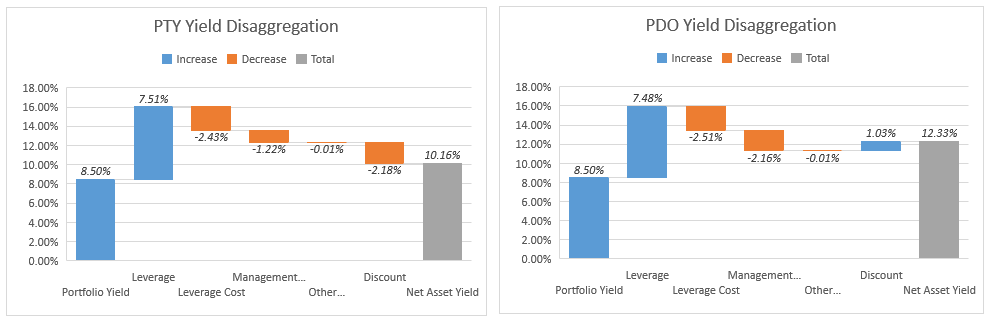
For instance, the 15% premium for PTY was only a 0.85% headwind when its portfolio yield was 4.5% but has grown to a 2.18% headwind when the portfolio yield is 8.5%. And the PDO 10% discount added only 0.34% of additional net yield at a portfolio yield of 4.5% but now adds 1.03% at a portfolio yield of 8.5%.
What this comes down to is that at a portfolio yield of 8.5% the PTY management fee puts it 1% ahead of PDO (-1.22% vs -2.16%) but its higher valuation puts it more than 3% behind PDO (-2.18% vs +1.03%). The resulting net yields are 10.16% for PTY and 12.33% for PDO. In short, while at a 4.5% portfolio yield the two funds were able to generate roughly similar net yields, at a portfolio yield of 8.5% PDO comes out far ahead of PTY as its wider discount adds much more in net yield than its higher management fee takes away relative to PTY.
The key takeaway here is that for the two funds to generate the same net yield the PTY valuation should move towards that of PDO. We calculate that instead of a 25% fair-value differential between the two funds at a portfolio yield of 4.5% it should be closer to 10% at a portfolio yield of 8.5% (i.e. in the current environment). Obviously, this number is approximate since PIMCO doesn’t actually disclose the portfolio yields of their funds but in our view it’s not a million miles away from reality.
The second impact on PIMCO taxable fund income and, hence, valuations has to do with what is happening to the funds’ auction-rate preferreds or ARPS. Investors who need a refresher on ARPS can have a look at our earlier article. In short, ARPS are used by a small number of funds, including the PIMCO funds, as leverage instruments – akin to repo or credit facilities.
When ARPS fail at auction (which has been the case since the GFC) they are automatically reset to a Max rate. These rates are calculated for the PIMCO funds as some multiplier x some short-term rate, usually a commercial paper rate. The interest rate on many of these has been floored near zero in 2021 for the simple reason that their Max rate is calculated as 1.5x or 2x some short-term rate and because short-term rates were near zero in 2021 the funds were able to borrow at near zero levels on a sizable fraction of their borrowings. The table below shows the ARPS formulas.
PIMCO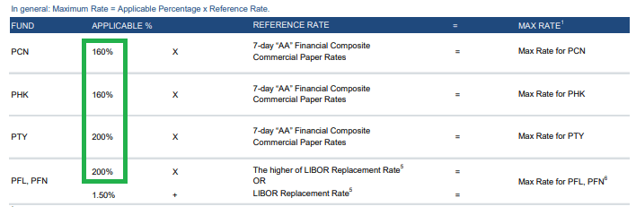
Obviously, this has now reversed – as short-term rates are moving higher these ARPS (auction-rate preferreds) are becoming a real liability (in more ways than one!). For instance, PTY (which has 20% of its borrowings in preferreds) pays 2 x AA commercial paper on its preferreds so it paid a rate of near zero in 2021 on the ARPS while a fund like PDI had to do with a rate of around 1% on all of its borrowings (which were exclusively in repo).
However, second-grade algebra tells us that if we compare the PTY ARPS interest rate of 2 x short-term rate to the cost of repo which is very roughly short-term rate + 0.75%, at some point the multiplier effect will start to make a serious impact on the interest rate and the ARPS interest rate will be much more expensive than the repo.
For example, if, as the Fed thinks, short-term rates will top out around 4%, PTY will be paying 8% on its ARPS while PDI will be paying 5% on all of its financing. Granted, ARPS are a minority of PTY liabilities but it’s clear that while funds like PTY enjoyed a lower leverage cost than non-ARPS funds (like PDI, PCM, PDO, PAXS, RCS, PGP) their leverage cost will now exceed that of non-ARPS funds.
This means that on a fair-value basis it should cause premiums to converge somewhat between the ARPS funds and their non-ARPS counterparts. It’s not a massive impact but it’s real.
Takeaways
Given the valuation and income dynamics discussed above, we continue to favor the PIMCO Dynamic Income Opportunities Fund (PDO). The fund does operate at a high level of leverage which has clearly been a liability this year but its total NAV return this year is only 1% off that of PTY which has also struggled this year in absolute terms as well as in the PIMCO taxable suite as well.
PDO has the highest covered yield (i.e. net investment income yield on price) in the taxable suite and boasts far and away the strongest distribution coverage.
Systematic Income CEF Tool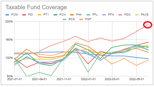
Its NII has also been growing strongly after its special distribution and is indicative of another special later this year.
Systematic Income CEF Tool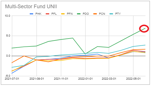
Be the first to comment