

nuchao/iStock via Getty Images
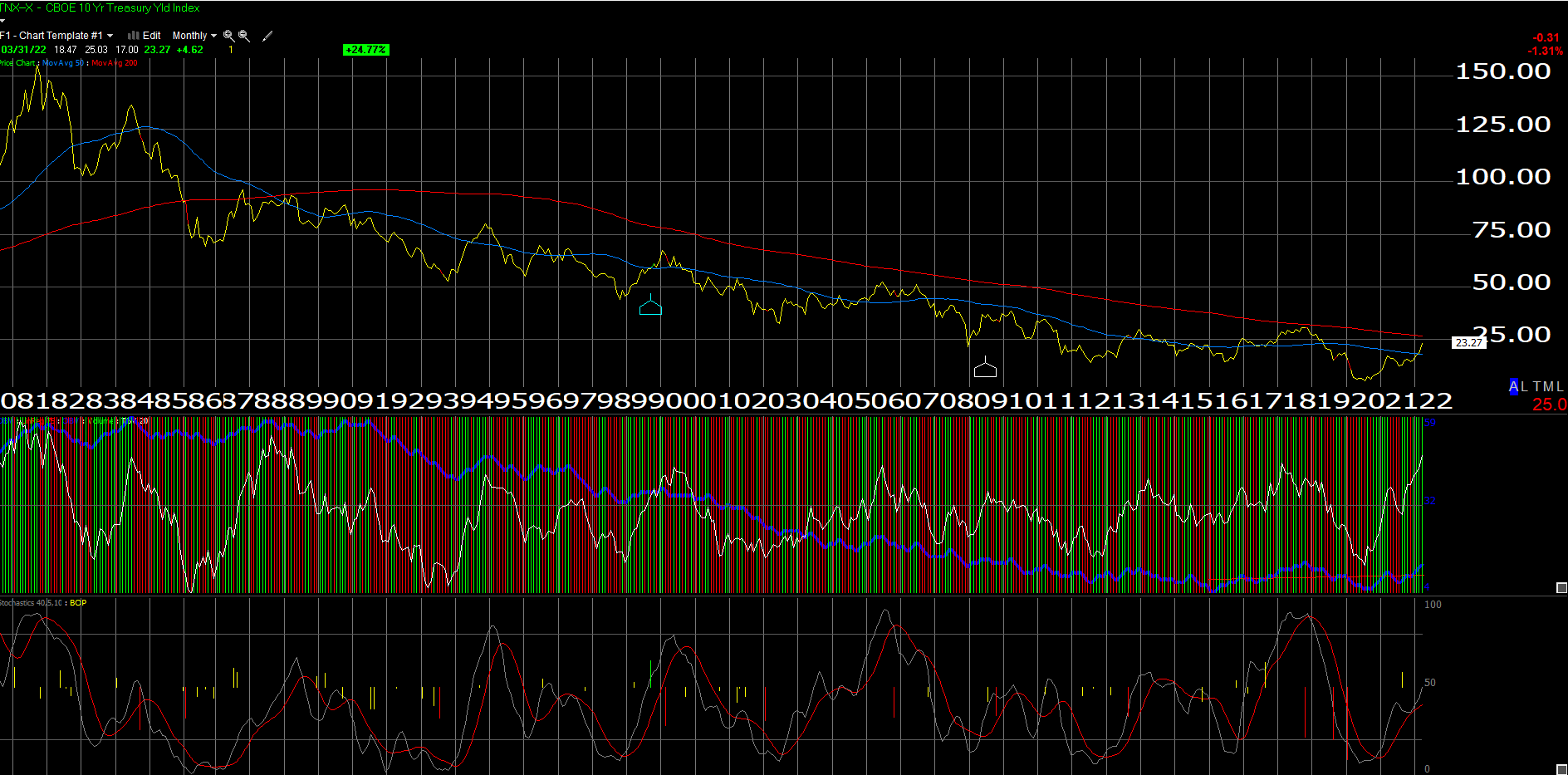
The above “monthly” chart of the TNX or the CBOE 10-year Treasury “yield” contract shows that the key Treasury security is poised to test its 200-month moving average around 2.69%.
As readers can see, the 10-year Treasury yield exceeded 3% in late 2013, early 2014 (Bernanke’s taper tantrum), and then in late 2018 after Jay Powell had taken over hiking the fed funds rate from Janet Yellen.
Sitting in Denver Monday night, March 28th, at a client meeting with a married couple who had fared very well over the last 40 years in the commercial real estate business, I showed the above chart to the client and pointed out its significance to the overall market posture, and the client said, “that line (200-month moving average) is going to be taken out”.
What’s interesting is that – absent a brief period in 1987 – the TNX – hasn’t exceeded the 200-week moving average since 1985.
People forget that in the Spring of 87, the 30-year Treasury bond lost 10 points in a month and was one of the precursors of the October ’87 crash.
That being said, 2.69% is still a way away from today’s closing yield of 2.33%.
By the time most readers get to see this, the March ’22 payroll report will have been reported Friday morning, April 1, ’22. Consensus expectations per Briefing.com is expecting 525,000 overall net new jobs created, with 500,000 from the private sector.
Part and parcel of the job picture is the inflation story. If crude oil would correct down to the $75 area (and that seems unlikely) I do think it gives Powell a legitimate reason to slow the expected rate hikes now planned in 2022.
Do your own analysis and take all of this with substantial skepticism.
Thanks for reading.
Editor’s Note: The summary bullets for this article were chosen by Seeking Alpha editors.
Be the first to comment