

takasuu/iStock via Getty Images
VOE strategy and portfolio
The Vanguard Mid-Cap Value ETF (NYSEARCA:VOE) has been tracking the CRSP US Mid Cap Value Index since August 2006. It has 204 holdings, a distribution yield of 1.84% and an expense ratio of 0.07%, cheaper than the 0.22% fees of the SPDR S&P Midcap 400 ETF Trust (MDY).
As described on CRSP’s website, the underlying index selects stocks using five factors: book to price, forward earnings yield, past earnings yield, dividend yield and sales-to-price ratio.
VOE invests mostly in U.S. based companies (98.1% of asset value). Mid-cap companies represent 92.9% of the portfolio. Unexpectedly, VOE is not cheaper than the benchmark MDY regarding price/earnings ratios. Other valuation ratios are marginally lower, as reported in the next table.
|
VOE |
MDY |
|
|
Price/Earnings TTM |
15.93 |
15.58 |
|
Price/Book |
2.29 |
2.42 |
|
Price/Sales |
1.31 |
1.43 |
|
Price/Cash Flow |
11.41 |
12.6 |
The top 10 holdings, listed below with valuation ratios, represent 10.4% of asset value. The heaviest position weights about 1%, so the risk related to individual stocks is very low.
|
Ticker |
Name |
Weight |
P/E TTM |
P/E fwd |
P/Sales TTM |
P/Book |
P/Net Free Cash Flow |
Yield% |
|
Carrier Global Corp |
1.11% |
24.21 |
19.93 |
1.95 |
5.94 |
27.24 |
1.33 |
|
|
Occidental Petroleum Corp |
1.11% |
37.50 |
9.40 |
2.17 |
5.32 |
8.36 |
0.90 |
|
|
Corteva Inc |
1.08% |
24.84 |
23.88 |
2.75 |
1.70 |
24.55 |
0.95 |
|
|
Nucor Corp |
1.07% |
6.39 |
7.47 |
1.15 |
3.00 |
10.19 |
1.34 |
|
|
Motorola Solutions Inc |
1.06% |
33.47 |
24.28 |
5.11 |
N/A |
37.58 |
1.32 |
|
|
Discover Financial Services |
1.03% |
6.27 |
7.84 |
2.60 |
2.69 |
6.41 |
1.80 |
|
|
Welltower Inc |
1.03% |
434.67 |
117.74 |
9.05 |
2.43 |
191.08 |
2.50 |
|
|
International Flavors & Fragrances Inc |
0.97% |
129.43 |
22.96 |
2.86 |
1.58 |
89.45 |
2.42 |
|
|
Valero Energy Corp |
0.97% |
44.55 |
12.70 |
0.36 |
2.23 |
22.85 |
3.89 |
|
|
Ameriprise Financial Inc |
0.96% |
12.90 |
11.55 |
2.52 |
6.15 |
10.89 |
1.52 |
The top two sectors are financials (17.9%) and real estate (12.1%). Other sectors are below 11%. Compared to the S&P Midcap 400, the fund overweights financials, real estate, utilities, materials, energy, consumer staples and communication. It underweights industrials, technology, consumer discretionary and healthcare.
VOE sectors (chart: author; data: Fidelity)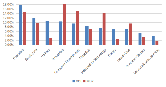
Since inception (08/17/2006), VOE has slightly underperformed MDY and it has a similar volatility (standard deviation of monthly returns). The maximum drawdown is deeper.
|
Total Return |
Annual Return |
Drawdown |
Sharpe ratio |
Volatility |
|
|
VOE |
301.60% |
9.30% |
-61.49% |
0.54 |
18.12% |
|
MDY |
339.66% |
9.94% |
-55.37% |
0.56 |
18.82% |
Data calculated with Portfolio123
Comparing VOE with my value benchmark
The Dashboard List is a list of 80 stocks in the S&P 1500 index (occasionally less), updated every month based on a simple quantitative methodology. All stocks in the Dashboard List are cheaper than their respective industry median in Price/Earnings, Price/Sales and Price/Free Cash Flow. An exception in Utilities: the Price/Free Cash Flow is not taken into account to avoid some inconsistencies. After this filter, the 10 companies with the highest Return on Equity in every sector are kept in the list. Some sectors are grouped together: Energy with Materials, Telecom with Technology. Real Estate is excluded because these valuation metrics don’t work well in this sector. I have been updating the Dashboard List every month on Seeking Alpha since December 2015, first in free-access articles, then in Quantitative Risk & Value.
The next table compares VOE performance since inception with the Dashboard List model, with a tweak: here the list is rebalanced every quarter to make it comparable with a passive index.
|
Total Return |
Annual Return |
Drawdown |
Sharpe ratio |
Volatility |
|
|
VOE |
301.60% |
9.30% |
-61.49% |
0.54 |
18.12% |
|
Dashboard List |
484.70% |
11.96% |
-57.35% |
0.65 |
18.96% |
Past performance is not a guarantee of future returns. Data Source: Portfolio123
The Dashboard List beats VOE by a significant margin in return and risk-adjusted performance (Sharpe ratio).
VOE fundamental shortcomings
The underlying index has two shortcomings in my opinion. The first and largest one is to classify all stocks on the same criteria. It means the valuation ratios are considered comparable across sectors. Obviously they are not: you can read my monthly dashboard here for more details about this topic. A consequence is to privilege sectors where valuation ratios are naturally cheaper, especially financials. Some other sectors are disadvantaged: those with large intangible assets like technology. To make things simple, companies with large intangible assets are those with a business model based on massive R&D, a strong branding, large user databases, or operating in a field where competition is limited by an expensive entry ticket. All these elements are not correctly reflected by valuation ratios. The value discrepancy between sectors results in a significant difference in sector weights as seen in a previous chart.
The second flaw is using the price/book ratio (P/B), which amplifies the intangible asset issue and adds some risk in the strategy. In general, a large group of companies with low P/B contains a higher percentage of value traps than a same-size group with low price/earnings, price/sales or price/free cash flow. Statistically, such a group will also have a higher volatility and deeper drawdowns in price. The next table shows the return and risk metrics of the cheapest quarter of the S&P 500 (i.e.125 stocks) measured in price/book, price/earnings, price/sales and price/free cash flow. The sets are reconstituted annually between 1/1/1999 and 1/1/2022 with elements in equal weight.
|
Annual Return |
Drawdown |
Sharpe ratio |
Volatility |
|
|
Cheapest quarter in P/B |
9.95% |
-72.36% |
0.48 |
21.05% |
|
Cheapest quarter in P/E |
11.25% |
-65.09% |
0.57 |
18.91% |
|
Cheapest quarter in P/S |
12.62% |
-65.66% |
0.6 |
20.46% |
|
Cheapest quarter in P/FCF |
12.23% |
-63.55% |
0.61 |
19.05% |
Data calculated with Portfolio123
This explains my choice of using P/FCF and not P/B in the Dashboard List model.
Takeaway
VOE holds about 200 mid-size companies picked by a ranking system based on five valuation metrics. It is cheap in management fee and it doesn’t look riskier than the midcap benchmark: the maximum drawdown is a bit deeper, but historical volatility is similar. It has slightly lagged MDY since inception. VOE strategy doesn’t seem to bring added value to the midcap benchmark. I think there are two shortcomings in the underlying index: it ranks stocks regardless of their sectors, and one of the five metrics brings additional risk. An efficient value model should compare stocks in comparable sets (sector, industry), like I do in the Dashboard List since 2015. My model uses less valuation metrics (only three), but prefers price/free cash flow to price/book. Moreover, a simple profitability rule helps filter out some value traps and normalize the number of components.
Be the first to comment