

Douglas Rissing/iStock via Getty Images
The purpose of this article is to examine the USA sectoral flows for August 2022 and assess the likely impact on markets as we advance into September. This is pertinent, as a change in the fiscal flow rate has an approximately one-month lagged impact on asset markets and is a useful investment forecasting tool. Other macro-fiscal flows can point to events many months ahead or even years ahead.
The table below shows the sectoral balances for the USA and is produced from the national accounts.
US Treasury and author calculations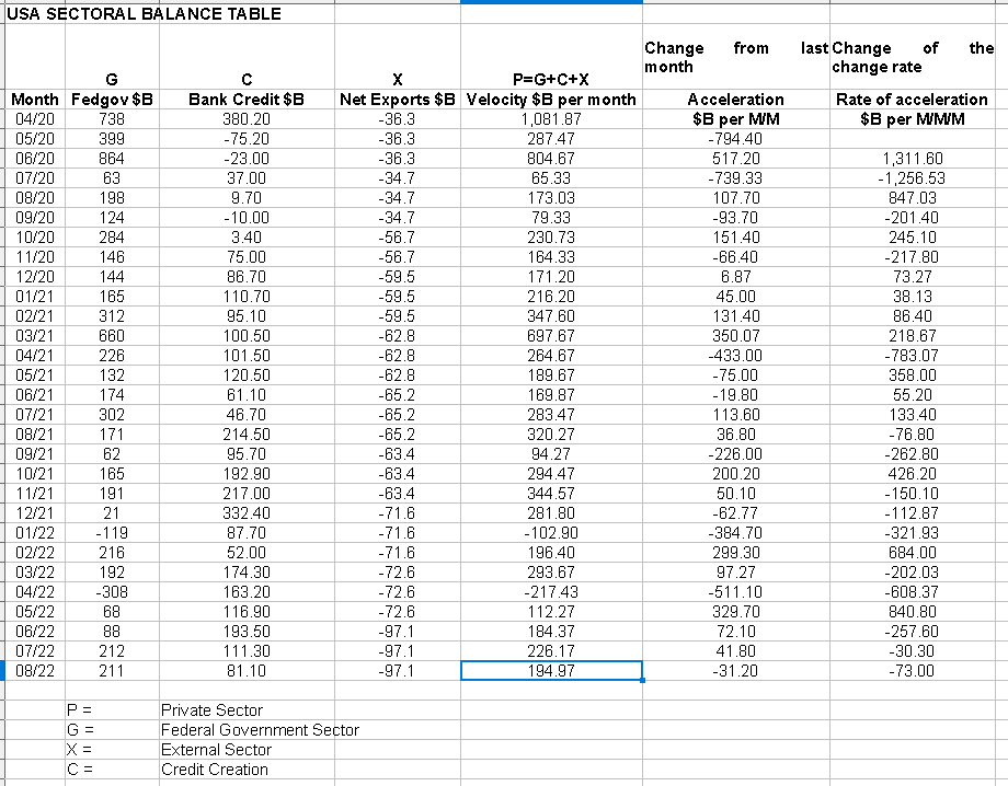
From the sectoral balances table above, we see that for August 2022, we have a positive nominal flow of $194+B into the private sector but a negative change rate month-over-month with the associated reversal of the acceleration rate. For markets, the change rate tends to be more important than the headline number, and in this case, it is negative and so not positive for markets. This month [September] the result will be worse given the large federal tax collection that takes place in the middle of the month.
The $194+ billion private sector injection of funds from the table above is made up of a $211+ billion injection of funds from the federal government, plus a weaker $81+ billion of credit creation from commercial banks and less the -$97+ billion that flowed out of the private domestic sector and into foreign bank accounts at the Fed in return for imported goods and services.
The following chart emerges when one graphs the change rate of the information in the USA sectoral balances table above and adjusts for impact time lags.
Mr Robert P Balan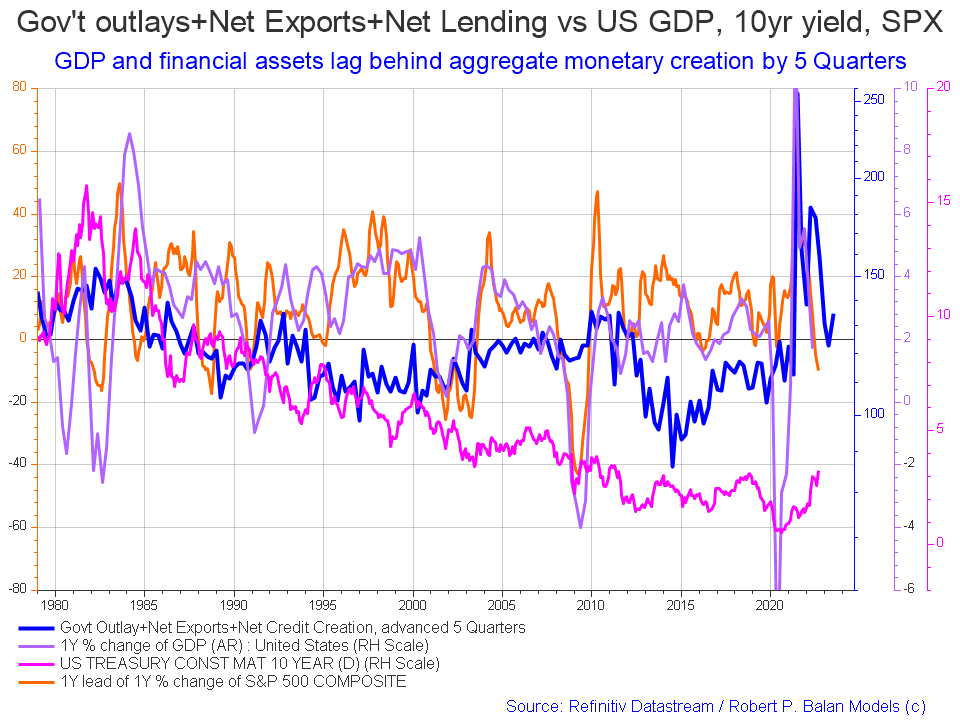
There is no change in the chart as compared to last month given the coarse granularity of the reporting structure. An uptrend in both rates and the SPX is pre-programmed though and will follow the blue leading indicator line upwards.
The chart below shows the five-year average of the seasonal stock market patterns for the SPX (SPX), NDX (NDX), Dow (DIA), Russell 2000 (RTY), and Biotech (IBB) market indexes. The black oval shows roughly where we are [trading day 181 at the time of writing and the end of the green line on the chart below]. Markets have been moving up since June now and match the private sector surplus that has been pouring in for the last three months. There was a sizeable down move in markets despite the favorable fiscal background and this can be largely attributed to the comments made by Jerome Powell at the Jackson Hole central bankers meeting at the end of August. This is a case of sentiment events, such as a very negative central back announcement or an act of war [think Ukraine] which can cause markets to reverse despite favorable fiscal conditions underpinning them.
Mr Robert P Balan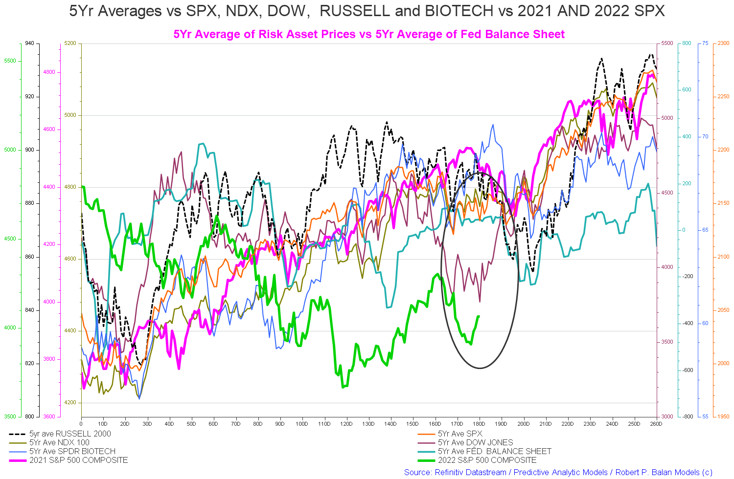
The important point to note on the above chart is the key inflection point that is coming up at about trading day TD200 [late September early October]. There is a serious dip and then generally a recovery into the end of the year. The dip is most likely the impact of the mid-September federal tax collection, and the recovery is the new round of federal agency spending from the newly approved federal budget and the Fed loading up the federal reserve system with extra cash in readiness for the burst of transactions over the Xmas and New Year holiday period.
US Treasury and author calculations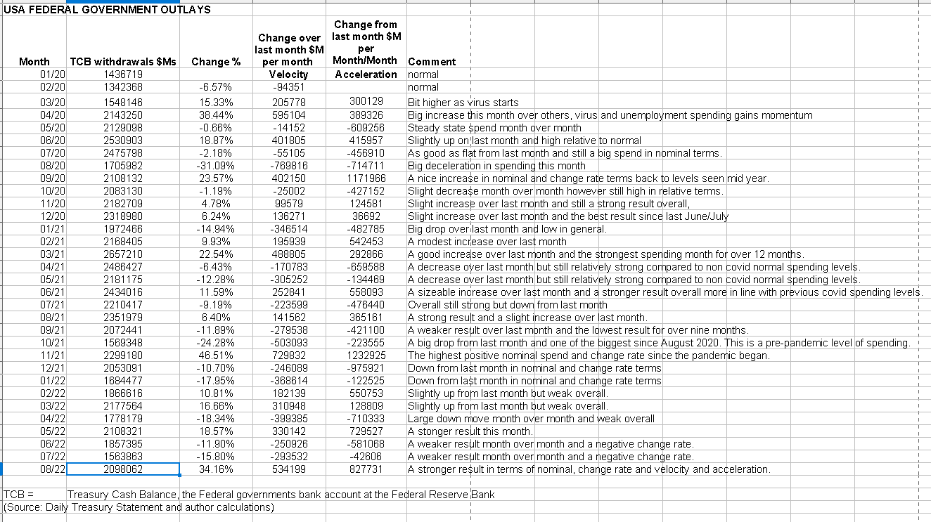
The above chart shows a significant turnaround in expenditure patterns. August was a strong spending month and 34% larger than the previous month, with a large increase in money velocity and acceleration. The latter are strongly positive now after July’s strong deceleration.
The chart below shows graphically the relationship between the federal government (currency creator) and the private sector (currency user) and is from ANG Traders of the Away from the Herd SA Marketplace service. The bottom panel highlights in red and green the financial relationship between the currency creator and currency users.
During the month of August, $227B was net-transferred into private bank accounts, and the 20-day average of the daily net-transfers is +$10.2B/day. In the second-half of August, the 20-day average stopped growing (dashed pink-arrow) and was reflected in the SPX weakness. This weakness could be due to preemptive tax selling (front-running the mid-September tax-take). If so, that opens up the possibility for September to be less stressful on the market when the tax-take actually occurs. At this point, the direction of stock prices in September is an open question (pink and blue dashed-arrows).
(Source: Mr. Nick Gomez, ANG Traders, Away from the Herd SA Market Service).
ANG Traders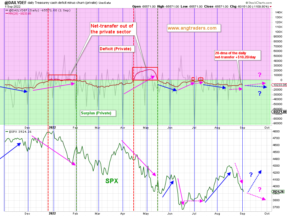
Corporate taxes represent money drained from the most productive portion of the economy and is money that is not able to be paid to workers for their efforts or as dividends to owners or reinvested into more productive capital. Just like in a game of monopoly, the money is removed from circulation by the entity that puts it into circulation and has it in infinite supply.
The positive takeaway here is that the overall trend is back down into a private sector surplus that supports markets overall and lifts financial balances in the private sector. One can see on the bottom panel how the SPX rises almost on cue with the private sector surplus and vice versa.
Another point to note is that the market reversal we had that seemed to come at the time of Jerome Powell’s Jackson Hole speech also come at a time when the broad direction of the fiscal flows was trending back up into the pink private sector deficit area of the chart. This trend will worsen in September when corporate taxes are paid in the middle of the month. This is a good illustration of how the change rates and acceleration direction are important in terms of determining likely short-term market direction. Perhaps Jerome Powell simply made a bad situation worse.
ANG Traders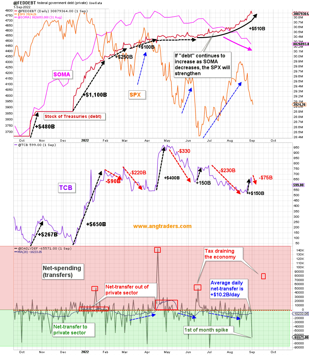
The chart above shows:
As the SOMA is reduced but the “debt” is increased, the stock market rallies (blue-arrows below). However, when the TCB (Treasury cash balance) is increased, like during the last week of August, the market tends to weaken.
(Source: Mr. Nick Gomez, ANG Traders, Away from the Herd SA Market Service).
This month we were treated to two significant publications. One was from the Levy Institute looking at future U.S. sectoral flows, and the other was an examination of the economy and markets from Mr. Nick Gomez of the Away from the Herd SA market service. Link to the article.
The first publication mentioned above contained the following key findings based on the sectoral flows.
Levy Institute of Bard College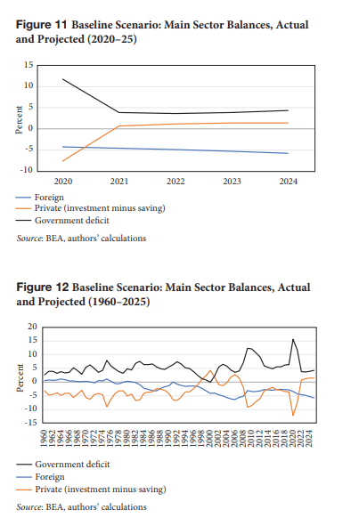
What the charts are showing is that the brown line [the private domestic sector] is moving into deficit, that is, being drained of money. This is being caused by both a reduction in the federal government deficit and an increase in the foreign sector external deficit. So you have the situation where less money is flowing into the private domestic sector because less is flowing in from the federal government [the currency creator] and more is flowing out to bank accounts held at the Fed by foreign entities. [In exchange for foreign goods and services that might one day increase the USA’s productive capacity or it just went on overseas vacations, the use for which the foreign expenditure was put makes the difference in its overall utility.]
The Levy institute summarizes their findings with regard the sectoral flows as follows:
Levy Institute of Bard College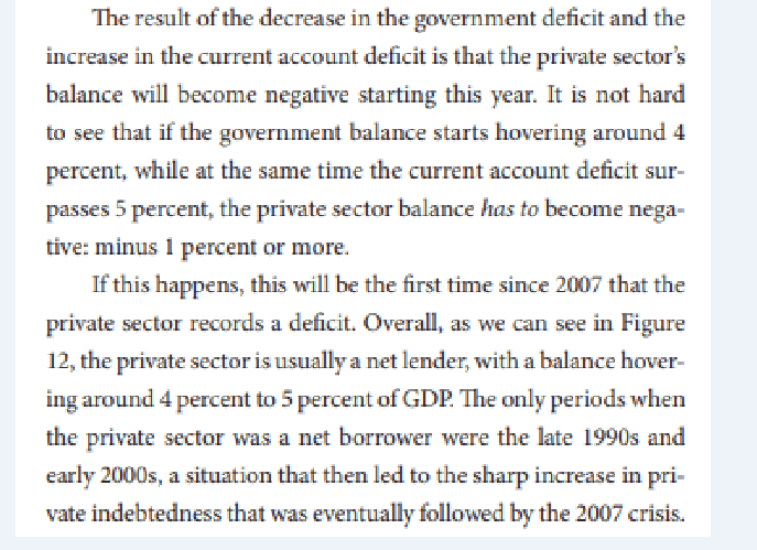
When one plots the U.S. sectoral balances against the stock market one gets the chart shown below. Note that, in contrast to the Levy Institute sectoral charts shown above, this chart has been formatted to show the private domestic sector as a positive balance and the other two as negative, which is mathematically more correct as they are deficits. These are the famous twin deficits that the mainstream believes are sinking America and that mean you need to buy guns, food, gold and silver and retreat to a log cabin in Montana and sit out the financial holocaust that is coming.
US Federal Reserve Bank
When the green line [private domestic sector] declines or goes negative, a recession and market crash is on the way because the sector is being drained of financial assets. The recession and market crash are cured once the green line expands back out again. It is in effect recharged with cash again as the red and blue lines move back in the opposite direction and stop their draining effect. At present, we have a situation where the external sector [blue line] is moving ever further into deficit and at the same time, the federal government [red line and currency creator] is declining. This is a zero-sum game. The gain of one sector is at the exact loss of another, and in this case, the private domestic sector line is being reduced by both the government and external sector gains.
I will make the above chart available to readers in the comment section as it is interactive and live on the FRED website.
One normally associates a private domestic sector deficit, and the resultant market crash and recession, with a federal government surplus. However, in this instance it could well be the case that the private domestic sector deficit could come at a time of a continued [and normal] federal government deficit but caused by the external sector balance moving further into deficit. When the federal government deficit balance is not large enough to cover both the private domestic sector balance and the external sector then it means that the external deficit is funded partly by dissaving by the private domestic sector. The private domestic sector not being sovereign in its currency has a finite capacity to spend. At some stage, the private domestic sector runs out of savings, and aggregate demand drops and markets with it. The collapse comes suddenly like a car running out of gas. Full throttle one minute and nothing the next.
Note in the first table in this article that the numbers in the external sector column [X] trend higher and higher and but for that, the private domestic balance would have been that much higher.
At the White House in the last month, the most notable positive thing has been the advancement of a bill for the partial forgiveness of student debt. This is a good thing, as it then allows more income to go toward real goods and services rather than to interest and principal payments on money that was created out of thin air for a thing that should be free. Education to at least college level should be a right for every citizen to build the nation’s intellectual capital given that people are the reason a nation exists and its most important asset.
Seeking an advanced education in many western nations, that demand payment for it, is more a poverty risk for the individual rather than an asset for the future and so less of it occurs than might otherwise have been the case and the nation as a whole is poorer and weaker for it. Not to mention dumber. We will return to the concept of debt forgiveness later in this article.
A nation that is spending $x billion per year on tanks, guns and prisons will have the same GDP as a nation spending $x billion on schools, hospitals and parks and gardens.
But qualitatively the two are light years apart.
(Professor William Mitchell, Billyblog, September 2022)
The same could be said of a nation that is spending $x billion per year on principal and interest payments.
The Fed and central banks in general have been the cause of some serious market reversals since the Jackson Hole meeting last month. The damage, though, started as soon as the world banks as a group began raising interest rates.
The SA article by ANG Traders earlier this month, mentioned and linked earlier in this article, shone a light on the economic screws that hold the economy together and put together some great charts to back up what he is saying. There is no room at all for the standard mainstream myths and dogma in articles by ANG Traders. One aspect of the report shows the damage the Fed is doing to the land market as the following extracts show.
ANG Traders
ANG Traders ANG Traders
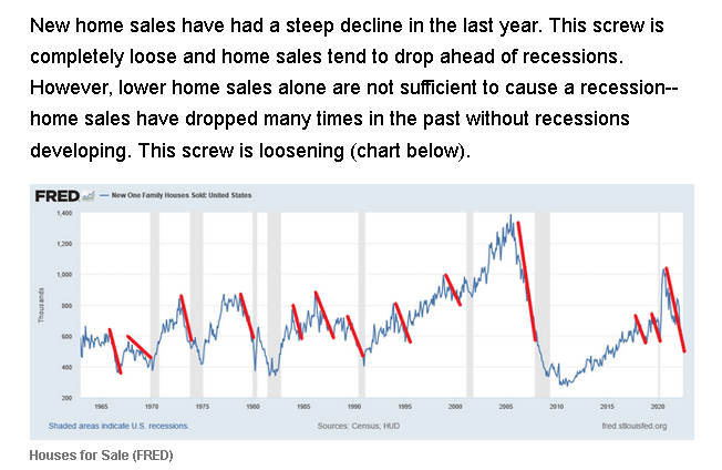
Land prices, sales, and construction have slumped since the Fed started raising interest rates. The impact now is a constriction in the supply of new accommodation at a time of a growing overall population. The result has been an increase in rental accommodation costs. The process now is that the increase in rental rates makes it attractive, at some point, to build new accommodation. Similarly, once the Fed has induced a recession and caused wider spread unemployment and the pain that it promised at its last meeting, it will be forced to again lower rates to stimulate an economy that it laid low, to begin with. Lower interest rates, and higher rents, will again invigorate the real estate market and propel it to its decade peak of 2025/26 in line with the underlying demographic trend and the basic need for accommodation.
Why are land and housing so important? It is because mortgages created against land and building assets ARE the capital structure. Upset this structure and you have a serious financial crisis on your hands, as the chart below shows. look at the size and value of the orange-colored area on the chart.
New York Federal Reserve Bank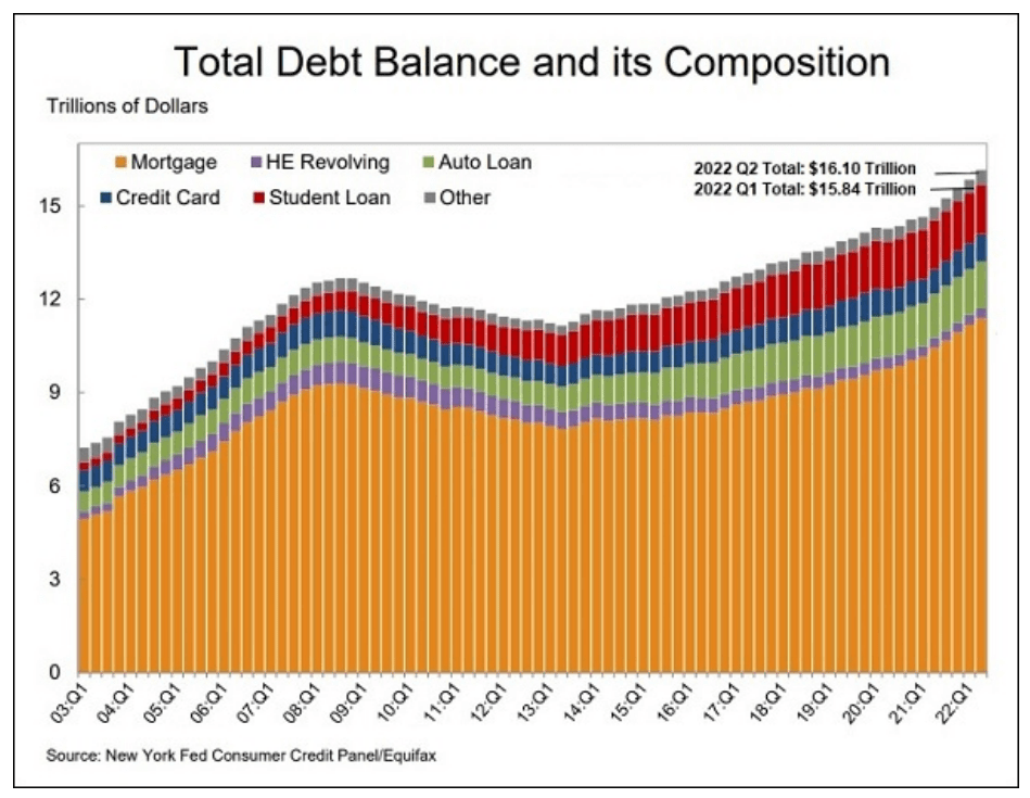
A tiny portion of this debt may soon be relieved in a mini debt jubilee for students. The elephant in the room though is the mortgage debt.
The Jubilee campaign’s origins are linked with the Biblical Year of Jubilee, outlined in Leviticus 25-26, a magnificent and widely ignored text which calls for periodic complete overhaul of the economy. In the Jubilee, there is release for those enslaved because of debts, a Sabbath rest for land and people, redistribution of lands lost because of debt, and a reordering of prices for land and labor based on proximity to the next Jubilee.
(Source: Tim Atwater)
“Clean Slate (AKA debt forgiveness): Originates a royal practice in Bronze Age Sumer and Babylonia to annul debts so as to save society from being torn apart by transferring land and personal liberty to creditors. This became the core of Judaic Law as the Jubilee Year. …In contrast to ancient society’s idea of circular time – with clean slates to restore economic order when debts grew too burdensome – today’s concept of linear progress treats the debt build up as cumulative and irreversible. The result is that without debt cancellations economies evolve into oligarchies that claim their takeover is “natural” and thereby morally justified.
Hudson, Michael. J IS FOR JUNK ECONOMICS: A Guide To Reality In An Age Of Deception (Kindle Location 1485). ISLET/Verlag. Kindle Edition.
When the value of land and housing starts to reverse the central bankers have an even bigger problem on their hands, as the banking and finance system unravels, and must reverse course or the structure comes tumbling down as it did in 2009.
The world’s central banks are fighting inflation by seeking to crush aggregate demand down to match the shortages of supply that has been caused by such things as the Covid-19 epidemic and the war in Ukraine.
Eventually, the purchasing power of the population will be reduced by unemployment to match the reduced supply of materials and thus tame inflation. It is like cutting off your toes to make a pair of smaller shoes fit instead of getting bigger shoes.
The correct response was to use fiscal policy to alleviate the shortages via investment in new capital and equipment but this would have required an almost impossible to achieve [unless it is for war] political consensus.
So, un-elected central bankers can more easily and quickly crush the economy and aggregate demand with interest rate rises. In so doing, the cost is transferred onto the unemployed. Inflation and inflation expectations will be anchored with unemployment.
By doing these dubious things, the central bankers are seen as strong and virtuous. Former central bankers such as Paul Volker are held up as role model heroes for taming inflation in the 1970s with the same tactics even though, back then, all that was needed was an alleviation of the shortage of oil and grain that began the inflation in the first case. In the 1970s, 20%+ interest rates and 10%+ unemployment rates were not a good solution to the problem of inflation and are still not and yet the policy is allowed to continue just the same.
Mr Robert P Balan
Mr Robert P Balan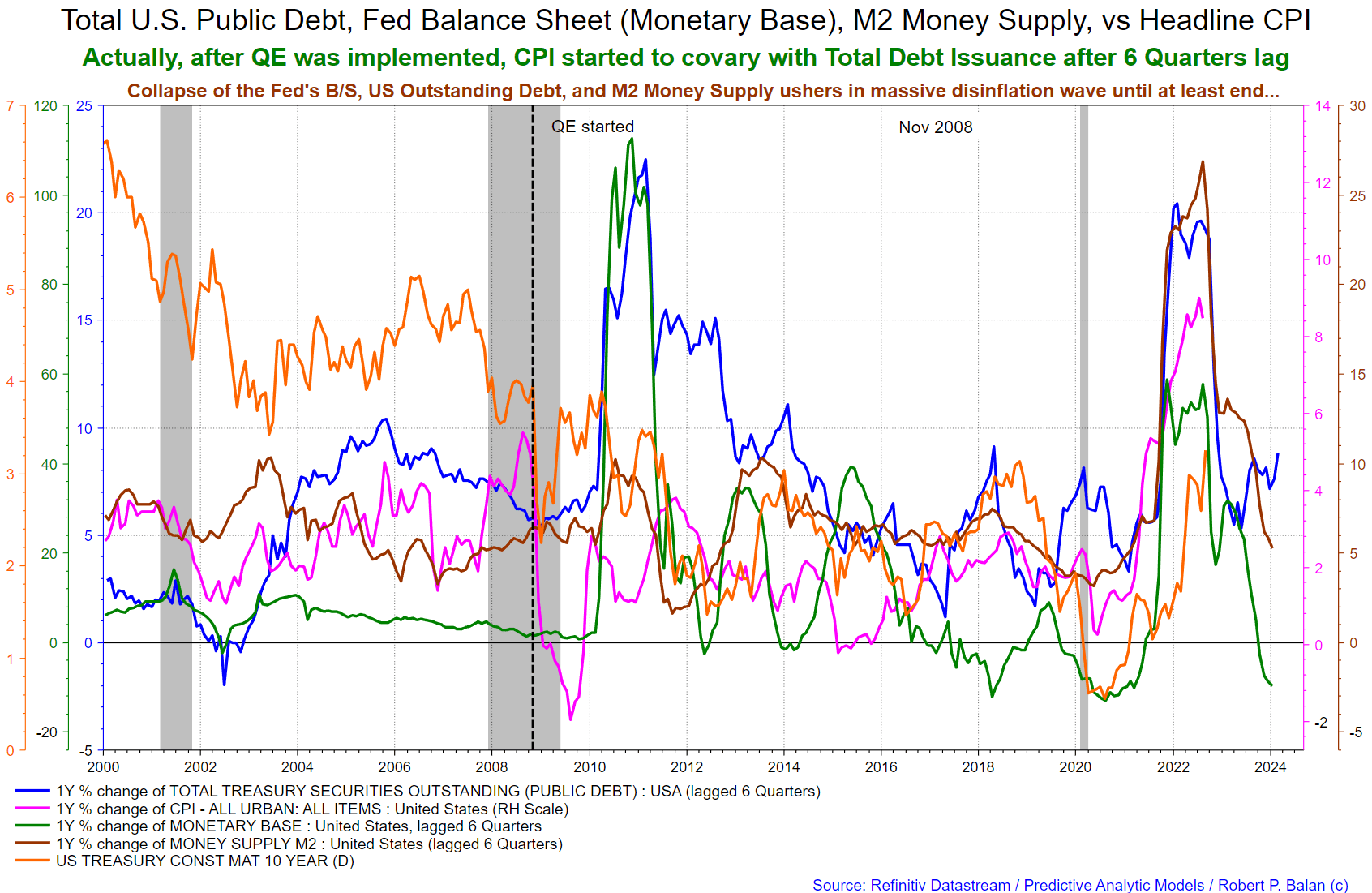
The above quote and chart from Mr. Robert P. Balan show that disinflation is pre-programmed into the economy and provides some guidance as to when the Fed and the other central banks will begin to reverse their destructive round of interest rate rises and predictions of “economic pain” as toes are lopped off to fit feet into smaller shoes.
The big winner from this move is land and housing. This is why this month there was a focus on that subject. If one wanted a sure investment winner with little or no risk, then that is the one worth waiting for.
Mr Robert P Balan Mr Robert P Balan
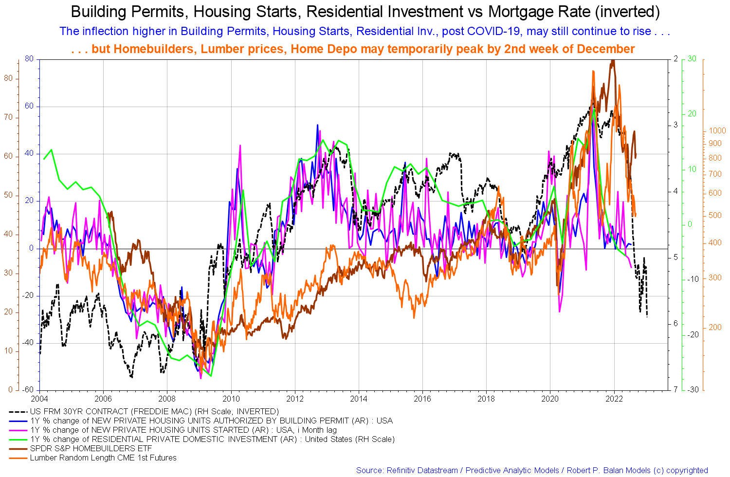
The chart above tracks co-variables related to land and housing, and one can see that the 30-year mortgage contract [Freddie Mac – dashed black line] is oscillating back and forth trying to find a bottom before heading back up again to lower rates and will take the other co-variables up with it.
On the world stage, the chart below shows the expected likely path of asset markets based on the flow of funds at the macro world level.
The chart below comes from Mr. Robert P. Balan of Predictive Analytic Models and is part of his SA Marketplace service information for subscribers. The chart shows the level of money creation by the top five world governments [the G5] in a change rate format, along with a host of other indexes. This chart gives a sense of important inflection points and direction.
Mr Robert P Balan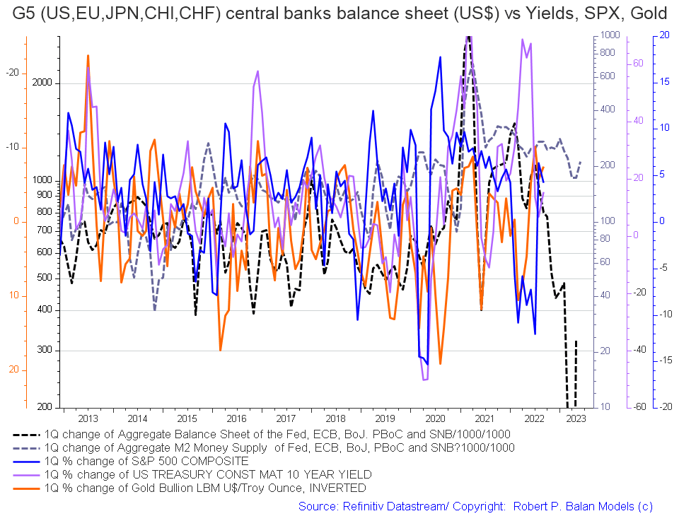
The precipitous drop in the one-quarter change of the G5 aggregate balance sheets [black dotted line on the chart], which was highlighted in a previous article, has ticked back up again and points to rising fortunes in mid-2023.
A more zoomed version of the data similar to the chart above shows a similar trend [dark green line on the chart] and a sense of amplitude. [not that great]. Few things will match the amplitude of change that was experienced during the response to the Covid-19 crisis. That was a once-in-50 to 100-year event. This chart tracks the activities of the top five central banks [the C5].
Mr Robert P Balan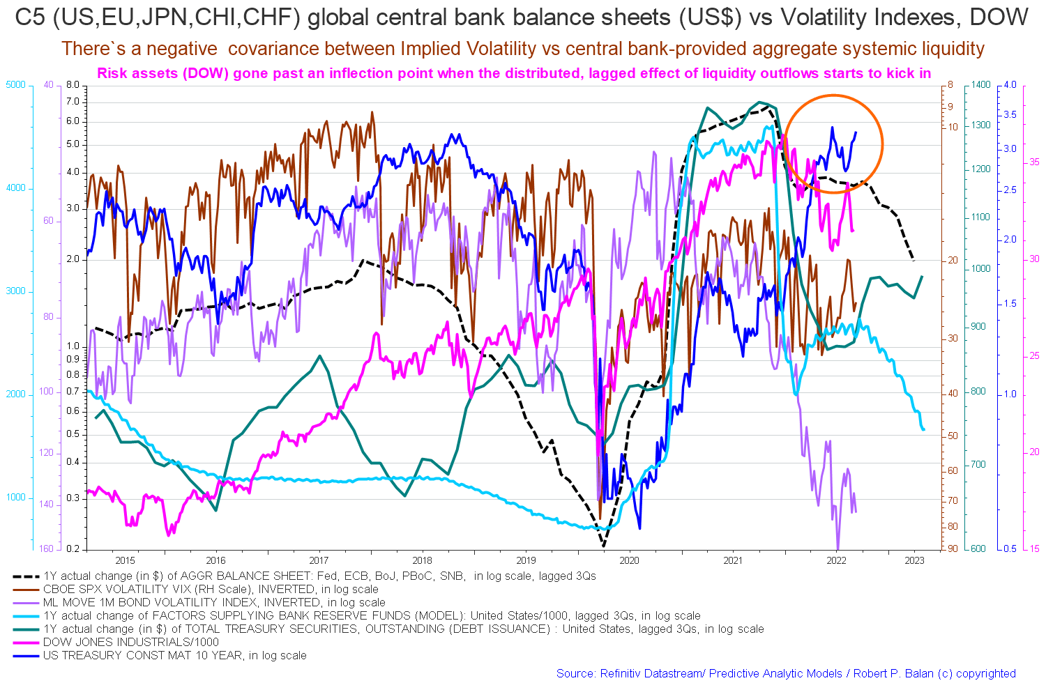
Be the first to comment