

MCCAIG/E+ via Getty Images
(This article was co-produced with Hoya Capital Real Estate.)
AUTHOR’S NOTE: For historical context, this article was researched and mainly written over the weekend of June 11/12. As it is finalized the morning of Monday, June 13, the market is experiencing further sharp declines.
This past Friday, June 10, the S&P 500 index closed at 3,900.86, basically tied with its 3-week-old low close of 3,900.79, set on May 19, and some 19.04% below its 52-week high of 4,818.62.
And I did nothing. I did not buy even a single share as the market cratered into the close.
Why? Because I’m afraid there is still more pain to come.
I believe there are two specific reasons for this.
- After an extended period of artificial inflation, there’s a good chance that household balance sheets, including both stocks and real estate, will experience significant deflation on their own.
- If they don’t, an argument exists that the Fed will ensure that they do.
In this article, I will briefly argue both points, including offering links to two previous articles I have written for any interested in further reading.
I will next talk about my own viewpoint, and offer some interesting price targets on key ETFs, including SPDR S&P 500 ETF Trust (NYSEARCA:SPY), for consideration.
But First – How We Got Here
In my last article here on Seeking Alpha, I took a reasonably detailed look at how we got to where we are today, to a place where household balance sheets have experienced a very strong run of asset inflation. If you’ve always wondered how to explain it simply and understandably to a coworker or friend, I think you would find the article very helpful. However, I will offer a very brief summary here.
Following the Global Financial Crisis, or GFC, in addition to lowering short-term interest rates to zero the Fed engaged in what is known as quantitative easing (QE). On top of this, more stimulus was introduced to help offset the economic downturn as a result of the COVID-19 pandemic. In combination, the effect of this was to both increase the money supply, as well as hold down longer-term interest rates.
However, as opposed to being spent on goods and services, much of this money ultimately made its way into assets, including both the stock market as well as real estate. Going a step further, low interest rates emboldened at least some investors to take on outsize risks. The end result? A rather meteoric increase in asset prices.
Ironically, actual inflation, as opposed to asset inflation, started to raise its ugly head. The COVID-19 pandemic led to a drop in spending on services but a sharp increase in spending on goods, as people found themselves confined to their homes. Then came supply chain issues, followed by the war in Ukraine. All of this has led to inflation that reached 8.6% in May, its highest level since 1981.
Recent data, however, appear to suggest that all of this is starting to lead to asset deflation. In other words, that household balance sheets are starting to shrink, as opposed to continuing to grow.
Household Balance Sheets – Deflating On Their Own
In support of the statement I made to conclude the last section, allow me to share three graphics, along with some related commentary, from data recently released by the Federal Reserve in a report entitled Financial Accounts of the United States. I will then follow that up with a related graphic from the FRED website from the St. Louis Fed.
Here’s the first graphic, showing the state of household balance sheets in the United States.
US – Household Balance Sheets (Federal Reserve)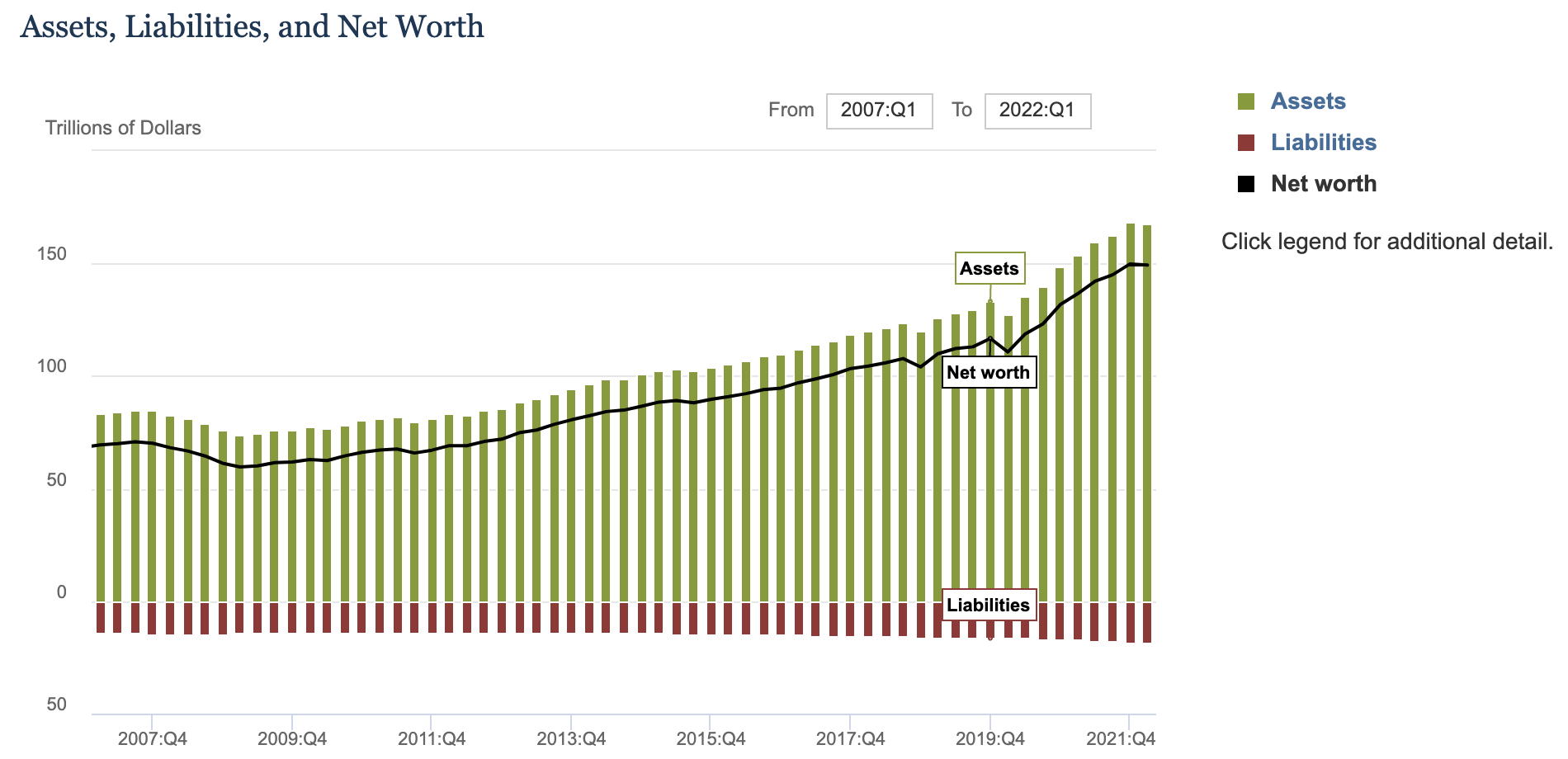
Summarizing this data, related commentary featured 2 things worth mentioning in the context of this article:
- For the first time since the onset of the pandemic, household net worth decreased, by $0.5 trillion.
- At the same time, household debt grew at an annual pace of 8.3%.
Next, we have our second graphic, breaking down the components of the change in household net worth.
Changes to Components of Net Worth (Federal Reserve)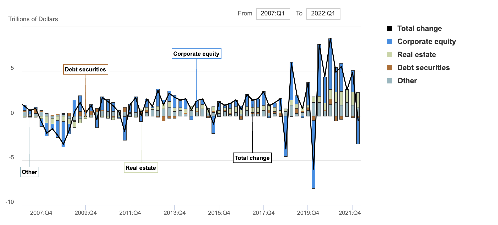
Here’s the biggest takeaway I would like you to notice. As featured in the opening paragraph of this article, stocks have experienced a sharp decline. This is represented by the blue segment of the bar furthest to the right. At the same time, real estate prices have continued to rise, as featured by the light green segment of the bar. Hold that thought, because it comes into play later.
With our third graphic, we come to the part where cracks are already starting to show. Another recent release from the Fed features the status of Consumer Credit Outstanding.
Consumer Credit Outstanding (Federal Reserve)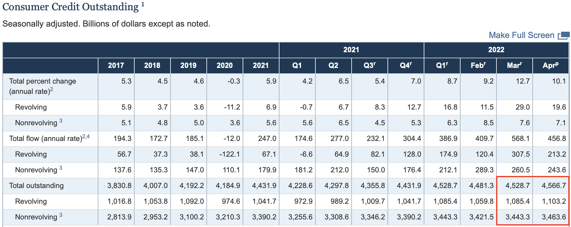
Please draw your eyes to the section I highlight with the red box. Here is the related commentary from the report:
The latest Federal Reserve data on outstanding consumer credit, released Tuesday afternoon, comes after March’s record increase of $52.4 billion. That figure has since been revised downward to $47.3 billion.
In April, consumer credit increased at a seasonally adjusted annual rate of 10.1 percent. Revolving credit increased at an annual rate of 19.6 percent, while nonrevolving credit increased at an annual rate of 7.1 percent. (Bold mine, for emphasis)
Related to that, here’s the last graphic, courtesy of the St. Louis Fed.
Personal Saving Rate (FRED – St. Louis Fed)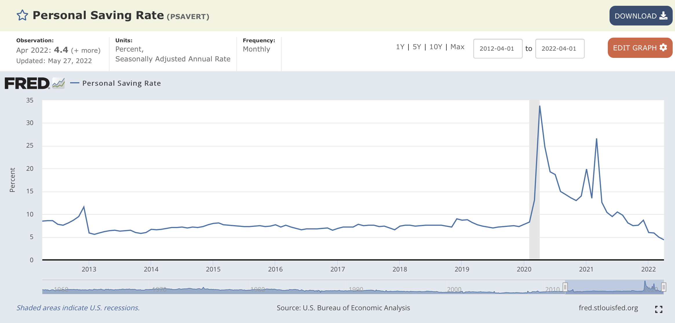
Fueled by stimulus money, the personal saving rate in the U.S. rose dramatically during the pandemic. However, within the past 2 months or so, you can quickly see that it has now dropped below recent historical averages.
In summary, then, evidence is starting to appear that inflation is already taking a toll on household balance sheets. In other words, that they are starting to deflate on their own. That was point 1 in our introduction.
Let’s now move on to the second possibility.
Household Balance Sheets – Deflated By The Fed
As we open this section, let me quickly feature two recent news items.
- Jerome Powell was recently confirmed by the Senate for a second term as Fed Chairman.
- Treasury Secretary Janet Yellen admitted she “didn’t fully understand” the combination of circumstances leading to the current level and duration of inflation.
What does all of this suggest? How about if I let people much more qualified than I am answer that question?
First, some comments from JPMorgan Chase (JPM) CEO Jamie Dimon according to a recent article on CNBC.
“You know, I said there’s storm clouds but I’m going to change it … it’s a hurricane,” Dimon said Wednesday at a financial conference in New York. While conditions seem “fine” at the moment, nobody knows if the hurricane is “a minor one or Superstorm Sandy,” he added.
“You’d better brace yourself,” Dimon told the roomful of analysts and investors. “JPMorgan is bracing ourselves and we’re going to be very conservative with our balance sheet.”
Dimon went on to talk about the upcoming quantitative tightening, or QT, scheduled to begin this month. Why does the Fed need to do this? Here’s how Dimon explains it.
Central banks “don’t have a choice because there’s too much liquidity in the system,” Dimon said, referring to the tightening actions. “They have to remove some of the liquidity to stop the speculation, reduce home prices and stuff like that.” (Bold mine, for emphasis)
Ah, there’s the first hint of what could be the second “shoe to drop.” In our first section, discussing the status of US household balance sheets, you will recall that while the value of equities declined, the value of real estate continued to rise. What’s this about home prices taking a hit as well?
As it happens, the idea that home prices could also be fair game in the Fed’s battle to slay inflation was also featured in a recent note from Zoltan Pozsar, Investment Strategist at Credit Suisse. I recently wrote a fairly comprehensive summary of his note, but allow me to quickly summarize just a couple of key thoughts here.
With respect to home prices, here’s an excerpt towards the conclusion of his note:
Our message today is this:
Consider the possibility that the Fed, on a singular mission to slay inflation, won’t rest in its pursuit of tighter financial conditions until yields shift higher, stocks fall more, and housing turns as well. (Bold mine, for emphasis)
So now we have both Dimon and Pozsar, at some level, saying essentially the same thing. As you ponder this, bear in mind that the severe market declines following the GFC caused a large portion of Americans to avoid stocks. However, roughly 65% of Americans own a home, and this percentage has stayed relatively stable even during the period since 2009. As a result, if, to slay inflation, the Fed feels that it needs to effectively take away some of the spending power of those who have gained the most, housing prices are part of that picture.
Before we conclude this section, though, we need to consider what the possibility of deliberate asset deflation on the part of the Fed might do to stocks. Once again, from Pozsar:
At 4,000, the Fed does not seem content, and in the grand scheme of things . . .. At 3,500, we would have lost all of the post-pandemic gains in market wealth, but that level for stocks still feels like a put option, just with a lower strike price. At 2,500, we would lose not only all of the post-pandemic gains, but would eat into some of the pre-pandemic gains too. And if something indeed happened to the supply of labor post-pandemic (and some of that is wealth related), then to cool price pressures, maybe a pre-pandemic wealth level is appropriate indeed.
To check that, I dug into the numbers myself. Right before the Covid-19 related collapse in March 2020, the S&P average was in the 3,300-3,400 range. Clearly, Pozsar is suggesting that the Fed would be willing to let things fall at least that far. With his reference to a 2,500 S&P average, he also invites us to at least consider the possibility that the Fed might feel the need to do even more to truly crush inflation.
Putting It All Together
In this article, I have given you a lot to think about. And really, it comes from sources a lot smarter than I am.
Briefly, though, I will share my personal thoughts in conclusion.
I tend to agree with Pozsar. I believe, at this point, that a low of 3,600 on the S&P 500 is all but a foregone conclusion. Whether it happens on its own, or is engineered by the Fed, I believe we will get there. Going a step further, I believe 3,400 is a real possibility. At that level, we would be roughly 30% off the 52-week high of the index, as well as back to levels achieved prior to the pandemic, and all the related stimulus money pumped into the system.
What practical steps can investors take at this point? I will approach this from the standpoint that whatever losses each of us have incurred are “water under the bridge” at this point, and we must do the best we can moving forward.
Here are two thoughts:
- Take advantage of the power of rebalancing to realign your portfolio back to target weights. If you have not done so in awhile, it may be that your portfolio is actually underweight stocks at this point.
- Consider the possibility of increasing your stock weighting at preset points you are comfortable with. While what we are going through now is extremely painful, and may continue to be so for at least a little while longer, I might suggest that if you were comfortable with an allocation of 50% at the peak of the good times, you could take advantage of a slightly increased allocation to buy at discounted prices.
One way you can do this is to take advantage of good-till-canceled (GTC) limit buy orders to automatically acquire shares if they fall to a level at which you would be happy to buy.
One of the many things I love about ETFs is that they have significant advantages over both mutual funds and stocks when it comes to using this technique. Since mutual funds only price once per day, at the market close, they offer no opportunities to take advantage of intraday moves in pricing. And, as opposed to the risks involved with buying a single stock, which becomes more of a guessing game of trying to select individual winners and losers, you have the comfort of diversifying with an entire index, or basket of stocks.
With all of that in mind, here’s a little graphic I put together for you.
The left-most column is the S&P 500 index, starting with the recent 52-week high. Down the rows, I calculate various levels of decline. Along the way, you will see dedicated lines for the 6/7/22 close as well as last Friday’s close, so you can have an idea of where we are in the big picture at this point in time.
Going across, I list associated price targets for 5 top-flight ETFs at each level. Three of the ETFs are directly tied to the S&P 500 index, the last two are total-US market ETFs that could also be used.
Key Price Points: S&P 500 & Related ETFs (Author-Developed Spreadsheet)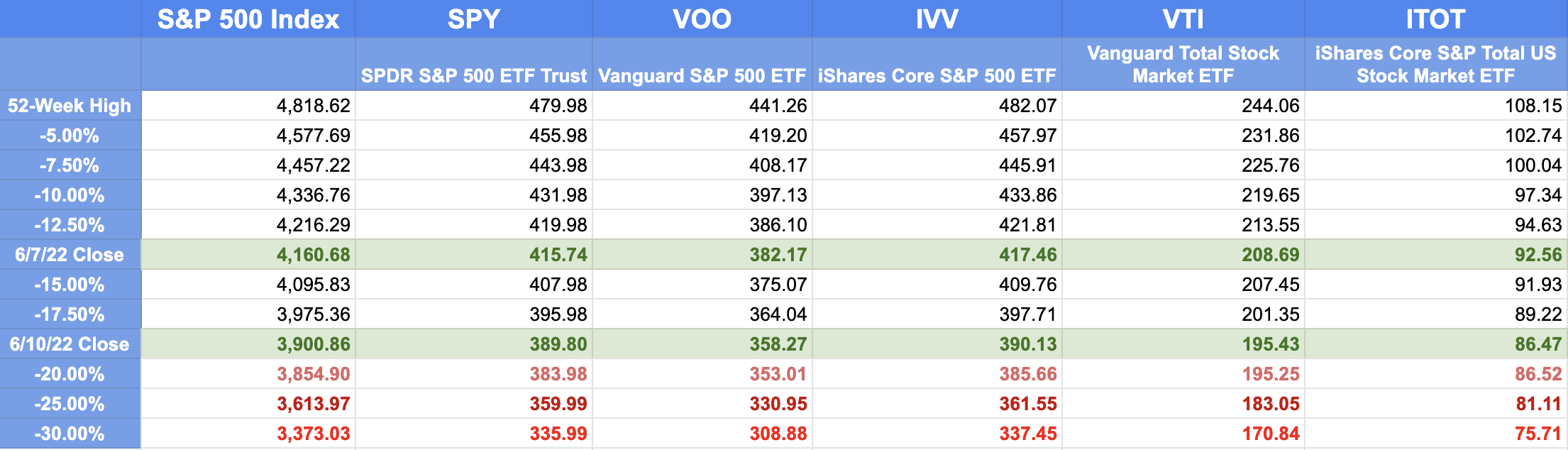
So, as one example, if you were to decide that you would be willing to increase your stock allocation if the S&P 500 experiences a 25% decline, you could set a GTC limit buy order for SPY at $359.99. Keep in mind that the purchase will not trigger unless and until we experience such a decline.
I hope you have found this article both interesting, and useful on a practical level. I’d love to hear your thoughts in the comments section below.
Until next time, I wish you . . .
Successful investing!!
Be the first to comment