


Dilok Klaisataporn
Thesis
This is an update of an earlier article published about half a year ago (on June 3, 2022, to be exact). That article compared two covered-call funds from the Global X family: the Global X Russell 2000 Covered Call ETF (NYSEARCA:RYLD) and the Global X NASDAQ 100 Covered Call ETF (NASDAQ:QYLD). The article was entitled “RYLD Vs QYLD: Why QYLD Is The More Attractive Covered-Call ETF”. My main conclusion at that time was that:
Both RYLD and QYLD are attractively valued against their historical record and also against the treasury rates. Although I like QYLD more because of its thicker yield spread. QYLD yield spread is 12.1% above 10-year treasury rates, not only more than 120 bps thicker than RYLD, but also at the highest level since its inception about 8 years ago.
This current updated article is motivated by two considerations: the change in risk-free rates and the change in market volatility. As you can see from the following chart, both the risk-free rates and the market volatility have changed substantially in the past 6 months or so. To wit, the 10-year treasury rates have surged from 2.80% back then by more than 100 basis points to the current level of 3.81%. And the volatility index (“VIX”), on the other hand, has been much quieter now than 6 months ago. When I wrote my original article, the VIX index hovers around 32, the 95% highest percentile historically. As you can see, the VIX index has spent most of the past six months way below that level and currently, it is only at 23.
Both risk-free rates and volatility impact income generation from call writing. And as you will see in the remainder of this article, the rise in risk-free rates and the quieter volatility have made both QYLD and RYLD less attractive than 6 months ago – especially in the case of RYLD. As such, I am downgrading my thesis on both of ETFs to “hold” after this reassessment.
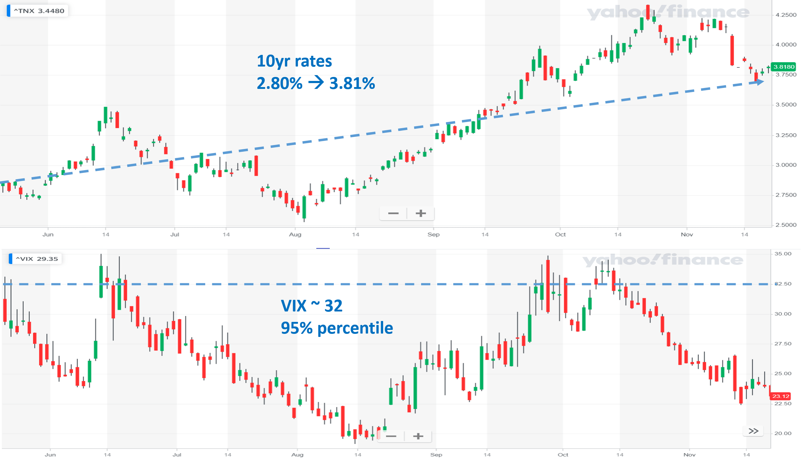
Source: Author based on Yahoo data
RYLD and QYLD: Basic information
Both ETF funds follow a similar covered-call strategy. And the difference is in the underlying index that they use: RYLD uses a small-cap index (the Russell 2000 index) and QYLD uses a large-cap index (the NASDAQ 100 index). Both funds generate monthly distributions thanks to the call writing strategy as detailed in their fund description (slightly edited by me and the emphases were added by me too):
- The RYLD fund gains exposure to the stocks in the Russell 2000 and simultaneously sells a call option on the Russell 2000 index. The fund collects the premium received from selling this option in exchange for forfeiting the upside appreciation of the Russell 2000.
- QYLD follows a similar approach. Its covered call position is created by buying (or owning) the stocks in the Nasdaq 100 Index (NDX) and selling a monthly at-the-money index call option
- RYLD/QYLD seeks to generate income through covered call writing, which historically produces higher yields in periods of volatility.
As highlighted in the third bullet point, both RYLD and QYLD have historically produced higher yields in periods of volatility. That is because the premium on call writing rises with volatility. And as just mentioned, given the quieter volatility since my last writing, I expect their distributions to show a decrease in tandem too. Furthermore, I also expect the volatility to remain at a relatively lower level going forward because recent inflation data is showing signs of moderation, and treasury rates are beginning to stabilize, which will keep limiting their income generation capability.
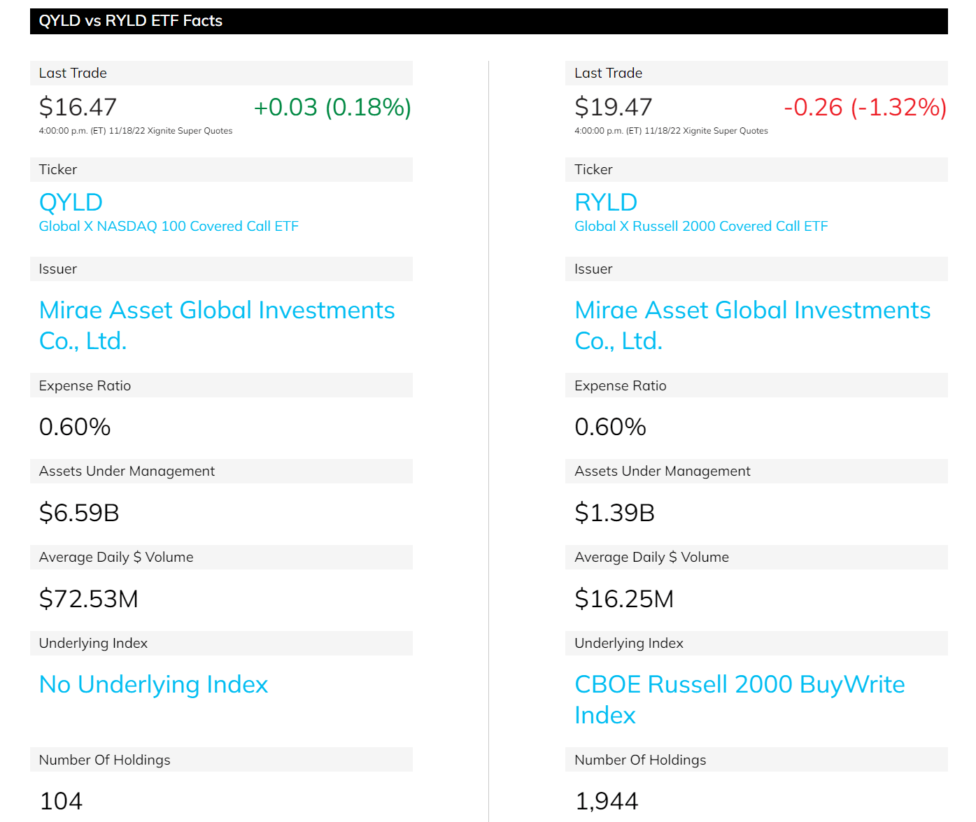
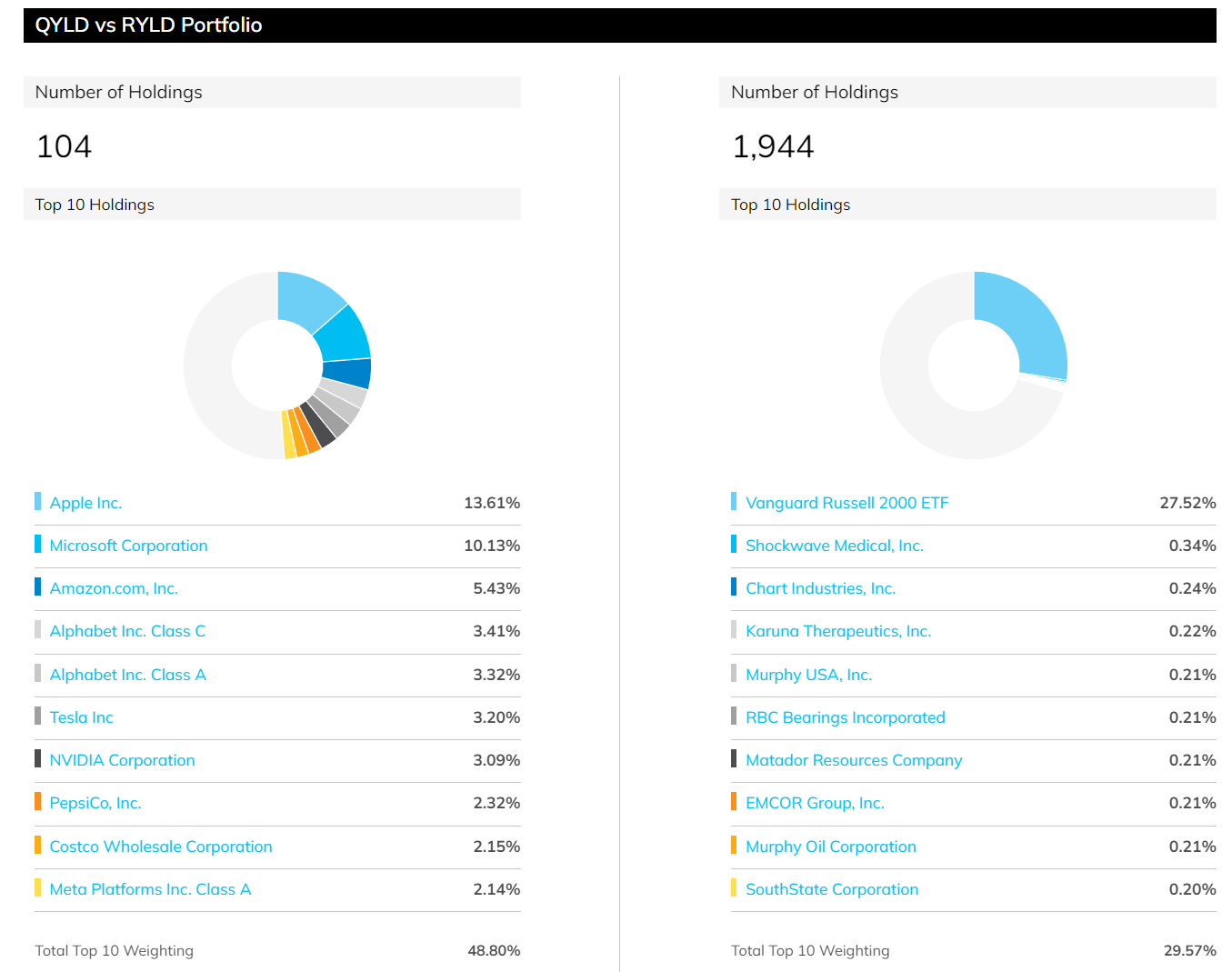
Other basic information about these funds is summarized in the two charts below. As seen, RYLD is the relatively smaller (and also more recent) fund with a total AUM of $1.39B, compared to an AUM of $6.59B for QYLD. As a result, QYLD offers much higher trading volume and tradability (average trading volume for QYLD is about $72M, almost 5x higher than RYLD’s $16). They both charge an expense ratio of 0.6%. And the second chart below shows their holdings. As aforementioned, RYLD is indexed based on the Russell 2000 index, and as a result, it holds about ~2,000 holdings (1944 at this time to be exact) and it uses these holdings to write covered calls. In comparison, QYLD uses the NASDAQ 100 index and therefore holds about 100 stocks (104 to be exact), based on which it writes its covered call for income generation, as elaborated on next.
Source: ETF.com
Source: ETF.com
RYLD and QYLD: how they generate income and why volatility matters
As just mentioned, both RYLD and QYLD use their underlying holdings to write covered calls and generate income. Readers not familiar with call writing can find a more detailed description in my earlier article. The essence is:
Writing a call is essentially selling insurance – at least when the income generation is concerned. The insurance seller (the RYLD or QYLD fund in this case) receives a premium upfront. The gain does not change regardless of the price movements in the underlying assets. The advantage is that the gain was materialized upfront – meaning the funds get to keep the gain no matter how the price of the underlying changes, and that is how/why the funds can keep paying high distributions consistently. But there are disadvantages too and we will discuss them later.
Also, just like selling anything, the amount of the premiums changes as the demand-supply dynamics change. When the market is in panic mode (i.e., when VIX index is high) – like in 2021 during the wakes of the pandemic or 6 months ago due to inflation fear – the demand for insurance is high, leading to an increase in the so-call implied volatility, and in turn leading to higher premiums for calls.
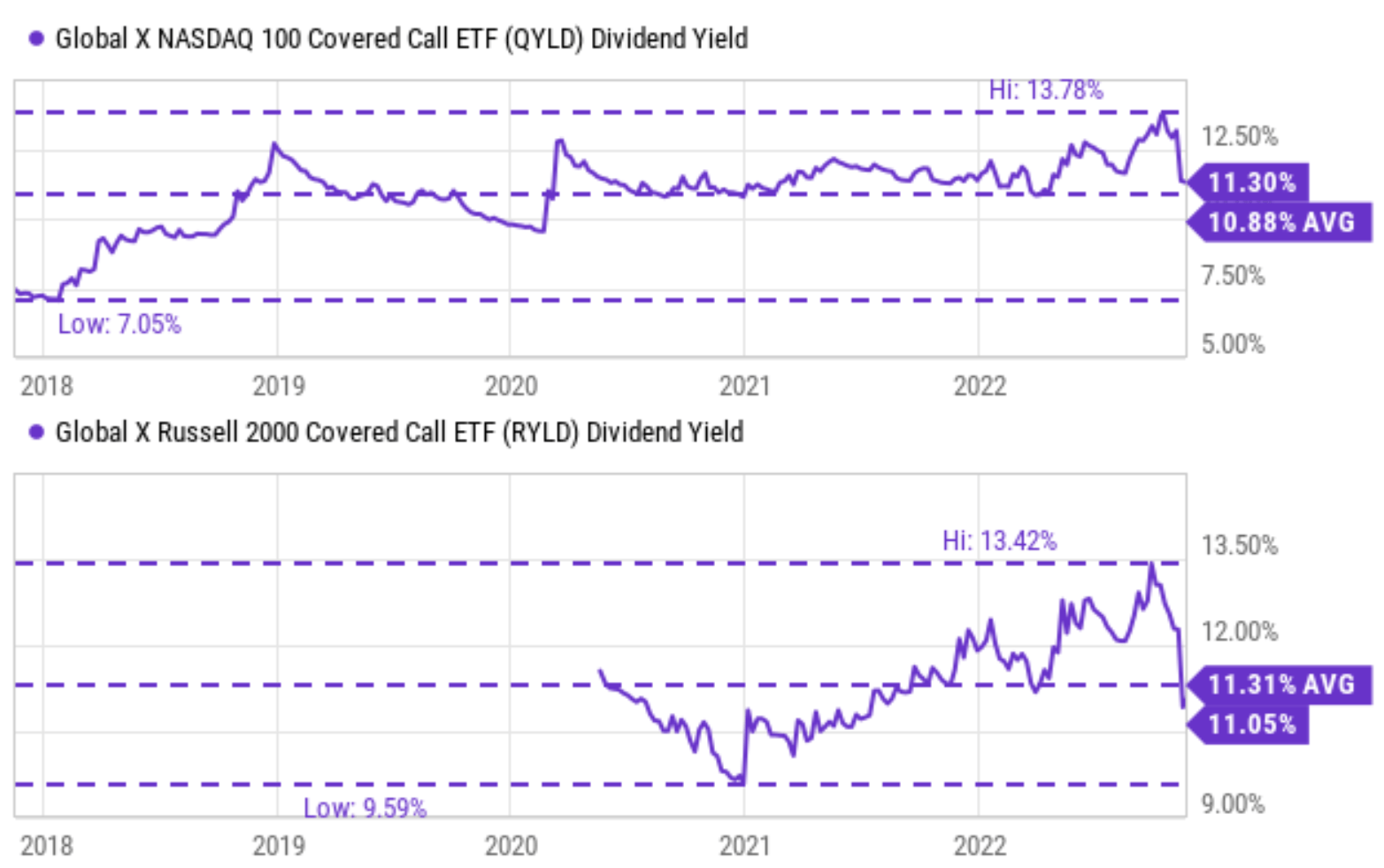
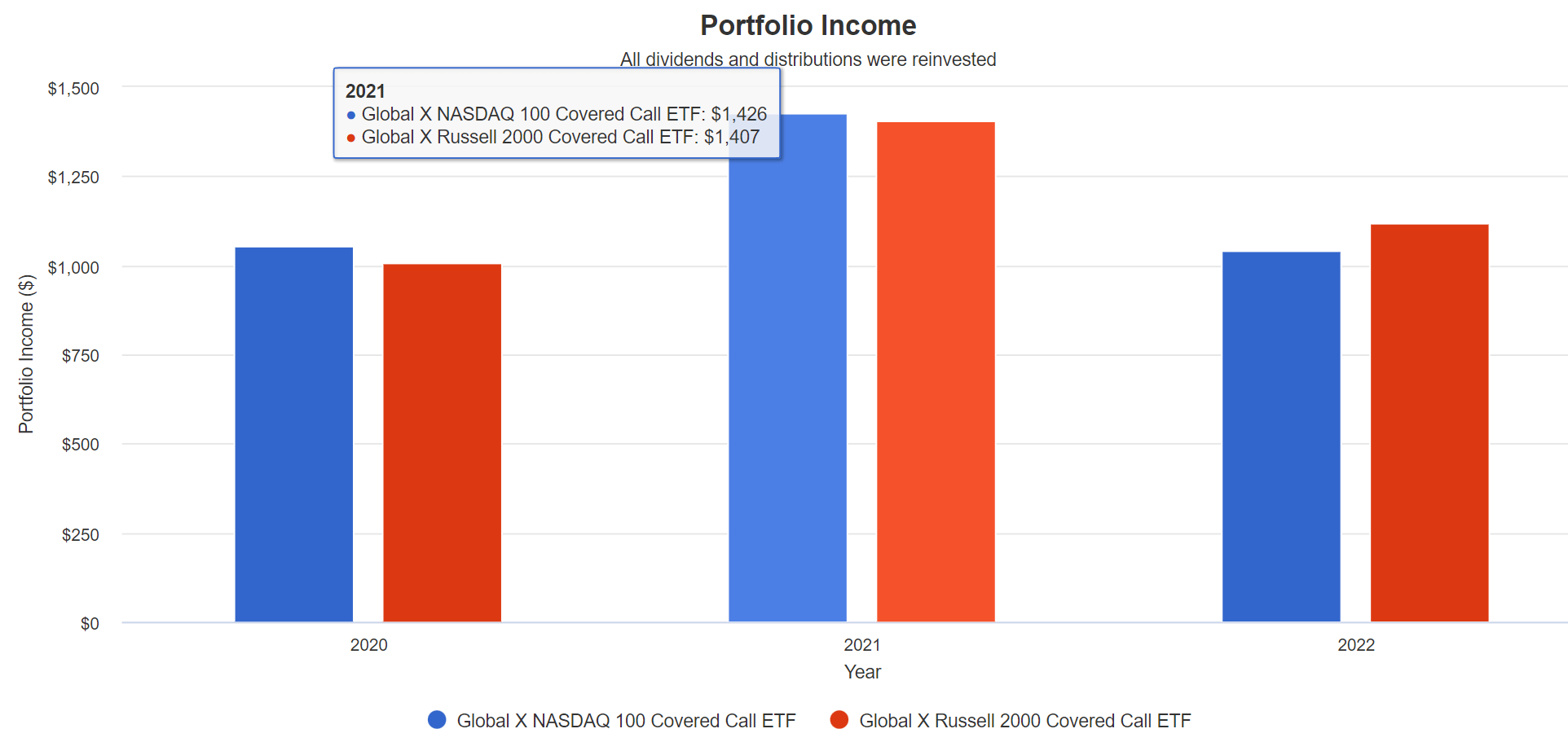
As demonstrated in the following two charts, this strategy has enabled both funds to consistently generate high dividends for investors. Since their launch, both funds have been steadily yielding about 11% on average as seen in the second chart. RYLD’s current yield is 11.05%, slightly below its historical average of 11.31% – a sign of concern in my mind. And currently, QYLD yields 11.3%, slightly above its historical average of around 10.88% – a sign of some margin of safety here.
And also, as a demonstration of their historical ability to “produce higher yields in periods of volatility”, you can see from the 2nd chart below that their income is indeed much higher in 2021 (around $1400 on $10k of principal) than in 2020 (around $1000 only).
Source: Seeking Alpha
Source: Author, with simulator from Portfolio Visualizer, Silicon Cloud Technologies LLC
RYLD and QYLD: yield not as attractive when compared to treasury rates
Risk-free interest rates act as the gravity of all asset valuations and therefore serve as the universal benchmark for all yields. As detailed in our earlier writings,
For bond-like equity funds such as RYLD and QYLD that pay regular dividends, a major indicator I rely on (and fortunately with good success so far) has been the yield spread (“YS”), i.e., the dividend yield minus the 10-year treasury bond yield. The spread also provides a measurement of the risk premium investors are paying. A thinner YS indicates a smaller margin of safety, and vice versa, therefore serving as a market timing indicator.
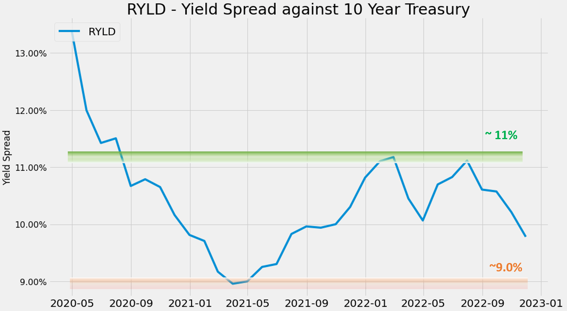
Using this method, the two charts below show the yield spread (“YS”) between RYLD and QYLD relative to the 10-year treasury rates. The YS is calculated as their TTM dividend yield minus the 10-year treasury rates. As seen, the YS for both funds oscillated within a fixed range most of the time. Note that RYLD only has a small amount of past data available and it’s more difficult to establish a reliable range for it. But still, you can see that its YS reached a peak of 13%+ in early 2020 during the COVID panic. The YS then spent most of its time between 9% and 11% since then. To wit, it reached a bottom of around ~9% in mid-2021 and has widened to ~11% twice in 2022.
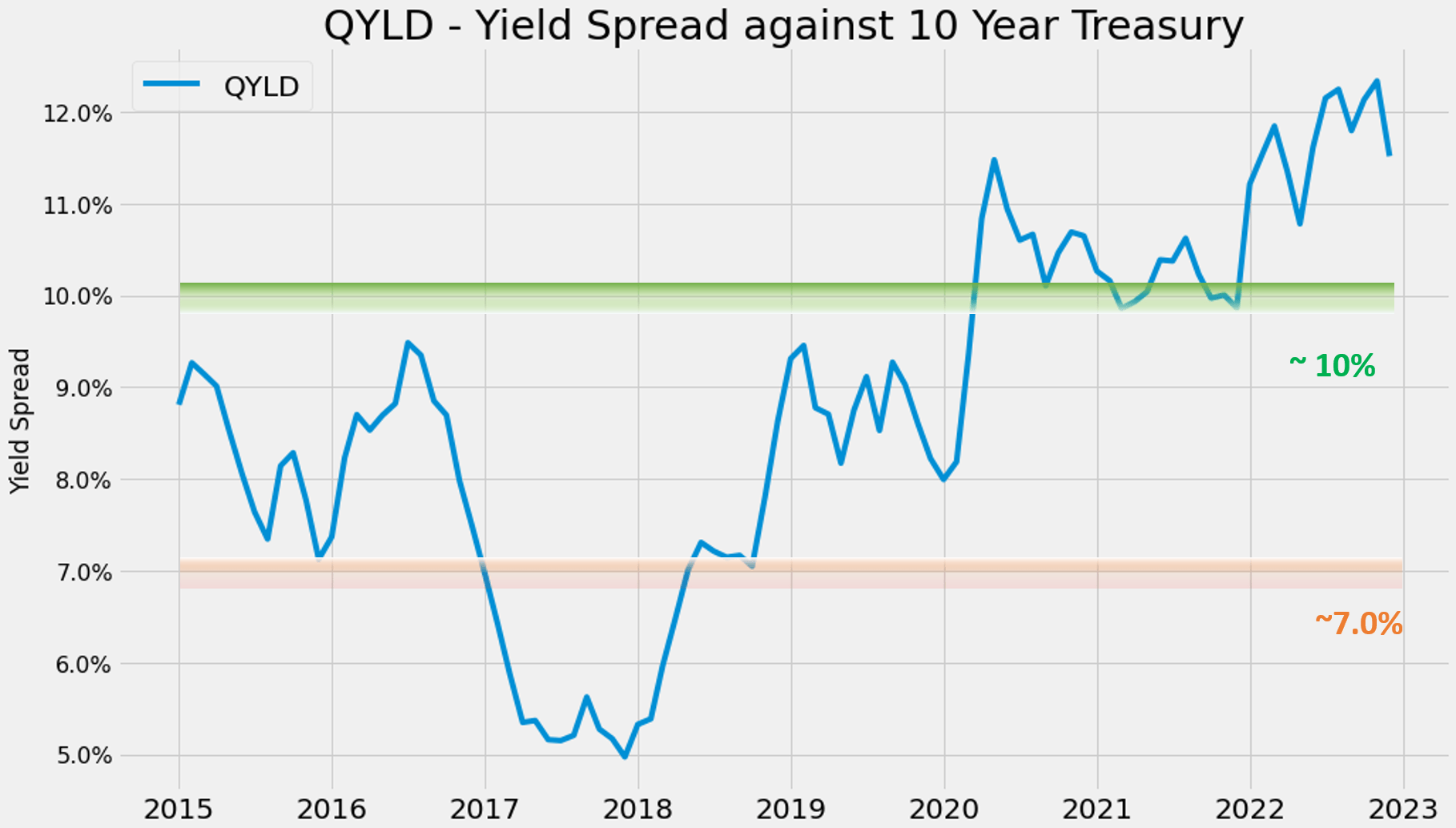
The YS for QYLD is shown in the 2nd chart. And as seen, its YS relative to the risk-free interest rates is more attractive than RYLD currently. And also due to its longer history, there is more data on QYLD to establish a more reliable range. In the past 8 years, its YS has been spending most of its time fluctuating between 7.0% to 10.0%. Its current YS is around 11.5%, towards the thickest level historically.
Source: author based on Seeking Alpha data
Source: author based on Seeking Alpha data
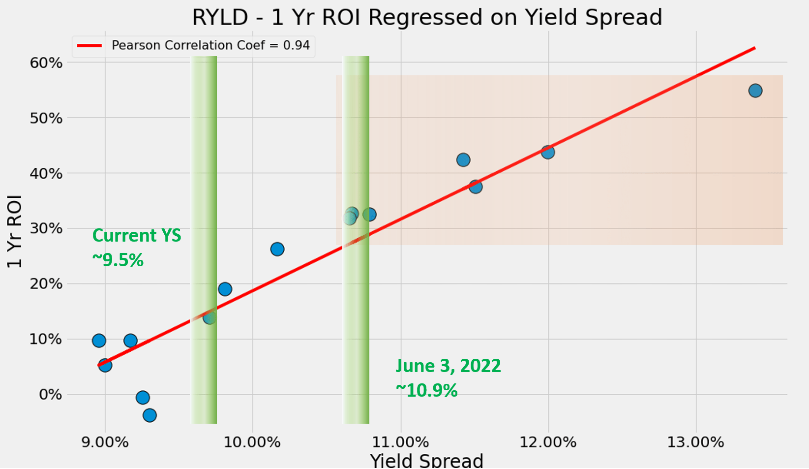
For readers familiar with our approach, you know that their short-term returns are closely correlated with the YS as illustrated in the next two charts. The chart below shows the 1-year total return of RYLD regressed on YS. The correlation is nearly perfect with a Pearson correlation coefficient of 0.94 (partly due to the limited data mentioned above). Again, its current YS is around 9.5%, a lot thinner than the 10.9% at the time of my last writing, signaling a much higher risk premium due to the surges in risk-free interest rates.
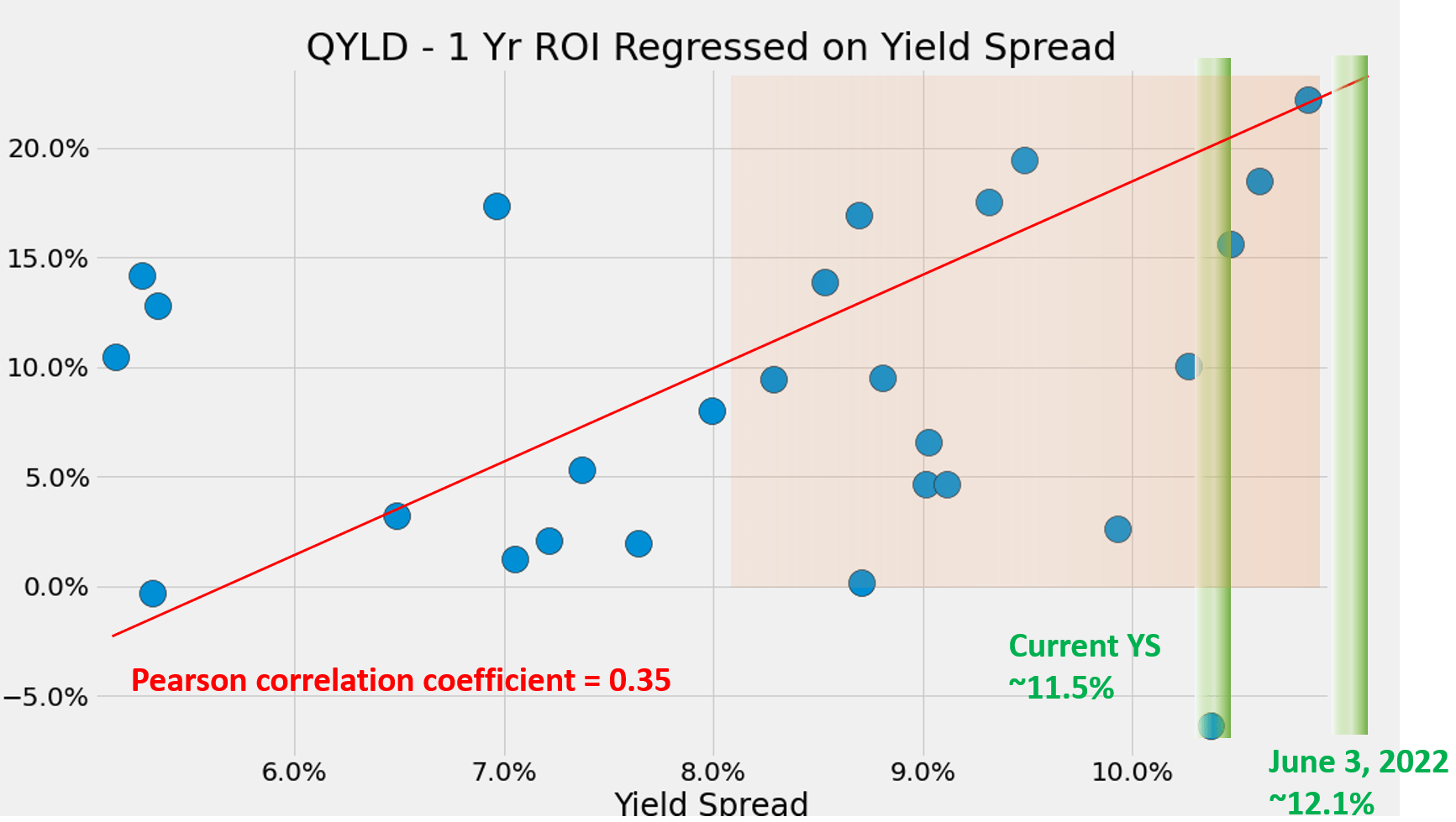
The correlation for QYLD is similar and shown in the 2nd chart below. The chart shows more scattered data points simply because of the larger amount of data available. But the positive correlation still remains (with a positive Pearson correlation coefficient of 0.35). Again, its current YS is around 11.5%, also much thinner than the 11.1% at the time of my last article. Such a thinner YS also signals a higher risk premium for QYLD (again due to the surges in risk-free interest rates). But overall, it is still wide enough when put under a historical perspective and suggests a more manageable risk premium.
Source: author based on Seeking Alpha data
Source: author based on Seeking Alpha data
RYLD and QYLD: other risks
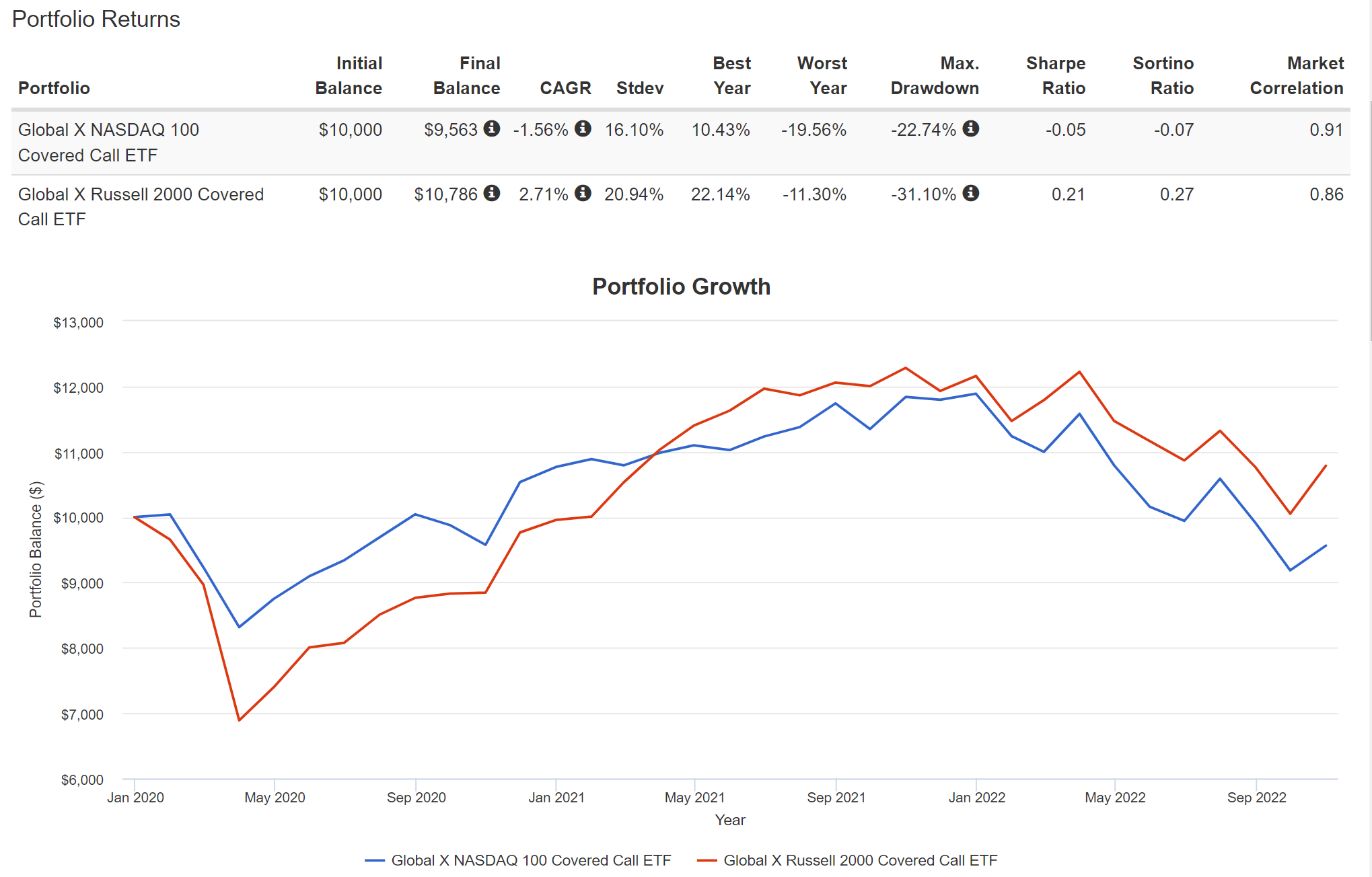
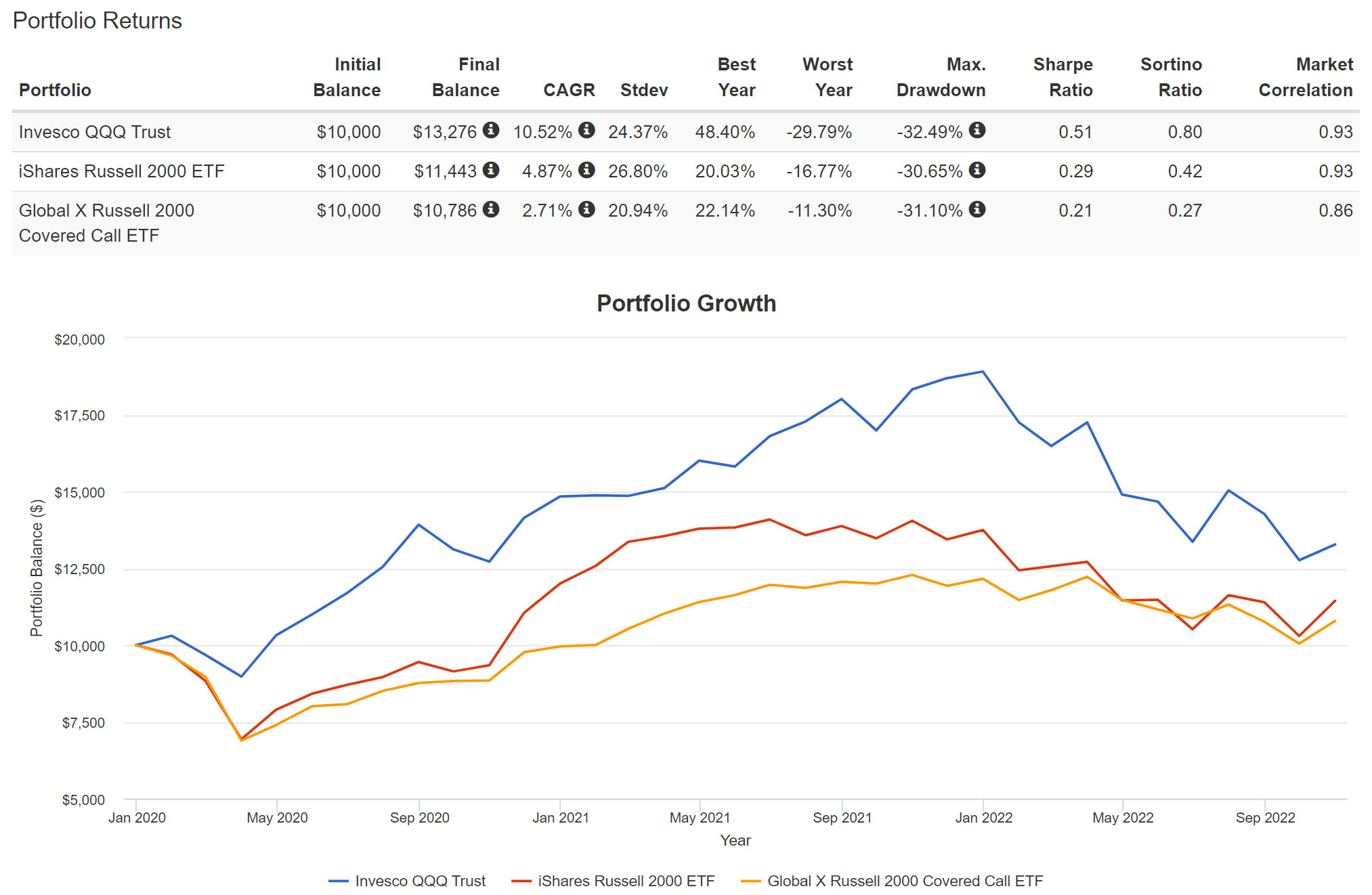
The biggest risk in using the covered-call strategy is that it puts a cap on the upside potential. As aforementioned, the gain from the call writing was fixed upfront, regardless of how much the price of the underlying rallies. As a result, selling calls limit the upside potential at a root level. You can see the limitations very clearly from the data in the following charts. The charts compare the overall returns from RYLD and QYLD vs. their underlying indices, represented by IWM and QQQ.
From the first chart, you can see that the overall return of QYLD has been a negative 1.56% CAGR since 2020, and RYLD at 2.71%. And from the second chart, you can see that the IWM fund returned 4.87% CAGR, outperforming the RYLD fund by more than 210 bps during this period. QQQ returned even more, about 10.52% CAGR and therefore outperforming QYLD by an even larger gap of about 12%.
Source: Author, with simulator from Portfolio Visualizer, Silicon Cloud Technologies LLC
Source: Author, with simulator from Portfolio Visualizer, Silicon Cloud Technologies LLC
Summary and final takeaways
This article provided an updated assessment of my earlier analysis of QYLD and RYLD published about 6 months ago back in June 2022. In that article, I concluded that both are attractive given their thick yield spread relative to risk-free interest rates, largely because risk-free interest rates were near a secular low at that time (10-year treasury rates were only about 2.8%).
This update is triggered by two factors: the large surges in risk-free rates and also the large decrease in volatility since then. Both factors impact income generation capability from call writing. Overall, the rise in risk-free rates (by more than a whole 1%) and the quieter volatility have made both QYLD and RYLD less attractive than 6 months ago. Especially in the case of RYLD, its YS relative to 10-year treasury rates is now near the thinnest level since its inception. As such, I am downgrading my thesis for both of them to “hold” in this update.
Be the first to comment