

Chip Somodevilla
It’s always a bit of a risk when our Friday morning commentary makes reference to what is happening in the market on the very same day that we write and publish. As of now, US equity markets are down on the day from the stronger-than-expected jobs market report that came out earlier this morning – hence the “jobs taketh away” portion of the headline. That dynamic could, of course, change between now and the end of the day. But whatever the one-day effect on the S&P 500 winds up being, the jobs report is worth talking about in conjunction with that other big market driver this week, the one that did “giveth.”
That, of course, was Fed chair Powell’s speech at the Brookings Institute on Wednesday. The speech didn’t actually contain anything Powell hasn’t said before, but it did omit any pointed comments about financial conditions being “too easy.” That omission was enough to power stocks ahead by mid-single digits by the end of the day. But the question persists: are financial conditions too easy? Is a persistently strong labor market a sign that conditions are still too supportive to meaningfully suppress inflation? Or does it suggest that the Fed still has enough space to actually pull off that much hoped for soft landing?
The Jobs Conundrum
The jobs market has been the joker in the deck throughout the Fed’s campaign to slow down demand enough to bring inflation down. The chart below shows the performance of the jobs market before and during the monetary tightening period. There’s a lot of information in this chart, and we will go through it all in detail below.
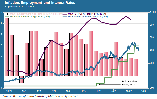
Since the Fed started raising interest rates in March of this year, the average monthly growth in payrolls (the “Non-Farm Employment” mauve columns in the above chart) has amounted to 363,000 new jobs. In the past four months, the monthly gain in payrolls has not fallen below 260,000. Compare that to the average number of monthly payroll gains from January 2010 to February 2020 – i.e. the long economic cycle leading up to the pandemic: 184,630. In other words – and this is important – the economy is still creating jobs on a monthly basis at a higher rate than the average throughout the longest economic growth cycle on record. This has happened even with the steepest program of interest rate hikes the Fed has engineered since the early 1980s.
One Month Tight, Ten Years Easy
That brings us to the other notable oddity on the above chart: the relationship between the Fed funds rate (the green line) and the 10-year nominal Treasury yield. Intermediate and long-term bond yields have come down considerably in recent weeks, as we covered in more detail in last week’s commentary. The Fed has signaled that the Fed funds rate is likely to wind up somewhere around five percent or even higher, depending on what it takes to bring inflation down. Today the 10-year yield sits at 3.6 percent. Does that make sense? This is a very important question for anyone with portfolio exposure to… well, just about anything. The 10-year Treasury acts as the world’s default risk-free rate, the building block upon which discount rates are built that translate expected future cash flows into present day values. A 10-year Treasury yield of 3.6 percent is an easier world for any rate-sensitive asset than a 10-year yield somewhere north of five percent. Quite a lot of portfolio money around the world is at stake in considering whether today’s intermediate and long-term rates are too easy (a characterization, which, again, Powell took a pass on during his Wednesday speech) or not.
These are not easy questions and they do not produce easy answers. There are structural factors at play that go at least some way in explaining the current labor market strangeness. It may well be that other macro data points like consumer expenditures, retail sales and household debt levels provide more useful guideposts toward an economic downturn than the jobs market. We will have more data on these items in the next couple of months. Ultimately what matters, of course, is seeing that dark-purple inflation line in the above chart come down considerably from where it is today. The Fed is not going to back off its program until it sees clear evidence of that happening. By early next year, we will likely see what that means for how much more financial conditions need to change.
Editor’s Note: The summary bullets for this article were chosen by Seeking Alpha editors.
Be the first to comment