

NVS
The whole point of tightening monetary policy is to increase the demand for money and/or decrease the supply of money at the expense of other things. Tighter monetary policy today serves to balance the supply of money with the demand for money, and that is what will deliver low and stable inflation.
Higher interest rates increase the appeal of holding cash and cash equivalents, and at the same time they discourage the borrowing and spending of money (and thus tend to depress prices). Unfortunately, nobody knows (not even the Fed) how high interest rates have to rise in order to slow and ultimately reverse the recent rise in inflation.
So we (and the Fed) must instead rely on old-fashioned methods such as watching prices. Continuously rising prices are a clear sign that interest rates are too low and/or monetary policy is too easy. Falling prices, on the other hand—if sufficiently widespread—are a pretty good indicator that monetary policy is gaining traction and thus helping to bring inflation down.
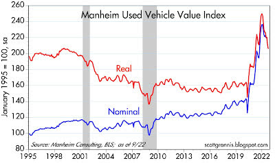
Such is the case today. So far this year we have seen significant declines in a number of prices and markets, and here are just a few that are down significantly: stocks, commodities, foreign currencies (see Chart #1 in my last post), TIPS, bonds in general, and used cars, the latter of which have declined by 18% in real terms (see Chart #1). Though not down year to date, gasoline prices are down 27% since their peak last June.
Chart #1
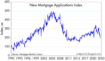
Since reliable measures of housing prices take months to show up, it’s best to look at indicators that update more frequently, such as mortgage refinancings, which have plunged to levels not seen since 2000, and new applications for mortgages, which have dropped by 43% since the peak of early 2021. Both of these are symptomatic of what we would expect from higher interest rates: reduced demand for borrowed money.
The rise in housing prices which began about 18 months ago coupled with sharply higher mortgage interest rates (Chart #2) has caused housing affordability to plunge to levels not seen in over 30 years (see Chart #3), and there is little doubt this has arrested the boom in the housing market, which can be seen in a sharp decline in applications for new mortgages (Chart #4). Home prices are almost certainly falling on the margin and we saw a hint of that in the August numbers.
To be sure, even though the bloom is off the housing rose, and prices are weakening on the margin, rents have been slow to catch up to the rise in prices. I would expect to see rents rising for at least the next 9 months, and this will add to measured CPI inflation. But rents are a lagging, not a leading indicator (if for no other reason than that rents are infrequently adjusted as leases expire); the important thing is housing prices which change daily. Rents don’t cause inflation, and neither do wages; only excess money causes inflation, and there seems to be a lot less of it recently, which is great news.
Chart #2
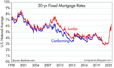
Chart #3
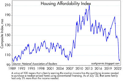
Chart #4
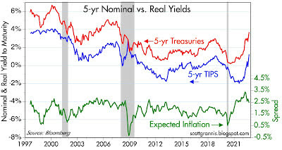
TIPS prices are down sharply because real yields are much higher, having risen from a low of -2% on 5-yr TIPS to now 1.2% (Chart #5). That’s because TIPS are an inflation hedge, and in the presence of tight money the demand for inflation hedges should decline. This might be the best chart of all, because the “tightness” of monetary policy can be measured directly by the level of real yields.
There is no question but that the Fed’s policy stance has gained traction significantly and is thus affecting markets all over the world. Icing on the cake: Chart #5 also shows how inflation expectations have declined this year, from a high of 3.7% in early March ’22 to now 2.5%.
Chart #5
Meanwhile, supply chain bottlenecks are clearing up rapidly, thus facilitating the supply of goods, and in turn tending to lower their prices. For example, the Baltic Dry Index (an index of shipping coasts in the eastern Pacific) has fallen by 72% since its peak last October. Where there used to be over a hundred container ships anchored off the coast between San Clemente and Palos Verdes waiting to unload, there are now just a handful.
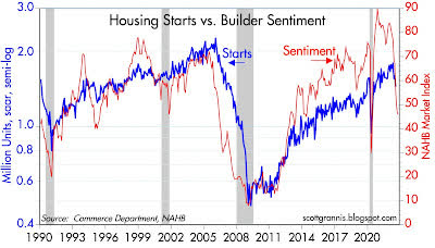
In Chart #6, note how builder sentiment has fallen dramatically in recent months. This likely reflects decreased housing demand, soaring mortgage rates, and softer prices, and that further presages a slowdown in housing starts (and weaker demand for construction materials), some of which we have already seen.
Chart #6
A CPI report is old news by the time it’s released. Indicators such as the above tell you where the CPI is headed.
Editor’s Note: The summary bullets for this article were chosen by Seeking Alpha editors.
Be the first to comment