

reklamlar/iStock via Getty Images
This monthly dashboard series reports sector metrics in the S&P 500 index. It is also a top-down analysis of all ETFs tracking this index. Among them, the iShares Core S&P 500 ETF (NYSEARCA:IVV) is the second most popular behind the SPDR S&P 500 ETF (SPY) regarding assets under management and average daily volume. It is also cheaper in management fee, with a 0.03% expense ratio vs. 0.09% for SPY.
Shortcut
The next two paragraphs in italic describe the dashboard methodology. They are necessary for new readers to understand the metrics. If you are used to this series or if you are short of time, you can skip them and go to the charts.
Base Metrics
I calculate the median value of five fundamental ratios in every sector: Earnings Yield (“EY”), Sales Yield (“SY”), Free Cash Flow Yield (“FY”), Return on Equity (“ROE”), Gross Margin (“GM”). All are calculated on trailing 12 months. For all these ratios, higher is better and negative is bad. EY, SY and FY are medians of the inverse of Price/Earnings, Price/Sales and Price/Free Cash Flow. They are better for statistical studies than price-to-something ratios, which are unusable when the “something” is close to zero or negative (for example, companies with negative earnings). I also calculate two momentum metrics for each group: the median monthly return (RetM) and the median annual return (RetY).
I prefer medians rather than averages because a median splits a set in a good half and a bad half. Capital-weighted averages are skewed by extreme values and the largest companies. As a consequence, these metrics are designed for stock-picking rather than index investing.
Value and Quality Scores
Historical baselines are calculated as the averages on a look-back period of 11 years for all metrics. They are noted respectively EYh, SYh, FYh, ROEh, GMh. For example, the value of EYh for technology in the table below is the 11-year average of the median Earnings Yield of S&P 500 tech companies.
The Value Score “VS” is the average difference in % between the three valuation ratios (EY, SY, FY) and their baselines (EYh, SYh, FYh). The same way, the Quality Score “QS” is the average difference between the two quality ratios (ROE, GM) and their baselines (ROEh, GMh).
VS may be interpreted as the percentage of undervaluation or overvaluation relative to the baseline (positive is good, negative is bad). This interpretation must be taken with caution: the baseline is an arbitrary reference, not a supposed fair value. The formula assumes that the three valuation metrics are of equal importance, except in energy and utilities where the Free Cash Flow Yield is ignored to avoid some inconsistencies. VS and QS are capped between -100 and +100 when the calculation goes beyond these values.
Current data
The next table shows the metrics and scores as of last week’s closing. Columns stand for all the data defined above.
|
VS |
QS |
EY |
SY |
FY |
ROE |
GM |
EYh |
SYh |
FYh |
ROEh |
GMh |
RetM |
RetY |
|
|
All |
-7.29 |
12.99 |
0.0467 |
0.3876 |
0.0264 |
18.25 |
47.66 |
0.0454 |
0.4488 |
0.0297 |
14.95 |
45.88 |
-9.14% |
-14.70% |
|
Cs. Discretionary |
-6.60 |
9.89 |
0.0491 |
0.6443 |
0.0244 |
26.74 |
34.08 |
0.0468 |
0.6637 |
0.0312 |
21.16 |
36.48 |
-8.54% |
-21.54% |
|
Cs. Staples |
-10.49 |
-1.07 |
0.0418 |
0.4898 |
0.0172 |
25.03 |
37.70 |
0.0443 |
0.4995 |
0.0226 |
23.63 |
41.01 |
-8.50% |
-2.11% |
|
Energy |
100* |
100* |
0.1157 |
0.5078 |
0.0736 |
26.32 |
46.14 |
0.0179 |
0.5374 |
-0.0156 |
5.08 |
42.50 |
-9.77% |
43.56% |
|
Financials |
4.16 |
17.25 |
0.0843 |
0.4113 |
0.0704 |
13.26 |
80.21 |
0.0690 |
0.4540 |
0.0706 |
10.64 |
73.00 |
-7.64% |
-16.97% |
|
Healthcare |
0.01 |
9.45 |
0.0413 |
0.2859 |
0.0352 |
18.93 |
64.01 |
0.0375 |
0.3025 |
0.0369 |
16.23 |
62.61 |
-5.79% |
-21.29% |
|
Industrials |
-22.49 |
9.89 |
0.0422 |
0.4265 |
0.0202 |
24.61 |
36.94 |
0.0471 |
0.5821 |
0.0290 |
20.55 |
36.93 |
-8.24% |
-10.79% |
|
Technology |
-13.75 |
15.15 |
0.0400 |
0.2210 |
0.0311 |
26.87 |
63.68 |
0.0406 |
0.2876 |
0.0373 |
20.88 |
62.66 |
-10.30% |
-20.41% |
|
Communication |
17.00 |
-11.44 |
0.0520 |
0.7519 |
0.0399 |
13.36 |
53.22 |
0.0493 |
0.5269 |
0.0388 |
16.80 |
54.55 |
-11.34% |
-30.18% |
|
Materials |
12.37 |
16.05 |
0.0676 |
0.6463 |
0.0205 |
21.46 |
37.86 |
0.0447 |
0.6222 |
0.0250 |
16.88 |
36.07 |
-11.35% |
-19.76% |
|
Utilities |
-21.09 |
1.30 |
0.0471 |
0.3598 |
-0.0678 |
9.27 |
41.81 |
0.0512 |
0.5465 |
-0.0460 |
9.67 |
39.17 |
-12.44% |
3.24% |
|
Real Estate |
46.61 |
30.73 |
0.0327 |
0.1037 |
0.0126 |
9.84 |
67.24 |
0.0206 |
0.1150 |
0.0066 |
6.20 |
65.46 |
-11.77% |
-16.94% |
* capped for convenience
Score charts
The next chart plots the Value and Quality Scores by sectors (higher is better).
Value and Quality in sectors (Chart: author; data: Portfolio123)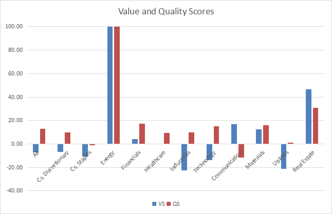
Score variation since last month:
Value and Quality variations (Chart: author; data: Portfolio123)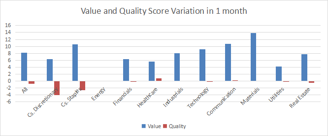
The next chart plots momentum data.
Momentum in sectors (Chart: author; data: Portfolio123)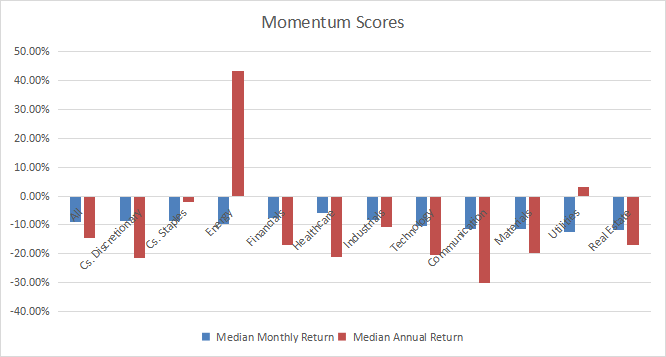
Interpretation
A hypothetical S&P 500 “median” company is overvalued by 7.3% relative to average valuation metrics since 2011. The quality score is about 13 points above the baseline. We can translate median yields in their inverse ratios:
Price/Earnings: 21.41 – Price/Sales: 2.58 – Price/Free Cash Flow: 37.88
These numbers have improved since last month because of the ongoing downtrend.
Energy has been the best-ranked sector regarding value, quality and momentum for a long time. Real estate, materials, communication and financials are undervalued relative to 11-year averages. Real estate, materials and financials are above their quality baseline, but communication is below it. The ratios used to calculate scores are not the most relevant for real estate and finance in absolute value, but looking at their evolution in time makes sense (it is what the scores do). Healthcare is just on its baseline in valuation, and slightly above it in quality. Consumer staples, consumer discretionary and technology are moderately overvalued (less than 14% from the baseline). It may be partly justified by good quality scores for consumer discretionary and technology. Utilities and industrials are the less attractive sectors now, overvalued by more than 20% relative to their historical averages.
The S&P 500 (SPY) is down -15.9% in 12 months, the momentum measured in median return is -14.7% and the equal-weight average is -14% (measured on RSP). It is a clue that S&P 500 recent performance has not been significantly skewed by mega-cap companies. Return is similar for the S&P mid-cap 400 index (-15.7% for MDY), but significantly lower for the Russell 2000 (-24% for IWM). Performance has been quite homogeneous in large and mid-cap segments. Small caps have suffered the most.
We use the table above to calculate value and quality scores. It may also be used in a stock-picking process to check how companies stand among their peers. For example, the EY column tells that a large consumer staples company with an Earnings Yield above 0.0418 (or price/earnings below 23.92) is in the better half of the sector regarding this metric. A Dashboard List is sent every month to Quantitative Risk & Value subscribers with the most profitable companies standing in the better half among their peers regarding the three valuation metrics at the same time.
Be the first to comment