

Pgiam/iStock via Getty Images
This article is part of a continuing series of articles (here) on how to use metrics of investor buying in ETFs to help determine the direction of the stock market and specific sectors of the market. They’re about measuring “investor expectations or outlooks”. Every article will have a follow-up article each month until the concept behind that original article is complete. This article focuses on the GLD ETF.
The Eternal Investment Question
It is normal to see an increase in bearish sentiment after a price decline or bear market. It is not normal to see it, however, after a high-level price consolidation following a major price advance. When you do see it it’s one of the strongest indicators of higher prices ahead. Why? To answer that let’s discuss gold, even though what we’re going to say is universal.
Over 22 months – from October 2018 to August 2020 – GLD rose 72%, from a low of $112 to a high of $192. That’s a large percentage increase over a short period of time for a global financial asset. It’s normal after a price gain like this to have period of price consolidation, where prices mark time and don’t go anywhere. They oscillate up and down and go sideways. For the last two years GLD has been doing just that; oscillating between $190 and $160.
Now here’s the question, and it’s always the question. I call it the eternal, investment question. After the initial, large price advance, has the trading range of the last two years been a distribution top before a price decline – or, has it been a price consolidation prior to another surge higher? We’ve found the best way to answer this question is by studying metrics of investor sentiment.
If it’s a distribution top, investors usually remain bullish throughout the consolidation and are measurably bullish right before prices roll over. If it’s a consolidation before a price break out, investors are often measurably bearish right before the breakout. It’s contrary opinion in action.
Although the metrics on investor sentiment in gold are not as strongly bearish as we would like, they’re bearish enough to be brought to people’s attention. In fact, the metrics are convincing enough to us to call it the end of gold’s trading range and the start of higher gold prices.
GLD Shares Outstanding
GLD versus Shares Outstanding (Michael McDonald)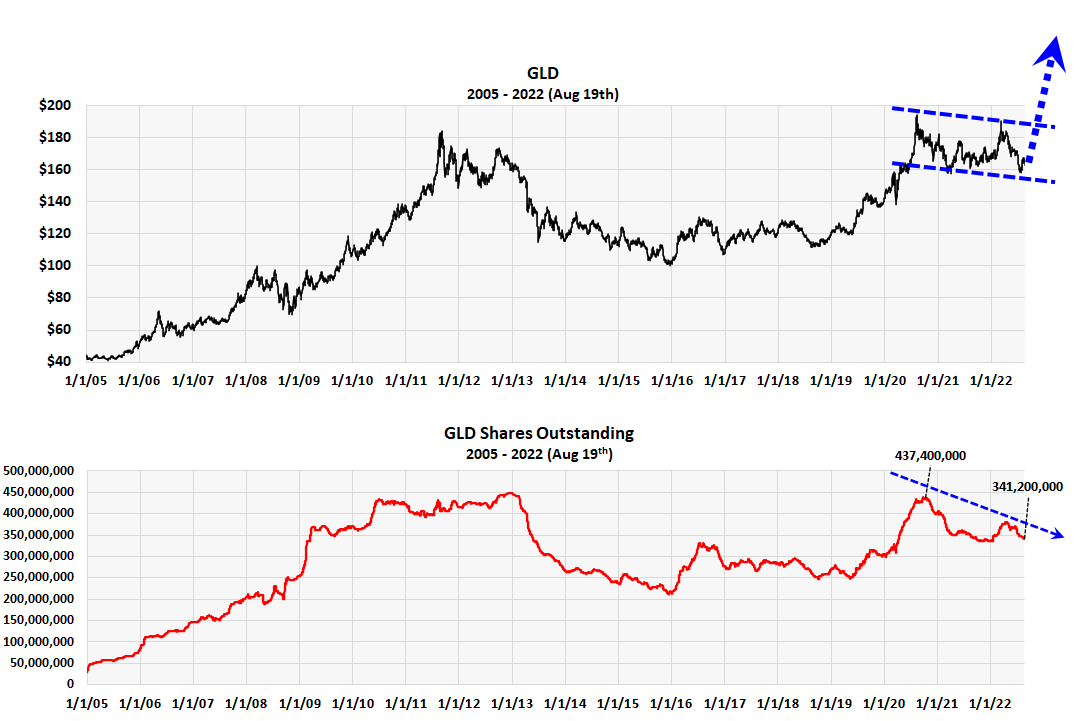
This graph plots the number of shares outstanding in GLD against the price GLD. SO doesn’t always indicate something important but at certain times it can because the number of shares outstanding tells you if the investor base is growing or shrinking. The graph shows the 22 month price surge from $112 to $192 followed by the two-year consolidation. It was accompanied by a large increase in the number of investors in GLD. During the two-year consolidation, however, investors shrank 22% while prices essentially went sideways. We believe it’s a measurable sign of investors getting cautious.
Commitment of Trader Data in Gold
If the number shares outstanding in GLD were the only bullish indicator it wouldn’t be enough, but it’s confirmed by commitment of trader data on gold futures. We’ll show you the long and short positions of two categories of futures traders – producers and asset managers – that aligns with this bullish conclusion.
The Producers or Dealers
GLD versus Producer Long Percent (Michael McDonald)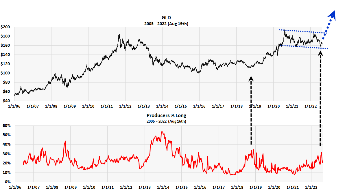
The source of the product behind future contracts, or the primary dealer in futures, is called the producer or dealer. They’re generally sellers and their positions are usually opposite everybody else, often by necessity. Contrary opinion doesn’t really apply to them in that their opinions or positions are usually right. They’re usually bullish and long at the bottom and bearish at the top, which is what you want to be. The ratio of positions, however, are always relative. Is not the absolute level but the relative level against past extremes.
This chart plots the percent that the producers are long gold. It goes back to 2006. As you can see the percent almost always rises near lows in gold prices. You can see this if you carefully inspect the graph. Notice the recent peak two weeks ago. A peak like this is what you would see prior to a price breakout.
The Money Managers
GLD versus Money Manager Future Short Positions (Michael McDonald)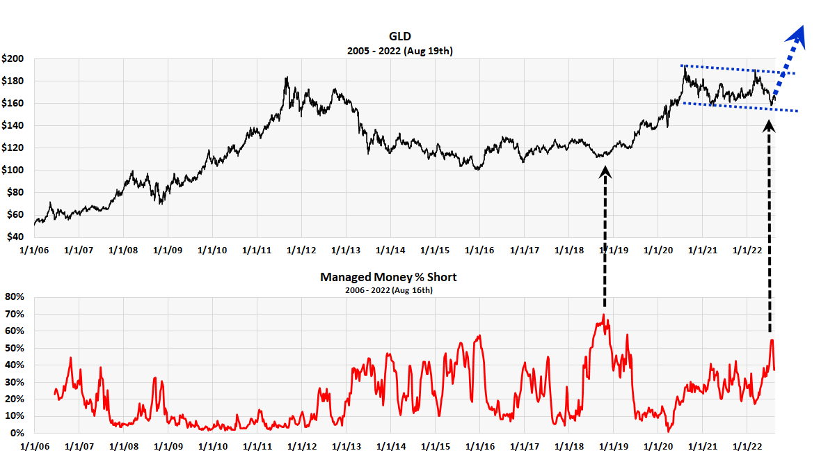
This third chart plots the short position of money managers in gold futures. Historically, professional money managers have bad track records in futures. They are usually overly short at the bottom and have low, short positions at the top. Here contrary opinion does apply. The chart above confirms this (as does our July 11th COT article on future Money Managers and the stock market). Study it carefully. Notice the recent peak in money manager short positions two weeks ago. Notice it’s comparable at other price lows in gold. We believe this, plus the producers higher than normal long position are strong indications that gold is about the breakout.
Conclusion: We believe these three charts, which are based on investor activity in both GLD and gold futures, point to an impending rally in gold after a two-year price consolidation. It’s an example of bearish sentiment after a high-level price consolidation following a major price advance. If our reading is correct, it’s one of the strongest indicators of an impending price breakout. The price move shouldn’t just be going back across the price range to $190 but a full breakout to new highs. We’re expecting at least a 30% price rise over the next year and a half.
Be the first to comment