

IvelinRadkov/iStock via Getty Images
Investment Thesis
The number of companies that have increased dividends for at least ten consecutive years is growing, and with each passing year, this once-admirable dividend growth streak gets less impressive. The Invesco Dividend Achievers ETF (NASDAQ:PFM) tracks these 373 companies, but due to its market-cap-weighting scheme, it ends up being too similar to an S&P 500 Value Index fund. For 0.53% in annual fees with no quality screens, it makes sense that PFM has been an average-at-best long-term performer. I expect it will remain that way in the future, and therefore, I am limiting my rating on PFM to a hold.
ETF Overview
Strategy and Fund Basics
PFM passively tracks the NASDAQ US Broad Dividend Achievers Index, selecting constituents with at least ten years of increasing annual regular dividend payments. Reviews are once per year in March, and the Index is market-cap-weighted with a cap of 4% per security at each quarterly rebalancing. As a result, PFM is more concentrated than you might think. I’ve listed some additional statistics below for easy reference:
- Current Price: $38.68
- Assets Under Management: $735 million
- Expense Ratio: 0.53%
- Launch Date: September 15, 2005
- Trailing Dividend Yield: 1.87%
- Five-Year Dividend CAGR: 7.79%
- Ten-Year Dividend CAGR: 6.08%
- Dividend Frequency: Quarterly
- Five-Year Beta: 0.85
- Number of Securities: 373
- Portfolio Turnover: 28% (6%, 5%, 13%, 20% From 2017-2020)
- Assets in Top Ten: 25.05%
- 30-Day Median Bid-Ask Spread: 0.05%
- Tracked Index: NASDAQ US Broad Dividend Achievers Index
- Short-Term Capital Gains Tax Rate: 40%
- Long-Term Capital Gains Tax Rate: 20%
- Tax Form: 1099
One positive feature is that PFM is a low-turnover ETF. It makes sense, given that qualifying companies are likely to maintain their dividend growth status. There’s a good chance PFM will have many of the same securities in five years as it does today, so passive investors will appreciate not having to check in each year as the Index reconstitutes. On the downside, the Index is becoming so watered down that ten consecutive years of dividend increases are no longer impressive. In my view, investors need additional quality or valuation screens.
Sector Exposures and Top Ten Holdings
The table below highlights sector exposure differences between PFM and three other funds: the SPDR S&P 500 ETF (SPY), the SPDR S&P 500 Value ETF (SPYV), and the ProShares S&P 500 Dividend Aristocrats ETF (NOBL). NOBL requires 25 consecutive years of dividend increases, so it’s the next level up for those valuing dividend consistency.
Morningstar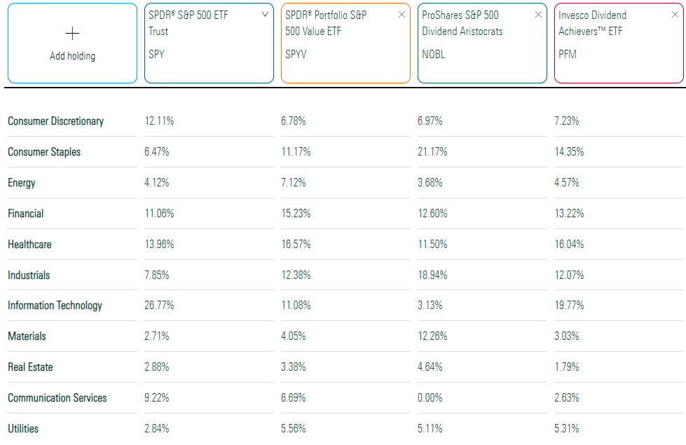
Based on these exposure levels, PFM may be considered a cross between SPY and SPYV, primarily because of its high exposure to Technology and Consumer Staples stocks. Notably, it lacks any meaningful exposure to Energy and Materials stocks, which are often commodity-driven. This feature is a key reason for PFM’s recent underperformance against other large-cap dividend ETFs. This will probably continue, too. Stocks in these sectors are less likely to reach ten consecutive years of growing dividends because commodity prices are cyclical.
PFM’s top ten holdings, which total one-quarter of the ETF, are shown below. Microsoft (MSFT) is one of 26 Technology stocks in the Index, while three Health Care stocks make the list. They are UnitedHealth Group (UNH), Johnson & Johnson (JNJ), and Procter & Gamble (PG). According to Global Industry Classification Standards, Visa (V) and Mastercard (MA) are also considered Technology stocks.
Invesco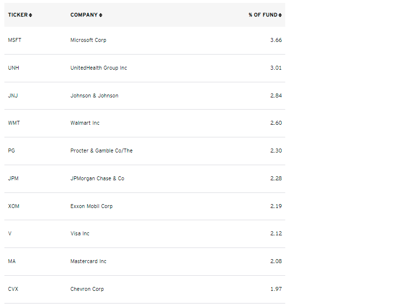
Historical Performance
Historically, PFM looks closer to an S&P 500 Value fund more than anything. Its annualized returns are almost identical, but it did experience less volatility. As a result, its risk-adjusted returns (Sharpe and Sortino Ratios) were slightly better. Still, PFM trailed SPY by 2.89% per year, which, over 16.5 years, means an underperformance of 124%.
Portfolio Visualizer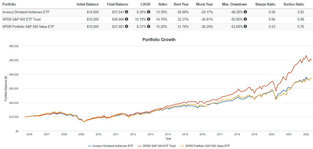
In fairness, most of this underperformance came in the last five years, and PFM was a solid product up until then. The graph below shows the abrupt change in five-year rolling returns around 2016.
Portfolio Visualizer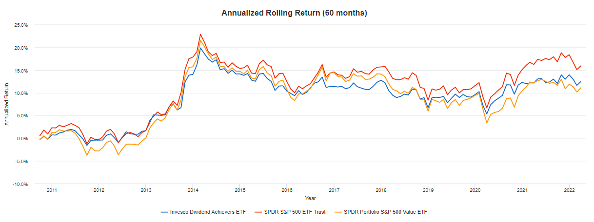
ETF Analysis
Dividend Growth and Yield History
Since all constituents have grown dividends for an extended period, I doubt dividend safety and consistency are an issue. However, the degree of dividend growth is often a problem. PFM’s trailing yield is only 1.87%, so I think investors need some steady growth over time to be a worthwhile long-term investment. The graph below shows that this growth is meager – only 5.19% annualized in the last 15 years.
Seeking Alpha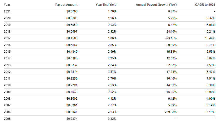
The growth in 2017-2018 almost offsets each other, so the figures may be difficult to interpret. Instead, I’ve graphed the distributions on a trailing twelve-month basis and included the yield on each ex-dividend date to give a better picture. You can see that distribution growth isn’t linear but has increased at a reasonable rate over the last ten years. From March 2012 to March 2022, trailing distributions rose from $0.3339 to $0.7216, or an annualized 8.01%. Yield has been more volatile, of course, but it’s worth noting that the yield hasn’t been this low since December 2017.
The Sunday Investor
Dividend Scorecard
Seeking Alpha’s Dividend Grade for PFM is an “A-,” but as mentioned before, dividend growth is my main concern because I don’t think there’s an issue with safety and consistency. To analyze this in more detail, I’ve calculated weighted-average ratings for PFM’s top 20 industries, which total about two-thirds of the ETF. The net ratings for the entire ETF are at the bottom, alongside ratings for NOBL, which is probably a reasonable alternative if you favor a long dividend growth streak.
The Sunday Investor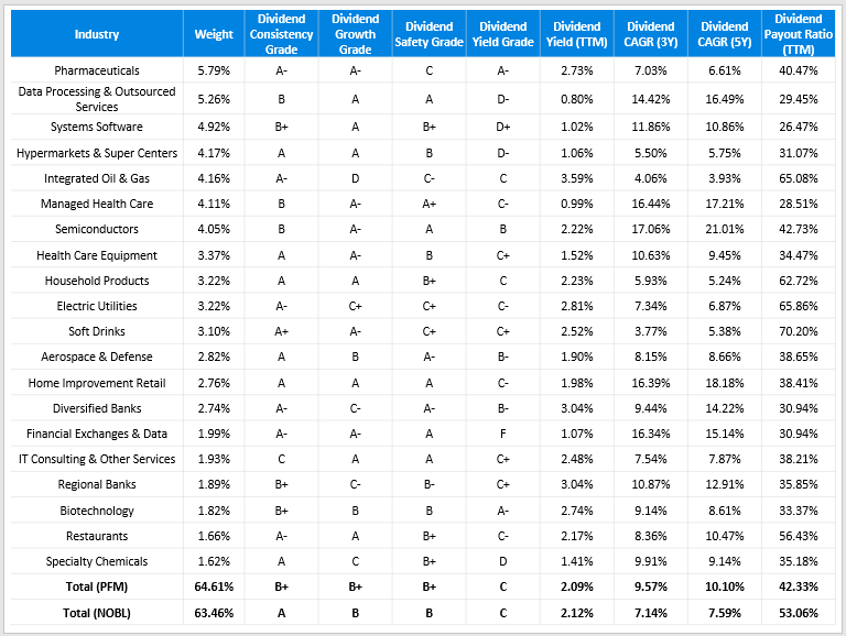
Even though PFM has 373 constituents, it has roughly the same concentration in its top 20 industries as NOBL, which takes an equal-weight approach. In my view, choosing PFM over NOBL for diversification purposes doesn’t make sense. However, PFM appears to be a better choice for dividend growth and safety, as reflected by its “B+” grade compared to NOBL’s “B” grade.
Constituents also have a similar gross dividend yield of 2.09% but have stronger three- and five-year dividend growth rates. This more robust growth is anchored by stocks in the Data Processing & Outsourced Services, Systems Software, Managed Health Care, Semiconductors, and Health Care Equipment industries. Together, these account for 21.71% of PFM compared to 6.31% in NOBL.
Another positive feature is PFM’s lower dividend payout ratio (42.33% vs. 53.06%). I use 60% as a ballpark figure for what I consider safe (75% for Utilities), and only 13.99% of PFM’s constituents by weight cross this threshold. That figure increases to 23.42% for NOBL, so I think PFM has more room to grow their dividends, all things being equal.
Fundamental Analysis
For my fundamental analysis, I will look at each ETF’s revenue and earnings growth rates and their valuations. I’ve added SPYV to the mix due to its historical performance similarities.
The Sunday Investor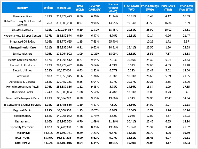
The above table suggests that all three funds have similar revenue and earnings growth rates, though SPYV is cheaper than PFM based on its forward price-earnings ratio (21.08 vs. 21.70), trailing price-sales ratio (4.17 vs. 4.96), and trailing price-cash flow ratio (18.03 vs. 19.69). These differences are minor, but they suggest there’s no reason to be paying 0.53% per year in expenses for what appears to be an inferior portfolio.
Against NOBL, PFM does appear to have an edge. It has a larger market capitalization, which usually suggests better profitability, and it has better growth rates and valuations (except for price-sales). If you value dividend consistency, choose PFM, but this would not be my approach. Unless an ETF has much better fundamentals, I default to the lowest-cost option. SPYV’s expense ratio is only 0.04%, resulting in just 0.59% of your total gains lost to fees over ten years (assuming a 10% annual return). In contrast, according to Larry Bates’ calculator, you’ll lose 7.67% of your profits to fees with PFM.
Larry Bates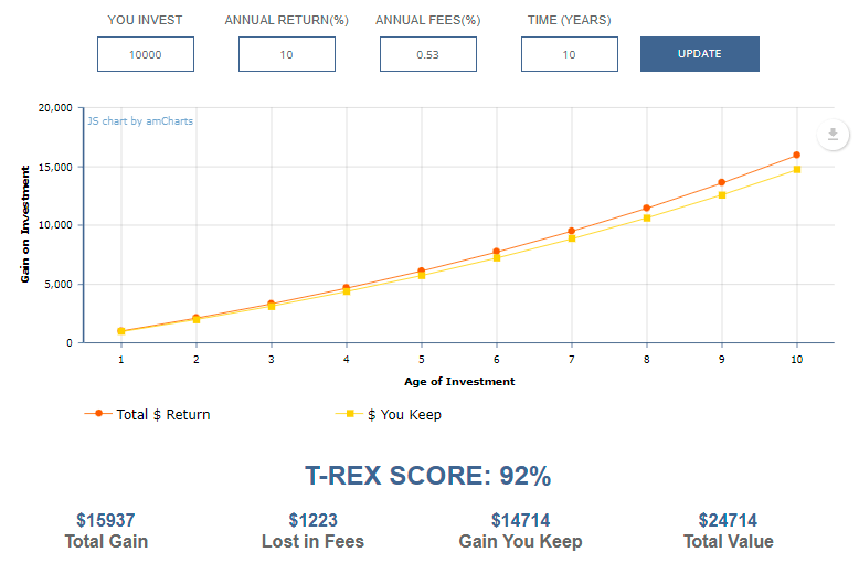
Investment Recommendation
PFM certainly seems better than NOBL for those valuing dividend consistency. However, I caution against this approach, considering how PFM’s historical returns are nearly identical to SPYV. Its current portfolio is weaker on growth and valuation, and the 1.87% dividend yield is close to its lowest point ever and is unlikely a selling point for dividend investors.
The number of companies that have increased their payments for ten consecutive years is too large, and it’s no longer a metric that suggests superior quality. PFM is an average-at-best dividend ETF with high fees without any additional quality screens. I don’t recommend it and think you’re better off going with low-fee value ETFs instead.
Be the first to comment