

IvelinRadkov/iStock via Getty Images
If I had to invest in a broadly diversified US stock market index fund (I use the terms “fund” and ETF (exchange-traded fund) interchangeably), I would put 100% of that allocation into a good small-cap value fund. While this goes against the philosophy of simply buying the biggest total market index fund at the lowest possible cost, I believe the historically observed outperformance of small-cap value stocks over the larger stocks will likely persist decades into the future, and so I am willing to bear those higher costs and risks for those higher expected returns.
I preferred small-cap value over large-cap growth back when the S&P 500 was over 10% more expensive than it is today, and believe now is the best time to add to small-cap value allocations since mid-2020. In this article, I aim to provide a thorough updated review of the historic track record and forward looking thesis for small-cap value’s return premium, see how this is implemented in the Vanguard Small-Cap Value ETF (NYSEARCA:VBR), which is the largest and second lowest expense ratio small-cap value fund I’ve found anywhere.
My outline for this article is as follows:
- Review the historic track record of small-cap value stocks versus broader stock market returns;
- Consider the numbers and assumptions that would imply higher or lower returns for small-cap value going forward; and
- Examine how these numbers compare for VBR versus competing funds within Vanguard.
In the first two headlined sections, where I look at the past and future of the small-cap value premium, I make the following six observations, which I believe are worth listing up-front here for later reference:
- Small cap value stocks have a consistent history of delivering higher returns than larger and more expensive stocks over long enough time horizons.
- This return premium seems to increase the deeper a portfolio is concentrated in smallest and cheapest corner of the market, versus decreasing in a portfolio more broadly diversified towards the middle of the market.
- To the extent practical, there seems to be a return premium from equal weighting, rather than market cap weighting, a small-cap value portfolio.
- The main advantage from considering the relative profitability of stocks seems to come from excluding stocks that are both expensive and less profitable.
- Any future return premium from small-cap value stocks depends on the metrics driving their past outperformance continuing to drive their future outperformance.
- To the extent that return premium is expected to be in the hundreds of basis points, it seems worthwhile to pay tens more basis points in implementation costs for a portfolio more concentrated in the metrics expected to capture that premium.
1. Small-Cap Value’s Historic Outperformance
Many studies have highlighted historically higher returns of smaller stocks over larger stocks, and of cheaper stocks over more expensive stocks, with the most famous of which likely being the 1992 paper by Eugene Fama and Kenneth French titled Common Risk Factors In The Returns of Stocks and Bonds. The below charts provide simple summaries of these historic observations updated through March 2022 from the data on Ken French’s website, which I will cite as the source of each of the below charts as “Ken French.”
1.1. Dividing the market into 1/6ths
The first two charts are of the “corner” portfolios in the “6 Portfolios Formed on Size and Book-to-Market” dataset. As clarified in the below diagram, this data set divides the US stock universe, annually in June, into six buckets based on their market value and Price / Book ratios, and we will be charting the cumulative returns of the four color-coded “corner” portfolios, ignoring returns of the middle 40% of stocks by Price/Book ratio.
Author’s Illustration Based On Ken French’s Description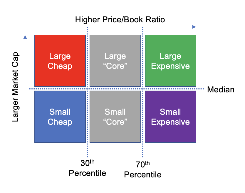
When we chart these four “corner” portfolios, weighted by value, we see the following chart, which is likely to be familiar to many small-cap value investors. This chart shows the long-term outperformance of value stocks over growth stocks, and that this outperformance has been more pronounced between smaller stocks than between larger stocks. I use the terms “cheap” and “expensive” rather than the more traditional markers “value” and “growth” to highlight that the only metric we are sorting by here is Price/Book ratio.
In number terms, $1 invested in “Large Expensive” stocks would have grown to around $10,000 from 1926 to early 2022, or roughly 10% per year. By contrast, the same $1 invested in “Small Cheap” stocks would have grown to over $400,000 over the same period, an annual rate of return around 14.5% per year.
Ken French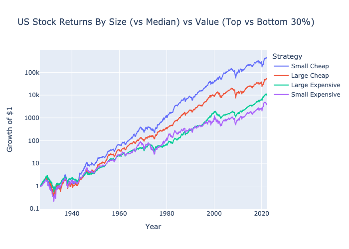
One big practical problem with the above chart is that it highlights the cumulative returns over a 95-year period, which is longer than many investors’ time horizons, and the 4.5%/year return premium was certainly not uniform over those 95 years. The following chart shows how this return premium has varied over rolling 20 year periods, with the highest small-value premium periods apparently being those ending in the late 1970s through the late 2000s. The most recent 20-year periods ending in the early 2020s seems like the first time in the past century that the value quadrants underperformed their respective growth quadrants, inspiring many debates over “the death of value.”
Ken French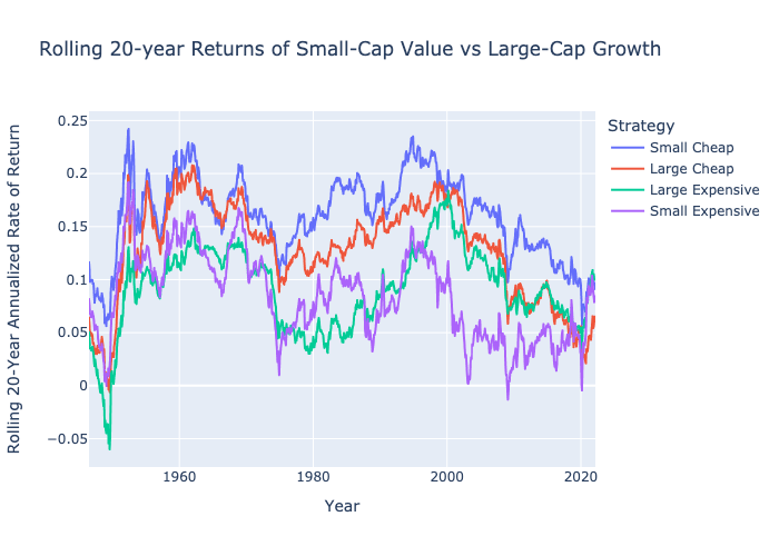
From the above two charts, I draw the first of the six observations I listed earlier:
Observation #1: Small-cap value stocks have historically outperformed larger and more expensive stocks by a significant margin, at least until very recently.
1.2. Dividing the market into 1/25ths
Next, I wanted to look at how stock returns varied when we look at more granular portfolios defined by narrower quintiles of market cap and Price / Book ratio. There are many ways I could have charted this, but I chose to focus on the five portfolios along the “diagonal” of these two dimensions, progressing from the smallest and cheapest companies to the biggest and most expensive stocks as this diagram hopefully makes clear:
Author’s Illustration Based On Ken French’s Description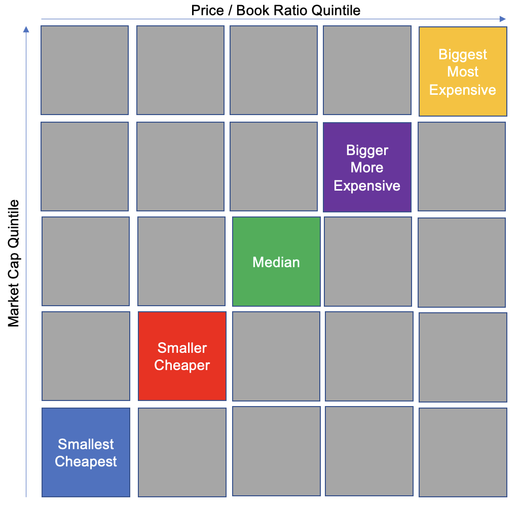
When we chart the cumulative returns of these five portfolios from 1926 to early 2022, we reassuringly see an almost monotonic spectrum showing progressively higher long-term returns as we go from the portfolios on the upper right to the ones on the lower left. Looking more closely at the “Biggest Most Expensive” chart, we can clearly see the 1999-2000 dot-com bubble and subsequent “lost decade,” followed by the strong performance of large cap growth in the 2010s.
Ken French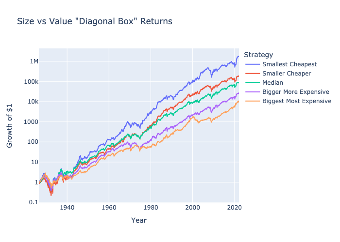
What should encourage small cap value investors from this run of more concentrated “1/25th” portfolios is that the 20-year rolling outperformance of the “Smallest Cheapest” portfolio manages to persist even over the most recent 20 year period.
Ken French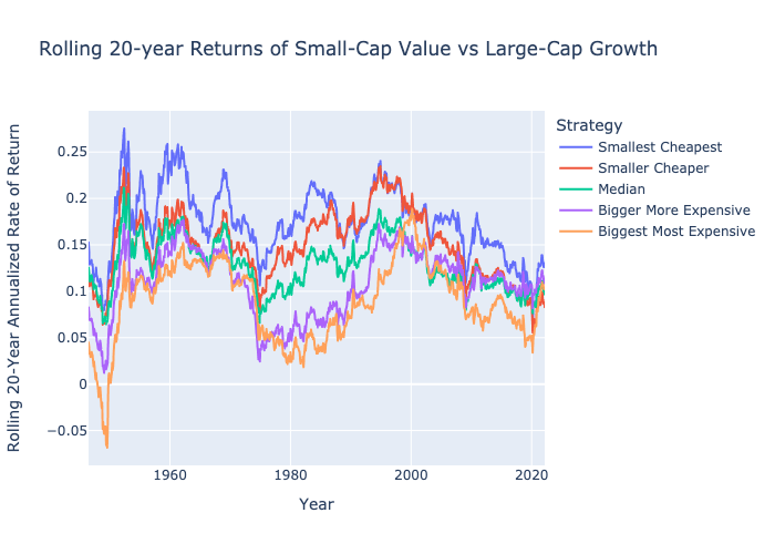
In terms of overall average historic returns, the series show an average of 16.5%/year for the “Smallest Cheapest” portfolio, compared with only 10%/year for the “Biggest Most Expensive” corner. This leads me to the second observation:
Observation #2: If I’m going to tilt towards small-cap value, I should concentrate more deeply into that small-value corner of the market, rather than diversifying more broadly toward the middle.
1.3. Equally-weighting versus cap weighting
Having divided the market into more granular “1/25th” portfolios, I then wanted to see how the returns would be different if we equally-weighted, rather than market cap weighted, each of the portfolios in the data set. Fortunately, the Ken French data includes these equal-weighted return data right below the value-weighted series in each data set. The cumulative results of equal-weighting the “Smallest Cheapest” corner of the markets, compounding $1 to about $100 million in under one century, are so extreme I will take it with a grain of salt, but I do agree with the conclusion that equal-weighting would have advantages over cap weighting here.
Ken French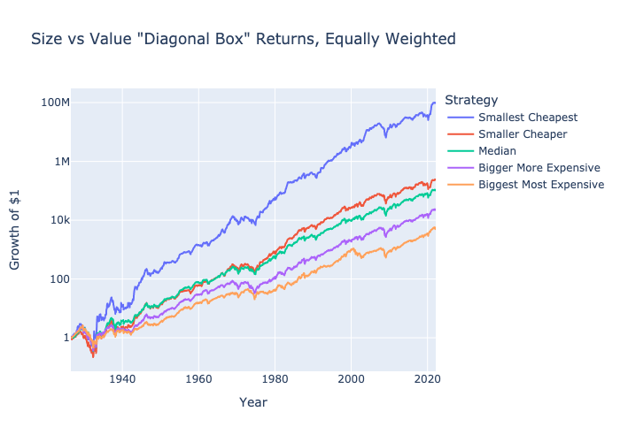
One very significant challenge to implementing an equal-weighted portfolio of the “Smallest Cheapest” 1/25th of the market over most of the past century would have been the much higher transaction costs of such a strategy. This probably explains why the theoretical return premium of this equal-weighted strategy was highest before about 1990, but that it has remained consistently so high since gives me reason to consider it.
Ken French
Observation #3: When implementing a small-cap value portfolio, tilt away from market cap weighting and closer towards equal-weighting.
1.4. Factoring in profitability
The Ken French data sets splitting US stocks by relative profitability, which he defines as a modified version of return on equity using operating income rather than net income, starts much later in 1962, but provides enough economic cycles to test the effect of this factor on past stock returns. While shares of companies with higher profitability ratios do seem to have delivered some return premium over time, the most significant advantage of factoring in this profitability ratio would seem to come from avoiding the “Expensive Less Profitable” corner of the market. I first saw this explicit exclusion of stocks with high Price/Book and low operating ROE ratios in funds and indexes from Dimensional Fund Advisors, as can be read in one of the footnotes of this article. Seeing that in the below chart leads me to my fourth take-away:
Observation #4: Although it seems better to focus on the most profitable companies, the biggest advantage in small caps seems to come from simply avoiding companies that are both the least profitable AND most expensive.
Ken French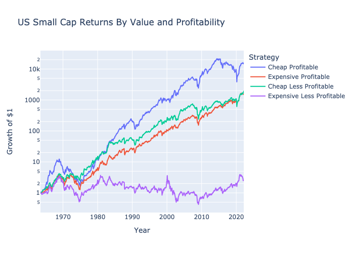
2. The future of the small-cap value premium
The above observations of higher past returns from small-cap value stocks may be interesting, but will only be valuable to today’s investors if this return premium continues into the future. This section aims to summarize the narratives against and for a positive future small-value premium, followed some math and metrics we can use to estimate this future premium.
2.1. A “small-cap value is dead” narrative
When evaluating an investment, I often find it useful to start by asking how the investment could underperform, lose money, or both. One bullet point against the small size premium, plus one bullet point against the value premium, might be summarized as follows:
- Network effects and economies of scale of the larger companies are making it more difficult than ever for smaller companies to compete, or even survive. In other words, bigger may actually be better in the 21st century in ways that weren’t as true in the 20th century.
- With information more easily accessible than ever, and trading costs lower than ever, markets are far more efficient in the 21st century than in most of the 20th, so the only stocks that are still cheap are cheap for reasons reflecting lower, rather than higher, future returns.
Investors agreeing with one or both of these bullet points might avoid allocation to small-cap value beyond that within a total market index fund (as seen with the Vanguard funds below), and the more aggressive may even consider a tilt towards large-cap growth. So a very important question for any investor looking to overweight small-cap value is whether that investor can confidently reject the above two bullet points.
2.2. A “bright future of small-cap value” narrative
On the positive side, two main bullet points explaining why value stocks, especially smaller value stocks, should deliver higher returns in the future could include:
- Behavioral or institutional reasons – smaller stocks, cheaper stocks, and especially smaller cheaper stocks, tend to be ones that larger institutional investors have incentives to ignore, and smaller retail investors tend to have less interest in than larger or more glamorous stocks. If enough other investors aren’t buying these stocks, that leaves their prices cheaper, and their future returns higher, than more widely purchased stocks.
- Risk-based reasons – a more academic explanation is that smaller stocks, cheaper stocks, and especially smaller cheaper stocks, are rationally assessed as being more risky. This explanation may emphasize that these “other” institutional and individual investors are rational, and so are not ignoring or shunning these stocks for reasons other than wanting to demand a higher risk premium to own them.
These points have been discussed by many authors, and one article I recommend is this 5-year old write up by Alpha Architect on the value premium. I personally tend to focus more on the behavioral or institutional explanations, because I have spent enough time speaking with both amateur and professional investors to understand common biases why I feel less competition buying small value stocks than today’s biggest darlings.
Behavior is also at least as likely an explanation as transaction costs for why we don’t see many billionaires today whose grandparents simply put $100 in an equal-weighted portfolio of the smallest, cheapest 1/25th of the market and rebalanced annually over the past 95 years: what family do you know that would have started and stuck with this program? Some have argued that Warren Buffett’s billions may be largely attributed to his tilts towards smaller and cheaper companies. Similarly, Sir John Templeton might be another small value success story given his fame for buying every stock selling under $1 during World War II.
The behavior argument implies that the return premium from small-cap value is likely to be lower following periods were everyone seems to know about it and already want to tilt towards small-value funds, while the return is likely to be higher following periods where small-value is out of favor. I feel very safe saying small-cap value still feels quite out of favor following the run in U.S. large caps over the past decade, as I believe the metrics in the next section clearly quantify.
2.3. Estimating Future Returns Via Fundamentals
When I look at an individual stock or ETF, I often try and model future returns by using absolute projections of dividend distributions, denominator growth, and multiple expansion or contraction. For example, when I look at the metrics of VBR, I can look metrics like its 1.8% dividend yield, 12.8% historic earnings growth rate, and 11.3x P/E ratio, as of April 30th 2022. Those metrics alone imply that if the dividend and earnings growth rates continue, we should expect a 1.8% + 12.8% = 14.6%/year annual rate of return in the future assuming the P/E ratio remains 11.3, and our total return will be higher or lower than 14.6% if the future P/E is higher or lower, respectively. By contrast, the Vanguard Total (U.S.) Stock Market ETF (VTI) reports a 1.4% dividend yield, 19.7% past earnings growth rate, and 19.4x P/E ratio. Those metrics would imply a significantly higher future rate of return for VTI than for VBR assuming that:
- Earnings per share of large cap stocks can continue growing at a significantly faster rate than those of smaller cap stocks, and
- VTI will continue trading at a P/E multiple nearly double that of VBR’s.
While there are easily understandable explanations for why the earnings of large-cap companies have grown at a significantly higher rate than those of small-caps recently, and especially during the COVID-19 pandemic, many believers in the small-cap return premium expect small companies to have more growth upside than large companies. As the saying goes, we expect it to be much easier for a $1 billion company to grow into a $10 billion company than for a $1 trillion company to grow into a $10 trillion company.
On the second assumption, while it would be reasonable to expect that small-cap value should generally trade at cheaper multiples than the overall market, much of the recent outperformance of the biggest most expensive stocks seems to owe as much to multiple expansion as to that higher recent earnings growth. Although buybacks have been significant in pushing up the Price/Book ratios of larger companies with slowing revenue growth (see my explanation using McDonald’s as an example), the biggest most expensive stocks have gotten more expensive relative to the smallest cheapest stocks by many other metrics as well. It seems fair to assume that over the next decade or two, these valuations are likely to exhibit some mean reversion, which in turn would drive higher returns in VBR relative to VTI.
Ken French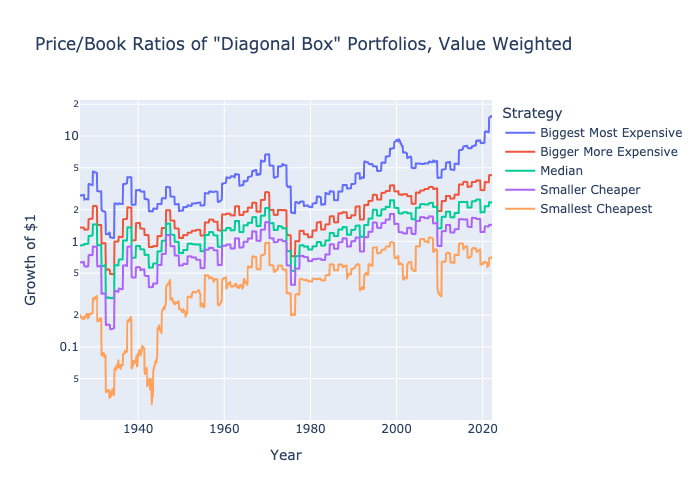
One third factor which is harder to quantify, but important if we are investing in a slice of a market according to a rule, is that small-cap value funds will generally sell out of a stock ones it grows from being small and cheap to being large OR expensive, and buy stocks on dips when they become small or cheap. This would further imply that small-cap value benefits from mean reversion, while the biggest most expensive stocks would rely on continuing momentum / mean aversion.
2.4. A Simpler Return Premium Estimate Grid
Although I prefer to estimate future fundamental denominators and valuation multiples for individual assets, for comparing different diversified fund portfolios, I prefer to compare grids showing how they are allocated to different segments of the market with different expected returns. As this article is focused specifically on small-cap value and small-cap value funds, the grid I want to use is one that divides the U.S. market into 25 buckets by market cap and Price/Book ratio, and then inputting my assumption for future return premium by bucket.
For any investor debating allocation to small-cap value vs large cap growth or any other segment, I highly encourage jotting down assumptions in a grid like this to better organize what your assumptions imply about estimated expected future returns of different portfolios. I have rounded these numbers to acknowledge that none of them are exact, but in general, this shows that I am expecting a value premium like the one seen in the “diagonal” portfolios above, with the spread between the returns of cheap vs expensive stocks getting wider the lower the market cap.
Author’s Assumptions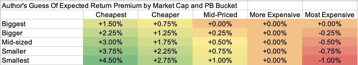
With our assumptions summed up in a grid like this one, it then becomes very easy to run the holdings of each fund, starting with VTI, VBR, and DFAT, to their relative allocations to each of these 25 buckets. That should give us a clearer idea of which of these ETFs best provide us a small-cap portfolio best fitting the six observations listed above.
To group each funds’ holdings into these 5×5 grids, I merged each ETF’s holdings with the market cap and Price / Book statistics of VTI’s holdings from Koyfin and grouped them using the Pandas qcut function with q=5 for quintiles. Before I ran qcut, I limited the data set to stocks with a market cap of at least $500 million, as that still covers over 92% of most the funds I looked at with a much cleaner break out of the top two size quintiles.
3. How Vanguard Implements Small-Cap Value
As mentioned earlier, VBR is the largest and one of the cheapest small-cap value ETFs, and can be seen as a slice of the cheaper stocks in the Vanguard Small-Cap ETF (VB), which in turn is a slice of the smaller stocks in VTI. Starting at the top, we see the allocation of VTI by market cap and Price/Book ratio are as follows:
Author’s calculations from Vanguard ETF holdings and Koyfin data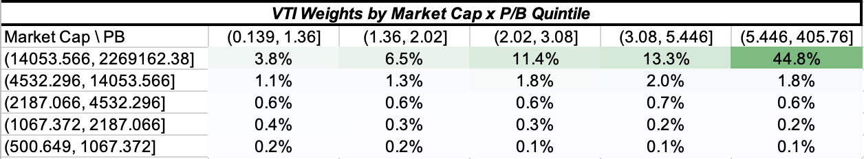
Although the formatting is not the prettiest, which this table shows is that 44.8% of VTI is allocated to stocks that have a P/B ratio over 5.446 AND a market cap over $14.05 billion. In total, about 80% of the VTI portfolio adds up to being in the “biggest” quintile of stocks of over $14 billion in market cap, with most of those big stocks being on the expensive half of all stocks. Only 0.2% of VTI is allocated to the “smallest cheapest” stocks our past observations and “guess grid” assumes to be the highest returning corner of the market. It is worth noting that among the smallest two quintiles of stocks, VTI is more heavily allocated to cheaper stocks than expensive stocks, the opposite of what we see in the two largest quintiles, indicating very clearly that larger stocks now tend to be more expensive stocks in the US market.
When we then look at the weights within VB, which we understand to be a small-cap slice of VTI, we see that the size cut-off for small-caps must have been just above $14 billion, as about 77% of this fund is allocated to stocks with a market cap between about $2 – 14 billion. VB still has a slight tilt to more expensive stocks, as about 19.7% of VB is in the most expensive quintile of stocks trading at over 5.446x book, versus only 15.8% of VB in stocks trading below 1.36x book. If we cross-multiply these weights against our “guess grid” above, this maps to an assumed future return premium of about 0.6%/year of VB over VTI.
Author’s calculations from Vanguard ETF holdings and Koyfin data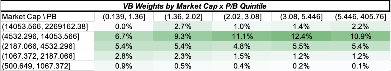
Moving on to how VBR is weighted relative to VB, the first thing that surprised me is how much VBR’s allocation is spread among what many of us might consider “expensive” or “growth” stocks. I first critiqued this in 2018 by pointing out how light the value tilts were in many of the largest and most popular value ETFs, but that article focused on larger-cap value, while this article focuses on the wider return gap between “small cheap” vs “small expensive” stocks. That said, as light as this tilt may be, when we cross-multiply it against our “guess grid”, we see VBR having an assumed return premium of about 0.3%/year over VB, or just under 1%/year over VTI.
Author’s calculations from Vanguard ETF holdings and Koyfin data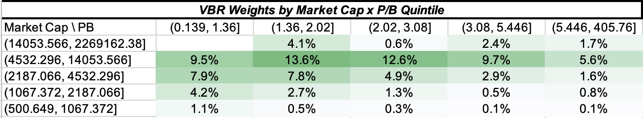
For comparison, I also wanted to run the grid for one of Vanguard’s other small-cap value funds that tracks a more widely used small-cap value benchmark: the Vanguard Russell 2000 Value ETF (VTWV). Although this was the one fund I was only able to match 88% of against Koyfin data, it is immediately visible that VTWV has a lower size cut-off (with no stocks over $14 billion in market cap and many more between $1-5 billion, as well as a heavier tilt towards value. When I cross-multiply these weights against the “guess grid”, we get an assumed return premium of 0.7%/year over VBR, or almost 2%/year over VTI. I take this calculation with a huge chunk of salt, since I also notice that the weighted average return on equity rate of VTWV is only around 7.4%, versus 10.4% for VBR. So although VTWV tilts towards smaller and cheaper companies, it doesn’t seem to have as much of a filter away from less profitable companies, which was point #4 of the six I looked at above.
Author’s calculations from Vanguard ETF holdings and Koyfin data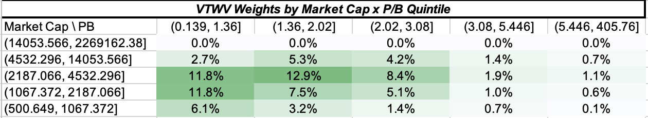
In terms of fees, Vanguard’s best known advantage is that they keep costs low. VTI charges 3 basis points per year, VB charges 5 and VBR 7, so the incremental costs of these tilts are about as low as I could find anywhere. VTWV charges a much steeper 15 basis points, most likely because of licensing fees that need to be paid to FTSE Russell. Those who prefer the Russell 2000 Value Index, might also want to compare VTWV to the iShares Russell 2000 Value ETF (IWN), which also has listed options that are fairly liquid. My position in IWN is long a long-dated call option.
Conclusion
I remain a long-term believer in the small-cap value premium, and if I had to allocate to a broadly diversified U.S. stock fund, I would allocate most or all to a good small-cap value fund. While VBR is the biggest and second cheapest small-cap value ETF I have found anywhere, it does not tilt as deeply towards smaller, cheaper, and more profitable companies as I would like. For those simply looking for a low cost Vanguard fund, VBR looks like a clear step in the right direction away from VTI and VB, but I would look elsewhere for deeper tilts.
Be the first to comment