

Pavel Vozmischev
This monthly article series shows a dashboard with aggregate industry metrics in utilities. It is also a top-down analysis of sector ETFs like the Utilities Select Sector SPDR ETF (XLU) and the Fidelity MSCI Utilities Index ETF (NYSEARCA:FUTY), whose largest holdings are used to calculate these metrics.
Shortcut
The next two paragraphs in italic describe the dashboard methodology. They are necessary for new readers to understand the metrics. If you are used to this series or if you are short of time, you can skip them and go to the charts.
Base Metrics
I calculate the median value of five fundamental ratios for each industry: Earnings Yield (“EY”), Sales Yield (“SY”), Free Cash Flow Yield (“FY”), Return on Equity (“ROE”), Gross Margin (“GM”). The reference universe includes large companies in the U.S. stock market. The five base metrics are calculated on trailing 12 months. For all of them, higher is better. EY, SY and FY are medians of the inverse of Price/Earnings, Price/Sales and Price/Free Cash Flow. They are better for statistical studies than price-to-something ratios, which are unusable or non available when the “something” is close to zero or negative (for example, companies with negative earnings). I also look at two momentum metrics for each group: the median monthly return (RetM) and the median annual return (RetY).
I prefer medians to averages because a median splits a set into a good half and a bad half. A capital-weighted average is skewed by extreme values and the largest companies. My metrics are designed for stock-picking rather than index investing.
Value and Quality Scores
I calculate historical baselines for all metrics. They are noted respectively EYh, SYh, FYh, ROEh, GMh, and they are calculated as the averages on a look-back period of 11 years. For example, the value of EYh for hardware in the table below is the 11-year average of the median Earnings Yield in hardware companies.
The Value Score (“VS”) is defined as the average difference in % between two valuation ratios (EY, SY) and their baselines (EYh, SYh). FY is reported for consistency with other sector dashboards, but it is ignored in utilities‘ score to avoid some inconsistencies. In the same way, the Quality Score (“QS”) is the average difference between the two quality ratios (ROE, GM) and their baselines (ROEh, GMh).
The scores are in percentage points. VS may be interpreted as the percentage of undervaluation or overvaluation relative to the baseline (positive is good, negative is bad). This interpretation must be taken with caution: the baseline is an arbitrary reference, not a supposed fair value. The formula assumes that the two valuation ratios are of equal importance.
Current data
The next table shows the metrics and scores as of last week’s closing. Columns stand for all the data named and defined above.
|
VS |
QS |
EY |
SY |
FY |
ROE |
GM |
EYh |
SYh |
FYh |
ROEh |
GMh |
RetM |
RetY |
|
|
Gas |
0.08 |
-2.23 |
0.0561 |
0.5210 |
-0.0946 |
9.04 |
36.75 |
0.0479 |
0.6274 |
-0.0603 |
9.40 |
37.00 |
2.39% |
6.23% |
|
Water |
-30.89 |
4.54 |
0.0286 |
0.1568 |
-0.0446 |
10.40 |
56.06 |
0.0374 |
0.2539 |
-0.0321 |
9.63 |
55.43 |
0.31% |
-6.61% |
|
Electricity |
-14.91 |
-2.34 |
0.0486 |
0.4036 |
-0.0809 |
9.37 |
38.60 |
0.0518 |
0.5286 |
-0.0455 |
9.82 |
38.64 |
3.67% |
2.01% |
Value and Quality chart
The next chart plots the Value and Quality Scores by industry. Higher is better.
Value and quality in utilities (Chart: author; data: Portfolio123)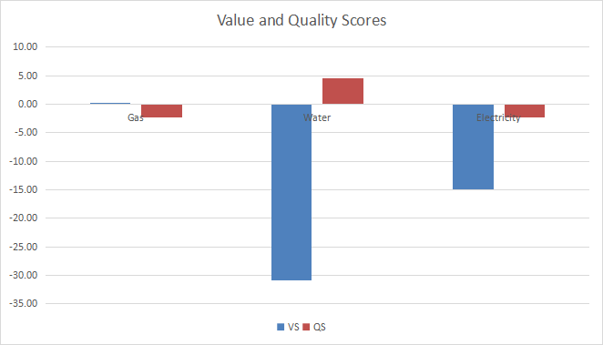
Evolution since last month
The value score has improved in gas utilities and deteriorated in electricity.
Variation in value and quality (Chart: author; data: Portfolio123)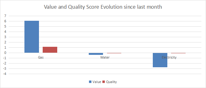
Momentum
The next chart plots momentum data.
Momentum in utilities (Chart: author; data: Portfolio123)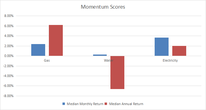
Interpretation
Gas utilities look the safest industry in the sector regarding fundamental data: valuation and quality metrics are close to 11-year averages. They also have the highest 12-month median momentum with +6.2%. Electricity and water are overvalued by about 15% and 31% relative to their historical baseline. Their quality scores don’t justify such overvaluation.
Fast facts on FUTY
The Fidelity MSCI Utilities Index ETF has been tracking the MSCI USA IMI Utilities 25/50 Index since 10/21/2013. The expense ratio of 0.08% is a bit cheaper than for XLU (0.10%).
As of writing, the fund has 69 holdings. The next table lists the top 10 names with fundamental ratios and dividend yields. Their aggregate weight is 52.2%.
|
Ticker |
Name |
Weight |
EPS growth %TTM |
P/E TTM |
P/E fwd |
Yield% |
|
NextEra Energy, Inc. |
14.20% |
61.60 |
43.45 |
29.26 |
2.02 |
|
|
Duke Energy Corp. |
6.57% |
27.82 |
20.19 |
18.91 |
4.01 |
|
|
The Southern Co. |
6.13% |
12.59 |
22.00 |
19.41 |
3.92 |
|
|
Sempra Energy |
4.46% |
94.05 |
22.09 |
17.92 |
2.91 |
|
|
American Electric Power Co. |
4.24% |
1.09 |
19.63 |
18.83 |
3.51 |
|
|
Dominion Energy, Inc. |
4.23% |
-12.42 |
21.11 |
14.24 |
4.55 |
|
|
Exelon Corp. |
3.46% |
26.65 |
19.37 |
18.54 |
3.22 |
|
|
Xcel Energy, Inc. |
3.26% |
4.91 |
22.82 |
22.08 |
2.79 |
|
|
Consolidated Edison, Inc. |
2.96% |
42.49 |
19.97 |
20.99 |
3.32 |
|
|
Constellation Energy Corp. |
2.68% |
N/A |
N/A |
31.36 |
0.64 |
Ratios: Portfolio123
FUTY and XLU show similar performances and risk metrics since FUTY inception. The difference in annualized return, drawdown and risk-adjusted performance (Sharpe ratio) is insignificant.
FUTY vs XLU since inception: almost identical path (Portfolio123)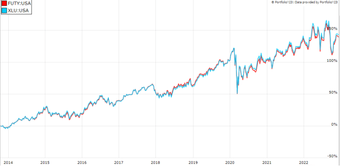
In summary, FUTY is a good instrument with cheap fees for investors seeking capital-weighted exposure in utilities. It has more holdings than XLU (currently 69 vs. 32), but past performance is almost identical. The two funds are equivalents for long-term investors. However, XLU is a better choice for tactical allocation and trading because it has a much higher trading volume. Both funds have a high exposure to the top holding: NextEra Energy weighs over 14%. Investors worried by concentration may prefer the Invesco S&P 500 Equal Weight Utilities ETF (RYU).
Dashboard List
I use the first table to calculate value and quality scores. It may also be used in a stock-picking process to check how companies stand among their peers. For example, the EY column tells us that an electricity company with an Earnings Yield above 0.0486 (or price/earnings below 20.58) is in the better half of the industry regarding this metric. A Dashboard List is sent every month to Quantitative Risk & Value subscribers with the most profitable companies standing in the better half among their peers regarding the three valuation metrics at the same time. The list below was sent to subscribers several weeks ago based on data available at this time.
|
FirstEnergy Corp. |
|
|
Hawaiian Electric Industries, Inc. |
|
|
Black Hills Corp. |
|
|
New Jersey Resources Corp. |
|
|
CMS Energy Corp. |
|
|
Portland General Electric Co. |
|
|
Entergy Corp. |
|
|
DTE Energy Co. |
|
|
NRG Energy, Inc. |
|
|
NiSource, Inc. |
It is a rotating list with a statistical bias toward excess returns in the long term, not the result of an analysis of each stock.
Be the first to comment