

(This article was co-produced with Hoya Capital Real Estate.)
Henrik5000
For several years now, I have featured the merits of the 60/40 portfolio.
In early-2019, I wrote an article synopsizing a seminal piece from Peter L. Bernstein entitled The 60/40 Solution. Here’s a tiny snippet from the article.
The simple fact is; no one knows the future with 100% certainty. Bernstein argues that “the constant lesson of history is the dominant role played by surprise.” Because of this, unexpected events defy the forecasts of even the keenest investors. And it is this steady stream of surprises that contributes to the volatility of stocks, particularly in the short run.
Based on that article, I penned an article for Seeking Alpha titled In Search Of The Perfect Portfolio For The Next 10 Years.
That was in February 2019. I think it would be an understatement to say that, since that time, the quote featured above has played out in spades. Within roughly a year of that article, most of the world was on lockdown as a result of COVID-19. To help offset the resultant economic downturn, the U.S. government introduced stimulus that had the effect of both increasing the money supply as well as holding down longer-term interest rates.
Fast-forward another 2 years, and we have the largest land war in Europe since World War II.
In the first half of 2022, what did all of this lead to, for the classic 60/40 portfolio? Here’s Charlie Bilello.
With that backdrop in mind, in this article I will first lay out what would seem to be the somewhat disappointing performance of the “perfect portfolio” I proposed back in 2019.
Following that, however, we will examine the question of whether the 60/40 portfolio is dead, or whether it will rise above the horrible performance of the first half of 2022 to remain a valuable tool for investors.
In Search Of The Perfect Portfolio For The Next 10 Years – An Update
What did I suggest as the “perfect portfolio?” Here is how I summarized it in my Seeking Alpha article:
Without further ado, then, here is my “base” allocation for the next 10 years.
- 30% U.S. Stocks
- 20% Global ex-US Stocks
- 50% Long-Term U.S. Treasuries
In summary, we are talking about a 50/50 allocation in stocks vs. bonds, with the stock allocation being broken down 60/40 between U.S. stocks and foreign stocks.
At this point in time, we are now roughly 42 months since that article was published, or roughly one-third through the 10-year timespan I proposed.
Using a backtest in Portfolio Visualizer (hereafter PV), let’s see how the portfolio has fared. Here are the parameters I used:
- The backtest covers the period from January 2019 through the end of June 2022.
- I started the portfolio with an initial balance of $10,000.
- The portfolio was rebalanced quarterly and the comparisons reflect both inclusion and reinvestment of all dividends.
Similar to the 6-month update I shared following the initiation of the portfolio, I will use Vanguard Total Stock Market ETF (VTI) and Vanguard Total International Stock ETF (VXUS) as my chosen ETFs for domestic and foreign stocks. With respect to bonds, as recommended in the article I went full TLT (sorry, couldn’t resist) with my proposed 50% allocation deployed in the iShares 20+ Year Treasury Bond ETF (TLT). In my article, I did hedge my bets a little bit, offering alternative options for investors concerned by the longer-duration of TLT.
For this update, however, I will do a quick mockup of a couple of different takes on the bond portion of the portfolio. In one, I will faithfully stick to the 50% allocation to TLT that I proposed. In the other, I will show the results had I been slightly more conservative and gone with a 20% allocation to TLT, 20% in Vanguard Total Bond Market ETF (BND) and 10% in Vanguard Short-Term Bond ETF (BSV).
As a comparison, I will evaluate the portfolio against the performance of the S&P 500, using the venerable SPDR S&P 500 ETF Trust (SPY) as my proxy. Let’s take a look. For any interested in examining the backtest for themselves, here is a handy link.
First of all, here is the PV graphic displaying the portfolio. As can be seen, Portfolio 1 is the ‘perfect portfolio’ exactly as proposed in the article, Portfolio 2 is a variant with a slightly more conservative bond allocation, and Portfolio 3 is a simple 100% allocation to SPY.
Text.
Portfolio Structure: ‘Perfect Portfolio’ vs. SPY (PortfolioVisualizer.com)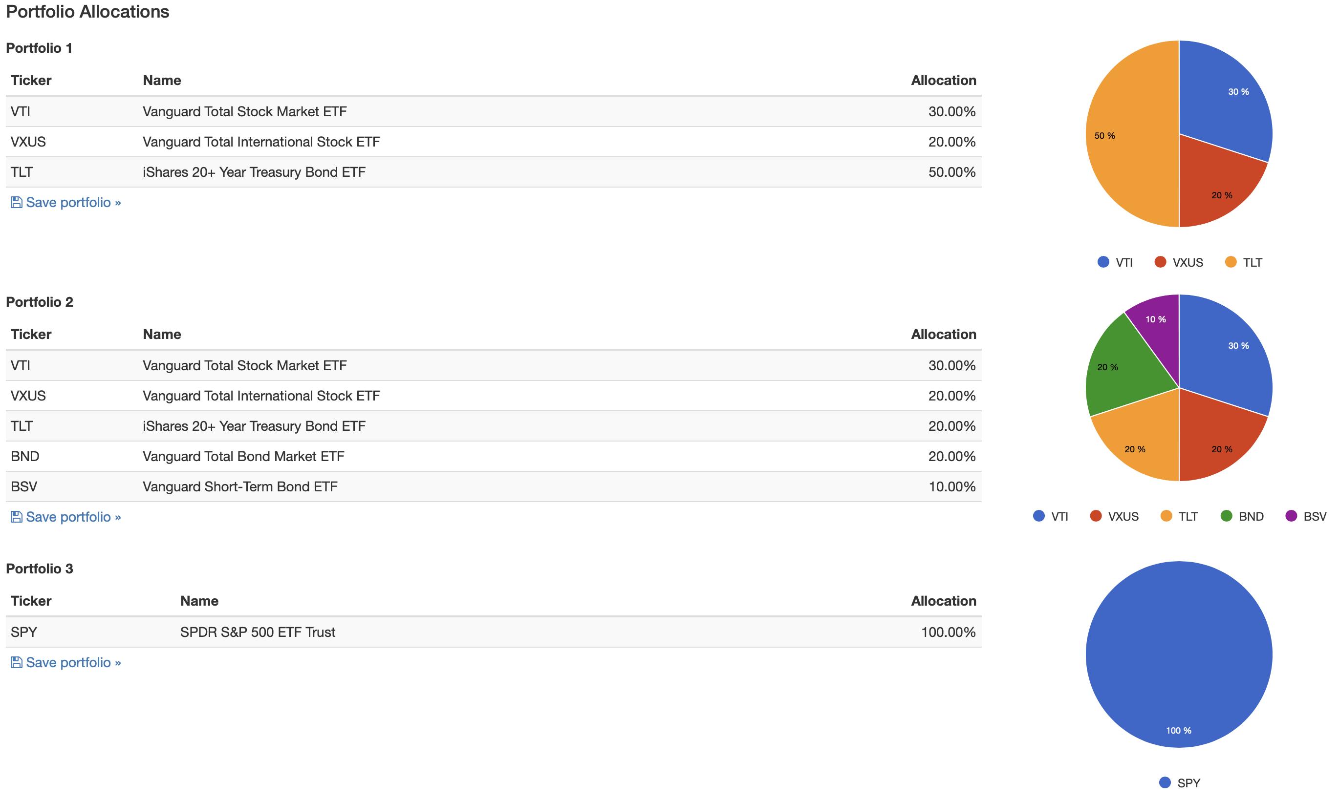
Next, the results.
Portfolio Results: ‘Perfect Portfolio’ vs. SPY (PortfolioVisualizer.com)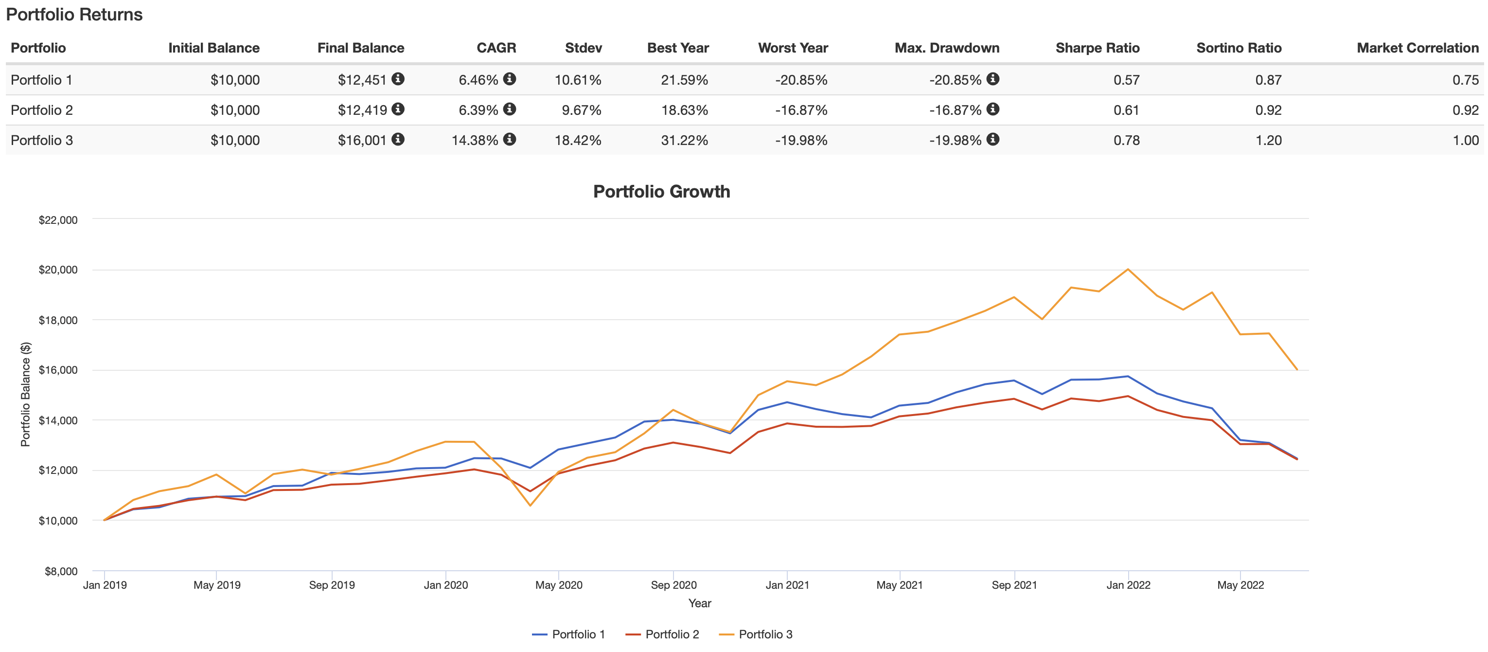
Lastly, the level of income produced by the 3 options.
Portfolio Income: ‘Perfect Portfolio’ vs. SPY (PortfolioVisualizer.com)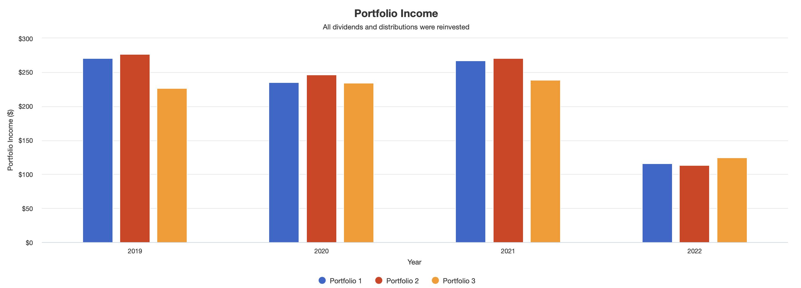
In some ways, the performance of the portfolio could be considered disappointing over this time span. As can easily be seen, in absolute terms the S&P 500 trounced the ‘perfect portfolio’ over the roughly 3-1/2 years covered by this backtest. And, while the standard deviation of the ‘perfect portfolio’ compares quite nicely overall, the turmoil of the first half of 2022 leaves the ‘worst year’ and ‘max drawdown’ figures as severe as the S&P 500!
Digging a little deeper, if you were to play around in PV and look at the components individually, you would see that foreign stocks, as represented by VXUS, dramatically underperformed their U.S. counterparts, represented by VTI, over this period. And further, that long-term bonds, as represented by TLT, did very well through approximately mid-2020 but have declined since that point, and dramatically so during the first half of 2022.
Lastly, even if I had been more conservative with the bond portion, you will see that the final results are approximately the same, albeit with slightly less volatility.
Is The 60/40 Portfolio Dead?
I don’t believe so.
If anything, I propose that the less-than-stellar results that I shared above suggest that we have just experienced a very uncommon set of circumstances, and that the venerable 60/40 portfolio might prove even more valuable moving forward.
The tweet from Charlie Bilello that I shared above makes clear that, historically speaking, the first half of 2022 was an anomaly. Further, in reporting on the performance of the ‘perfect portfolio,’ I purposely chose to use June 30, 2022, as the end point. In so doing, it could be viewed that I embarrassed myself, by reporting on what could be considered sub-standard performance.
As it happens, though, some of this has already started to turn around in July. And I am not speaking of stock prices. Yes, those have turned around, possibly a little too quickly in my view. No, I am talking about bond prices. As I finalize this article shortly after the market close on July 29, BSV is up roughly .8%, BND roughly 2.5%, and TLT roughly 3.1%.
Building on this theme, have a look at the graphic below, courtesy of Vanguard’s research team.
Historic Stock vs. Bond Diversification (Vanguard)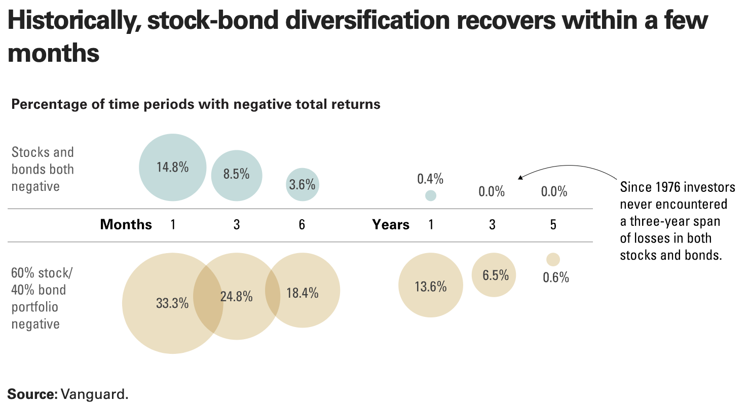
Focusing on the top left, over a one-month period, stocks and bonds are both negative approximately 15% of the time, or approximately once every 7 months. Over a 6-month period, it happens 3.6% of the time, or roughly once every 3 years. So, while the first-half drop in 2022 was dramatic in terms of magnitude, it was not all that uncommon in terms of occurrence.
But extend the time horizon, and the odds drop dramatically. As the graphic features, there has never been a 3-year span since 1976 where investors have encountered losses on both stocks and bonds.
One last thing. Vanguard features that the goal of the 60/40 portfolio is to achieve long-term annualized returns of roughly 7%. This is on average, not each and every year.
With that in mind, take one more look back at the ‘results’ graph for the ‘perfect portfolio’ in the prior section. Faced with both underperformance from international stocks, and the worst run for bonds in many years, the portfolio still managed to deliver a CAGR of 6.46%, not all that far below the 7% goal.
With both stocks and bonds having experienced severe recent declines, the odds of greater returns moving forward are more promising.
Summary and Conclusion
Here is where we come full circle, back to the seminal article from Peter L. Bernstein that I featured at the beginning of this article.
When investing, perhaps more important than any of the specifics I wrote about in the last section is the matter of discipline. In other words, coming up with a plan and then sticking to it.
Your chosen mix might not be 60/40. If you are in your 20s, your chosen mix might be 80/20, or even 90/10. For a retired, or extremely conservative, investor, your mix might be the inverse, 40/60 or even 30/70.
In their investor education materials, Vanguard provides this helpful graphic, in terms of deciding where along the spectrum of risk you want to be.
Historical Spectrum of Returns (Vanguard)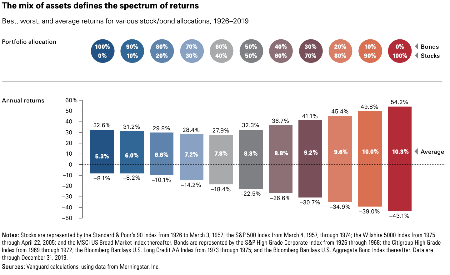
Bernstein, in his article, reminds that selecting a risk tolerance that you can live with, and then sticking to it, will go a long way in stopping you from panicking during times of market turmoil, and taking drastic actions that could prove detrimental to your long-term goals.
I hope you have found this article interesting, and helpful. Thanks for honoring me by taking the time to read my work.
Until next time, I wish you successful investing.
Be the first to comment