

franckreporter/E+ via Getty Images
Editor’s note: Seeking Alpha is proud to welcome Crystal Allen as a new contributor. It’s easy to become a Seeking Alpha contributor and earn money for your best investment ideas. Active contributors also get free access to SA Premium. Click here to find out more »
Since practically everything goes down in a steep market correction – gold, real estate, cyber currencies, blue-chip stocks, etc. – some investors choose to keep their money in cash or municipal bonds. But other traders invest in a falling market by choosing an ETF that shorts one of the major indexes.
ETFs such as ProShares Short S&P 500 x1 (NYSEARCA:SH), ProShares UltraShort S&P 500 x2 (SDS), ProShares UltraPro Short S&P 500 x3 (SPXU), ProShares VIX Short-Term Futures ETF (VIXY), and ProShares Short Dow 30 (DOG) are pinned to the Dow and the S&P 500 such that they make money while the indexes lose money. Let’s take a look at the ProShares Short S&P 500, which pays investors $1 for every $1 lost on the S&P 500.
Historical Chart for ProShares Short S&P500 x1 [SH] Jan 2015-May 2022![S&P Proshares Chart [SH]](https://static.seekingalpha.com/uploads/2022/6/1/56245210-16541285631727827_origin.png)
This steep downward trend is an inverse of the S&P 500’s upward trend as it rose in tandem with the market over the same period. Notice that every time SH breaks above the 50-day moving average, it spikes before returning to the trend line. The most recent break above the 50-day moving average occurred on April 11th. The ensuing spike is likely to be high, possibly historically high, for the following reasons.
What to expect from the Fed
First off, there will be no more Fed quantitative easing (QE) rescues for the foreseeable future as the central bank is now devoted to saving the U.S. dollar from the inflation monster. Those investors who assume the Fed will backstop a market crash with another generous round of QE, as it has since 2000, are sure to be disappointed this time around.
These persistent Fed injections of new money into the markets every time they falter have caused what investment strategist Jeremy Grantham refers to as a “super bubble.” Grantham, who co-founded Grantham, Mayo, & van Otterloo (GMO), a Boston-based financial management firm with 68 billion in assets as of the beginning of 2022, coined the term “reversion to the mean.” He predicts that when this current bubble pops (which it may be doing at this moment) the market plunge could be 50% or more.
As of this writing (June 3, 2022), the S&P sits at 4109, down 14% from its Jan. 1 peak of 4800. According to Grantham, the trend line, in the absence of Fed intervention, is heading toward 2500. He also maintains that, historically, when market super-bubbles pop, the market tends to go below the trend line and stay there for “quite a while.”
Other Reliable Indicators of a Recession
Head and Shoulders Formation
One of the clearest, and most trustworthy stock chart formations is the classic head and shoulders, which is easy to see in the image below of the S&P 500 chart showing activity over the past two years. The first shoulder, formed between May through September 2021, is followed by a triple-peaked head, formed in September 2021 through January 2022. That is followed by a clearly visible high, narrow second shoulder.
S&P 500 Historical Chart Head & Shoulders Formation (Finance.Yahoo.com)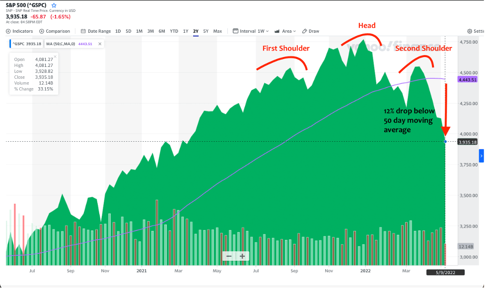
Price Drop Beneath Moving Average
Note in this two-year historical chart that the S&P 500 has dipped 12% below the 50-day moving average in mid-May. While this percentage has recently improved thanks to the market rally moving into the Memorial Day weekend, the S&P is still trailing its 50-day moving average. A significant drop of any equity below this line is another classic indicator of a bear market ahead as the moving average reveals whether the stock is trending above or below its averaged former price.
Inversion of the Treasury Yield Curve
Among the most reliable indicators of a recession is an inversion of the yields of the two-year and the 10-year treasury bills. This happens when institutional bond portfolio managers determine that a market reversal is in the works. They respond by rebalancing their bond portfolios. Short-term bonds are replaced by long-term bonds in a wealth preservation move. The long-term bonds protect the financial institutions’ overall portfolios from market risk over the ensuing years. This action causes the price of the more desirable long-term bonds to go up, and the price of the less desirable short-term bonds to go down. Since bond price is inversely proportional to yield, that means the yield of the long-term bonds goes down as the yield of the short-term bonds rise until they cross paths in what’s known as an inverted yield curve.
It usually takes markets several months, and sometimes up to a year, to react. But as the chart below demonstrates, the inverted yield curve is a fairly reliable indicator of a recession.
10-Year Treasury Minus 2-Year Treasury Historical Chart Jan 1990-May 2022 (Federal Reserve Economic Data)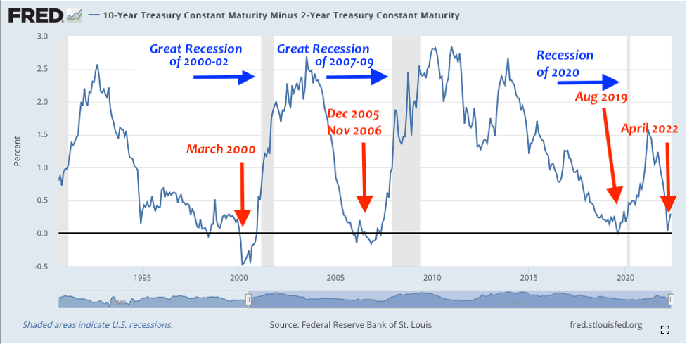
Yield Curve Inversion of March 2000
Five months later, the S&P 500 achieved a new all-time high of 1520 in August 2000, before plunging 47% to a low of 800 in September 2002.
Yield Curve Inversion of Dec 2005 and Nov 2006
The S&P 500 achieved a new all-time high of 1560 in October 2007, before plunging 56% to a low of 680 in February 2009.
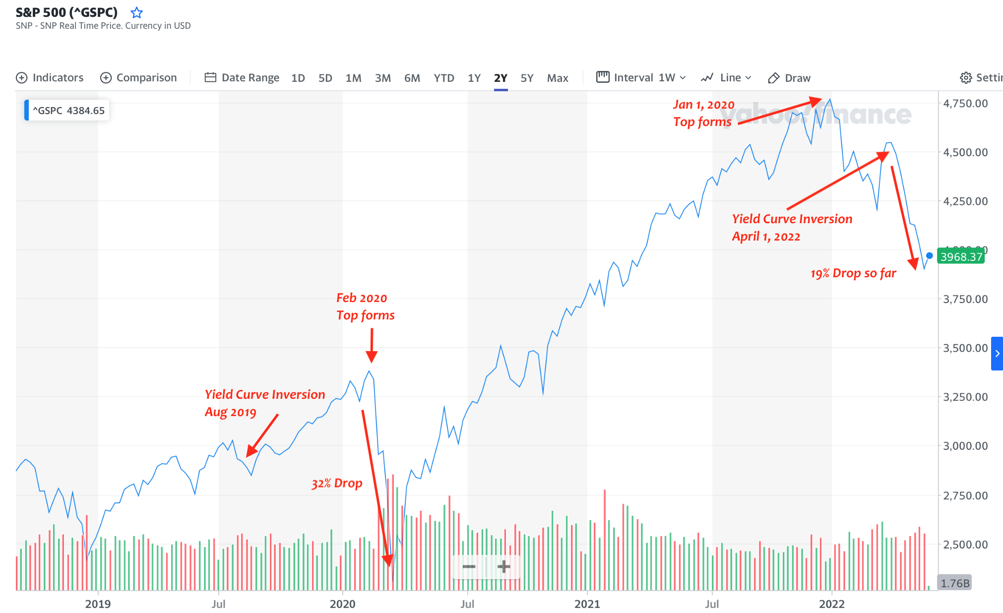
Yield Curve Inversion of August 2019
Six months later, the S&P 500 formed a new all-time high of 3380 in February 2020, before dropping 32% to a low of 2300 in March 2020.
Yield Curve Inversion of April 2022
This was a rare instance in which the yield curve inversion occurred four months after the S&P 500 formed a new high of 4797 in January 2022. By May, the S&P 500 had dropped 19%, closing at 3901 on May 16. While the S&P rallied back to 4158 in the last week of that month, the majority opinion among financial analysts is that the bottom is not yet in. In fact, on June 1, Jamie Dimon, CEO of JPMorgan Chase, predicted an economic hurricane on the horizon, and claimed investors had better brace themselves for “bad outcomes.”
S&P 500 Historical Chart From 1998-2013 (Finance.Yahoo.com) S&P 500 Historical Chart From 2019 – 2022 (Finance.Yahoo.com)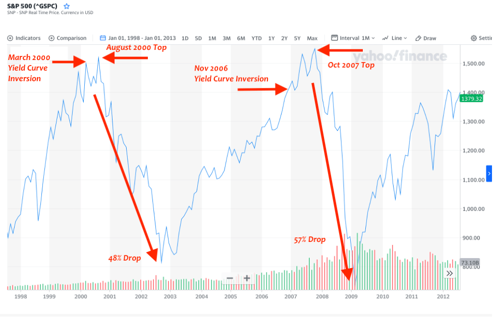
How Bad Can It Get?
The most powerful downward force in a stock market crash generally comes from a chain reaction of corporate bond defaults and margin calls. The soaring rise of national and global debt is the best indicator of how bad this current market drop can get.
The U.S. government debt now stands at slightly over $30 trillion. The U.S. debt to GDP as of the end of 2021 was a stunning 123%. Notice in the Federal Reserve chart below that even before the COVID-19 pandemic, the U.S. public debt as a percent of GDP was at an all-time high. While it has fallen slightly from its high of 136% in the 2nd quarter of 2020, it was already at 107% as of the end of 2019. For comparison, just before the Great Recession of 2007-09, the U.S. public debt as a percentage of GDP was at 62% as the stock market peaked in September of 2007, roughly half of what it is today.
Federal Debt: Total Public Debt as Percent of Gross Domestic Produce (Federal Reserve)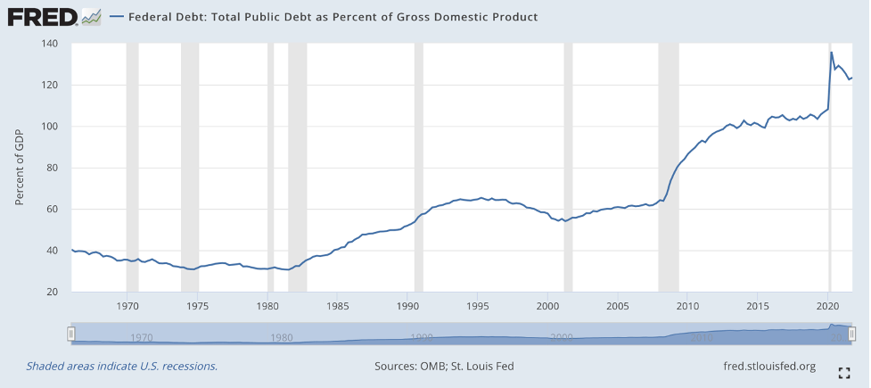
The global debt to global GDP is even more shocking at a whopping 368% as of the end of 2021, which is close to $300 trillion.
Consumer Price Index Chart (Federal Reserve)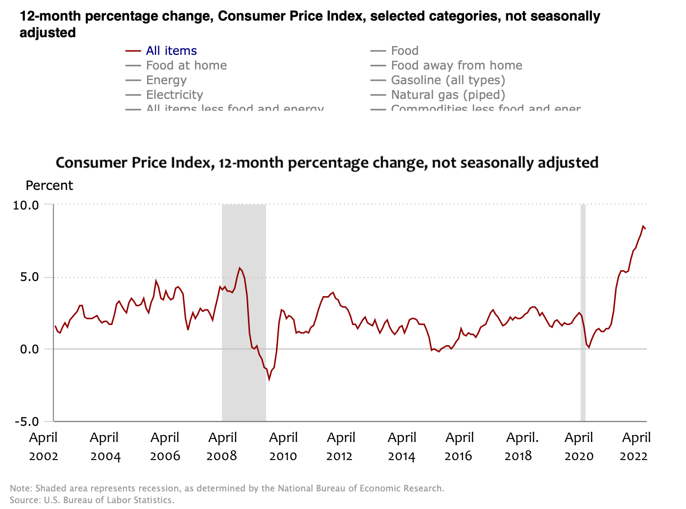
Now that rapid inflation has set in (see chart above), and is unlikely to abate in view of projected global food and fuel shortages over the next year or two, central banks cannot rush in and flood the markets with QE cash without crashing their respective currencies. When you add it all up, it is possible the world is facing a stock market crash and a long-term recovery period similar to the Great Depression. The upcoming recession might not be as serious as the Great Depression, due to the likelihood the Fed will resume its QE policy once inflation is brought under control. Nonetheless, considering the projections of food and fuel shortages over the next two years, the stock market is likely to fall lower – as an overall percentage of the last market top – than it has in the past 20 years because the Fed cannot backstop it with another round of QE for the time being.
Dow Jones Industrial Average Index daily closing price Jan 1920-Dec 1954 (Federal Reserve)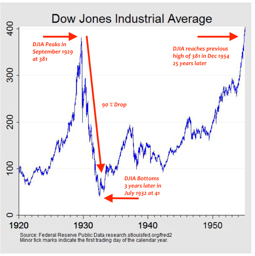
How This Cookie Could Crumble
Reverse Quantitative Easing
Because rapid inflation has forced the Federal Reserve to reverse its QE policy, it is now raising key interest rates. This means many corporate bond sellers will be forced to refinance their bonds at higher rates. The ones that don’t qualify will need to pay off their bonds coming due with cash on hand. This affects the markets in two ways. Bond sellers may have to sell whatever equities they can to pay off their bonds as they come due, and this puts downward pressure on the equities markets. Those bond sellers who don’t have enough equity to pay their bond holders could be forced into bankruptcy, which generally involves rapid liquidation of equities as the bond holders seek to curb their losses. This would cause further downward pressure on the markets.
Margin Calls
Many hedge funds and individual investors buy equities on margin, especially in a strong bull market. When equities are rising, buying on margin can dramatically increase profits. However, when the markets turn and head downward, these margin investors lose money rapidly and must endure repeated rounds of margin calls. If they can’t make their margins, their positions are quickly liquidated so their creditors can get their money back. If this scenario comes to pass, waves of liquidations could accelerate the market’s decline.
Caveat
A word on short-selling a market index like the S&P 500 or the Dow Jones Industrial Average. Pretty much every position you take in the stock market is a gamble. But the risk associated with short selling a market index is much higher than a conventional long trade. That’s because, over time, markets generally move in an upward direction, so short-selling a market index means you need to plan a logical entry point and look ahead to a logical exit point. Short-selling anything is absolutely not a long-term hold, as most experienced short-sellers would agree.
Entry Point For ProShares Short S&P 500
A good time to enter an investment in ProShares Short S&P500 is right now. As I’ve mentioned above, many of the market indicators for a long downhill slide in the global markets are in, including the 50-day moving average, the recent inversion of U.S. treasury bills, the head-and-shoulders formation in the S&P 500 chart, and ongoing global food, fertilizer, and fuel shortages as predicted by a quorum of experts. If you want to fine-tune your entry into SH, look for a day over the next week or so when the S&P 500 is up over one percent, and buy the next day when the market is likely to slip back into a downward direction.
Exit Point For ProShares Short S&P 500
In regard to establishing an exit point, the easiest way is to set a predetermined target for your exit. One target might be the low point of the S&P 500 in the last market crash, which was 2305 on March 16, 2020. Since the S&P 500 was at 4109 as of June 3, this would be a 44% drop from that date. Insofar the last crash was stopped by the Fed, which injected a massive amount of cash into the stock market, one could argue the markets would have fallen much further without the Fed’s intervention. That means an S&P 500 target of 2305 would likely be a safe exit point. An even safer exit point would be an S&P 500 target of 2500, insofar investment expert Jeremy Grantham claims this as the trend line for the S&P in the absence of Fed intervention.
Another way to establish an exit point is to look for a chart formation known as an upside down head and shoulders, which is simply an imperfect mirror image of the head-and-shoulders formation shown above. This usually occurs alongside a significant (over 10%) rise in the 50-day moving average using a two-year chart with a one-week interval. (The 50-day moving average is influenced by the interval of reported prices or points on a chart.)
ProShares Short S&P 500 Risk Factors
Finance expert Stuart Allsopp zeroes in on the risks involved in shorting the S&P using an index fund like SH in his Seeking Alpha article “SH: A Dangerous Way To Position For A Crash.” According to Allsopp, because the fund’s underlying securities are a complicated set of derivatives transactions and because these transactions come with a cost, these funds lose money over time even if the price activity in the underlying benchmark, like the S&P 500, remains flat over the same time period.
As per Allsopp, another way these funds can lose money is “if the Index has a dramatic intraday move that causes a material decline in the Fund’s net assets, the terms of a swap agreement between the Fund and its counterparty may permit the counterparty to immediately close out the transaction with the Fund.” When this happens, the fund is at the mercy of the market in regard to getting back into position. This unplanned expense could cause a surprise drop in the fund’s value that puts it out of synch with its underlying benchmark.
As an example of the unpredictability of SH, Allsopp points to a three-month period between November 2008 and March 2009 when SH dramatically underperformed its stated goal of a dollar gained for each dollar lost on the S&P.
In the graph below, if you look at the dotted vertical line you can see that at the end of December 2008 SH, shown in green, overreacted to a sudden rise in the S&P 500 (blue line). When SH recovered, it should have shot past its previous high, but failed to do so. The underlying SH derivatives may have been reacting to the fact the Fed was scrambling to save large financial institutions from a chain reaction of credit default swaps. At this time the Fed was experimenting with several powerful financial tools it had never used before, and sending numerous mixed signals to the marketplace.
S&P versus ProShares Short S&P500 [SH] Chart 2008 (Yahoo.com) S&P500 Compared to ProShares Short [SH] 2020 (Yahoo.com)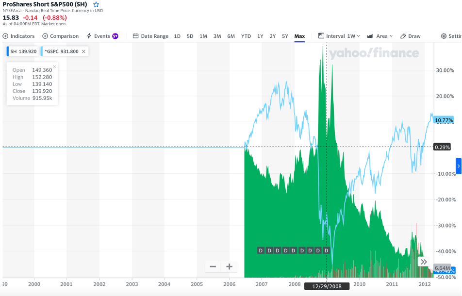
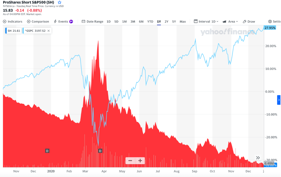
The graph above shows the correlation between SH and the S&P 500 during the five-week crash that occurred over February and March of 2020. Notice that in this instance SH, shown in red, mirrors the S&P 500 (blue line) almost exactly, which means it performed as predicted.
Let’s check the numbers. The most popular ETF for trading the S&P 500 index is SPDR S&P 500 ETF Trust (SPY). If a trader invested $1,000 in SPY and $1,000 in SH on Feb. 9, 2020, and then sold both equities the following month on March 15, that trader would have lost $351.89 on their SPY investment, but gained $383.43 on their SH investment, which means SH actually performed slightly better than promised during that particular market downturn.
Allsopp suggests VIXY as a “less bad option.” However, there is no way to know how VIXY would have performed over the period of December 2008 through March 2009 because it did not exist at that time. Nonetheless, the VIXY fund performed spectacularly well during the crash of 2020, rising from 44 to 200 over the five-week period from Feb. 9 through March 15, a 355% increase. But the VIXY is extremely volatile and sometimes unpredictable. If a trader had invested in the VIXY on March 7, 2022, at $23.24 per share, even though the S&P 500 has dropped 93 points or 2% as of June 3 (rather than rising as predicted) the VIXY fell to $17.17 in the same time period, a disturbing 26% drop. It is likely to recover as the S&P continues to fall, but this is something to keep in mind.
The upshot is shorting the markets is probably a gamble best left to experienced traders. For those who wish to short a major index, it may be wise to spread the risk around by investing in more than one such ETF. A popular term for short-selling the market during a steep correction is “catching a falling knife.” Just as the term implies, this sort of trade is risky. You must expertly choose both your entry point and your exit point. If you don’t get out in a timely fashion you risk losing your entire investment, even if you had spectacular gains for a period of time. But if you educate yourself, use a small percentage of your portfolio (less than 5% is recommended), and proceed with caution, you can make a profit in a falling market.
Be the first to comment