

D3Damon/iStock via Getty Images
In my previous article on dollar strength and what it is telling us about the (woeful) state of globalization, I briefly mentioned why gold’s price action in late September was so disheartening, insofar as it implied depressing outcomes for markets generally going well into 2024. In this article, I am going to explain why gold’s decline in the context of this market is problematic. In doing so, it will also be necessary to lay out some historically informed principles about gold and its relevance to market analysis. This is important, because gold is so unique.
And, that’s the question. What is gold? A “piece of metal”, i.e., a mere commodity of limited utility? An asset class on par with equities and bonds? Is it money-in-exile? Or, is it a way for market prognosticators like myself to extract cash out of a panicky public? I am going to argue here that the answer is all of the above. It is a financial chimera. Coming to some pristine definition of gold’s value is not the main thrust of this piece, however. Rather, I am more interested in outflanking our preconceptions about gold in order to simply confront what it is that the shiny rock might be telling us about markets. So, I am going to largely skip ideological or philosophical discussions about gold and fiat money or what the definition of money might be.
I will conclude that the recent decline in gold points to cyclical disinflation, particularly in industrial commodities and energy, but also in corporate earnings. Gold itself is likely to outperform equities and commodities but underperform Treasuries. But, I will also argue that gold has an X factor, probably originating in its monetary qualities, and this ultimately requires those who are oriented towards preservation of capital to hold it despite downside risks.
Chart A. Gold is losing momentum. (Stockcharts.com)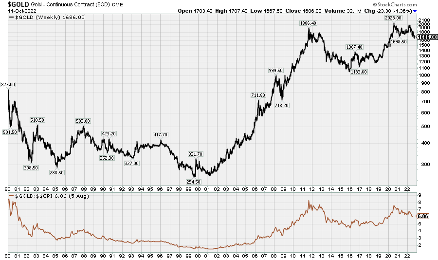
Six principles
Below, I am going to reduce these observations to six basic principles based on the history of gold prices. Because these principles are rooted more in historical performance than theoretical considerations, this is not at all intended to be the final word on the significance and meaning of gold. At the risk of repeating myself, the aim, rather, is to set aside theory and skip to the data instead, while keeping in mind possible theoretical implications on the one hand and actionable applications on the other. As with the previous article on the US dollar index, the most interesting thing about gold is what it says about the markets generally rather than what is going on in the metal itself.
Those six principles are:
- Gold is a commodity.
- Gold leads the market cycle.
- Gold lags the market supercycle.
- Gold is a defensive commodity.
- Gold has risen in every “secular” bear market in equities over the last century.
- Gold is money.
Before getting into this, the very first thing to note is the “tension”, as academics often like to say, between Points 2 and 3: gold leads the market cycle but lags the market supercycle. In both instances (i.e., “cycle” and “supercycle”), I am primarily thinking of commodity prices. At the cyclical level, gold (and other precious metals to no small degree) leads commodities, but at the supercyclical level, gold lags commodities. If this seems contradictory, it is nonetheless the best way I have found to slice the problem, and I will be interested to hear if readers have some more efficient way of describing these relationships.
Gold is a commodity
The price/production curve
Eight years ago, in Water And Diamonds, Iron And Gold, I showed that the relative prices of (likely) all primary commodities tend to trade at a ratio that is the inverse of their relative levels of production. To put this more simply, if Commodity X is produced at $10 per metric ton, and Commodity Y is produced at $1 per metric ton, then Commodity Y is probably produced at 10 times the rate of Commodity X. This includes gold.
And, if gold is priced the same as cement and iron ore and copper, we do not need to be too deferential in our treatment of it. It is one rock among many, and it is priced in much the same fashion as the rest of them.
I will illustrate this relationship in the charts below, partly to ram the point home and partly because it is interesting (I think) in its own right. In “Water and Diamonds”, I looked at agricultural commodity data in addition to metals and minerals data, but here we will just look at metals and minerals data from the USGS, albeit updated and expanded in this instance.
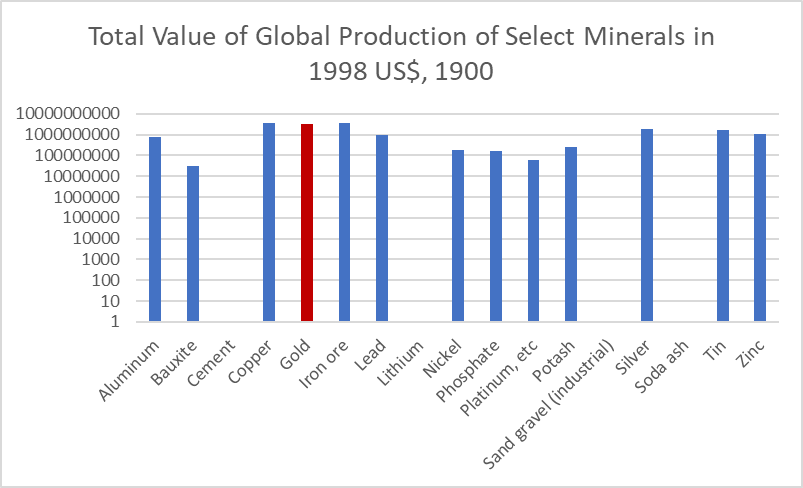
The two charts below show the respective values of total production for select commodities in 2018 and 1900.
Chart B. The value of global gold production in 2018 rivals all other commodities. (USGS) Chart C. This was true 120 years ago, as well. (USGS)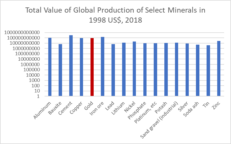
The log scale distorts the situation somewhat. Global iron ore production, for example, was over 20x larger than global lead production in 2018 (Chart B). From a bird’s eye view, however, this relationship has been constant. The tendency is for the total value of production in a given year to be equal across commodities.
Chart D, below, shows the same relationships for 1985 (the first year in which there is complete data for each of these commodities), except in this instance broken down by price and production levels. Gold is in red.
Chart D. Gold lies above the historical trendline of the price-production function. (USGS)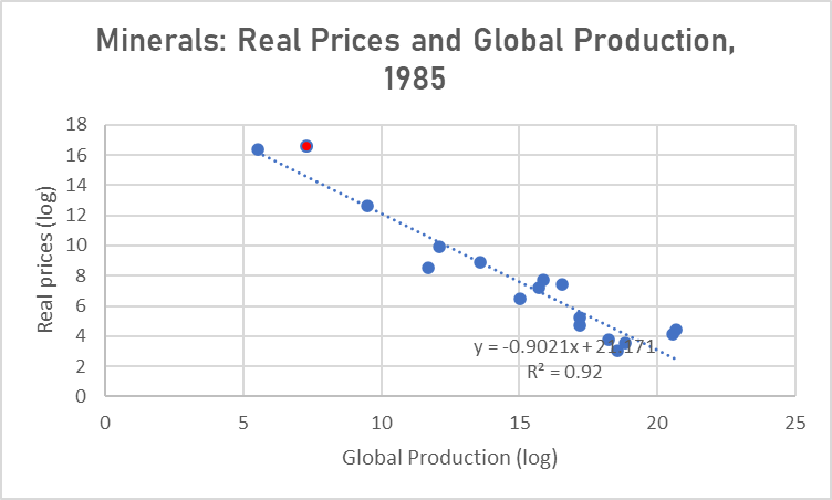
It is on charts like this that gold starts to stand out somewhat, since it consistently lies above the trend line, and it is the slope of the trend line which suggests that there is a tendency for it to decline at a rate somewhat above -1.0. That means that there is a tendency for cheaper commodities to be produced at slightly higher rates than the rule I proposed above suggests (wherein the relative price should be inversely proportional to the relative level of global production) or a tendency for plentiful commodities to be produced at a cheaper price than the rule suggests.
But, gold tends to violate this exception, so to speak, as can be seen in the charts above. Thus, in Chart D above, it is above the trendline, and in Charts B and C, gold’s total production value was at roughly the same level as aluminum, cement, copper, and iron ore—many of the most plentiful of these commodities.
The chart below shows that the slope has almost always been >-1.0.
Chart E. The price-production function has had a consistent relationship over the last 120 years. (USGS)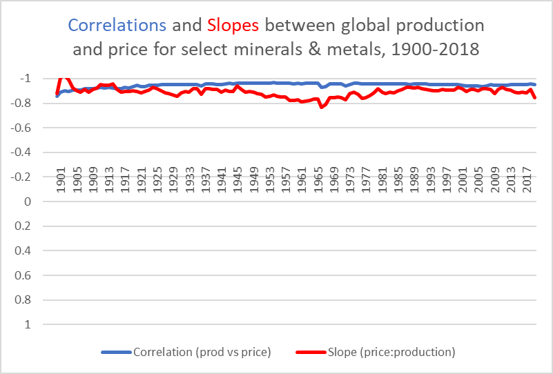
The chart below shows that gold has not only remained above the level implied by the historical slope values but even above the value of the rule I have suggested tends to govern relative commodity prices. In every year, even as late as the eve of the end of the suppression of gold prices in the 1970s, total gold production has remained above the average level of these commodities, which is only mathematically possible insofar as gold is above the level implied by a slope of -1.0.
Chart F. The value of gold produced in any given year has been more valuable than the average value of all other major minerals. (USGS)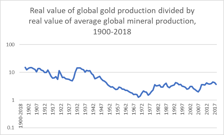
The charts below present these tendencies in somewhat greater detail. The next chart, for example, shows the direction of travel of these commodities in price and production between 1900 and 2019. Gold here is the light blue cluster in the top left quadrant.
Chart G. The price-production curve has been pushed to the right over the last 120 years. (USGS)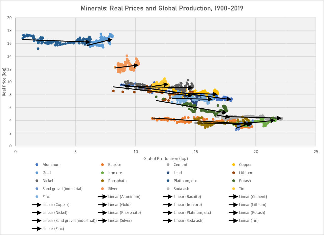
In order for this roughly -1.0 slope to remain intact over time, when a certain class of commodities should experience a significant increase in production levels (as with commodities like aluminum, bauxite, iron ore, fertilizers, and cement, among others), other classes of commodities have to “respond” through a comparable increase in production, a comparable increase in price, or some combination of the two.
So, in the chart below, I show all commodities that have had a tendency to rise in terms of production but fall in terms of price over the last 120 years (keeping in mind that about half of the commodities in this article do not have data going back the entire 120 years).
Chart H. The most plentiful minerals and metals have tended to fall in price over the last 120 years. (USGS)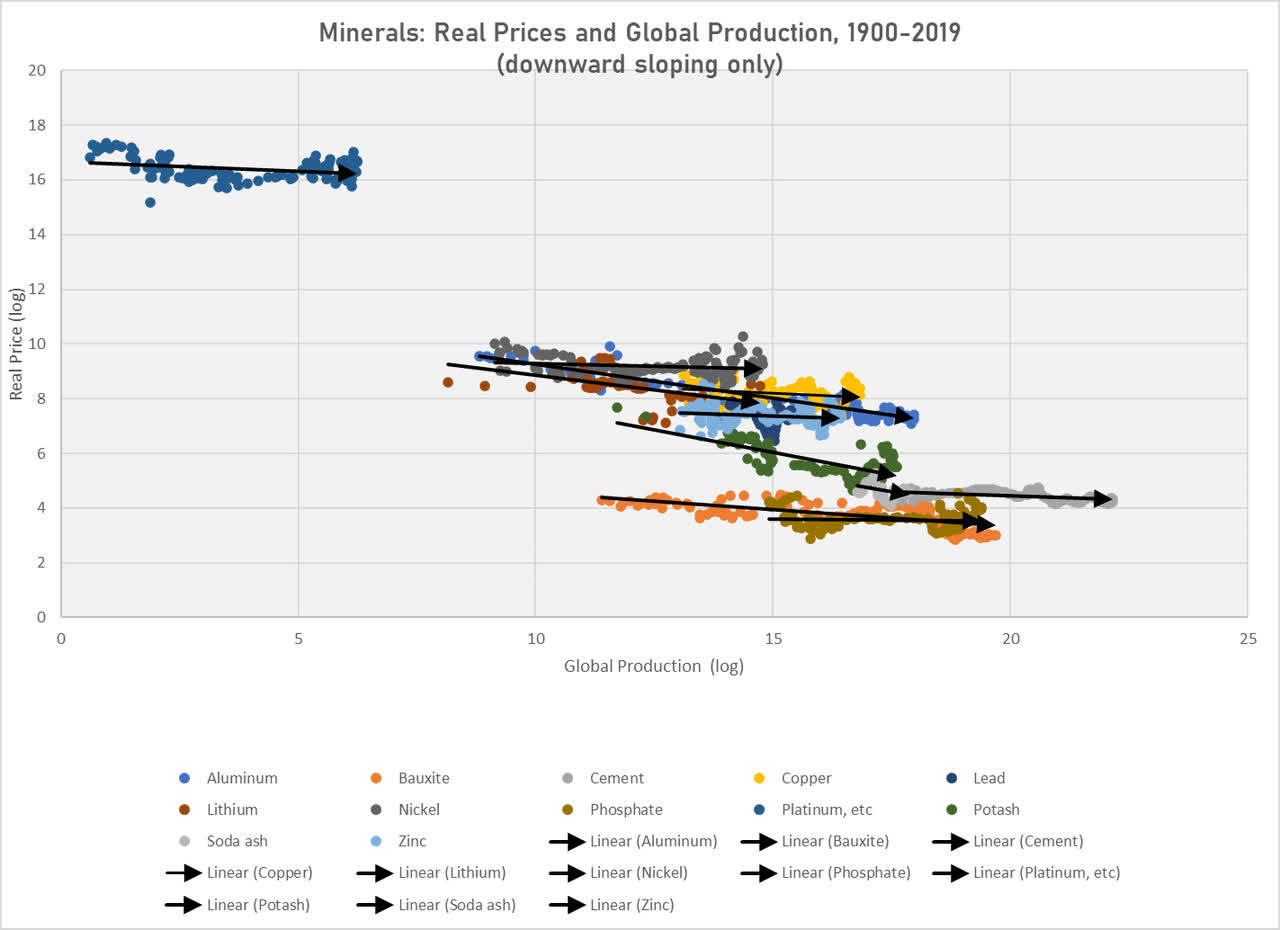
Compare this with commodities that have had a tendency to rise in price, shown in the chart below.
Chart I. Rarer metals have tended to push the curve by moving both up and to the right. (USGS)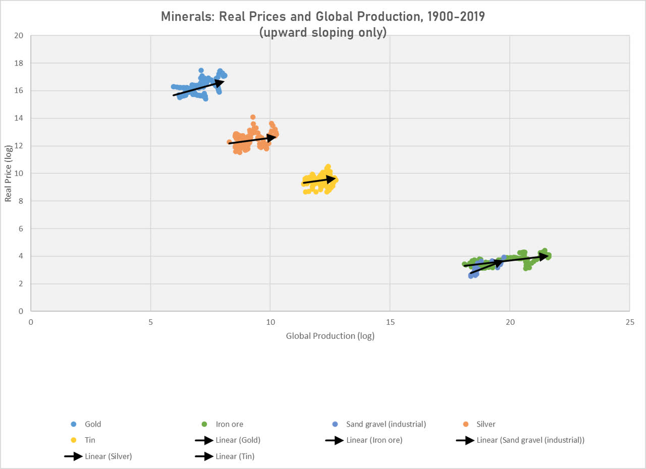
The commodities with lower levels of production tend to be found in the upper left quadrant (most notably, gold, silver, and tin). That is, the rarer commodities have a greater tendency to rise in price when the more plentiful commodities, located primarily in the bottom right quadrant, rise in production.
The advent of economic modernity and its spread across the world is found in the remarkable rise in the global production of these most basic commodities. Aluminum, bauxite, and phosphorate (but also the platinum metals) have seen tremendous growth in production levels.
Chart J. Gold remains at the leading edge of the curve. (USGS)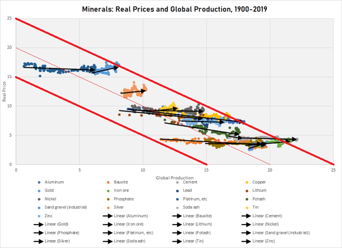
Gold has responded largely by rising in terms of price, despite being at a relatively high price from “the beginning”, in this instance the Year 1900 (as illustrated in Charts C and F).
Historically, the overall tendency has been for levels of production to increase to match price ratios. This is shown in the following chart in which I compare relative 1900 prices to relative 2018 production levels. The prices do a better job of predicting production levels 118 years down the road than do 1900 relative production levels predict either 2018 relative prices or production levels. It is almost as if the 1900 prices already more or less “understood” what production levels ought to be, which seems to explain why platinum metals, in contrast to gold, silver, and tin, grew in terms of production levels rather than price over the last 120 years.
Chart K. 1900 prices predicted 2018 global production levels. (USGS)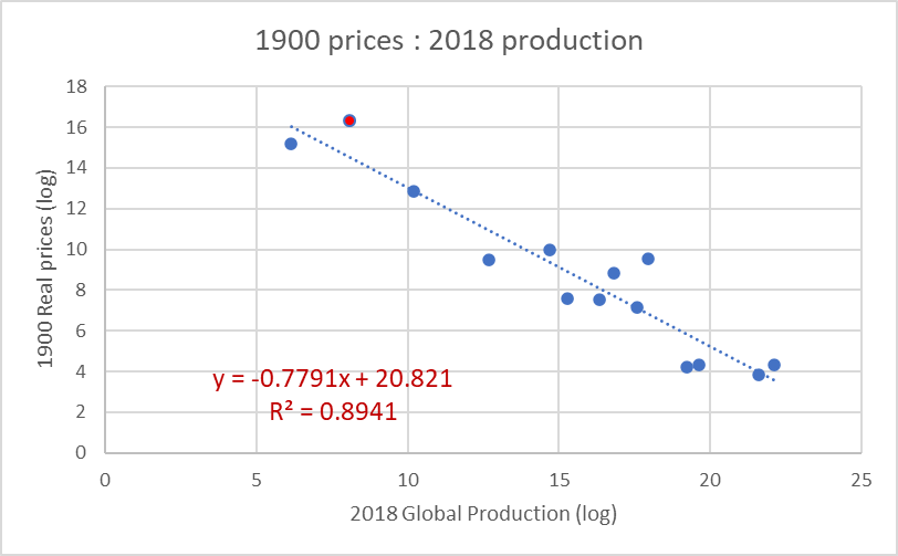
No matter how you slice it, however, gold, the red dot in the chart above, remains above the trendline. Gold, it would seem, has either greater industrial or commercial utility than is recognized, or it has some other utility that is not properly recognized in mainstream theory (as far as I am aware).
In some ways, prices in 1900 predicted 2018 levels of production even better than they predicted 1900 levels of production, shown below.
Chart L. Today’s real production levels are more closely clustered around 1900 prices than they were in 1900. (USGS)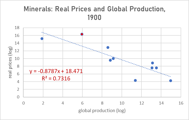
That the r-square value is higher in Chart K than Chart L while the slope is steeper in the latter than the former suggests that production was “catching up” to the 1900 price regime over the last century, and even overdid it somewhat.
In sum, gold generally adheres to this price-production commodity curve, but it does have some unusual qualities, particularly insofar as its total production value has consistently been above both the level implied by a slope of -1.0 and above the actual historical curves illustrated in the charts above. Somewhat surprisingly, the value of the gold produced in any given year is worth just as much as all of the copper or aluminum produced in that year, despite copper and aluminum each being more essential to the prosperity of the global economy—at least in the crudest utilitarian terms possible. That is a problem worth pondering, but the point that this section attempts to drive home is that, in essence, gold is fundamentally a commodity, but perhaps a prima inter pares, a first among equals.
The Gibson Effect
If we take this same data and separate the price and production values and spread them out over time, we get a fairly good snapshot of the history of the global economy over the last 120 years. The chart below shows average log levels of production (in blue) and real prices (in orange) for each year from 1900 to 2018.
Chart M. Much of the story of global markets can be told using historical minerals data. (USGS; author calculations and annotations)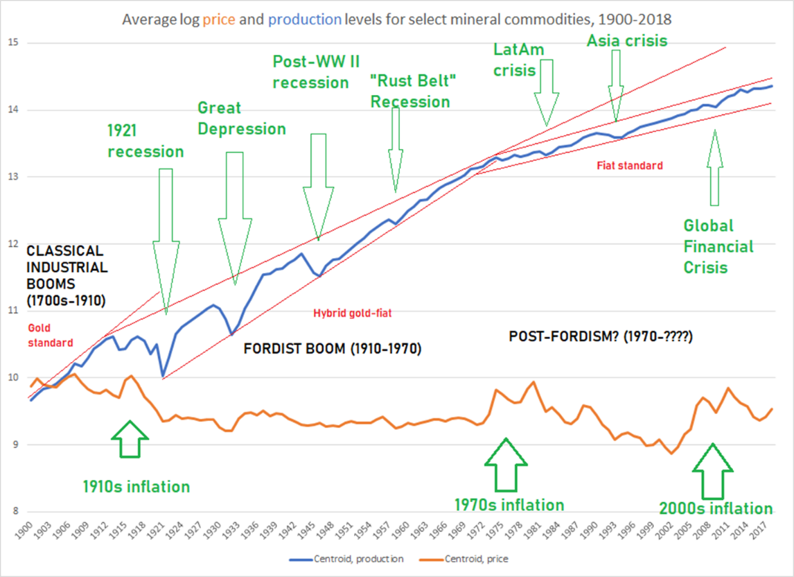
Major economic crises have often coincided with declines in global metals and minerals production and declines in real prices, but declining prices do not necessarily imply slowed growth.
After 1973, the price of gold was no longer pegged to the dollar. Once it was freed from this encumbrance, it began to trade largely in sympathy with the rest of the commodity complex, and commodities have historically always tracked the earnings yield on equities, as I first showed in my series, Inflation And Yields, nearly a decade ago. Below is an updated chart of this relationship, which I have argued is the true heir of the phenomenon behind what Keynes called “ Gibson’s Paradox”, the correlation between prices and bond yields under the original gold standard.
Chart N. Real commodity prices have always tracked the earnings yield. (Shiller, World Bank, St Louis Fed)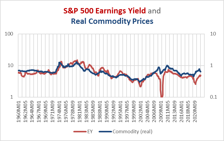
But, the precious metals, particularly the most precious ones—gold and platinum—have the greatest difficulty adhering to this correlation. The chart below shows that gold has had a tendency to drift higher, somewhat as we saw in the earlier examination of the commodity price-production curve.
Chart O. Real gold prices have had less of a tendency to the Gibson Effect. (Shiller; World Bank; St Louis Fed)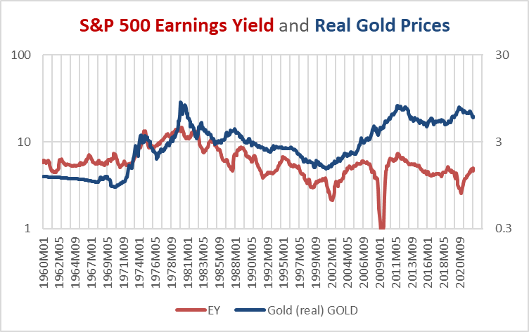
During the “secular” decline in the earnings yield from 1980-2000, real gold prices declined alongside real commodity prices. During the commodity boom of the 2000s, real gold prices and the earnings yield both rose. And since 2011, real commodity prices, including for gold, have had a tendency to drift lower, but it is obvious that real gold prices remain elevated, despite commodity prices and yields having fallen to extreme lows prior to the worst episodes of the pandemic (such as when oil prices went negative).
Again, the price of gold seems to move largely as the Gibson Effect would dictate, but there appears to be some other role that gold plays in the commodity complex and the market system as a whole. Gold is a commodity, but a very special one. I cannot explain this, but we can make further observations below.
Gold leads the market cycle
The word “cycle” here refers to the cyclical rate of change in a host of market factors, primarily centered around corporate earnings, industrial metals prices, and interest rates. I measure this cyclical rate of change either as a 16-month rate of change or the rate of change over a 36-month moving average (effectively a smoothed 18-month rate of change). I use these measures rather than year-over-year rates of change, because in my research, I have found these (like the 7.5-year rate of change) to contain information that others do not.
If earnings, industrial metals prices, and interest rates form the core of the market cycle, other factors such as energy prices, food commodity prices, textile commodity prices, GDP, and consumer inflation measures tend to remain in a near orbit, often with a range of lags. This is something I have described in greater detail in previous articles, most recently in a piece on commodity prices in March and in an article on industrial metals prices in June.
Precious metals are different in that they, especially gold, lead the commodity/inflation cycle by about 12-16 months. In other words, gold’s rate of change tends to peak or trough about a year or so before the commodity/inflation cycle does. This effect is clearest in the relationship between gold and the typically late-cycle commodity categories of grains, fertilizers, and energy (commodities that seem to be expungable).
I do not want to exaggerate this, however. The correlation between the 16-month gold cycle and the 16-month cycle in the World Bank energy index 16 months later is about 0.34 in the 1967-2021 period. For the World Bank grains cycle, it is 0.36. And, for fertilizers 0.28. For the base metals index, it is 0.08—virtually nothing.
But, I think this is not the best way to measure this effect. Gold, as we have seen in the earlier section, is itself a commodity, and commodity prices have this built-in tendency to move together. In the chart below, I present the precious metals (in green), oil (in blue), and corporate earnings (in red) cycles. Especially in the commodity supercycles of the 1970s and 2000s, the most obvious phenomenon is the near-simultaneous booms in precious metals and energy prices.
Chart P. Precious metals cycles tend to lead earnings and commodity cycles. (World Bank, Shiller)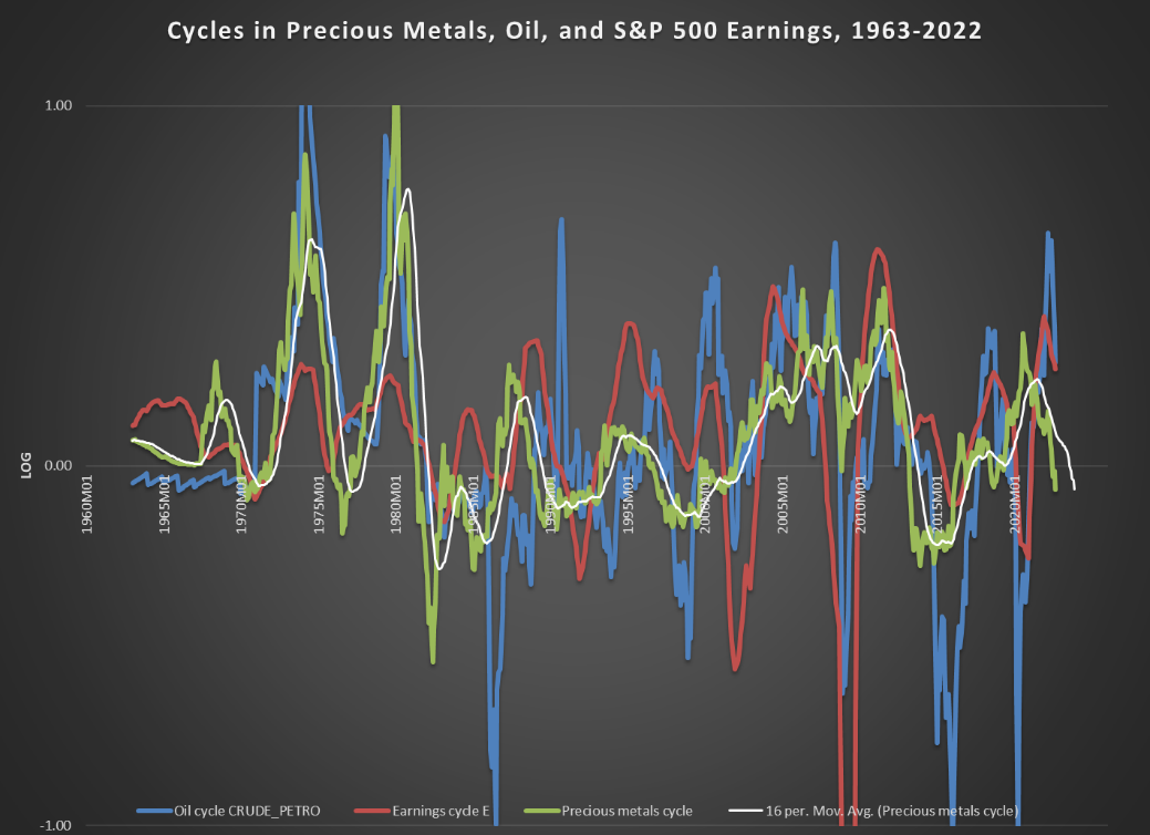
With my naked eye, I can see a secondary correlation between peaks and troughs in the moving average of the precious metals cycle (the thin white line in the chart above) and the oil and earnings cycles, but this is perhaps more tiring than convincing.
Rather, the most predictive correlation appears to be gold price-ratios and the subsequent performance of market cycles. For example, if you take the ratio of, say, the gold price to S&P 500 earnings and compare it to the subsequent 16-month rate of earnings growth of 1961-2021, the average correlation of the two (that is, gold/earnings ratio vs subsequent earnings growth) was 0.42. Do the same things with industrial metals, and the correlation is 0.57; energy 0.59; fertilizers 0.58; and grains 0.57.
One of the weakest correlations between a particular gold/commodity ratio and that commodity’s price cycle is with aluminum. The average correlation between the gold/aluminum ratio and subsequent aluminum performance has been 0.42. The chart below shows those 16-month rolling correlations and a 7.5-year moving average of those correlations.
Chart Q. The gold/aluminum ratio is more predictive of the aluminum cycle than not. (World Bank)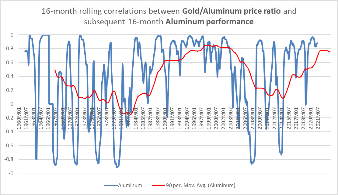
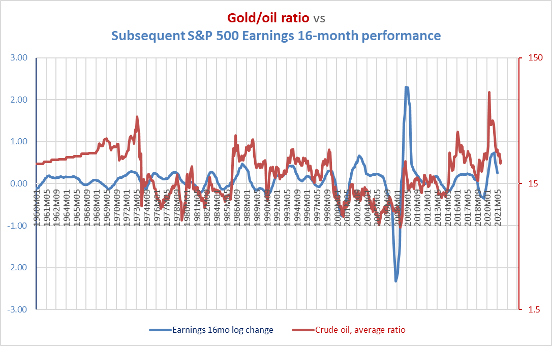
More often than not the gold/aluminum ratio has anticipated future cyclical momentum. As the chart below suggests, the gold/oil ratio has been a fairly consistent predictor of subsequent oil price cycles.
Chart R. The gold/oil ratio has been a good predictor of oil price cycles. (World Bank)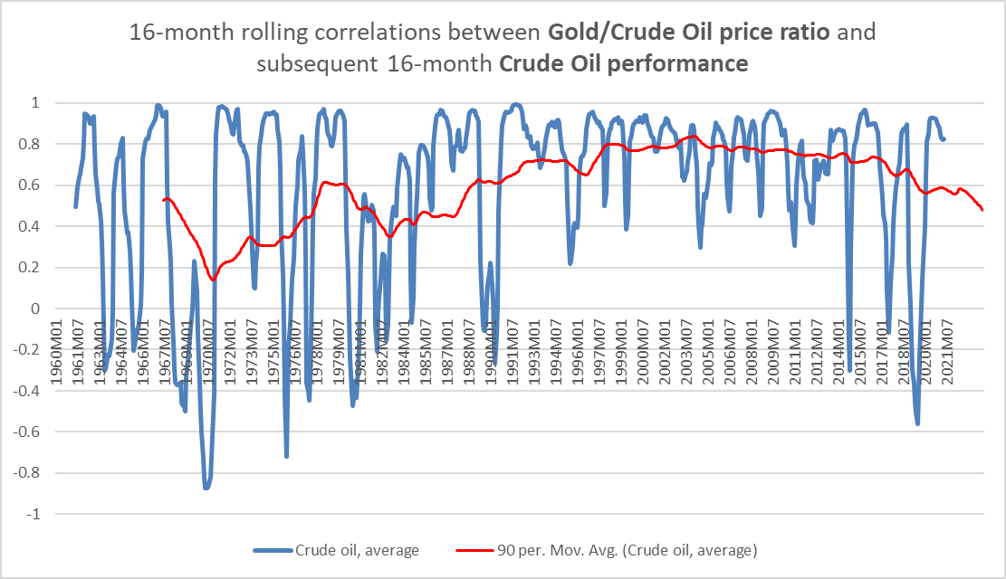
In other words, a peak in the gold/oil ratio tends to point to a peak in the rate of change of oil prices 16 months later.
Let’s look at an unusual comparison mentioned above: the gold/earnings ratio (black in the chart below) versus subsequent earnings growth (red).
Chart S. The gold/earnings ratio appears to often anticipate the earnings cycle. (World Bank, Shiller)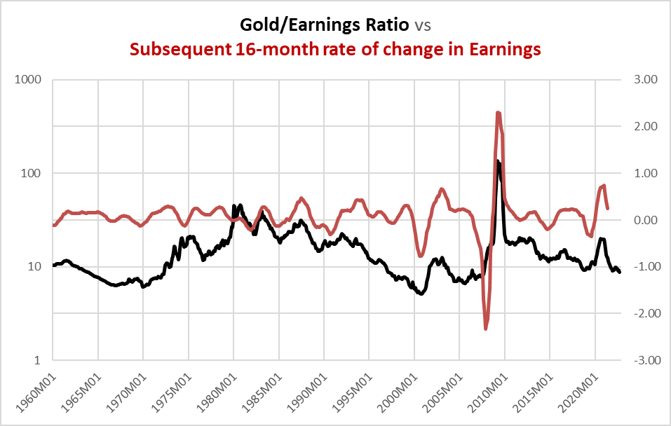
The average correlation is a modest 0.42, with particularly big misses in the 1975 recession and the Global Financial Crisis of 2008-2009.
Chart T. The gold/earnings ratio often anticipates earnings cycles. (World Bank, Shiller)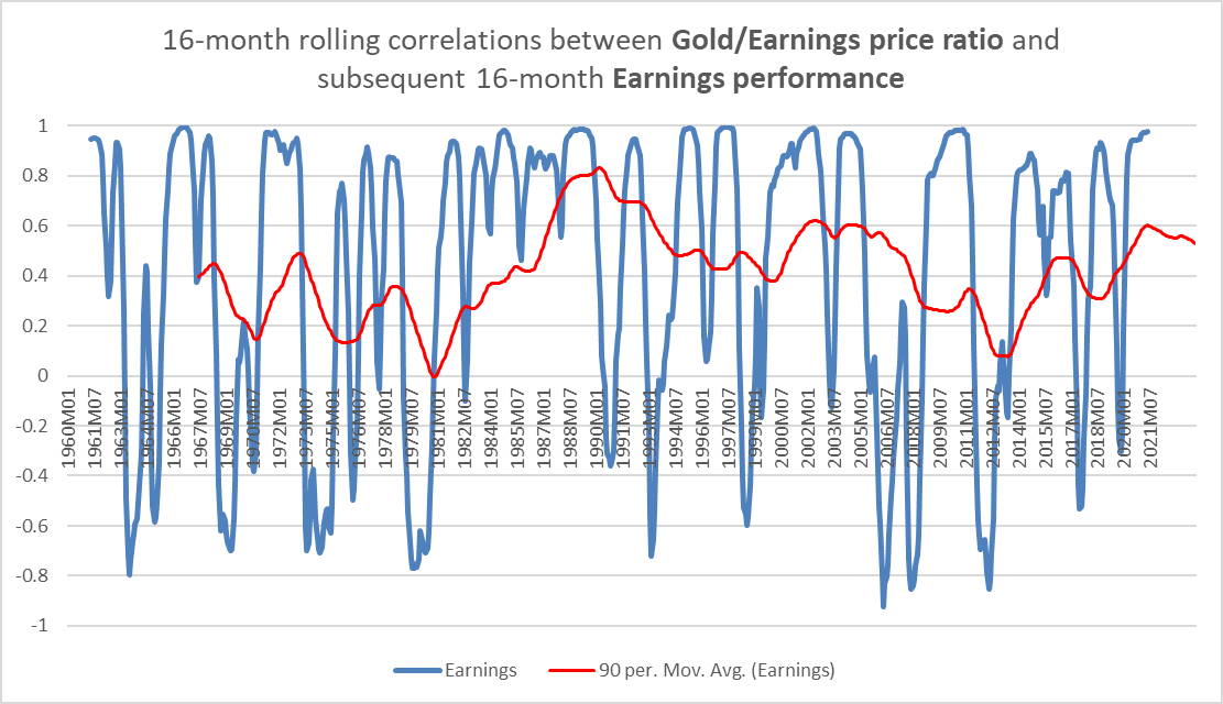
With the price of gold falling faster than corporate earnings, history suggests (all else being equal) that earnings growth will likely continue to decelerate into early 2024. By itself, that does not necessarily mean that earnings growth will be negative—although with earnings already in absolute decline, it would perhaps be foolhardy to ignore that danger. Gold ratios are not great at predicting absolute levels, as the chart below suggests.
Chart U. The gold/earnings ratio does not do a good job of anticipating subsequent earnings levels. (World Bank, Shiller)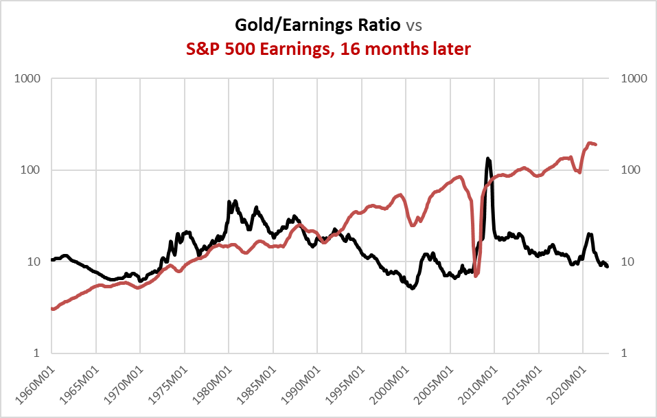
The absolute decline in the gold/earnings ratio simply suggests the possibility of a cyclical deceleration in earnings growth, albeit perhaps to the extent that earnings growth will be negative for an extended period of time (i.e., into 2024).
There is one more thing to note, however, in connection with this. The gold/earnings ratio has been a fairly good indicator of long-term stock market returns over the last 60 years. Extreme peaks in the ratio (as in 1980 and 2009) marked the beginnings of major bull markets (1980-2000 and 2009-2021?, respectively) while extreme troughs, as in 1970 and 2000 were followed by “secular” bear markets (1970-1980 and 2000-2009, respectively). So far, the gold/earnings ratio has not gotten as low as it did in 1970 or 2000, but even at the current level, long-term equity returns have not been good historically at these levels.
The persistence of these relationships suggest that the correlations are not spurious. So, what is going on? It is hard to say much beyond what is staring us in the face: the inflation impulse runs through different elements of the market—precious metals, industrial metals, consumer inflation, corporate earnings, stock prices, bond markets, etc—at different but rather regular rates. The current obsession with “peak inflation”, although understandable for many reasons, does not make much sense from an analytical perspective, unless one is thinking about where inflation will flow to next, if at all.
All else being equal, the current decline in gold points to disinflation and outright deflation in a number of key markets and factors: commodities, earnings, and bond yields.
Chart V. The gold cycle has been in decline since August 2020. (Stockcharts.com)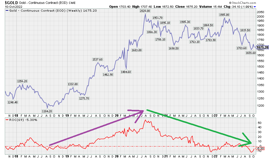
The chart below shows the gold/oil ratio which happens to be useful for anticipating a variety of phenomena beyond just oil.
Chart W. The decline in the gold/oil ratio has anticipated a cyclical peak in oil prices. (Stockcharts.com)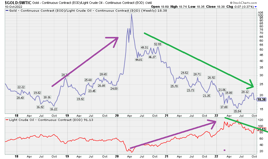
At first glance, it might appear that the ratio is controlled by the commodity in the denominator of the ratio, i.e., oil, but actually gold is just more ponderous. Gold and oil (and most commodities) tend to trade within certain ranges relative to one another, and these ratios appear to be “predictive” of the market cycle. The two gold-oil charts below reiterate this point: this ratio appears to anticipate both the oil cycle and the earnings cycle. This is most likely because of the way inflation flows through global financial systems and the global economy.
Chart X. The gold/oil ratio has been a fairly consistent predictor of the oil cycle. (World Bank) Chart Y. The gold/oil ratio even appears to anticipate the earnings cycle. (World Bank, Shiller)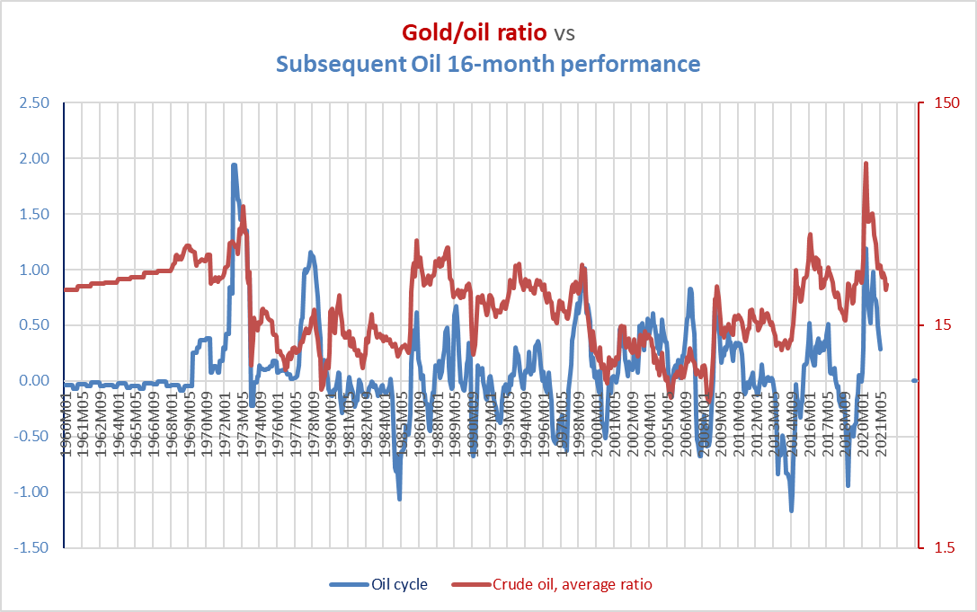
When inflation flows through markets at uneven but orderly rates, it is hard to figure out how the Fed would ever be able to manage outcomes through attempting to mash the levers of the rate of change of consumer prices and the unemployment rate. Both consumer inflation and unemployment are lagging indicators. By the time you get around to reacting to them, it is very likely too late, and whatever you do might only accelerate, or even create, subsequent imbalances.
There seem to be very few slam dunks in life or in markets, but the weight of historical evidence points to disinflationary forces materializing across all elements of the cycle, including commodities, earnings, and interest rates for some time to come. This disinflation has made itself felt already to some degree in commodities and earnings, but only unevenly in long-term Treasury yields. Presumably, as downward earnings surprises materialize, the pressure to take refuge in long-term Treasuries will start pushing yields down (albeit possibly from levels higher than where they stand now). At the moment, however, it does not look as if the bond yield cycle has broken (see the red line in the chart below).
Chart Z. The Treasury yield cycle has proven to be quite resilient this cycle. (Stockcharts.com)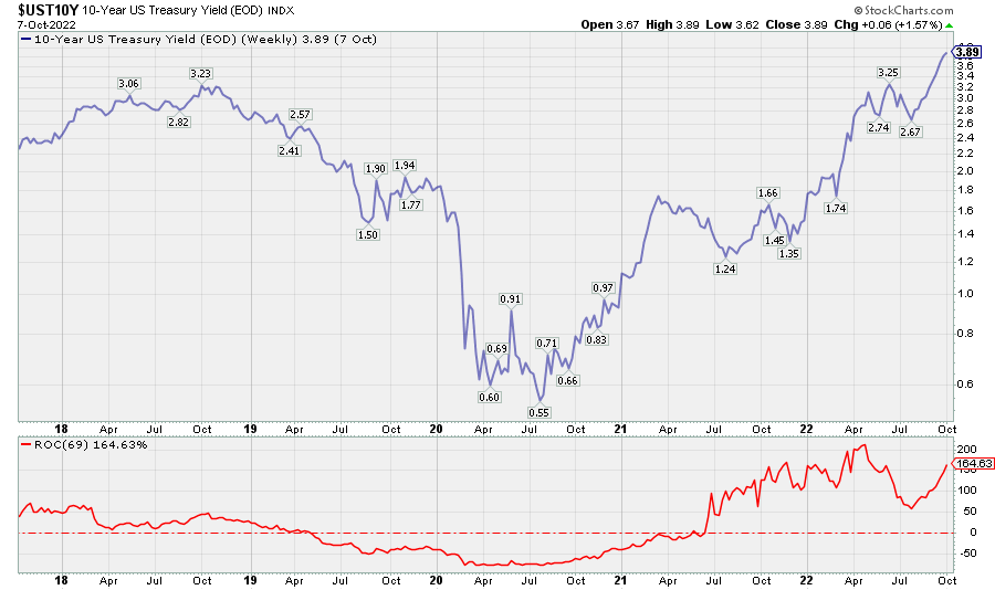
Setting aside the present state of bond yields, however, which we will come back to later as a possible determinant of the current price of gold, the indication is of a rapidly dying inflation impulse that will not revive perhaps until 2024.
Gold lags the commodity supercycle
Earlier, we saw how gold tends to track both the commodity complex and the earnings yield, in line with the Gibson Effect. And, we also just saw how cyclical changes in gold lead cyclical changes in earnings, commodities, and bond yields.
But, gold also tends to lag commodity supercycles. For reasons I have argued in the earlier pieces on commodity prices, I do not think that we are in a commodity supercycle now but rather that we are coming out of an exaggerated commodity cycle.
Chart AA. Gold prices tend to spike at the conclusion of commodity supercycles. (World Bank, Shiller)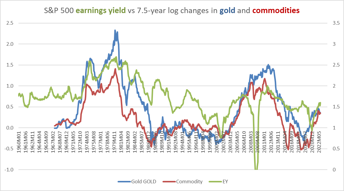
The only two confirmed commodity cycles of the last 60 years were in the 1970s and 2000s, as the chart above shows. Gold’s behavior appears to change depending on whether or not commodities are in a “secular” bull market—a so-called commodity supercycle—or in a “secular” bear market. Notice, for example, the gold/oil ratio’s behavior over the course of the last sixty years in the following chart.
Chart AB. Periods of high commodity prices tend to see gold lag until the end, then remain high during disinflation. (World Bank)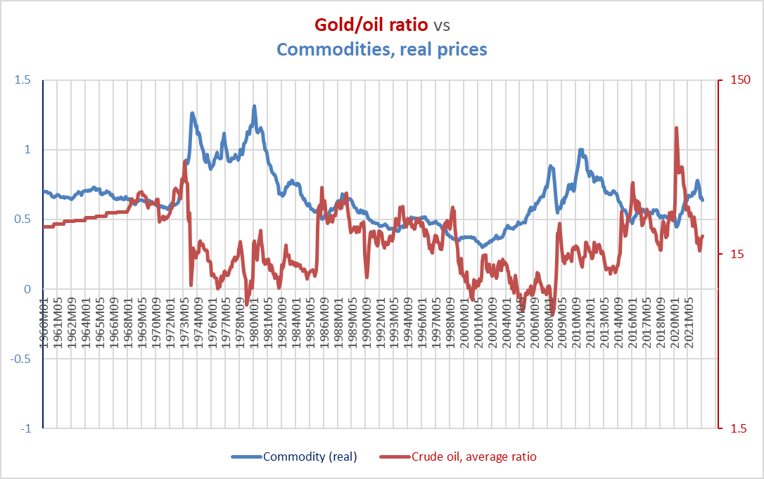
As we saw earlier, a high gold/oil ratio tends to point to high cyclical inflation in commodities and other cyclical measures just around the corner, but at “secular” durations, the opposite is the case. During these commodity booms, gold tends to lag.
Chart AC. Gold ratios start moving higher near the end of commodity supercycles. (World Bank)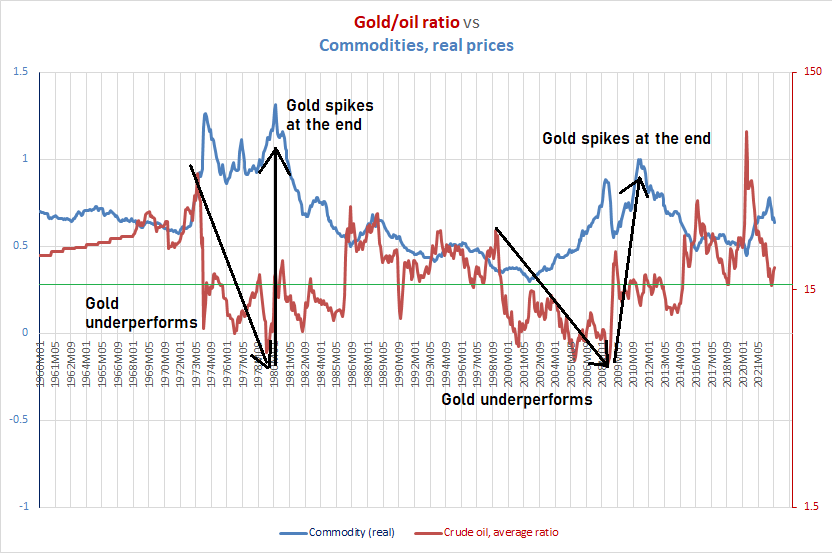
It then spikes at the conclusion of the commodity boom, as it did in 2011. A spike in gold (and silver, too) during a commodity boom is often a kiss of death for commodities, not the beginning of a hyperinflationary episode.
Chart AD. Gold prices spiked in 2011 at the conclusion of the commodity supercycle. (Stockcharts.com)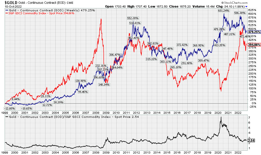
This suggests that gold’s very high absolute levels relative to commodities point to our being in a period of secular disinflation. It is difficult to write that sentence when we have been in a period where consumer inflation is at the highest level in 40 years, but our brief period of free-floating gold prices suggests as much.
Gold is a defensive commodity
When the cycle turns down, typically gold outperforms other commodities (especially energy, metals, and fertilizers) and corporate earnings. In other words, cyclical rates of change in these factors are typically the inverse of their gold ratios. We saw that earlier in Chart W where the gold/oil ratio was contrasted with the price of oil itself.
Thus, we have seen gold remain high relative to these factors as the cycle has turned down. It is likely, therefore, that as the cycle continues to turn down that gold will outperform.
Chart AE. Many commodity cycles move with their respective commodity/gold ratios. (World Bank)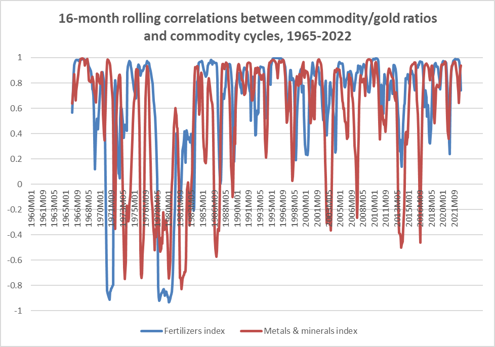
If one believes that we are in a new commodity supercycle, gold will likely do very well in the medium- to long-term, and if one believes that we are in a commodity downcycle, then going long gold is a way to lower downside risk relative to other commodities.
In recent years, metals/gold price ratios have tended to move with long-term Treasury yields, thereby creating an effect whereby the price of gold has tended to move with the ratio of industrial metals prices to bond yields.
Chart AF. Gold often seems to track the ratio of industrial metals prices to the level of long-term Treasury yields. (World Bank, St Louis Fed) Chart AG. Falling commodities and rising yields may be putting pressure on gold price. (World Bank, St Louis Fed)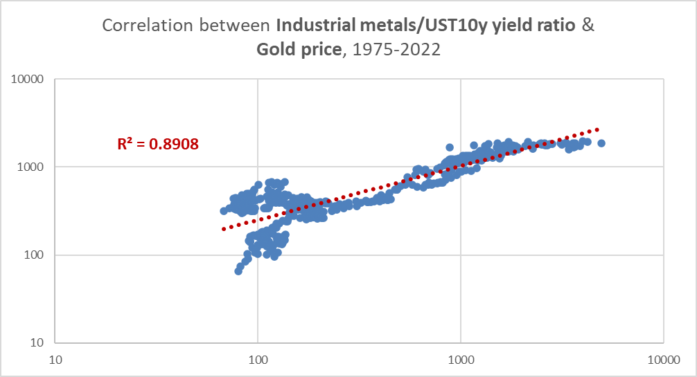
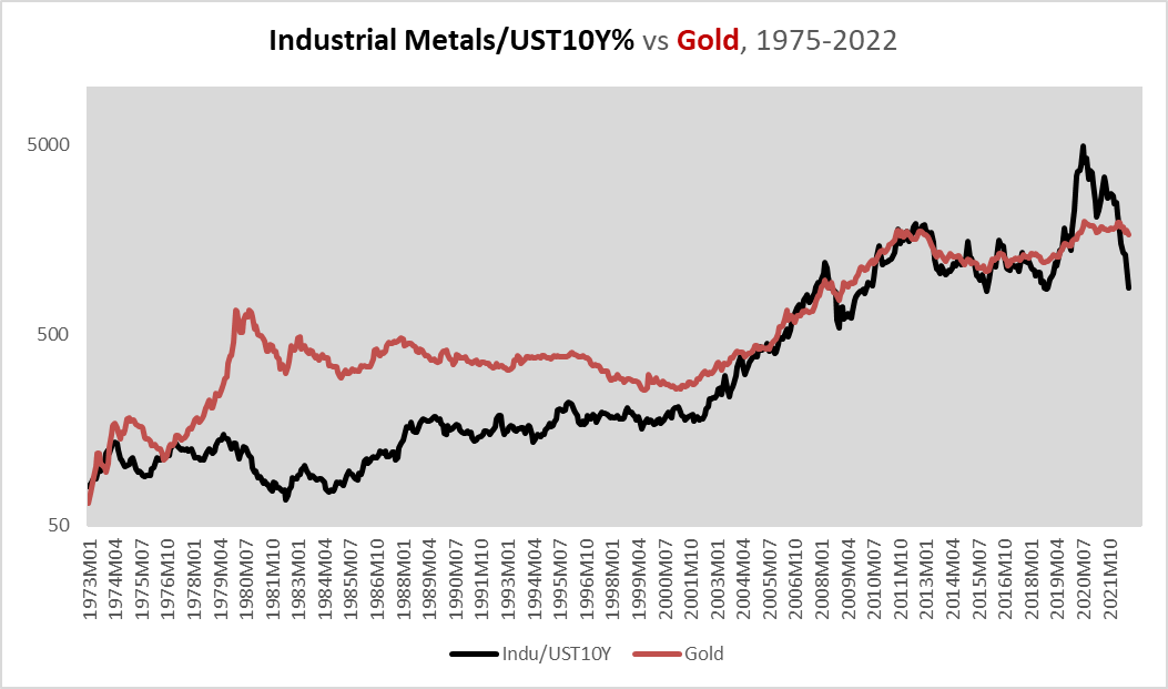
This suggests that, as long as industrial metals keep falling (which seems likely) and bond yields keep rising (less likely), or so long as industrial metals decline faster than yields fall, gold will be under pressure to decline.
What about the relationship between gold and equities?
Gold has risen in every secular bear in equities of the last century
Let’s go back to the dataset we used in the first section. In the chart below, I show seven-year rates of change for all of the mineral and metal commodities we covered there in the 1907-2019 period, with gold marked in black, and green arrows pointing to the three decades of “secular” bear markets in equities during that period (the 1930s, 1970s, and 2000s).
Chart AH. Gold rose during each of the three secular bear markets of the last century. (USGS)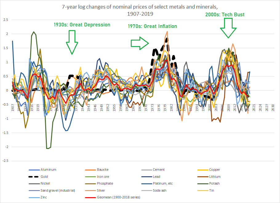
Gold (and, curiously, bauxite) were the only commodities to consistently rise during each of those periods. Even during the general deflation of the 1930s, the price of gold rose. This rise occurred through the US government raising the official price of gold, so it is difficult to say if gold would rise during a similar deflationary crisis, but as the previous sections show, the post-gold standard era has seen gold outperform in both equity bear markets and periods of disinflation (relative to other commodities).
Gold is money
This article has focused on the history of gold prices over the last 120 years, but gold’s history runs much farther back than that, of course. By virtue of its unique combination of physical properties, gold has been used for millennia as money across civilizations. Over the course of that history, gold would have provided protection against the occasional attempts to debase currencies, particularly in times of war, and from deflation, where gold would, by definition, have outperformed everything else. Even today, gold is treated as a currency under Basel III banking regulations.
Conclusion
Gold’s history of the last 120 years suggests that it still contains this ability to protect against the risks of both very high inflation and extreme deflation, by virtue of its own characteristics and the needs of the market continuously expressed over centuries.
Chart AI. The markets look to gold to ward off inflation, deflation, and all manner of financial pestilences. (Wikipedia, annotated by author)
Thus, gold has offered consistent protection against periods of very high inflation, periods of commodity deflation, and “secular” bear markets in equities. We might call these passive functions. Gold, for example, lags commodity booms. Gold outperforms other commodities during deflationary periods, but this is because the other commodities tend to be more volatile. Gold does well during “secular” bear markets in equities less because of any clear gold-related impetuses than because of more generalized conditions in financial markets.
But, it appears to have more active functions, as well, particularly in the way it anticipates inflation cycles in commodities, earnings, and yields. Right now, gold is in a state of cyclical decline. That points to a likelihood of continued deflationary pressure in the centermost cyclical indicators—industrial commodities, corporate earnings, and yields—perhaps going well into 2024.
In the chart below, I am showing the 69-week (about 16 months) rate of change in gold prices (in brown) and the real price of copper (in red) to show how a simple indicator can be built out of this lead-lag relationship. Overlaying the 69-week rate of change is a 138-week moving average (69×2=138). The point at which the rate of change in gold crosses its 138-week moving average has often marked a turning point in the price of copper. The red and green arrows identify cherry-picked instances in which this simple indicator may have provided some warning about subsequent performance in copper.
Chart AJ. The decline in gold likely points to declining commodity prices for some time into the future. (Stockcharts.com)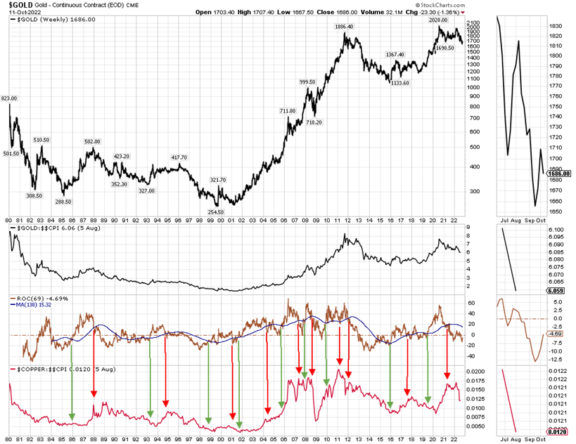
I have never used this indicator before and would not recommend using it in the absence of a larger thesis about the totality of markets, but readers could create more sophisticated indicators using this lead-lag relationship.
In the context of an overall bearish outlook for equities, which I have outlined in multiple articles on Seeking Alpha, from the need to unwind long-term sectoral imbalances and unsustainably high valuations and earnings growth to the exhaustion of a technological supercycle and the prospect of rising long-term global political instability to the end of cheap energy, lots of things have been pointing to a new order in global markets.
Gold plays a complicated role in the global economy that cannot be easily reduced to slogans. Even as a slowing economy with falling commodity prices and rising yields points to continued downside pressure for gold, the long-term prospects for gold look more promising. A long-term bear market in equities lasting to the end of the decade and perhaps well into the 2030s is likely to provide long-term support for gold. Buying into a physically-backed ETF like SPDR Gold Shares (GLD) may be prudent, particularly if one has a long-time horizon (7-20 years), but is probably not a good way to make a quick buck in this market. I assign GLD a “Hold” rating, because I expect continued weakness in commodities, but the metal also has the potential to significantly outperform other commodities and global stock indices.
Be the first to comment