

fotosipsak/E+ via Getty Images
1. Correction Drivers Update:
- EPOL [Poland ETF] (geopolitics proxy): relief rally stalled
- LQD [IG Credit ETF] (credit/rates): new lows as bond yields spike
- ARKK [New Tech Fund] (tech burst): lower highs, rolling over again
Thus, my overall sense: path of least resistance = lower
@Callum_Thomas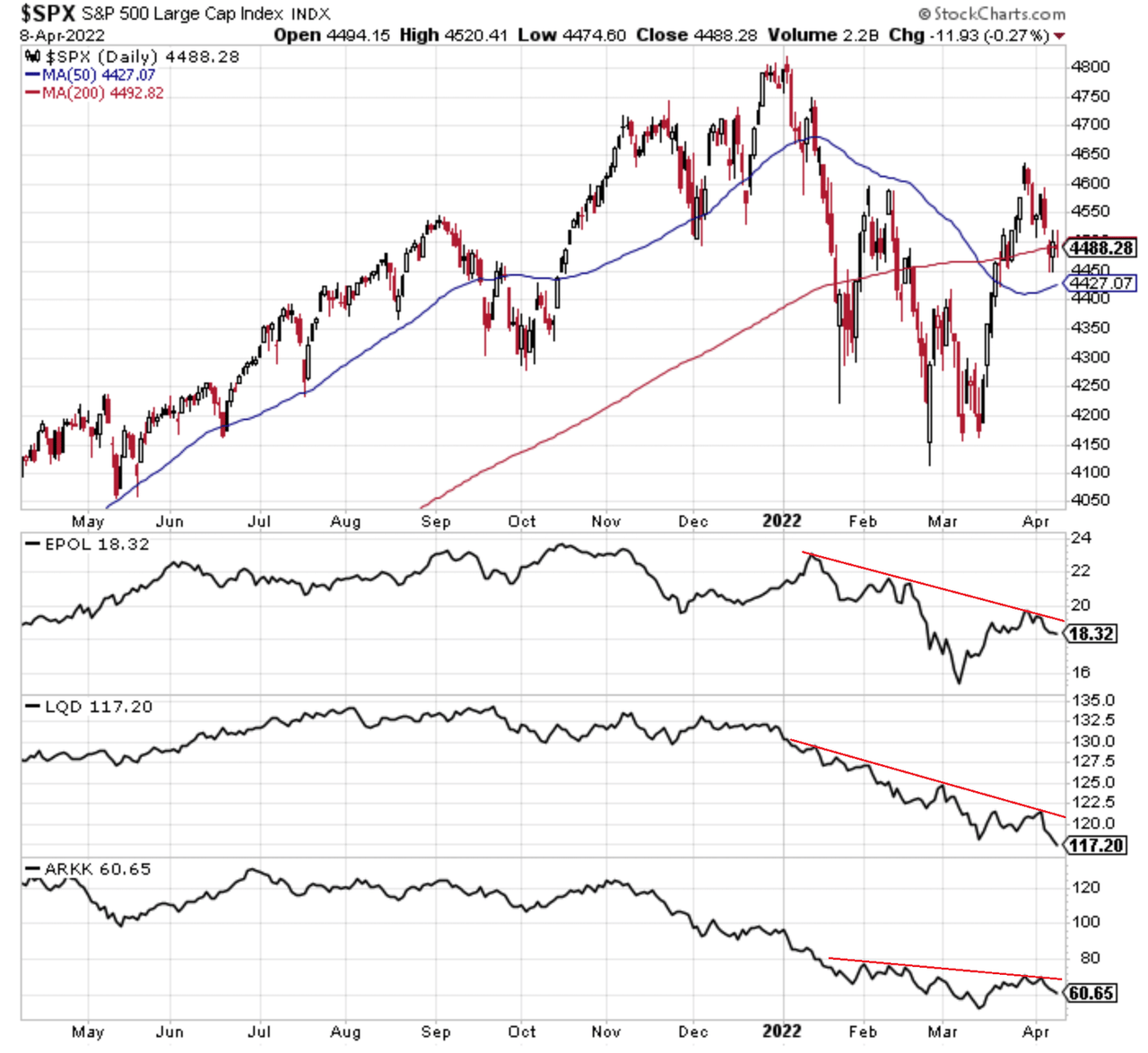
2. Big Trouble in Small Tech: Seems small cap tech stocks are struggling to keep up. For that matter, small caps in general have been a picture of weakness, and tech still seems vulnerable. I would call this breakdown here a red flag.
@adaptiv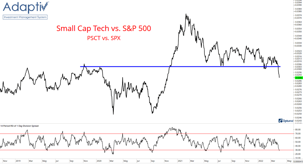
3. Stock Correlations: Can deduce from this chart that the correction saw big rotation, whereas the rebound however floated all boats…
Correlations spike during times of panic selling and panic buying: especially when it’s a generalized risk-on/off move, and especially accentuated by passive flows.
@DrewTheCharts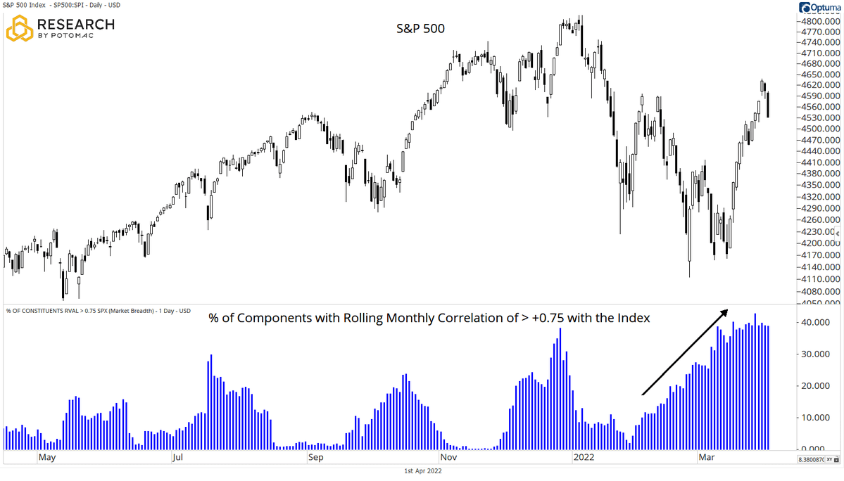
4. Recession vs Correction: “March 8th was likely the bottom unless we witness a recession.” (J.P. Morgan’s Michael Cembalest). So basically: tell me if we’re headed into recession, and I’ll tell you what the market’s going to do…
@SethCL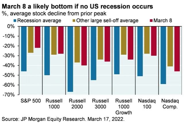
5. Stock Market vs Recessions: Market seems to typically stall about 6 months before the official beginning of a recession according to this chart.
Bear Market Warnings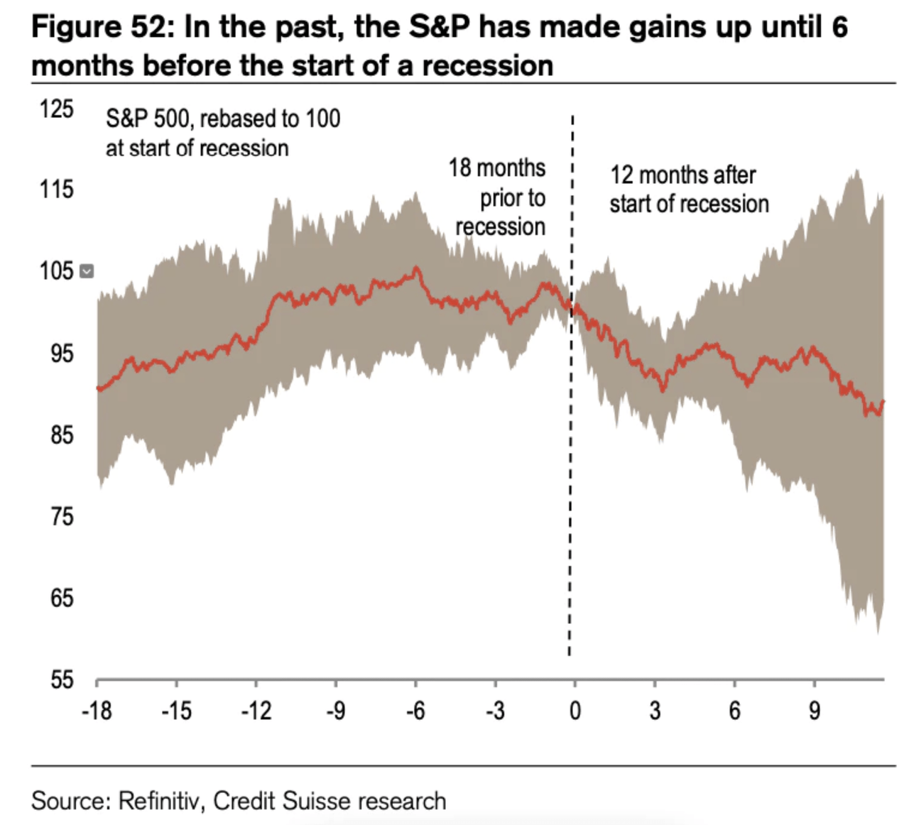
6. Earnings Revisions: It was always going to be hard to maintain the post-pandemic rebound momentum, but this looks like a fairly clear red flag for growth/earnings…
@MrBlonde_macro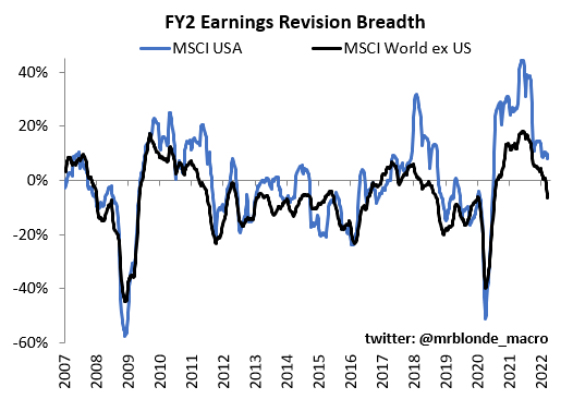
7. Big Stock Earnings Impotence: Seems like the top 10 stocks are no longer on top when it comes to earnings contribution to the S&P 500…
@SoberLook via @jessefelder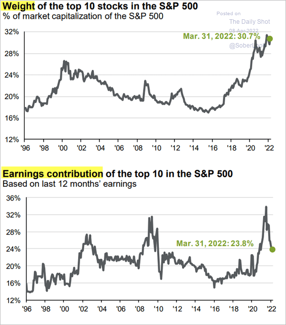
8. Peak Profit Margin?
@MaverickBogdan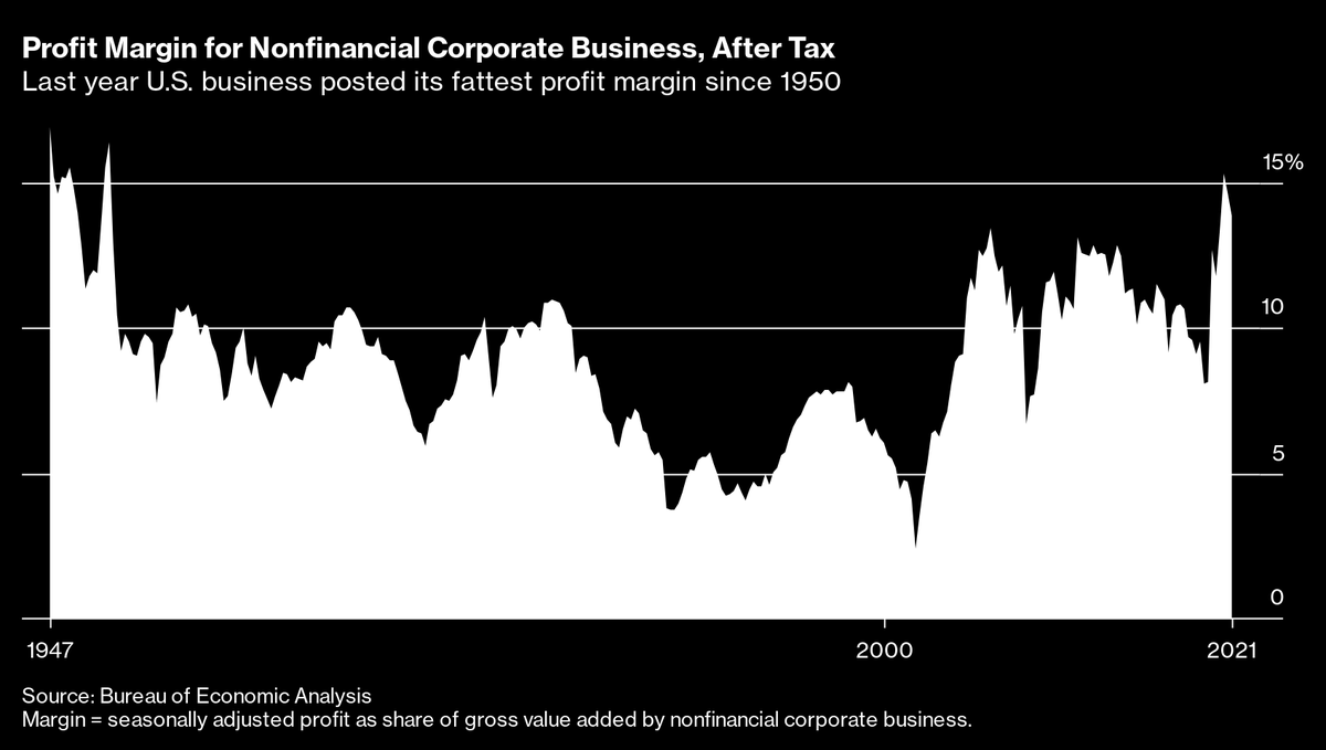
9. Sectors and Bubbles: Interesting thing to me on this chart is (not annotated) Energy basically had an echo-bubble in the late-2000s. One could argue that Tech is currently in the middle of an echo-bubble… (or maybe it’s just the “new normal”, as many assert).
@SamRo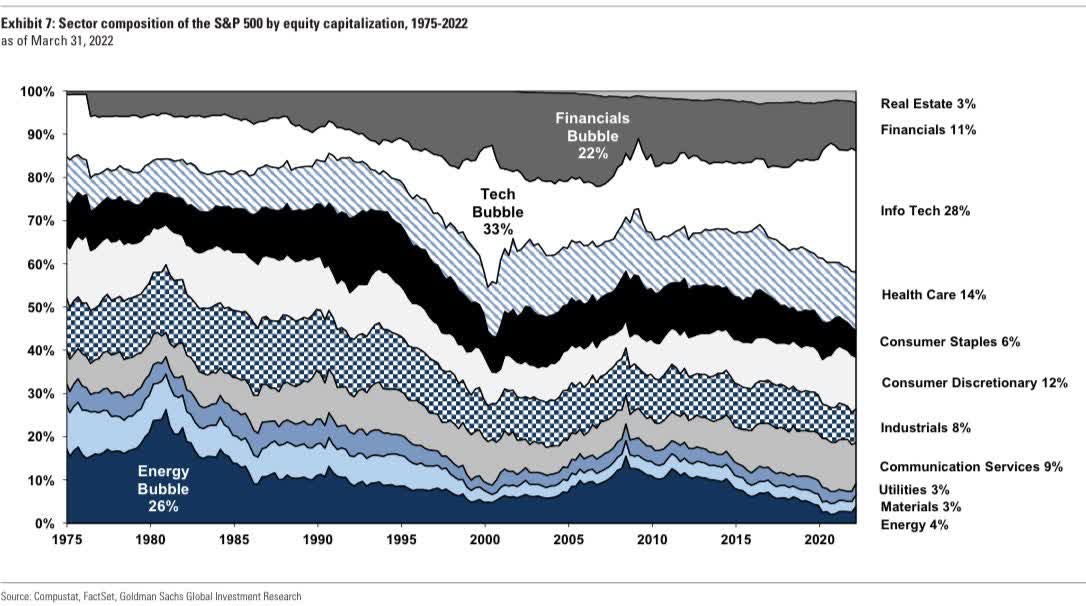
10. Space Investing to the Moon!!
The Space Investor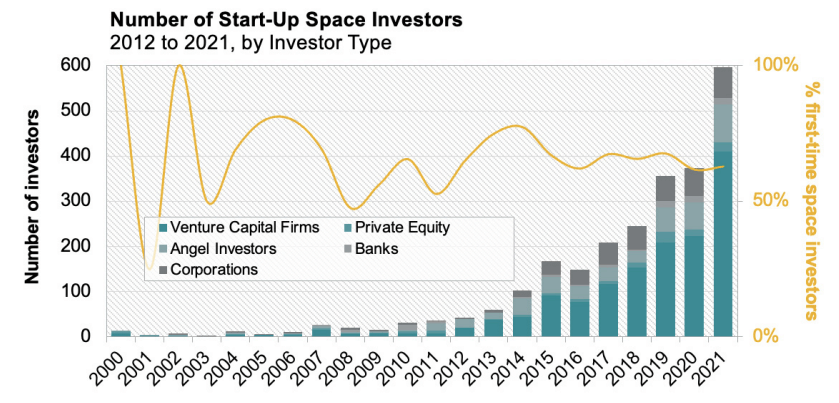
Thanks for following, I appreciate your interest!
oh… that’s right, almost forgot!
BONUS CHART >> got to include a goody for the goodies who subscribed.
Dividend Yield vs Bond Yield: as some have pointed out, the spread between the dividend yield of the S&P 500 vs the US 10-Year Treasury yield has dropped to multi-year lows. But how unusual is this?
Not very: in fact, the existence of a positive yield spread is actually relatively unusual in the scheme of things, judging from this chart.
Topdown Charts, Refinitiv Datastream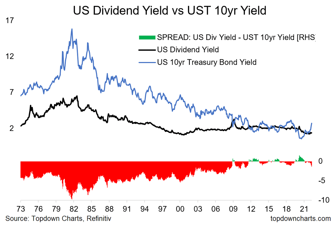
That’s not to say that rising yields are not potentially problematic for equities (i.e., rising yields squeezes the equity risk premium, presents headwinds to growth, and complicates things for longer-duration growth stocks).
So, I think probably the more interesting thing in this chart is less about the spread, and more about the movement in yields. Bond yields are on the move as inflation shifts higher, geopolitical shockwaves ripple, and the Fed pivots into rate hikes and balance sheet normalization…
Be the first to comment