

Bigpra
This monthly article series shows a dashboard with aggregate industry metrics in utilities. It is also a top-down analysis of sector ETFs like the Utilities Select Sector SPDR ETF (NYSEARCA:XLU), whose largest holdings are used to calculate these metrics.
Shortcut
The next two paragraphs in italic describe the dashboard methodology. They are necessary for new readers to understand the metrics. If you are used to this series or if you are short of time, you can skip them and go to the charts.
Base Metrics
I calculate the median value of five fundamental ratios for each industry: Earnings Yield (“EY”), Sales Yield (“SY”), Free Cash Flow Yield (“FY”), Return on Equity (“ROE”), Gross Margin (“GM”). The reference universe includes large companies in the U.S. stock market. The five base metrics are calculated on trailing 12 months. For all of them, higher is better. EY, SY and FY are medians of the inverse of Price/Earnings, Price/Sales and Price/Free Cash Flow. They are better for statistical studies than price-to-something ratios, which are unusable or non-available when the “something” is close to zero or negative (for example, companies with negative earnings). I also look at two momentum metrics for each group: the median monthly return (RetM) and the median annual return (RetY).
I prefer medians to averages because a median splits a set in a good half and a bad half. A capital-weighted average is skewed by extreme values and the largest companies. My metrics are designed for stock-picking rather than index investing.
Value And Quality Scores
I calculate historical baselines for all metrics. They are noted respectively EYh, SYh, FYh, ROEh, GMh, and they are calculated as the averages on a look-back period of 11 years. For example, the value of EYh for hardware in the table below is the 11-year average of the median Earnings Yield in hardware companies.
The Value Score (“VS”) is defined as the average difference in % between two valuation ratios (EY, SY) and their baselines (EYh, SYh). FY is reported for consistency with other sector dashboards, but it is ignored in utilities’ score to avoid some inconsistencies. In the same way, the Quality Score (“QS”) is the average difference between the two quality ratios (ROE, GM) and their baselines (ROEh, GMh).
The scores are in percentage points. VS may be interpreted as the percentage of undervaluation or overvaluation relative to the baseline (positive is good, negative is bad). This interpretation must be taken with caution: the baseline is an arbitrary reference, not a supposed fair value. The formula assumes that the two valuation ratios are of equal importance.
Current Data
The next table shows the metrics and scores as of last week’s closing. Columns stand for all the data named and defined above.
|
VS |
QS |
EY |
SY |
FY |
ROE |
GM |
EYh |
SYh |
FYh |
ROEh |
GMh |
RetM |
RetY |
|
|
Gas |
-15.75 |
-1.35 |
0.0461 |
0.4728 |
-0.0891 |
8.84 |
38.36 |
0.0482 |
0.6489 |
-0.0578 |
9.44 |
36.99 |
2.63% |
12.93% |
|
Water |
-24.90 |
6.07 |
0.0341 |
0.1596 |
-0.0389 |
10.75 |
55.21 |
0.0381 |
0.2629 |
-0.0323 |
9.56 |
55.40 |
10.32% |
-6.40% |
|
Electricity |
-25.30 |
-0.08 |
0.0447 |
0.3524 |
-0.0591 |
8.96 |
41.88 |
0.0526 |
0.5470 |
-0.0435 |
9.85 |
38.45 |
3.22% |
4.24% |
Value And Quality chart
The next chart plots the Value and Quality Scores by industry. Higher is better.
Value and Quality in Utilities (Chart: author; data: Portfolio123)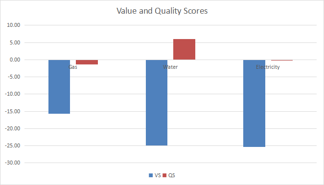
Evolution Since Last Month
The value score went a bit up in gas and electricity, a bit down in water. These moves are not very significant.
1-month variations (Chart: author; data: Portfolio123)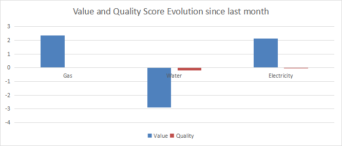
Momentum
The next chart plots momentum data.
Momentum in Utilities (Chart: author; data: Portfolio123)
Interpretation
Utilities is one of the two most overvalued sectors, along with industrials (S&P 500 dashboard here). The sector has the second-best 1-year momentum behind energy. Utilities industries are overvalued by 15% to 25% relative to 11-year averages. Quality is above the historical baseline in water utilities, but not high enough to justify a 25% overvaluation. Electricity and gas are close to the quality baseline. Regarding momentum, water is the weakest subsector in a trailing year and the strongest one in a trailing month.
XLU Fast Facts
The Utilities Select Sector SPDR Fund (XLU) has been tracking the Utilities Select Sector Index since 12/16/1998. It has 28 holdings, an expense ratio of 0.12% and a distribution yield of 2.9%.
The next table shows the top 10 holdings with basic ratios and dividend yields. Their aggregate weight is 63% and the largest one weighs 15.7% (NextEra Energy Inc.). The risk related to the top four holdings is quite elevated (each of these positions represents over 6.5% of the portfolio).
|
Ticker |
Name |
Weight% |
EPSgrowth %ttm |
P/E ttm |
P/E fwd |
Yield% |
|
NextEra Energy Inc. |
15.67 |
-65.14 |
105.24 |
27.12 |
2.19 |
|
|
Duke Energy Corp. |
8.38 |
173.19 |
22.12 |
19.33 |
3.81 |
|
|
Southern Company |
7.79 |
-32.29 |
33.36 |
20.17 |
3.79 |
|
|
Dominion Energy Inc. |
6.51 |
241.75 |
21.84 |
18.94 |
3.42 |
|
|
American Electric Power Co. |
4.96 |
13.77 |
17.92 |
18.70 |
3.34 |
|
|
Sempra |
4.82 |
-75.95 |
47.24 |
17.55 |
3.07 |
|
|
Exelon Corp. |
4.39 |
136.41 |
16.54 |
19.36 |
3.09 |
|
|
Xcel Energy Inc. |
3.86 |
2.96 |
22.96 |
21.60 |
2.84 |
|
|
Consolidated Edison Inc. |
3.35 |
27.65 |
21.20 |
20.33 |
3.45 |
|
|
WEC Energy Group Inc. |
3.22 |
7.88 |
23.04 |
22.62 |
2.95 |
Ratios by Portfolio123.
Investors who don’t like the exposure to the top names may prefer the Invesco S&P 500 Equal Weight Utilities ETF (RYU).
Since January 1999, XLU has beaten the S&P 500 (SPY) in total return (411% vs. 374%). However, the difference in annualized return is just about 40 bps (7.2% vs 6.8%). XLU has outperformed the broad index by 16.5 percentage points in the last 12 months:
XLU vs. SPY last 12 months (Chart by Portfolio123)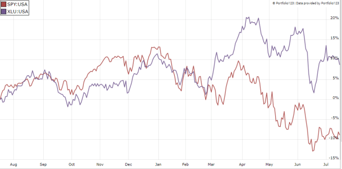
Dashboard List
I use the first table to calculate value and quality scores. It may also be used in a stock-picking process to check how companies stand among their peers. For example, the EY column tells us that an electricity company with an Earnings Yield above 0.0447 (or price/earnings below 22.37 is in the better half of the industry regarding this metric. A Dashboard List is sent every month to Quantitative Risk & Value subscribers, with the most profitable companies standing in the better half among their peers regarding the three valuation metrics at the same time. The list below was sent to subscribers several weeks ago based on data available at this time.
|
NRG Energy Inc |
|
|
Spire Inc |
|
|
Black Hills Corp |
|
|
Hawaiian Electric Industries Inc. |
|
|
FirstEnergy Corp. |
|
|
California Water Service Group |
|
|
Exelon Corp |
|
|
Pinnacle West Capital Corp |
|
|
CenterPoint Energy Inc. |
|
|
PNM Resources Inc. |
It is a rotating list with a statistical bias toward excess returns on the long-term, not the result of an analysis of each stock.
Be the first to comment