

WeatherStudios/iStock via Getty Images
This year has been a very challenging year for investors and portfolio managers alike. For example, a Wall Street Journal article by William Power, on October 7th, 2022, titled Stock Funds Down 24.8% in 2022, lamented that {according to Lipper data} “The average fund is down 24.8% for the year to date. Only a handful of stock-fund managers have managed to stay in positive territory.” The news wasn’t much better for international or bond funds, which typically offset risk in portfolios. Consequently, let’s examine the current market environment, look at portfolio ideas and risk, and the areas that are showing relative strength against the overall market.
Buy Low, Sell High
Around October 2020, we moved from a “recover fiercely” stance to a more rural theme. The premise was that companies serving more rural areas would be less subject to Covid mitigation policies and hence potentially have more stability over the ensuing recovery. Combine the rural strategy with asset classes that typically rise with inflation and interest rates and an investor would find themselves with a portfolio far different than the growthier securities held in the S&P 500 Growth Index (SPYG) and heavily weighted S&P 500 (SPY).
There are some new things on my screen lately, as I’ve been evaluating different historical periods; like, what worked during the 1978 to 1982 period, the period after WWI and the 1918 Flu, WWII, and the Vietnam era. Keep in mind that we do not consider purchases (or sales) until a security or sector is exhibiting relative strength compared to other sectors and securities. It’s also unlikely that any or all the past leaders will do a repeat, as many of those securities aren’t even traded today. However, we can glean some perspective from the behavior of different asset classes throughout history.
The following sectors that are leading, based on relative strength against the S&P 500. Many since mid-2021:
The (XLE) – Energy, (XLF)– Financials, (XLB) – Materials sectors have been exhibiting some higher relative strength. Other sectors that have been showing relative strength vs the S&P 500 are the (XLI) – Industrials, (XTN) – Transports, (XLP) – Consumer Staples, (XLV) – Health Care, and nations that are rich in natural resources, like (ECH).
The Midcap (MDY), SmallCap, (SLY) and (RVT) have shown some relative strength more recently. Lastly, the equally weighted S&P 500 index (RSP), S&P 500 Value (SPYV), and S&P 500 High Dividends (SPYD), which we discussed in March 2022, have also exhibited relative strength vs the S&P 500
Sectors that have low relative strength compared to the S&P 500 include: (XLK) – Technology, (SPYG) – The S&P 500 Growth Index, (XLC) – Communications, (XLY) – Consumer Discretionary, and (XLRE) Real Estate.
Side Note on The Rule of Arithmetic Returns
In describing the rule of arithmetic returns, and for simplicity’s sake, let’s assume a portfolio is down 50%. for that portfolio to recover, the portfolio would need to gain 100% to return to even. Another example is a portfolio that is down 30%. This portfolio would need to gain ~42% to return to even. This may present an opportunity for investors that may have dodged some of the downside in 2022.
Market Risk Meter
First, let’s examine how it works. The proprietary risk meter was designed in January 2009, to help gauge the level of risk in the markets. When looking at the markets and risk, an investor may compare the ebbs and flows as ocean tides. When the tide comes in, per this methodology, risk is higher, and conversely, when the tide flows out, risk is lower. The risk meter does not anticipate the timing of corrections or bounces; however, it helps determine when there is inherent risk in the market. Like ocean tides, it helps determine whether the tide has come in further than normal, (presenting greater risk) or gone out further than normal (providing us with the potential for lower-risk entry points).
Per the methodology as illustrated on the charts below, when risk rises above 20, it is time to consider trimming losers, taking some gains from winners, and reviewing the types of positions deemed suitable enough to hold if things get ugly. Long-term asset allocation investors may consider re-balancing portfolios by shifting equity gains and considering assets that are less correlated to the overall market. Some investors may also consider hedging strategies like selling calls, purchasing puts, or initiating stop limit orders to try to mitigate risk.
When readings get below -20, this methodology calls for having a buy list of favored mutual funds, equities, ETFs (exchange-traded funds), etc. These potentially lower risk opportunities are complemented by identifying high volume, high volatility, downside trading days, coupled with a strong reversal and 1-2 days’ follow through to meet our criteria. This may also be a rebalancing opportunity for long-term asset-allocation investors. Rather than simply rebalancing on a quarterly or annual basis, rebalances may be driven by market variation.
Behind the scenes, an investor will be looking to purchase at prices that under normal rational conditions other investors would not be willing to sell at. However, once emotion is brought to the table and when others are panic-selling, the rules of logic are usually tossed out the window. It’s like comparing an orderly fire drill to what really happens when there is a fire.
Those historical or even hysterical moments are opportunities for a well-trained and experienced money manager who is looking to buy. However, these opportunities usually only occur once or twice a year, during corrections (on a milder scale) or during bear market recoveries. Seeing as the ideal buying opportunities do not present themselves very often, as evidenced by the fact that not every correction gets to -20 or lower on the risk meter, there is a little more to discuss. Most purchases are made by identifying market reversals between the -10 and 0 levels on the diagram. Some purchases in positions will continue between 0 and 10 and rarely ever above 10, except in assets that are not correlated with the overall market direction.
10/03/2022
In September and early October 2022, while some very large firms were forecasting additional declines of 16% to 27% for the rest of the year, our proprietary risk meter was reading in at historically low risk levels.
Market Risk Meter October 3, 2022. This chart has been provided for informational purposes only, and should not be used as the sole basis for making an investment decision. Investment decisions must be made on your own individual needs and risk tolerance. The content is developed from sources believed to be accurate but even so may contain inaccuracies. (DeMaria Financial Services)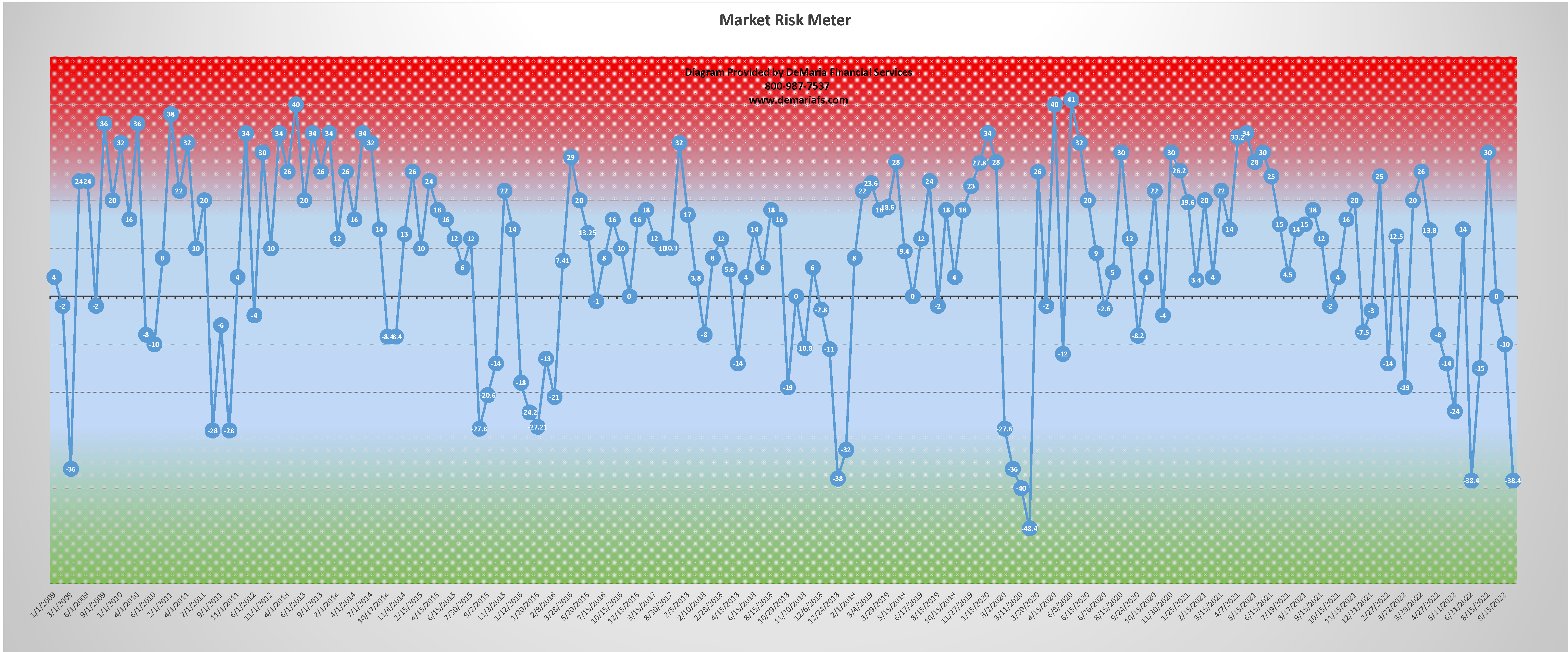
11/15/2022
Consequently, the market rallied through much of the month of October and rolled in the largest October gain on record for the Dow Jones Industrial Average. This now leaves us in the upper risk ranges and pondering whether we can get a Santa Claus rally into the end of 2022.
Market Risk Meter November 15, 2022. This chart has been provided for informational purposes only, and should not be used as the sole basis for making an investment decision. Investment decisions must be made on your own individual needs and risk tolerance. The content is developed from sources believed to be accurate but even so may contain inaccuracies. (DeMaria Financial Services)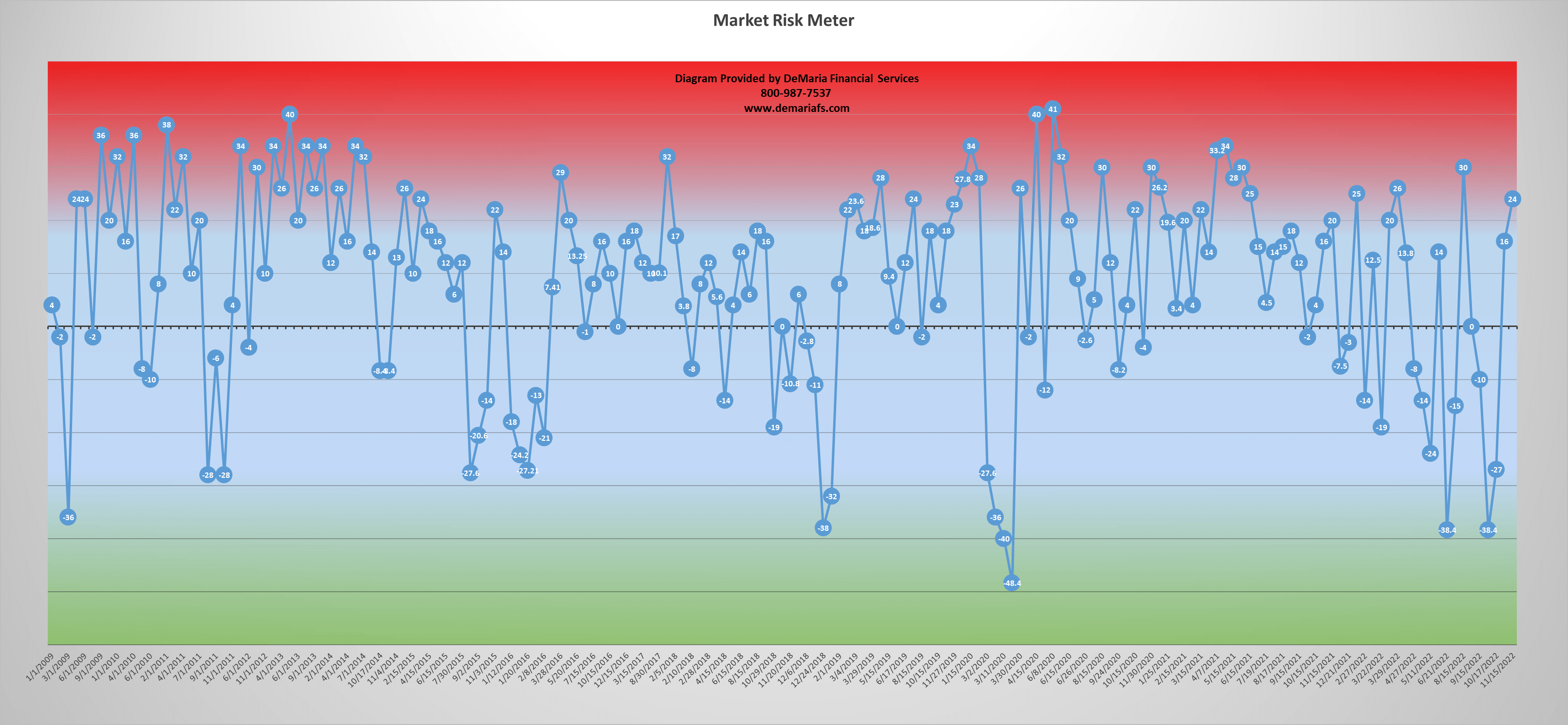
The Significance of Earnings Yield
Per Investopedia:
“The earnings yield refers to the earnings per share for the most recent 12-month period divided by the current market price per share. The earnings yield (the inverse of the P/E ratio) shows the percentage of a company’s earnings per share. Earnings yield is used by many investment managers to determine optimal asset allocations and is used by investors to determine which assets seem underpriced or overpriced.”
Many managers compare the earnings yield of a broad market index (such as the S&P 500) to interest rates, like the current 10-year Treasury yield. If the earnings yield is less than the rate of the 10-year Treasury yield, stocks may be considered overvalued. If the earnings yield is higher, stocks may be considered undervalued relative to bonds.
What we are finding is that the current earnings yield has been keeping pace with the rate increases and flattening yield curve, as illustrated by the red line in the diagram below. You are welcome to compare the earnings yield to the long-, mid-, and short-term interest rates.
Rates began to tighten/flatten in March of 2018, as we discussed a few years ago in the article: The American (Debt) Jubilee, And The Current Correction…. They reached a precipice in March of 2020, as we were facing intense pressure from Covid. For far different reasons, we are again at a convergence point, where interest rates have not only risen, tightened, and flattened, but they have also inverted with the most favorable yields right around the 7-year mark.
Treasury Yield vs S&P 500 Earnings Yield. This chart has been provided for informational purposes only, and should not be used as the sole basis for making an investment decision. Investment decisions must be made on your own individual needs and risk tolerance. The content is developed from sources believed to be accurate but even so may contain inaccuracies. (DeMaria Financial Services)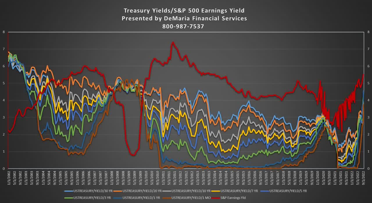
Secular and Cyclical Markets
Despite its recent rally, and depending on the day, the S&P 500 is still down ~16%-20% year-to-date. While it’s been a tough year for many asset classes, including stocks, bonds, and real estate (especially commercial), all the downside pressure is not necessarily indicative of a swing to a secular bear market.
Many analysts have lamented the state of the market of late, and not all agree the downtrend is indicative of a secular bear market. I believe investors are dealing with a cyclical bear market, in the overall context of a long-term secular bull market that began in 2013. These types of secular bull markets can remain active for 15 to 20 years, not unlike the period between 1980 and 2000; while the crash of 1987 was tucked right smack in the middle of one of the longest bull runs in history.
My conclusion:
- The increasing earnings yield is keeping pace with interest rates and that is believed to be a positive sign for the economy.
- Despite a tightening, flattening, and now inversion of the yield curve, these periods are often temporary and currently due in part to the FED’s short term interest rate policy. The current inversion is likely due to the FED’s attempt to slow down Covid stimulus and not due to a weak economy. However, the individual consumer, high P/E industries, and consumer discretionary sector are likely feeling the brunt of the pain right now.
- More evidence is building that we may be at the beginning stages of a ~50-year cycle, where interest rates could continue to rise as they had between ~1930’s and ~1980’s.
- Short term market risk is high; however, I believe the long-term secular bull is still intact. This is despite the cyclical bear market we have been experiencing throughout 2022 and the Wall Street wags continually discussing the risk of a potential recession in 2023.
Citations
- William Power, October 7th, 2022, Stock Funds Down 24.8% in 2022, Wall Street Journal, URL: https://www.wsj.com/articles/stock-funds-down-24-8-in-2022-11665163528
Be the first to comment