

Pgiam/iStock via Getty Images
This article is part of a continuing series of articles (here) on how to use investor buying in ETFs to help determine the direction of the stock market, and specific sectors of the market. These articles are about investor sentiment and the measurement of “investor expectations”. Every article will have follow-up articles until the concept behind that original article is complete. This one focuses on NYSEARCA:SH – a ProShares ETF that goes short the S&P 500.
SH
SH is a ProShares ETF that goes short the S&P 500. It was started in July of 2006 and now has assets of $2.5 billion. It is the fifth largest ProShares fund. Since stock prices have had a tremendous rally since its inception, SH has obviously underperformed. It attracts longer term bear market investors while the leveraged ETFs, such as SPXU and SDS, attract shorter term traders. SH is really an investment for bear markets.
Price history of SH (Michael McDonald)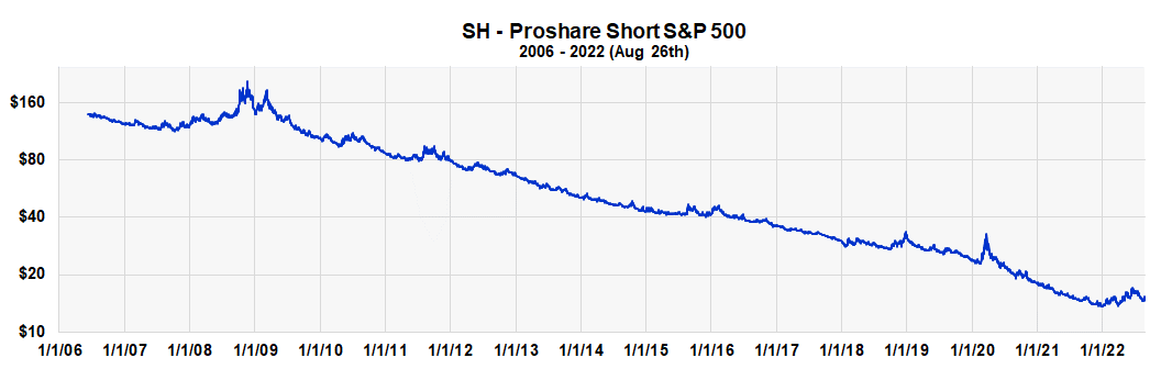
After last week’s market decline, a number of investors are wondering whether it’s time to go short the market and buy SH? They’re wondering whether the price increase the last four weeks was just a bear market rally, and things are now headed back down again. We believe investor activity in SH – and other sentiment indicators – say they’re not.
Outstanding Shares of SH Grow Too Fast
SH shares Outstanding (Michael McDonald)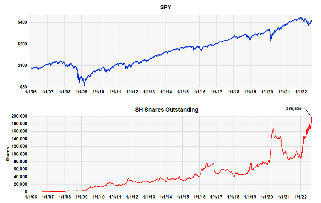
Historically, rapid increases in the number of shares outstanding of SH occur at major market bottoms. At these moments it acts as a contrary opinion indicator and highlights when “too many” investors are expecting lower prices.
At the end of Friday there were over 196,000 shares outstanding, which is a new record. At the beginning of the year there were only 90,000 shares. We believe this is a strong indication the S&P 500 will move higher, and SH will move lower.
High Buying Activity in SH Also Indicates Extreme Bearish Sentiment
Buying levels of SH as percent of Assets (Michael McDonald)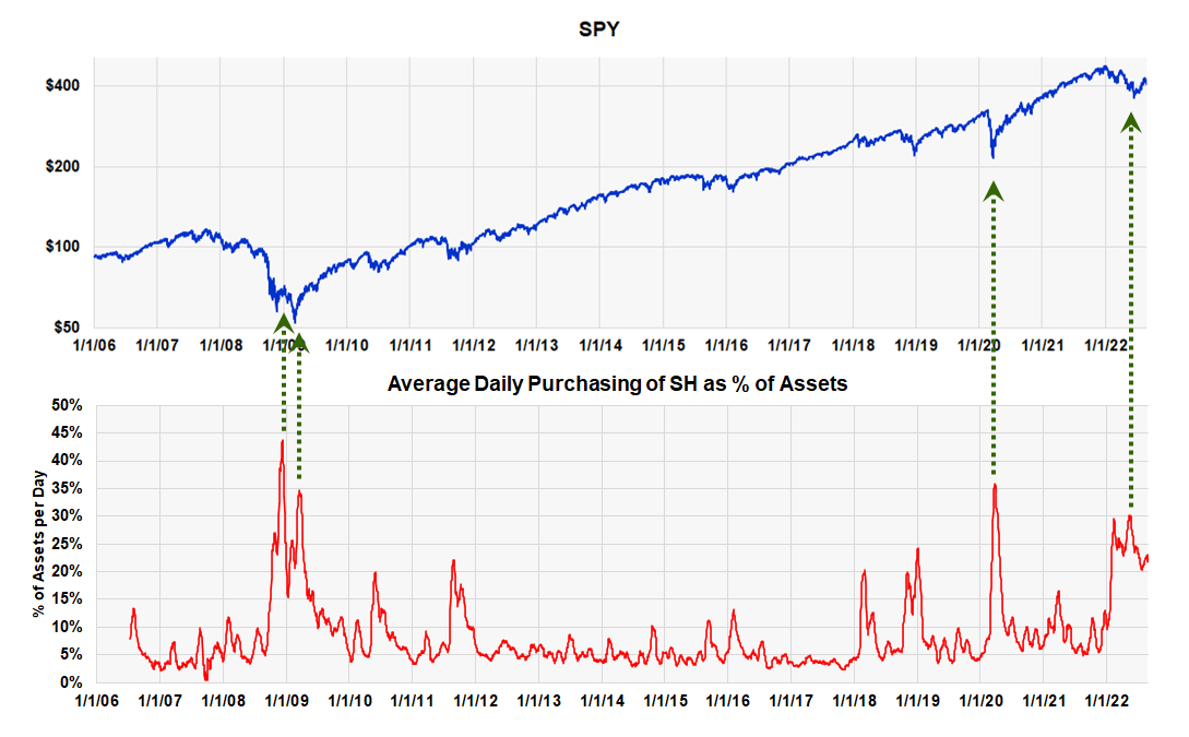
This 16-year chart shows the buying activity in SH plotted against the S&P 500 as of July 26. Normally, purchase levels in SH are between 5% and 10% of assets per day. At market bottoms they rise to 25% to 30%, or more. It is this activity that causes the surge in the number of shares outstanding.
At the end of last week, the ratio was 22 ½%, which is still very high considering the four-week rally. This again is a very strong indicator the market is going higher. Let me explain where these purchase numbers come from and why they’re so important.
Short-Selling Indicators
During the heyday of technical analysis from 1960 to 1985, the best indicators of bear market bottoms were the odd lot and public short selling ratios. They were based on the “theory of contrary opinion,” the theory that says stock prices reach bottom when most investors are bearish and are expecting further price declines. Large amounts of short selling by investors historically indicated these moments. After correctly signaling the bear market bottoms of 1962, 1966, 1970 and 1974, with no false signals in between, these two short selling ratios became the primary tools of market technicians in that era when looking for the end of a bear market.
Unfortunately, with the emergence of index futures and arbitrage short selling in the mid-1980s, these short selling indicators became useless as it became impossible to distinguish arbitrage short selling from short selling because of the expectation of lower prices. Very few market technicians today know this important history, but those who were around in the 1970s do.
Bear Market ETFs
This situation changed around 2007 with the creation of bearish ETFs. These funds made it possible to again measure investor “short selling.” In this instance, however, investors weren’t short selling directly but were buying ETFs that were. Once these funds were established, it was only necessary for the occurrence of a few bear markets to establish the levels of investor buying that represented extreme levels of bearishness. We now have that history; a history that includes both the 2007-09 bear market and the extreme market decline of 2020.
The fund family chosen for the study was ProShares. The ProShares family is composed of 135 funds with $67 billion under management. ProShares makes available all the data on their funds daily, and the large size of this family helps give statistical validity to the results. Forty-two ETFs are classified as bear market funds for our purposes.
Measuring “Bear Market” Buying
How do you measure investor buying in bearish ETFs? Looking at daily dollar sales like one does any stock is insufficient, since it doesn’t specify how much is from investor buying. With stocks, sales do represent the amount of buying, since buying and selling amounts are always equal. But with ETFs they aren’t. If there are more buyers than sellers of an ETF, the fund creates more shares for the excess buyers. If there are more sellers than buyers, they retire the excess shares.
So, sales numbers alone don’t tell you how much money is going into or out of an ETF; you must combine sales with changes in the number of shares outstanding to determine that. Once this is done, multiplying the number of shares being purchased by the fund’s NAV yields how much money is going into the fund on a daily basis.
Measuring the dollar amount going into a fund is not the best measure, however. What’s better is the amount of money going into the fund divided by the total assets in the fund. Producing a ratio allows for historical comparisons; absolute values don’t.
This ratio or percent is like the old short selling indicators, where the amount of short selling was divided by the amount of total selling.
The Master Sentiment Indicator Continues to Point to Higher Stock Prices
We combine seven classic sentiment indicators to form one Master Sentiment Indicator. The seven indictors that make up the composite are:
- The CBOE equity puts and calls ratio
- The CBOE total puts and calls ratio
- The Commitment of Trader data on the E-mini S&P Futures
- The Buying Level in the SH ProShares ETF
- The Exposure Level of the National Association of Active Investment Managers
- The daily Hulbert Stock and Nasdaq Sentiment readings
- The AAII Sentiment Survey
The MSI is designed to locate major market lows. It’s shown in the next two charts – one is a long-term view from 2007, the other starts in 2018 and shows more detail. The indicator is currently -4.4, which is still relatively low after a four-week rally and, in our opinion, points to higher prices.
Master Sentiment Indicator – Long Term (Michael McDonald)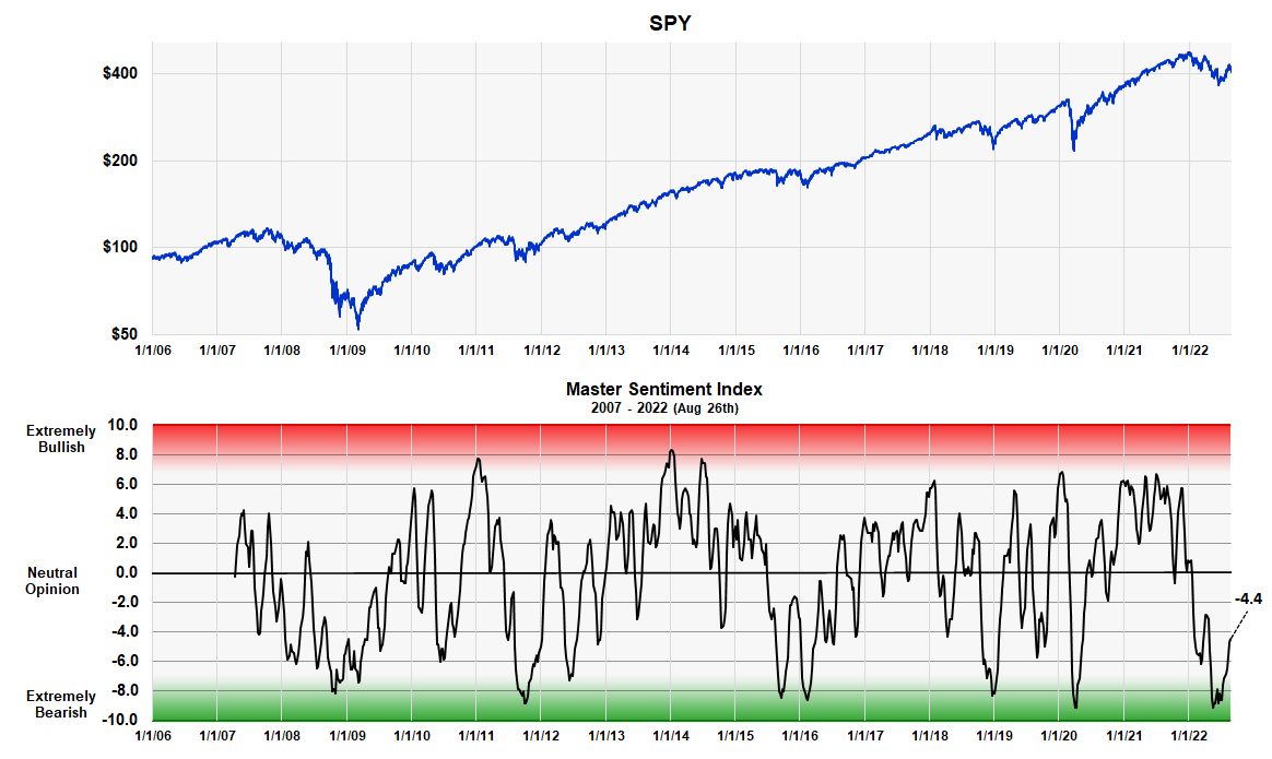
Master Sentiment Indicator – Shorter Term (Michael McDonald)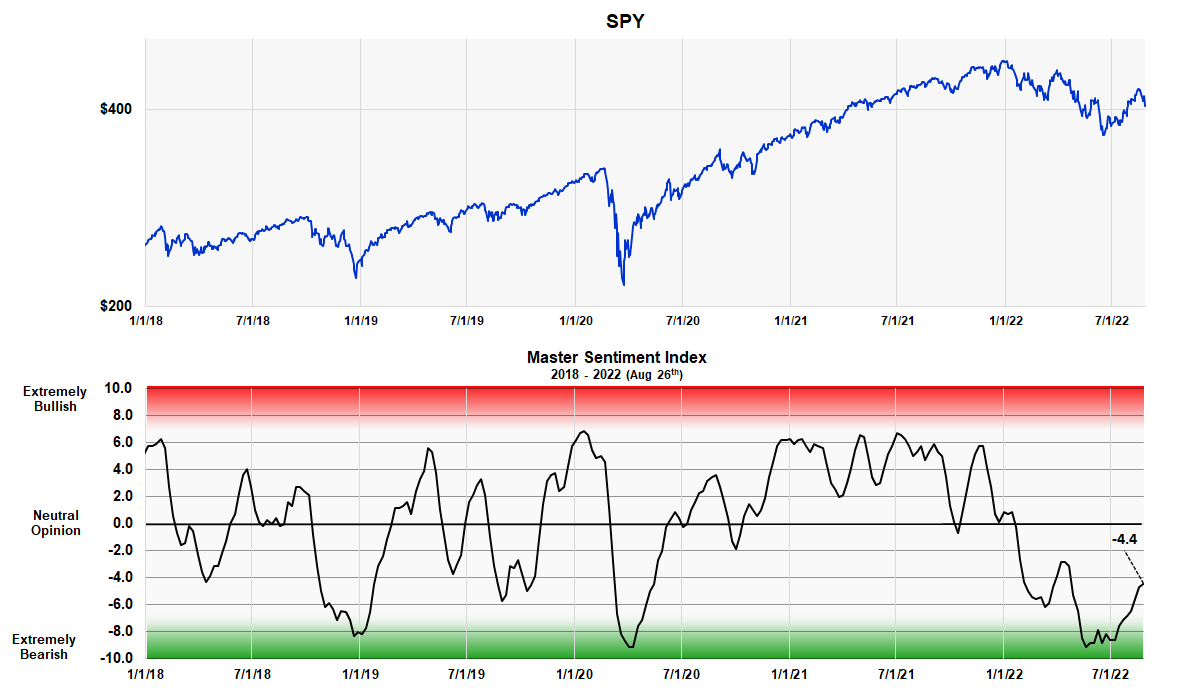
Forming the Master Sentiment Indicator
Combining multiple indicators to form one sentiment indicator is not easy. How do you combine a puts and calls ratio of 1.0 with a 40% Investor’s Intelligence bearish percent? When forming a composite everything has to be mathematically consistent. We accomplished it in the following way.
We took each indicator back as far as history allowed (the smallest time period being 17 years) and determined the range of values that contained the highest 5% of its values. Then we determined the range of values that contained the next highest 5%. This procedure was continued in 5% increments down to the 5% band that contained the smallest values. This activity allowed us to put every indicator on the same 21 range scale which was labeled 10 to -10.
We then added each indicator’s position number (10 to -10), which determines where it is historically, and divided the total by the number of indicators in the composite. Out came a composite number between 10 and -10 that represented the average bracket value of all the sentiment indicators.
The MSI Red and Green Zones
As you can see the MSI oscillates between 10 and -10. The large, grew area in the middle represents periods when there is no extreme opinion. The red area shows when the indicator is getting into the “extremely bullish” range. The lower green band shows when it’s getting into the “extremely bearish” range. There is no sudden demarcation but graduated numbers that shows greater or lesser degrees of sentiment. The chart clearly shows how recent levels compare to readings at major lows over the last 16 years.
The MSI Table
The table shows the ranking of each of the seven components that make up the composite, as well as the composite itself.
Master Sentiment Indicator – component table (Michael McDonald)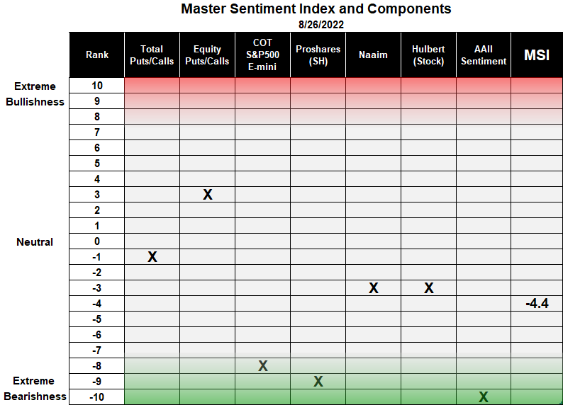
The first column in the table lists the 21 rankings that go from +10 to -10. This is followed by the names of the seven indicators used in the composite with an X showing the current ranking of each. Two of these indicators – the buying of ProShares Short S&P 500 ETF and the short position of asset managers in the S&P 500 E-mini futures – were explained in Seeking Alpha articles here and here. The last column displays the ranking number of the MSI index, which on August 26 was -4.4.
Conclusion
We recommend investors avoid SH as the risk at this time of higher prices is great. On the other hand, we highly recommend positions in SPY to QQQ for their intermediate long-term. These opinions are based on the recent and current high levels of bearish sentiment found in many indicators.
Be the first to comment