

da-kuk/E+ via Getty Images
This article was first released to Systematic Income subscribers and free trials on Mar. 19
Welcome to another installment of our Preferreds Market Weekly Review where we discuss preferreds and baby bond market activity from both the bottom-up, highlighting individual news and events, as well as top-down, providing an overview of the broader market. We also try to add some historical context as well as relevant themes that look to be driving markets or that investors ought to be mindful of. This update covers the period through the third week of March.
Be sure to check out our other weekly updates covering the BDC as well as the CEF markets for perspectives across the broader income space.
Market Action
All preferred sectors bounced this week with the average preferred up more than 1.5%. Year-to-date, however, all sectors remain in the red.
Systematic Income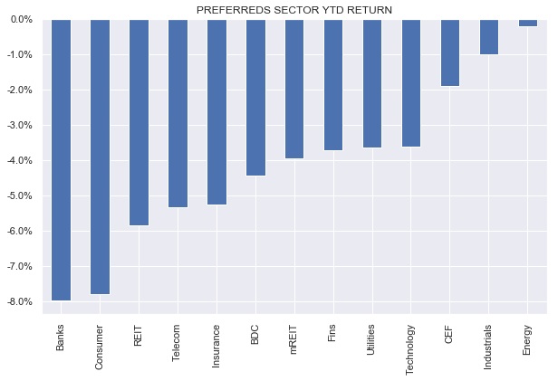
This strong weekly performance clawed back all of the losses during the month with March now shaping up flat as a pancake.
Systematic Income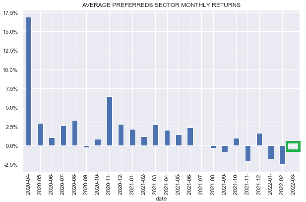
The average preferred has generated a near-zero return over the past year which is not too bad given the price action we have seen so far year-to-date.
Systematic Income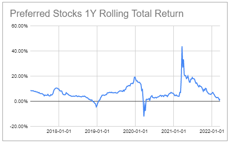
A year of standing still (in aggregate) is clearly a disappointment for many investors. On the plus side, however, this short-term pain sets up income portfolios for longer-term gains because it allows investors to reinvest dividends at higher yields as well as deploy drier-powder assets into more attractive holdings.
Market Themes
If we described a particular investment product as having a coupon that can shift around based on market forces, having a potentially unlimited lifetime and having embedded call options many investors would think we are talking about some sort of highly complex institutional derivative. However, we just described a pretty basic preferred stock. Despite the fact that preferreds are very popular with individual investors doesn’t make them any less complex instruments. This complexity is particularly relevant now that Libor – the base rate for most Fix/Float preferreds – has begun to lift off in anticipation of a sequence of Fed policy rate hikes.
This, along with the fact that 1) many preferreds will come to their first call date soon and, hence, the start of their floating coupon periods and 2) many will be unredeemed as their coupons will step down highlights the fact that investors should start to seriously think about the yields on their Fix/Float holdings after the end of the non-call period.
The chart below compares current fixed-rate coupons to the Libor-based reset coupons of these stocks. Reset coupons are basically derived from Libor forwards or market expectations of Libor on the first call date. For example, a stock with a fixed coupon of 6.5% today which switches to a coupon equal to 3-month Libor + 4% at the end of 2022 and trades at $24 will have a reset yield of 6.19% since Libor is expected to be around 1.94% by the end of the year.
What is clear is that the vast majority of stocks will very likely see a stepdown in coupons based on current Libor market expectations. Of course, it is possible that 1) some of these stocks will be redeemed or 2) Libor will rise above current market expectations but as things stand now, it is our expectation that most stocks will remain outstanding given the stepdown in coupons and a difficult refinancing environment for issuers. The chart below compares current and reset coupons of Libor Fix/Float stocks that are expected to switch to a floating-rate coupon within the next two years.
Systematic Income
What can investors do? One option, as usual, is to do nothing. It is not entirely unreasonable to say that the expected step-down in coupons is more-or-less priced into markets today and that the higher yields up to the first call date of Fix/Float preferreds is simply a kind of balancing-out of a lower yield to come.
For example, we can see this by comparing the yield-to-worst of four CIM preferreds, one of which is fixed-rate (CIM.PA) with the other three Fix/Float. The fact that all three Fix/Float stocks trade at higher yields up to their call date than CIM.PA could just be a fair-value reflection of their coming step-down in yields. In short, investors are compensated today for the likely drop in yield to come in the future, net net leaving them square.
Systematic Income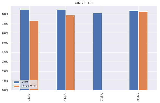
We are sympathetic to this argument, however, it is also our view that the broader preferreds market is not as universally efficient as this example may imply. Specifically, there are opportunities between Fix/Float preferreds of the same issuer as well as between Fix/Float series between issuers.
Let’s see how investors can identify these opportunities. Let’s use the three NLY preferreds as a case study – they are summarized below with a screenshot from our investor Preferreds Tool.
Systematic Income Preferreds Tool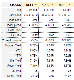
Now let’s plot, what we call, forward yields of these stocks relative to each other.
Systematic Income Preferreds Tool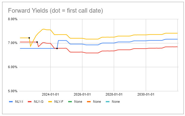
This is how forward yields work. Up to the first call date (marked with a black dot) the yield of a given stock is just the yield-to-worst. The yield-to-worst is the minimum of stripped yield and yield-to-first-call – a pretty standard way of dealing with the yield of a callable security up to its first call date.
For example, for NLY.PF, the stripped yield is 7.2% while the yield-to-call is 14.1%, hence the yield-to-worst is 7.2%.
After the first call date the yield of the stock is just the expected Libor (i.e. Libor forward) on that date plus the spread over Libor, divided by the stripped i.e. clean price x liquidation preference. For example, the reset yield of NLY.PF on its first call date 30-Sep-22 is (Libor forward of 1.62% + spread over Libor of 4.993%) / current stripped price $24.07 x liquidation preference $25 = 6.87%.
Each subsequent quarter the coupon will shift based on the evolution of Libor forwards which looks like the following as of this writing. Libor forwards update daily just as “normal” or par interest rates do since they are just a function of current interest rates. The geeks in the audience can learn all about bootstrapping forward rates here.
Systematic Income Preferreds Tool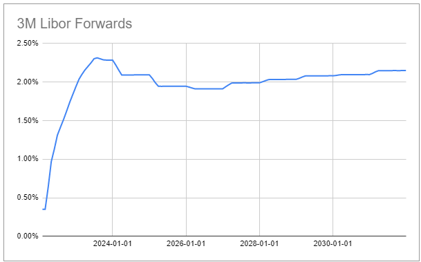
If we go back to the chart we see that, except for the initial blip lower on its first call date, the NLY.PF forward yield tends to trade above the yields of the other two series which is why it is the series that looks most attractive to us.
There is a small chance of a redemption on the first call date and it’s something investors ought to keep in the back of their minds, however, even here NLY.PF looks close to the best. NLY.PF does have less call protection, however, in our view it is fairly likely to remain outstanding past its first call date and, it seems, given its below-“par” price this is what the market expects as well.
Obviously, investors may have a different view on the trajectory of Libor than what is implied by the market, however, a comparison of forward yields like we described here is a good starting place.
Market Commentary
Sachem Capital recently issued new 6% 2027 bonds (SCCE). The company makes secured loans to real estate investors for the purpose of acquiring, renovating or developing property – a decent business to be in at the moment but pretty dependent on house prices remaining well-behaved and which may come under pressure as the Fed continues to hike / reduces MBS on the balance sheet.
Asset coverage of the $160m or so of bonds looks relatively thin at around 2x with a $30m line of credit ahead of the bonds. That said, some of the shorter-maturity bonds don’t look too bad. Within their suite, SACC (currently callable, trades at 6.7% YTM) looks reasonable as it’s less likely to get redeemed immediately, having a lower coupon than 2 other bonds that are either currently callable or will be soon. SACC has a pretty short maturity at the end of 2024 so there is better visibility to that date than the Q1-2027 of SCCE. Three of the company’s bonds are in the green year-to-date, highlighting, once again, that pinned-to-par / shorter-maturity securities can hold up OK in a period of rate rises.
Stance And Takeaways
The 3s10s Treasury yield curve has continued to flatten decisively as shorter-term rates have risen faster than longer-term rates. For example, the 3s10s part of the curve has already inverted while the closely watched 2s10s is about 0.17% away from inversion.
Systematic Income Preferreds Tool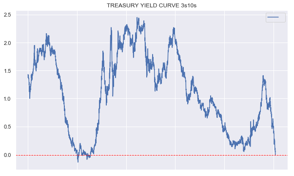
This sharp flattening means longer-duration instruments now offer a much smaller yield pickup than they have historically, making them less attractive relative to lower-duration instruments such as term senior securities (i.e. those with maturities).
For this reason we continue to find value in mREIT AAIC 6.75% 2025 Notes (AIC) trading at a 6.76% YTM, CEF Eagle Point Credit 5.375% 2029 Notes (ECCV) trading at a 6.28% YTM and BDC OXSQ 6.5% 2024 Notes (OXSQL) which have held up well so far this year.
Be the first to comment