

leonid_tit
Today, I’ll lay out how dire US fundamentals are for markets; the world is similarly situated. But I want to be clear that fundamentals make a terrible tool for making market decisions. I find that I recognize fundamental trends either too early or too late; too early this time. I find more success putting my effort into understanding the risk implications of the VIX complex, and by the end of this article I’ll describe recent work informed by the chaotic nature of 2022 markets.
Fed Policy
First let’s consider how aberrant monetary policy has been. This basic chart of the Fed balance sheet is taken from the Federal Reserve Bank of St. Louis (“FRED”); the dotted line is mine.
Fed Balance Sheet (Federal Reserve Bank of St. Louis)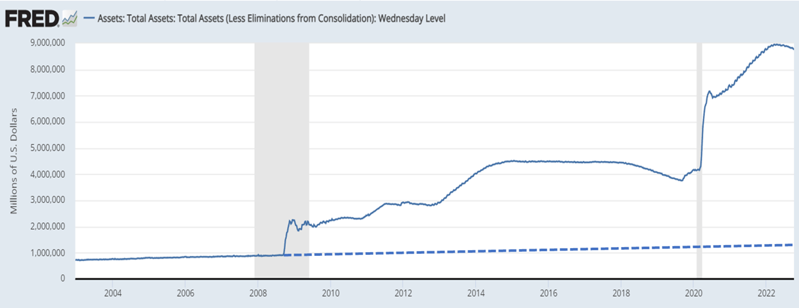
If the Fed is targeting a 2% inflation rate, it seems rational that their balance sheet might grow at 2%. That is the approximate slope of the line on the left third of the FRED graph and my extrapolated dotted line from August 2008. In that context, their response to the Great Financial Crisis (“GFC”) and then COVID looks ridiculous.
I’m not going to argue with the immediate response to the GFC, but can anyone justify the subsequent 12 pre-COVID years of near-free money. Then in 2020, you could argue the COVID response either way, although it looks excessive to me. But how would you justify the following two years of largesse?
So, here we are about $8 trillion dollars above the 2% trend line. Putting that in perspective, the GDP of the USA is about $25 trillion; allowing for the 2% growth as normal, the Fed’s excess balance-sheet inflation equals about one-third of GDP. If you’ve made large returns over the last 14 years, you might send them a thank-you note, but now the trick is to preserve your capital as they make an attempt to normalize policy.
While most focus on interest rates, the Fed is also withdrawing about $95 billion dollars per month from the economy through balance sheet reductions. That began in June and we have not seen anything like it in recent history. Here is an excerpt from the Federal Reserve Bank of St. Louis:
“Mechanically, the Fed will reduce its securities holdings by not reinvesting the funds it receives from maturing securities. So, for example, when a Treasury security hits its maturity date, the Fed will not reinvest the proceeds into another Treasury security (as it has been doing over the past two years). Instead, it will redeem the maturing security, which will reduce the amount of the Fed’s securities holdings and the size of its balance sheet.
The Fed wants a predictable and smooth reduction in its balance sheet, so it is imposing redemption caps on the dollar amount of securities that will run off the Fed’s portfolio in any given month. For Treasuries, this monthly cap will peak at $60 billion; for agency MBS, the monthly cap will peak at $35 billion. To ensure a smooth transition to the runoffs, the caps will be phased in, set at half their peak levels in June, and increased to their higher levels in September . . .”
That last sentence is largely ignored. We only saw one-half the pace of monetary withdrawal through August; the real deal began in September. This is how the S&P behaved in September.
S&P Since September 2022 (Fidelity)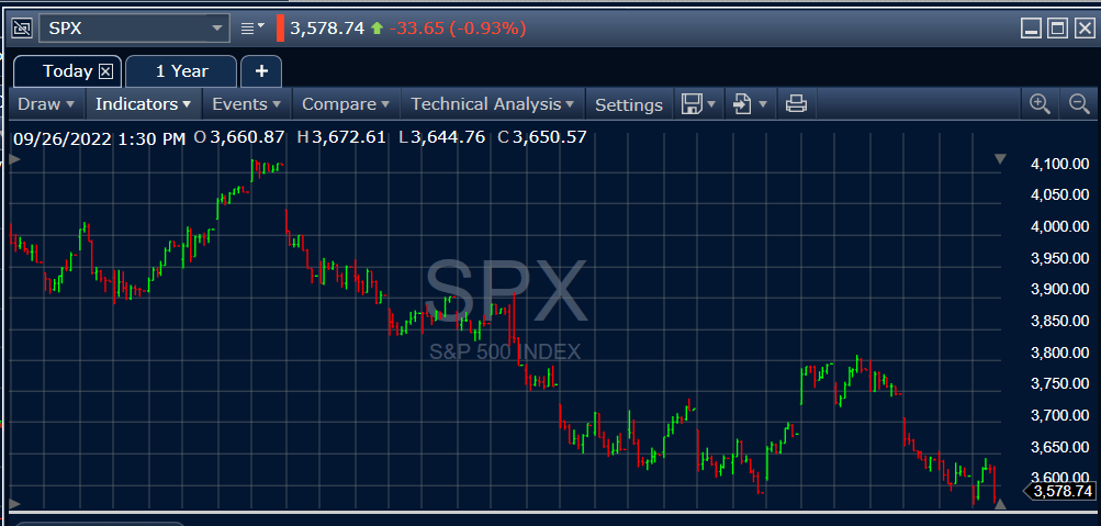
This discussion has characterized the last decade-plus of Fed policy and their current effort to reverse the excesses. While I think the excess money creation has been a big problem, don’t take my description of the most recent tightening as an endorsement. In large measure, the Fed’s excessive money creation has been an accommodation of fiscal excess; they buy treasuries to monetize the government debt. I think they could return stability to the system by simply announcing they will no longer monetize the debt, and undertaking a much more gradual balance sheet reduction. But, thankfully, I’m not in charge, and sadly Fed independence is often theoretical.
GDP
This is a graph of changes in GDP published by the U.S. Bureau of Economic Analysis:
Quarterly GDP Changes (U.S. Bureau of Economic Analysis:)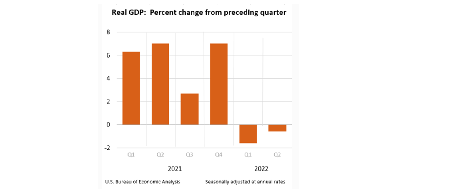
When talking heads discuss whether or not we’ll be in a recession, it raises the question as to whether they are paying attention. We’ve already had two sequential quarterly contractions. Even if Q3 shows a small GDP growth, the recession has started.
A strong employment picture is no reason to believe there is no recession. This excerpt from my own Seeking Alpha article of Aug. 15, 2022 makes the point:
“In the next graph, recessions are shaded in grey and the unemployment rate is the line. Without exception, unemployment lags the start of each recession. This one will be no exception.”
GDP, Unemployment & Recessions (Federal Reserve Bank of St. Louis)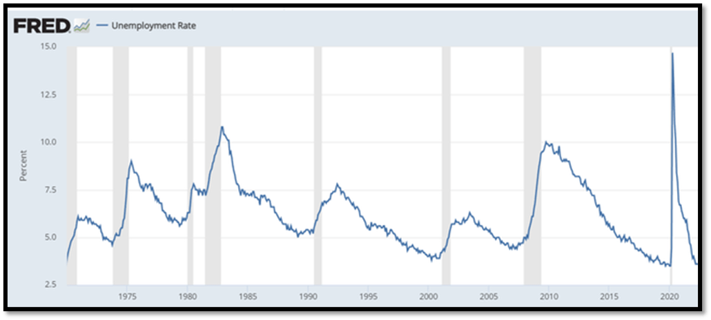
We’re in a bad place. Higher interest rates suppress demand, but also suppress supply as capacity additions and labor cost more. Administration policies are also suppressing supply. The Fed’s actions are aimed at demand destruction in order to bring inflation down to 2%. How long might that take if supply is contracting as well?
So, my own expectations are that we’ll see unemployment mushroom, earnings declining, bankruptcies increasing, and maybe a major pivotal event akin to the Lehman collapse in 2007. Sorry for the gloom, but sugarcoating would not be productive.
I’ve written before about “normalcy bias,” the tendency for all of us to think the future will be much like past norms. Hurricane Ian was not expected to produce a 500-year flood, but according to the governor it did. Jamie Dimon has been predicting a hurricane in financial markets; will it be a 20-year event, a 50-year event, or worse?
Protect Your Capital & Win Big After The Storm
The ten-year treasury has lost about 17% YTD and the S&P about 25%. The simplest way to protect yourself is to divest of all equities and medium-to-long-dated bonds. You could just hold floating-rate treasuries with a current, but growing, 2-1/2 percent yield. There are three problems with that. The first is knowing when the storm has passed because the S&P rebound from ultimate lows, when it comes, will be very profitable. The second is that 2.5% does not keep up with 8% inflation, so the strategy must be a temporary one. The third and smaller issue is that even bear markets have bullish episodes, so money can be made as long as risk conditions are monitored and exposures constrained.
My own plan is a little more aggressive, but not much. I’m currently holding about 70% of my portfolio in TFLO, USFR, and VRIG. They are floating-rate yield instruments, so prices are steady despite rising rates. The first two are composed of US government instruments and VRIG is investment-grade, floating-rate corporate debt.
The other 30% of my portfolio is a mix of covered calls over SPXL (a 3X-leveraged S&P ETF) and TFLO with occasional SDS (a 2X-leveraged inverse ETF). The short calls against SPXL can produce loss mitigation down to about 20% of acquisition cost if the tenor is six months or so, and I modulate commitments based on risk metrics.
The modulation is based on risk metrics derived from the VIX futures curve. YTD that strategy produces small gains rather than the market’s big losses.
In the interest of full disclosure, my portfolio is actually down mid-single digits this year attributable to my unwillingness to take taxable gains on some legacy holdings and a phased adoption of the strategy described. That is still far better than the 20% loss of a conventional 60/40 portfolio, and I’m positioned well for the future.
The Risk Algorithm
I’ll use a partial snapshot of Monday’s dashboard to illustrate how positions are modulated for that 30% variable-risk component of my strategy.
EZV Dashboard, Partial (EZV Algorithms)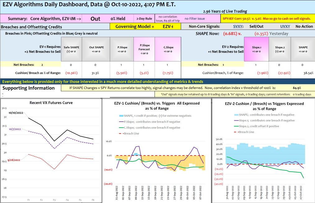
The ‘Out’ signal near the top of the dashboard reflects continuation of an earlier-day sell signal; EZV-IM’s ‘Out’ signal is the Integrated Model’s output. So at this point, I’m holding about 3% of my portfolio in SDS and the rest of it in those floating-rate positions I described above. The graphic on the left shows the VX Futures curve (VX is the futures version of the spot VIX) which is increasingly backwardated (declining from month 1 forward); this backwardation versus contango status is the source of my most basic metric, the SHAPE. I’ll say more about that later. The other two graphics show the two core models and how their metrics (SHAPE, fast Slope and slow Slope) oscillate, both models are currently below the threshold for holding stocks.
It’s important to recognize that this is not a market-timing system aiming at calling day-to-day price gyrations. If you’re bothered by small day-to-day disappointments, it can be a problem.
The goal is to avoid large drawdowns and ride the big gains from discounted reentry prices during bull intervals. Performance assessments are valid over months and years, not days and weeks.
So when the market is up during a sell interval, as may be true today, it’s just noise. Over time, calendar-year performance using SPY looks like this, with two years underperforming and 12 of the last 14 overperforming:
EZV Model, Annual Returns (Michael Gettings)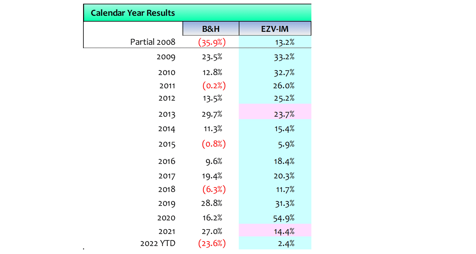
Recent Refinements
The market in 2022 has been a challenge; right now it looks to be my system’s worst performance in the last 14 years.
“Out of adversity comes opportunity.” — Benjamin Franklin
So, I recently did a deep dive into when signals were most reliable and when they were less so. Here is what I found beginning with the basic aim of the algorithm and its trouble spots.
The EZV model, via the SHAPE metric, relies on VX futures ability to presage emerging risk-off sentiment, so when the SHAPE moves in relative lockstep with SPY, signals become unreliable.
Said colloquially, if VX traders move in lockstep with S&P traders, they add no insight. In more quantitative terms, when the VX-futures-curve behavior, as measured by changes in the SHAPE, is highly correlated with price movements, signal reliability suffers. This is evidenced in the current market, when everyone – stock traders and VX traders – are following every daily pronouncement of any Fed authority who might offer a passing comment. In fact, it was the tendency of the SHAPE and SPY to move in sync with Fed comments, confounding signals, that tipped me off to the issue.
This is a graph of the correlation between changes in SHAPE metrics and SPY returns since mid-September 2021. I chose the limited timeframe only because looking at the whole 14 year history on a graph creates indecipherable chaos. The color shading offers no precision; it simply indicates that higher correlations should be viewed cautiously.
Correlations, SHAPE v SPY Changes (EZV Algorithms)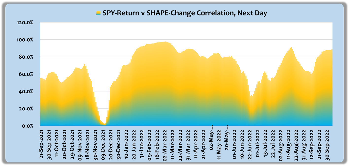
It’s surprising how variable these correlations are. Recently correlations are about 80%, but they have been near zero in the last year. I chose a two-month lookback, 42 trading days, to create some level of stability. Remember that when we discuss the rate of correlation change, the rate of change reflects how current-day data is replacing earlier data, thereby producing a more current indication of status than the 42-day correlation itself.
The next chart shows the rate of change in correlations for the same 12-1/2 months. It is calculated as a short-term linear slope. I found that when that slope is higher than a variable threshold, ‘Sell/Out’ signals can be deferred for a limited period or until the correlation growth subsides. The net effect on algorithm performance is a benefit in terms of compound returns as well as more risk-averse performance.
Correlations, Rate of Change (EZV Algorithms)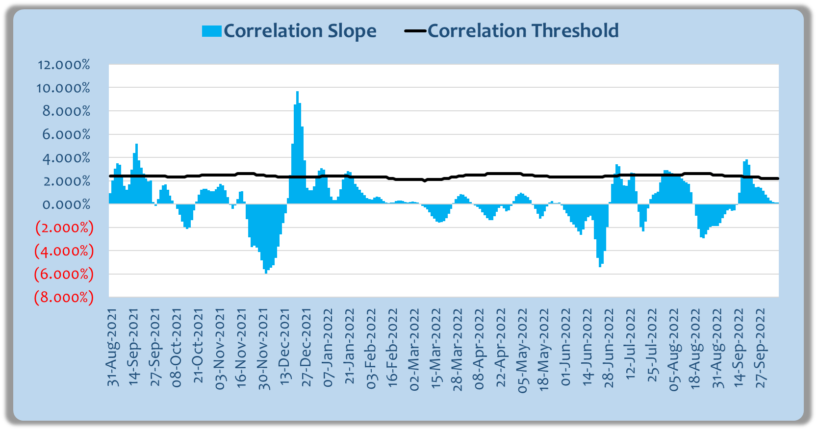
When the correlation filter is overlaid on the core algorithms results look like this:
EZV Model Performance (EZV Algorithms)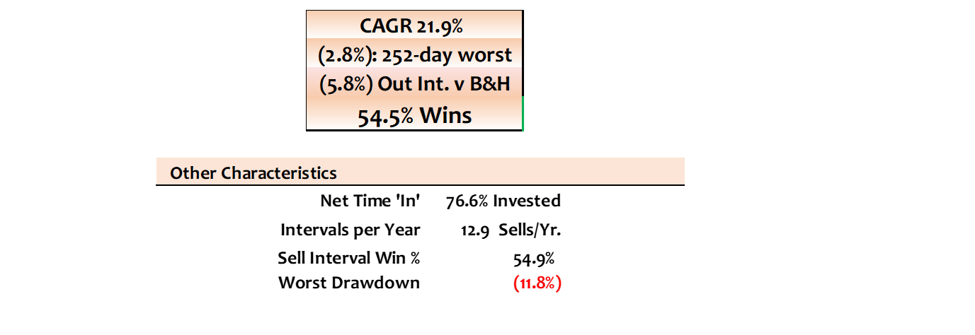
I prefer to be cautious about expectations, so while parameters are not set to optimize results, they are close. For example, CAGR could be increased to about 22.5% if the correlation threshold were set at an optimal fixed level rather than a variable one. But other parameters are set at or near back-fit values. I tested material variations and my expectation is that CAGR should be at 20% over the long haul, but worst losses are likely to be mid-single digits rather than the 2.8% reported above. Drawdowns, before the refinements, were 11.8% using the trailing optimizations of the core models, so that should be a fair reflection.
Closing
In my GDP comments I posed this question:
Hurricane Ian was not expected to produce a 500-year flood, but according to the governor it did. Jamie Dimon has been predicting a hurricane in financial markets; will it be a 20-year event, a 50-year event, or worse?
I come back to that because it presents an obvious, but seldom expressed, issue. The modeling I do is based on 14 years of history. It has performed beautifully over that time span and similarly over the three years of the EZV service. But 14 years is not 500 years, so if markets do experience a “500-year flood” or anything like that, things could become stressful.
This year has already been aberrant in many respects. The Fed put that dominated 2021 has been replaced by a tug of war between realists who see the depths of potential problems and optimists who believe the Fed will relent soon in its war on inflation. My own most likely scenario is that the Fed will continue their demand-destruction up to the point of market capitulation and then it will modify but not reverse policy. With SPY down 25% we’re probably half way there, but the next 25% could be rocky.
Be careful out there!
Be the first to comment