

leolintang/iStock via Getty Images
Two years ago, Bloomberg’s Eric Balchunas tweeted about a hypothetical exchange-traded fund (“ETF”) that would select stocks at random. Since I had an account on the Folio investing platform, where I could create and run live U.S. stock portfolios without the cost an overhead of an ETF, I responded by creating five actual random portfolios. I then followed up a year later, and am sad to now report that I am closing out this experiment with this article after two years.
To recap my simple methodology for constructing these five random portfolios:
- Universe: I started with the Russell 3000 index of U.S. stocks, then had to limit selections from the 2,863 that were tradable on the Folio platform.
- Each “Random Stock Portfolio” would be a sample of 30 stocks (about 1% of the Russell 3000’s names, NOT 1% of the index weight). I would choose these stocks at random from the universe, then equally weight them.
- I ran the random sampling by sorting the Russell 3000 index components by the values of an Excel rand() function, and then selecting sequential blocks of 30 each.
- I ran 5 of these random stock portfolios in parallel, to get some sample of the dispersion / variance of what five completely different but similarly constructed random portfolios might produce.
Below are the results of each of the five random portfolios, followed by a snapshot of the final holdings and weights. For reference, the performance of each portfolio is benchmarked against the overall Russell 3000 index, which can be tracked by the iShares Russell 3000 (IWV) or Vanguard Russell 3000 (VTHR) ETFs.
I expected even from the start that these random portfolios would have a significant tilt towards small and even micro caps, but since I did not factor in value or profitability, I expected these to be very different from how I look at small-cap value.
One final note: I am closing out these portfolios and have already closed all my positions in all of these portfolios, so my disclosed holdings are names I just happen to have positions in in other accounts.
Random Portfolio #1
This first random portfolio is the only one whose performance I will screenshot with the explanatory text around it. This one has a dotted line because it seems to have had the most securities absorbed by corporate actions, the results of which we will see after the chart when we look at the holdings. Despite that corporate action, this randomly selected portfolio seems to have significantly outperformed the Russell 3000 Total Return Index (labelled as “^RUATR” in the charts below), with most of that outperformance occurring between October 2020 and March 2021.
Goldman Sachs Folio Institutional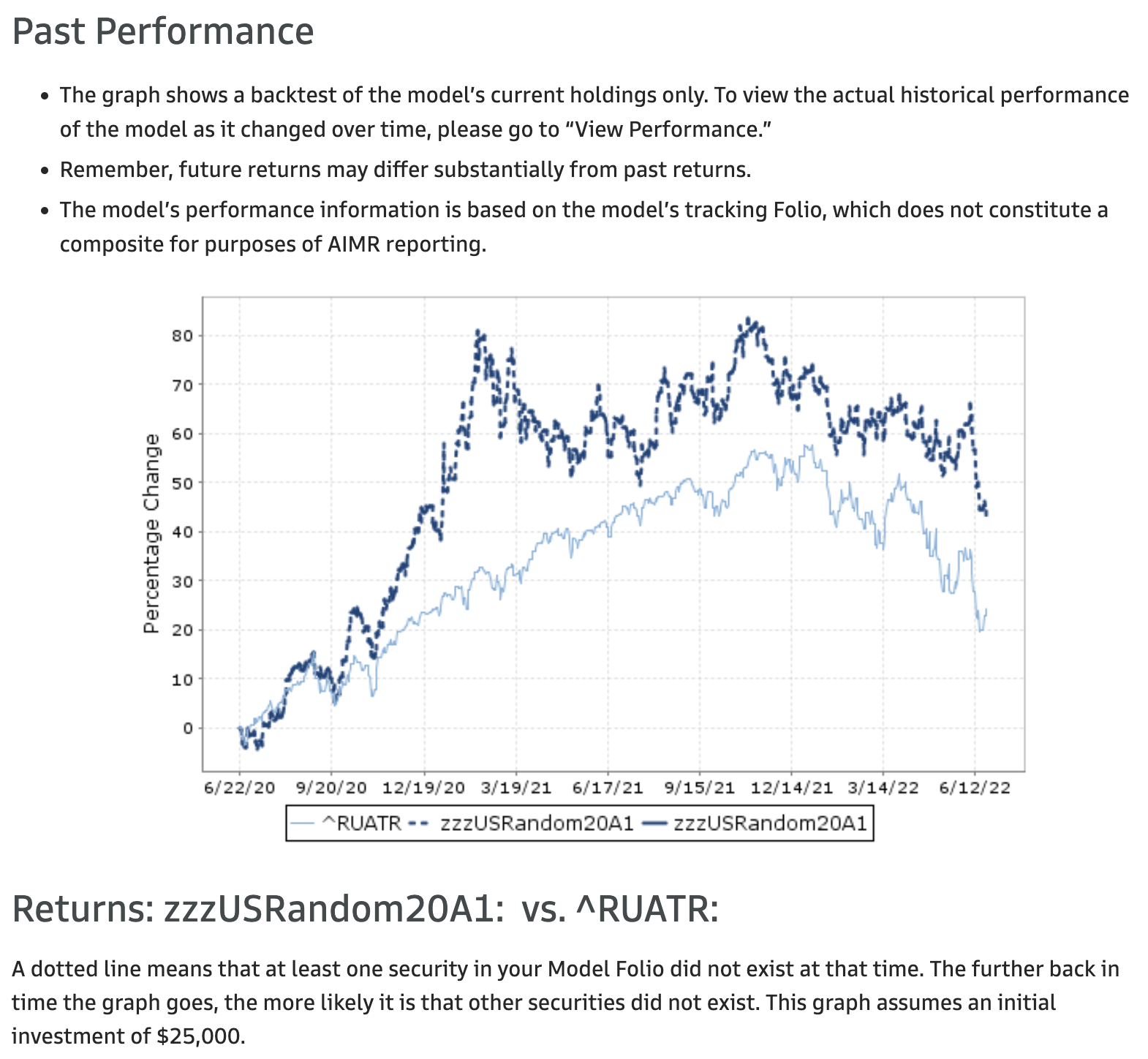
For reference, here is the parting snapshot of the final holdings, with their final weights. Note the portfolio has become 14.5% cash, and has 7% in leftovers from the Supernus acquisition of Adamas Pharmaceuticals. Other than that, the top performer in this portfolio based on the final weights was Darling Ingredients (DAR), with the long unprofitable biotechnology firm Black Diamond Therapeutics (BDTX) being the outlier worst performer.
| Symbol | Current Weight |
| ADMS.CVR1 | 0 |
| CCS | 3.61 |
| AQUA | 4.15 |
| GCP | 4.29 |
| EXPI | 4.54 |
| MCK | 4.9 |
| SKT | 5.11 |
| PBF | 5.75 |
| DAR | 6.18 |
| ADMS.CVR2 | 7.05 |
| FDIC.CASH | 14.56 |
| OVBC | 3.29 |
| BUSE | 3.24 |
| POWI | 3.02 |
| LNT | 3.01 |
| FBC | 2.88 |
| ARGO | 2.89 |
| EIX | 2.87 |
| OHI | 2.72 |
| MA | 2.59 |
| AMOT | 2.4 |
| GRC | 2.38 |
| PRAA | 2.28 |
| DMRC | 2.17 |
| INCY | 1.71 |
| UPLD | 1.07 |
| CNCE | 0.95 |
| XELA | 0.27 |
| BDTX | 0.13 |
Now let’s compare this to the other random portfolios…
Random Portfolio #2
When I pulled up the performance of the second random portfolio, I was pleased to see a solid line, indicating that all stocks in the final portfolio have continuous performance records over the two years since we randomly selected the initial portfolio. Since the final holdings, listed below, only contain 29 stocks and a 4.33% position in cash, I would guess one of the original 30 stocks was bought out for cash, and I don’t have the original holdings handy enough to look up which one that was. Again, we see significant outperformance of this random portfolio over the Russell 3000, and again, most of that outperformance seems to have come between October 2020 and June 2021.
Goldman Sachs Folio Institutional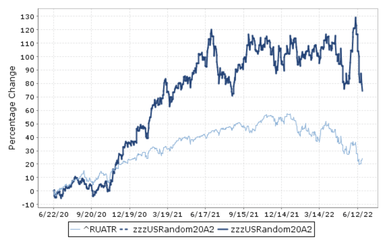
Here are the 29 remaining stocks with their weights and that final cash position.
| Symbol | Current Weight |
| ARI | 3.36 |
| PTC | 3.43 |
| FORR | 3.52 |
| FISI | 3.97 |
| OPBK | 4.04 |
| SONO | 4.08 |
| KLAC | 4.24 |
| LPX | 5.42 |
| BG | 5.66 |
| FDIC.CASH | 4.33 |
| LPI | 11.96 |
| APH | 3.34 |
| MWA | 3.23 |
| NUS | 3.12 |
| PEB | 3.08 |
| BERY | 3.04 |
| SR | 2.94 |
| MD | 2.86 |
| EXPE | 2.86 |
| FNWB | 2.75 |
| AIMC | 2.62 |
| PDFS | 2.57 |
| AL | 2.58 |
| GNL | 2.55 |
| RYAM | 2.28 |
| TCX | 1.76 |
| NNBR | 1.41 |
| MTRX | 1.31 |
| CNNE | 1.28 |
| EVER | 0.4 |
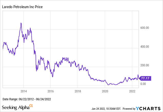
The main outlier in this portfolio was Laredo Petroleum (LPI), which has had a wild ride, but is up almost 5-fold since this experiment selected it at random two years ago.
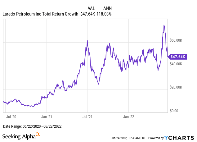
When we zoom out, it seems clear that this outsized return from LPI was entirely due to the dumb chance of this experiment selecting it when the stock was so beaten down, that it didn’t take much of a recovery for the stock to more than quadruple. This is not unlike what I saw and wrote about with Tupperware when it recovered from its lows.
Random Portfolio #3
Moving on to the third random portfolio, we again see a solid line, and significant outperformance mostly due to the October 2020 to June 2021 period.
Goldman Sachs Folio Institutional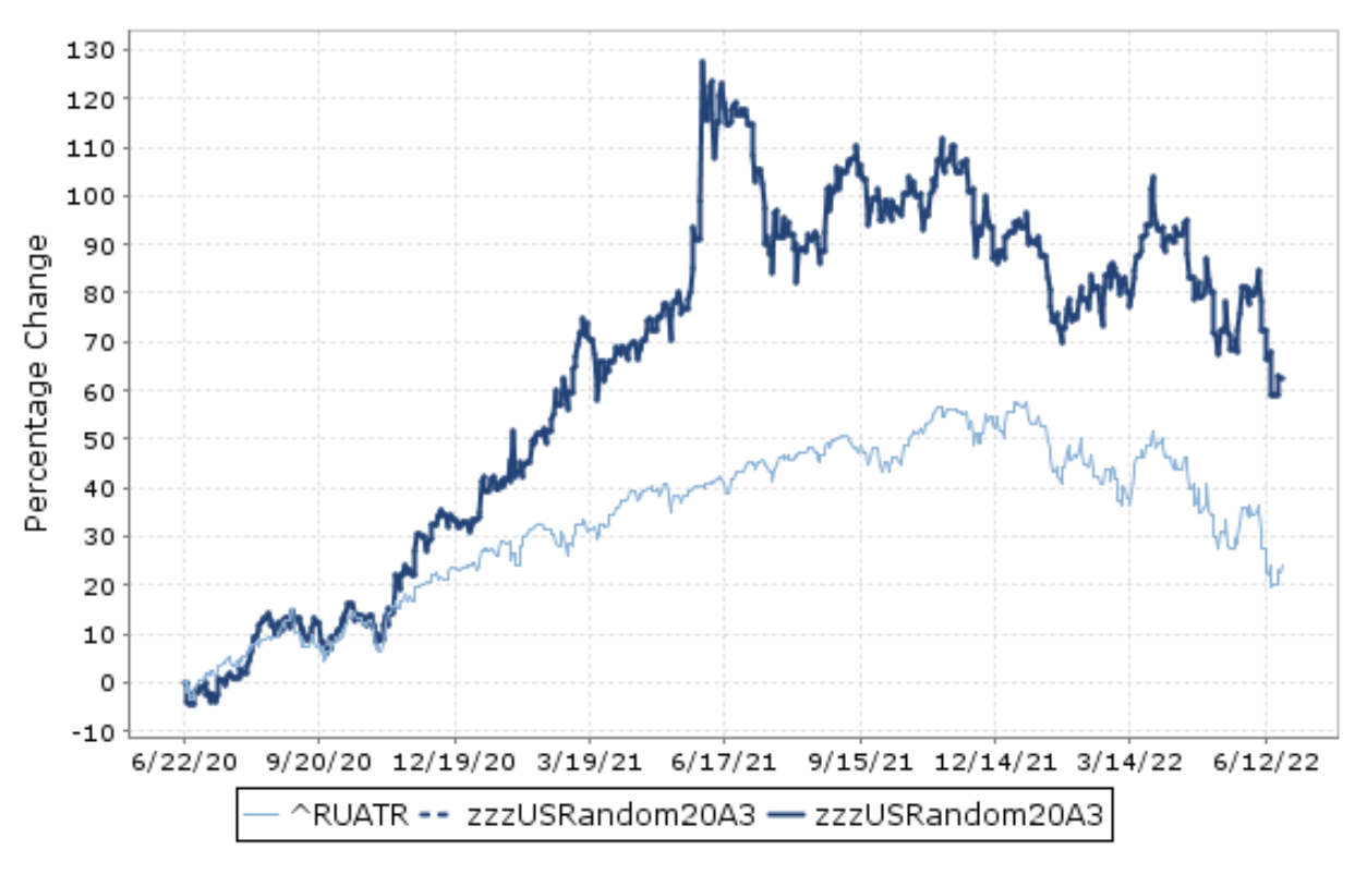
Compared with the second random portfolio, the third one didn’t have any outliers finishing with weights finishing above 8%, let alone almost 12% like LPI, and also no stocks finishing with weights below 1%, let alone the 0.4% of EVER.
| Symbol | Current Weight |
| ROIC | 3.45 |
| SNA | 3.52 |
| CATO | 3.6 |
| TSCO | 3.71 |
| EME | 3.8 |
| SND | 3.99 |
| RLGT | 4.06 |
| WTFC | 4.13 |
| NNI | 4.14 |
| FLXS | 4.25 |
| HPQ | 4.93 |
| AMC | 5.09 |
| PXD | 6.12 |
| PWR | 7.3 |
| FDIC.CASH | 4.94 |
| DGX | 3.06 |
| FBMS | 3.03 |
| ABM | 2.65 |
| NLOK | 2.57 |
| EPAC | 2.49 |
| KEX | 2.44 |
| QNST | 2.34 |
| FICO | 2.22 |
| EVOP | 2.18 |
| PATK | 2.08 |
| CARG | 1.98 |
| BURL | 1.69 |
| SATS | 1.57 |
| IPGP | 1.38 |
| CCL | 1.26 |
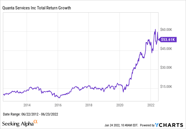
The top performer in this third portfolio was Quanta Services (PWR), which unlike LPI, was not a recovery after a steep COVID-induced fall, but rather was a stock that seemed to go nowhere until COVID, and then somehow took off. Below I only chart the 10-year performance of PWR to show the difference of before and after the mid-2020 date when we just happened to start our experiment.
Random Portfolio #4
The performance of our fourth random portfolio is also a solid line, and at first it looks quite similar to the first three, but here we notice the outperformance was not as solely reliant on the October 2020 to June 2021 period, as we also see bursts of outperformance around October 2021 and the second quarter of 2022.
Goldman Sachs Folio Institutional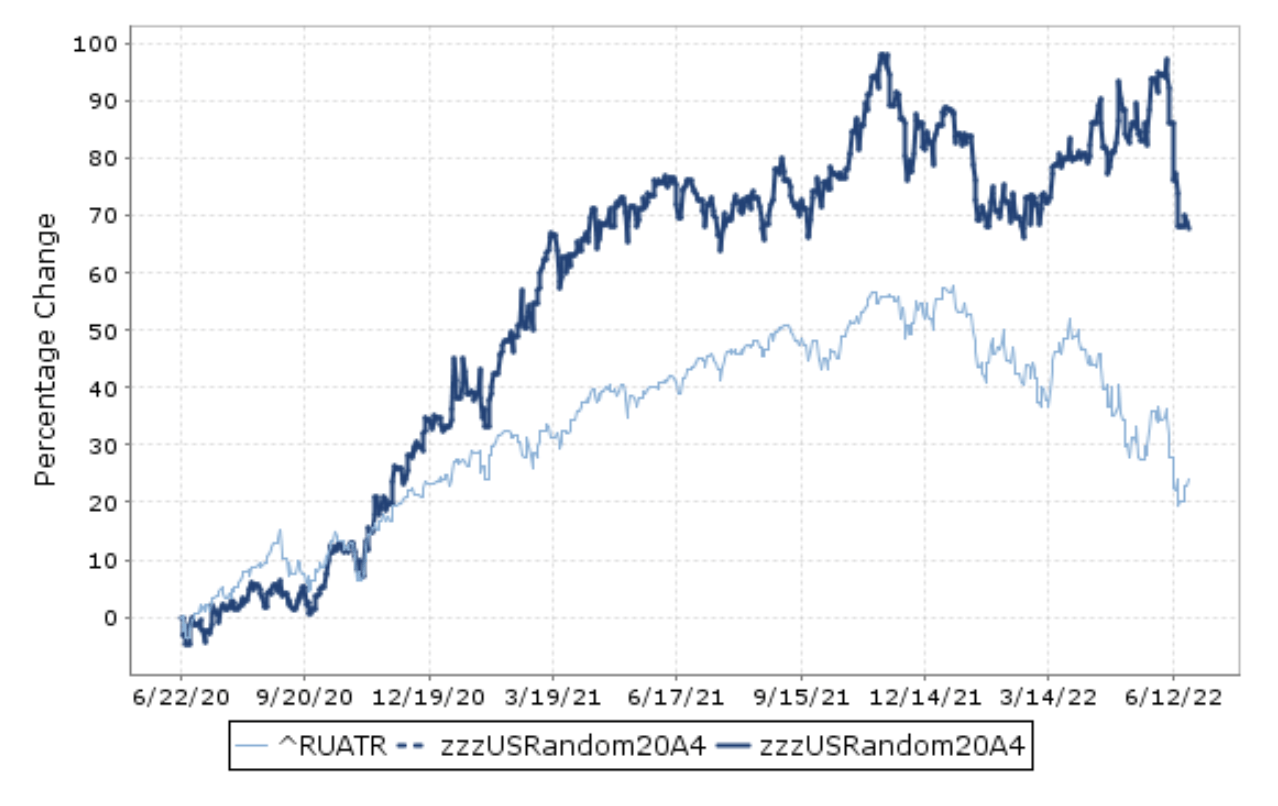
Seeing the larger cash position of 7.7%, and that there are only 28 stocks here tells me there might have been two cash acquisitions out of the original 30 stocks, but otherwise nothing too surprising in these final holdings.
| Symbol | Current Weight |
| WWE | 3.49 |
| AVY | 3.67 |
| CPF | 3.84 |
| CMLS | 3.94 |
| CTLT | 4.03 |
| WMK | 4.33 |
| UMBF | 4.35 |
| NFG | 4.49 |
| FFIC | 5.5 |
| NL | 7.53 |
| OLN | 9.67 |
| FDIC.CASH | 7.67 |
| VSEC | 3.33 |
| AVA | 3.29 |
| FND | 3.2 |
| GO | 3.17 |
| TWTR | 3.02 |
| CAH | 2.77 |
| QGEN | 2.75 |
| NINE | 2.67 |
| JKHY | 2.62 |
| ENTA | 2.43 |
| PLMR | 1.93 |
| CLX | 1.78 |
| LVS | 1.75 |
| NFLX | 1.05 |
| TCDA | 0.98 |
| RDFN | 0.63 |
| PTE | 0.13 |
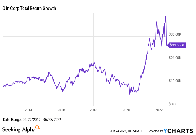
The top performer in portfolio #4 was commodity chemical manufacturer Olin Corp (OLN), which somewhere between LPI and PWR traded sideways from 2012 to 2020, with a fall of over 50% from 2018 to 2020, until skyrocketing
On the other extreme, the worst performer in this fourth portfolio was PolarityTE (PTE), a biotech firm that has been reporting annual losses every year since 2013.
Random Portfolio #5
Finally, we plot the performance of the fifth and final random portfolio I created, which interestingly enough has a dotted line between its period of its most significant outperformance between about July 2021 and March 2022, with solid lines before and after. Even before the dotted line period, the outperformance seems to have been significant, and then we see as even steeper decline than IWV/VTHR after the dotted period, so I definitely want to know more about what drove this.
Goldman Sachs Folio Institutional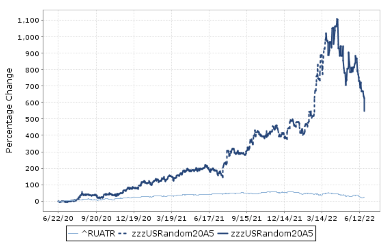
In the final holdings and weights of the fifth portfolio, we see just over 9% in cash with 28 remaining stock positions, whose weights ended at the most extreme levels of any of the five portfolios with a range of 0.01% to over 27%.
| Symbol | Current Weight |
| EMBC | 0.04 |
| RUTH | 3.63 |
| PBPB | 3.71 |
| ARLO | 4.39 |
| ACHC | 4.59 |
| RILY | 4.67 |
| GLNG | 4.79 |
| FDIC.CASH | 9.15 |
| LXU | 27.17 |
| HVT | 3.34 |
| SIVB | 3.2 |
| RF | 2.89 |
| TRV | 2.53 |
| HCKT | 2.53 |
| PZN | 2.5 |
| JWN | 2.42 |
| PVH | 2.33 |
| FAST | 2.27 |
| PINC | 1.91 |
| ISRG | 1.85 |
| BDX | 1.85 |
| MRVL | 1.72 |
| POWL | 1.68 |
| HAIN | 1.33 |
| TSAT | 1.29 |
| GPN | 1.15 |
| YEXT | 0.57 |
| SPPI | 0.48 |
| MNKKQ | 0.01 |
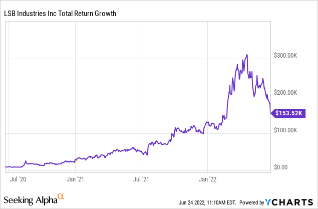
The far and away outlier on the upside of this portfolio was LSB Industries (LXU), which went up over 30-fold from the start of our experiment in June 2020 through around March 2022, before declining by half in recent months. Looking at the above weights and this chart, it seems that this one stock came to dominate the portfolio on the way up and on the way down, and some automatic rebalancing would have helped this portfolio take some profits and lower overall volatility.
Conclusions
While it at first surprised me that five out of five of the random portfolios outperformed the Russell 3000, my main explanation for this was that we started this experiment by selecting mostly obscure and smaller stocks shortly after the 2020 COVID-19 crash. I had already noted in April 2020 how I expected small caps to outperform coming out of COVID, and so seeing how most of the outperformance of the first four random portfolios happened between late 2020 and mid 2021 seemed to be something I could explain with this size and liquidity factor.
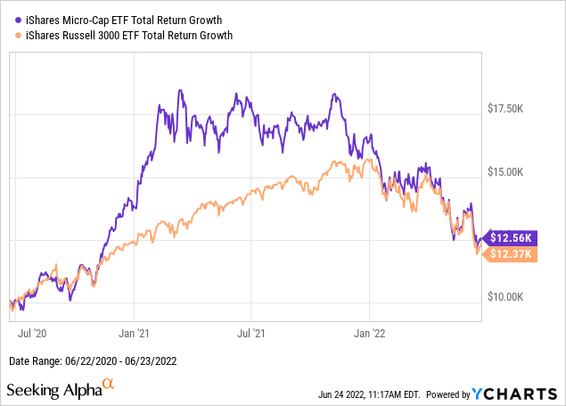
A counter-argument to this explanation is if we look performance of the iShares Micro-Cap ETF (IWC) versus IWV, where we see outperformance in 2020-2021 like our portfolios, but unlike our random portfolios, IWC gave this all back in 2021-2022. I would like to explore further how exactly this happened in all five cases, but my first guess is that by having only 30 stocks, the outliers on the upside had more of an opportunity to drive upside, and perhaps we got lucky by picking relatively few stocks that fell by 90% or more.
Another conclusion I might draw from this experiment is that 30 stocks really does seem to provide more than enough diversification, even in silly cases where we pick stocks completely at random. I have long argued that individual human investors are better off owning 30 stocks they know than 300 or 3,000 they don’t know, and if owning only 30 stocks lets you know what you own better, the results of this experiment should make you more confident in that focus than in the random selection part.
Be the first to comment