

rarrarorro/iStock via Getty Images
Co-produced with Beyond Saving
Long-time readers know we spent the past year warning about high inflation and discussing ways to be positioned to benefit from it. I think today, we can all admit that inflation is not “transitory”. Investors who positioned their portfolios to benefit from it had a good Q1, those who stuck with Growth stocks, not so much. Well, the past is the past. Yay to us, nobody cares, it’s time to figure out how to collect dividends tomorrow. Now it’s time to think about the future.
Recently, the yield curve inverted along with the widely watched 10-2 year spread. Today, I want to take a closer look at the yield curve, and what it means for the potential of a recession. While the news media is drooling over the possibility of a recession, I see a much different path. Recession risks are very low for the foreseeable future.
Reading the economic tea leaves is never straightforward. There are often conflicting indicators, one that points toward doom and gloom, and others that point to glitter and gold. Reading them is as much art as science and you must constantly consider the big picture. Let’s take a look at what is happening today.
The Yield Curve Inverted
The yield curve officially “inverted” for a brief period, with 2-year Treasuries trading at a higher yield than 10-year Treasuries. The spread remains very low, and it wouldn’t take much for it to invert a second time.
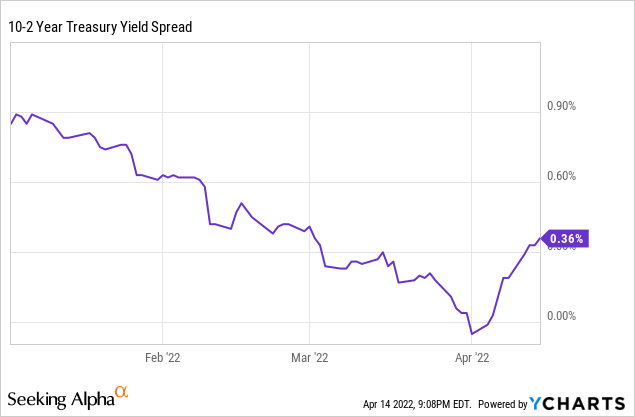
Grab your bowl of popcorn and cue the news articles about the upcoming recession. A yield curve inversion is not a reason to panic in the near term. In fact, historically it has been a buy signal indicating that the next 12 months will be positive for the stock market. The historical pattern is that after an inversion happens it is 1.5 years or even longer before a recession happens. File this bit of information away as notice that in 12-18 months, recession risk might be elevated.
Why do I say “might”? The 10-2 spread inverting has been a sign of recession in the future, but one with a large time lag. In several cases, the curve would invert, then recover, and then invert a second time, and then a recession would follow in a couple of years. Recession always followed, but every time I’ve eaten a banana a recession eventually followed too. And if the curve inverts twice, does that mean the first inversion didn’t predict a recession? Or is the second inversion a continuation of the first?
Historically, the 10-year to 3-month Treasury spread has an even better record of predicting recessions. Timing-wise, it has proven a bit more useful as it typically occurs about a year before a recession. Which is a reasonable warning period to start positioning yourself more defensively, without missing the typical equity runup we see in the years leading to a recession.
Here is a look at the spread between the 10-year and 3-month Treasuries. Below the black line is an inversion and the shaded areas are recessions. Note that the one “oddball” is 2019 when this spread inverted and was 2020 really a “recession” or was it a false signal? Well, COVID did bring the economy to a halt. In many ways, COVID played across the economy like watching a recession on TV at full fast-forward.
ST. Louis Fed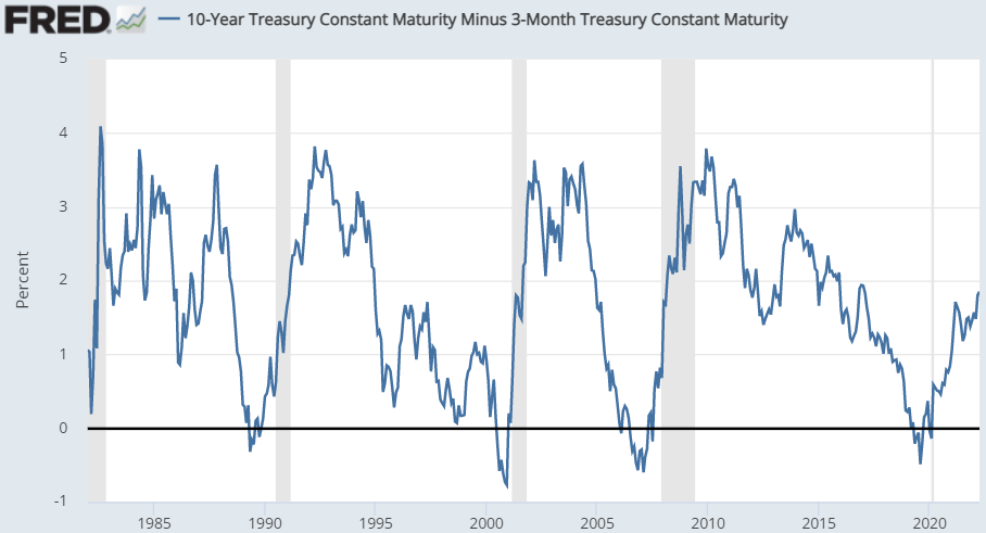
You’ll note that this spread is not indicating a recession risk right now. In fact, it is higher than it has been in several years. This spread has gone up significantly, while the 10-2 year Treasury spread has collapsed.
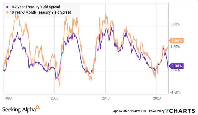
The years where these two spreads diverged this far include 2010, 2002, and 1994. In all cases, these incidents were followed by at least five years of positive equity returns. This signal implies that we will go 5+ years without a recession.
The Problem With Patterns
This is the problem with trying to rely on patterns to predict the future. It isn’t enough to recognize a pattern, you need to understand why the pattern exists. That way, when you have a situation where you have two patterns that both have a good track record that suddenly predict very different things, you can determine which one is right.
In today’s case, the 10-2 spread inverting has been a historically reliable indicator that a recession will start in the next 1.5 to 3 years. Looking at this one point, we would conclude that the risk of a recession in the U.S. is elevated and we can expect a recession starting sometime from Q4 2023 through Q4 2026.
Yet, when we look at an arguably more consistently accurate and more timely indicator, the 10-year to 3-month spread, it is suggesting there is no recession in sight.
So let’s take a deeper look into what an inversion actually means from a practical standpoint.
Why Inversion Is “Bad”
The yield curve is a smart money poll:
From a 50,000-foot level, a longer-dated bond trading at a lower yield than a short-dated bond means that investors have a negative view of near-term economic conditions compared to the long-term. If you believe a recession is coming next year, then owning 10 to 30-year bonds is a way to protect yourself. What happens during a recession? Yields decline. So owning longer-dated bonds is more profitable than shorter maturity bonds if a recession occurs.
So a yield curve inversion can be read as basically a poll of big-money investors. If they are buying more longer-dated bonds than short-term bonds, you might conclude that they are bearish on the economy. Since it is generally huge institutions that move the bond market, many might say this is the “smart money”. If the smart money is betting trillions on a recession occurring, you probably don’t want to be against it.
Banks and lending:
Banks and lenders play a huge role in America’s consumption-centric economy. Let’s face it, living within your means just isn’t the American way. Borrowing to buy houses and cars and having a wallet overflowing with credit cards has been the fuel for the U.S. economy for decades.
Banks make money from borrowing short-term debt and lending long-term debt. So when the yield curve inverts, this means that it is less profitable to lend. If it is less profitable to lend, lenders tend to tighten up and not lend as much. When they tighten up, borrowers can’t refinance, they can’t borrow more and demand declines. If demand declines enough, you have a recession.
This is the pattern we’ve come to expect. Lending slows down, consumers stop buying, and companies have to cut back due to lack of demand. That’s a recession. This is probably the most convincing theory for how an inverted yield curve is actually a contributing factor to a recession. The best signals are those that have a causal impact.
10-2 Year, or 10-Year to 3-Month?
Which spread should you look to? Well, the 10-year to 3-month is certainly a much more accurate representation of what life is for banks. Banks generally do not borrow 2-year money, they are borrowing 3 months or even shorter. So the 10-2 year inverting doesn’t mean much from a practical standpoint.
The way I look at it is the 10-2 spread inverting is a “yellow flag”. It’s something that should be observed and noted, but not something that needs to be obsessed over. We have the inversion, now we should watch the 10-Year to 3-Month Spread. Currently, that spread is increasing.
The Economic Backdrop
As the news media pontificates on the risk of a recession, the economic data continues to reinforce that the economy is hot and driven by high demand. Unemployment is low, job openings are high, wages are climbing and inflation is high. These are all signs of a growing economy.
Of course, economic numbers are always trailing. In the past month, we’ve seen gasoline prices skyrocket, commodity prices going through the roof and the Federal Reserve’s first rate hike in the post-COVID era. All of which could have an impact. In the coming weeks, we’ll see March numbers being compiled which will provide more insight into how these things impacted the economy.
Manufacturing Purchasing Managers Index (PMI)
The first report covering March that has been released is the ISM Manufacturing PMI. The ISM Manufacturing PMI report is an index that measures the economic activity of U.S. manufacturers through a survey of purchasing managers of major U.S. businesses.
The overall number is 57.1% for March, which as news media headlines like to describe as “stumbling” and gleefully point out is “the lowest in 18 months”. Scary stuff, I’m sure those headlines generated lots of clicks.
The last time the manufacturing PMI was exactly 57.1% was July 2014. For those of you who don’t remember the economic collapse of 2014, it was dark days, the economy was in shambles, cities were empty, zombies were rising from the dead and eating people’s brains… Oh wait, that was the Walking Dead. It was quite popular back then and people were far more concerned with what happened on the show last Sunday than the PMI.
Just for fun, I looked up an old headline from the last time PMI was exactly 57.1%:
“July ISM factory index hits 3-year high”
Same website, same number, 8-years later:
“U.S. factory activity stumbles in March to lowest level in 18 months, ISM survey shows”
This headline is actually 100% false. It implies that factories had less activity in March than they had in February (or even the past 18 months). PMI doesn’t measure gross activity, it measures the rate of growth. What really happened in March is that pace of growth slowed down, but activity was still much higher than in February. More goods were produced, more goods were sold, and more money exchanged hands.
A PMI reading above 50 indicates expansion. Recessions are generally associated with PMI readings below 43.2%. After all, it is not at all unusual for manufacturing to slow down for a few months even during an expansion cycle. PMI is always measuring this month over last month.
The Demand Bubble
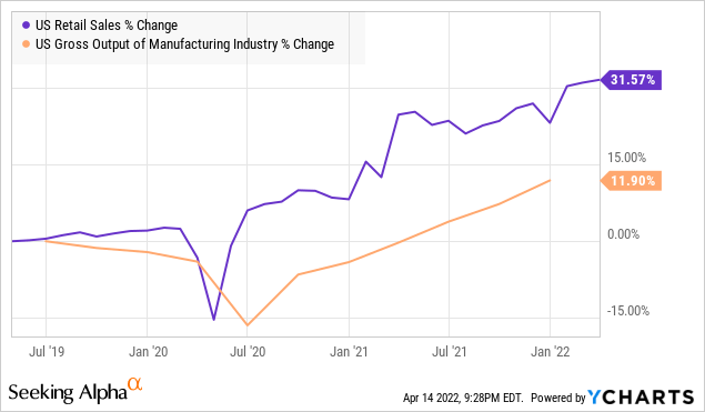
Previously, I highlighted how supply chain problems and inflation were being driven by excessive demand. Manufacturers in the U.S. are producing more than they ever have. Yet no matter how fast they produce, they have been unable to keep up with insatiable consumer demand.
This high demand is being met with an inability of current supply chains and infrastructure to meet it. Econ 101 says that when demand is higher than supply, prices rise. Yet so far, rising prices have not had a material impact on reducing demand. It seems unlikely that the Fed’s token interest rate raises to date will have a material impact.
The Bubble of Liquidity
As expected, the Fed’s small raise in interest rates had no impact on the Bubble of Liquidity. (Source: St. Louis Fed)
ST. Louis Fed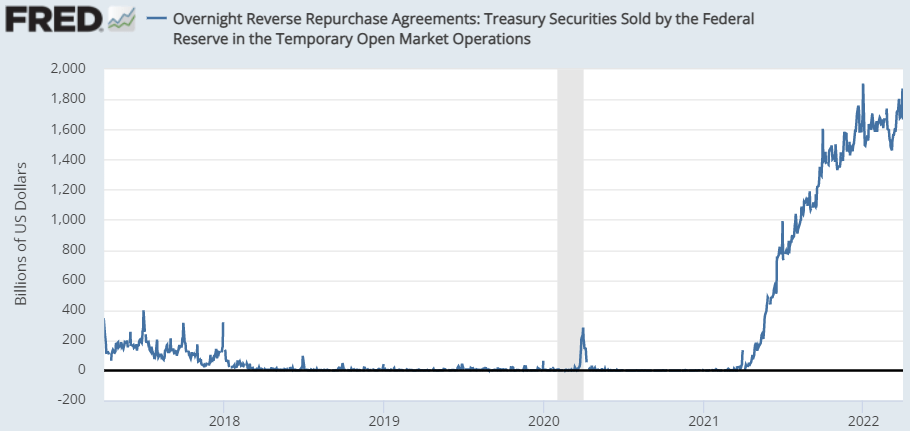
U.S. banks continue to lend $1.6-$1.8 trillion to the Federal Reserve every night. Meanwhile, U.S. non-financial corporations are sitting on record levels of liquidity with over $7 trillion in liquid assets.
ST. Louis Fed
This is 30% higher than Q4 2019. We are in an era where there is a combination of businesses having significant cash on hand, while banks are also very liquid allowing for easy credit. This combination is why we continue to see record low levels of corporate debt defaults.
Bet On The U.S.
Let’s review:
- The yield curve inverted along the 10-year/2-year line, a possible indicator of a recession in a few years. However, the 10-year/3-month curve has steepened and has historically been a more accurate indicator of recession.
- Other economic indicators remain strong across the board. Unemployment is low, demand is high, capital expenditures are up, and U.S. businesses are expanding.
- Consumer demand in the U.S. has been resilient despite rising prices.
- Manufacturers are constrained from meeting demand by supply chains and infrastructure.
- Banks and lending institutions continue to have a historically high amount of liquidity.
- Corporations have historically high liquidity.
- Corporations are looking at ways to “onshore” or “nearshore” their supply chains following the COVID complications. This means more investment in the U.S.
It is very hard to see how a recession starts in this kind of environment. The only indicator that points towards recession is the 10-2 yield spread inverting. However, that is a pattern that has been less than 100% reliable and one that usually takes several years. All of the other data is pointing towards economic expansion.
Shutterstock
Conclusion
It is easy to get sucked into one or two sensationalized metrics. The financial media is like any media – the primary goal is selling clicks. As someone who crafts titles myself, I am well aware of the power of a sensational title.
As investors, it is important for us to always look beyond the headlines. The headlines might impact prices for a day, but what really matters is the actual impact on our investments and the profitability of the underlying companies.
I remain very bullish on the U.S. economy. The yield inversion is a caution sign, but one that has historically been followed by a green year for stocks. Historically, the date of the inversion has been a buy signal, not a sell signal, even when it did accurately predict a recession.
The market is full of great income opportunities that are on sale simply because the yield curve inverted. Investors should be taking advantage of these low prices to grow their income. When the market has a red day because of “bad news”, I don’t panic. I salivate at the opportunity to reinvest my dividends at great prices.
This is the freedom of being an income investor, who profits from regular recurring dividend income instead of trying to flip stocks at higher prices. I don’t need to sell, I have dividends being deposited every week saying I can buy as others panic over this signal or that signal. Whether the market is red or green, my income is growing every month, is yours growing too?
Be the first to comment