

syahrir maulana
This ETF article series aims at evaluating products regarding the relative past performance of their strategies and quality metrics of their current portfolios. As holdings and weights change over time, updated reviews are posted when necessary.
IWN strategy and portfolio
The iShares Russell 2000 Value ETF (NYSEARCA:IWN) has been tracking the Russell 2000 Value Index since July 2000. IWN has 1394 holding, a 12-month distribution yield of 2.00% and a total expense ratio of 0.23%.
As described in the prospectus by iShares, the underlying index measures the performance of a small cap segment of the US stock market. It includes companies with “lower price-to-book ratios, lower sales-per-share historical growth and lower forecasted growth” in the parent index Russell 2000. It represents about 52% of the Russell 2000 market value. Turnover in the last fiscal year is 35%.
IWN invests almost exclusively in U.S. companies (98.5% of asset value). The heaviest sector by far is financials (28.9%). It is followed by industrials (13%), healthcare (10.6%), real estate (10.6%) and consumer discretionary (10%). Other sectors are below 7% individually and 27% together. Compared to its parent index Russell 2000 (IWM), the fund overweights financials, real estate, and to a lesser extent utilities and communication. It underweights mostly technology and healthcare.
IWN sectors (Chart: author; data: iShares.)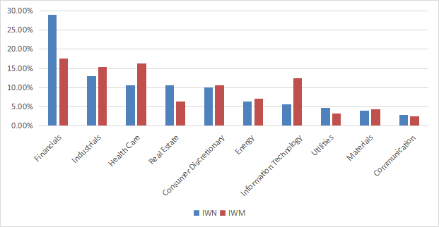
As expected, IWN is cheaper than the Russell 2000 regarding the usual valuation ratios, reported in the next table.
|
IWN |
IWM |
|
|
Price / Earnings TTM |
9.48 |
11.59 |
|
Price / Book |
1.3 |
1.91 |
|
Price / Sales |
0.93 |
1.15 |
|
Price / Cash Flow |
7.72 |
9.66 |
The top 10 holdings, listed below with valuation ratios, represent only 4.7% of asset value, and the heaviest position weighs less than 0.6%. The portfolio is well diversified and risks related to individual companies are very low.
|
Ticker |
Name |
Weight (%) |
P/E TTM |
P/E fwd |
P/Sales TTM |
P/Book |
P/Net Free Cash Flow |
Yield% |
|
SouthState Corp. |
0.54 |
13.87 |
12.85 |
4.12 |
1.34 |
N/A |
2.32 |
|
|
STAG Industrial, Inc. |
0.49 |
24.83 |
36.81 |
9.30 |
1.72 |
N/A |
4.43 |
|
|
Glacier Bancorp, Inc. |
0.46 |
23.27 |
20.87 |
6.91 |
2.30 |
32.96 |
2.47 |
|
|
Light & Wonder, Inc. |
0.46 |
N/A |
1.53 |
2.43 |
6.91 |
18.36 |
0 |
|
|
Old National Bancorp |
0.46 |
17.84 |
9.55 |
3.81 |
1.17 |
11.05 |
2.98 |
|
|
RBC Bearings, Inc. |
0.46 |
84.49 |
30.99 |
5.02 |
2.78 |
47.40 |
0 |
|
|
United Bankshares, Inc. (West Virginia) |
0.46 |
16.33 |
14.95 |
5.72 |
1.30 |
58.34 |
3.36 |
|
|
Valley National Bancorp |
0.46 |
12.10 |
9.83 |
3.49 |
1.08 |
6.22 |
3.41 |
|
|
Agree Realty Corp. |
0.45 |
37.76 |
38.90 |
13.80 |
1.28 |
47.73 |
4.16 |
|
|
Selective Insurance Group, Inc. |
0.45 |
24.35 |
18.33 |
1.58 |
2.49 |
8.85 |
1.31 |
Since inception in July 2000, IWN beats its parent index by 1.3 percentage points in annualized return and it is close to it in risk metrics (maximum drawdown and historical volatility).
|
Total Return |
Annual Return |
Drawdown |
Sharpe ratio |
Volatility |
|
|
IWN |
553.18% |
8.79% |
-61.17% |
0.44 |
20.26% |
|
IWM |
399.83% |
7.49% |
-58.26% |
0.37 |
20.62% |
Data calculated with Portfolio123
IWN also beats the Russell 2000 in 2022 (next chart). However, it lags its main competitors: the iShares S&P Small-Cap 600 Value ETF (IJS), the Vanguard Small-Cap Value Index Fund (VBR) and the Avantis U.S. Small Cap Value ETF (AVUV). AVUV is the best performer year-to-date.
IWN vs. IWM and competitors (Portfolio123)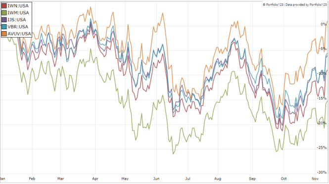
Comparing IWN with my value benchmark
The Dashboard List is a list of 80 stocks in the S&P 1500 index, updated every month based on a simple quantitative methodology. All stocks in the Dashboard List are cheaper than their respective industry median in Price/Earnings, Price/Sales and Price/Free Cash Flow. After this filter, the 10 companies with the highest Return on Equity in every sector are kept on the list. Some sectors are grouped together: energy with materials and communication with technology. Real estate is excluded because these valuation metrics don’t work well in this sector. I have been updating the Dashboard List every month on Seeking Alpha since December 2015, first in free-access articles, then in Quantitative Risk & Value.
The next table compares IWN performance since inception with the Dashboard List model, with a tweak: here the list is reconstituted once a year to make it comparable with a passive index.
|
Total Return |
Annual Return |
Drawdown |
Sharpe ratio |
Volatility |
|
|
IWN |
553.18% |
8.79% |
-61.17% |
0.44 |
20.26% |
|
Dashboard List (annual) |
1182.85% |
12.13% |
-57.52% |
0.65 |
17.09% |
Past performance is not a guarantee of future returns.
The Dashboard List beats IWN by a significant margin in return and risk-adjusted performance (Sharpe ratio). However, IWN price history is real, whereas the model performance is hypothetical.
Fundamental shortcomings
Most value indexes have two shortcomings in my opinion, and IWN is no exception. The first one is to classify all stocks on the same criteria. It means the valuation ratios are considered comparable across sectors. Obviously, they are not: you can read my monthly dashboard here for more details about this topic. A consequence is to privilege sectors where valuation ratios are naturally cheaper, especially financials. Some other sectors are disadvantaged: those with large intangible assets like technology. To make things simple, companies with large intangible assets are those with a business model based on massive R&D, or a strong branding, or large user databases, or operating in a field where competition is limited by an expensive entry ticket. All these elements are not correctly reflected by valuation ratios.
The second flaw is using the price/book ratio (P/B), which adds some risk in the strategy. Intuitively, we can guess a large group of companies with low P/B contains a higher percentage of value traps than a same-size group with low price/earnings, price/sales or price/free cash flow. Statistically, such a group will also have a higher volatility and deeper drawdowns. The next table shows the return and risk metrics of the cheapest quarter of the S&P 500 (125 stocks) measured in price/book, price/earnings, price/sales and price/free cash flow. The sets are reconstituted annually between 1/1/1999 and 1/1/2022 with elements in equal weight.
|
Annual Return |
Drawdown |
Sharpe ratio |
Volatility |
|
|
Cheapest quarter in P/B |
9.95% |
-72.36% |
0.48 |
21.05% |
|
Cheapest quarter in P/E |
11.25% |
-65.09% |
0.57 |
18.91% |
|
Cheapest quarter in P/S |
12.62% |
-65.66% |
0.6 |
20.46% |
|
Cheapest quarter in P/FCF |
12.23% |
-63.55% |
0.61 |
19.05% |
Data calculated with Portfolio123
This explains my choice of using P/FCF instead of P/B in the Dashboard List model.
Takeaway
IWN selects stocks with value characteristics in the Russell 2000 index. Doing so, it combines two of the three factors of the original Fama-French model: size and value. IWN has beaten its parent index by a short margin of 1.3 percentage points in annualized return since inception. However, it lags its main competitors in 2022. I see two shortcomings in its strategy. First, it ranks stocks regardless of sectors and industries. This results in a high concentration of asset value in financials (28.9%), especially in banks (19%), and it underweights technology and healthcare. Value metrics work better to rank stocks in homogeneous sets (sector, industry). The second problematic point is using the price/book ratio as the main valuation factor. My Dashboard List model uses three valuation metrics, but not this one because I consider it too risky.
Be the first to comment