

ErikMandre/iStock via Getty Images
The stock market has been wild in the past several weeks. Since the year began, we’ve seen warning signs that selling was coming all over the place, and in the middle of January, those warning signs came to fruition. We’re now well over a month into this most recent selling episode, and while investors have been conditioned to buy the dip over and over in recent years, this time, I believe, is different.
Below, I’ll give you my take on the macro situation we find ourselves in today, and my outlook for what’s to come. Spoiler alert: it’s not good.
Where are we today?
Let’s begin with a chart of the S&P 500 ETF (NYSEARCA:SPY). Below, I’ve included a one-year, daily chart, and there are some very important annotations that I believe give us some clues that this selling episode may only be about halfway done.
StockCharts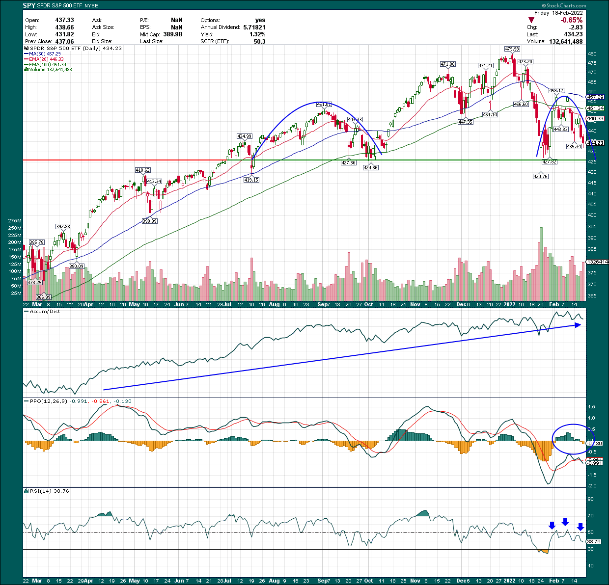
We’ll start with the price chart, which I’ve annotated with blue semicircles (roughly) that show what I believe is the later stages of a head-and-shoulders pattern. Now, before we get to the specifics, any pattern that is not yet complete is not yet a pattern. However, this one certainly looks like it is not only very close to completion, but that the odds of it completing are extremely high. That would have massive implications for the broader market, and not in a good way.
We can see the H&S has its neckline right at 427 (give or take). The left shoulder formed back in August/September of last year, with the head forming from November to January. Now that we’ve rolled over, the right shoulder is well and truly formed at this point. The only thing left for the market to do is fall below the neckline. That would unequivocally confirm the H&S pattern, and that would be tremendously bearish for this market.
The reason I think we’re going to break down and that this pattern is going to confirm is because sentiment isn’t bearish enough yet, and because the chart above is telling me we’re not done.
The one outlier on this chart is that the A/D line is still very near its high. That means dip buyers remain, which just means there isn’t enough pessimism in the market for a sustainable bottom yet. Bottoms are formed when sellers become exhausted, and the A/D line shows that just isn’t the case. When we see selling with a declining A/D line, we are then closer to a tradable bottom.
In addition, the PPO is in bearish territory, and has already rolled over, as I’ve shown with the circle on the histogram. In other words, we’re in bearish territory below the centerline, and momentum is weakening further. This is not a bullish behavior by any stretch.
Finally, we see exactly the same behavior with the 14-day RSI, another bearish indicator.
None of this suggests we’ve reached bottom and below, I’ll share some more reasons why I don’t think we’re there yet.
So what? It’s already happening
That’s a fair question, because plenty of pundits like to tell you they were right after it’s way too late to do anything about it. These Captain Hindsights simply try to make it seem like they knew what they were doing after the fact but it doesn’t do you any good in terms of making or saving money.
In my marketplace service, Timely Trader, I was cautious beginning in the middle of January, noting there were signs of weakness cropping up, particularly as it pertained to growth stocks. In recent weeks, I’ve turned from cautious to outright bearish, and have been for weeks at this point.
In fact, I have been talking about the H&S in the SPY for some time now with my members, and back on February 11th, I shared this chart with my members.
StockCharts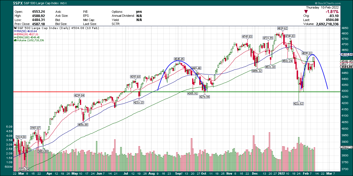
Note that this was when the right shoulder of the H&S was forming, and sentiment at the time was very bullish. After all, we’d just rallied from 4,300 to 4,600 in basically a straight line, and I can tell you from personal experience that remaining bearish in the face of that advance was pretty challenging. However, the next day we formed what would become the top of the right shoulder with a local double top at 4,600 on the SPX, and we’ve rolled over quickly since then.
In other words, rather than trying to cover up my past mistakes or touting how I knew all along this was going to happen, I’m showing you that technical analysis does work, and can save you a bundle of money when things go south.
Other factors to consider
I mentioned sentiment earlier and that’s another piece of the puzzle when you’re trying to figure out where a bottom may form. For pedestrian, run-of-the-mill dips, sentiment doesn’t move much. But for major selling episodes like what we’re in now, you need sentiment to collapse before a bottom is made. I showed the A/D line on the SPY above, and that is nowhere near collapse. However, there are others we can look at to see if we’re near a tradable bottom.
StockCharts
The obvious choice is the VIX, and I’ve plotted a 5-day simple moving average on the price chart, with the 10-day rate of change on the 5-day SMA in the bottom panel. The point of this is to show a smoothed version of the VIX and ROC to get an idea of what panic behavior looks like.
We can see that harsh selling episodes end up with the 5-day SMA in the area of 30 to 35, and we’re nearing that level now. However, spikes in the daily chart end up in the 40s or higher during the worst selling episodes. Mark me down right now for betting on a VIX reading of at least 40 before this selling is done.
If we look at the ROC chart in the bottom we can see the worst of the selling results in VIX ROC of 75% or more. We’re at 19% now, and I do not think we’re going to plummet straight through the neckline starting on Tuesday. That could happen, but generally we get at least a little bit of bullish support before the break down. Given that, I would think we’ll see the VIX moderate a bit, reset momentum, and then soar as the market plunges through support, confirming the H&S.
In addition to the VIX, it is well accepted that this episode of selling is at least somewhat attributable to fears of runway inflation. The CPI is ugly, and of course, there are those that think “real” inflation is higher than the quoted number. I’m not here to debate what “real” inflation is, but what I am here to do is to try and make you some money. If we assume the selling is due to inflation fears, it follows that we should take a look at when we think inflation fears may subside. Below, we have the CPI for the past decade, and the 12-month ROC at the bottom.
StockCharts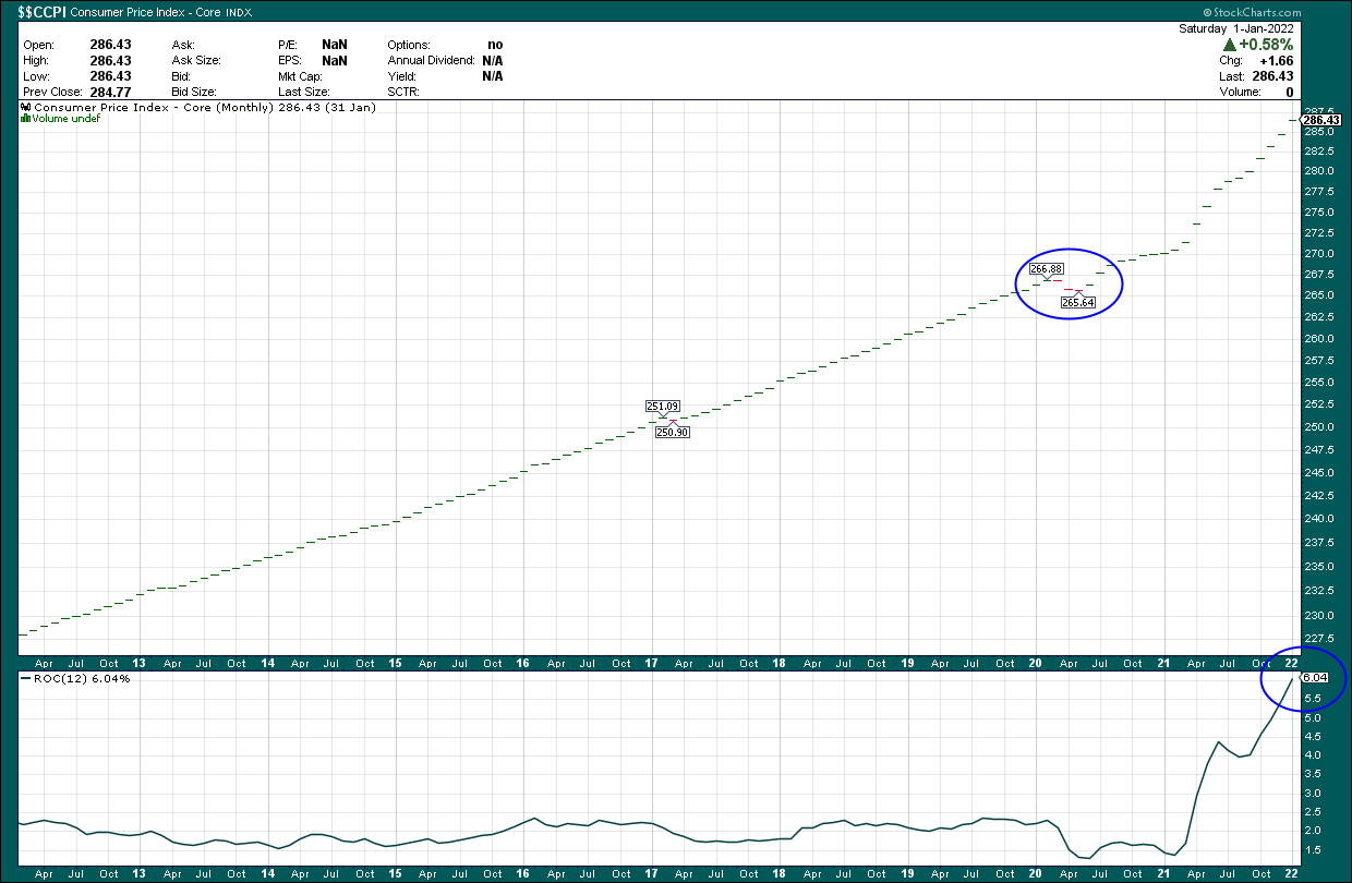
We can see that inflation stayed in the sub-3% range for many years, then went to just over 1% during the initial stages of the pandemic. That makes sense given conditions that persisted at the time, but the net of that is when we lap that period – particularly as economic growth had already accelerated – we end up with spiking ROC values.
Indeed, if you look at the same period in 2021, you see the CPI is flying, which is some reversion to the mean – lapping the deflationary period we had – and part of it is soaring economic activity. Today, our year-over-year change in the CPI is above 6%, and rising all the time. However, the hottest inflation readings we had last year were in the spring, and that’s where we’re coming up to now.
I suspect February and March’s inflation data will show some eye-popping ROC values. That will scare people, but if you look at the chart above, the odds are that we cannot sustain that level of inflation increases for long. In other words, after we have fully lapped the worst of this, it appears to me that barring some other monumental stoking of inflation that is absent at the moment, I’m betting we see a lot of moderation in inflation readings year-over-year. That corresponds roughly to the time period I laid about above in terms of this selling episode in the market, and then I think we’ll see a massive recovery rally later this year, with growth stocks leading us out of it.
What happens if we break down?
Now, I mentioned above that we’d look at the “so what” of the H&S pattern I keep talking about, so let’s put a playbook together. Measuring the impact of a H&S pattern – whether a bottoming H&S or topping H&S – is pretty straightforward. You simply measure the distance between the top of the “head” and the neckline, and then add (or subtract) it to/from the neckline.
In this case, our neckline in the SPY is ~427, and the top of the head was 480. That’s 53 points, and instead of splitting hairs over each tick, let’s just say the H&S pattern was formed at 430 on the neckline and 480 on the head, for a measurement of 50 points.
In round numbers, that means that if we break the neckline, we could then see another 50 points on the SPY. That measures to something like 380 at a minimum before we reach a sustainable bottom. That’s my base case, and that’s what I’ve been telling my members in my Marketplace service. That correlates to roughly 3,800 on the SPX, and remember that’s the minimum downside target if we confirm the H&S; we could go materially lower than that but it’s too early to tell.
In short, if we confirm this H&S, we’re going to see sheer panic selling in this market. So far, value and defensive sectors have held this market up, but they’ll fall as well, and we’ll see widespread dumping of everything. That’s what we need for a bottom, and that’s what I’m looking for.
Be the first to comment