

ljubaphoto/E+ via Getty Images
A week ago, in an update on the long-term outlook for the S&P 500, I mentioned that I had closed my remaining long commodity positions in favor of Treasuries. This follows the previous article about base metals, entitled DBB: The Cyclical Downturn Has Likely Begun, in which I wrote that “energy and agricultural commodities, cyclical laggards, are likely months behind the metals.” That appears to have been incorrect. Agricultural commodities seem to have been only days to weeks behind rather than months.
In this article, we are going to look at the prospects for agricultural commodities and specifically the Invesco DB Agriculture ETF (NYSEARCA:DBA) by applying the general commodity principles outlined in March that suggested “depressed commodity returns throughout the remainder of the decade” and “negative returns over one- to three-year periods.” The dramatic deceleration in agricultural commodity prices in recent days appears to be broad-based and likely portends significantly lower prices, especially relative to Treasuries, over the coming one to three years.
Chart A. DBA is at its lowest point in months. (Stockcharts.com)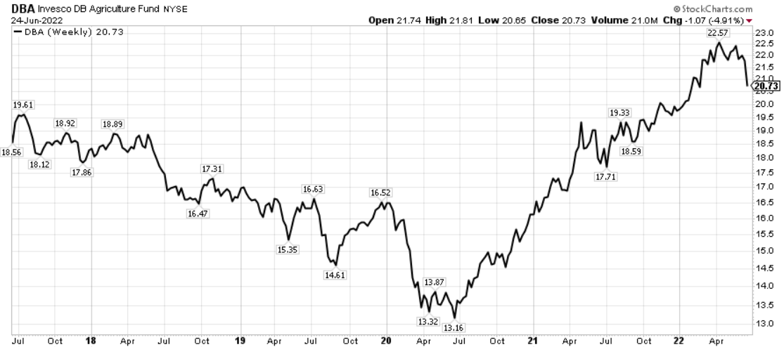
The logic of an agricultural hedge
There are, of course, good reasons to take a short-term long position in agricultural ETFs as a hedge against food and fertilizer inflation in some portfolios, especially in light of the rising threat of impediments to the global agricultural and energy trade. Harrison Schwartz summed up these dangers nicely in April. But, for reasons I will explain below, I think there is little upside potential relative to the risk of a significant decline, and grain-focused ETFs like JJG, JJA, or BRKY would likely be a better hedge, if one’s primary concern is a supply-constraint in the Black Sea.
Let’s look at what’s in the DBA. The ETF tracks the DBIQ Diversified Index which is a fixed-weight index (rebalanced annually) of “Corn, Soybeans, Wheat, Kansas City Wheat, Sugar, Cocoa, Coffee, Cotton, Live Cattle, Feeder Cattle and Lean Hogs.” Those fixed weights are listed on Deutsche Bank’s website.
Chart B. DBA ETF’s fixed weights (Deutsche Bank)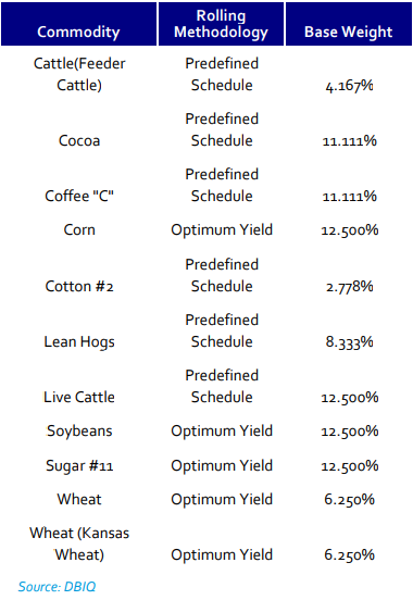
Livestock take up 25% of the index while “grains” like wheat, corn, and soybean comprise 37.5% of it. The remainder are “softs” like cocoa, sugar, cotton, and coffee which make up the remaining 37.5%. At present, grains make up just above 40%, softs 30%, and livestock 20% of DBA’s holdings.
|
DBA holdings as of June 24, 2022 |
|
|
Corn |
13.71 |
|
Wheat |
13.61 |
|
Soybeans |
12.99 |
|
Coffee |
10.72 |
|
Sugar |
10.54 |
|
Live Cattle |
10.41 |
|
Cocoa |
9.05 |
|
Lean Hogs |
8.19 |
|
Feeder Cattle |
3.36 |
|
Cotton |
2.54 |
If one sees the primary risk to agricultural commodities as coming from restrictions on the normal flow of grains, particularly wheat, then it is not clear why DBA would be the best vehicle for that play. Investing in (WEAT) or one of the more grain-focused ETFs mentioned above seems like the more logical route.
If the worry is that agricultural commodities will rise due to increased fertilizer prices, either because of restrictions on the normal global flow of fertilizers or through a rise in energy prices, it may be worthwhile to think about which commodity prices would react most.
Globally, grains consume the most fertilizer per year, as can be seen in the International Fertilizer Association’s charts below.
Chart C. Grains consume the most fertilizer in the world. (IFA) Chart D. Cereals and soybeans consume half of global fertilizers. (IFA)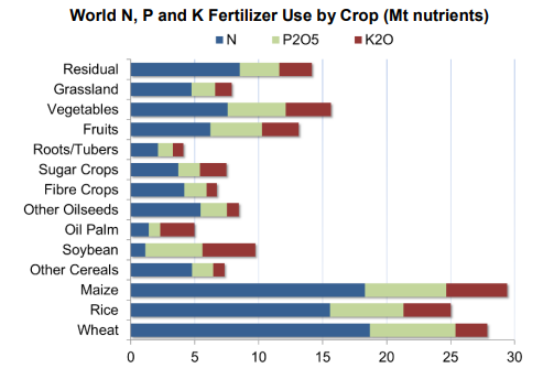
But, grains (or cereals) do not appear to be the most intensive consumers of fertilizers. The following chart from the FAO shows, in the right-hand column, how many kilograms of fertilizer are used per hectare of crop for cereals, oilseeds, vegetables, and so forth, respectively.
Chart E. Cereals have one of the lowest fertilizer application rates of all commodities. (FAO)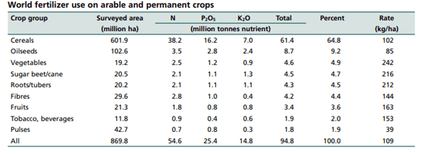
Bananas have much higher fertilizer application rates (nearly 5x) than do grains. Citrus has nearly 2.5x the rate of the cereals.
Chart F. Bananas have extremely high fertilizer application rates. (FAO)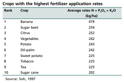
Fertilizer rates vary by region and yield but remain constant across grains. Eyeballing the table below suggests a yield-to-fertilizer ratio of 20x-30x.
Chart G. Fertilizer application rates appear to be constant relative to yields. (FAO)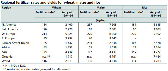
According to the FAO, “In general, within commercial banana production of the Cavendish variety, the average yield per hectare ranges between 40 and 50 tonnes.” That puts the yield-to-fertilizer ratio around 10x (half of that for grains). The lower production values would seem to be balanced out by the price of bananas, however, which have tended to be around two to four times as expensive as grains.
If we imagined that relative commodity prices, production, and inputs were in a long-term state of equilibrium, it is not clear why a ‘fertilizer shock’ would necessarily lead to higher prices in one commodity rather than another, all else being equal. Presumably, the primary effect would be on the demand side. Were food prices across the board to rise, real incomes would decline, and people would opt for the cheapest calories (presumably, grains) and thus price pressure would be felt more intensively there. In other words, the relative inelasticity of demand for grains would force their price up relative to other food commodities.
In either scenario (one in which there is a supply constraint for a specific commodity or set of commodities or one in which there is a general constraint on fertilizer supplies), grain prices would seem to have the greatest likelihood of rising in response. Thus, a grain-heavy ETF would be more likely to provide higher returns.
Two objections to the bull narrative
But, I have two objections to this. One is that it is nearly July. Everybody and their mother is well-versed in the problems the battle between Russia and Ukraine and the West is causing in the commodity space. How much of that is already priced in? And, more theoretically, how do we know what the “correct” price for any of these commodities at a given level of supply and demand? As far as I am aware, there is no formula for that.
That leads to my second objection, which is that, although relative commodity prices appear to be linked to relative production (as outlined in Water And Diamonds, Iron And Gold: The Problem With Commodity Prices), there is no clear link between absolute prices and supply and demand. Rather, commodities, even agricultural commodities, have their own rules.
Commodity rules
Having gone into greater detail in my article on the Invesco DB Commodity Tracking Index (DBC), linked to in the second paragraph, I will summarize them here:
- Real commodity prices have been highly correlated with the earnings yield for as far back as we have data, but the gap between the two has widened in recent years, and this was likely to be closed by a fall in stocks (thus raising the yield) and/or a decline in commodity prices.
- “Secular” bear markets in commodities tend to last 20 years. This appears to be connected to supercycles in stocks, geopolitics, and technology, which I outlined in “ Conjunction and Disruption: Technology, War, and Asset Prices“.
- Commodity prices tend to peak with rates of change. In other words, they are extremely dependent on momentum. If the rate of growth changes direction, there is a good chance prices will soon change direction, too.
- Commodity cycles are closely correlated with the earnings cycle. In fact, it appears that commodity cycles tend to peak when forward earnings estimates start to flatten (as they have been doing this year).
- Precious metals, particularly gold, lead the commodity cycle by about 12-24 months while agriculture and energy commodities tend to lag the cycle. Gold has rallied this year but not enough to give the impression that another round of cyclical commodity inflation is in store.
Agricultural supercycles
The relationship between commodity prices and yields has always been strong, and it has been most consistently strong at the index level. That is, although over any given span one commodity or class of commodities may be more strongly correlated with yields than a general index of prices, over the long term, the correlation between a broad index and yields has been strongest. This was something I tested in the Inflation And Yields series a decade ago, in which I compared primary commodity prices and food prices with yields in the UK and U.S. going back three centuries.
This relationship can be seen in the following two charts based on the World Bank’s global export-weighted agricultural index and the earnings yield on the S&P 500. The iAgriculture index is comprised of food and beverage commodities (75%) and raw materials (25%).
Chart H. Agricultural prices have tended to track yields historically. (World Bank; Robert Shiller data) Chart I. Real agriculture prices and the earnings yield are strongly correlated. (World Bank; Shiller data)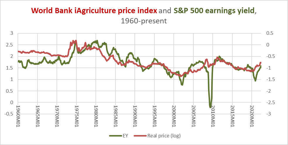
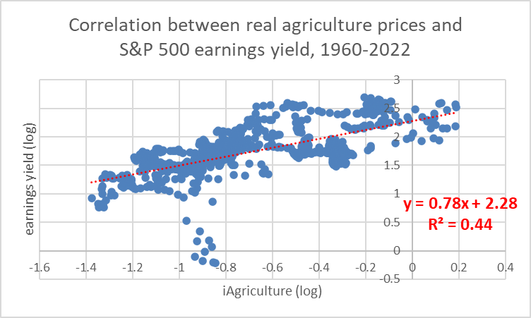
Whatever else is going on in the world, over the long term, commodity prices cling to the earnings yield. Thus, if one expected a long-term appreciation in commodity prices, one ought to expect a long-term decline in P/E ratios, either through a decline stock prices or a rise in earnings. For reasons explained in some of my recent articles on equities, although a long-term decline in stock prices is probable, this is likely to be matched by declines in earnings. And, since industrial metals cycles are highly correlated with earnings cycles and those too are declining, there is little reason to expect help from earnings.
If we include the historical pattern of decade-long supercycles occurring every twenty years, that would also suggest that we are only halfway through a “secular” bear market in commodities, since the last commodity supercycle ended a little over a decade ago.
Agricultural cycles
Precious metals (DBP) point in the same direction. Not only do gold (GLD) and the other precious metals (SLV, PLAT) continue to soften, but commodity/gold ratios have likely been too strong for too long. As I mentioned in Point 5 above, gold and precious metals tend to lead the earnings and commodity cycles, industrial metals and raw materials coincide with the cycle, and food, beverages, fertilizers, and energy lag. (Presumably, something about the “durability” of a given commodity is at play in this pattern).
Gold/commodity ratios are the most straightforward way of illustrating this relationship with regards to agricultural commodities. Typically, I measure a cycle as a change in a given price series relative to its 36-month moving average or as a 16-month rate of change. So, in the chart below, which shows the gold/phosphate ratio and the subsequent 16-month rate of change, we are interested less in the absolute levels as we are in the changes in momentum.
Chart J. The gold/commodity ratio tends to anticipate subsequent commodity momentum. (World Bank)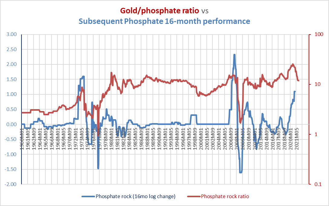
I have taken each 16-month segment of this relationship and measured the correlations between the two measures. The average correlation between the two is 0.48. Since the gold/phosphate ratio has been in decline for some time (since August 2020), that would suggest that this year ought to see a deceleration in price, and well into 2023. Of course, fertilizer prices generally have continued to rise this year (at least up until April).
The relationship between gold ratios and commodity momentum is not super-predictive in terms of timing trades, but it does tend to tell us which way the wind is likely to blow. The ratio in this chart suggests that now is not the best time to go looking for spikes in fertilizer prices.
The fundamental thing to keep in mind is the lead in precious metals and the lag in the least durable commodities. There are only two ways, mathematically, for the gold ratios to lead commodity cycles. First is that gold tends to surge before other commodities. Second is that commodities are themselves so cyclical that they accelerate and decelerate with regularity. In actuality, there is some truth in both. We can see, for example, that the two biggest spikes in phosphate prices were followed by two of the sharpest declines (in 1974-1976 and 2008-2009), which then lifted the gold ratio.
Typically, however, all of these principles are working hand in hand. We can see this in the relationship between the gold cycles and the World Bank’s fertilizer index cycles in the following chart.
Chart K. The gold cycle both correlates with and leads the fertilizer cycle. (World Bank)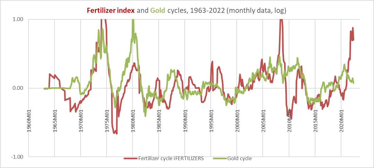
Commodities, even those as different as gold and fertilizers, tend to move together. But, there are also these patterns within the commodity complex. Look at the 2008-2009 fertilizer crash, for example, which we referenced a moment ago. It is true that the collapse in fertilizer prices helped lift the gold/fertilizer ratio, thus “setting up” the resurgence in fertilizer prices in 2010-2011, but gold prices remained strong, too. Indeed, in most of the instances in which fertilizer prices spiked, gold was leading the way and often in a proportional fashion.
Among the major commodity indexes tracked by the World Bank (many of which overlap)—Fuel, Nonfuel, Agriculture, Beverages, Food, Oils & Meals, Grains, Other Food, Raw Materials, Timber, Other Raw Materials, Fertilizers, Metals & Minerals, Base Metals (ex. iron ore), and Precious Metals—the strongest correlations between gold ratios and the subsequent commodity cycles are in Fuel (0.59), Grains (0.57), and Fertilizers (0.58), each late-cycle commodity groups. The weakest correlation (apart from Precious Metals themselves) is with the Nonfuel index (0.37), the most general World Bank index.
This does not negate the possibility of continued stress in fertilizer production and distribution leading to a real food crisis (the Great Depression did not put food on tables, for example), but it does reduce the probability of continued price appreciation. And, the fertilizer cycle is beginning to reflect this.
Chart L. Prices and momentum tend to move together in commodities. (World Bank)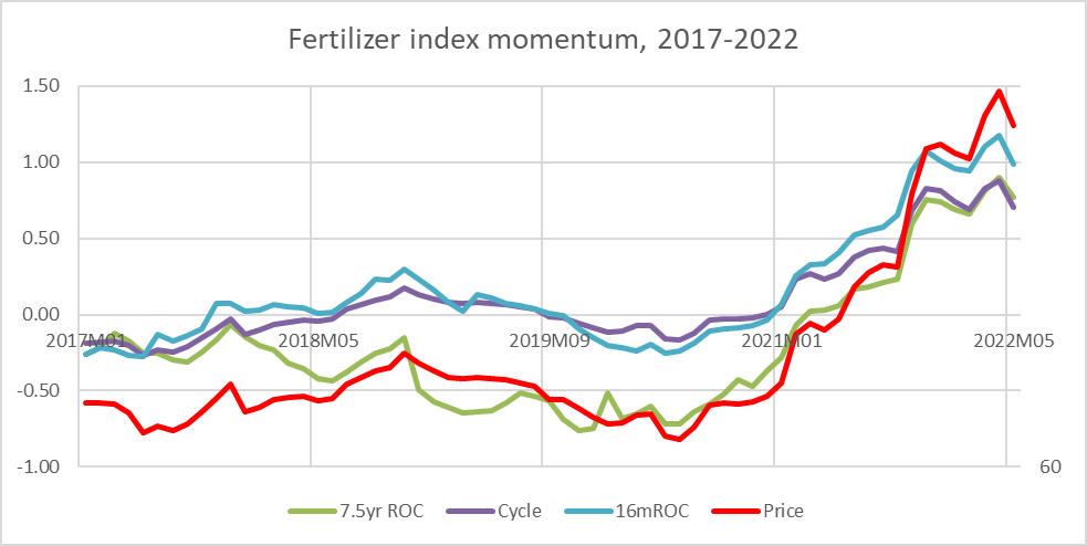
In commodities, momentum is not everything, but it is a lot. Nominal prices, real prices, supercycles (which I measure as 7.5-year rates of change), and cycles tend to move together.
None of the commodity ETFs that I know of track fertilizer prices, but because fertilizers inevitably come up in discussions about agriculture commodity prices, it was necessary to address this. This also allowed us to illustrate some of the relationships and indicators at work in agricultural commodities.
Before moving on to cocoa and soybeans and wheat, however, I should briefly talk about the livestock holdings in DBA. Although the limited data I have (thanks to Investing.com) suggests, as with other commodity price series, that that livestock prices are correlated with the earnings yield, they do not appear to behave like other commodities. On the inflation spectrum, they seem to be closer to the consumer inflation end than the primary commodity end. Since consumer inflation tends to follow commodities rather than lead (although this depends to some degree on the time frame), I am going to largely ignore livestock prices.
Chart M. Cattle prices are far less volatile than primary commodity prices. (Shiller data; Investing.com)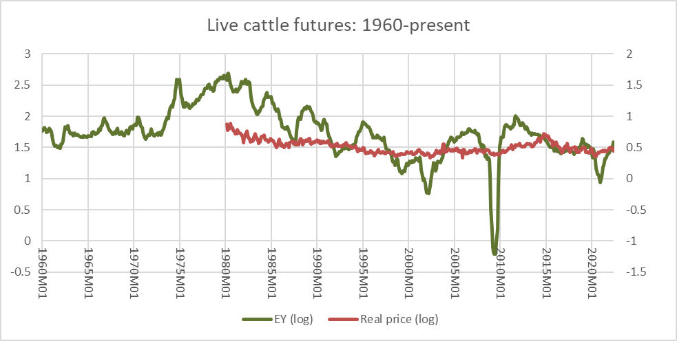
As in fertilizers, the decline in the gold/grain ratio points to further downside pressure over the coming year and beyond.
Chart N. The gold/grains ratio has tended to anticipate changes in grain momentum sixteen months in advance. (World Bank)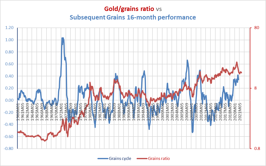
The precious metals point to commodity deflation.
Chart O. Gold cycles tend to correlate with and lead grain cycles. (World Bank)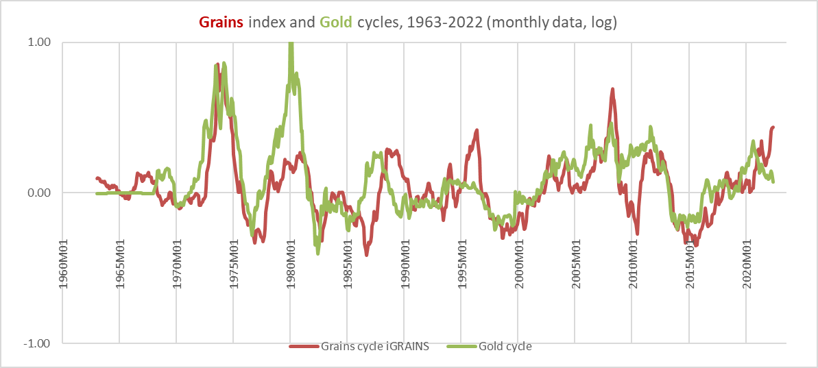
Eighty percent of the World Bank’s Beverage index is made up of coffee and cocoa, which take up 20% of the DBA. Weakness in beverage commodities is already apparent.
Chart P. Gold cycles tend to correlate with and lead beverage commodity cycles. (World Bank)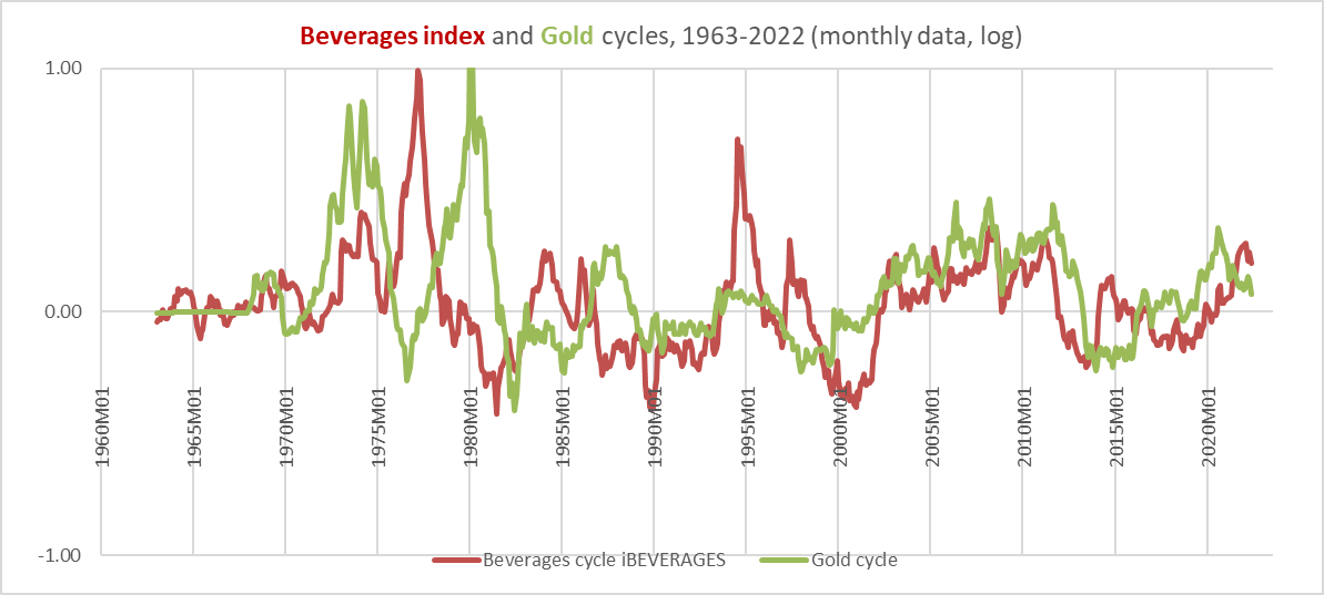
One technique I have come up with this year is taking the commodity cycle (measured as the 16-month rate of change) and amplifying it with the use of bond prices. Not only does this amplify the inflation/deflation signal, it provides sporadic but effective signals for when to switch from commodities to bonds or vice versa.
Agriculture/bond ratios
I first began using 16-month cycles, in fact, because I detected 69-week cycles in both interest rates and the oil/gold ratio a decade ago (16 months is roughly 69 weeks). By taking the ratio of a commodity price to bond prices and looking at the rate of change of the 16-month rate of change, you get a signal that points to going long either commodities or Treasuries and that, over the last 62 years, would have beaten both classes (that is, produced alpha relative to both the commodities and Treasury markets). The primary problem with this ‘system’ is that it produces a lot of signals. This can be reduced by smoothing to some degree, but this also tends to lower the likelihood of outperformance.
Things are further complicated by the fact that this commodity data is only spot prices whereas commodity trading is done in the futures markets where contango can eat into returns.
Nonetheless, whereas the principles outlined in the article thus far point to medium-term to long-term outcomes, this measure provides short-term signals, which, at least theoretically, may be enhanced by using the longer-range indicators.
Agricultural momentum in freefall
Although I have not backtested 69-week signals specifically, the dramatic decline in these commodity/bond ratios is so strong as to be unmistakable. Each of the commodities in the DBA, except for livestock, are shown below.
Momentum in the cotton ratio is in freefall.
Chart Q. Cotton/bond ratio momentum has dropped off a cliff. (Stockcharts.com)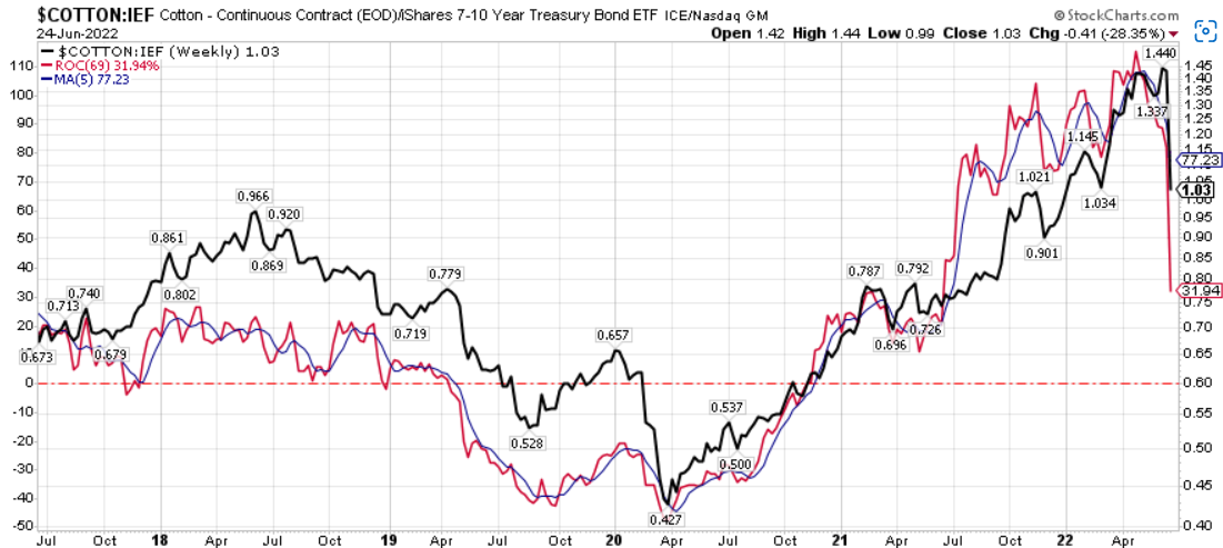
Momentum in the wheat ratio is not far behind.
Chart R (Stockcharts.com)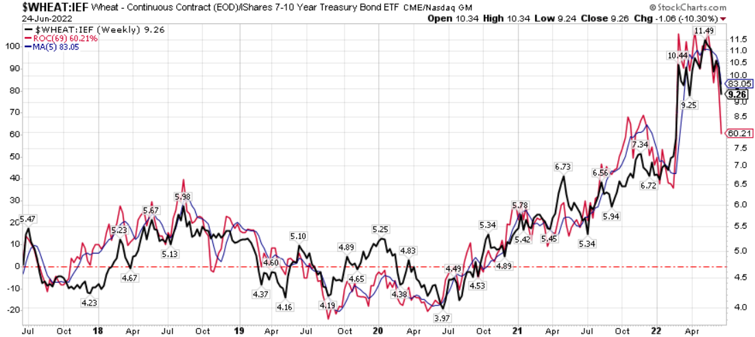
Corn ratio momentum has been in decline the entire quarter.
Chart S (Stockcharts.com)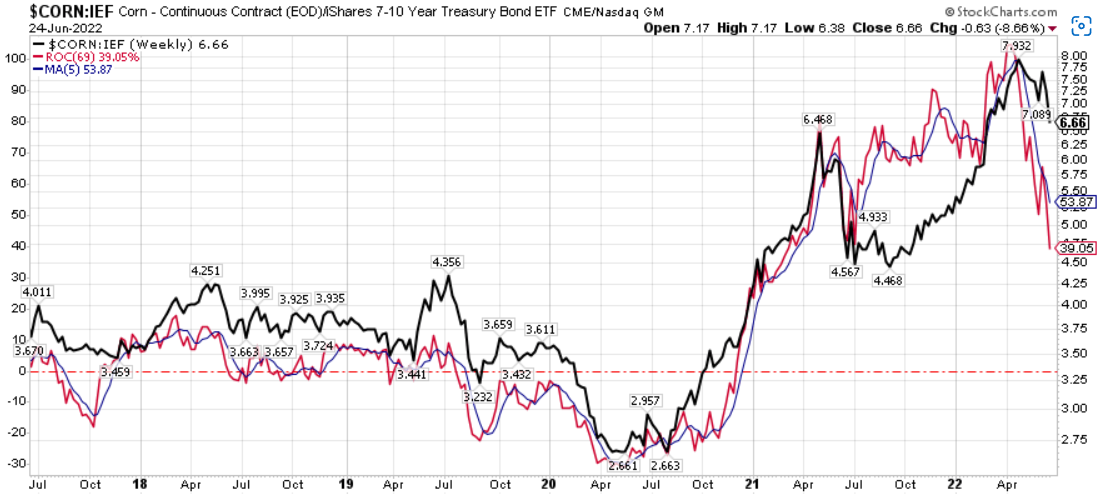
Cocoa prices, which have been relatively muted over the last two years, appear to be indecisive.
Chart T (Stockcharts.com)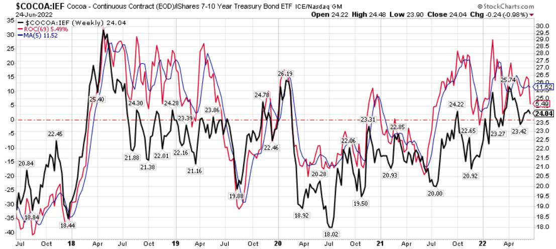
Coffee ratio momentum peaked in the first quarter, although the ratio itself has remained near multi-year highs.
Chart U (Stockcharts.com)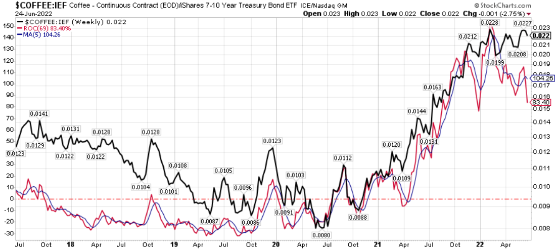
The soybean ratio is rapidly losing momentum.
Chart V (Stockcharts.com)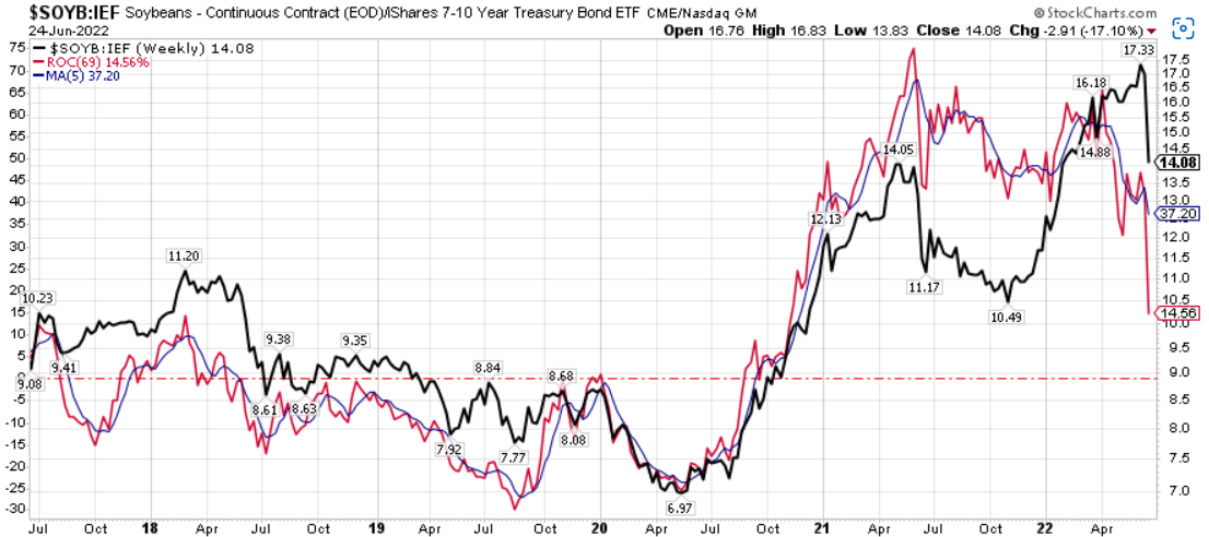
Sugar ratio momentum peaked a year ago and has continued to decline, even though the ratio has hit new highs.
Chart W (Stockcharts.com)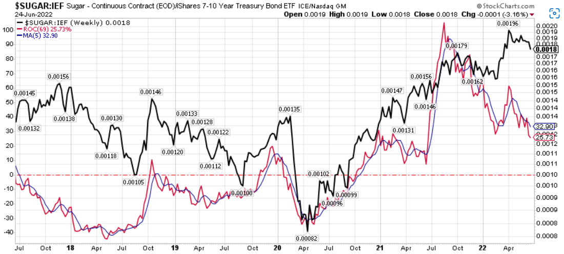
Collectively, these developments are suddenly making themselves felt in the DBA/bond ratio and its momentum.
Chart X (Stockcharts.com)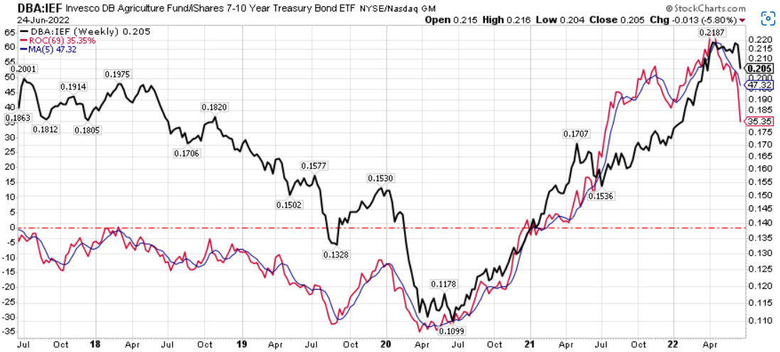
Momentum is not everything in commodities, but in a world in which a negative growth shock is expected, this kind of momentum is likely the beginning of much deeper declines.
Conclusion
As these final charts show, momentum in commodities and bonds is extremely fickle. It would not be surprising to see a sudden rebound in prices and price ratios to previous or even new highs in coming weeks. But, these longer-term relationships and patterns which appear to be connected to supercycles in technology, war, and stocks (and earnings) and to the way commodity cycles unfold suggest a commodity downturn should be more than imminent, and the momentum in commodity/bond ratios and, increasingly, the levels of the ratios themselves suggest that the growth shock is upon us.
With gold and industrial metals leading the way, the late-cycle commodities were likely to not be too far behind. We may see both technical and fundamental rebounds (driven perhaps by developments in Eastern Europe or elsewhere), but the risk of a growth shock is significantly higher than further commodity shocks.
Be the first to comment