

Igor Kutyaev/iStock via Getty Images
This article was first released to Systematic Income subscribers and free trials on Apr. 10
Welcome to another installment of our CEF Market Weekly Review where we discuss CEF market activity from both the bottom-up – highlighting individual fund news and events – as well as top-down – providing an overview of the broader market. We also try to provide some historical context as well as the relevant themes that look to be driving markets or that investors ought to be mindful of.
This update covers the period through the fourth week of March. Be sure to check out our other weekly updates covering the BDC as well as the preferreds / baby bond markets for perspectives across the broader income space.
Market Action
The relief rally we saw in the previous week did not last with the CEF market performing poorly last week. Only MLPs clawed a marginally positive return during the week. 10-year Treasury yields rose each day of the week, putting pressure on the entire income space.
Systematic Income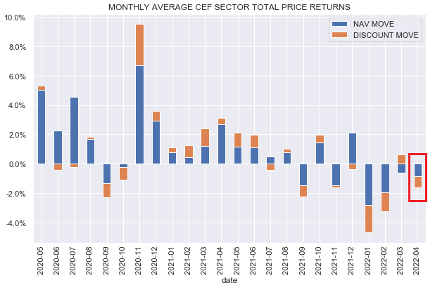
Year-to-date about a quarter of CEF sectors feature a worse than -15% total return and about half of the sectors feature double-digit negative returns. Only MLPs are in the green with Utilities pretty flat.
Systematic Income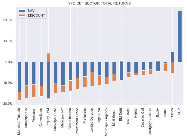
CEF discounts have not yet moved past their wides of a few weeks ago.
Systematic Income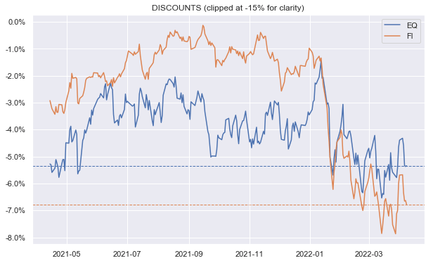
Our credit CEF swirlogram shows that the modest rally in March has been partly reversed with both credit spreads and discounts widening. However, the credit CEF market remains slightly stronger than its end-of-Feb level.
Systematic Income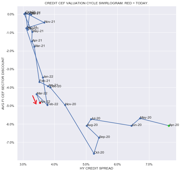
Taking a look across CEF sector discounts in terms of average discounts (y-axis) and 5-year discount percentiles (x-axis), we see that quite a few tax-exempt Muni sectors, along with other bond sectors like Investment Grade and Limited Duration, remain on the cheaper end of the spectrum while sector like Utilities, Equity and Taxable Munis are still on the rich side.
Systematic Income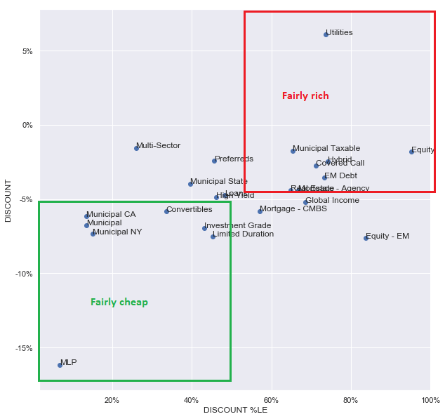
Checking in on the Christmas tree chart we see that, after lagging for 4 years in a row, MLPs have delivered the best returns over the past couple of years. Among credit funds, loans and CMBS sectors are towards the top end with EM Debt, perhaps surprisingly, hanging in pretty well also.
Systematic Income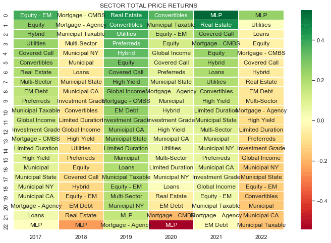
Market Themes
The sharp recent rise in short-term interest rates is, arguably, one of the most salient market dynamics of the last six months. Since mid-September the 2-year Treasury yield has risen from around 0.2% to 2.5% as of this writing.
FRED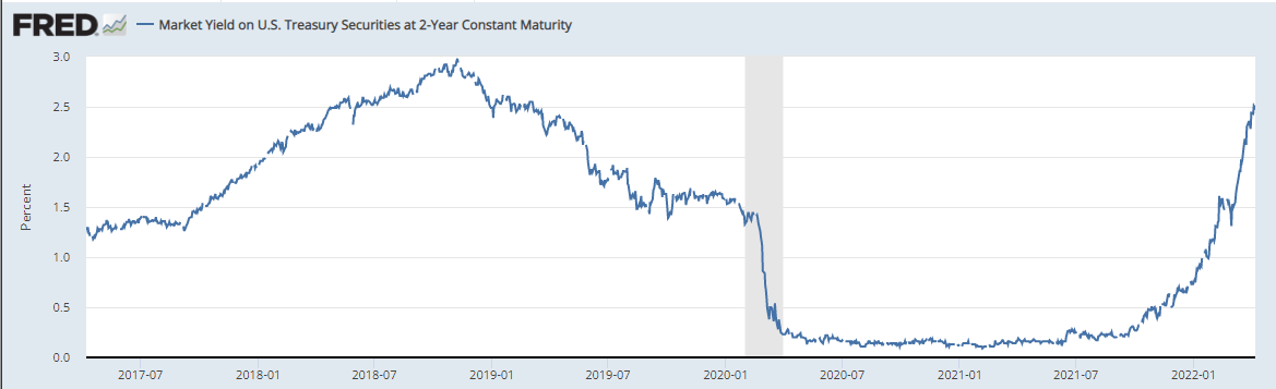
The key drivers of such a sharp move have been both a high and persistent level of inflation as well as increasingly hawkish messaging coming from the Fed. With the first Fed hike already behind us, the market consensus is for the Fed Funds rate to rise to around 3% in about a year’s time.
The most direct impact of rising short-term rates on CEFs will be via its impact on CEF income and underlying portfolio yields. This is because most leveraged CEFs utilize floating-rate financing such as repo or credit facilities which are typically anchored off Fed Funds, SOFR or Libor. As short-term rates continue to rise in line with the Fed’s hiking trajectory, cost of leverage for most CEFs will increase as well.
Before we break down the projected impact of higher short-term rates on CEF sector income levels, let’s get an intuition of how the cost of leverage flows through the CEF income sausage factory. The two charts below show the before and after pictures of net investment income or NII yield for a fairly generic CEF, holding assets with a yield of 5.8% (selected specifically because that’s the current yield of the High Yield corporate bond index), expenses on total assets of 1% (this includes sundry expenses in addition to the management fee and is roughly middle-of-the-road with some funds having somewhat lower fees and others higher), leverage cost of Libor + 0.8% (roughly in line with what taxable funds usually pay) and leverage of 35% (taxable CEFs tend to feature leverage levels in the range of 25-45%).
The first chart assumes 3-month Libor of 0.20% which is where we were roughly at the start of Q4 last year. The numbers in the chart are on net assets. We start with the assets in the portfolio yielding 5.8%, add another 2.7% of yield due to assets bought on leverage, pay away 1.5% in expenses (i.e. 1% expenses on total assets turned into a figure on net assets), pay away 0.54% in leverage cost on net assets with the net result of 6.42% net investment income NAV yield. This number is what the NAV accrues in yield.
Systematic Income CEF Tool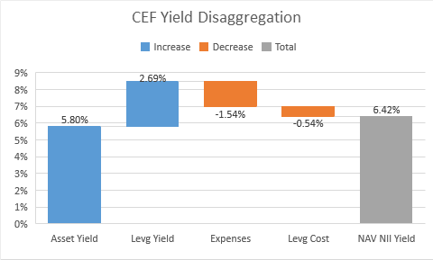
Now, let’s see what happens when / if Libor rises to 3% – roughly what is expected by Fed Funds futures over the next year or so. Leverage cost rises to around 3.8% (Libor of 3% + 0.80%) which equates to around 2% on net assets. The result is that NAV NII Yield falls from 6.42% to 4.91%.
Systematic Income CEF Tool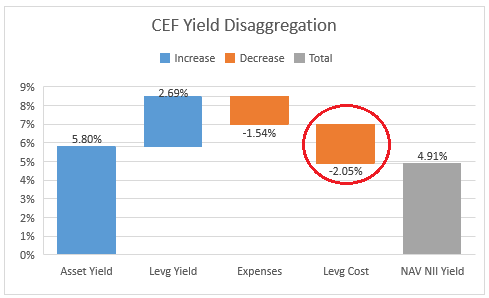
What is also very interesting is that the fund goes from adding about 0.6% to its underlying asset yield (from 5.8% to 6.4%) to reducing its asset yield by 0.9% (from 5.8% to 4.9%). In short, the cost of leverage along with fund expenses more than offsets the additional yield the fund can generate by using leverage.
This doesn’t look great, however, we need to keep six things in mind. First, not all CEFs use leverage. Those in equity-linked sectors such as pure equity or covered calls typically don’t use leverage so won’t be directly affected. Second, many fixed-income CEFs often use higher-yielding assets than the 5.8% figure we assumed below. Third, CEFs are (at least in theory) capable of generating additional value above and beyond the sausage factory picture above through active management which can potentially offset the drag from higher leverage costs. Fourth, a number of CEFs either use hedges for their floating-rate leverage financing or they have fixed-rate term financing. For example, quite a few preferred CEFs use partial interest-rate hedges which not only lower the duration of these funds but also lock in the cost of financing. Fifth, many credit CEFs hold floating-rate assets whose income will grow along with short-term rates and offset the leverage cost drag. Finally, a wide discount can add additional yield above and beyond what the sausage factor examples provide.
Now, let’s turn to the impact of rising leverage costs on various fixed-income CEF sectors. The starting yields for each of the sectors are below – these come from the Nuveen weekly, FRED in the case of EM High Yield or the S&P for the Muni sector. Keep in mind that these are yields-to-worst rather than the current yield you would see in CEFs which, in some cases such as the Muni sectors in particular, are biased upwards by the high coupon convention in that sector.
Systematic Income CEF Tool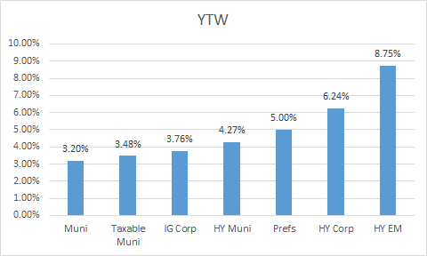
The chart below shows the impact of the expected rise in Libor from 0.2% to 3%. We adjust the Muni sector leverage cost lower by a third due to the fact that tax-exempt leverage instruments are tax-exempt themselves and don’t rise 1:1 with Libor.
Systematic Income CEF Tool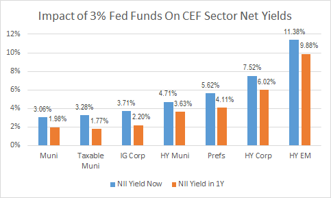
The chart below captures the relative impact on CEF sector NII from the projected eventual rise in Libor to 3%. Clearly, the higher-quality / lower-yielding sectors will be impacted more for the simple reason that their starting yields are relatively low so the rise in the cost of leverage takes out a bigger chunk from their overall yield.
Systematic Income CEF Tool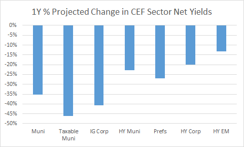
Market Commentary
There was a sizable increase in tax-exempt CEF distribution cuts for April with more than 20 funds making a cut (primarily Nuveen and Invesco). Of the bigger names, BlackRock and PIMCO have not yet made big changes. Unfortunately, this is something we should expect to see over the coming months. The good news (if you can call it that) is that asset and CEF yields are much higher than they were at the end of the year. Obviously, sitting on mark-to-market losses and seeing distribution cuts come in is fairly unpleasant but it can also offer attractive entry opportunities for new capital. The Invesco Senior Income Trust (VVR) increased distributions by 23% to $0.026. Last monthly NII was $0.0217. That’s quite a sizable increase and is way above the last NII level. It likely reflects two things. One is the fact that the fund’s distribution coverage was already well above the sector average at around 100%, giving the fund more room to hike.
And second, obviously, loan CEF income will be moving higher – if Libor reaches 3% loan CEF income should move higher by around 25-35% or so, depending on Libor floor composition. Here, it does look like they are taking the expected windfall all at once. Prior to COVID, their distribution was $0.024 so this hike puts us back there and then some. Longer-term returns of the fund are pretty good – VVR has outperformed the sector over the past 3-5 years in total NAV terms. Its discount of 6.1% is wider than the sector average of 4.7% and is a decent option in the sector.The AllianceBernstein National Municipal Income Fund (AFB) decreased its distribution by 16%. Muni fund distribution changes are pretty frequent so we don’t always want to draw conclusions from a single cut. The eventual drop in muni CEF income levels, assuming current Fed Funds rate expectations are realized, should eventually be on the order of 20-35%. If we see this kind of dynamic, funds taking a big front-loaded distribution cut, which causes their discounts to open up, will become pretty attractive.
This is, obviously, the opposite of the usual behavior you see where investors tilt to funds that don’t make distribution cuts and which look good on a price return basis (due to the fund’s premium increasing in line with the fund’s overly generous distribution). In reality these funds just have low coverage numbers and are usually expensive.
What usually happens to these funds is something like (PTY) – after a while the distribution is right-sized which leads to very large premium compression (50% at the peak to 16% today). Commentary of PTY never having made a cut in its life and having outperformed SPX (a curiously circular argument that the more a fund’s premium rises the more it outperforms stocks and the more it’s worth owning) and therefore deserving of a huge premium is quietly forgotten and never referred to again. That kind of hole in the portfolio, particularly for those investors who bought in late, is difficult to make-up with distributions. Sometimes defense is more important than offense.
Investor Toolkit Update
This week we added a new metric in our investor CEF Tool – the 3-year Valuation-Adjusted NAV Total Return. The basic idea is to address how to gauge the attractiveness of a given fund based on its historic total NAV return and its current discount valuation.
All else equal, the higher the historic total NAV return (with the obvious caveat that past performance is no guarantee, etc.) the better and the wider the discount the better. However, the two often move in sync so better-performing securities often have a higher valuation, though not always.
The key point is that a fund with the best historic NAV return won’t always provide the best sector return on investor capital if it trades at an elevated premium even if it continues to outperform the sector by the same amount. This is because investors don’t have access to the fund’s NAV return but can only have exposure to the fund via its current valuation.
The metric is simply the 3Y total NAV return / (1+discount). It shows what the 3Y total price return will be if 3Y total NAV returns are repeated and discount valuation doesn’t change. You will tend to find that this metric shows much more compressed returns than NAV returns for the simple fact that better-performing securities tend to trade at a higher valuation.
Systematic Income CEF Tool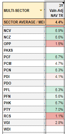
It also highlights that some of the well-regarded funds like (PCM) or (PDI) don’t look all that great either because their 3Y total NAV returns are not that amazing (in the case of PDI) or their premium valuation is simply too high relative to what it has been able to deliver over the past 3 years (in the case of PCM). Obviously, the 3Y window period is just one snapshot in time but it’s still useful, in our view, to get a quick sense of how these two metrics combine.
Stance And Takeaways
We continue to like a barbelled stance of holding lower-duration credit funds alongside higher-quality / higher-duration funds. On the credit side of the barbell we continue to like the Apollo Tactical Income Fund (AIF), trading at a 10% discount and a 7.1% current yield as well as the Ares Dynamic Credit Allocation Fund (ARDC), trading at a 8.3% discount and a 8% current yield.
Within this bucket we also like funds with consumer-linked assets such as non-agency residential mortgages given consumers are in a relatively strong position and house equity has risen strongly over the last year or two. These include the Western Asset Mortgage Defined Opportunity Fund (DMO), trading at a 9.4% discount and a 9.8% current yield.
In the higher-duration bucket we like the Nuveen Municipal Credit Income Fund (NZF), trading at a 7.6% discount and a 5.07% current yield, among others.
As we have highlighted over the course of this year, it makes sense to nibble on both parts of the barbell. An all-in allocation, however, is, in our view, conditional on credit spreads moving wider from currently relatively rich levels and Treasury yields consolidating.
Be the first to comment