

Darren415
I’ll let the charts do the talking this week. This is always a good idea when it’s been a while since you’ve had a broader look at markets. As far as I can see, not much has changed. The U.S. CPI report is still the most important economic report of the month. The violent sell-off in response to what was a small upside surprise to U.S. core inflation in August is all you need to know. Markets would like to see a sustained roll-over in inflation and an associated pivot in Fed tightening. So far, this is not happening. Equities have suffered badly in the wake of the August CPI data, and a 75bp rate hike from the Fed later this month is now a done deal. Some sell-siders have even stuck their neck out, calling for a 100bp hike. It’s gnarly.
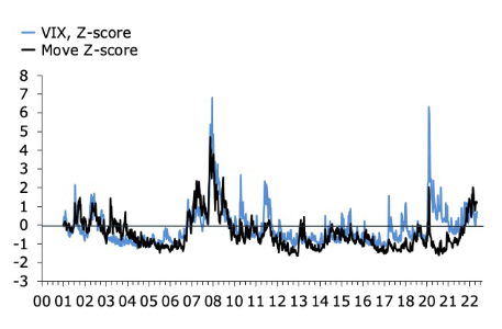
Fig. 01 shows that equities are still above their June lows, though at this rate, they will blow through that level very soon. This chart also shows that commodities are rolling over, which should be good for inflation, with a lag. Fig. 02 shows that volatility remains elevated and, importantly, that fixed income volatility is still trending up. I don’t have a strong view on where these lines are going, except the direction I see on the screen. A new low in equities certainly would be interesting, though also potentially cathartic.
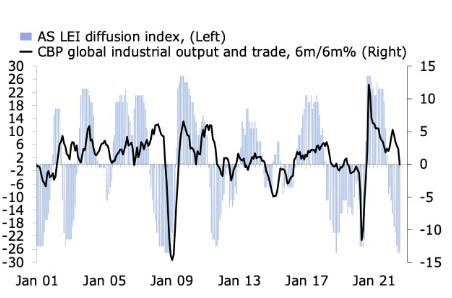
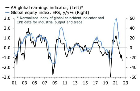
Meanwhile in the macro charts, the picture is clear as rain. The global economy is in the midst of a cyclical downturn. Fig. 03 shows my LEI diffusion index alongside what is now a clear downturn in global industrial production and trade growth. We see similar signs in the global composite PMI, which is now below 50 for the first time since the financial crisis, not counting the Covid plunge. My diffusion index is built with OECD’s leading indicators and counts the difference between above long-run average LEIs that are rising or falling and vice versa for LEIs below their long-run average. It is now as depressed as it was during the Covid nadir, the EZ sovereign debt crisis, the GFC and the recessions early in the 2000s. That’s not pretty, but the silver lining for markets trading at the margin of the data is that it can’t get much worse, at least not as far as the breadth of leading indicators are concerned. Fig. 04 shows that earnings growth for global equities have rolled over, and that leading indicators point to further weakness.
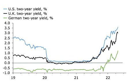
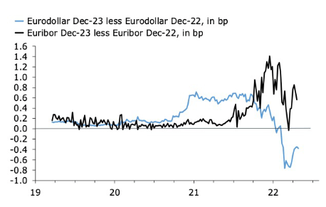
Fig. 05 captures the sea change which has shifted the outlook for markets in the past 6-12 months. Front-end yields, here in the US, the UK, and the eurozone, are rising, and they’re still making new highs. This indicates that bond markets have not yet fully discounted the level of the terminal policy rate in this hiking cycle. Granted, rate futures tell a more complicated story. Fig. 06 shows that the Dec. 23-22 eurodollar curve has been inverted for some time. This means that markets believe the Fed will be busy next year trying to undo the pain it is currently administering via aggressive hikes. In the eurozone, meanwhile, euribor futures suggest that the ECB will keep hiking in 2023. This is despite the fact that Dec-22 futures currently imply that the ECB will lift its policy rate, which has already risen by 125bp since June, by a further 150bp between now and December.
Translated back into cash bonds, this is a story in which the US two-year yield will soon roll over hard, while the German equivalent keeps rising. It is also a story in which the Fed cuts rates next year, while the ECB keeps hiking. Given that this is a signal being transmitted at a time when EURUSD is below parity makes it even more fascinating. Either the FX market is wrong or the eurodollar or euribor curve is wrong. My bet is on the latter. More specifically, I think the eurodollar and euribor curves will meet in the middle, at zero, soon.
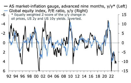
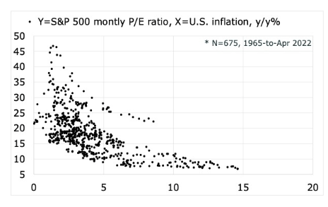
The introduction implies that we should put particular emphasis on the inflation data. I have devoted my final six charts to this. Fig. 06 and 07 look at inflation from the perspective of markets. The first shows that the year-over-year change in yields and oil prices continue to signal headwinds for the P/E multiple. This suggests that inflation and bond yields are still challenging for equity valuations and, by extension, the growth factor. The second reminds us that once the dust settles, it matters at what rate underlying inflation settles at. Anywhere below 5% and high multiples are still a possibility, even likely. Anything above and we’re in a new regime.
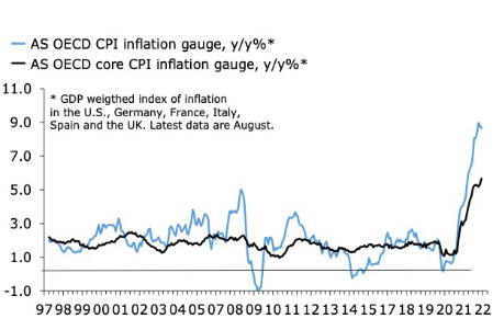
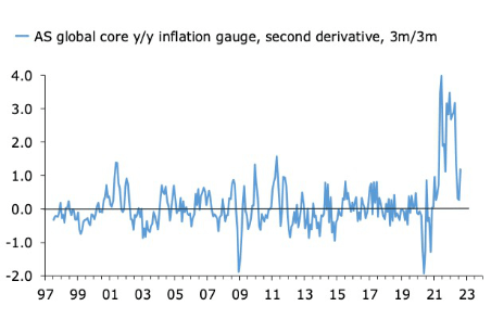
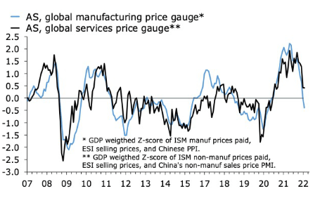
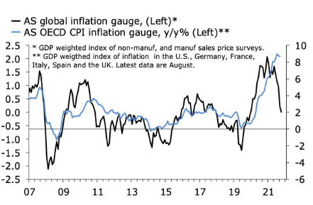
In the actual inflation data, the headline numbers are still ugly, as Fig. 09 shows. The further rise in core inflation in August, in particular, spooked markets. Look closer, however, and relief is on the way. This is especially true if we assume that markets will cheer a sustained turn in the second derivative just as hard as they have been panicking over the most recent increase in inflation. Fig. 10 shows that the second derivative in global core inflation, here mainly DM, already has rolled over. Fig. 11 shows that survey-based inflation gauges, combined with the Chinese PPI, are now softening, especially in manufacturing. The turn in Chinese manufacturing goods inflation is especially eye-catching in this respect. Fig. 12 combines leading indicators for inflation in services and manufacturing with the OECD headline CPI. The leading index rise and falls more quickly than inflation, but its message is pretty clear all the same. The peak is close.
The Story Is Stale
My overall reaction to the story above is that it’s a bit stale. Don’t get me wrong. It’s highly amusing to watch investors throw stocks and bonds around by several standard deviations on every tenth of a percentage point surprise in the US CPI, but this won’t last. We’ll have to move on eventually. The soft landing we’re all hoping for is a transition in which inflation fades into the background, transitory style, while the economy and risk assets suffer only minor further damage. This is also a scenario in which central banks are allowed, gracefully, to ease the pace of tightening if not halt it altogether. Hope springs eternal, but the longer that inflation stays uncomfortably high and the more the aggressive central banks are, the higher is the risk of a harder landing. In this story, we stop talking about inflation because monetary policy eventually breaks the back on the economy and asset prices. Inflation, being sticky as it is, will stay high for a while, but at that point, it will be the least of markets’ concerns. It is this combination of high and sticky inflation, and central banks’ determination to drive it down, which is the biggest risk to markets at the moment. This, unfortunately, also means that we likely will remain at the mercy of inflation for a while longer.
Fig. 01 – New lows ahead? (Author) Fig. 02 – Fixed income volatility is still rising (Author) Fig. 03 – Economic growth is slowing… (Author) Fig. 04 – … and so are earnings (Author) Fig. 05 – Not yet at a peak (Author) Fig. 06 – A plausible picture for 2023? (Author) Fig. 07 – Pressure on multiples (Author) Fig. 08 – Low inflation → higher multiples (Author) Fig. 09 – This is an ugly picture… (Author) Fig. 10 – …but the acceleration is slowing (Author) Fig. 11 – Leading inflation gauges are softening (Author) Fig. 12 – The peak? (Author)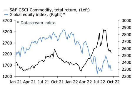
Editor’s Note: The summary bullets for this article were chosen by Seeking Alpha editors.
Be the first to comment