


It doesn’t have to be this hard.
SimonSkafar/E+ via Getty Images
So far in 2022, we’ve seen enormous volatility in interest rates. The trend has almost always been higher. We’ve seen share prices hammered in almost every sector. At first, it seems we can rationally explain away lower prices as:
Treasury yields went up, so preferred share yields went up.
Higher Treasury yields did cause a decline in preferred share prices. That’s true. Anyone would be hard pressed to argue that Treasury yields had zero impact. However, it’s only one part of the story.
The Second Part – Credit Spreads
A recession is looming (whether it began months ago, today, or months from now). It would be reasonable to argue that a recession justifies wider credit spreads. Investors are less inclined to take risks, so in theory, they demand greater additional yield. That makes perfect sense logically.
We want to be careful to avoid demanding additional yield on securities designed to generate growth in earnings. Common shares in equity REITs or other corporations should have long-term earnings growth that’s not reflected in the yield. This conversation is about income-focused securities.
Basis Points
We will talk about the change in yields. We focus on basis points. 100 basis points is 1%. If rates increase from 2% to 4%, some people will say they “doubled.” That’s true, but it distorts conversation. They increased by 200 basis points. Likewise, if yields change from 5% to 7%, it’s still 200 basis points.
Widening And Tightening Credit Spreads
If credit spreads remained constant, then you might say that if the 5-year Treasury Rate increased by 100 basis points (such as 2% to 3%), then the yield on another bond or a preferred share should increase by at least 100 basis points. If the yield on the bond or preferred share increased less than 100 basis points, we would say credit spreads tightened. That usually goes with expected economic growth. However, if it increased more than 100 basis points, the credit spread widened. That usually goes with greater fear about the economy.
The problem is that credit spreads are sending extremely mixed signals.
Preferred Share ETF Holding Up Absurdly Well
The iShares Preferred and Income Securities ETF (PFF) has many positions in fixed-rate shares with relatively low yields. These shares would most likely never be called. Therefore, if I expected the 5-year Treasury rate to increase by 272 basis points (1.26% to 3.98%) or the 10-year Treasury to increase by 217 basis points (1.52% to 3.69%), I would also have expected PFF to get crushed.
While PFF is down, it’s down less than the other index ETFs we track. Their returns so far (as of 9/26/2022) are:
- PFF: -17.6%
- KBWY: -21.66%
- MORT: -30.46%
- VNQ: -28.08%
PFF is clearly winning, despite being heavily invested in fixed-rate shares. Yet we’ve seen similar declines in some of the lowest-risk fixed-to-floating preferred shares. Not all, but some.
Note: The first section of this article was prepared on 9/26/2022. Each time we change dates, you’ll have a clear indication.
Prior Periods
For comparison, during many prior periods of rising rates or economic stress (excluding the pandemic-driven liquidity crisis), we’ve seen many mortgage REIT preferred shares shine. The AGNC preferred shares would shine due to the lower risk and some of the others would shine because higher coupon rates meant shares were already trading near their call value.
Since the call values create a ceiling for share prices around $25.00, shares with high dividend rates would often trade close to $25.00. Their yield would’ve justified a higher price, but call risk prevented it. Consequently, even if Treasury yields increased, the spread between the preferred share and Treasury rates would’ve been sufficient.
For instance, this is why CIM-A was largely glued to trading around $25.00 for quite a while. Shares would’ve justified a lower yield but paying much over $25.00 would be unwise. Therefore, the shares were stuck in a tight price range.
The Shares
To dig deeper into the swings, we pulled values on several preferred shares:
- JPM-C (JPM.PC)
- WFC-Q (WFC.PQ)
- WFC-Z (WFC.PZ)
- T-C (T.PC)
- PSB-X (PSB.PX)
- CIM-A (CIM.PA)
- RITM-D (RITM.PD)
- AGNCP (AGNCP)
- AGNCN (AGNCN)
Starting Yields
To begin with, we will consider the starting yields:
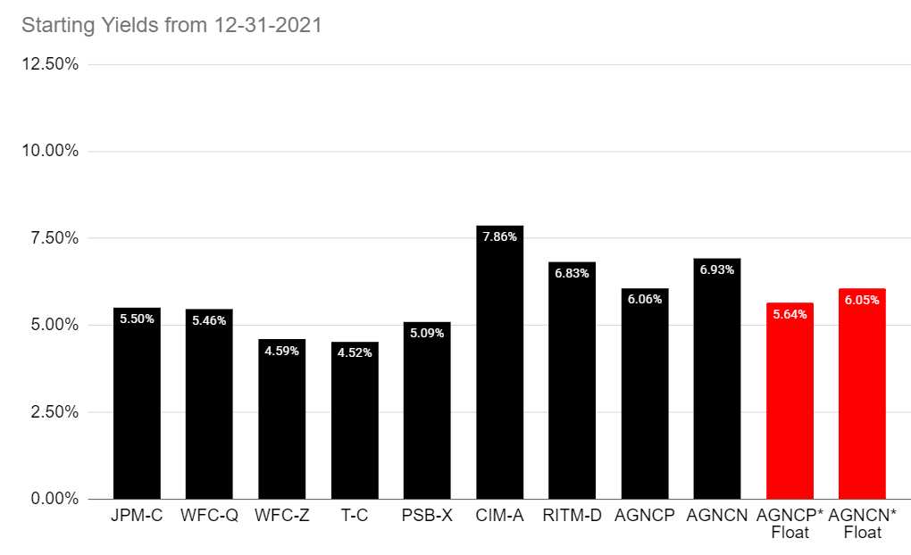
The REIT Forum
Technical Note: These are not stripped yields. For simplicity’s sake, we’re just using “current yields.” That means the annualized dividend rate divided by the share price. For AGNCP Float and AGNCN Float, we needed to look at forward rates since the curve was positively sloped. Based on prior expectations for rate hikes, I decided to use 1% for the floating rate. On 12/31/2021, estimating a 1% rate for 3-month LIBOR in late September 2022 would’ve been a reasonable guess (based on bond markets).
JPM-C and WFC-Z
Looking at those yields, you would probably think investors who owned WFC-Z would get wrecked. According to the prospectus for WFC-Z, shares had a coupon rate of 4.75% and traded at $25.86, leading to a yield of 4.59%.
Who would have wanted JPM-C? The prospectus for JPM-C indicates shares carry a 6% coupon rate. Investors loved that deal so much that shares traded at $27.25 on 12/31/2021. That brought the yield down to 5.50%. Surely, owning JPM-C at a yield of 5.5% would’ve been an awful idea when rates rose so rapidly. Right?
When the 5-year Treasury offers a 4.17% yield, shares that came with a yield of 4.59% and 5.5% should be candidates for a massive beatdown. Right?
The market disagreed.
Today’s Yields
The yields as of 9/26/2022 tell a vastly different story:
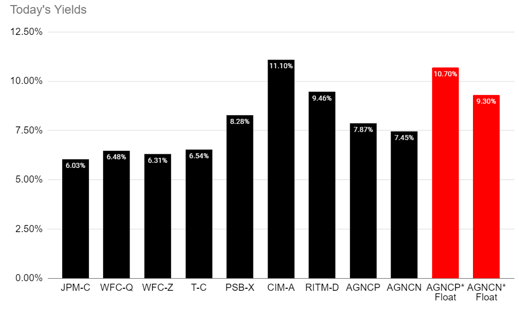
The REIT Forum
Technical Note: We’re using actual 3-month LIBOR values of 3.62843% for AGNCP and AGNCN here.
At a glance, you may notice that the bars for the first four shares do not appear to have climbed much. However, you don’t have to contrast the two images.
Change In Yield
Here is the change in yields:
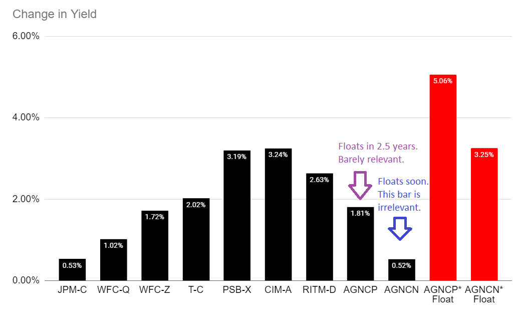
The REIT Forum
That should hammer the point home.
Some investors may be concerned that AGNCN’s black bar is short, but AGNCN switches over to the floating rate in a few weeks. Therefore, the black bar for AGNCN will be literally irrelevant soon with only the red bar being relevant. For AGNCP, investors wait a few years longer, but the red bar is still the more relevant one.
Change In Spread To 5-Year Rates
The 5-year rate increased by 291 basis points. Therefore, if we chart the change in spreads to the 5-year Treasury, it will be the same as the “Change in Yield” chart above except every value is lower by 291 points:
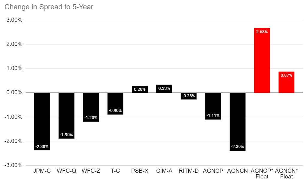
The REIT Forum
Using this chart, it becomes clear that the first four shares actually saw spreads tighten materially. While credit spreads are generally widening due to the recessionary risk, those spreads tightened. Investors get less of a yield boost for taking on that credit risk today than they did before.
What about the other shares?
PSB-X has outstanding credit quality, but we refused to cover shares because we assumed if interest rates rose rapidly, it would create huge losses due to the low starting yield. Since no one is consistently predicting future rates correctly (fast track to being a billionaire with options on Treasury ETFs), we don’t get into that game. Instead, we argued that shares with low credit risk (like PSB-X) carried too much interest rate risk.
CIM-A saw yield spreads increase. That’s a bit surprising because CIM-A’s call risk was limiting share prices at the start of the year. If CIM-A was not callable for many years, the yield on 12/31/2021 probably would’ve been much closer to 7% or 7.5% than 8%. Consequently, the 33 basis points of widening is even more remarkable. Since yields were held down by call risk, CIM-A would’ve been a good candidate for spread tightening. Whether Treasury yields were at 0.5% or 1.5%, CIM-A’s 8% coupon rate was dramatically better.
RITM-D appears to have seen spreads tighten, but RITM-D will reset the dividend rate in late 2026 based on the 5-year Treasury rate. We’re too far away from that date to include it in the chart, but it would show the eventual yield on RITM-D widened dramatically. Seriously, the implied rate (using current 5-year Treasury rates) when RITM-D resets would result in a yield over 14% on today’s share price of $18.50.
To be fair, yields would also swing depending on what time of day we pulled share prices:
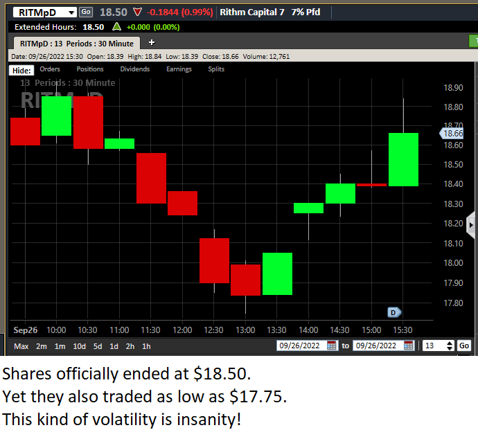
Street Smart Edge
That rally later in the day is not because yields dropped. Treasury yields ended about where they were at 1:30pm Eastern.
Change In Price
We focused on the change in yields so far, but we really want to talk about the change in share prices. As yields increased, share prices fell. Even investors focused on the income become concerned when they see share prices falling so far. That makes sense. We encourage investors to be aware of the portfolio value and to focus on growing it over time.
We know some shares saw yields move further than others, but how did that reflect share price movements? See the chart below:
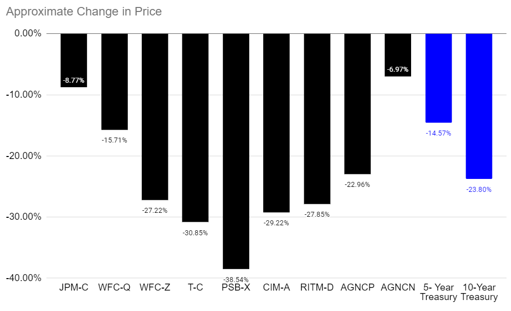
The REIT Forum
There’s no need to repeat the values for AGNCP and AGNCN twice, so we used the right two bars to show the approximate change for 5-year and 10-year Treasuries. I’m left scratching my head about JPM-C falling by far less than the 5-year Treasury. That’s a preferred share with a 6% coupon rate.
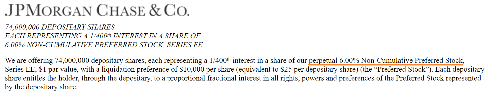
JPMorgan Chase Prospectus
Arguments about investors “discounting future cash flows at a higher rate” clearly don’t apply to JPM-C. If they did, JPM-C would’ve been down more than 30%.
Note: Non-cumulative is the standard for bank preferred shares and discussing reasons and regulations is not part of this article. We don’t cover non-cumulative shares.
So why didn’t JMP-C fall? I won’t be able to give you a complete answer. JPMorgan Chase (JPM) common shares are down nearly 34% year-to-date. So, it isn’t like JPM is simply immune to recessions.
Further, WFC-Q and WFC-Z both started with higher yields than JPM-C, yet they declined further. Is it because WFC is much more vulnerable to recessions? No. Common shares of WFC are only down 21% year-to-date.
Adding One More Share: GSL-B
GSL-B had to stay out of the early charts because I wanted to lay the groundwork first. GSL-B is a testament to the idea that shares with a high coupon rate should be far less exposed to increasing Treasury yields. GSL-B’s price is down less than 2% year-to-date. It really distorts the chart:
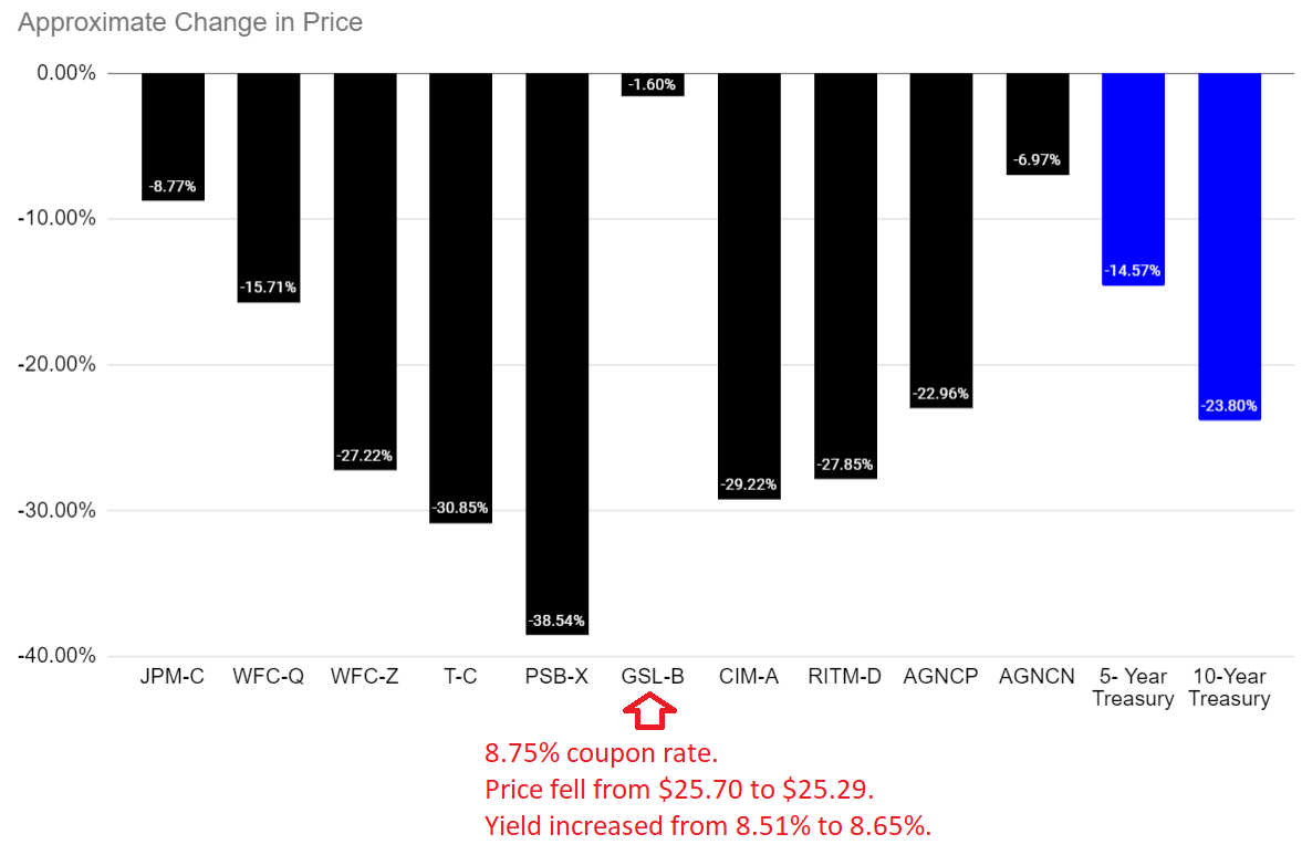
The REIT Forum
That 8.75% coupon rate is higher than the rate for CIM-A, but today GSL-B has an 8.65% yield. Yes, that means it is trading above $25.00. That’s an extreme example of the way higher-yielding preferred shares can resist higher rates.
Now, you might argue that Global Ship Lease (GSL) is in a better industry for this environment. That’s fine. However, GSL’s common shares are down 34% year-to-date. Therefore, we can’t simply excuse GSL-B’s massive outperformance by proclaiming that GSL is immune to all potential economic threats. That’s clearly not the case. Instead, investors saw the big yield and weren’t too concerned about GSL. Consequently, it had an 8.51% yield when the 5-year Treasury was at 1.26% and today it has an 8.65% yield with the 5-year Treasury at 4.17%.
According to GSL-B’s prospectus, GSL-B does not float and does not have any conversion rights. Perhaps GSL-B has some other strengths, but it isn’t the only example of fixed-rate preferred shares withstanding the increase in Treasury yields.
Investors are simply not severely discounting all preferred shares the same way.
We saw some of this strength in mortgage REIT preferred shares back in 2018. Today, we’re seeing panic. What’s the difference? I think the pandemic left investors spooked. They pulled out of shares even though the fundamentals were fine. As prices fell, it gave the appearance of bigger problems.
Did Mortgage REIT Preferred Shares Really Hold Up Before?
Note: This section is as of 9/27/2022.
We saw rates increase substantially in 2018. They didn’t reach the current levels, but they were up dramatically. Consider the monthly chart for CIM-A:
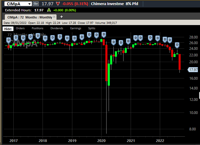
Street Smart Edge
In 2018 Treasury yields were roaring higher. There was only one month where CIM-A temporarily traded below $24.00. That was it. The 10-year Treasury broke 3.2% and CIM-A traded under $24.00 for a fraction of a month. CIM-A wasn’t an outlier. While many preferred shares from that period have already been called (making historical pricing harder), there are others that remain outstanding.
PMT-A (PMT.PA) is fixed-to-floating, but it trades around $20 today. Think that’s because of higher discount rates? The floating rate starts in 2024. Back in 2018, that floating rate was much further away. How did PMT-A respond to higher rates in 2018:
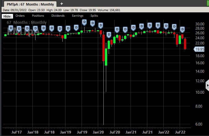
Street Smart Edge
Much like CIM-A, it only had a brief period below $24.00. Most of the time shares traded above $25.01. Therefore, there is no basis for believing that these shares can only recover if Treasury yields go back around 1%. The history demonstrates that they’ve traded around $25.00 even when Treasury yields were around 3%.
If you believe mortgage REIT preferred shares should’ve seen tightening spreads (like many other preferred shares), rather than dramatically widening spreads, it makes sense to believe share values deserve to be materially higher.
Wrapping It Up
Higher Treasury yields are negatively impacting share prices throughout the market and negatively impacting the economy. The market hasn’t been entirely reasonable in deciding which cash flows to discount at higher rates. Further, weakness in some of the fixed-to-floating shares occurs despite dramatic increases coming over the next few years.
Investors seeing the drop in share prices may feel that lower prices are here forever. However, it appears that the market has simply discounted some shares dramatically harder than others. While there are clearly significant declines in book value, we see no evidence that any of these REITs are near failing. Instead, we see much more attractive spreads relative to Treasury rates. These shares offer significant income and the potential for substantial capital gains.
One Last Note On AGNCN Vs. AGNCP
With all these charts, it feels wrong to close the article without referencing the disparity between AGNCN and AGNCP.
You also can see right away that AGNCN’s near-term floating rate has been a huge advantage. It had the smallest decline among the preferred shares measured.
While the yield spread on AGNCN increased dramatically, the projected dividend also increased dramatically. Because investors could see that the floating rates would kick in soon, they focused on the higher floating rate and supported AGNCN’s share price.
However, they didn’t give the same love to AGNCP. A few key facts to consider:
- AGNCN should’ve outperformed AGNCP year-to-date (and it did) since AGNCN floats sooner.
- The spread shouldn’t have been that wide.
- AGNCP only needs to wait an extra 2.5 years.
- Investors are paying $4.04 more for AGNCN per share.
That brings us to two scenarios.
If Rates Remain Flat:
- If we froze current rates, AGNCN would pay out an extra $1.634 per share over the next 2.5 years.
- The investor paid an extra $4.04, so they would still need to recover $2.406.
- When both shares float, AGNCN’s annualized dividend rate is higher by $.1035 per share per year. That investor in AGNCN would recover the final $2.406 over 23.25 years if shares are not called. That’s in addition to the first 2.5 years, for a total of 25.75 years.
If Rates Increase Further
- If we assume 3-month LIBOR averages 4.628% (higher than any future implied rate) for the next 2.5 years, then AGNCN’s higher dividend would pay shareholders an extra $2.259 over the next 2.5 years.
- The investor paid $4.04, so they would still have $1.781 to recover.
- By recovering $.1035 per share, investors in AGNCN catch up with AGNCP after a total 19.7 years, if shares are not called.
If AGNCP is called within 19.7 years, AGNCP simply wins. There’s no way for AGNCN to match the cash flows of AGNCP.
Investors who want to discount future cash flows (entirely reasonable) should like AGNCP even more. AGNCP investors save the $4.04 today. It’s the only cash flow that would not be discounted. Every future dividend payment would be discounted, so instead of 19.7 years to 25.75 years, you’re stuck with some pretty insane numbers.
Another Thing
Note: This section is as of 10/04/2022, around market close.
Shares of NLY-F (NLY.PF) closed 10/04/2022 at $24.41. That’s pretty close to $25.00 given the volatility in the sector. The commentary I just made about AGNCN can also be applied to NLY-F.
It appears that as screening tools are updated to show investors the new yield on NLY-F, the investors are getting excited. It’s a big yield. A little over 9%. However, investors would be better off with one of the fixed-to-floating shares that has a lower yield today. They get less “income” today, but they save vastly more in cash today than they would expect to earn from paying up for NLY-F. It’s the same argument as AGNCP vs. AGNCN, only with slightly different numbers. It also assumes that you don’t really care whether your preferred share came from AGNC or NLY. In my opinion, the risk for the preferred shares of the two big mortgage REITs is about equal.
Why are investors buying NLY-F instead? The big dividend yield shows up on their screen.
For AGNCP, the yield if floating would come in at 10.69%. Investors need to wait 2.5 years to get that. NLY-F pays about 9.03% (will change each quarter). Which investment do you think you would be happier with at that point? AGNCP purchased at $19.77 or NLY-F at $24.41?
Updated Charts
The rest of the charts in this article may be self-explanatory to some investors. However, if you’d like to know more about them, you’re encouraged to see our notes for the series. The part below is reproduced in each article to provide investors with easy access to the updated charts. It is my gift to readers.
Stock Table
We will close out the rest of the article with the tables and charts we provide for readers to help them track the sector for both common shares and preferred shares.
We’re including a quick table for the common shares that will be shown in our tables:
Let the images begin!
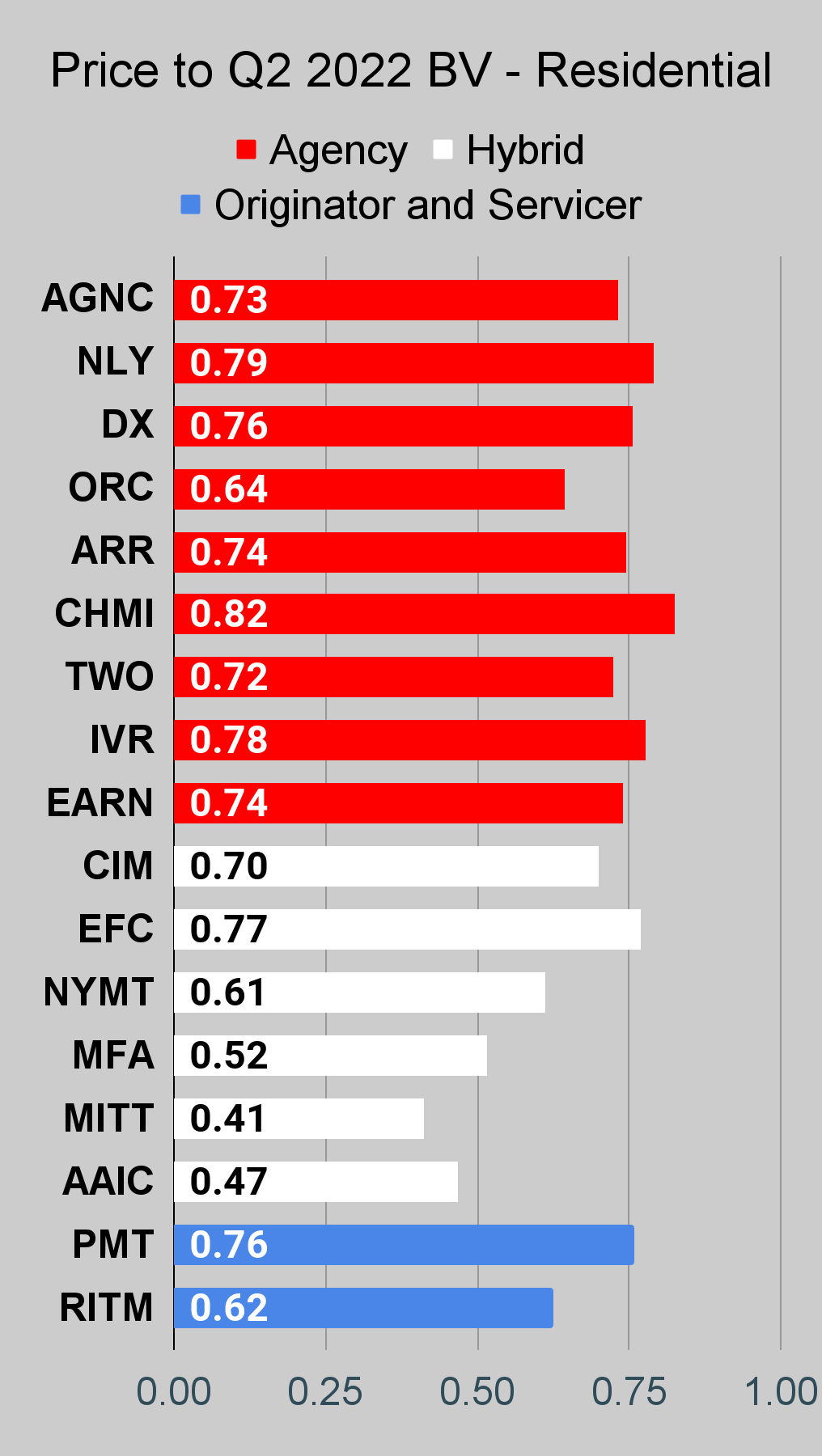
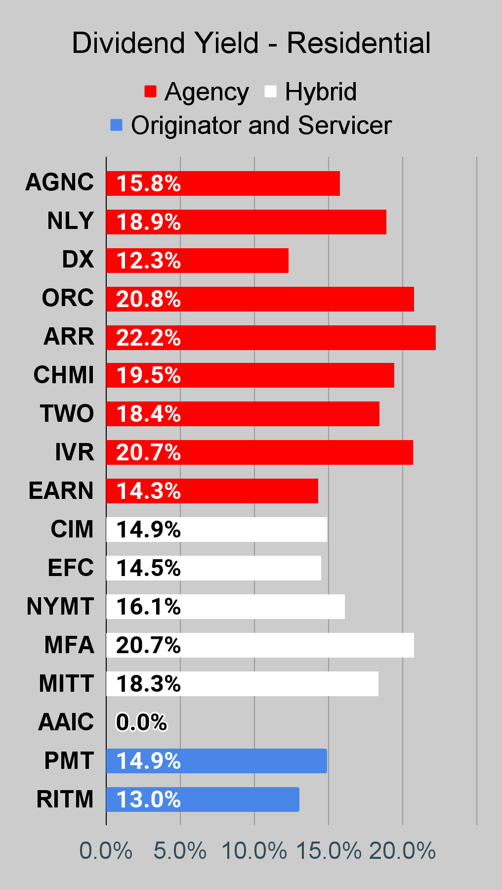
Residential Mortgage REIT Charts
Note: The chart for our public articles uses the book value per share from the latest earnings release. Current estimated book value per share is used in reaching our targets and trading decisions. It is available in our service, but those estimates are not included in the charts below.
 The REIT Forum |
 The REIT Forum |
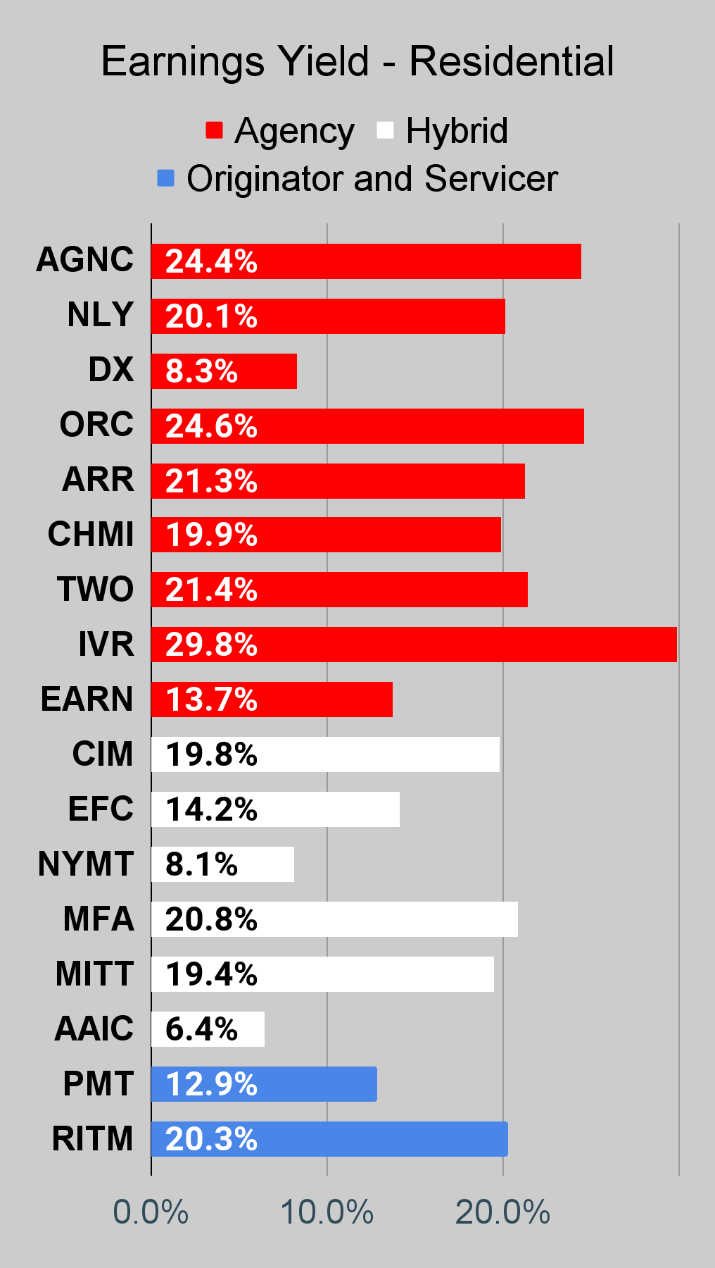 The REIT Forum |
Commercial Mortgage REIT Charts
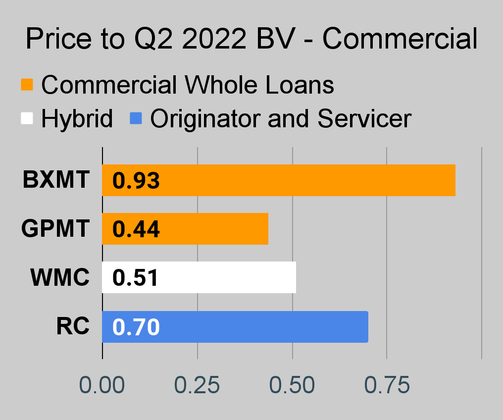 The REIT Forum |
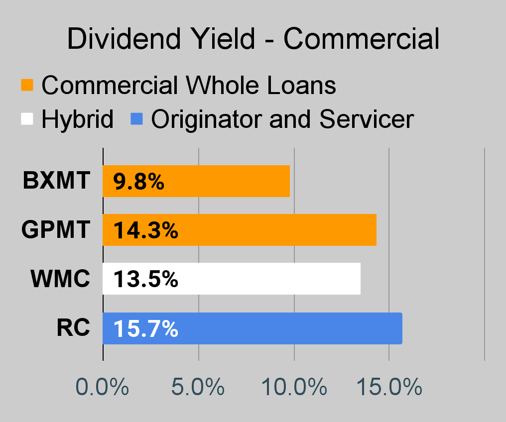 The REIT Forum |
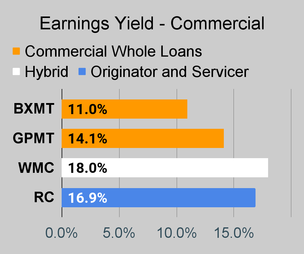 The REIT Forum |
BDC Charts
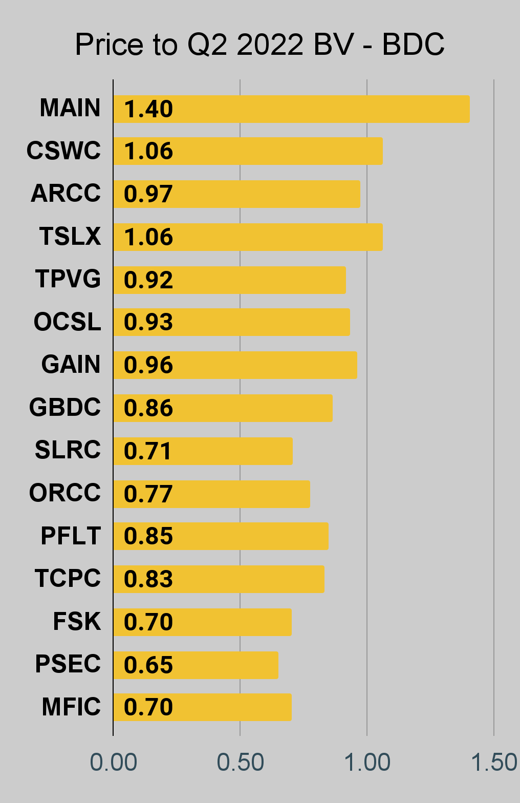 The REIT Forum |
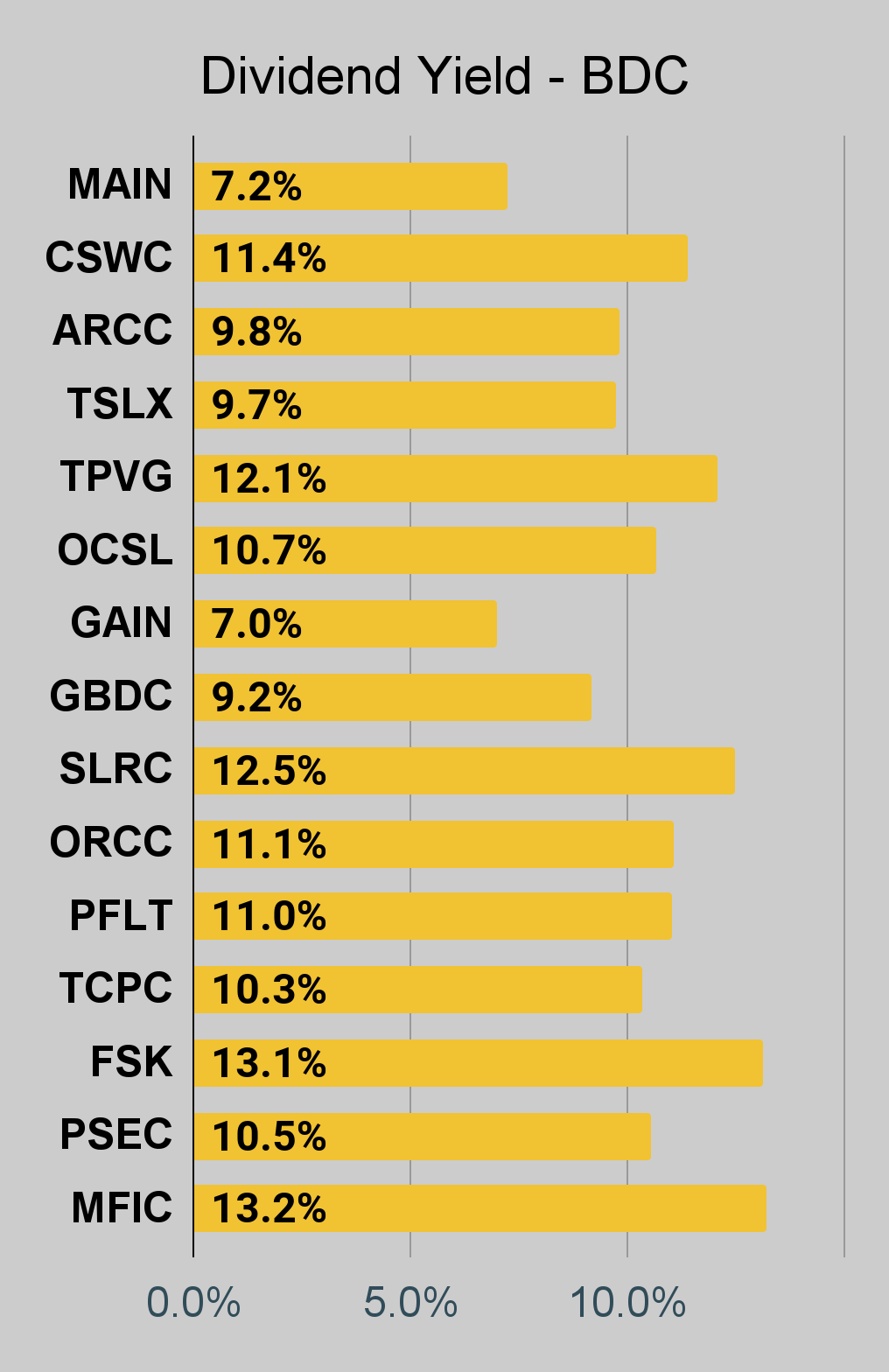 The REIT Forum |
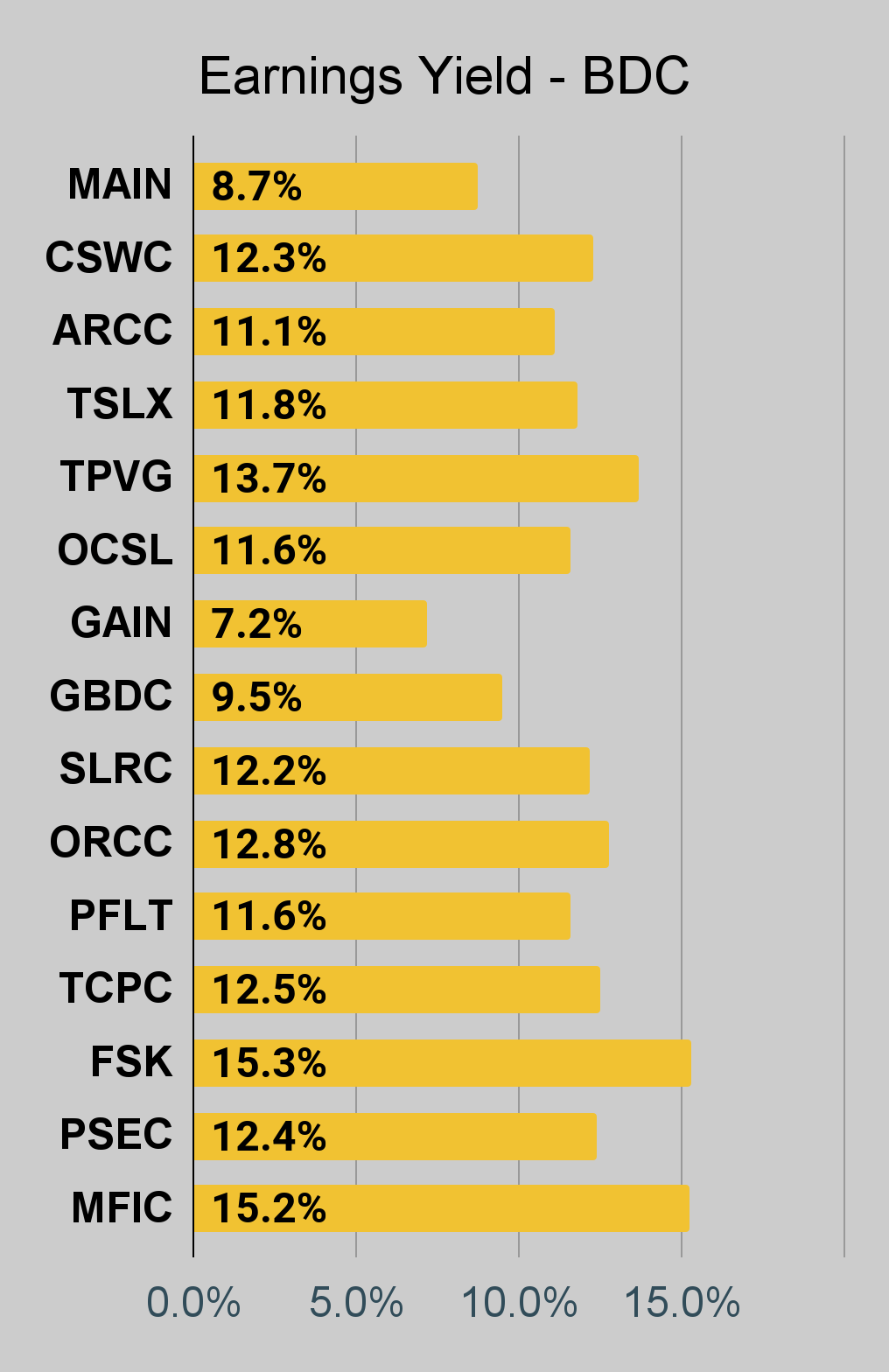 The REIT Forum |
Preferred Share Charts
I changed the coloring a bit. We needed to adjust to include that the first fixed-to-floating shares have transitioned over to floating rates.
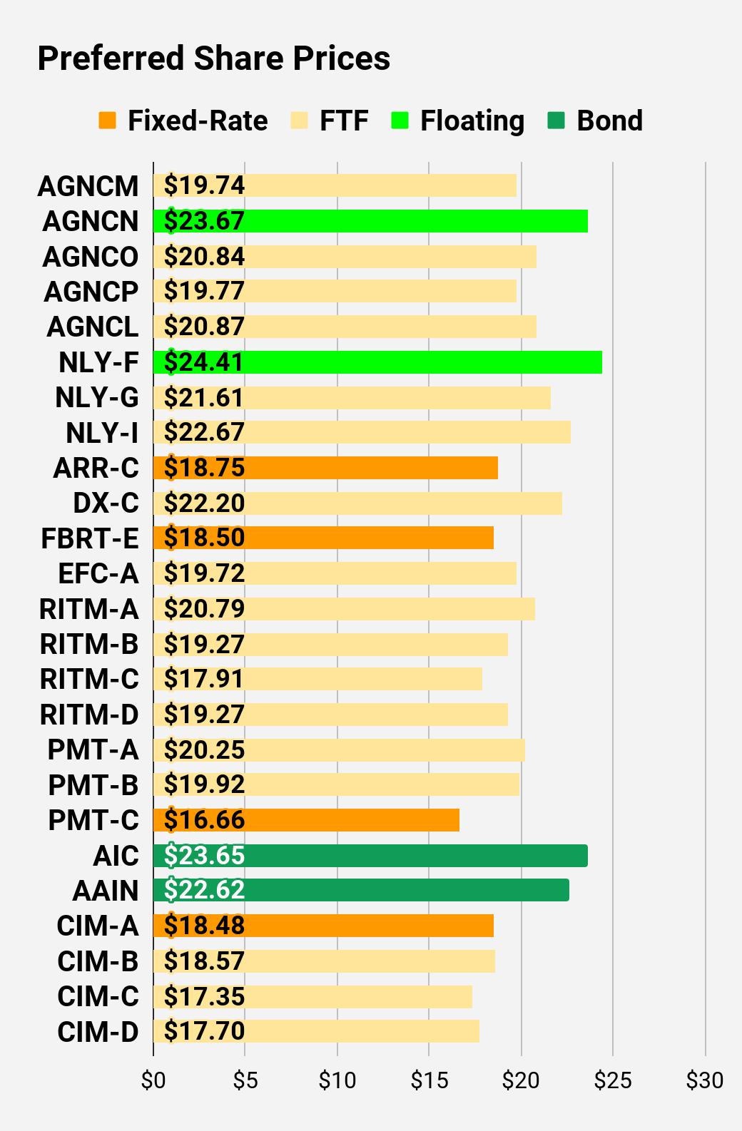 The REIT Forum |
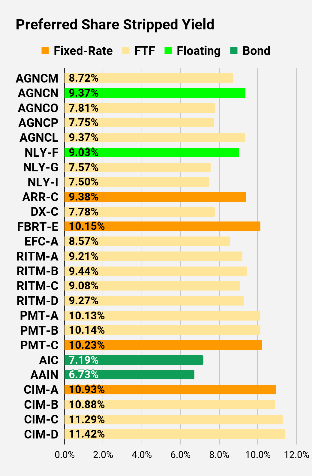 The REIT Forum |
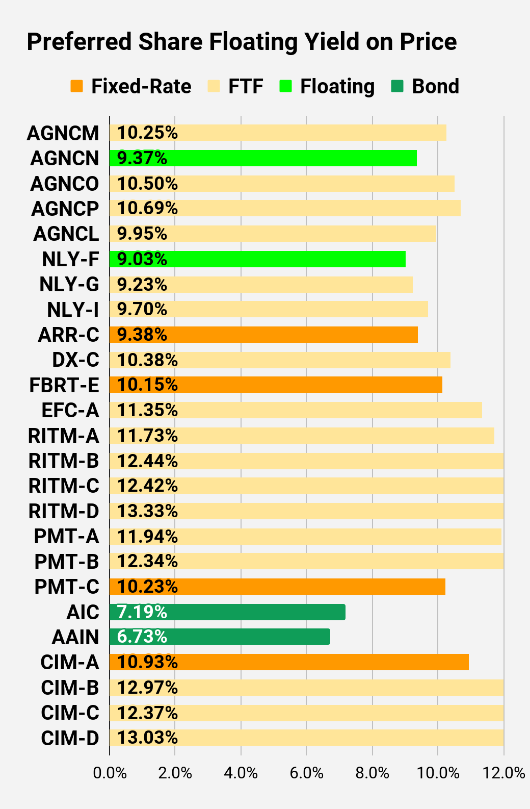 The REIT Forum |
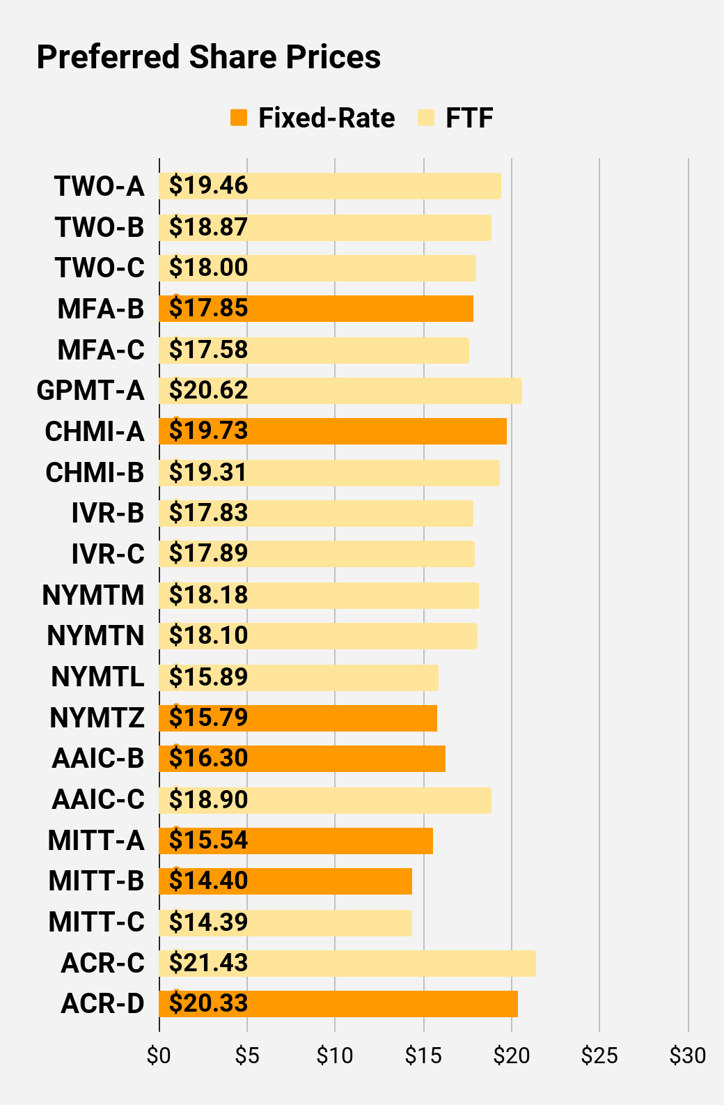 The REIT Forum |
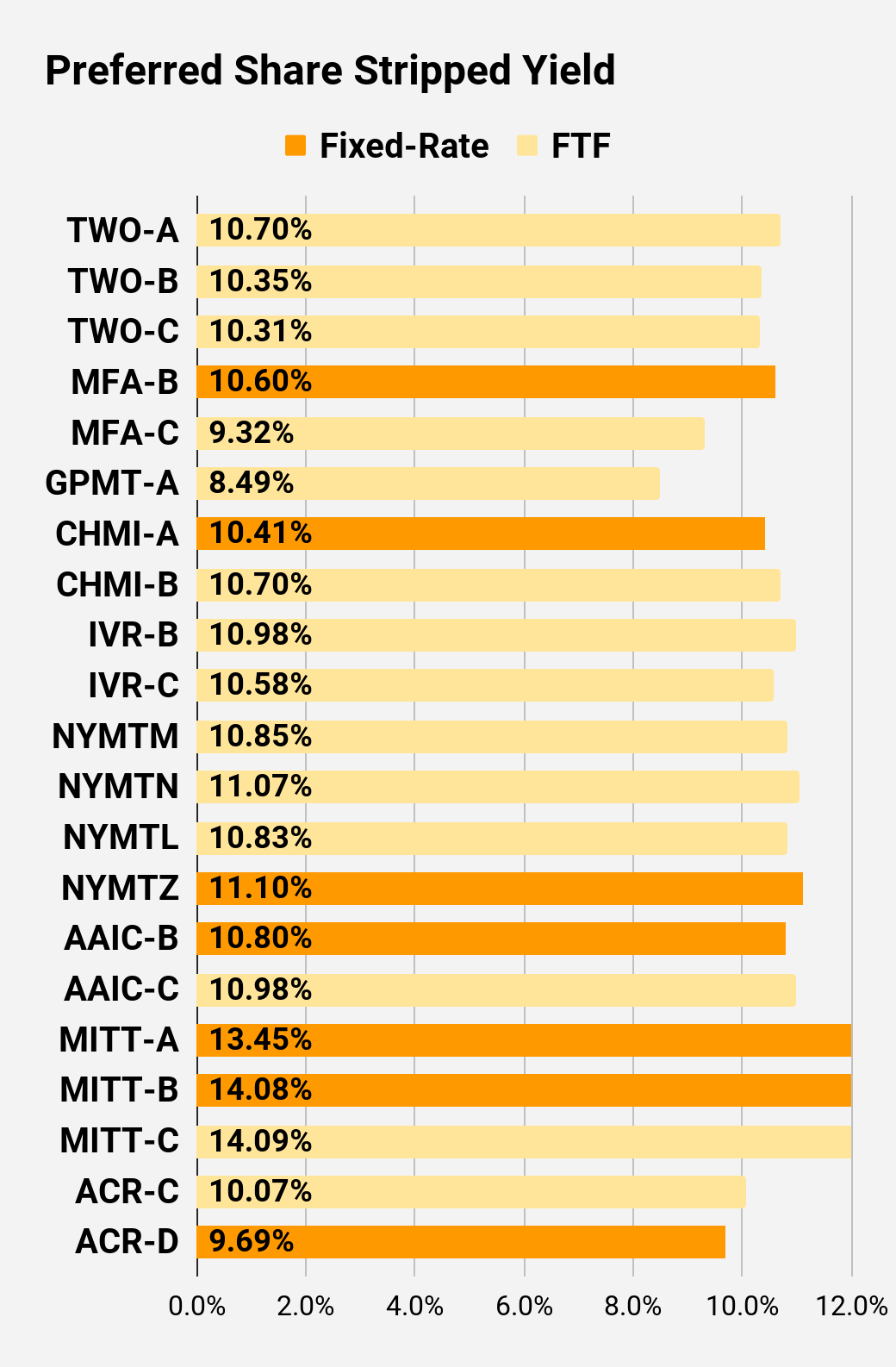 The REIT Forum |
 The REIT Forum |
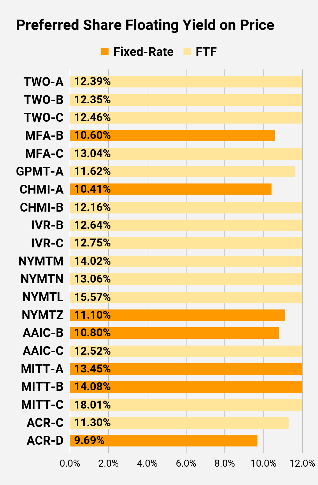
Preferred Share Data
Beyond the charts, we’re also providing our readers with access to several other metrics for the preferred shares.
After testing out a series on preferred shares, we decided to try merging it into the series on common shares. After all, we are still talking about positions in mortgage REITs. We don’t have any desire to cover preferred shares without cumulative dividends, so any preferred shares you see in our column will have cumulative dividends. You can verify that by using Quantum Online. We’ve included the links in the table below.
To better organize the table, we needed to abbreviate column names as follows:
- Price = Recent Share Price – Shown in Charts
- BoF = Bond or FTF (Fixed-to-Floating)
- S-Yield = Stripped Yield – Shown in Charts
- Coupon = Initial Fixed-Rate Coupon
- FYoP = Floating Yield on Price – Shown in Charts
- NCD = Next Call Date (the soonest shares could be called)
- Note: For all FTF issues, the floating rate would start on NCD.
- WCC = Worst Cash to Call (lowest net cash return possible from a call)
- QO Link = Link to Quantum Online Page
Second Batch:
Strategy
Our goal is to maximize total returns. We achieve those most effectively by including “trading” strategies. We regularly trade positions in the mortgage REIT common shares and BDCs because:
- Prices are inefficient.
- Long term, share prices generally revolve around book value.
- Short term, price-to-book ratios can deviate materially.
- Book value isn’t the only step in analysis, but it’s the cornerstone.
We also allocate to preferred shares and equity REITs. We encourage buy-and-hold investors to consider using more preferred shares and equity REITs.
Performance
We compare our performance against four ETFs that investors might use for exposure to our sectors:
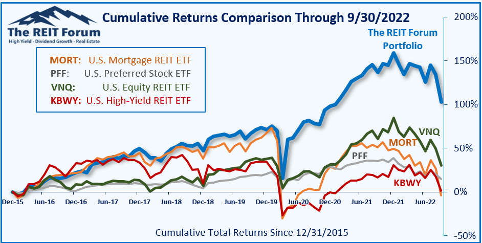
The REIT Forum
The four ETFs we use for comparison are:
|
Ticker |
Exposure |
|
One of the largest mortgage REIT ETFs |
|
|
One of the largest preferred share ETFs |
|
|
Largest equity REIT ETF |
|
|
The high-yield equity REIT ETF. Yes, it has been dreadful. |
When investors think it isn’t possible to earn solid returns in preferred shares or mortgage REITs, we politely disagree. The sector has plenty of opportunities, but investors still need to be wary of the risks. We can’t simply reach for yield and hope for the best. When it comes to common shares, we need to be even more vigilant to protect our principal by regularly watching prices and updating estimates for book value and price targets.
Ratings:
- Bullish on AGNCP. Obviously, I’m bullish on several other investments also. However, the word count on this piece is obscene already.
Be the first to comment