

richcano
Long-term Treasury bonds are likely entering, at long last, their cyclical turn. The PIMCO 25+ Year Zero Coupon US Treasury Note ETF (NYSEARCA:ZROZ) is about 50% below its Spring 2020 peak, but has risen 20% off of its lows in the second half of last year. ZROZ, as well as other long-term Treasuries, are likely to continue appreciating over the course of 2023, particularly relative to other major asset classes like commodities, equities, and corporate debt. As the market cycle slows down and disinflation increasingly creeps in, long-term Treasuries have the best chance of all the major asset classes of seeing positive returns for the year, and the recent change in momentum suggests that the remarkable cyclical bear market in Treasuries will likely come to a close over the next two months. There is also reason to expect that long-term Treasuries will outperform these other asset classes over much of the remainder of the decade.
In general, the thrust of this argument ought to apply to all long-term Treasuries (say, durations of seven years or more), but if it is correct, it ought to apply especially to the longest end of the curve (twenty years or more), and most especially to long-term zero-coupon Treasuries, whose returns are most sensitive to changes in interest rates. Because all of the yield in zero-coupon bonds is realized at maturity, these bonds are most exposed to the benefits and risks of duration. Thus, for those who are most interested in outperformance, going as far out as possible on the duration branch would be best if a decline in yields is anticipated. For those who are more interested in avoiding the risk of a decline in equities, commodities, or corporate bonds, shortening duration is advisable. And, there are numerous points along the Treasury curve where investors can balance those risks.
Because we are interested here in both the absolute and relative (to equities, commodities, and other bonds) performances of long-term Treasuries over both the long-term and short-term, we have a lot of ground to cover. First, we are going to look at the long-term performance of Treasury bonds and their performance relative to equities and commodities. After that, we are going to look at how they perform over cyclical durations (which typically last from 32-60 months). Finally, we will try to identify key indicators for anticipating absolute and relative performance in Treasuries.
But, before we get to that, let me just restate the primary argument of this article:
- Interest rates are likely on the verge of entering a cyclical downturn that will probably last at least a year.
- This downturn in interest rates is likely to benefit long-term zero-coupon Treasuries most.
- There is also reason to expect that Treasuries will outperform the S&P 500 and commodities over much of the remainder of the 2020s.
The top panel of the chart below shows the relationship between ZROZ and the 10-year yield on Treasuries and the bottom panel shows the correlation between the two.
Chart A. ZROZ has been consistently inversely correlated with 10-year benchmark rates. (Stockcharts.com)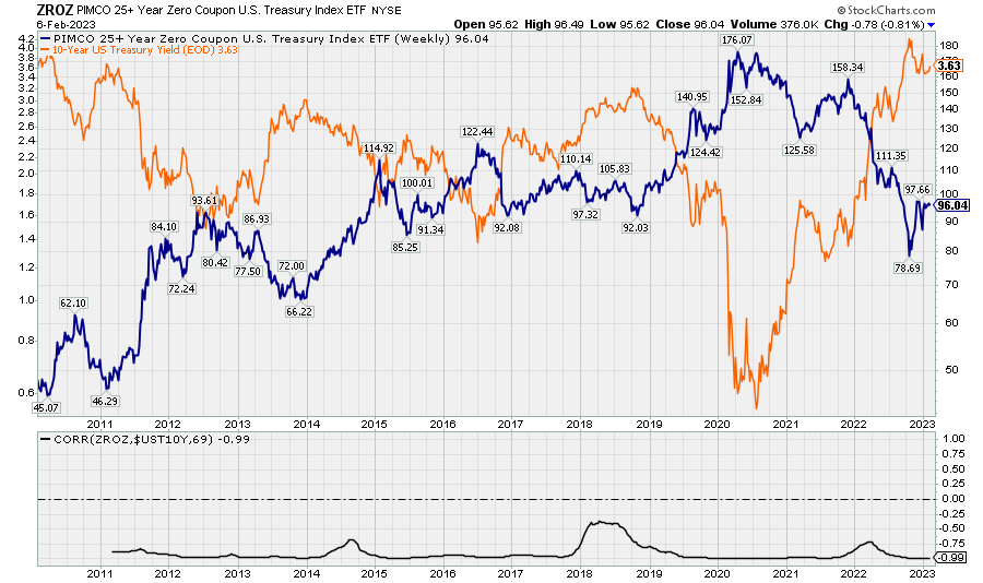
The following chart replaces ZROZ with the ratio of ZROZ to IEF, the iShares 7-10 Year Treasury Bond ETF. When the 10-year Treasury yield moves, ZROZ, with rare exceptions, moves even more than the IEF. If yields are indeed cresting, ZROZ is among the best places to be to take advantage of that.
Chart B. ZROZ typically outperforms ten-year bonds when 10-year interest rates fall. (Stockcharts.com)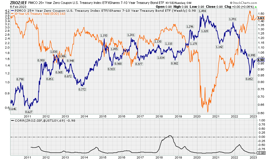
Treasury yields in context
In some ways, the long-term behavior of Treasuries is the most difficult to categorize among the major asset classes. Historically, there has been a quite close relationship between “long waves” in inflation and the earnings yield on equities. Major spikes in the earnings yield have tended to occur when long-term consumer inflation was well above average. Treasury yields had been less consistently responsive to inflation prior to the 1950s, as can be seen in the following chart.
Chart C. Bonds are less responsive to inflation than are earnings yields. (Robert Shiller; S&P Global; St Louis Fed; University of Michigan; own calculations)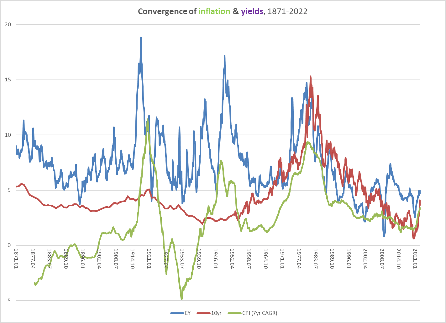
This generally applies to commodity inflation, as well. The earnings yield has clearly been more sensitive to commodity inflation over the last 150+ years than Treasury yields have been. This is illustrated in the next chart.
Chart D. Treasury yields are even less responsive to commodity long waves than consumer inflation long waves. (Warren & Pearson; World Bank; Shiller; S&P Global; St Louis Fed; own calculations)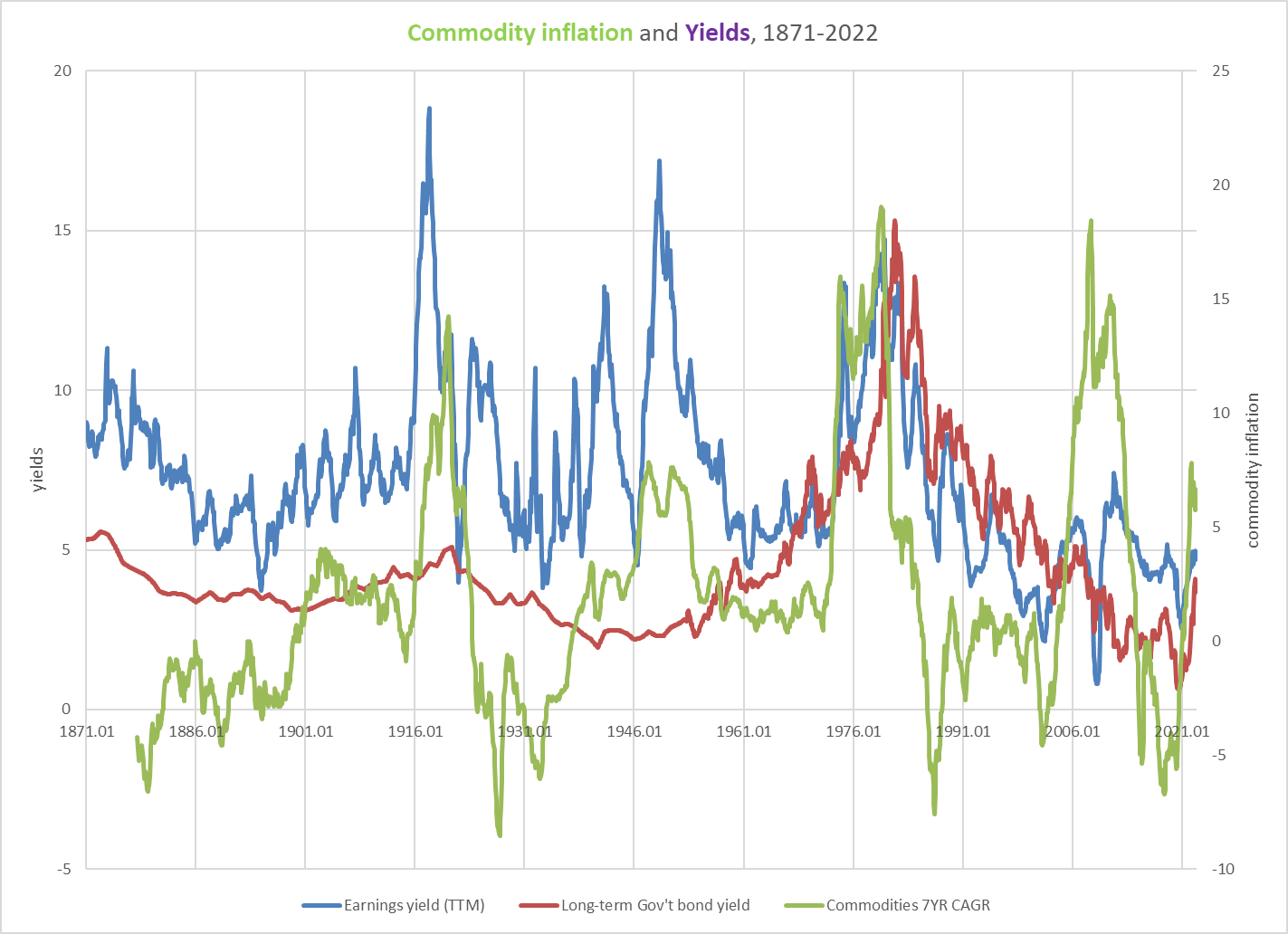
Thus far, we can really only say that Treasury yields tend to be low when inflation is low, but when inflation is high, it is a bit of a coin toss. There also appears to be a “long wave” in Treasury yields that sees them peak every 50-60 years (e.g., 1870, 1920, 1980), much in the manner of Nikolai Kondratiev’s long waves of the Long 19 th Century. Interestingly, throughout the 1950s and well into the early 1960s, while the earnings yield and inflation were low and/or falling, Treasury yields were rising.
The following chart shows the spread between the yield on long-term government bonds-this data set is based on an assortment of long-term government yields prior to the 1950s and the 10-year Treasury yield since-and long-term consumer inflation.
Chart E. Real interest rates used to be primarily determined by long waves in consumer inflation. (St Louis Fed; University of Michigan; own calculations)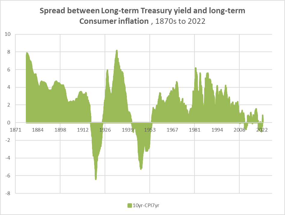
The unusual thing about the current period is that the spread between Treasury yields and long-term consumer inflation is so low, even though inflation is low. Typically, this spread hit its lowest points (in the 1910s, 1940s, 1970s) when inflation is hot, not when it is cold. The following chart suggests that the “real yield” has been way below average.
Chart F. Real interest rates are much lower than they were in previous decades. (St Louis Fed; University of Michigan; own calculations)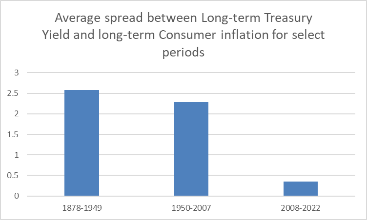
If we assume a return to more typical historical patterns, then we ought to expect the spread to become much more positive (under a low-inflation regime) or much more negative (under a high-inflation regime). Prior to the anomaly of the last two decades, what has driven large shifts in the spread has been long waves in consumer inflation. But, there have been occasions in which the spread was widened over time by a simultaneous rise in yields and softening of inflation: roughly the 1903-1914 period and the 1950-1965 period. This is similar to the current emerging trend of rising real yields caused by rising nominal yields and disinflation.
The chart below shows nominal and real Treasury returns from the 1870s up until the beginning of this year.
Chart G. Periods in which inflation moderated while interest rates rose, as in the early 1910s and 1960s saw modest returns followed by long waves of inflation. (St Louis Fed; University of Michigan; own calculations)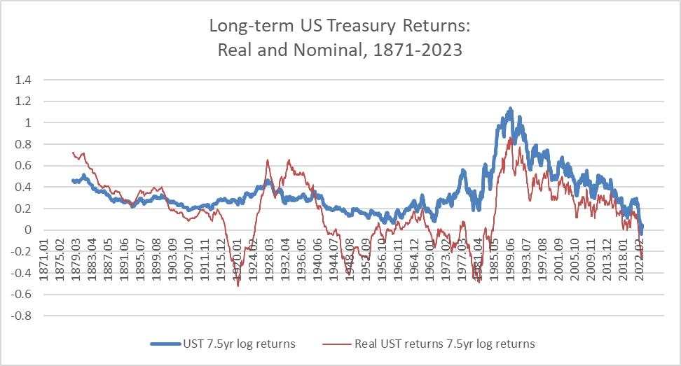
It suggests that those two periods mentioned above in which yields rose while inflation softened (i.e., the early 1900s-1910s and 1950s-1960s) saw low but positive real and nominal returns in Treasuries and, in nominal terms, a rising rate of change over the final 7-8 years (1907-1914 and 1958-1965). In real terms, returns held up over those periods, but then crashed as the long wave of inflation surged (in the late 1910s and the 1970s). In sum, secular periods of gently rising yields combined with disinflation has produced low but positive bond returns, but in both cases, real returns were subsequently severely depressed by a surge in inflation.
This is at least a plausible scenarios for the 2020s and 2030s: gently rising yields and softening inflation in the former decade followed by a sustained acceleration in inflation and yields in the second. There is at least one other long-term pattern that points to a more dramatic disinflation in the 2020s, but this requires us to look at relative returns in commodities, bonds, and stocks.
Long-term relative returns
The chart below shows the absolute and relative performance of the S&P Composite over 7.5-year periods. Perhaps the most important thing to note is that patterns in long-term relative performance between equities and bonds is driven almost entirely by equities. The great bond boom of the 1980s is really the only time when there was a serious breakdown in the correlation between equities and the equity/bond ratio, as can be seen in the gap between the red and blue lines during the 1980s.
Chart H. Relative performance in stocks and bonds are almost always driven by stocks. (Shiller; S&P Global; St Louis Fed; own calculations)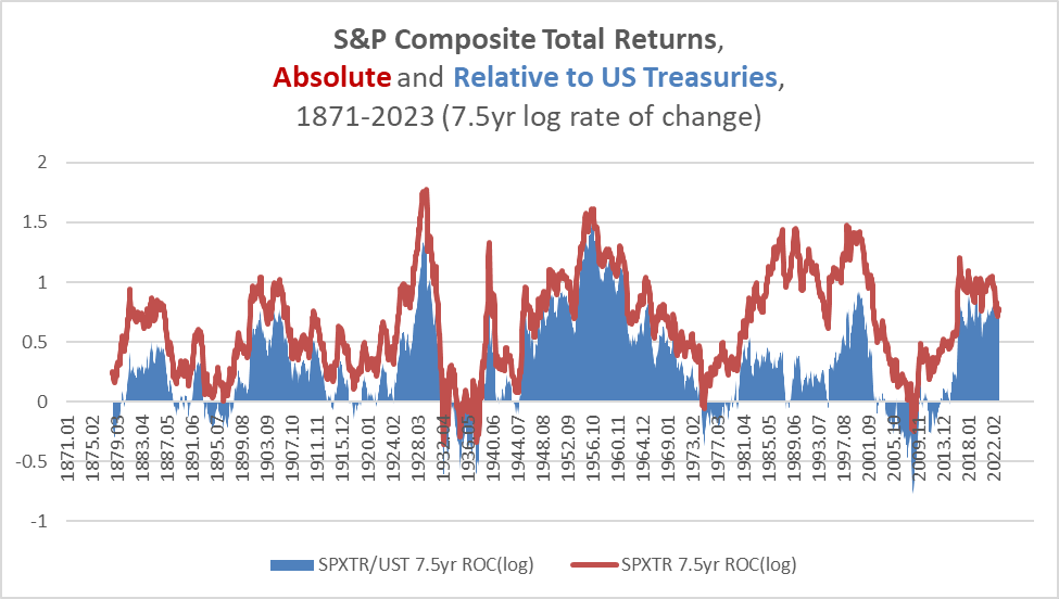
That great bond boom was a result of the extraordinary peak in yields in the early 1980s, as illustrated in the chart below.
Chart I. Long-term nominal returns are fairly predictable. (St Louis Fed; own calculations)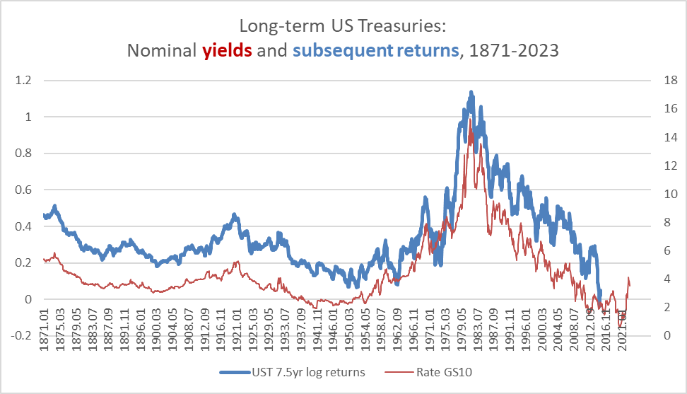
Unsurprisingly, the correlation between the yield and subsequent returns is 0.94.
Chart J. If long-term nominal returns are predictable, the primary risks are short-term price risks and real and relative return risks. (St Louis Fed; own calculations)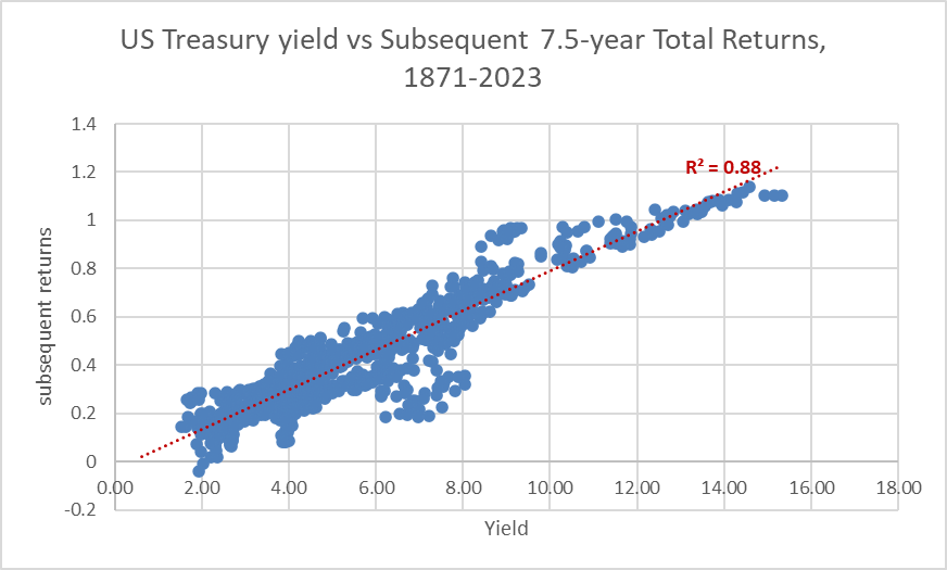
Even if we stretch the return horizon to twenty years, as in the chart below, we still have a general idea of what nominal returns are likely to look like.
Chart K. Even 20-year index returns tend to be anticipated by 10-year yields. (St Louis Fed; own calculations)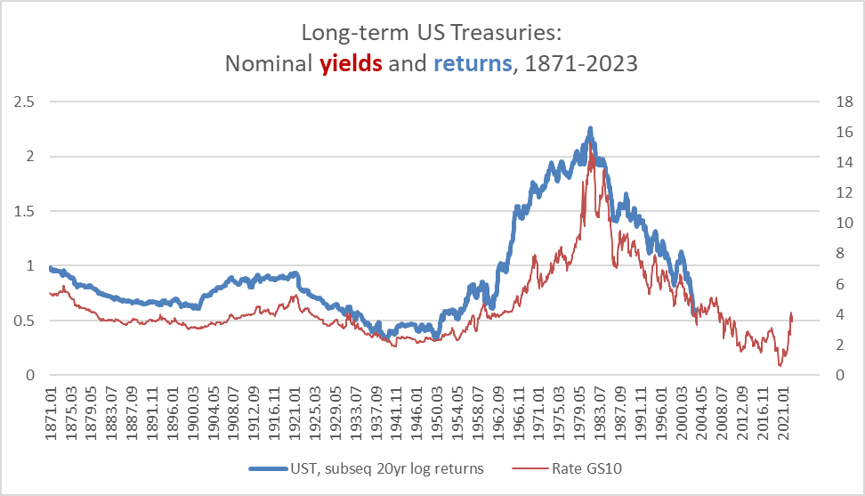
The real long-term dangers to investing in Treasuries are the threat of missing out on equity outperformance or getting caught offside in an inflation/commodity boom, and those dynamics are primarily determined in the equity and commodity markets, not the bond market.
We already looked at the equity/bond ratio above. The relationship between absolute commodity performance and performance relative to Treasuries is illustrated in the following chart.
Chart L. Relative performance in bonds and commodities tends to be driven by commodities (St Louis Fed; Warren & Pearson; World Bank; own calculations)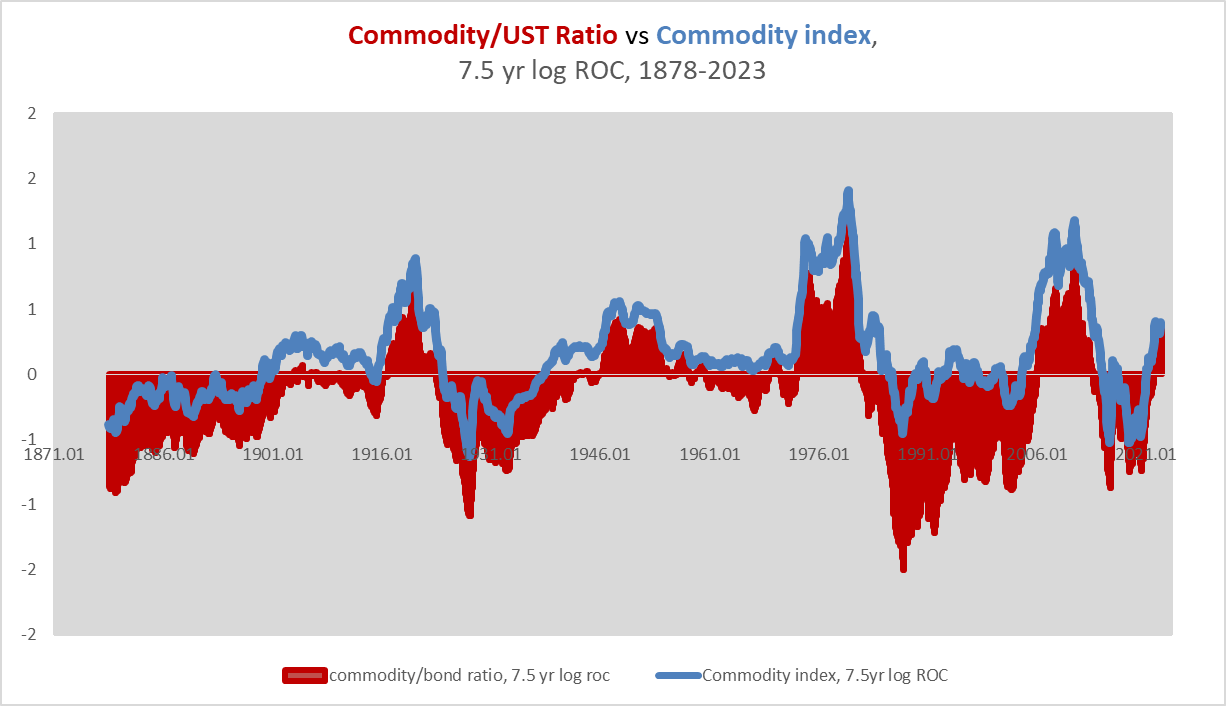
Treasuries outperform commodities almost exclusively in the periods between commodity booms, which tend to last about 20 years (for example, 1920-1940, 1950-1970, 1980-2000).
This is not the place to argue my commodity thesis, which I outlined in March of last year and have since updated for grains, energy, and industrial metals. Generally, over the long term, commodities move in sync with the earnings yield (as illustrated earlier), technology waves, inflation, and global political disorder. I outlined these interlocking relationships in the series Conjunction & Disruption: Technology, War, And Asset Prices. Typically, a major spike in these factors has occurred every 30 years since the establishment of the Fed a century ago. Since the last such spike occurred in the 2000-2010 period, a new commodity supercycle would not likely hit until the 2030s.
As for stocks, they are largely dependent on long waves in the earnings yield, as well. PE ratios (the inverse of the earnings yield) tend to trough every 30 years and to peak when (a) long-term earnings growth crests, (b) the long-term gap between technology and energy stocks has become too extreme, and (c) a cyclical energy shock hits. This can occur late in the trough of the earnings yield supercycle (as in the 1990s) or early (as in the 1920s). When the stock market peaks late in the yield trough, a “secular” bear market commences and is combined with rising commodities and yields (as in the 2000s). On the one occasion where stocks peaked early in the trough, a deflationary collapse that hit commodities, earnings, and stock prices followed (the Great Depression). These dynamics I addressed most recently in my 2023 forecast for the S&P 500.
The sum of it is that all of the conditions for the conclusion of an equity market boom were in place as of 2021, and thus, it is more likely that the rest of the decade will be low-growth and disinflationary. That does not preclude an extended period of rising nominal and real Treasury yields, however.
Within the context of the history of cross-asset patterns of behavior, the likeliest two scenarios for the remainder of the 2020s are that (a) markets will be struck with significant deflationary forces as in the Great Depression which will likely keep nominal yields subdued or (b) a gentler disinflation combined with a gradual rise in bond yields will lift real yields to a more normal level (as outlined in the previous section). What both scenarios have in common is rising real yields and significant outperformance of Treasuries versus commodities. But, there was a key difference in the relative performances of Treasuries and stocks in the two historical scenarios. In the first scenario, Treasuries beat equities by a considerable margin, but in the second set of scenarios, stock returns both relatively and absolutely were decelerating on the way to a “secular” bear market (i.e., the 1910s and 1970s) but stocks still outperformed.
Because conditions appear to be propitious for a “secular” bear market in equities, and previous bear markets saw Treasuries outperform equities, it seems more likely that a Depression-like scenario will take hold over the remainder of the decade. But, if there is such a thing as long waves in bond yields, it would also seem more likely than not that bond yields are going to be higher than their 2010 lows.
This discussion, however, sets aside the dramatic change in yields that has occurred since 2020.
Yield cycles
The 2015-2022 period was the first time, it appears, that 7.5-year returns in long-term Treasuries were negative. The 2021-2022 period also saw the worst cyclical performance in the last 150 years. Both of these points are illustrated below.
Chart M. Treasury returns appear to have become a lot more volatile over the last fifty years. (St Louis Fed; own calculations)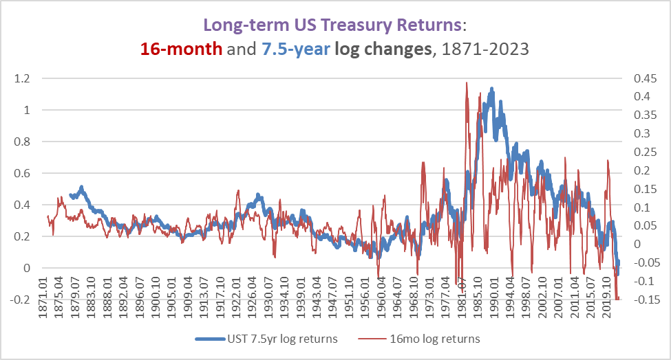
Since the 1960s, interest rates have been more prone to extreme supercyclical swings (unprecedented highs in the 1970s followed by unprecedented lows in the 2010s) and cyclical swings. Treasuries appear to be less risk-free than they used to be.
But, they appear to have always had a cyclical nature. The following chart shows a rolling 16-month correlation between the long-term Treasury yield and its 16-month rate of change (in blue) alongside a five-year moving average of the rolling correlation (in black). The average correlation for the entire period is 0.69, and it is unusual for it to turn negative.
Chart N. Momentum in yields tends to be correlated with the yields themselves. (St Louis Fed; own calculations)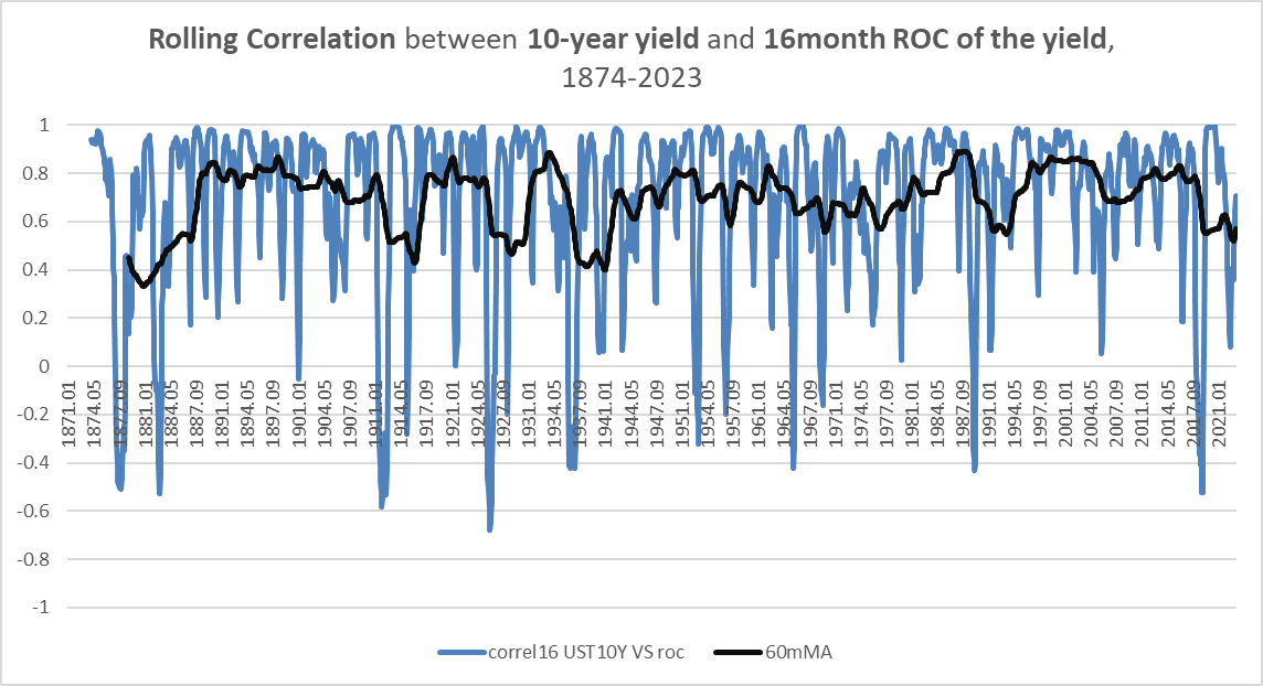
I also tested this relationship on New England municipal bond yields (using a five-quarter rate of change rather than a 16-month rate of change) prior to 1871 and found that this relationship held there, as well.
The only other places where I have seen similar such patterns are in commodities and corporate earnings. That is, their rates of change have tended to remain correlated even if their longer-term trajectories have diverged.
This relationship between commodities, earnings, and yields I term the “market cycle” in contrast to the “business cycle”. The chart below illustrates some of the relationships. The white line shows the 10-year Treasury yield. The orange line is the 16-month rate of change in that yield, and a blue line is a moving average that smooths the orange rate of change out.
Chart O. Commodity/bond ratios, interest rates, and their respective momentums tend to be correlated with one another. (Stockcharts.com)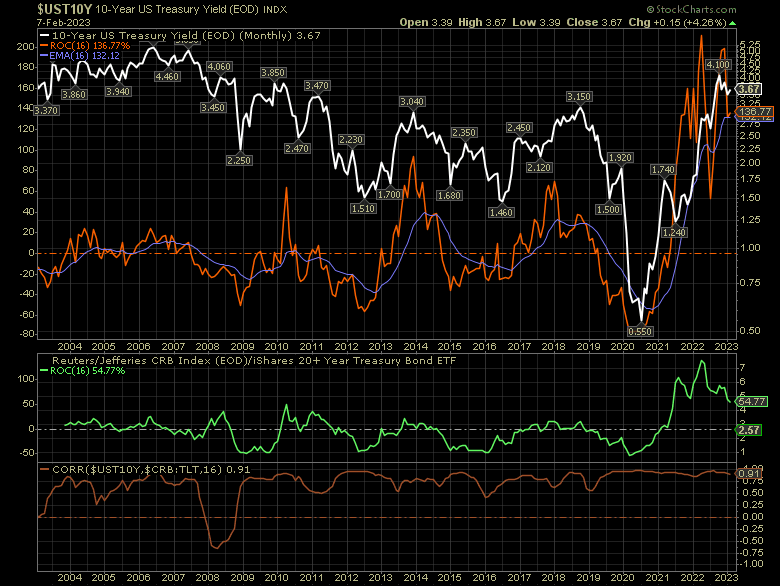
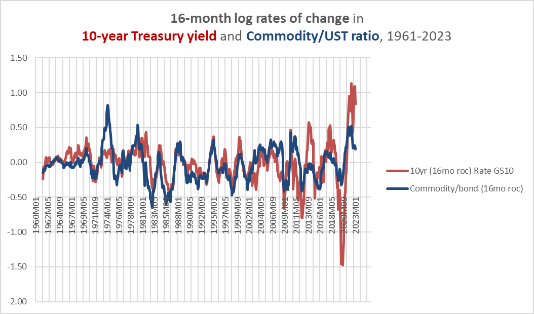
The green line is the rate of change in the CRB commodity index/TLT ratio. TLT is the iShares 20+ Year Treasury Bond ETF, used here to approximate ZROZ’s performance since ZROZ was not initiated until sometime later than TLT.
Momentum in the commodity/bond ratio (green) was correlated with momentum in the bond yield (orange), and both tended to be correlated with the yield itself (white). Notice that the momentum in both the commodity/bond ratio is currently falling and momentum in the yield is showing signs of flattening.
The brown line in the bottom panel of the chart above is the correlation between the 10-year yield (the white line) and the CRB/TLT ratio itself (that is, not its momentum as represented in the green line). It shows, in other words, that the commodity/bond ratio has itself tended to be correlated with interest rates over an average 16-month period in the last twenty years.
The correlation between the commodity/bond ratio appears to be higher the longer the duration of the bond used in the ratio. In other words, the commodity/ZROZ ratio’s correlation with the 10-year yield is stronger than the commodity/IEF ratio’s correlation with the 10-year yield, even though IEF tracks 10-year bonds.
The following chart looks at the correlation between the commodity/bond ratio and Treasury yields since 1871. (The 240- and 60-month moving averages are also presented in green and black, respectively). It appears that this relationship was positive but weaker prior to the 1920s. The average correlation for the entire period is 0.49, but since 1946, it has been 0.62.
Chart P. The commodity/bond ratio has been fairly consistently correlated with interest rate cycles over the last century. (St Louis Fed; Warren & Pearson; World Bank; own calculations)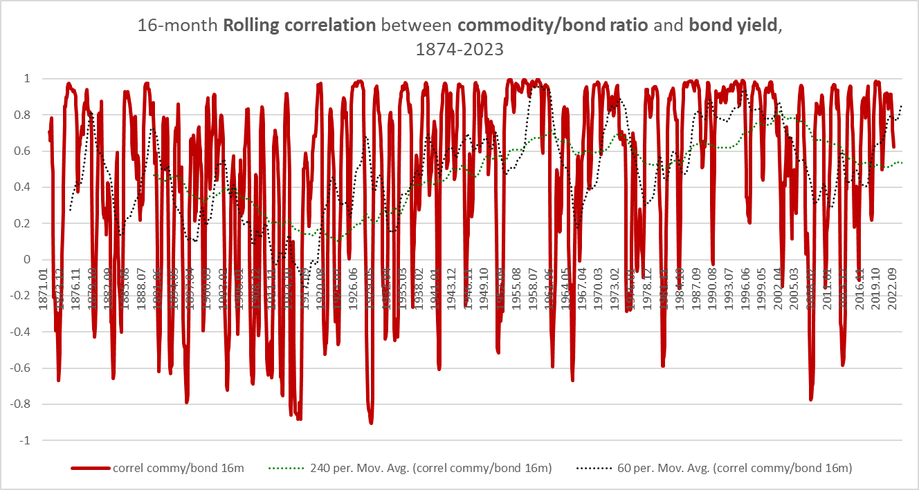
The two elements of this relationship are presented in the following chart.
Chart Q. Periodic placidity in bond yields combined with divergence appears to drive breakdowns in correlations. (St Louis Fed; Warren & Pearson; World Bank; own calculations)
The primary long-term disruptions to cyclical correlations appear to come from the combination of two factors: a difference in overall trend and a lack of volatility in yields. It is difficult to tell to what degree this is due to data issues and to what degree it was due to the nature of yields at the time. Prior to the 1950s, long-term government data is primarily annual averages of yields. But, there is ample monthly data on a variety of corporate bond indexes. So, in creating this data series, I combined the monthly volatility of corporate bonds with the annual averages of government bonds, but still the volatility, particularly prior to the Great Depression, was clearly lower than it was later and nothing at all like what we have seen since 1980.
Presumably, therefore, as long as we have bond market volatility, we will have this cyclical link between yields and commodity/bond ratios. But, what about the third member of the market cycle triumvirate, corporate earnings?
The following chart shows the ratio of the S&P Composite’s trailing twelve-month EPS to the bond return index.
Chart R. The earnings per share/bond ratio has become highly correlated with bond yields. (St Louis Fed; Shiller; S&P Global; own calculations)
The next chart shows the rolling correlation between the two.
Chart S. The correlation suddenly became stronger with the advent of more precise yield data. (Shiller; S&P Global; St Louis Fed; own calculations)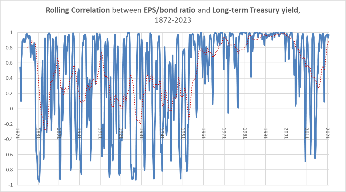
Prior to 1936, there is only annual EPS data, but right from 1953, the correlation between the earnings/bond ratio and Treasury yields rises. Prior to 1953, the average correlation was 0.27 and from 1953 onwards, it is 0.79. The Year 1953 happens to be when the reliable monthly data for long-term Treasury yields began. Either the EPS/bond ratio suddenly became strongly correlated with yields in 1953 or the monthly yield data is still not as precise as one might like.
But, we can say this much about the period for which we have reliable bond data:
- Treasury yields are highly cyclical, meaning that their momentum often matches their absolute behavior.
- Commodity/bond ratios tend to positively correlate with Treasury yields over cyclical durations.
- Earnings/bond ratios tend to positively correlate with Treasury yields over cyclical durations.
We can say a little more than that too. Rates of change in earnings, commodities, and yields are also consistently correlated, as are rates of change in the bond ratios for commodities and earnings, as illustrated in the following two charts.
Chart T. Momentum in the earnings/bond ratio and interest rates have been closely aligned with one another. (St Louis Fed; Shiller; S&P Global; own calculations) Chart U. Momentum in commodity/bond ratios has also been aligned with momentum in bond yields. (World Bank; St Louis Fed)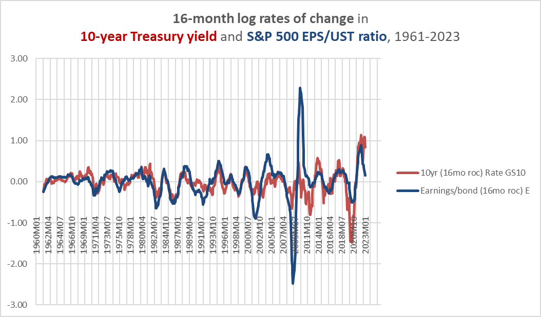
I think we can even throw the earnings yield into the mix, as in the chart below.
Chart V. Earnings/bond momentum tends to be positive correlated with the earnings yield. (Shiller; S&P Global; St Louis Fed)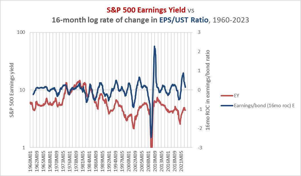
Yields, commodities, and profits all comprise the market cycle. I have argued in previous articles that the profit cycle is at the core of the market cycle, and generally the cycle wins out. That is to say, sometimes momentum in interest rates can be maintained when momentum in the rest of the cycle has changed course (as in the early 1980s), but the interest rate cycle tends to suddenly correct if it has been offside for too long.
Having said that, we still have to be mindful of momentum in the interest rate cycle itself. In early 1980, for example, momentum in earnings and commodity prices peaked, but momentum in interest rates continued to rise until deep into 1981. Yields then collapsed but bottomed at a level near where they had been when earnings and commodities had peaked in 1980. Treasuries outperformed commodities even as yields rose, but they still lost about 15% during the initial 1980-1981 period.
In my last article on industrial metals, I talked about a particular combination of cyclical momentum indicators that I call the CyclesPlus indicator. This indicator, shown below, suggests that momentum in earnings, energy, and the 10-year yield has peaked.
Chart W. Momentum in earnings, energy, and interest rates is declining. (St Louis Fed; Shiller; S&P Global; World Bank)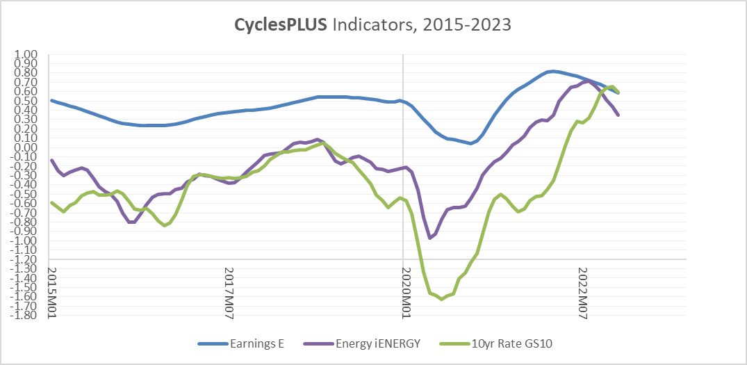
Energy commodities happen to be slightly more correlated with the interest rate cycle than are other categories, but industrial metals and raw materials are not far behind. Precious metals and food commodity prices are least correlated with the interest rate cycle.
The chart below uses similar MACD measures of 30-year interest rates. Both the more ponderous and the more sensitive indicators are suggesting that momentum has topped out.
Chart X. MACD indicators are also reliable ways of measuring momentum. (Stockcharts.com)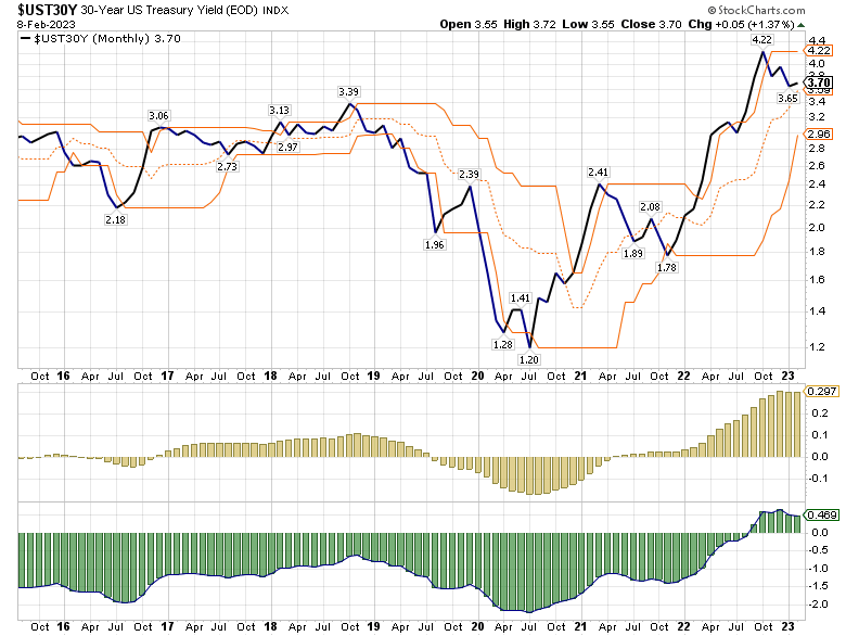
Right now, the evidence points to a period of cyclical decline in commodities, earnings, and bond yields. Commodities and earnings have been falling for nine months already. It is possible that yields will resume their rise over the next two months, but since it would be typical for a rise in yields to be matched by a rise in momentum, a sustained rise would likely require yet another explosive rise in yields. Against a backdrop of a probable continued decline in commodity prices and earnings and coming off of one of the worst bear markets in Treasury bond history, an explosive rise in yields seems unlikely. If yields manage to rise more gradually, they are still likely to beat commodities.
But, what about equities?
Stock/bond cyclical performance
We briefly mentioned earlier that even the earnings yield, the inverse of the price/earnings ratio, tends to obey the market cycle. All else being equal, that suggests that stock prices are inversely correlated with the market cycle. Often, that is true. In “secular” bull markets, for example, it is more typical for stock returns to accelerate as earnings growth decelerates while in “secular” bear markets, stocks tend to timidly follow the market cycle.
But, if you look at the correlation between stock market cycles and the earnings cycle (again, this is the core of the market cycle that bonds also participate in), it tends to be positive. This is because extreme cyclical collapses in earnings tend to translate into cyclical collapses in stocks, as well.
This is not the place to make an argument about equities. In December, I wrote my 2023 outlook for the S&P 500, linked to above. Essentially, coming out of a “secular” bull market propelled by above-average earnings growth and a tech boom that concludes with an energy shock, stocks have typically seen an extended period of low, cyclical returns. “Cyclical” here can be read to mean both that they do not exhibit the kind of sustained long-term momentum that they do in “secular” bull markets and that they tend to follow the market cycle. It could also be read to mean that cyclical sectors like energy, materials, and industrials will outperform over the long term.
In short, we ought to expect stocks to follow the market cycle for much of the remainder of the decade (and probably well into the 2030s, as well). That means that as momentum in the market cycle turns negative, stocks ought to be expected to see negative returns, as well. Bonds, therefore, ought to outperform equities.
But, using rate of change on equities typically is not a good indicator of when to buy and sell stocks. Based on my research, using price channels is the most consistently useful way to shift from equities to bonds, and the 10-month channel has provided the most consistent results, particularly in secular bear markets.
The chart below shows the SPY/ZROZ ratio alongside its 10-month price channel. The midpoint between the price channel is the signal. It appears that using this would, over time, tend to provide downside protection, even if one waited a full month to act on the signal.
Chart Y. The S&P 500 is still outperforming ZROZ by any meaningful measure. (Stockcharts.com)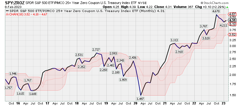
As you can see, currently the SPY/ZROZ ratio has been above the midpoint of its price channel since 2020, thus signaling continued relative strength in equities versus bonds.
This is in contrast to the SPY/SHV ratio (SHV is a short-term bond ETF), which signaled short-term bond strength beginning in Q1 of 2020 but has also flipped to equity strength in recent months.
Chart Z. The S&P 500 has not fared as well against short-term Treasuries over the last year. (Stockcharts.com)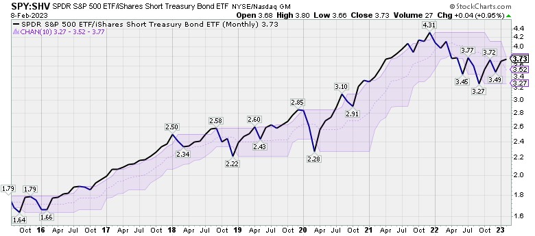
I have not done extensive historical research on corporate bonds, but they seem to follow the same patterns as equity. The chart below shows the iShares Long-Term Corporate Bond ETF (IGLB) relative to ZROZ.
Chart AA. Long-term government bonds are also outperforming ZROZ. (Stockcharts.com)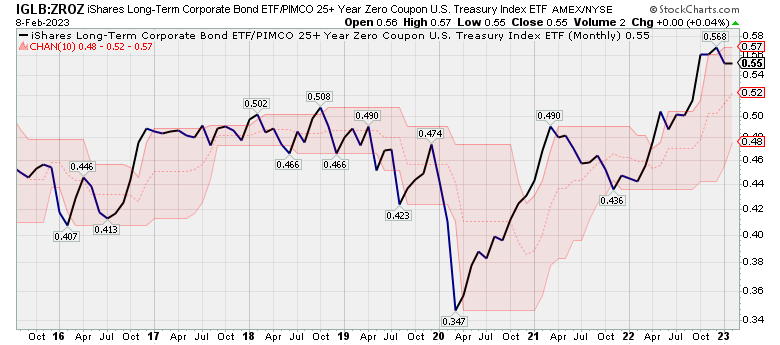
This ratio is signaling corporate bond strength relative to Treasuries.
If we compare short-term Treasuries with long-term Treasuries, it suggests that we may be on the brink of a cyclical change in relative momentum.
Chart AB. Short-term government bonds are still just barely positive against long-term bonds. (Stockcharts.com)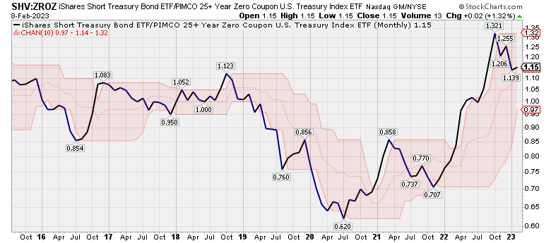
In sum, the technical picture right now points to relative strength in the riskiest asset classes (equities and corporate debt) and, at least at the moment, the safest asset (short-term Treasuries). Long-term Treasuries are just now starting to beat commodities generally, thanks largely to the decline in energy prices in recent months. This is illustrated in the chart below.
Chart AC. Commodities are now underperforming ZROZ. (Stockcharts.com)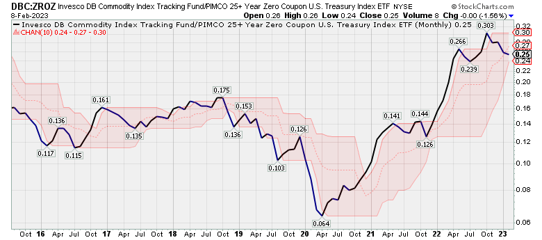
This change in the relative strength of commodities, as well as the deceleration in momentum in Treasury yields, particularly when placed within the context of a general decline in the market cycle and equities is probably the leading edge of bond market outperformance in 2023, with long-term Treasuries in the vanguard.
Conclusion
Although we have seen commodities, earnings, and equity prices fall over the last year, thus far Treasury yields were not following suit until quite recently. But, as the cyclical decline continues, yields are likely to begin falling, lifting long-term bond prices along the way. There is already some technical evidence that this has begun. This points to a few options. First, one could wait until there is a clearer signal that relative momentum between stocks and bonds is changing. Second, one could take a position in bonds of shorter duration. Three, one could shift to bonds. Four, one could short equities.
Speaking for myself, at the beginning of last year, in anticipation of a bear market in equities, I thought it would be better to play it safe by buying long-term Treasuries rather than shorting equities, but it soon became clear that Treasuries were not going to play the role of traditional safe haven, and it was necessary to short the market, particularly tech.
If Treasuries are indeed turning the corner, then that will provide a much safer way to bet against equities while getting exposure to a decent price return in the process.
More broadly, it appears to me that the recent rally in equities is part of a transition to a cyclical decline in yields. The stocks that were punished most heavily last year while yields rose have seen some of the most robust rallies this year, while sectors that might be expected to perform well in a cyclical expansion-energy, industrials, and materials-have softened somewhat, as have defensive sectors like healthcare, staples, and utilities. But, I think it is the cyclical slowdown that is the real story right now, not the rally in things like META.
Yields are likely to decline as disinflation takes hold, and this is likely to put cyclical stocks-most notably energy-under pressure for much of the year, perhaps even relative to other sectors. (I say this, even though I think it is likely that energy will be a long-term outperformer). Ultimately, the market as a whole will likely be pulled down in response to a continued cyclical decline.
I expect the hierarchy of returns in the US this year will look something like this:
- Bonds
- Long-term Treasuries
- Short-term Treasuries
- High-grade corporate bonds
- Commodities
- Precious metals
- Industrial metals
- Grains
- Energy
- Stocks
- Staples
- Cyclicals
- Other defensives
- Tech
Things are admittedly dicey right now, as many of the clear trends of 2022 suddenly look broken. But, this is likely a transition period within a bear market rather than the end to the bear market. It will be important to keep a close track of all of the different elements of the market cycle and how they relate to one another this year. The next two months, in particular, are likely to prove decisive.
Be the first to comment