

rusm/E+ via Getty Images
One risk I don’t think enough 21st century investors pay enough attention to is the risk of nuclear war. Nuclear weapons were a dominant factor in the geopolitics of the second half of the 20th century, and I feel many investors who’ve enjoyed good global (though mostly U.S.) stock returns over the past decade have barely noticed that the Doomsday Clock has moved from 720 to just 100 “seconds to midnight” over the past decade. While a country’s nuclear weapons capabilities should seem to have very little direct relationship to that country’s stock market returns, those capabilities indicate two things about a country that might make it attractive to investors:
- Countries with nuclear weapons might be more technologically advanced than similar countries without them, and
- Countries with nuclear weapons are less likely to be invaded by a foreign conventional military, who would see those weapons as a deterrent.
Clearly, these two advantages don’t apply to North Korea, which has no stock market. It also hasn’t helped investors this year in Russian stocks, which MSCI has concluded are worthless, but around which I still see other opportunities. The case of Russia most directly challenges a post-Cold War assumption many global investors might have had: that two nuclear powers have too much to lose by fighting each other, so they may as well just make money doing business with each other, as the U.S. and China have done.
In this article, I take a quick look at the risk-adjusted returns of groups of countries in three regions (North America, Western Europe, and East Asia) with the oversimplifying division between nuclear vs non-nuclear powers. With the exception of the U.S.’s recent outperformance, it seems that the stock markets of non-nuclear countries have averaged higher Sharpe ratios than those of nuclear-armed counties, which makes me wonder if these non-nuclear powers might be enjoying a “peace dividend” their nuclear neighbors are not.
Why I’m Just Comparing Sharpe Ratios
Comparing two countries for purposes of deciding how much of your investment portfolio to allocate to each can be deep and complicated enough, comparing over dozen countries can quickly get too complicated unless I boil it down to a few simple metrics. For this article, I choose breadth over depth, as I just want to look at the very big picture of how the stock returns of nuclear-armed countries have compared to those in non-nuclear countries in recent decades.
I chose the rolling 15-year Sharpe Ratio of each country’s longest-running U.S.-listed ETF as the metric of comparison. Although this is backward-looking, Sharpe Ratio is for many practical purposes a “good enough” measure of an investor’s realized returns per unit of risk, so that markets that steadily deliver 6%/year score higher than one averaging 10%/year but with more than twice the volatility. A 15-year period is long enough to capture the time horizons of many long-term investors and country allocators, and span more than one economic cycle, but is still short enough to see the different “regimes” of returns experienced before and after the 2008-2009 global financial crisis. The three charts I ran here I felt provided a clear and simple picture of how the risk-adjusted stock returns of nuclear vs non-nuclear nations have compared so far this century, and enough food for thought on how to think about this over the next fifth of this century.
So for each region, this article charts the rolling 15-year Sharpe Ratios for the U.S.-listed ETFs with the longest continuous track record tracking its respective market, and then I run down some brief summary points on how this performance might be related to nuclear defense.
Region 1: North America
This first Sharpe Ratio chart is the one that may be most familiar to U.S. investors, and is the one that shows the most dramatic difference between the Sharpe Ratio of the giant, nuclear-armed U.S. market versus two much smaller neighboring markets in Canada and Mexico. I measured U.S. market returns with its “oldest and still biggest” SPDR S&P 500 ETF (SPY), while for the latter two I use the iShares MSCI Canada ETF (EWC) and iShares MSCI Mexico ETF (EWW) respectively.
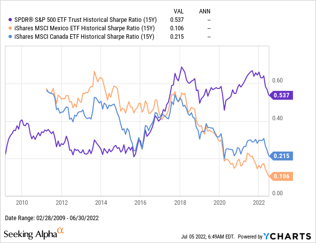
That EWC and EWW outperformed SPY so significantly from the late 1990s to the early 2010s has almost nothing to do with nuclear weapons, but rather, could be explained by at least the following three factors:
- The U.S. dollar was relatively strong in the late 1990s and weakened over the following 15 years, which boosted returns of foreign assets relative to US ones.
- Commodities went from bust to boom over the 2000s, which benefited resource-heavy markets like Canada over more diversified markets like the US.
- Mexico in the late 1990s was still recovering from the 1994 Tequila crisis, and emerging markets more generally went from super-cheap during the 1997-1998 Asian financial crisis to relative “boom” levels in the late 2000s.
The strong outperformance of the U.S. over the past 15 years, on the other hand, might have a non-trivial connection with the U.S.’s nuclear leadership if we consider the following:
- The strong performance of U.S. stocks in the 2010s, and after the 2020 COVID-19 crash, was largely led by technology companies which only the U.S. had, and only China has seriously tried to copy.
- Many have considered those technologies, which include applications of internet technology first developed by the U.S. military, as compound interest on the “peace dividend.” In other words, the smart engineers who might have been developing air defense systems in the 1970s and 1980s could instead invest their efforts in making Amazon a much more profitable company in the 2000s and 2010s.
While I do agree with long-term U.S. bulls that the U.S. stock market is more diversified and has many more profitable companies than you can find in Canada or Mexico, I have repeated perhaps too often that too much of the U.S.’s recent outperformance is due to multiple expansion. That is why I still expect U.S. stocks to significantly underperform many foreign markets over the next decade simply from valuation multiples reverting to their long-term means.
Region 2: Western Europe
I believe the comparison between nuclear vs non-nuclear countries gets far more interesting when we look at Western Europe, where there are only two countries with their own nuclear warheads: the United Kingdom (EWU) and France (EWQ). Unlike in North America, we see more similar levels of industrial development in diversification across many of these other countries across the continent, and this is likely a main reason the chart of Sharpe Ratios of these countries seems more steady over the past decade.
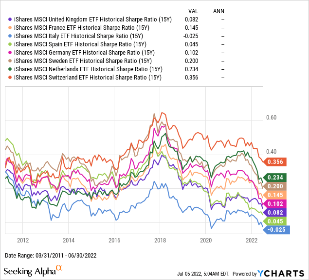
When we look more closely at this chart, however, we can spot a few additional details of interest:
- EWU and EWQ had Sharpe ratios in the middle of this country group starting with the 1996-2011 period, and their rolling Sharpe Ratios remained in the middle of the pack over this whole chart.
- Switzerland (EWL) has been an upside outlier, starting with a Sharpe Ratio in the middle and ending 2022H1 with the highest 15-year Sharpe Ratio of these 8 countries.
- The Netherlands (EWN) should also be noted as starting this chart with the lowest Sharpe Ratio and ending with the second highest.
- Spain (EWP) was the downside outlier, having started at the top and finishing this chart second from the bottom.
- Italy (EWI) has been more consistently at the bottom of this chart, and my October 2020 article on Italy explains some of the factors weighing down returns there.
- That leaves Germany (EWG) and Sweden (EWD), who like the UK and France have mostly remained in the middle, but on average have done a little better.
One additional factor that makes these 8 markets a little more interesting to compare is that although Italy, Spain, Germany, and the Netherlands don’t have their own nuclear weapons, they explicitly enjoy at least the second of the above listed benefits of being a nuclear power by being members of NATO. The first and third best performers in this chart, Switzerland and Sweden, are both notable for not being NATO members, which I understand as meaning no nuclear power is explicitly committed to protecting them if they are invaded. Sweden’s talks to join NATO only started this year, and so are beyond the range of anything that might impact this chart. While some might argue this is just a short example from recent history and not statistically significant, these strong returns from EWL and EWD indicate there might also be a peace dividend from not having nuclear weapons, if your economy is otherwise as developed and diversified as your neighbors that are nuclear powers.
Region 3: East Asia
Whatever ease I might have had comparing eight European countries that share a common market and similar levels of development I will need to throw out when I compare eight markets in East Asia, where things can be a bit more complicated. The only investible nuclear power in the East Asia region is China, and although it has the largest stock market in the region, it is still classified as an emerging market due to challenges foreign investors don’t have in non-nuclear powers like Japan (EWJ) or Australia (EWA). Making things more complicated, the iShares China Large-Cap ETF (FXI) is just the oldest of dozens of ETFs tracking shares of companies based in Mainland China, and it is not even the most representative, as FXI only tracks 50 H shares and no A or N shares. Then also consider that we have a separate ETF for companies based in Hong Kong (EWH) rather than in Mainland China, even though all the components of FXI also trade in Hong Kong and Hong Kong is a part of China with a different currency and other systems. Taiwan (EWT) is another market within “Greater China“, and describing Taipei’s relationship with the red button in Beijing as “it’s complicated” would be an understatement.
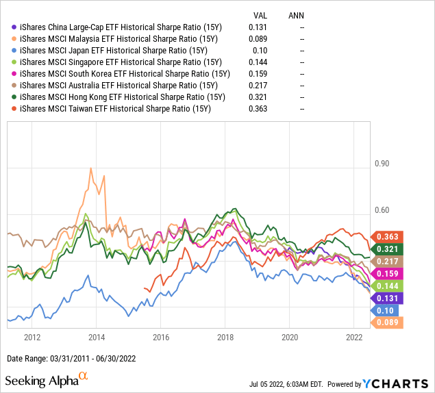
That said, here are some observations we can make from the above chart of Sharpe Ratios:
- FXI only launched in 2004, so the 15-year Sharpe Ratio chart only starts in 2019. Those who exited FXI in 2019 avoided part of Trump’s trade war, the start of COVID in 2020, executive orders banning U.S. investment in several Chinese stocks in 2021, and several other factors which have continued to drive FXI underperformance into 2022. By June 2022, a 15-year investment in FXI would have done little better than EWJ, despite the fact that China’s economy grew far more than Japan’s over the same period. What also makes FXI very tricky to evaluate is that it used to be much more heavily weighted in banks and state-owned enterprises until tech giants Alibaba (BABA), JD (JD) and Baidu (BIDU) also started listing in Hong Kong, which allowed them to be included in FXI. These three, plus two other tech giants Meituan (OTCPK:MPNGY) and Tencent (OTCPK:TCEHY), now make up about 36% of FXI.
- EWH finishes this chart with the second highest Sharpe Ratio, but unlike EWT, EWH has experienced much steadier rolling periods of positive returns. While there are many ways to explain this, the simplest one I believe is that EWH does a decent job of capturing returns from investing across China, but with the advantages of owning that through non-state-owned enterprises incorporated and operating in the Special Administrative Region. EWH’s 13% allocation to Hong Kong Exchanges and Clearing Limited (OTCPK:HKXCY) is a great example of how well positioned I see EWH in this regard.
- EWT’s chart starts with the 2000-2015 period, over which time many would think it natural that EWT’s returns would be quite similar to EWJ’s given the colonial history and reputation for hardware manufacturing, but ends with EWT having the highest Sharpe Ratio over the 2007-2022 period. A significant part of EWT’s can be attributed to the performance of one stock, Taiwan Semiconductor (TSM), which is 21.5% of EWT and a technology company, while FXI only has 2.7% total allocated to technology.
- The Sharpe Ratio for Singapore (EWS) seemed to “hug” that of EWH’s for most of this chart, and that makes sense if you think of Hong Kong and Singapore as being similar competing financial centers of Asia. Those similar Sharpe Ratios started diverging in periods ending after the start of the COVID-19 pandemic, with EWS starting to lag EWH.
- Malaysia (EWM) has the most volatile chart of these eight Asian markets, but that can be explained by two pieces of history. First of all, the 15-year period ending in 2013 started at EWM’s low after the Asian Financial Crisis, and the next 15 years were a steady recovery for EWM with excellent returns for those who overweighted Malaysia over that period. Most of those gains were wiped out from 2014-2016 as oil priced crashed. Oil is significant for EWM because state owned oil company Petronas is the largest company in Malaysia, and even though Petronas’s chemical and gas subsidiaries are only 5% and 3% of EWM respectively, the indirect effect on the financials which make up 40% of EWM is more significant.
- EWJ started at the bottom and remained close to the bottom over the entire period. Whole separate articles could be devoted to why Japan’s stock market continues to underperform and whether it will ever come back. I am one of those who believes Japan only had the boom it had from 1950-1990 because it was protected by U.S. nukes during that time, and so could devote its own domestic efforts into developing better/faster/cheaper cars and TVs. While I know the end of the Cold War is not the only reason Japan’s economy and stock market has lagged so much since 1990, I don’t think enough investors continue to acknowledge that it probably remains at least one significant reason.
- South Korea (EWY) started its chart with a 15-year period as strong as Hong Kong or Singapore, but followed Singapore in seeing this ratio decline to around 0.15 for the period ending June 2022. Although South Korea was lumped together with Singapore in what was called the “Asian Tigers” of the 1960s-1990s, I consider Korea more comparable to Japan for this article both due to its size and diversification, and also because of U.S. military presence in South Korea, especially in the face of a nuclear North Korea. EWY could also be compared to EWT because of the 21% weight in TSM rival Samsung Electronics, but there’s still the big question of why Korean stocks have gotten cheaper while EWT hasn’t. In 2007, the CAPE ratio of EWY and EWT were both around 25, and over the past 15 years, EWY’s has fallen to around 12 while EWT’s remains well above 20.
- Last but not least on this list is EWA, which is often grouped with Asia even through Australia is a separate continent, and is the best performer in this group outside of Greater China. Australia might be compared to South Korea as “same same, but different” in that Australia’s military alliance with the US is also quite clear, as penned in the “ANZUS” security agreement, and Australia’s returns have also been closely tied to the rise of China. Where EWA is a world apart from EWY is that Australia has half of Korea’s population on a landmass 75x as large, so it is perhaps not surprising that EWA is overweight natural resource companies (who sell to China), and the banks that finance them, with relatively little of EWA in technology or consumer sectors.
These eight points are a very messy attempt to summarize the returns of eight markets in Asia that just happen to have the longest running U.S.-listed ETFs. To me at least, these points seem to reinforce the idea that there seem to be advantages of investing in a market that is protected by a strong military, but doesn’t directly pay the full cost of that military. That factor might help explain the strong returns of EWH and EWA versus EWS and FXI, but at first might seem counter to how EWY outperformed EWJ, even though Korea spends almost 3x as much of its GDP on its military than Japan. Again, my explanation for how this factor affected Japan is that Japan became wildly overvalued towards the end of the Cold War, and the past 30 years of economic and demographic stagnation might be seen as at least partly due to Japan’s role among America’s allies changing since the end of the Cold War.
Conclusion
Readers who have made it this far may have found this one of the more controversial articles I’ve ever written on Seeking Alpha, but this is still the point of view of an investment analyst who studies history, not one of a military strategist or political pundit. Of the many questions that lead me down the rabbit hole that lead to this article, one was the question of where would be best to invest in a World War III scenario, to which my first answer was “well, in the market of the winner of course”. Some of the greatest total market losses of the last century were in Germany and Japan, the two major losers of World War II, with the latter surrendering after the first and only use so far of nuclear weapons in combat. Where it got more difficult for investors were the total market losses in places like Russia and China, who happened to be on the winning side of World War I and World War II respectively, but instead punished investors with political revolutions that made securities there worthless.
One thing I’ve probably thought too much about is how much of the U.S.’s exceptional stock returns over the past 100+ years would not have been there if the U.S. had not been such a dominant victor in the two World Wars, but despite that, South Africa still delivered better returns to investors than the U.S. One explanation for South Africa’s superior stock returns over the 20th century might be that it was rich in resources all the other countries in the world needed to fight each other in the first half of the 20th century, and then to rebuild themselves over the second half. Although South Africa sent plenty of men to fight in World War I and World War II, I would guess the financial costs of the wars were far less to South Africa to than to the major belligerents. I’m not sure what South African military spending was before 1960, but in 1960 it was only 1% of GDP, which around where it’s been since around 2000, with only the period between 1960-2000 being one of higher defense spending. South Africa seems to be yet another long-term case study in the benefits of profiting from the global economy, while minimizing how much you pay to defend it.
In terms of where to allocate more from here, I would expect EWH, EWS, and perhaps to continue outperforming FXI, I would expect EWL and EWD to outperform EWQ and EWU, though for all of these pairs, I have reasons go beyond just military budgets. I would actually say America is the trickiest of the three regions because the US market is simply so much more developed and diversified than any other market in North or South America, but I would not be surprised to see EWW outperform SPY from current valuation levels. Of course, the bigger thing for us to all hope in the meantime is that 15 years from now, this was all an exercise budgeting, risk management, and asset allocation, and that no actual nuclear weapon ever wipes out even part of anyone’s portfolio.
Be the first to comment