


SERSOL/iStock via Getty Images
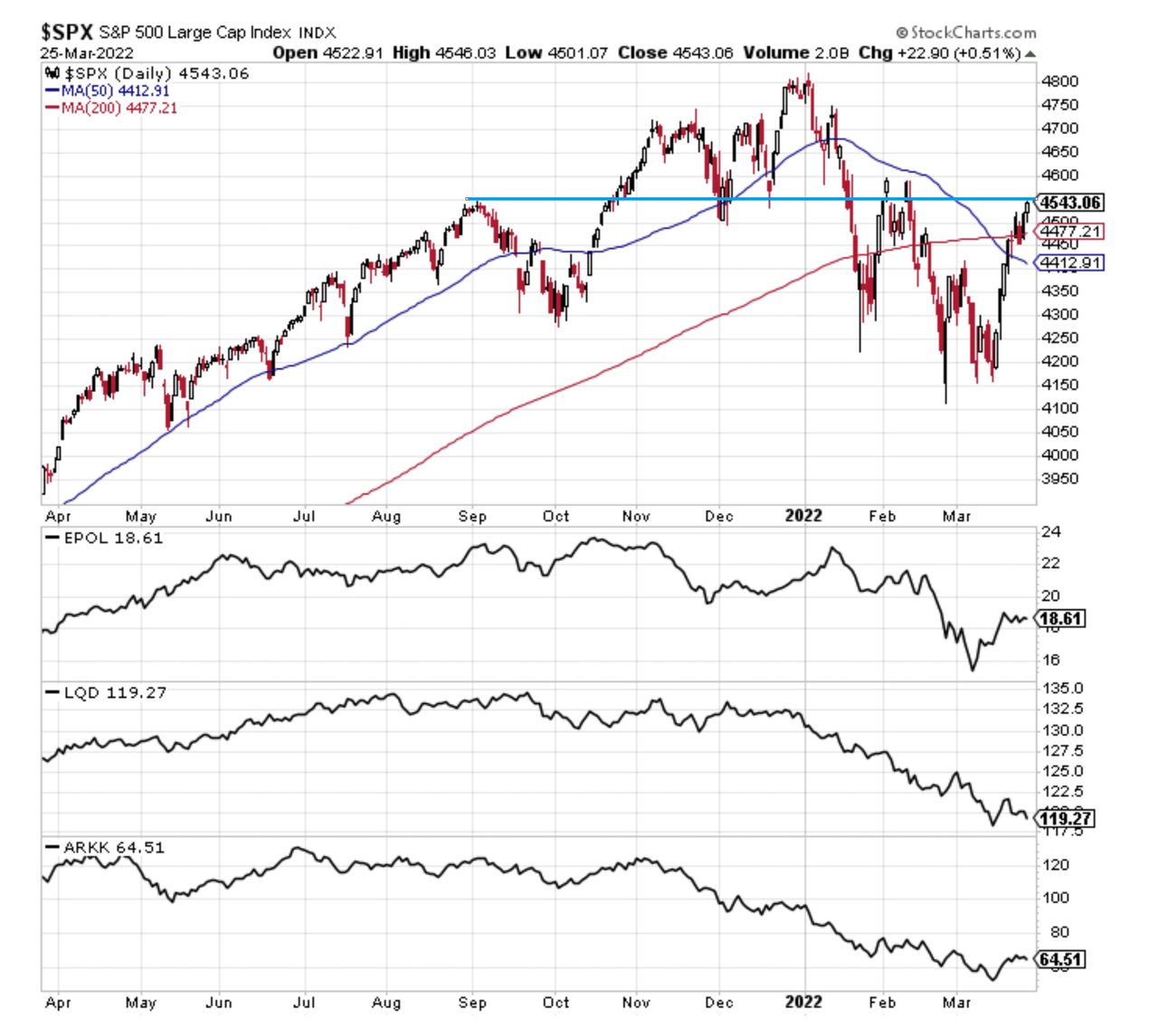
1. Correction Drivers: status check as the rebound plays through…
–EPOL (geopolitics): rebound has stalled, relief rally constrained by uncertainty.
–LQD (credit/duration): bond yields surging, but credit spreads contained for now.
–ARKK (tech burst): bounce also seems to be stalling.
(p.s. also note: “roundnumberitis” at 4550?)
@Callum_Thomas
2. Bitcoin base = S&P500 based: If we think of Bitcoin as basically a barometer for the ebb and flow of risk appetite and liquidity, the apparent base in bitcoin (still needs to break out to the upside though) looks to be a positive sign for broader risk assets such as the S&P 500.
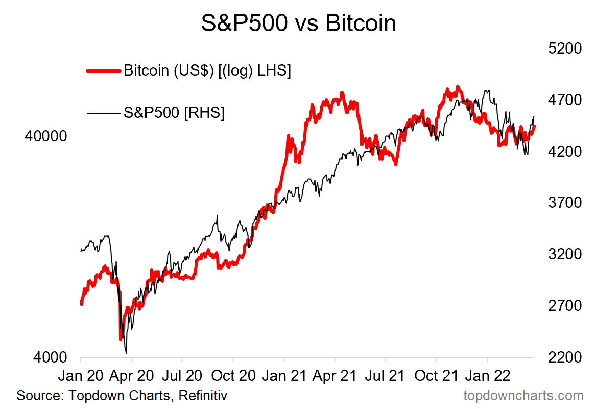
Topdown Charts, Refinitiv Datastream
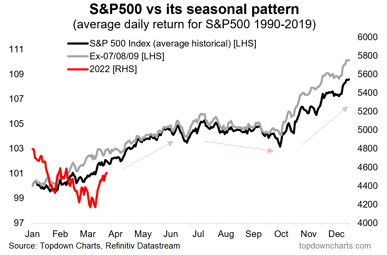
3. Seasonality: Yes it is different this time, it is always different, but worth noting that April is historically the best month (highest average monthly gain, and 74% of all Aprils in history were positive).
Topdown Charts, Refinitiv Datastream
4. Seasonality “Yeah But”… But then again, mid-term election-year seasonality would suggest that any such April rally would be about it, short lived, followed by down-at-best through October.
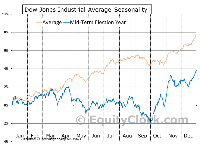
@EquityClock @MikeZaccardi
5. Hedgers… hedging FOMO risk: Massive pivot from record shorts to now sizable longs. Long live the dip buyers? ¯_ (ツ)_/¯
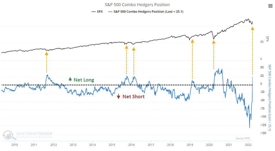
@sentimentrader
6. ETF Speculators: Similarly, trading in leveraged long vs short US equity ETFs has ticked up towards the long side after a hefty rinsing-out of previous speculative fervor.
(albeit n.b. this indicator’s track record in signaling bottoms has been early/false-dawny before… e.g. most notably recently in late-2018)
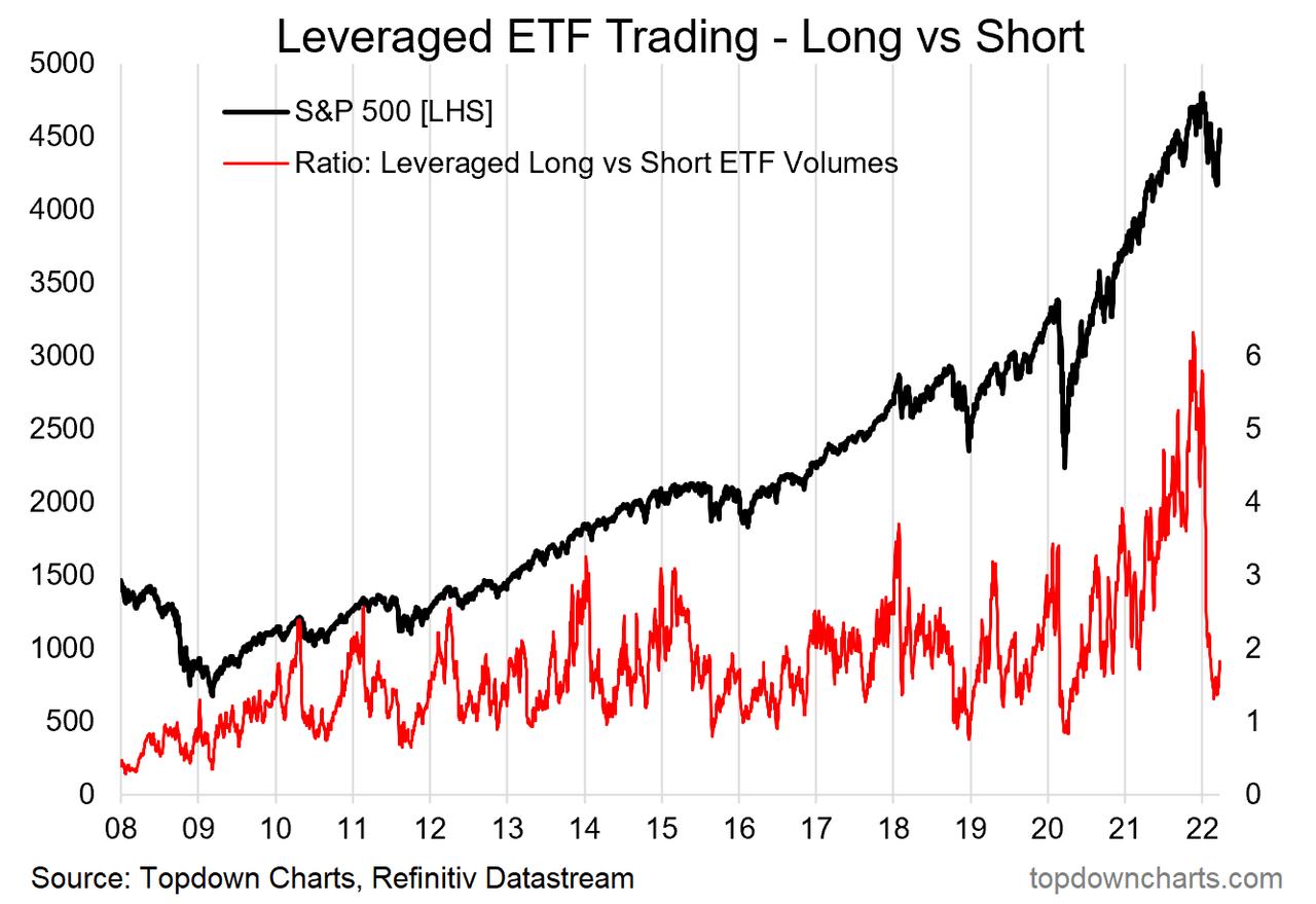
Topdown Charts, Refinitiv Datastream
7. Yield Curve: A lot of talk on yield curves recently, as this chart seems to show, yield curve flattening/inversion (at least as measured by this version of the yield curve) is not so much an immediate issue… but basically presents a tell in terms of lateness-of-cycle. In other words, most of the time this was the kind of thing you saw later in the cycle, before a turn (but typically well in advance of the turn).
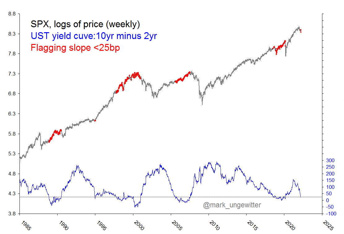
@mark_ungewitter
8. Stocks vs Commodities: Inflation is an equity killer.
Peaks in the S&P500 vs Commodities index ratio have served well in flagging major market tops for stocks. (inflation (where commodities are a key proxy/driver) places pressure on margins, consumers, and drives central bankers to tighten policy)
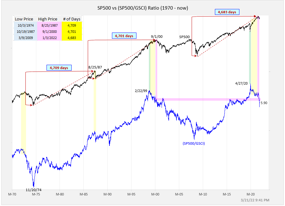
@exposurerisk
9. Living with Stagflation: So you’ve decided to move on with your life and just “live with stagflation”. Here’s what history says about where to allocate…
(n.b. past performance does not necessarily = future, etc)
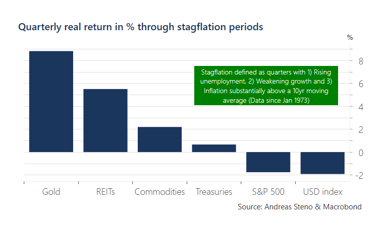
@AndreasSteno Steno & Macrobond
10. Healthy Healthcare: Healthcare relative performance price ratio is bouncing off its very-long-term trendline: fairly reliable signal for a run in healthcare.
n.b. healthier healthcare relative performance is often actually an unhealthy signal for the health of the broader market (being typically a defensive sector).
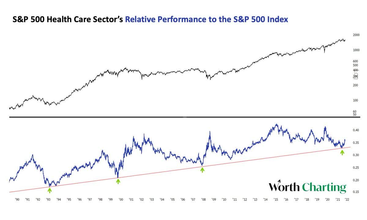
@CarterBWorth Worth Charting
BONUS CHART
S&P500 Valuations: the good news is that some of the steam has come out of frothy valuations, the bad news is that relative value is fading fast…
This chart shows absolute valuations in the black line (average of trailing PE, forward PE, PE10), and relative valuations in the red line [relative to bonds] (i.e. my calculation of the equity risk premium (ERP), *inverted* to align the signal).
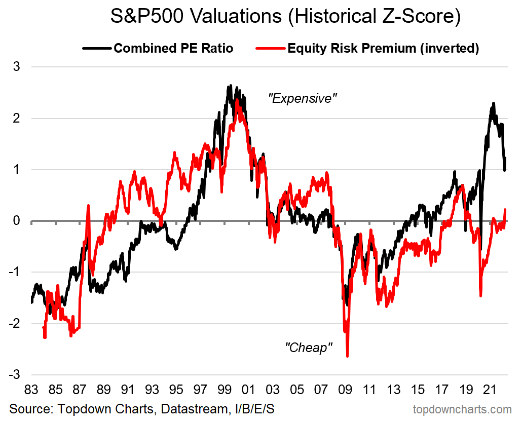
Topdown Charts, Refinitiv Datastream
As noted, absolute valuations have come off the boil, or at least have vented some steam. But even with the decent reset so far (partly driven by rebounding EPS), it’s still showing up as fairly expensive vs history.
Relative valuations (ERP) were tracking around neutral as rising bond yields had previously offset the rising earnings yield (falling PE), but the ~35bp surge in US 10-year treasury yields last week has pushed relative valuations into expensive territory.
Some have compared the current environment to 2018 (where rate hikes and rising bond yields ultimately scuttled the market later in the year), and with regards to the chart above I think there are certainly some parallels to be drawn.
As long as bond yields keep rising *and* stock prices also rise (pushing down earnings yields), then the ERP metric is going to get further squeezed and the risk of further downside incrementally increases.
Be the first to comment