

jacoblund/iStock via Getty Images
The purpose of this article is to examine the USA sectoral flows for September 2022 and assess the likely impact on markets as we advance into November. This is pertinent, as a change in the fiscal flow rate has an approximately one-month-lagged impact on asset markets and is a useful investment forecasting tool. Other macro-fiscal flows can point to events many months ahead or even years ahead.
The table below shows the sectoral balances for the USA and is produced from the national accounts.
US Treasury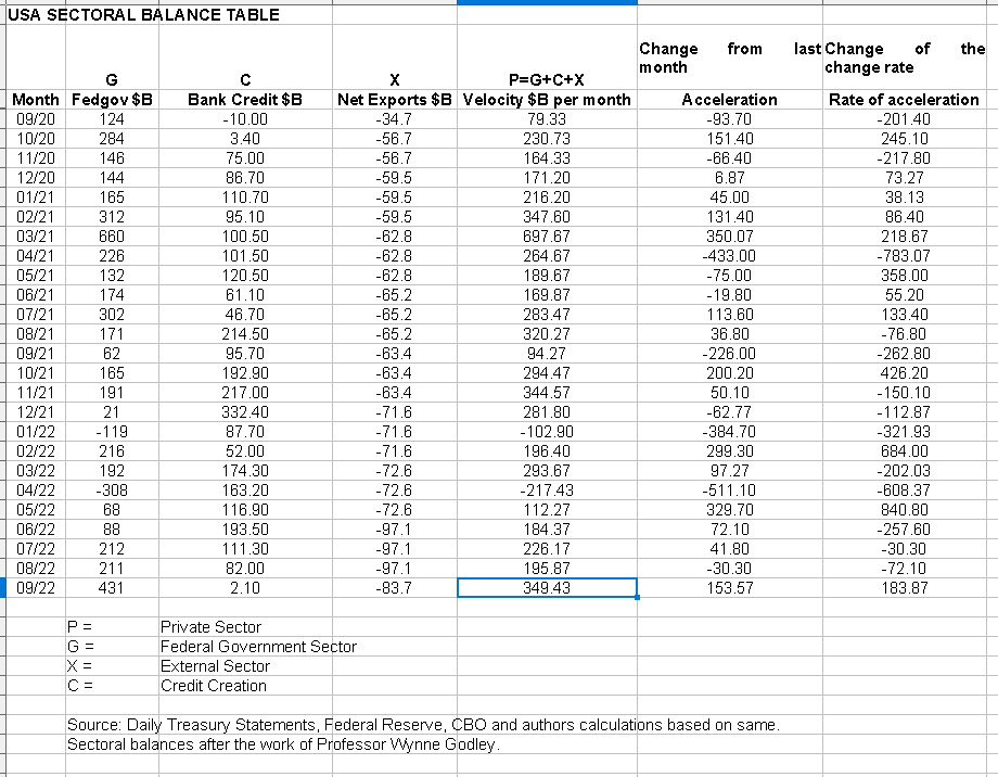
From the table, one can see that the federal government [currency sovereign] sector has injected an unusually high $431BB into the economy which is really good as this adds to private sector financial balances dollar for dollar. The external sector is draining slightly fewer dollars out of the private domestic sector but is really largely unchanged. The shock change is the apparent total collapse of bank credit creation which is only a tiny $2B this last month. Overall though there is an injection of $349B into the private domestic sector to drive markets forward or hold them steady. It is hard to be bullish after nearly a year of constantly falling markets and Fed tightening.
The $349+ billion private sector injection of funds from the table above is made up of an impressive $431+ billion injection of funds from the federal government, plus an alarmingly weak $2+ billion of credit creation from commercial banks and less the -$83+ billion that flowed out of the private domestic sector and into foreign bank accounts at the Fed in return for imported goods and services.
The following chart emerges when one graphs the change rate of the information in the USA sectoral balances table above and adjusts for impact time lags.
Mr. Robert P Balan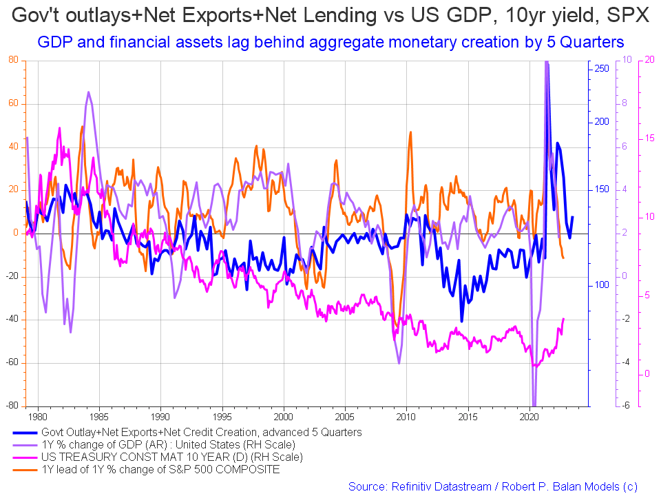
The change in the chart as compared to last month is that equities continue to fall and interest rates continue to rise.
The chart below shows the five-year average of the seasonal stock market patterns for the SPX (SPX), NDX (NDX), Dow (DIA), Russell 2000 (RTY), and Biotech (IBB) market indexes. The black oval shows roughly where we are [trading day 203 at the time of writing and the end of the green line on the chart below]. Markets have been moving down since July in line generally with the seasonal pattern in a year that has been bearish since Christmas last year. When the line is normalized it shows the same seasonal pattern as the average, it just moves downwards from left to right instead of upwards.
We are just about at a major seasonal inflection point that starts about trading day 210-220 [20-30 October] where markets normally move back upwards into the New Year holiday period. Given the harsh fiscal and monetary background forces at work in the economy, any upward movement is likely to be muted.
Mr. Robert P Balan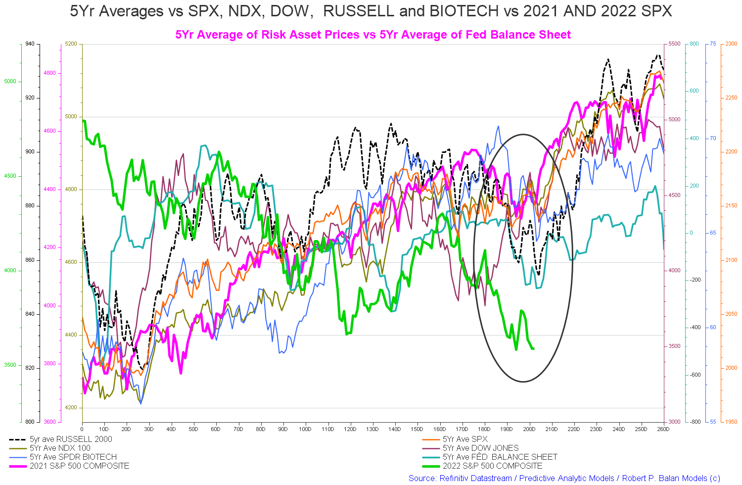
The recovery is caused by the new round of federal agency spending from the newly approved federal budget and the Fed loading up the federal reserve system with extra cash in readiness for the burst of transactions over the Xmas and New Year holiday period.
US Treasury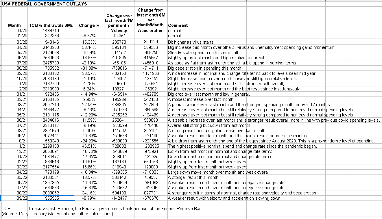
The above table shows slightly less federal expenditure over last month with the larger overall deficit spend [and private sector surplus] made possible by a lighter tax collection take. Naturally, lower overall spending means negative money velocity and acceleration.
The chart below shows graphically the relationship between the federal government (currency creator) and the private sector (currency user) and is from ANG Traders of the Away from the Herd SA Marketplace service. The bottom panel highlights in red and green the financial relationship between the currency creator and currency users.
In fiscal year 2021, the net-transfer was +$2.9T, compared to +$1.1T in the just-completed fiscal 2022 year. The latter, is slightly higher than the 2019 amount of +$0.96T, before the pandemic hit. We are expecting that the +$1.0T level will be maintained in fiscal 2023, but the 20-day average of the daily net-transfers is still slightly negative–a drain of -$1.7B/day over the last 20-days–which means the SPX rally is slower to get started than we expected.
(Source: Mr. Nick Gomez, ANG Traders, Away from the Herd SA Market Service).
ANG Traders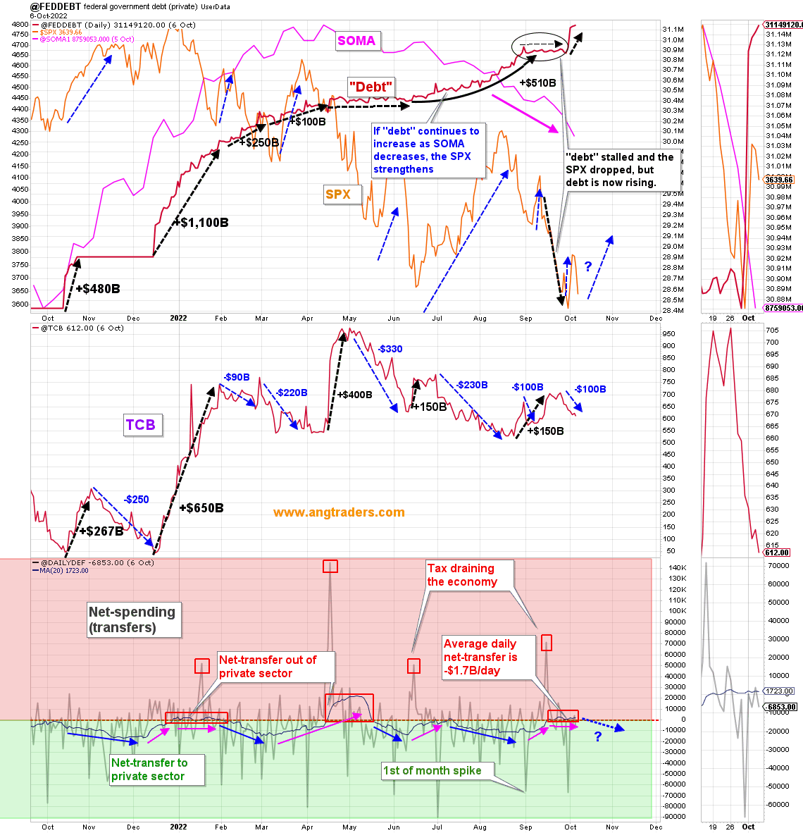
Notice that each of the panels in the charts above have the SPX superimposed over them so that one can see what the broader market did in response to the changes in fiscal spending, the fed’s balance sheet [SOMA], and the stock of treasuries aka ‘national debt’ and a gauge of the size of the total money supply. The comment boxes in the chart provide a guide as to the impact of these broad flows. This theme is continued in the charts below.
IG Markets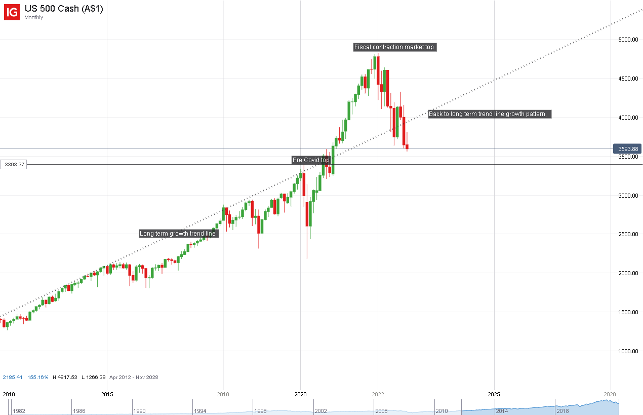
The first chart above shows the SPX over the last four years broadly covering the Covid epidemic period. One sees the dotted line running upwards from left to right showing the broad SPX market trend. In green and red are the actual monthly movements of the SPX. One sees the pre covid high in 2020 and then the rise to the crest reached in 2022 and labeled “Fiscal contraction market top”. This is labeled so as it represents the point where the addition to the private domestic sector from the other two sectors contracted just as violently downwards as it expanded upwards and the numbers are mentioned in the quote from Mr. Nick Gomez a few paragraphs further up.
It is likely that all the gains made by the stock market from the covid fiscal spending are likely to be [and to a large part have been] erased. This is a mechanical hydraulic inevitability given that the fiscal spending drove the markets higher and the following fiscal contraction drove them lower. Lower even than the broader long-term growth trend in what may be an overreaction or the impact of the harmful Fed monetary policy stance hammering markets even lower and discussed further below.
Just from a very broad fiscal flow point of view, one could posit that the markets are now making a bottom and look to be making a return to the pre covid growth trajectory given that they have worked off the boom and bust provided by the covid fiscal spending.
ANG Traders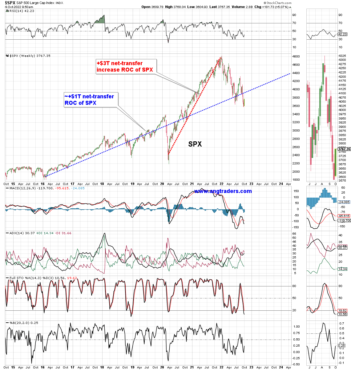
The blue line is the ROC (rate of change) of the SPX that results when net-transfers are between $0.6T – $1.0T/year. The red line shows the ROC of SPX when net-transfers were $3.0T/year. We are now back to the pre-pandemic net-transfer level and the SPX should trend higher in the same general direction as the blue line.
(Source: Mr. Nick Gomez, ANG Traders, Away from the Herd SA Market Service).
The above chart and commentary provide more detail on market movements in response to [blue dotted line] the $1T+ net transfers to the private domestic sector from the other two sectors. Then on the other hand [red dotted line] the $3T+net transfers from the other two sectors into the private domestic where the stock market and other asset classes are located.
This reinforces the view that now that the effect of the $3T+ net transfers has been worked off in terms of the amplitude [height] of the resulting market wave [it has almost gone back to where it started]. The shallower longer-term growth trend would now resume.
There is an old stock market axiom that the market tends to climb the stairs and go down the elevator and in this case, this appears to be holding true. It took approximately two years for the stock market to reach its peak [crest] at the end of 2022 driven by the covid response fiscal flows that started in 2020. It does not necessarily need to be that the market must contract for an equal length of time given that it tends to drop faster than it rises and has now reached a level of overall support where it is at the pre covid 2020 market top level. The market is also now below the longer-term growth trend. The amplitude [height] of the market boom/bust wave has canceled itself out. The rogue wave of liquidity has hit the metaphorical beach and rolled back out to sea taking the market gains back with it. Wave motion physics theory applies here and the terms and definitions of basic physics are shown in the diagram below
By Kraaiennest – Own work, CC BY-SA 3.0,
By Kraaiennest – Own work, CC BY-SA 3.0,
At the White House in the last month, nothing of fiscal or monetary impact note has occurred. What would be nice to see is a spending bill for the next budget passed so that the economy is not subject to the uncertainty of ad hoc spending resolutions and government shutdowns. As we all know:
“[A] government cannot become insolvent with respect to obligations in its own currency. A fiat money system, like the ones we have today, can produce such claims without limit.”
Source: Alan Greenspan, Federal Reserve Chairman, 1997
So let us not pretend there is a lack of money or that the federal government needs to shut down or go broke or tax first in order to spend, such things only happen for contrived political reasons.
The Fed and central banks across the world in general are continuing their policy of matching demand to supply by reducing demand by increasing the price of credit thus causing aggregate demand destruction. Last month’s bank credit creation amount, shown in the first table above, was a tiny $2B as compared to the previous months $82B and similar amounts going back years.
When we start writing negative numbers, as has happened before, it means the repayment of loans and writing down of bad loans has exceeded the net creation of new loans. The money supply then shrinks by that exact amount.
The Fed has now been successful with its policies in almost completely wiping out bank credit creation.
There is another FOMC meeting at the beginning of November where no doubt another rate rise will be made to further contract the economy and cause unemployment, bankruptcy, and misery.
Today, we have those shortages, not because demand is too great, and not because interest rates are too low, and not because the federal deficits are too high. We have shortages because the confluence of COVID, the Russian war, and reduced oil pumping caused supply to constrict.
Source: Roger Malcolm Mitchell
The only things the central banks could do to really materially lower inflation is to firstly lower interest rates. Secondly, they could step in and offer to buy any and all treasuries at a certain price and thereby completely have control of the interest rate.
It is the privilege of being the monetary sovereign. It would lead to lower inflation as the interest rate is the cost of credit and credit is part of the input cost of all goods and services. The inflation is caused by a shortage of real goods such as wood, gas, commodities, pc chips, etc, and is completely out of the control of the Fed and whether rates are high or low.
Interest rate rises only work to tame inflation in that they crash the economy and create unemployment so that the demand for the goods in short supply matches the lower supply.
The real solution to price inflation is to supply more of the goods and services in short supply by clearing logistic blockages, lifting production capacity and building better infrastructure, helping China covid vaccinate and end total lockdowns. That sort of creative long-term international cooperation and economic planning is beyond our political and economic mainstream understanding. One can expect such an approach may be possible after a few hundred more years of human development. For instance, it took humanity about 500 years to generally accept the earth is round and circles the sun instead of being flat and circled by the rest of the universe.
Bringing a speedy end to the Ukraine war would help end inflation too as it is affecting the supply of key commodities and energy and killing off large numbers of working-age people and destroying production capacity.
On the world stage, the chart below shows the expected likely path of asset markets based on the flow of funds at the macro world level.
The chart below comes from Mr. Robert P. Balan of Predictive Analytic Models and is part of his SA Marketplace service information for subscribers. The chart shows the level of money creation by the top five world governments [the G5] in a change rate format, along with a host of other indexes. This chart gives a sense of important inflection points and direction.
Mr. Robert P Balan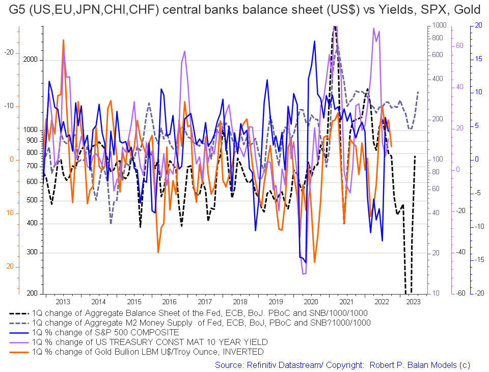
The basic changes over last month are positive in that both the dark dotted lines [central bank balance sheets and M2 money supply] are rising and point to a much more positive 2023 as hard as that can be now to imagine.
The chart below tracks the activities of the top five central banks [the C5] and shows a similar trend [dark green line on the chart] and a sense of amplitude. [not that great]. Few things will match the amplitude of change that was experienced during the response to the Covid-19 crisis [see the dark green line in the span of time between 2020 and 2022]. The change over the last month is that the green line is continuing its ascent and again points to stronger asset markets in 2023.
Mr. Robert P Balan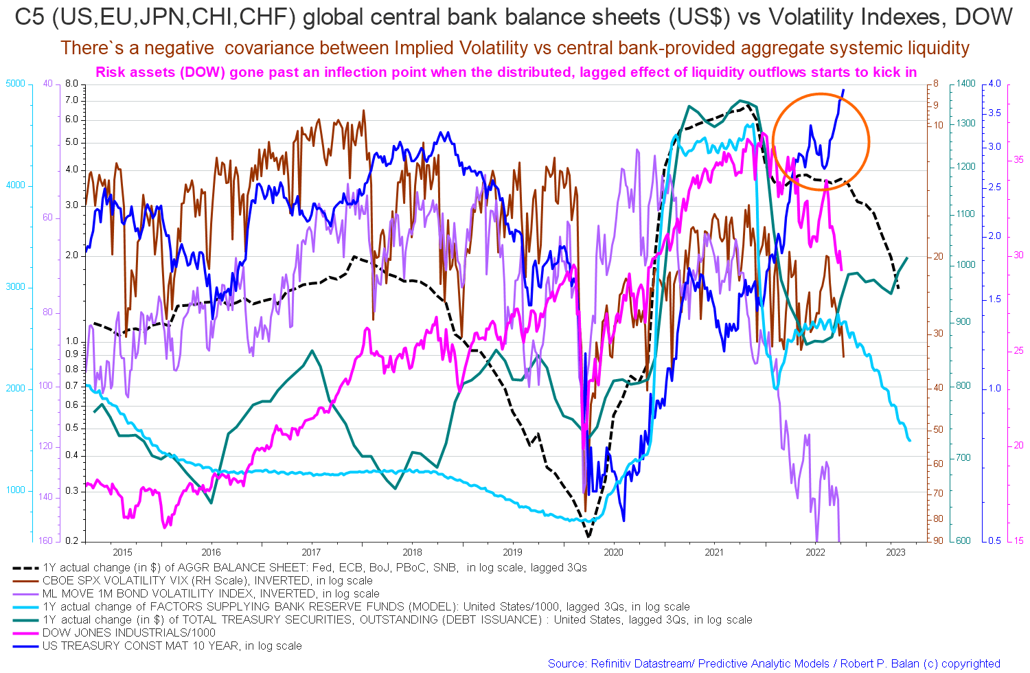
If you are looking to make a market entry, sometime in the first quarter of 2023 is likely to be a good time judging by the macro tidal forces that underpin the asset markets.
It could well be that this times with market-friendly sentiment events such as a Fed pivot and a regime change in Russia and an end to the war in Ukraine on western terms.
Be the first to comment