

MicroStockHub
The purpose of this article is to examine the USA sectoral flows for October 2022 and assess the likely impact on markets as we advance into November. This is pertinent, as a change in the fiscal flow rate has an approximately one-month-lagged impact on asset markets and is a useful investment forecasting tool. Other macro-fiscal flows can point to events many months ahead or even years ahead.
The table below shows the sectoral balances for the USA and is produced from the national accounts.
US Treasury and author calculations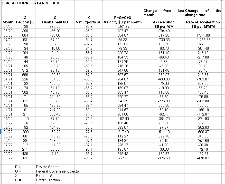
From the table, one can see that the modest $22+ billion private sector injection of funds came from an $83 billion injection of funds from the federal government, plus an alarmingly weak $23+ billion of credit creation from commercial banks and less the -$83+ billion that flowed out of the private domestic sector and into foreign bank accounts at the Fed in return for imported goods and services.
Normally one expresses the sectoral balances as a % of GDP and this produces a butterfly-like chart as per the one below that shows how sectors balance each other in perfect mathematics of a closed system.
US Federal Reserve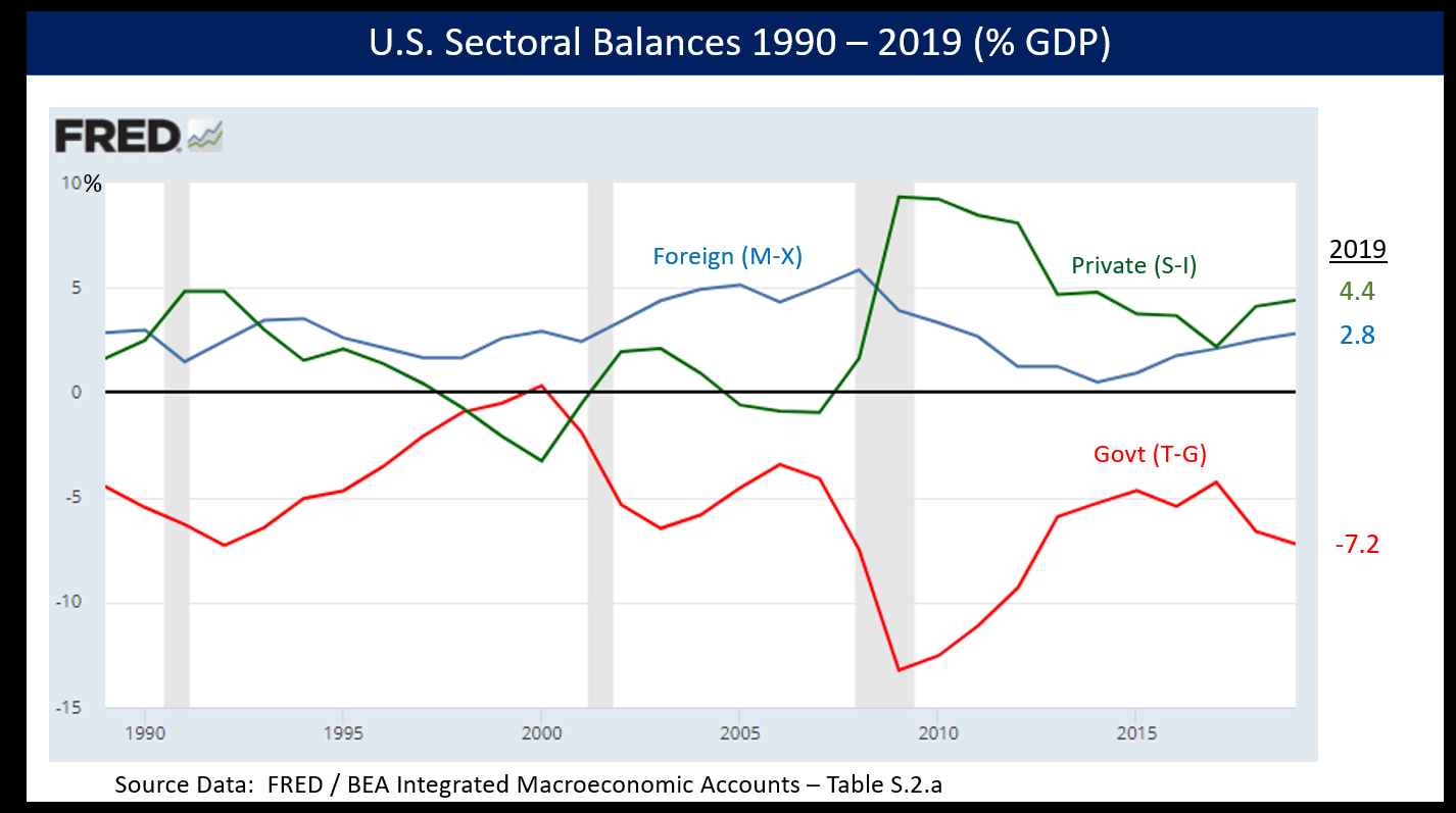
The percentage of the GPD method allows for a very lumpy one-year-at-a-time granularity and is not much use for trading and investing except at the very highest and slowest macro level.
So what if one took the raw financial data every month and charted the private domestic sector financial input and expressed it in dollars instead and then held it up against the SPX?
The chart below shows this. A trend line has been added to give an idea of the broad direction, which is downwards for both the private domestic sector (where asset markets are located) and the SPX. The calculation is Federal government spending (G) plus the external sector (X and normally a negative factor) to leave that amount of money left to the private domestic sector (P) by accounting identity true by definition.
US Treasury with author calculations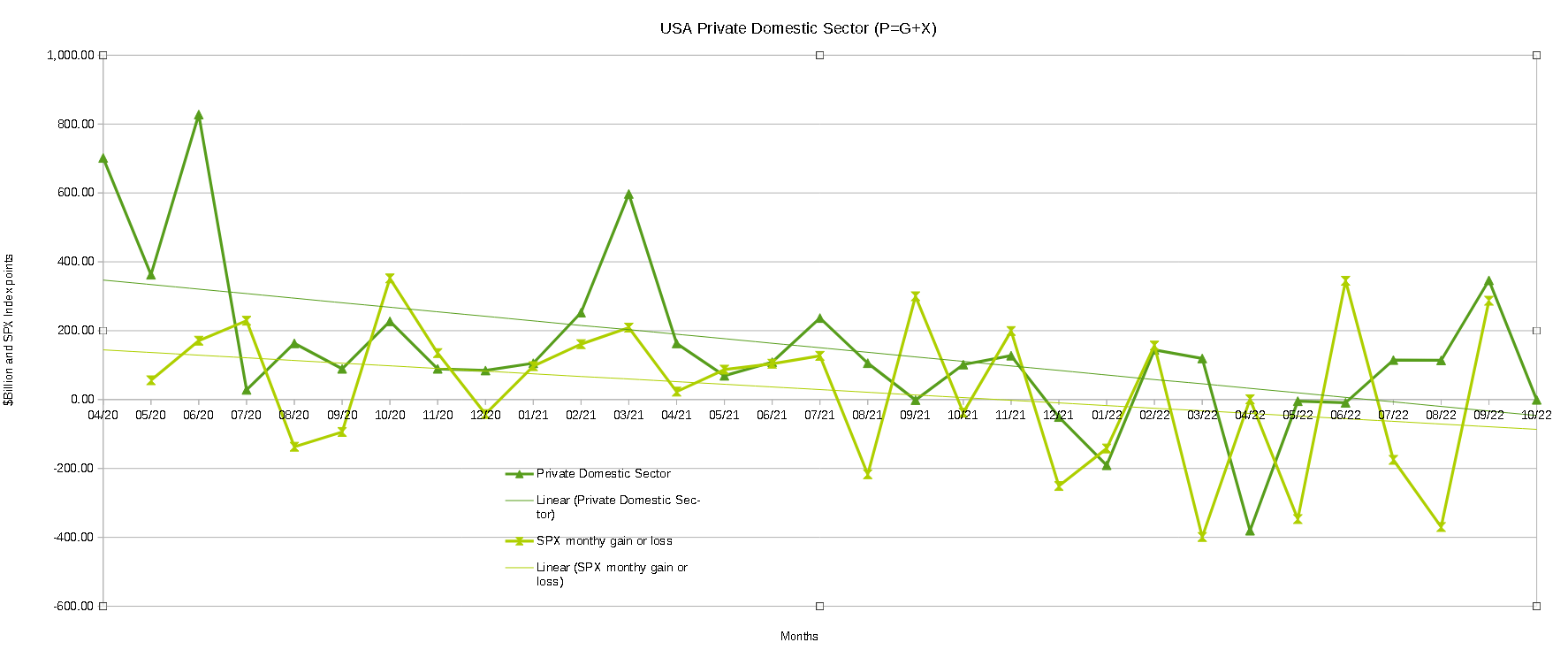
Federal government expenditures have been seasonably normal over the last year. In previous years they were abnormally high due to the covid response expenditures. This is why there has been a large fiscal contraction in relative year-over-year terms, which has had a big downward impact on markets.
One thing that comes out in the numbers and the chart is that the external sector drainage has increased to a point where it is now draining an average of over $80B to $90B out of the private domestic sector each month. This is like a huge undertow and is why the general trend line points downwards. This trend was not there in pre-covid years and is something that has grown this year as the chart below shows.
Trading Economics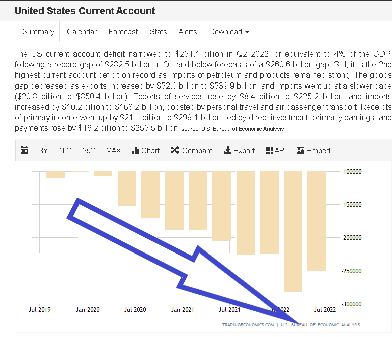
Similarly, federal government financial injections into the private sector have decelerated markedly as the chart below shows, and are now at a slower pre covid level.
Trading Economics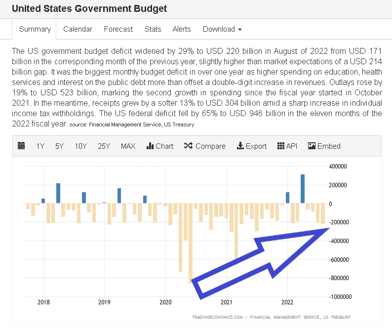
The domestic private sector balance is being reduced from two directions at once and this is why we have bear markets now. Add to this poor fiscal background a Federal Reserve aggressively tightening monetary policy and you have a sure recipe for bear markets and an economic recession.
The following chart emerges when one graphs the change rate of the information in the USA sectoral balances table above and adjusts for impact time lags.
Mr. Robert P. Balan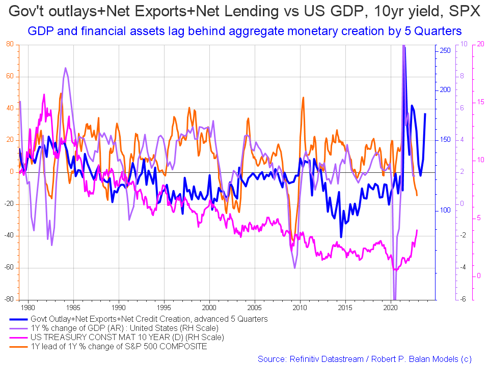
The change in the chart as compared to last month is that the all-important blue net fiscal flow line has shot up strongly pointing to stronger markets in late 2023. This chart gives no sense of the amplitude of the move and the chart was indicating an uplift in markets in the middle of this year, and we did get one, but has since resumed its overall falling trend as the chart below shows.
The chart below shows the five-year average of the seasonal stock market patterns for the SPX (SPX), NDX (NDX), Dow (DIA), Russell 2000 (RTY), and Biotech (IBB) market indexes. The black oval shows roughly where we are (trading day 223) at the time of writing and the end of the green line on the chart below. Markets have been moving down since July in line generally with the seasonal pattern in a year that has been bearish since Christmas last year.
We have just crossed the major seasonal inflection point that starts about trading day 210-220 (20-30 October) where markets normally move back upwards into the New Year holiday period. Given the harsh fiscal and monetary background forces at work in the economy, any upward movement is likely to be muted and more in line with the second chart shown below from Top Down Charts and gives an interesting comparison of the seasonal trend in normal, bull and bear markets during midterm elections.
Mr. Robert P. Balan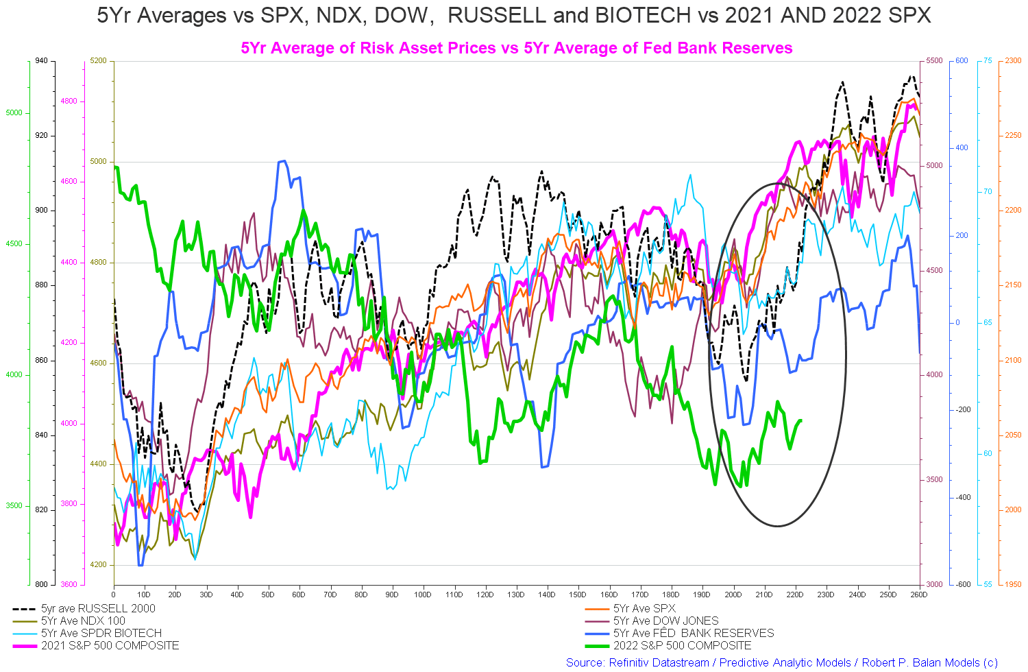
The chart below shows mid-term election stock market seasonality since 1961 based on whether it was a bull or bear market. This year we are clearly in a bear market and so in this instance, the most likely outcome is the red line marked on the chart below.
Top Down Charts Refinitiv Datastream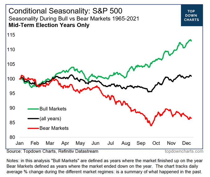
The chart below shows total federal withdrawals from their account at the Federal Reserve Bank.
US Treasury with author calculations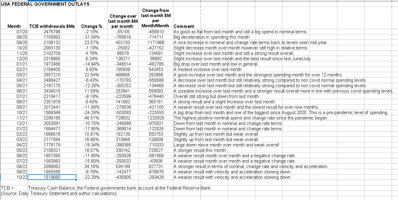
The above table shows much less federal expenditure over the last month. Naturally, lower overall spending means negative money velocity and acceleration. The federal government is the largest single spending agent in the economy and when it spends less it impacts markets in direct proportion. Month over month, it has spent almost half a trillion less than last month. That is a big missing spending impulse.
The chart below shows graphically the relationship between the federal government (currency creator) and the private sector (currency user) and is from ANG Traders of the Away from the Herd SA Marketplace service. The bottom panel highlights in red and green the financial relationship between the currency creator and currency users.
The 20-day average of the daily net-transfers has been growing over the past month and stands at +$8.27B/day, +$165B/month, and +$1.9T/year. If the current rate of net-transfer is maintained (+$1.9T/year), it means the fiscal support is now double what it was before the pandemic.
(Source: Mr. Nick Gomez, ANG Traders, Away from the Herd SA Market Service).
ANG Traders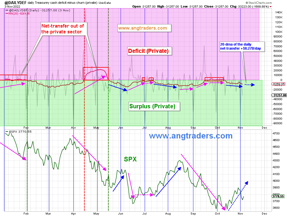
If the chart were adjusted to also include the external sector drain to the private domestic sector the peaks and troughs would be sitting firmly in the red private sector deficit zone. The trend line would also have a general downward trajectory falling from left to right as the external sector deficit grew and reduced private domestic sector financial balances. The current account balance is reported quarterly whereas the other data is daily and it is hard to combine the two in the same chart.
If one were to adjust the above chart to catch the impact of the external sector drain it would oscillate around the thick black line shown on the chart below.
ANG Traders with Author’s markups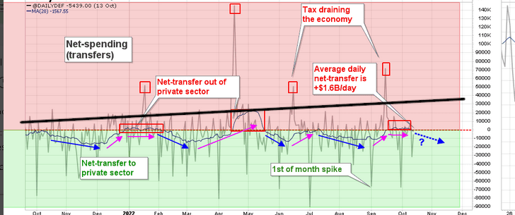
The impact of the growing external sector drain is not being taken into account by anyone except the good folks at the Levy Institute of Bard College.
ANG Traders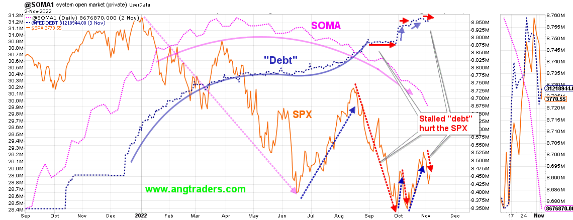
The chart above shows how since the Fed started its quantitative tightening and rate rises the Fed’s balance sheet (SOMA) has steadily fallen while interest rates have risen and markets have fallen. The chart shows that we can expect more of the same for the next few months at least.
At the White House in the last month, we have the mid-term elections that at the time of writing were not resolved.
One thing that is coming up on the fiscal horizon is the Debt Subject to Limit shown in the table below taken from the Daily Treasury Statement.
US Treasury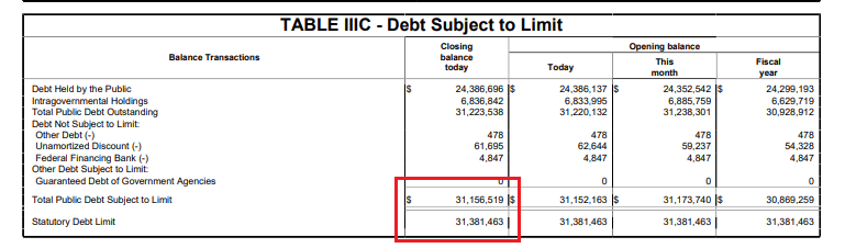
There could well be a scenario early next year where we have the last market drop caused by the fiscal vacuum made by a Federal Government shutdown on top of the rate rises and QT. A market dip opportunity where one could buy the dip. They could call the bottom of the bear stock market.
The Fed has now been successful with its policies in almost completely wiping out bank credit creation and we have two months in a row now with next to no credit creation.
There is another FOMC meeting in the middle of December that coincides with a major Federal tax collection where corporations pay their quarterly tax payments. At the next Fed meeting, it is likely that there will be another rate increase but perhaps by less this time. It may well be that the rate of the increases is decelerating now. The rate of increase has been slowing in satellite economies like Australia and NZ which tend to go faster and harder to maintain their foreign exchange parity with the USD even if this means throwing their citizens under an interest rate bus.
In the middle of this month is a big mid-quarter treasury interest payment. It should be $50B+ and the market should be buoyant around it into the first weeks of December.
Mr. Robert P. Balan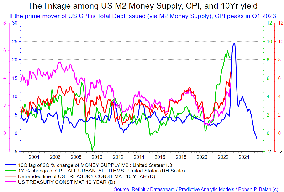
The chart above shows the link between the U.S. M2 money supply, the consumer price index, and the 10-year yield. The M2 money supply leads the other factors. The large spike in M2 during the federal government covid response has peaked and indeed gone negative. The other factors lag months behind the lead of the M2 money supply and will also fall with it. The Fed must no longer ‘fight’ inflation with rate rises as the CPI is falling naturally now with the drop in the M2 money supply. Despite this, the Fed ‘fight’ will continue until a serious recession forces them to reverse their course.
I discussed this matter at some length with Mr. Robert P Balan of the PAM market service and we came to these conclusions:
This is a long process. The central banks will pivot next year, when they get a pretext of falling inflation; we will have QE all over again. And the Central banks will over react — this time to the other side — then we will get another inflationary bout. The next time, the central banks will really take out the huge hammer — there goes your 2020 decade. You will get a 2025 high — the effect of new massive QE next year will power the economy to new highs in 2025. Then, downhill for the rest of the decade.
I predict that the next QE would be bigger than what we have seen so far. A quick descent in inflation as from Q2 2023 will be rapid — after all we will have recessionary pressures from Q3 2023 to Q2 2024. Sharp recovery from 2nd half of 2024 and apex in late 2025. By 1st half 2026, inflation from the new QE, on top of residual, second order effect of the original set of QE will combine — and inflation shoots up even higher than seen so far. Then the Centrals Banks globally clamp down really really hard.
Source: Mr. Robert P. Balan, PAM chat November 2022.
This scenario tallies with the land cycle as well and this is shown in the chart below.
Ascendant Strategies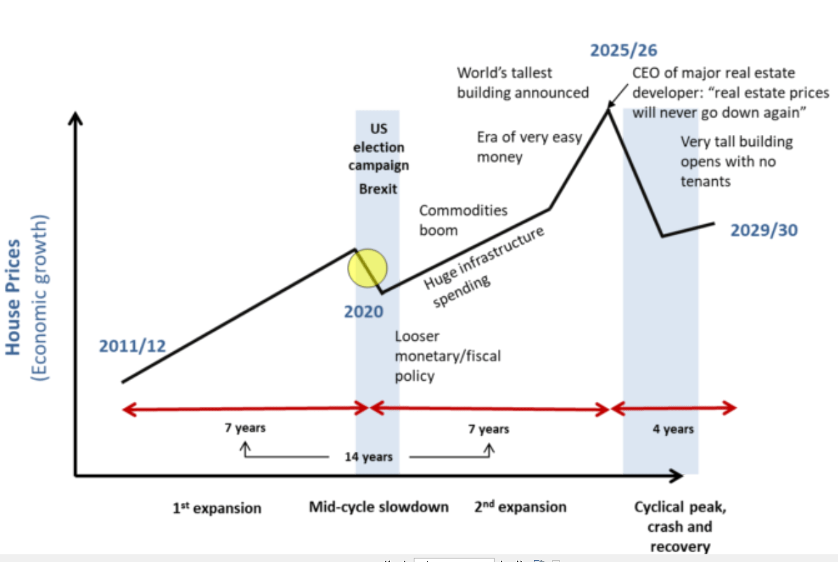
This is a cycle that has been repeating for at least the last 200 years.
On the world stage, the chart below shows the expected likely path of asset markets based on the flow of funds at the macro world level.
The chart below comes from Mr. Robert P. Balan of Predictive Analytic Models and is part of his SA Marketplace service information for subscribers. The chart shows the level of money creation by the top five world governments (the G5) in a change rate format, along with a host of other indexes. This chart gives a sense of important inflection points and direction.
Mr. Robert P. Balan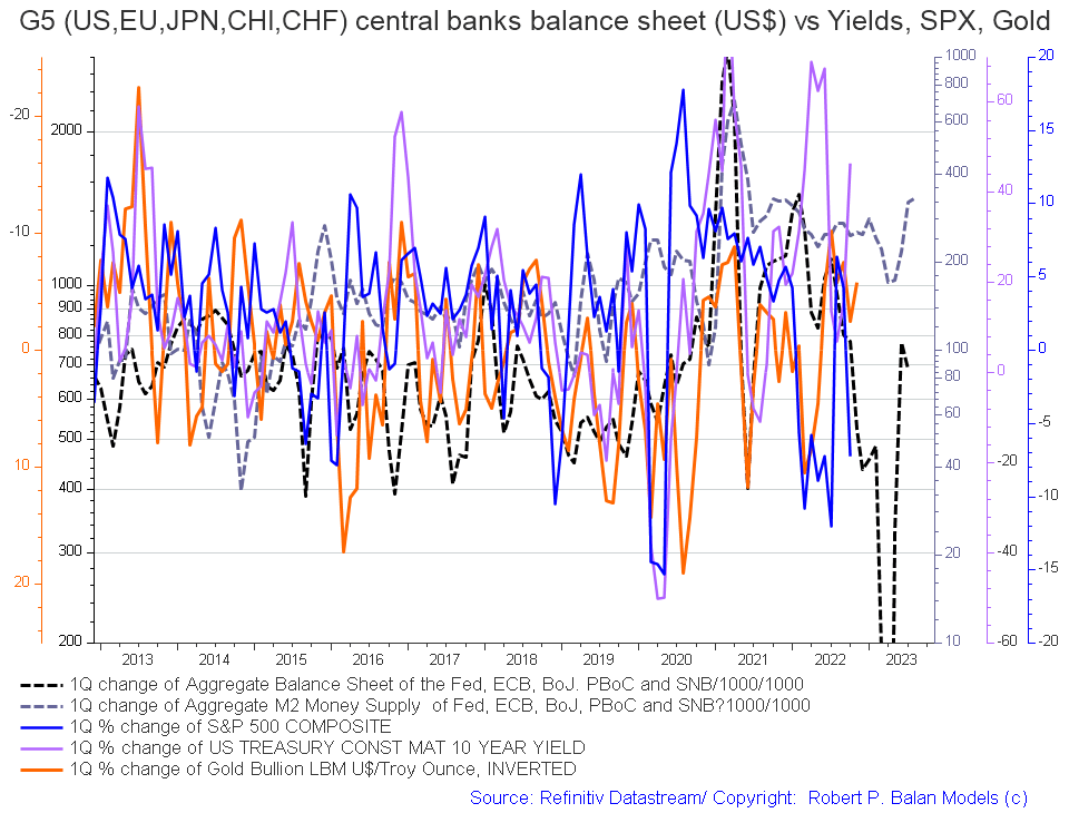
The basic changes over last month are positive in that both the dark dotted lines (central bank balance sheets and M2 money supply) are rising and point to a much more positive 2023 which is what the sectoral flow change rate chart earlier in this article is also showing.
The chart below tracks the activities of the top five central banks (the C5) and shows a similar trend (dark green line on the chart) and a sense of amplitude (not that great). Few things will match the amplitude of change that was experienced during the response to the Covid-19 crisis (see the dark green line in the period between 2020 and 2022). The change over the last month is that the green line is continuing its ascent and again points to stronger asset markets in 2023.
Mr. Robert P. Balan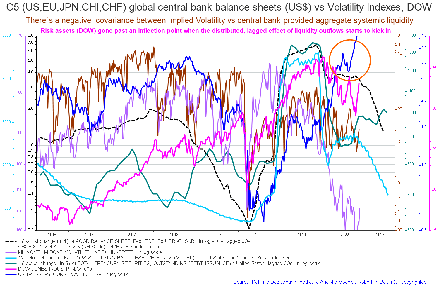
If you are looking to make a market entry, sometime in the first quarter of 2023 is likely to be a good time judging by the macro tidal forces that underpin the asset markets.
Be the first to comment