

trekandshoot
The purpose of this article is to examine the USA sectoral flows for June 2022 and assess the likely impact on markets as we advance into July. This is pertinent, as a change in the fiscal flow rate has an approximately one-month lagged impact on asset markets and is a useful investment forecasting tool. Other macro-fiscal flows can point to events many months ahead.
The table below shows the sectoral balances for the USA and is produced from the national accounts.
US Treasury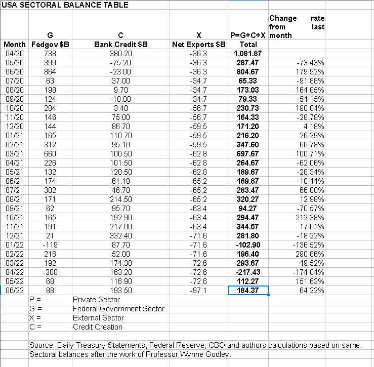
From the sectoral balances table above, we see that for June 2022, we have a positive nominal flow of $184+B into the private sector and a positive change rate month over month. For markets, the change rate tends to be more important than the headline number, and in this case, both are positive and this is supportive for asset markets.
The chart below shows the five-year average of the seasonal stock market patterns for the SPX (SPX), NDX (NDX), Dow (DIA), Russell 2000 (RTY), and Biotech (IBB) market indexes. The black oval shows roughly where we are [trading day 137 at the time of writing and the end of the green line on the chart below]. One can see from the chart that this year has not followed the seasonal pattern and has fallen from left to right up to the present day in what is an outlier year. This is due to the huge year-over-year fiscal contraction that has occurred and will be discussed later in this article.
Robert P Balan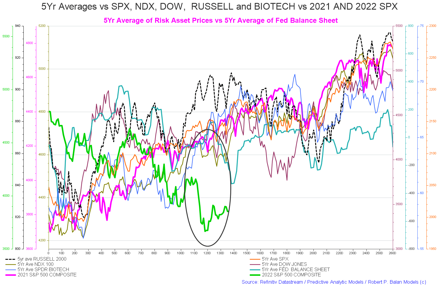
The $184+ billion is made up of an $88+ billion injection of funds from the federal government, plus an impressive $193+ billion of credit creation from commercial banks and less the -$97+ billion that flowed to foreign bank accounts at the Fed in return for imported goods and services.
The following chart emerges when one graphs the change rate of the information in the USA sectoral balances table above and adjusts for impact time lags.
Robert P Balan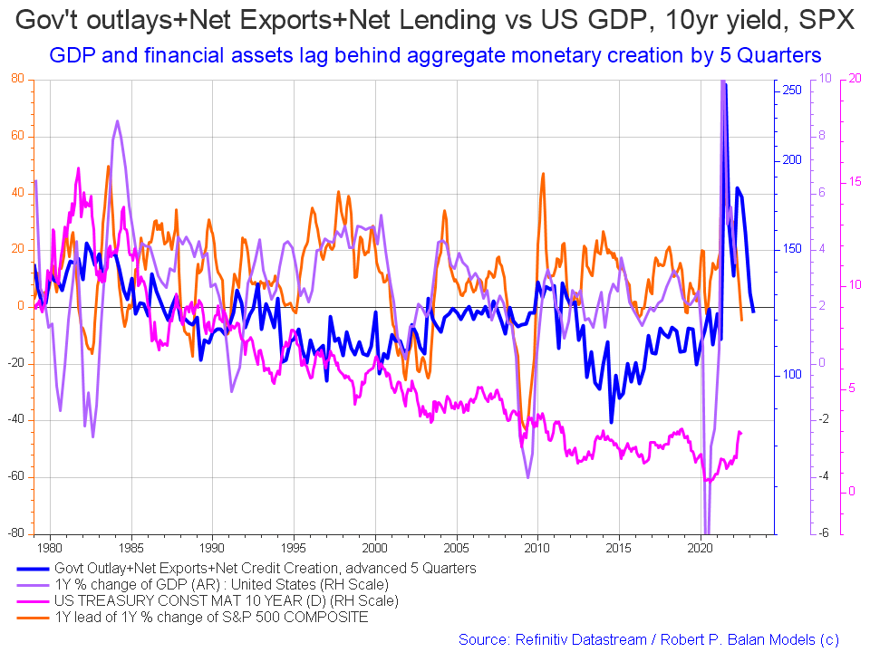
Compared to last month one sees that the 10-year rate has risen and the SPX has dropped further and still not followed the lead of the blue fiscal flow line.
The blue line is the crucial factor and leads by about five quarters and points to a recovery in the next quarter that is now overdue. One can lose patience with the financial models but not faith. The markets will turn and most likely it will be in September in line with the mid-term election year SPX pattern shown in the chart below.
Macrotrends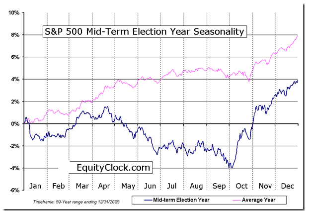
That said I would not expect much of a rise and all-time new highs are highly unlikely given the weak fiscal outlook and the repressive monetary outlook.
The table below shows that the overall federal expenditures were less than last month and a -14% increase from last month.
US Treasury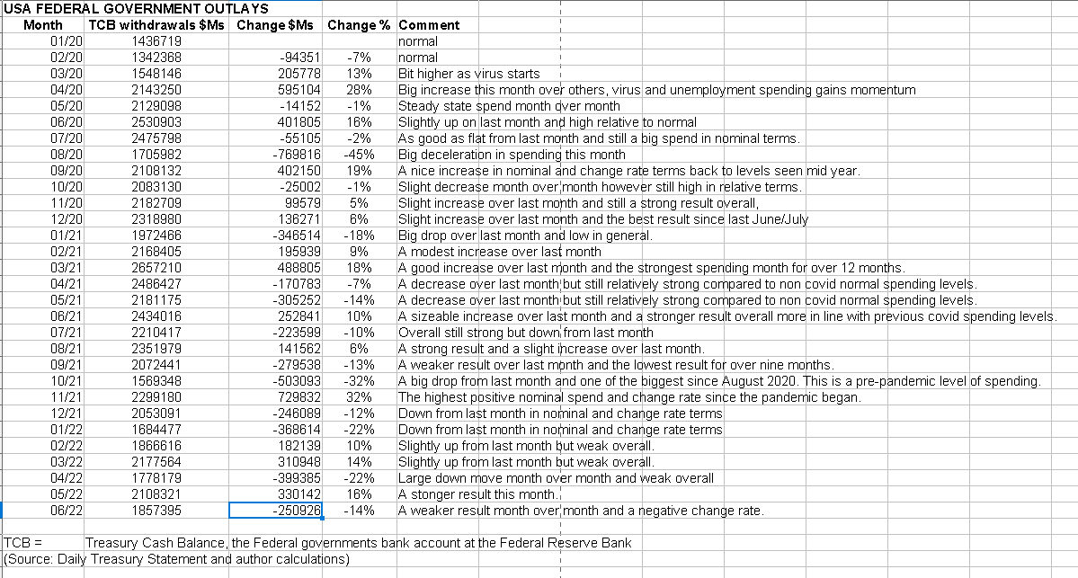
The chart below compares the last few years of federal deficit spending, and one can see the massive difference between 2022 and 2021, not to mention 2020.
Congressional Budget Office
The CBO had made the following comment about fiscal flows so far this year on their latest monthly federal budget review.
Congressional Budget Office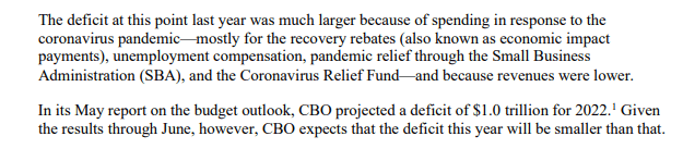
The last paragraph is important as the federal government deficit is the private sector surplus upon which financial balances grow. The prediction is that it will be less than a trillion dollars this year. That is one to two times less than in 2020 and 2021.
The chart below shows graphically the relationship between the federal government (currency creator) and the private sector (currency user) and is from ANG Traders of the Away from the Herd SA Marketplace service. The bottom panel highlights in red and green the financial relationship between the currency creator and currency users.
The 20-day MA of the daily net-transfers correlates well with the SPX; an increasing net surplus (blue arrows) is supportive of the market, while lower net-transfers (pink arrows) weakens it. Since there are no major tax-takes until September, the average net-transfers should increase and the SPX should follow.
(Source: Mr. Nick Gomez, ANG Traders, Away from the Herd SA Market Service Weekly report).
ANG Traders ANG Traders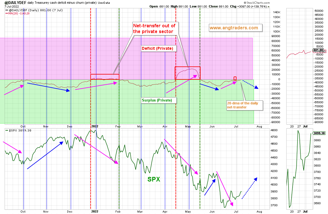
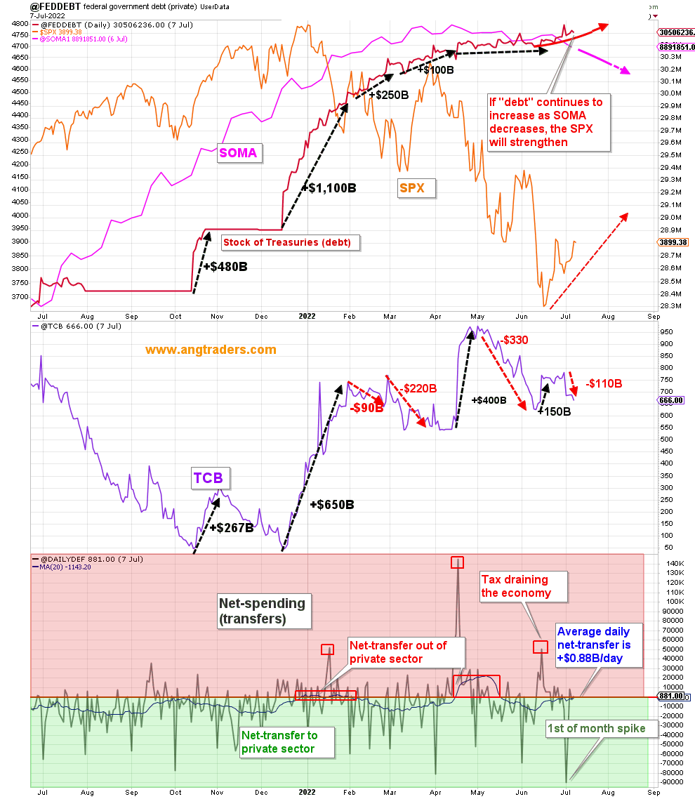
The chart above shows that while the Fed’s balance sheet is reducing [SOMA] the stock of treasuries [national debt] is increasing and this provides fiscal space for rising financial balances in the private sector given that the federal deficit is the private domestic sector surplus and the stock of treasuries is for all practical purposes the best measure of the money supply and it is growing.
At the White House, there have been no fiscal events worth noting that have any market-moving ability and this is reflected in the monthly budget statements above that show no major spending increases that might lift markets. The recent year-over-year cut to fiscal spending is still being celebrated as a great event with more to come. This is reminiscent of the Clinton administration surplus obsession that led to the dot com bust in 2000 and the GFC a few years later.
As reported in the press over the last month, there is some hope on the horizon if the world can come together and agree to fund a western-style belt and road project. The proposed $600B is not a lot though and the recent past has shown that one can spend trillions with little impact. It is a move in the right direction nonetheless.
The Fed has started QT and this is shown in the falling level of SOMA on the chart above. The next Fed meeting is later this month when more rate increases are expected. An interesting anomaly is that by continuing to raise the interest on reserves rate, which the fed pays for from its cash flow from its SOMA holdings, it will wipe out its income and have a negative balance and no ‘profit’ to remit to the US treasury at the end of the year. This has not happened before and it will be interesting to see how it is handled from an administrative point of view. The fed, being the issuer of the USD, creates dollars ad hoc as required and cannot go bankrupt and it can have a negative balance or for that matter any balance that it chooses to tap into its keyboard to fund any matter authorized by Congress.
The inflation bogeyman that the Fed and the rest of the world’s central banks are ‘fighting’ with rate rises to lower aggregate demand down to match the covid and Ukraine war-inspired supply-side shortage shocks may well soon come to an end as the followed charts show.
Robert P Balan
Personal Consumption expenditures have collapsed. [black line] The orange CPI line will follow it down.
Robert P Balan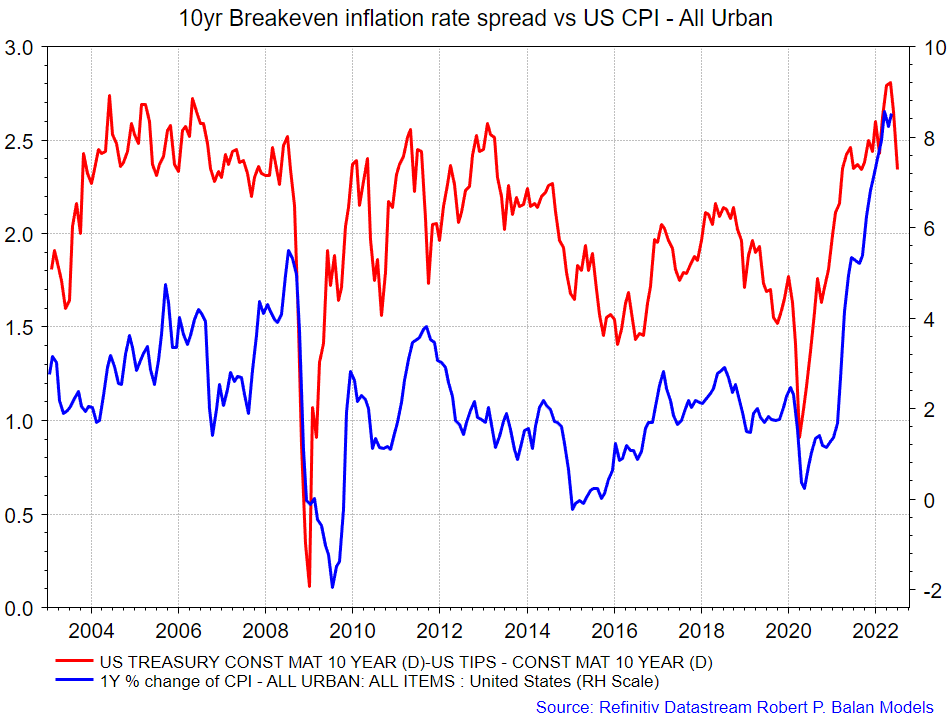
The market-based inflation gauge has turned around. [red line] The blue CPI line will follow it down.
Robert P Balan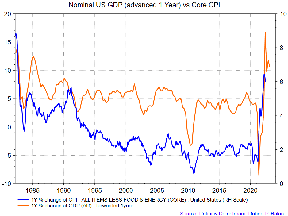
Core CPI has already peaked, following GDP’s rollover 1 year ago.
Robert P Balan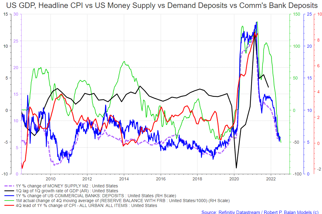
All the progenitors of demand are collapsing: M2 Money Supply, Bank Deposits, Bank Reserves, and GDP have all collapsed. We should see a sharp disinflationary impulse over the next 4 to 5 quarters.
(Source: Mr Robert P Balan, June 2022, PAM chat room)
Robert P Balan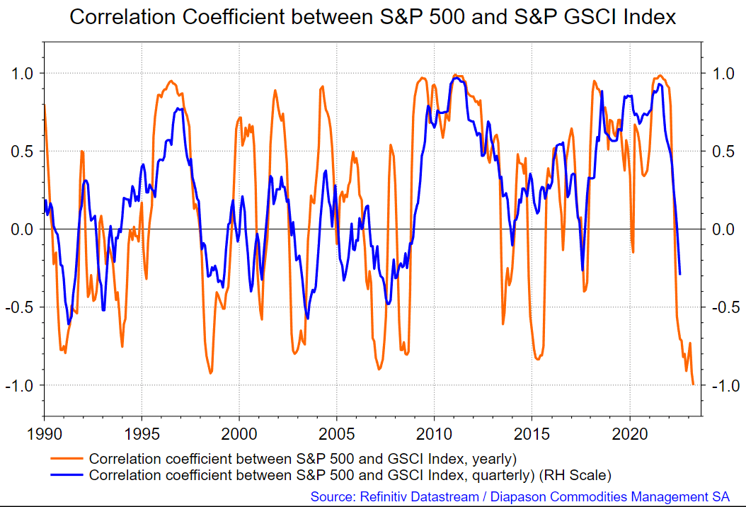
This model [chart above] suggests that the correlation between SPX and the S&P GSCI index will reach (-) 1 by April 2023. Something that is very different now versus in the past 13 years is that supply is the problem and it is not getting fixed. I don’t think the central banks will be able to do anything to fix it. As a matter of fact, they will make it worse because, with a long lag, they will destroy demand which in turn will just defer capital expenditure. Capex for energy and the basic materials that are in shortage takes years before a return begins to be realized.
(Source: Mr Robert P Balan, June 2022, PAM chat room)
These charts show that the global world banks will soon have cause to reverse their monetary repression policy positions as the wave of unemployment and the economic recession that is forming at present will cause world national governments to do the same with fiscal policy. When that occurs the stage is set for a further period of rising markets in line with the underlying positive trend in demographics out to 2025. But this is going to take a long time to come through in the monetary aggregates.
Professor William Mitchell reported the following in his economic blog earlier this week after reviewing the latest labor statistics report.
Professor William Mitchell
The mainstream celebrated the last jobs report as a positive however they overlook the deeper trends.
Note that we are still over 500,000 unemployed higher than the level before the start of the covid epidemic. Employment has not yet fully recovered from the impact of the epidemic let alone grown as the chart below shows.
Professor William Mitchell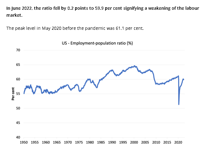
On the world stage, the chart below shows the expected likely path of asset markets based on the flow of funds at the macro world level.
The chart below comes from Mr. Robert P. Balan of Predictive Analytic Models and is part of his SA Marketplace service information for subscribers. The chart shows the level of money creation by the top five world central banks in a change rate format, along with a host of other indexes.
Robert P Balan
The big drop on the black dotted line [Central bank balance sheets] pointing out to early 2023 is hard to ignore and points to a similar market episode to the one we are having now thanks to the financial and fiscal repression we are suffering through at present.
A more zoomed version of the data similar to the chart above shows a near-term uptick in market fortunes led by the lagged impact of the growth in total Treasury securities outstanding. [light blue line]. This is similar to the overdue uptick shown above in the second chart at the start of this article. The chart below is more granular and allows for a better estimate of when a change in market direction might happen. Trade that at your peril.
Robert P Balan
Back in this article in August 2021, I had a look at what happens to markets when there is a massive fiscal contraction such as what happened at the end of world war two and is happening now.
We are now having a market downturn and recession similar to what happened when the world war two fiscal spending impulse stopped and then was even reversed when President Eisenhower ran some surplus federal budgets.
The chart below shows this period in terms of federal government spending and the SPX.
ANG Traders
It looks to me like we are having a stock market downturn as occurred in 1945-46 as shown by the second red arrow on the chart above.
Dow Jones Index Chart (Macrotrends)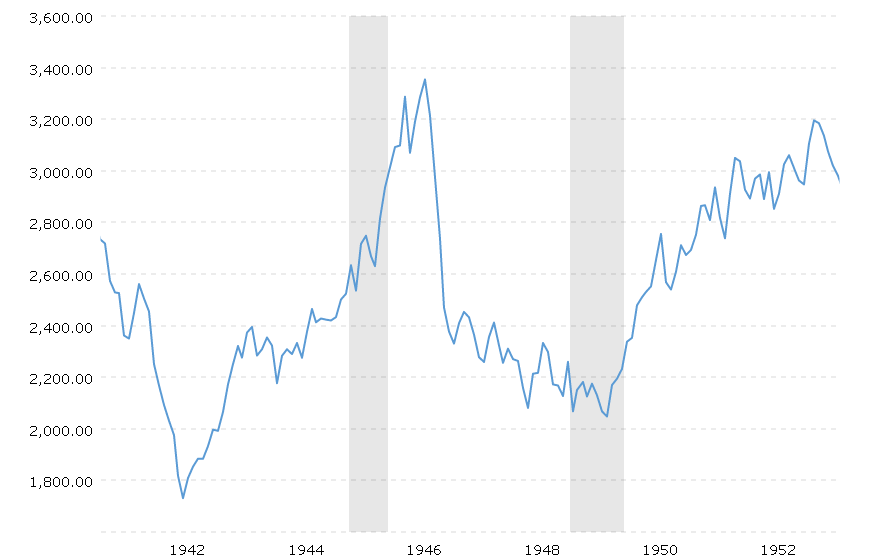
When one zooms onto the Dow Jones index for that same time one sees that markets fell from the end of the war spending for many years after and only started rising in about 1950. That is a 5-year bear market.
The big difference that points to a continuance of the bull market now is that the demographics are driving it higher and that is the first-principles factor as the chart below shows.
Robert P Balan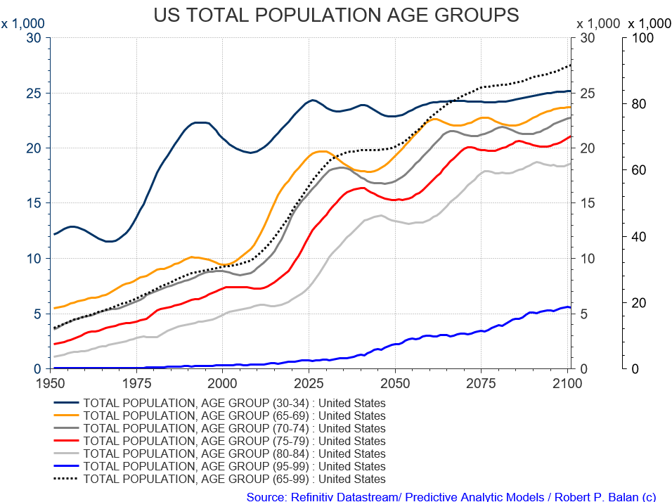
Be the first to comment