

Leonid Sorokin
The purpose of this article is to examine the USA sectoral flows for November 2022 and assess the likely impact on markets as we advance into December. This is pertinent, as a change in the fiscal flow rate has an approximately one-month-lagged impact on asset markets and is a useful investment forecasting tool. Other macro-fiscal flows can point to events many months ahead or even years ahead.
The table below shows the sectoral balances for the USA and is produced from the national accounts.
US Treasury and Author Calculations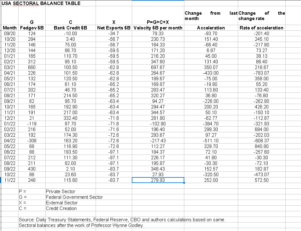
From the table, one can see that the $279+ billion private sector injection of funds came from a $248 billion injection of funds from the federal government, plus a stronger $115+ billion of credit creation from commercial banks and less the -$83+ billion that flowed out of the private domestic sector and into foreign bank accounts at the Fed in return for imported goods and services. The acceleration and rate of acceleration numbers are strong and positive as well.
The chart below shows the above data plotted in nominal terms. A trend line has been added to give an idea of the broad direction, which is downwards for both the private domestic sector (where asset markets are located) and the SPX. The calculation is Federal government spending (G) plus the external sector (X and normally a negative factor) to leave that amount of money left to the private domestic sector (P) by accounting identity true by definition.
US Treasury and Author Calculations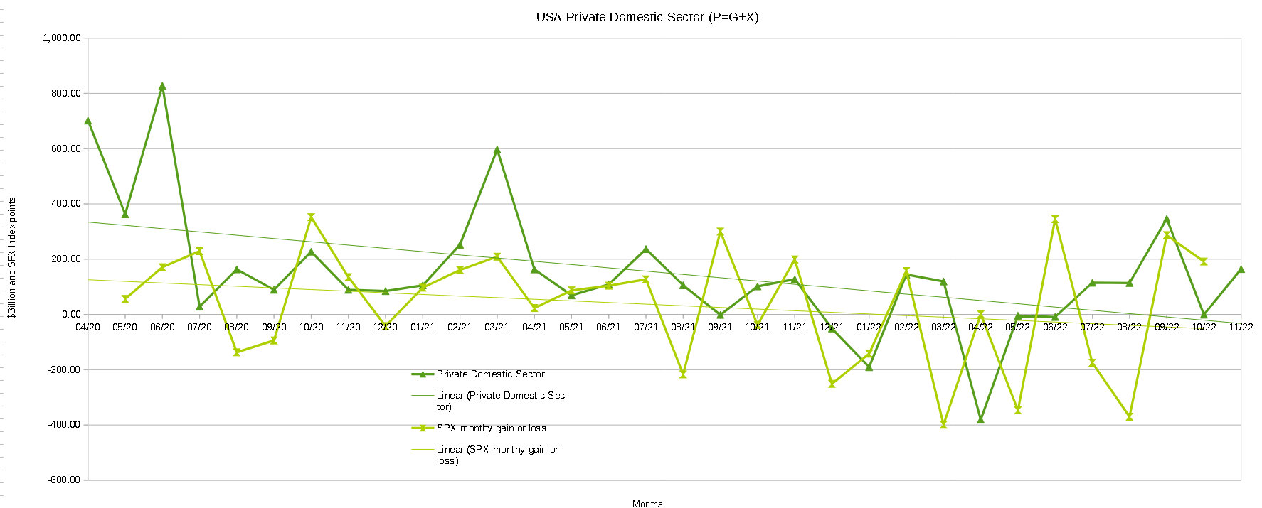
The following chart emerges when one graphs the change rate of the information in the USA sectoral balances table above and adjusts for impact time lags.
Mr Robert P Balan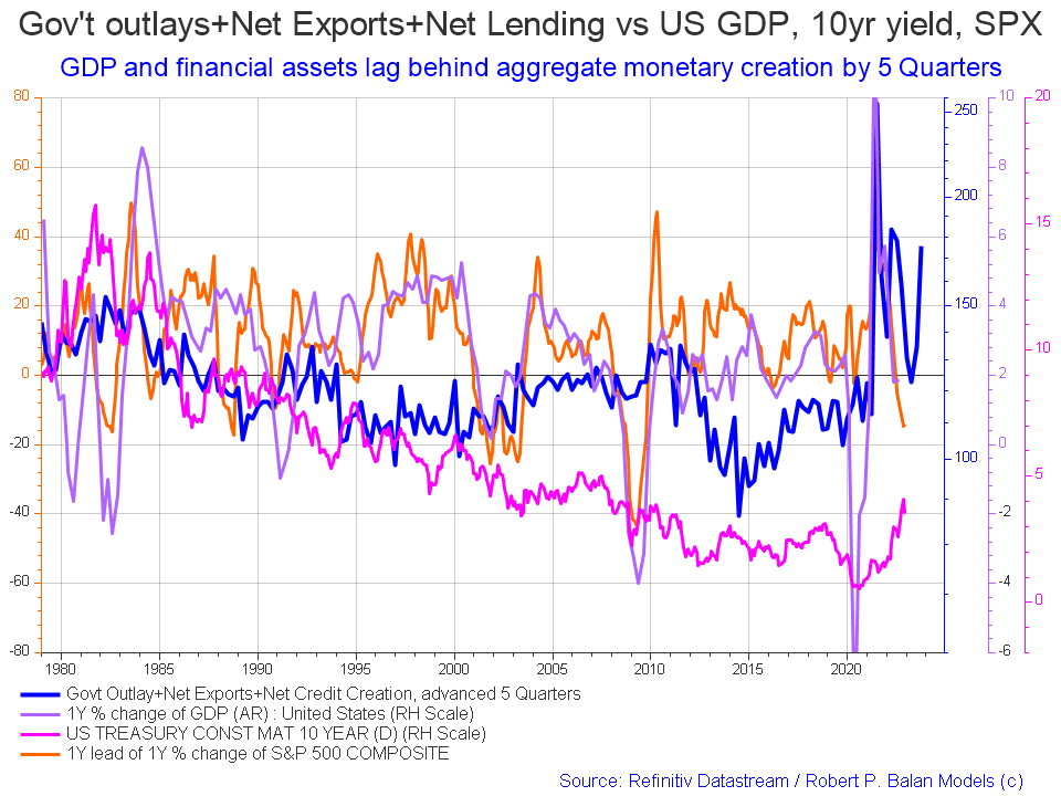
The blue line shows the fiscal impulse from federal government outlays plus bank credit creation and less the current account balance and leads by up to five quarters [a year and three months]. Though still trending downwards at present the orange SPX line is due to start trending back upwards and follow the leading blue line in about mid-2023. The granularity of this chart does not allow for a more precise timing than this but it does point to better times ahead.
The chart below shows the five-year average of the seasonal stock market patterns for the SPX (SPX), NDX (NDX), Dow (DIA), Russell 2000 (RTY), and Biotech (IBB) market indexes. The black oval shows roughly where we are (trading day 245) at the time of writing and the end of the green line on the chart below. Markets have been moving upwards since the general seasonal inflection point that starts about trading day 210-220 (20-30 October) in line with the seasonal pattern. This is an interesting break from the balance of the year where the markets have largely broken away from the seasonal pattern and trended down all year with little or no correlation with normal patterns. The discussion below on the M2 money supply sheds some light on why this has happened and when it will pass.
Mr Robert P Balan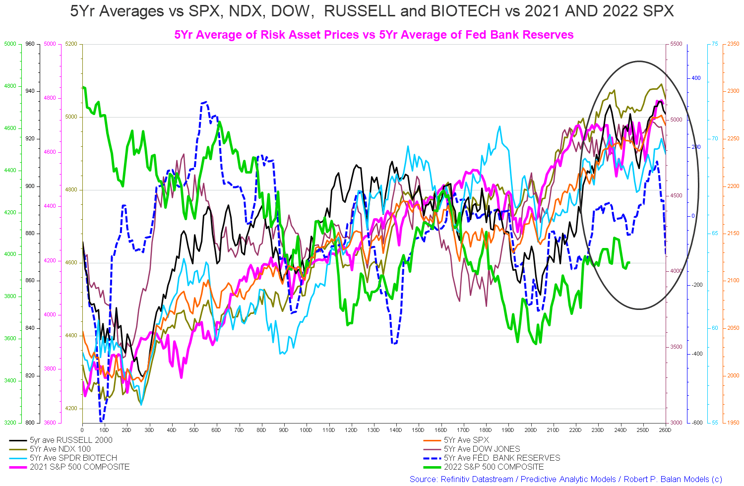
That the seasonal pattern was broken this year should come as no surprise given the massive year-on-year federal fiscal contraction combined with the end of QE, the start of QT, and a regime of sharp interest rate rises from the Fed. This makes for a very hostile anti-market growth background.
At its essence, the sharp federal fiscal contraction is a periodic wave [a one-off] that occurs once and is not sustained year on year. For this reason, once the impact of the negative spiral of liquidity has passed, standard seasonal patterns and the long-term pattern of general logarithmic market index growth will resume.
The chart below shows the wave of money [M2], the blue line, and its impact on the stock market [SP500] expressed in nominal terms.
FRED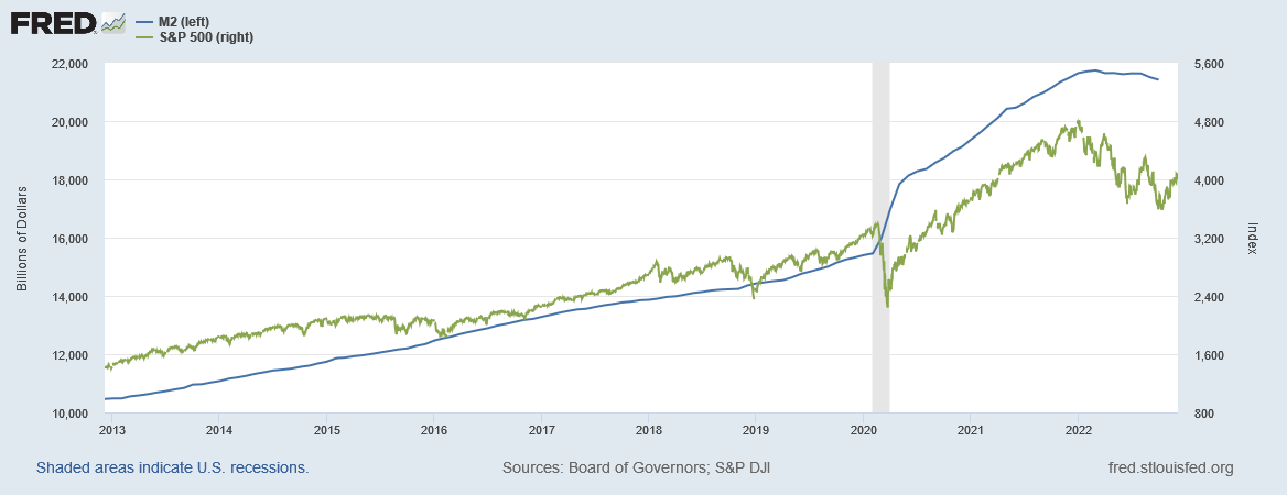
One sees from the chart above that the phenomenal M2 spending impulse peaked in early March 2022 and the SP500 reached a final peak in early January 2022 and both have been falling since then.
The chart below shows the same information expressed in a more dramatic change rate format.
FRED
One sees from the chart that the phenomenal M2 spending impulse made a change rate peak in early February 2021 and then the SP500 reached a final change rate peak in late March 2021 and both have been falling since then. In this case, M2 led the stock market by about one month. The change rate is always more important and revealing that the nominal flow information.
The stock market will not end its downward trajectory until M2 returns to its long-term positive growth pattern. The chart below shows the long-term M2 nominal trend. M2 has never contracted as much and for as long as it has now.
FRED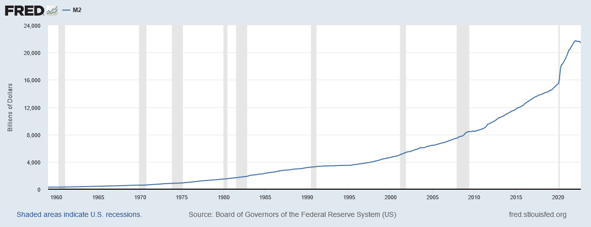
Only very rarely has M2 gone negative and taken money out of the economy and never before at this magnitude and duration as the chart below shows.
FRED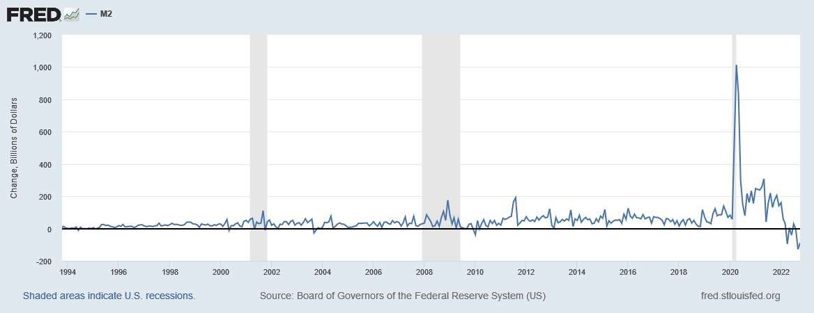
The table below shows the total federal withdrawals from their account at the Federal Reserve Bank. A withdrawal by the federal government is a receipt/credit for the private sector.
US Treasury and Author Calculations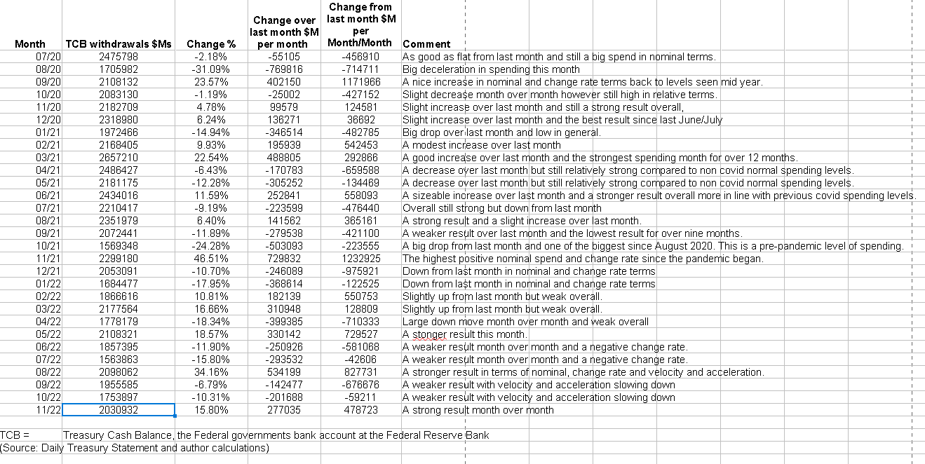
The above table shows the federal government spent strongly in November making for positive change rates and this is likely fueling the modest market rally we are experiencing at the moment. A glimpse of the most likely near-term prospects for the markets comes from this chart and a quote from Mr. Robert P Balan posted in the PAM chat this week.
Mr. Robert P Balan Mr Robert P Balan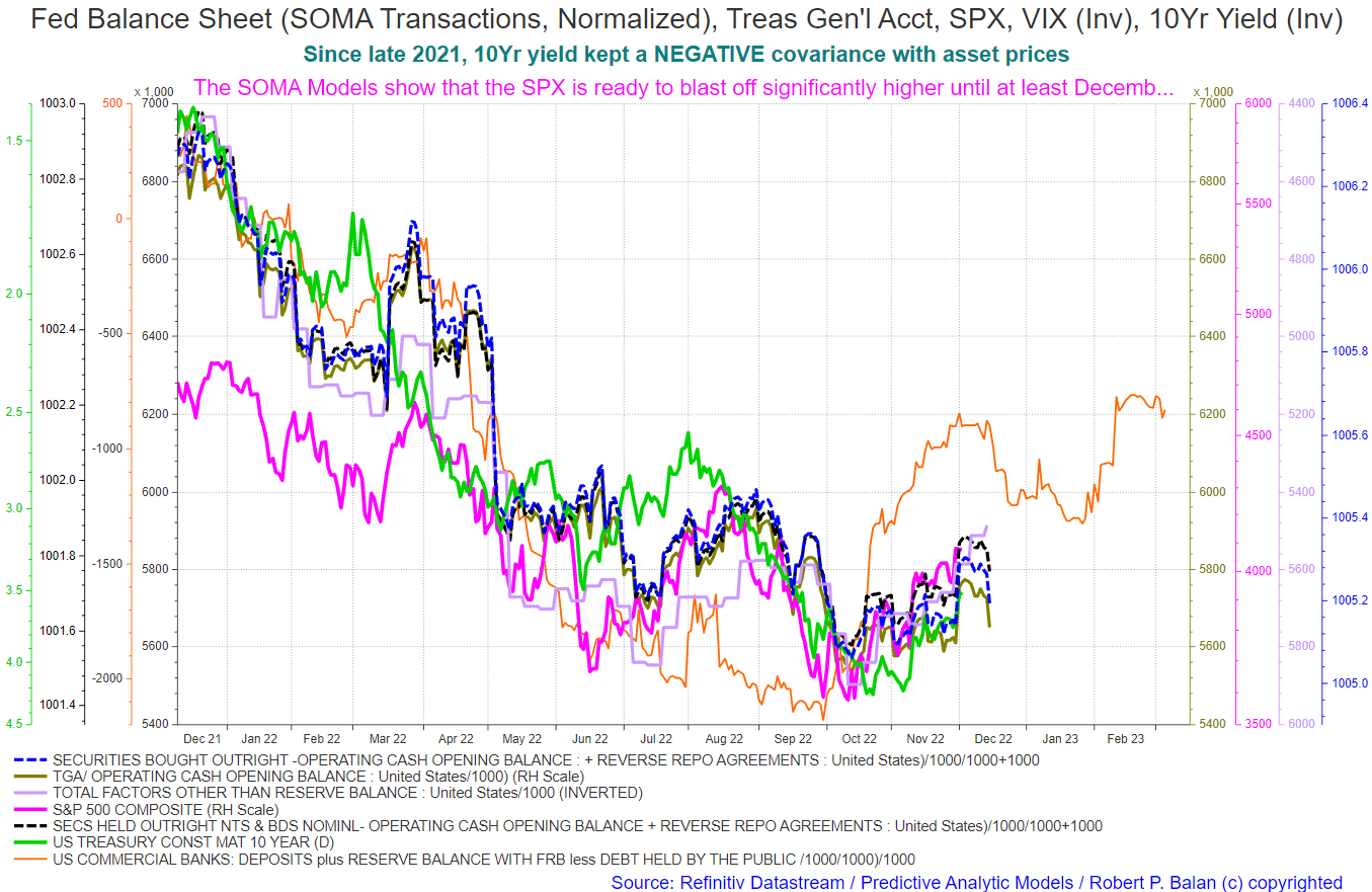

The chart below shows graphically the relationship between the federal government (currency creator) and the private sector (currency user) and is from ANG Traders of the Away from the Herd SA Marketplace service. The bottom panel highlights in red and green the financial relationship between the currency creator and currency users.
As of December 1, the 20-day MA of the daily net-transfers (from the Treasury to the private sector) is +$12.3B/day, +$246B/month, and +$2.95T/year. This is positive for stocks, but there is a tax-take at mid-month which, in combination with the debt-ceiling, could cause a short-term pullback.
(Source: Mr. Nick Gomez, ANG Traders, Away from the Herd SA Market Service).
ANG Traders ANG Traders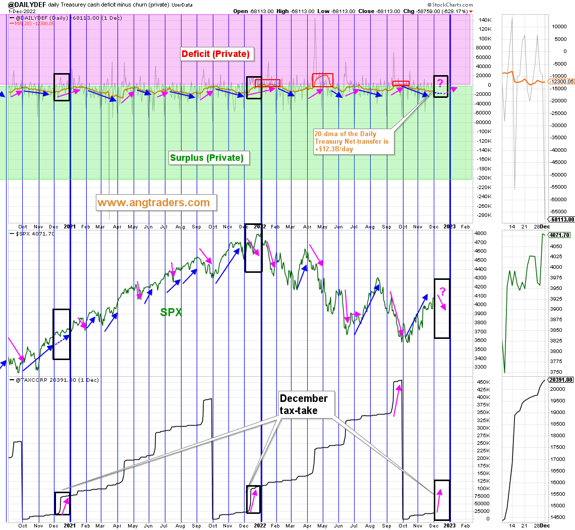
The chart above shows that since the Fed started its quantitative tightening and rate rises the Fed’s balance sheet (SOMA) has steadily fallen while interest rates have risen and markets have fallen. This is just one more factor working against markets at present.
FRED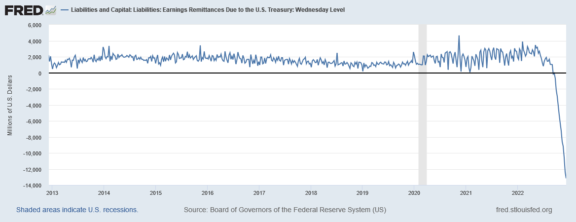
The above chart shows an interesting anomaly that has emerged since September 2022. The Fed has a rule that it pays to the Treasury the profits that it makes from its operations less its costs. The Fed’s profits come from its balance sheet holdings known as SOMA shown in pink two charts up. As part of its QT policy, the Fed is reducing its balance sheet by selling bonds back to the private sector. As the SOMA balance sheet reduces so does the Fed’s income stream from interest on those bonds.
The Fed also has an accounting rule that it pays interest on reserves out of its operating cash flows. Concomitant with the raising of the federal funds reserve rate the Fed has also been raising the interest of reserve balances as the chart below shows.
FRED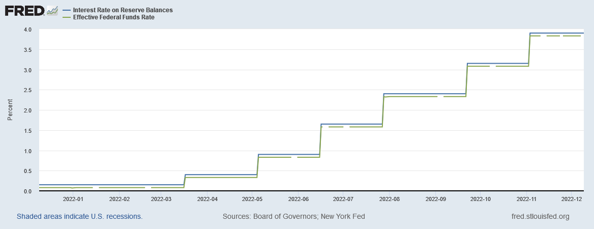
This leads to the situation where the Fed pays out more in interest on reserve balances than it receives as interest income on its SOMA holdings. It will be interesting to see what creative accounting they use to fix this anomaly. There will also be political ramifications from the fact that the Treasury now has to pay the Fed money rather than receive an income from it.
For the most part, the Fed has been selling its SOMA holdings to the private sector and in so doing it has been reducing the size of the special overnight reverse repurchase agreement facility that it set up in early 2021, this is shown in the chart below. This facility was a workaround to relieve banks of excess reserves that were weighing on their balance sheets as a liability and so crimping their lending ratios and thus ability to lend.
FRED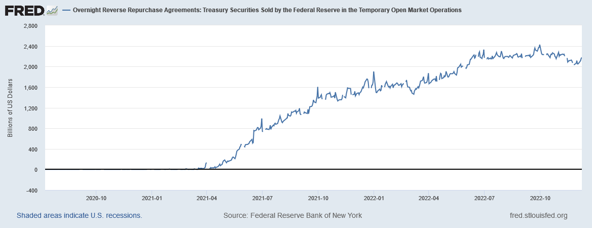
The chart looks much more dramatic in the change rate version shown below.
FRED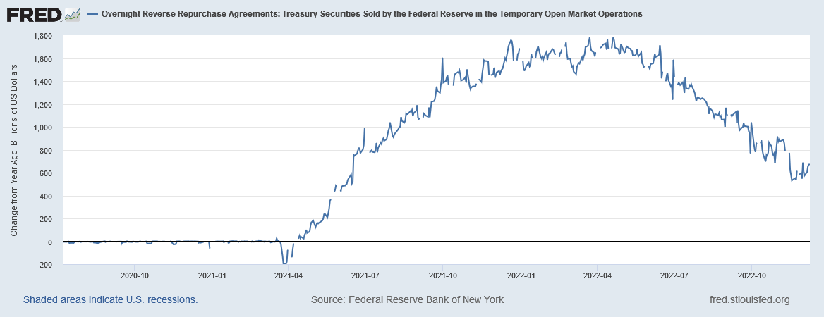
When this facility is fully drawn down the funds for further bond sales from banks will come directly from their bank reserves and then crimp their ability to buy trading assets such as stocks and bonds. They may have to offload trading assets such as stocks and bonds to meet their obligations as primary dealers to buy treasury bonds when offered for sale. This may well cause another step down in the current bear market and is an important factor to watch.
At the White House in the last month, the mid-term elections have come and gone with no dramatic changes.
One thing that is coming up on the fiscal horizon is the Debt Subject to Limit shown in the table below taken from the Daily Treasury Statement dated 6 December 2022.
US Treasury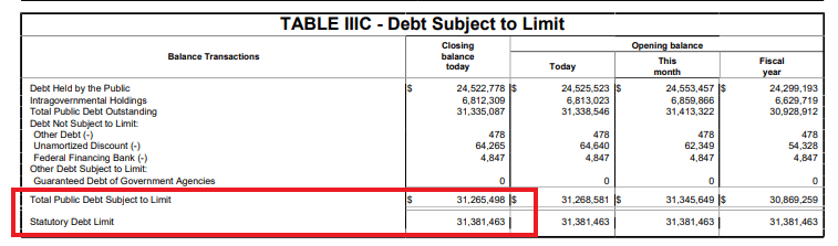
The mid-December federal tax collection will take some pressure off the federal government as the tax collections are recorded in the government’s account balance at the central bank and deducted from bank accounts in the private sector.
A scenario is building where several negative factors are coming together to cause an event that will call the bottom in stock markets and are as follows:
1. A federal government shutdown that causes a restriction in liquidity flowing into the private sector. This is normally the largest flow as well.
2. Rising federal funds rate.
3. Quantitative Tightening [QT] withdrawing liquidity from markets.
4. Depletion of the overnight reverse repurchase agreement facility which then places more pressure on banks to liquidate other assets to buy bonds from the Fed.
5. Declaration of an official recession with the associated unemployment and closing businesses that are associated with it.
6. Any number of random political or natural disasters that tend to occur at the same time and be labeled as the cause of the downturn.
This group of unhappy circumstances could call the bottom of the bear stock market and usher in a new wave of market growth propelled by lower rates, a resumption of QE, and a federal fiscal stimulus.
There is another FOMC meeting in the middle of December that coincides with a major federal tax collection where corporations pay their quarterly tax payments. At the next Fed meeting, it is likely that there will be another rate increase but perhaps by less this time. It may well be that the rate of the increases is decelerating now. The rate of increase has been slowing in satellite economies like Australia and NZ which tend to go faster and harder to maintain their foreign exchange parity with the USD even if this means throwing their citizens under an interest rate bus. This month Australia raised its central bank rate again by an amount of 0.25%.
We have a strange situation at the moment where the US 10-year bond is considered riskier than the Australian 10-year bond as the table below shows.
Trading Economics dot com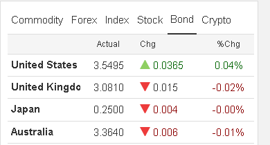
All the countries listed above are monetary currency sovereigns that as Fed Chairman Alan Greenspan famously said:
“[A] government cannot become insolvent with respect to obligations in its own currency. A fiat money system, like the ones we have today, can produce such claims without limit.”
Alan Greenspan, Federal Reserve Chairman, 1997
The rates are only as high as they are because the central banks, the rate-setting currency monopolist, have raised the policy rate, but for that, they would all be low like the Japanese rate.
The Japanese central bank has not raised its policy rate and for this reason, its 10-year bond has remained a low-interest rate bond [with a high face value and no bond rout] and its inflation rate is also low compared to the rest of the world as the table below shows.
Trading Economics dot com
Raising the policy rate to curb inflation is initially inflationary as it raises the cost of all goods and services as all of them to have a component of credit cost in their creation. Raising the policy rate only curbs inflation over the longer term by causing demand destruction and unemployment that leads to unsold inventories and then lower prices to clear those inventories.
In the USA, bondholders earn an extra risk dividend because periodically there is a debt limit crisis where the possibility of interest not being paid is real. It makes no sense that a nation like the USA, with all its economic power, should have a long-term bond rate higher than the UK, Japan, or Australia. The USA should have the lowest bond rate in the world.
…government spending is in no case operationally constrained by revenues (tax payments and borrowings). Yes, there can be and there are “self-imposed” constraints on spending put there by Congress, but that’s an entirely different matter. These include debt-ceiling rules, Treasury-overdraft rules, and restrictions of the Fed buying securities from the Treasury. They are all imposed by a Congress that does not have a working knowledge of the monetary system. And, with our current monetary arrangements, all of those self imposed constraints are counterproductive with regard to furthering public purpose.
Source: Warren Mosler, 2010, page 21.
Turning to inflation. The following chart shows in a nominal format the relationship between M2 and inflation.
FRED
The chart above shows how the M2 money creation [and Covid and the Ukraine war supply side factors] drove inflation higher in a similar way to how it drove a two-year stock market boom in the series of FRED charts shown earlier in this article. M2 peaked in March 2022 and has fallen since. Inflation has not yet peaked in nominal terms but soon will and it is clear that the red inflation line is decelerating in its ascent.
The chart below is a change rate version of the same information as shown above.
FRED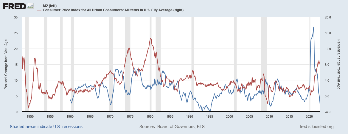
One can see in the above chart that both M2 and inflation have peaked and are falling. One can see from past times of inflation the same time relationship with a peak in M2 and then a peak in inflation some two to three years later. If one were to advance the blue M2 line to match the peaks and troughs in the red CPI line to get a match of best fit one then has a guide as to the lead of M2 over inflation and this is done in a chart further on in this article.
Other factors that one notices are:
1. The peak change rate in past CPI episodes was reached mostly in the gray recession bars shown on the chart. So the next official recession should coincide with the peak in the CPI.
2. The shape of the three past major CPI episodes [1968-1970, 1971-1974, 1977-1980] tends to have a symmetrical rise and fall pattern. The most recent CPI episode started rising in May 2020 and looks to have peaked in June 2022 and so one can forecast that CPI will return to its start level in June 2024. This is shown in the chart below which is a zoomed version of the last part of the chart above.
FRED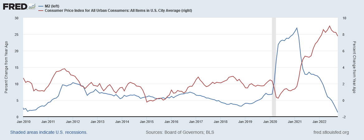
So the conclusion is that inflation is provably decelerating and one can expect the world central banks to slow and desist from their destructive rate-raising policies in the medium term.
The conclusions above are supported by two reputable scientific sources as shown in the charts below.
Mr Robert P Balan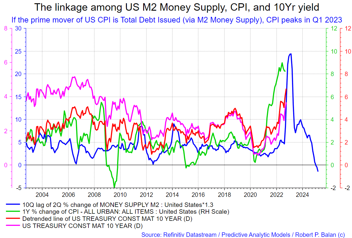
The chart above was shown last month and in this chart, the M2 and CPI peaks and troughs have been lined up to make a pattern of best fit. This then identifies the lagged impact of M2 and thus the path that the CPI will follow. The chart is showing that inflation is set to fall and most probably will fall as fast as it rose. A period of deflation is possible.
Professor Ivan Kitov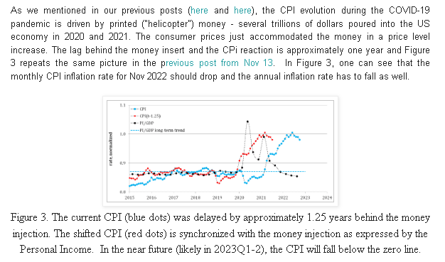
The chart and text above are from another source, Professor Ivan Kitov, who has identified the same factors and relationships at work. One point that Professor Kitov does not mention is that shortages of key goods and services related to COVID-19 shutdowns and illness also contributed to the rise in CPI. In effect the inflation was caused at both ends at once: There was an infusion of M2 on the demand side and then a parallel shortage of key goods and services on the supply side.
We now have a situation where the M2 demand side contribution to CPI has stopped. On the supply side, slowly but surely the COVID-related shortages are easing. The recent loosening of COVID restrictions in China is a major step forward in this regard because a lot of things are made in China.
The chart below comes from Mr. Robert P. Balan of Predictive Analytic Models and is part of his SA Marketplace service information for subscribers. The chart shows the level of money creation by the top five world governments (the G5) in a change rate format, along with a host of other indexes. This chart gives a sense of important inflection points and direction.
Mr Robert P Balan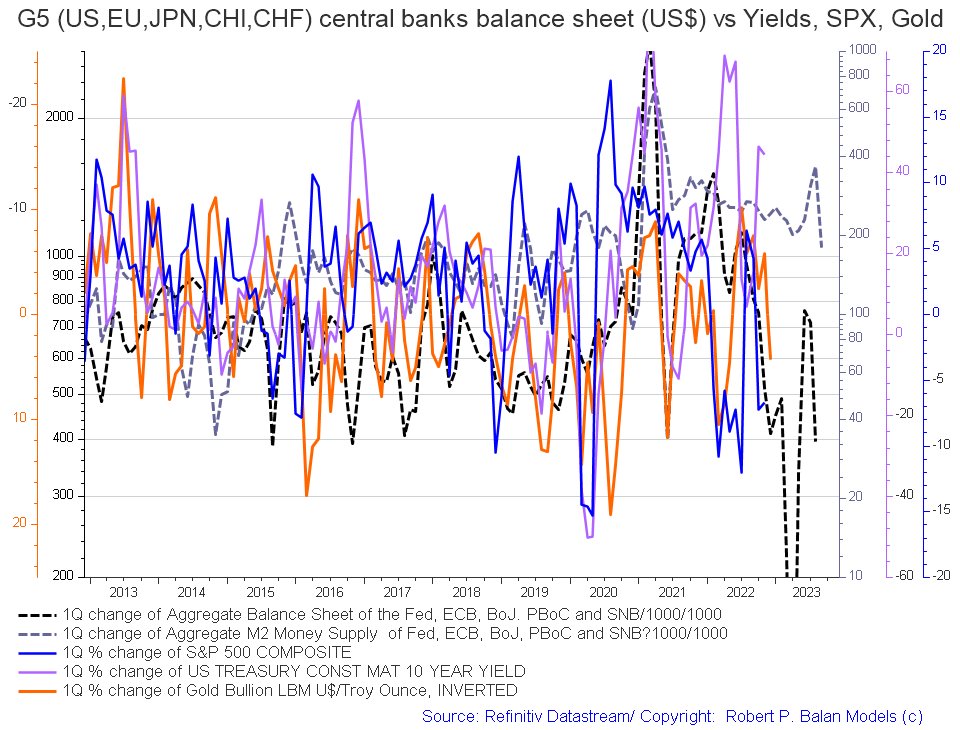
The basic changes over the last month are negative in that both the dark dotted lines (central bank balance sheets and M2 money supply) are falling and point to less promising times in late 2023.
The chart below tracks the activities of the top five central banks (the C5) and shows a similar trend (dark green line on the chart) and a sense of amplitude (not that great). The change over the last month is that the green line has flattened and like the chart above points to less buoyant markets in late 2023.
Mr Robert P Balan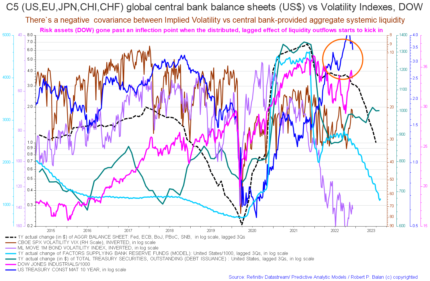
One notes also that the Dow Jones has managed to make two higher highs in a row even though it has also achieved a series of lower lows since the start of the market decline in December 2021.
If you are looking to make a market entry, sometime in the first quarter of 2023 is likely to be a good time judging by the macro tidal forces that underpin the asset markets.
Be the first to comment