

kirill4mula/iStock via Getty Images
Yesterday, the Fed released the May M2 numbers, and they were good. Since the end of January, M2 has grown at an annualized rate of just 1.3%. Over the past 3 months, growth has been a mere 0.08%—essentially flat. No longer is M2 surging at double-digit rates. If this keeps up, inflation could get back to something like “normal” by early next year.
It’s rather impressive that all this progress towards lowering inflation has been achieved while the Fed has only raised short-term rates to 1.75%. As I said in my last post, this is not your grandfather’s tightening-which-inevitably-leads-to-recession. That’s mainly because last year’s burst of inflation was the inevitable fallout from a bout of money-printing the likes of which we have never before seen, and which is very unlikely to continue or recur.
Stop the money-printing—as seems to have occurred—and you take away a major source of inflation virtually overnight. On top of that, the mere expectation that the Fed will seek higher interest rates while also shrinking its balance is working overtime. For example, 30-yr fixed rates on mortgages have zoomed up to 6%, almost twice what they were at the end of last year. This has slammed the brakes on the housing market by boosting financing costs and rendering housing unaffordable for many. Not surprisingly, lumber prices have fallen by more than half since March, suggesting a big cutback in new construction is coming. Meanwhile, we’ve all heard the drumbeat of recession forecasts from nearly every quarter, so everyone is tightening their belts. Seeing all this, the bond market in recent months has repriced to the expectation that inflation will plunge next year.
Chart #1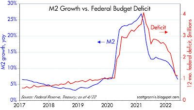
Chart #1 is arguably the most important one in the universe right now. What it shows is that the huge surge in M2 growth coincided with massive federal deficit spending. Milton Friedman long ago created a thought experiment now known as the “helicopter drop,” in which the government prints up tons of cash and drops it on the country, and lo and behold, inflation blossoms. Only this time it’s real: the government decided to send trillions of dollars of cash ($4-5 trillion) to nearly everyone as penance for COVID shutdowns. It was as if the economy were suddenly flooded with monopoly money dropped by helicopters. At first not much happened; inflation didn’t start surging until early 2021, because that was when people began to see that the COVID scare was over and life needed to get back to normal. In the early stages, people were happy to hold on to the flood of new cash. Now, not so much.
Chart #2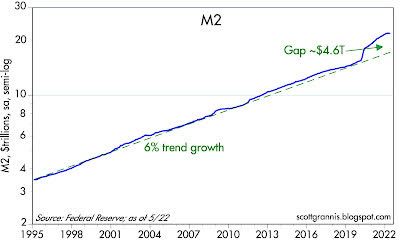
Chart #2 shows the level of M2, the best measure of easily spendable money, which includes currency and retail savings and checking accounts. Starting in April ’20, M2 growth surged like never before, and it now stands about $4.6 trillion above its long-term growth trend. (Note that this chart is plotted with a logarithmic y-axis, which makes constant growth rates look like straight lines.) For the past 4 months, M2 has flat-lined, and that is a big deal. The bulk of the outsized increase in M2 showed up in demand deposits, which have surged by 170% (about $3 trillion) since March ’20, and “other liquid deposits,” which have grown by about $3 trillion over the same period. These are the hallmarks of money printing: banks simply creating money out of thin air in order to monetize/maximize Congress’ desire to “stimulate” the economy with deficit spending. Thankfully, the chances of a repeat of this monstrous mistake are slim.
Chart #3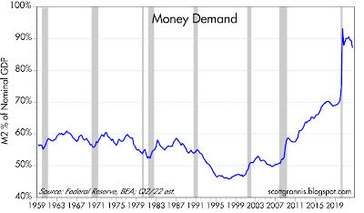
Chart #3 shows the ratio of M2 to nominal GDP, which is equivalent to the percentage of national income that is held by the public in the form of cash and bank deposits. The initial helicopter drop was welcome relief for most, and since the economy was locked down, it wasn’t easy to spend it, so cash holdings skyrocketed with almost no impact on prices. But by early 2021, people began to realize that they were holding a lot more cash than they needed, so they began to spend it. That overwhelmed supply chains and drove prices sharply higher, with the result that surging inflation caused nominal GDP to grow at double-digit rates. Nominal GDP rose at a 10.7% annualized rate in the first quarter, and it is likely to grow by about 9% or more in the current quarter (e.g., 2% real growth plus 7% inflation), while M2 growth (as noted above) is going to be close to zero. This effectively reduces the ratio of M2 to nominal GDP, which is the most basic definition of money demand. No one needs to hold a lot of cash these days, especially since it’s losing value due to inflation. As this process continues—slow growth in money combined with much faster growth in nominal GDP—money demand will return to levels more consistent with past history.
Chart #4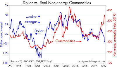
Chart #4 is worth a thousand words, but I’ll try to use a lot less. What it shows is that commodity prices (red line) typically rise and fall in inverse relation to the value of the dollar (blue line). A strong dollar usually depresses commodity prices, and a weak dollar typically boosts commodity prices. Except for the past two years, that is, as both commodity prices and the dollar have soared. However, note the recent dive in commodity prices: this very likely reflects the repair of supply chains and less frenzied demand.
It’s also encouraging to see the dollar so strong. If the Fed were doing the wrong thing (i.e., supplying way more dollars than the world wants to hold), then the dollar would be weakening, but it’s not. The Fed has not lost control of the situation, and inflation expectations are not “unmoored.”
Chart #5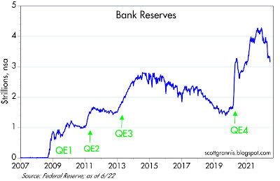
Chart #5 shows more good news. Bank reserves have plunged in recent months, having retraced almost 40% of the rise that accompanied the surge in M2 that began in April ’20. Bank reserves, recall, are created when the Fed buys securities from the banking system—when it grows its balance sheet. The process of unwinding QE4 is now well underway, but this has not had any negative impact yet because reserves are still abundant and banks therefore still have an almost unlimited capacity to increase their lending. In other words, there is no shortage of liquidity during this tightening, contrary to what happened with previous tightenings, which were all about the Fed intentionally restricting liquidity in order to boost interest rates. This is a crucial point of difference.
Chart #6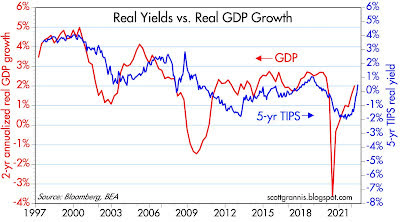
Chart #6 shows that real yields tend to correlate with real economic growth: stronger growth supports higher real yields, and weaker growth results in lower real yields. It also suggests that the bond market is expecting real GDP growth to average about 2% per year for the foreseeable future. This is the same rate that has prevailed since the Great Recession. It’s sub-par and not very exciting, but it’s a lot better than recession. Unfortunately, there are still headwinds out there in the form of oppressive regulatory and tax burdens, and the uncertainty which naturally accompanies high inflation and the Fed tightening needed to tame it.
Chart #7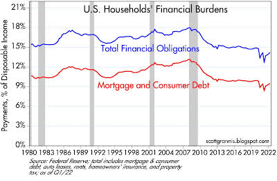
Chart #7 shows households’ financial burdens (i.e., monthly payments for mortgages, loans, homeowner’s insurance, and property tax as a percent of disposable income), which are very low from a historical perspective. Households have plenty of room to take on additional financial burdens, but they’re not. A sturdy household sector will lend important strength to the economy going forward.
Chart #8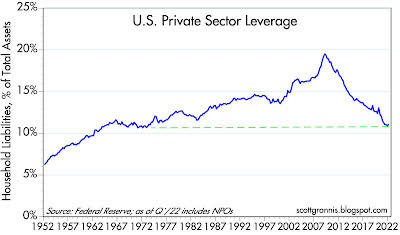
Chart #8 shows that the leverage of the private sector (i.e., total liabilities divided by total assets) has declined significantly over the past 14 years, and now stands at levels last seen in the early 1970s. The federal government has leveraged up, but the household sector has done just the opposite. Government profligacy is balanced by household prudence. Things could be worse.
Chart #9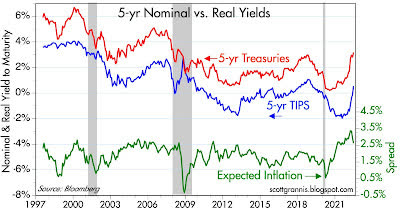
Chart #9 shows the level of nominal real yields on 5-yr Treasuries and the difference between them (green line), which is the market’s expectation for what the CPI will average over the next 5 years. Inflation expectations peaked at 3.7% last March, and they have since plunged to 2.7%. Inflation expectations by this measure now are consistent with, for example, a forecast for inflation this year of 6%, followed by 2% per year for the next four years. Bottom line, the market expects inflation to normalize in fairly short order, which is not impossible given the sharp slowdown in M2 growth of late.
On a final note, I would remind readers that I have been worrying about high and rising inflation for most of the past two years, and I think I was correct in doing so. But with the impressive slowdown in M2 growth and the strong likelihood that the banking system will no longer monetize federal deficits, the outlook has definitely improved.
Regardless, inflation is likely to continue at an elevated pace for most of this year. Wages are being bid up, rents are soaring (playing catch-up to housing prices), higher energy costs are being passed through to many areas of the economy, and some supply chains (Ukraine in particular, a huge source of global food production) are still strained. And, last but not least, money demand is likely going to continue to decline as households attempt to spend down their outsized money balances. It’s going to be a bumpy road for a while.
Markets are good at looking across the valley of despair and seeing hope on the other side, and that is not unreasonable in the present situation.
Editor’s Note: The summary bullets for this article were chosen by Seeking Alpha editors.
Be the first to comment