

maxsattana
I will go to my grave… believing that really loose monetary policy greatly contributed to the Financial Crisis. There were obviously problems with regulation, but when we had a 1% Fed Funds rate in 2003 after, to me, it was pretty obvious that the economy had turned (UP) and I think the economy was growing at 7% to 9% nominal in the fourth quarter of 2003 and that wasn’t enough for the Fed. They had this little thing called ‘considerable period’ on top of the 1% rate just so we would make sure that their meaning was clear. And it was all wrapped around this concept of an insurance cut… I’ve made some money predicting boom-bust cycles. It’s what I do. Sometimes I am right. Sometimes I am wrong, but every bust I had ever seen was proceeded by an asset bubble generally set up by too loose policy…
– Stanley Druckenmiller
Introduction
Almost everywhere I look, a near-term Fed pivot is being priced in. And, we may get a pause here at some point, as financial conditions, and future indicators of inflation are clearly deteriorating. However, any pivot or pause of the rate hike cycle could come with a catch. More specifically, interest rates could stay higher for longer, as inflation is going to remain sticky, held aloft by strong wage growth and robust bank lending. As an aside, when I hear pivot, I cannot help but think of the famous Friends episode with Ross and Rachel moving a couch up the stairs.
Circling back to the Fed, expectations for the terminal level of interest rate hikes have been slowly receding.
Rate Hike Expectations Slowly Being Dialed Back (The Daily Shot)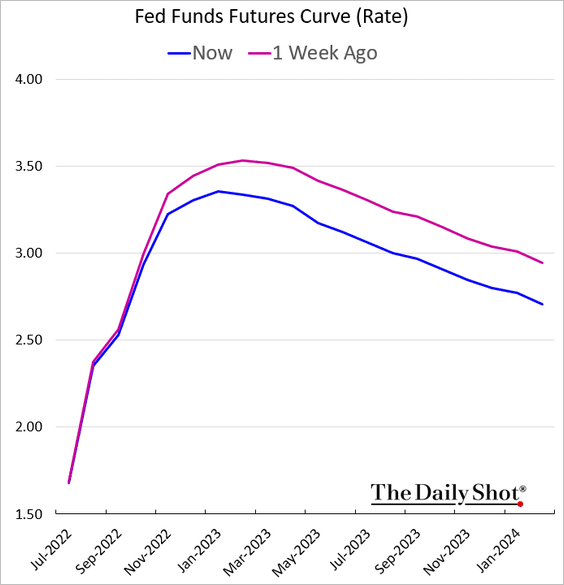
This makes sense as copper prices have nosedived, which is shown in the one-year chart below.
Copper Prices One-Year (Author, StockCharts)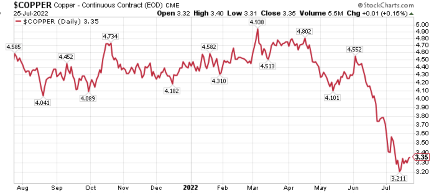
In fact, the roughly 29% decline in copper prices from the start of June 2022 through early July 2022, exceeds the roughly 27% decline in copper prices during the heart of the pandemic of 2020.
Copper Prices Three-Year (Author, StockCharts)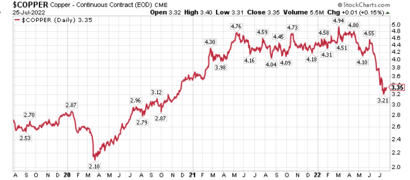
Think about that for a minute.
In a way, sentiment for the global economy now is more negative than what was witnessed at the heart of the pandemic. The major difference, of course, is that central banks and fiscal governments were aggressively easing monetary and fiscal policy then, while they are belatedly, in my opinion, aggressively tightening now.
The tightening of fiscal and monetary policy has torpedoed business expectations, as this chart from the Empire State Manufacturing Survey showing general business conditions six months ahead from David Rosenberg and Haver Analytics illustrates.
Business Conditions 6-Months Forward (David Rosenberg, Haver Analytics)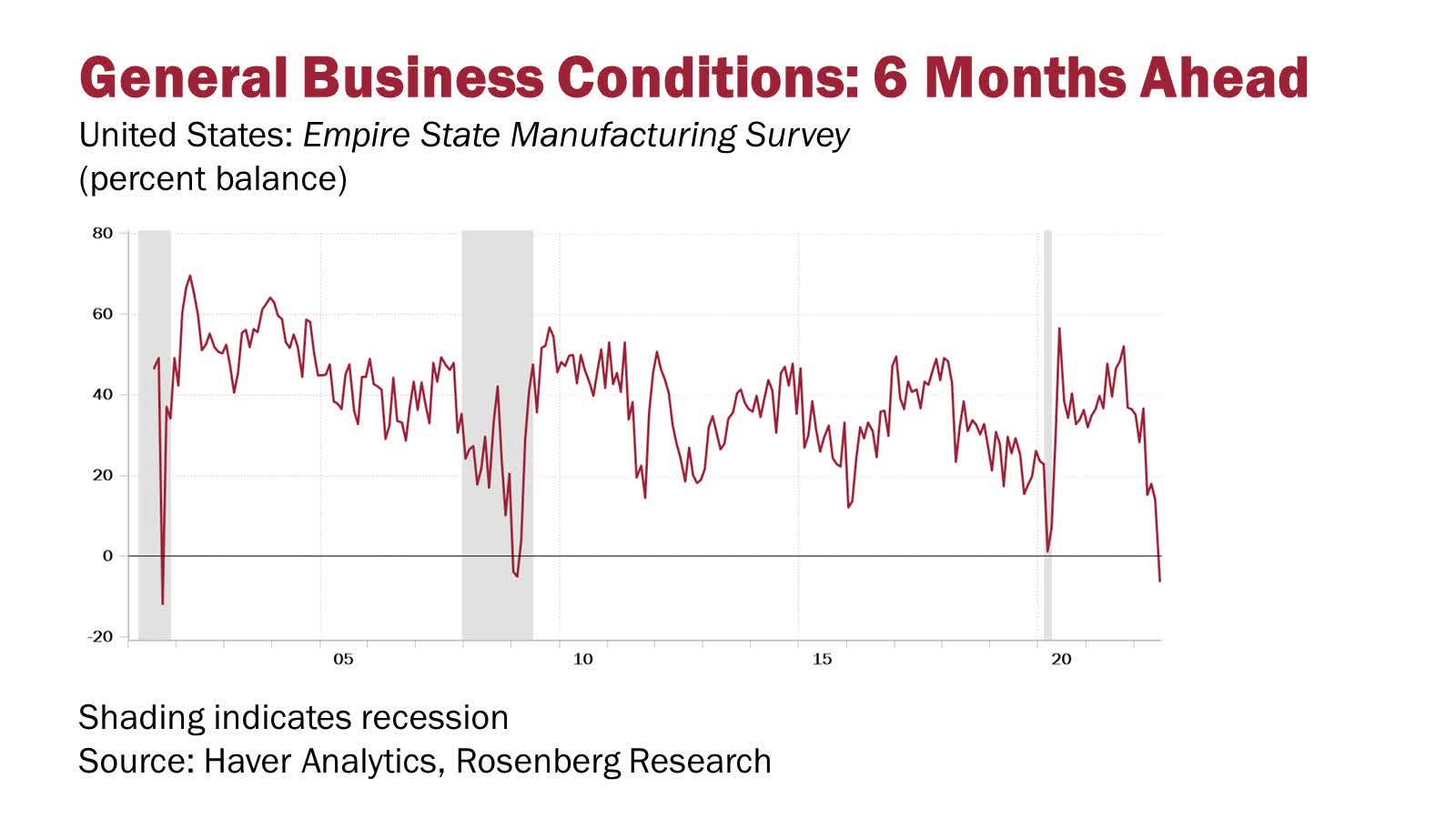
In summary, Freeport-McMoRan’s (FCX) CEO Richard Adkerson spelled out the conundrum facing the markets and policymakers. In remarks following Freeport’s second quarter earnings results, Adkerson pontificated on the disconnect between the current physical markets and the speedy drop in copper prices. His conclusion is that current copper prices were unsustainable, absent a deep recession. On that note, markets are increasingly pricing in a severe economic downturn, however, there is a high likelihood that inflation remains sticky, and economic growth is more resilient than expected, due in part to higher wages, and still pent-up savings. In this scenario, interest rates would stay higher for longer, dramatically changing where capital flows should be going, versus where they have been going.
Inflation Is Going To Be Sticky For Longer Than Many Anticipate
There is currently a widespread expectation that once CPI inflation rolls over, it will quickly head back to the targeted 2% annual inflation range. This is not likely to happen, as the current chart from Moore’s Inflation Predictor illustrates below.
Moore Inflation Predictor (Financial Trend Forecaster)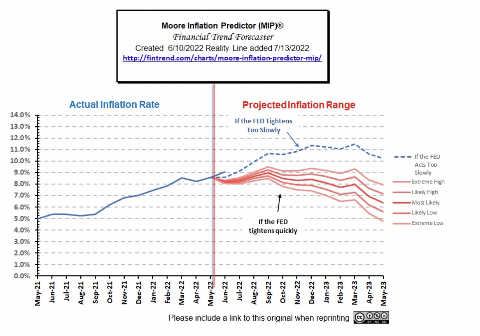
In fact, bank lending remains very strong, according to this chart from the St. Louis Federal Reserve, via the Fed Guy.
Bank Lending Robust (FRED)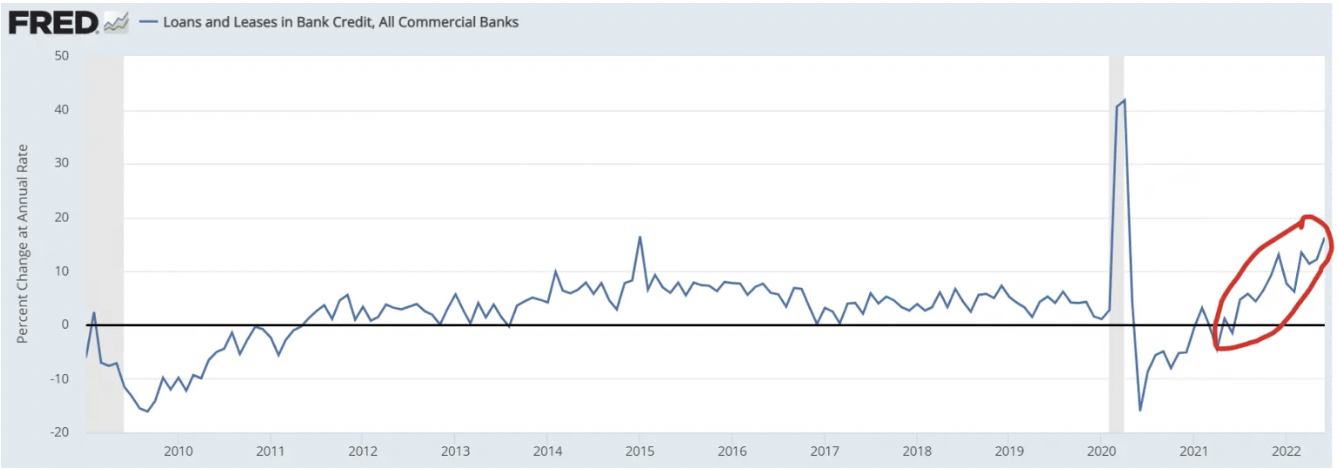
Strong bank lending is being fueled by strong consumer balance sheets, and healthy wage gains, which have continued to accelerate according to the Atlanta Fed’s wage tracker as shown below.
Wage Growth Is Still Accelerating (Atlanta Fed Reserve)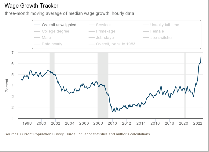
Ultimately, strong bank lending driven by strong wage growth is going to make inflation more persistent than many market participants expect right now, which has various investment ramifications.
The Yield Curve Will Steepen Again
In the intermediate-term, the Fed will pause the Fed Funds rate hikes, which the market currently projects in the 3.25% range, and when they do, with inflationary pressures still sticky, the yield curve will steepen.
Yield Curve 10-2 (Author, StockCharts)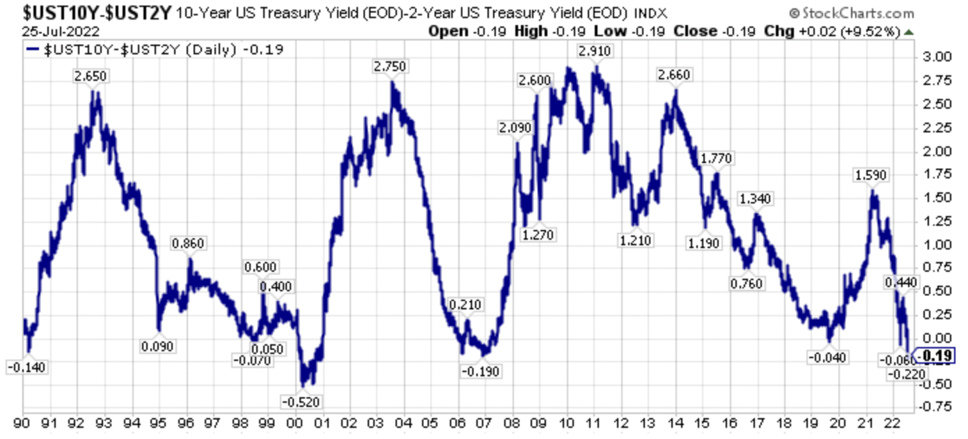
Any rate cuts in 2023 will accelerate this steepening, which is a cautionary thought for the iShares 20+ Year Treasury ETF (TLT), which is still down 20.0% year-to-date in 2022, despite the fears of a prospective deep recessionary downturn.
TLT Down 20.0% YTD In 2022 (Author, StockCharts)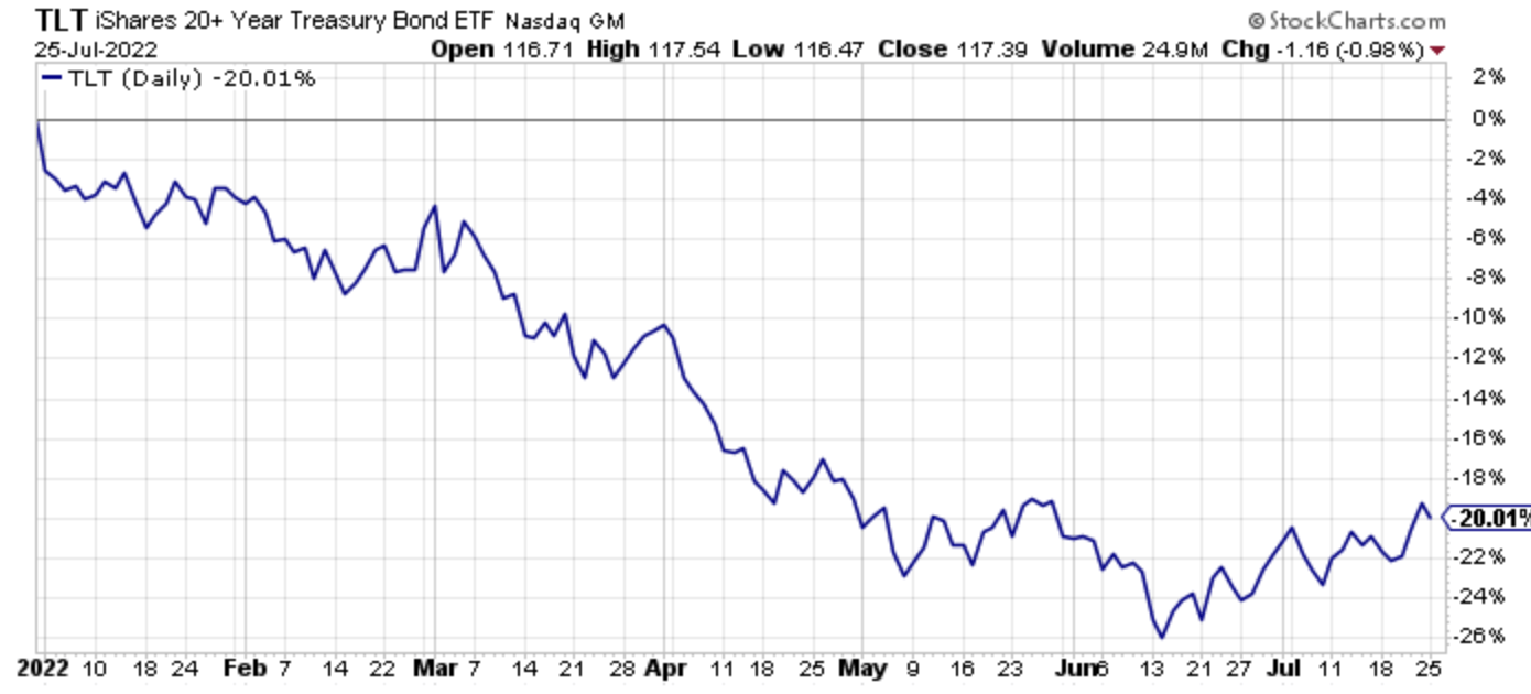
On that note, the price action in bonds has been very different during this bear market compared to the much discussed and compared to past bear markets of 2008 and 2000-2002.
Bear Market Returns (Author, GMO, NYU Stern )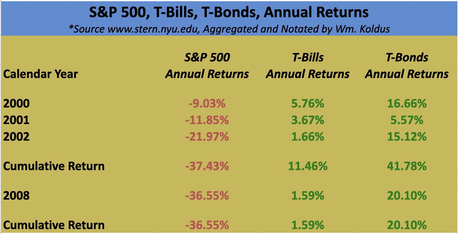
Look at the table above, and compare price action in 2022, with the SPDR S&P 500 ETF (SPY) down 16.1% year-to-date, the Invesco QQQ Trust (QQQ) down 24.3% YTD, and the ARK Innovation ETF (ARKK) still down 51.7% YTD after a recent rally.
Previously, I have been bearish on ARKK, publishing these three prior articles on Seeking Alpha, and if you read through these articles, it highlights the bifurcation we have seen in the markets.
ARKK Implosion Is On The Horizon Part II
ARKK: Why Cathie Wood Is Wrong To Bet Against Commodity Prices
ARKK Implosion Is On The Horizon
Said another way, this downturn in the financial markets is vastly different from what we witnessed in 2008, and 2000-2002. More specifically, it is an inflationary bust, which the market is in the process of recognizing, however, we are not fully there yet.
The Final Tell Is Precious Metals Producers, and More Specifically Barrick Gold
Yesterday, shares of Newmont Corporation (NEM) fell 13.2%, as an earnings miss driven by higher costs hammered shares.
NEM Daily Price Action (Author, StockCharts)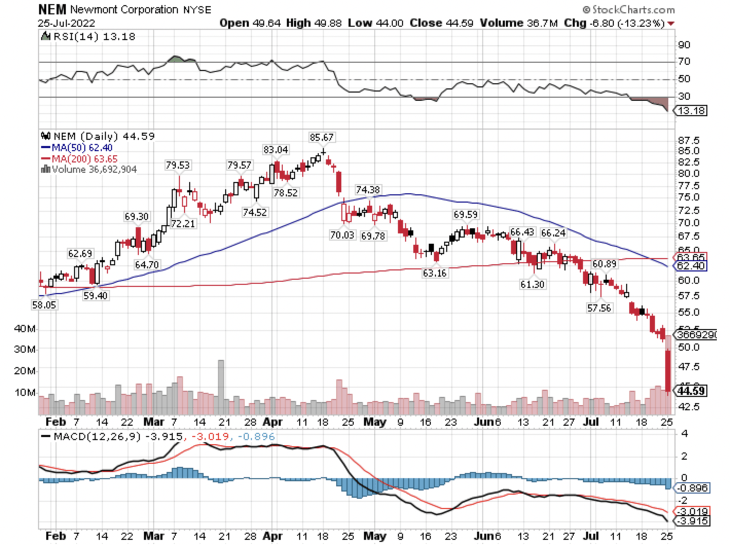
The decline yesterday brought Newmont’s year-to-date share price loss to a decline of 27.0%, which outpaced the previously mentioned 16.1% loss in the SPDR S&P 500 ETF.
NEM Year-To-Date Percentage Change (Author, StockCharts)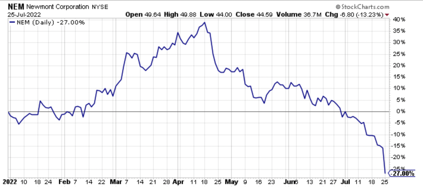
Similarly, shares of Barrick Gold (GOLD), which I have covered as an analyst and investor for over 20 years, with a nice overview in this May of 2018 public article, have struggled in 2022.
Barrick Gold shares fell in sympathy with Newmont yesterday, declining a more modest 2.7%.
GOLD Daily Price Action (Author, StockCharts)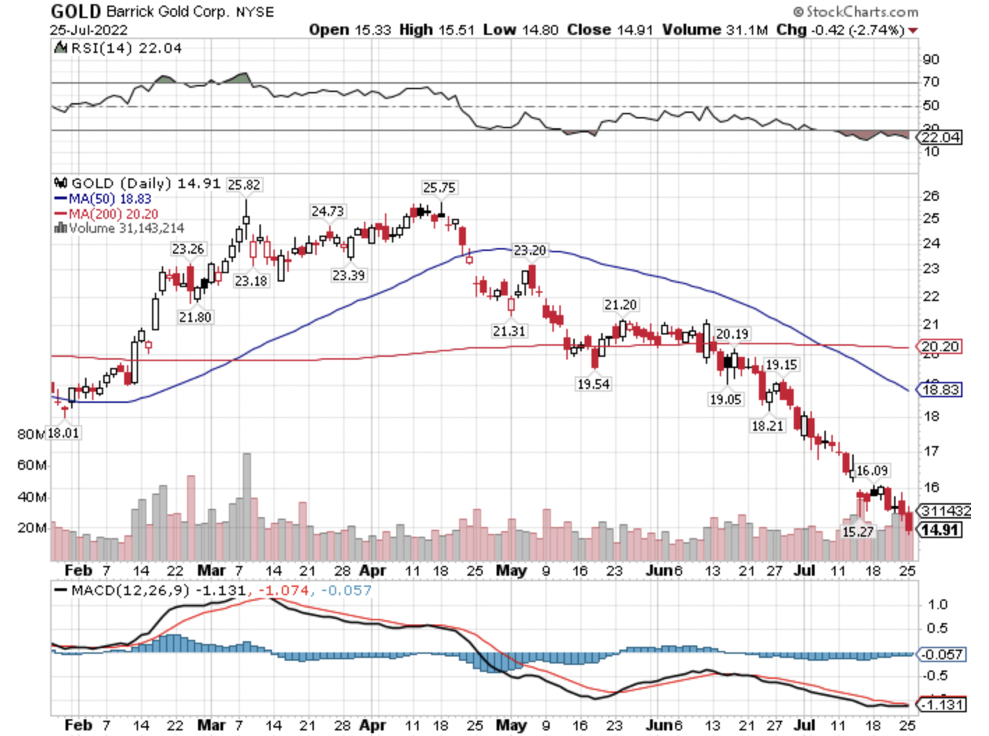
Year-to-date in 2022, Barrick shares are down 20.4%, again outpacing the decline in the SPDR S&P 500 ETF, and slightly ahead of the decline in Newmont shares.
GOLD Year-To-Date Percentage Change (Author, StockCharts)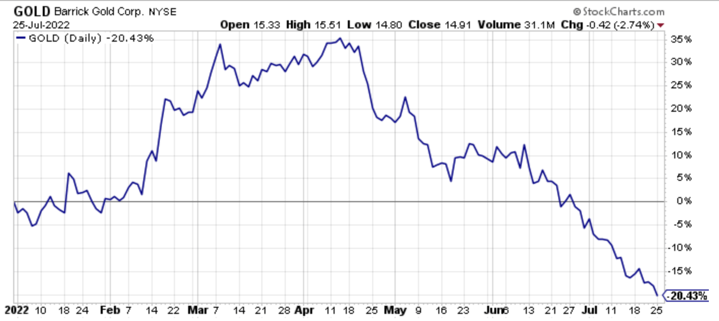
These price declines for two of the leading precious metals producers are significant, in an environment where inflation is at its highest levels in four decades, and many other supply-side driven inflationary plays, like energy equities, are surging, at least on a relative basis.
Notably, Freeport-McMorRan shares, after their recent swoon, are down even more in percentage terms in 2022, falling 31.4%.
FCX Year-To-Date Percentage Change (Author, StockCharts)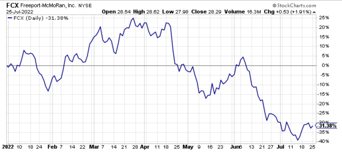
With the sharp decline in copper prices mentioned in the opening introduction, the copper-to-gold ratio has moved lower, which is typical behavior in an economic downturn.
Copper-To-Gold Ratio (Author, StockCharts)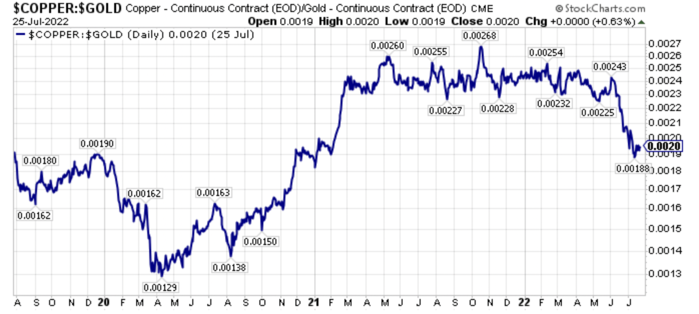
Could the copper-to-gold ratio move lower?
Yes, as the 2008 downturn and the recent pandemic of 2020 showed in the long-term price chart below.
Copper-To-Gold Long-Term (Author, StockCharts)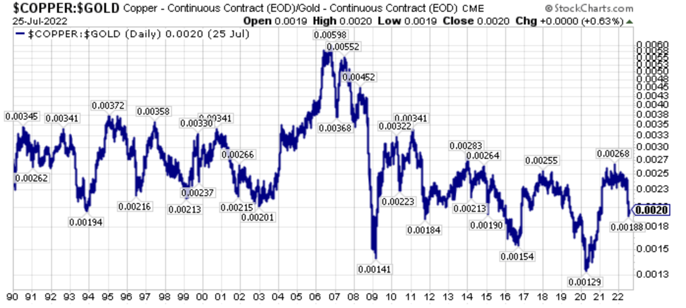
Having said this, I believe that one reason precious metals equities have not rallied substantially yet, is that they are pricing in a tighter for longer monetary policy.
After all, a stock like Barrick, which has no net debt, a dividend yield approaching 4% at these price levels, and the capability to generate a 10% plus free cash flow yield has become a high-quality, strong balance sheet producer that will anticipate a Fed pivot in monetary policy. First hand, I have witnessed precious metals stocks lead forthcoming rallies in 2002, early in 2009, and in late 2015 and early 2016. This was true in 2020 too, after a precious metals and precious metals equity panic. The fact that Barrick Gold and the high-quality precious metals producers have not turned yet is sending a message, in my opinion, that monetary policy could be sticky too.
Closing Thoughts: Fed Not Yet Ready To Loosen The Hangman’s Noose
We are getting closer to the Fed’s pivot point, as inflationary pressures are clearly peaking as this chart from my friend Robert P. Balan’s excellent Marketplace service earlier this month eloquently, and succinctly shows.
Leading Components Of Inflation Are Weakening (Robert P. Balan)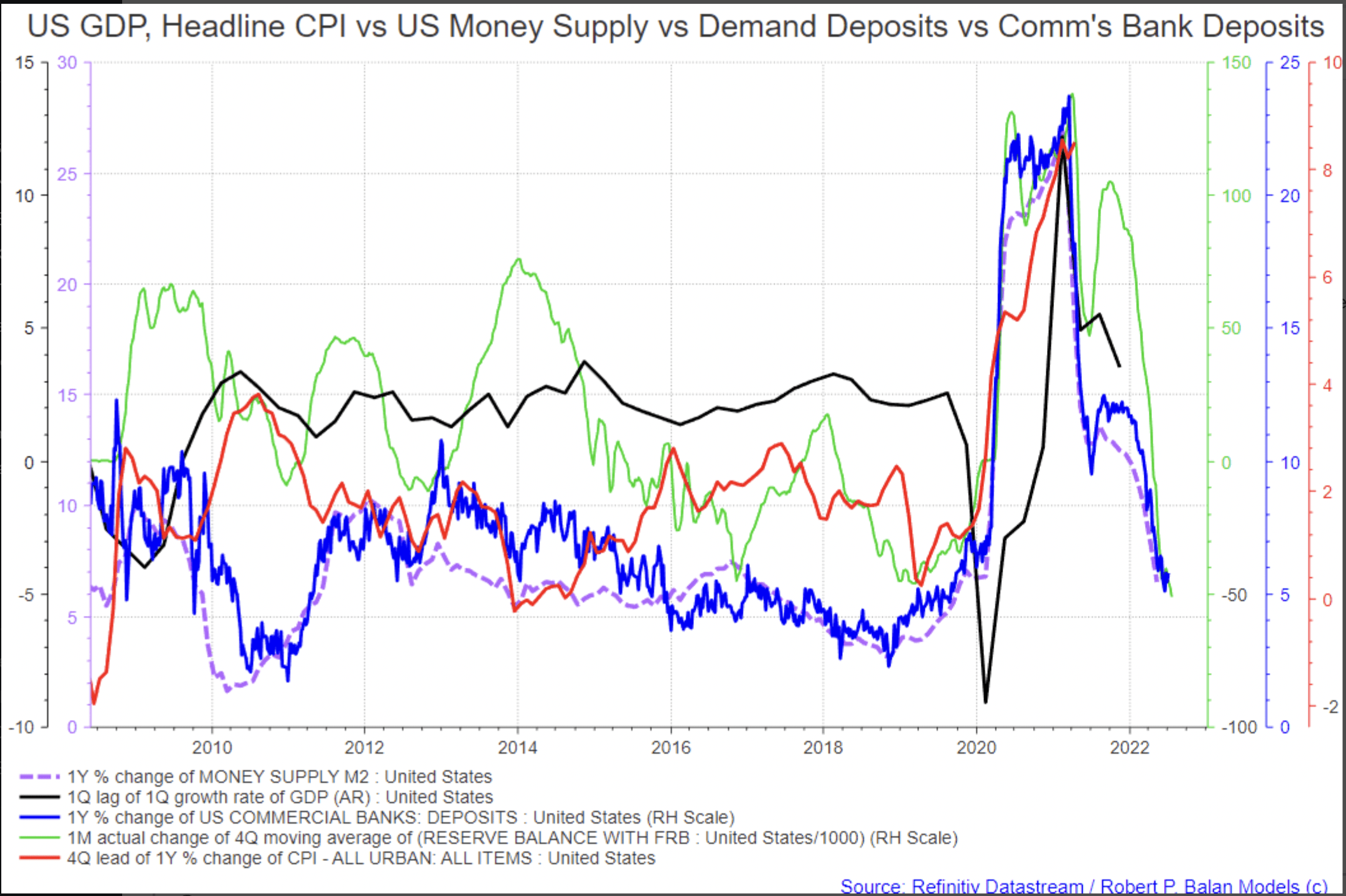
Circling back to longer-term copper prices reveals that we have had a long basing period after the run-up in the 2000-2008 bull market.
Copper Prices Over 30 Plus Years (Author, StockCharts)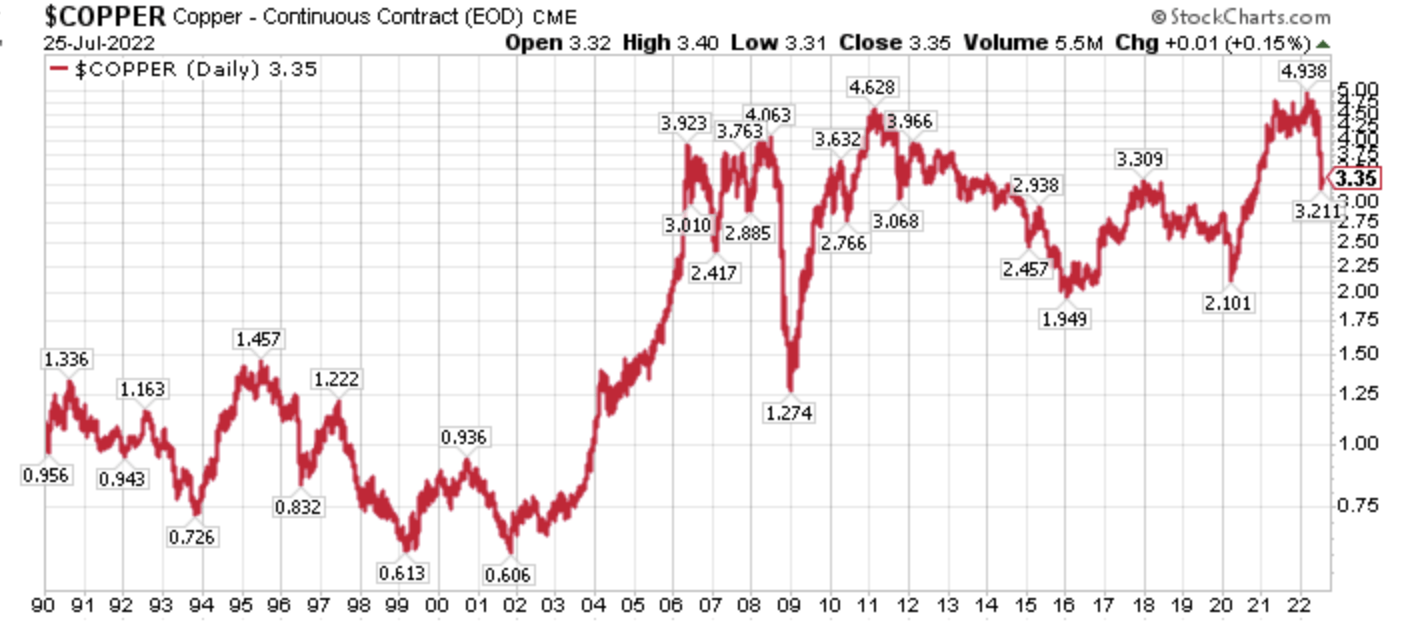
Looking at the chart of copper prices above, another important point can be distilled, which is that while this correction is painful, it is not 2008 all over again.
Investors, however, seem to believe that this is 2008 again, or at least a replay of 2009-2020 as they pile money into the previous bull market winners, specifically technology favorites while ignoring the now leading energy sectors, as this chart from Brax Research illustrates.
Investors Chase Previous Winners (Brax Research)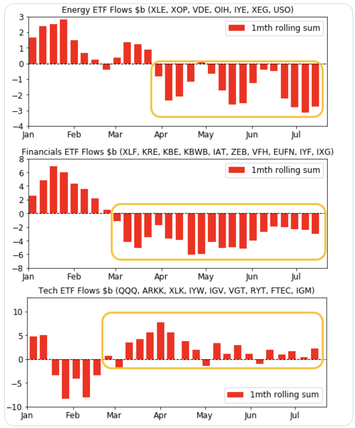
Building on this narrative further, economically sensitive and inflationary equities are leading the current bull market that sprung from the 2020 pandemic lows. In fact, as of this writing, the SPDR S&P Oil & Gas Exploration & Production ETF (XOP) is higher by 308.7% since March, 23rd, 2020, yet the recent correction has spurred outflows.
XOP, XLE, XME, QQQ, SPY, GDX Since March 23rd, 2020 (Author, StockCharts)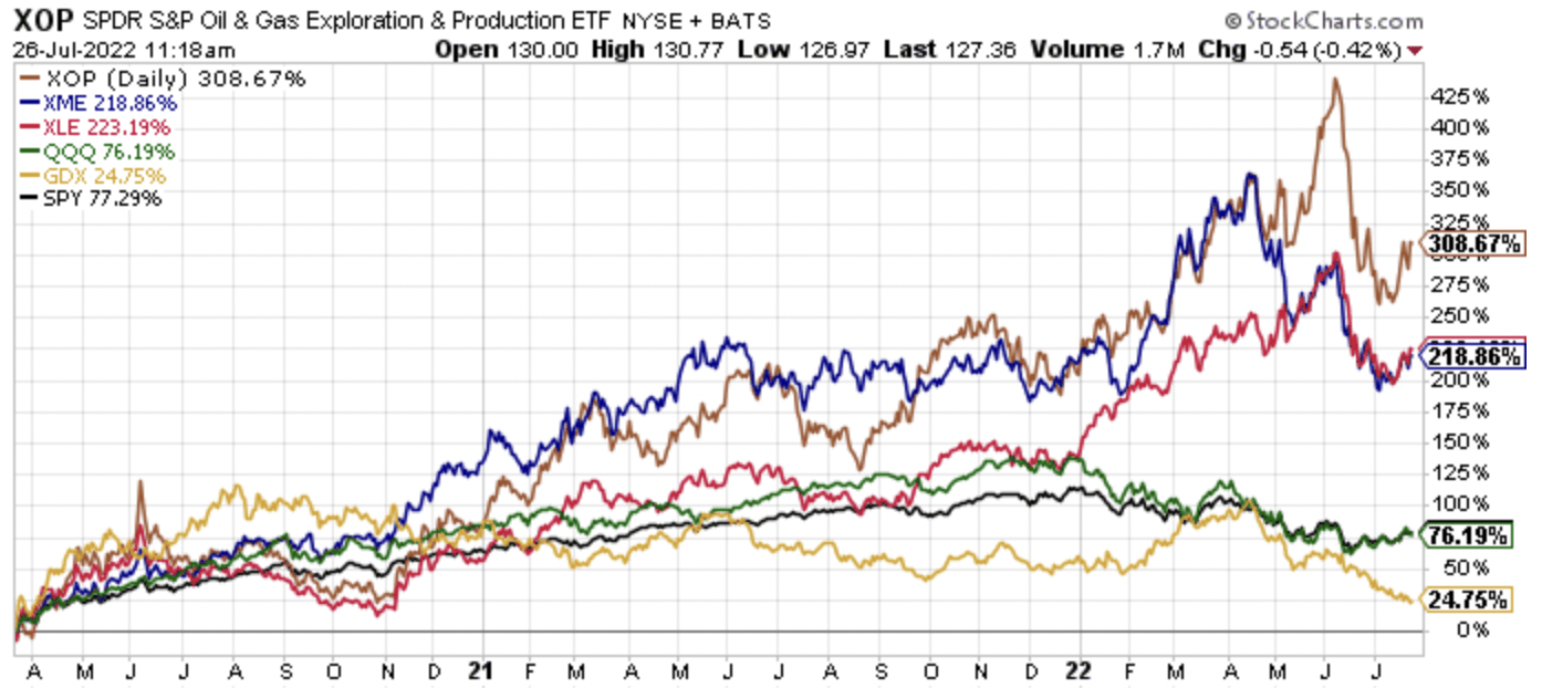
Similarly, the Energy Select Sector SPDR Fund (XLE) has risen 223.2% since March 23rd, 2020, and the SPDR S&P Metals and Mining ETF (XME) has risen 218.9%, far outpacing the 77.3% gain in SPY and the 76.2% gain in QQQ, yet XLE, and XME, in particular, have experienced outflows. Last, but not least, the VanEck Vectors Gold Miners ETF (GDX), after leading the initial rebound out of the March 2020 lows, is up a paltry 24.8% since the March 23rd, 2020 broader market lows.
Ironically, the precious metals complex may lead out of the current correction, once the Fed eases off its tightening path, or when other central banks catch up, causing the U.S. Dollar to lose some of its recent luster. The Fed, and other central banks can afford to be patient, though, as sticky inflation, strong lending, and strong wage growth, which are structurally inflationary, are all different from the pre-pandemic investment landscape. Market participants should keep an eye on this potential price action, meaning when precious metals and precious metals equities lead again, as it could foreshadow another round of price action that we have witnessed from 2020-2022, not another round of price action that we witnessed from 2009-2020.
Wrapping up, quietly at first, and now more rapidly as the capital rotation has broadened in scope, we have seen a passing of the baton of market leadership. Will there be ebbs and flows to this process? Unequivocally yes, meaning expect relative pullbacks as investors reposition, and investors of all stripes try to reorientate around the inflection point that is occurring real time.
At this juncture, most investors are simply just becoming aware of this leadership transition that has been taking place since the broader equity markets bottomed in March of 2020, though relative and absolute price action this year in 2022 has certainly opened more eyes. Recognizing this changing backdrop after years of study, including being too early, I have been pounding the table on the extremely out-of-favor commodity equities for several years now, and I still think we’re in the early innings of what will be a longer-term secular bull market, albeit with significant volatility. Personally, I think we will supersede the capital rotation that took place from growth-to-value during 2000-2007, which also coincided with the last secular commodity bull market which ran from 2000-2008.
Investors skittish of commodity equities should research cast aside financials as they also will benefit from a renewed steepening of the yield curve, which is probably forthcoming following the Fed pause and pivot, whenever it occurs. Understanding the bigger picture, then having an understanding of the bottoms-up fundamentals has been the key to outperformance, and this is a path that has not been easy with those participating confirming this reality. However, the road less taken is sometimes the better one, and I firmly believe that today, as traditional stocks, bonds, and real estate continue to offer very poor starting valuations, though they are better than at the start of this year where I opined it was better to be in cash for the next seven years, and very poor projected future real returns from today’s price levels. More specifically, the out-of-favor assets and asset classes, including commodities and commodity equities and out-of-favor specific securities, are where the historic opportunity has been, and that’s where it still stands, from my perspective.
Be the first to comment