

Modeled data for the Easy VIX algorithm began with May 2008. Until 2020 the performance in and following the Great Financial Crisis (“GFC”) was the best performing period in terms of loss avoidance and rebound performance. That has changed with the 2020 experience – at least so far. But there is a major difference . . . the 2008 experience reflects modeled data, while the 2020 experience reflects live trading in The Easy VIX marketplace service.
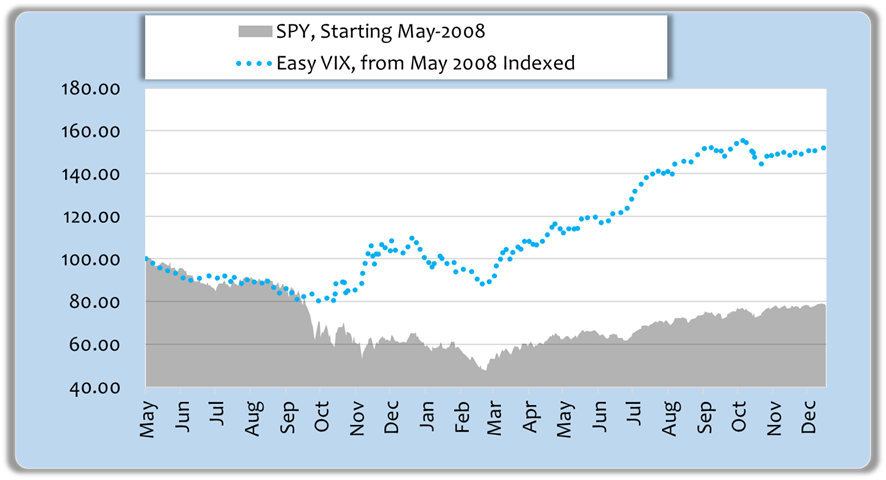
Let’s start with 2008 through year end 2009. The following graph shows SPY indexed to a 100 value in May 2008 along with the performance of the Easy VIX trading SPY, indexed to the same 100 value at the start.
Source: Michael Gettings; Data Sources: Fidelity, VIXCentral.com, CBOE
Until recently that was the best period for the algorithm. The superior performance resulted from the avoided losses in mid-to-late 2008 and then returns during the rebound were compounding on a much larger investment base. When you can avoid losing 3/8th of your investment balance, you then compound on a 60% larger base for the future. (1/.625=1.6)
But all the benefit was not derived from avoiding the big 2008 downturn. The following graph shows performance benchmarked to January 2009. The benefit is not as dramatic, but even ignoring the 2008 higher base, for that one year while the market rebounded, the Easy VIX portfolio finished up 37.1% rather than 19.9% for SPY, a 17.8% advantage.
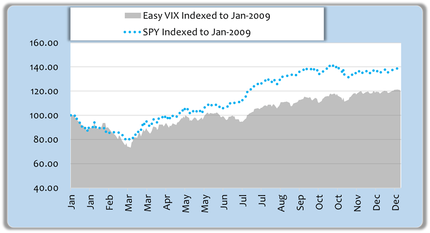
Source: Michael Gettings; Data Sources: Fidelity, VIXCentral.com, CBOE
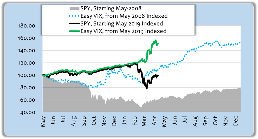
Earlier I alluded to the fact that live trading this year has outperformed that 2008 modeled performance. In the next graphic I overlay the 2019/’20 experience. I indexed both periods to May of 2008 and May 2019 respectively. My purpose is to compare the steepness of the current rebound to that of the GFC rebound, and then look for implications for the coming year.
Source: Michael Gettings; Data Sources: Fidelity, VIXCentral.com, CBOE
Looking at the chart superficially, it’s easy to think that the slope of the 2020 rebound is comparable to that of 2009, but look more carefully. The current SPY rebound should be compared to the grey raw-SPY numbers for early 2009, not the dotted blue line enhanced by the algorithm. This time it’s rising even more steeply than then; it appears to be starting more of a V-shaped bounce. You’ll also see that the 2020 Easy VIX green line is steeper than the 2009 Easy VIX dotted blue line.
Remember, Easy VIX live trading began in October 2019, so the first 5 months reflect the same algorithm methodology, but as modeled. Since October, buy and sell signals have been documented in the Easy VIX service. The divergence of the green Easy VIX line from the black raw-SPY line is even more dramatic than 2008 primarily because of how suddenly prices changed. Two things contributed to the performance difference.
- On February 21, 2019 Easy VIX sold SPY, and by March 23, 2019 SPY had dropped by 33%.
- At the time SPY was sold, IEF was bought (7-10 year treasury ETF), and IEF rallied dramatically as investors piled into the flight to safety.
So now, over a few short months since October, the algorithm has built a 51% greater investment base compared to simply holding SPY. I fully expect more volatility in months ahead, and that volatility translates to more opportunity to sidestep downturns and accumulate differentiated gains, just like 2008/2009.
The entire model history has been altered materially by the recent activity. With unmanaged SPY turning down while the algorithm’s returns turned up, the full 12-year graphic has gone hyperbolic. And better yet, the hyperbolic segment at the right reflects real trading, not just modeled results.
12 Year Comparison of Unmanaged SPY versus Easy VIX Algorithm
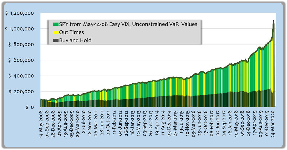 Source: Michael Gettings; Data Sources: Fidelity, VIXCentral.com, CBOE
Past performance, modeled or with live trading signals, never assures future results. Yet I’m excited about prospects for the coming year and beyond.
Commitments Under Volatility
I’ve found that members of the Easy VIX service represent a blend of aggressive investors and those in or near retirement. All of them value the loss-mitigation aspect of the algorithm, but some are more risk-averse than others. When volatility reaches the astounding levels of the recent COVID-19 experience, risk-averse members rightly become cautious about the size of their commitments to equity investments. To help gauge tolerable risk levels, value-at-risk metrics can be used to throttle commitments until volatility subsides.
This is a bit in the weeds, but it will hold value for some investors. If I measure volatility of daily portfolio changes using a lognormal distribution, and then calculate the next month’s potential losses for all but the worst 2% of outcomes (Value at Risk or “VaR”), I get an interesting contrast between the raw-SPY portfolio and the Easy-VIX-traded portfolio. Here is a graph comparing the two for the past year.
Value at Risk Comparisons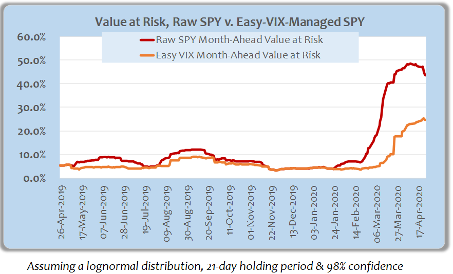
Source: Michael Gettings; Data Source: Fidelity
Recall that the Easy VIX algorithm is based on VIX futures which, in turn, are derivatives of the implied volatility of S&P options. Since the algorithm sells equities and buys IEF in response to worsening VIX futures metrics, it provides a natural risk-mitigation protocol. In other words it not only avoids losses, it also lowers effective risk exposures. As a consequence, if an investor wants to throttle equity commitments in a way that constrains loss exposure, using the Easy VIX net value at risk can facilitate approximately double the commitment in volatile markets. During stable markets, it makes little difference as risk metrics would typically permit normal allocations.
This is an important factor because the largest returns are earned in periods of high volatility like coming out of the GFC or the COVID-19 environment. The combination of earning enhanced returns while maintaining tolerable loss exposures is a powerful one. The following chart makes the concept tangible.
Comparative Holdings Reductions For Loss Tolerances (VaR-based)
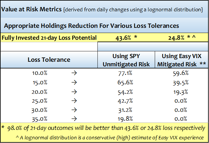
Source: Michael Gettings; Data Source: Fidelity
Taking one example from the chart, if an investor could tolerate a 20% loss next month, he/she would need to reduce holdings by 54% if holding SPY for the month, or alternatively follow the algorithm and reduce holdings by 19%.
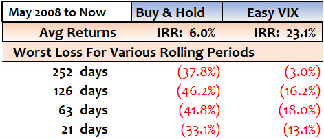
I’m running long, but I’ve got one more chart. Here are the 12-year average returns and worst losses by rolling periods for a buy-and-hold strategy versus the Easy VIX algorithm using SPY as the investment vehicle.
Comparison of Returns and Worst Loss for Rolling Periods
Source: Michael Gettings; Data Sources: Fidelity, VIXCentral.com, CBOE
I show this to make a point. While the 21-day loss in the VaR table would contemplate a material reduction in holdings to protect against 15% or 20% loss potential, the 12-year model history shows no loss of that magnitude even though full commitments were maintained. The worst experience was (13.1%). Either these are riskier times than anytime prior, or the assumption of a lognormal distribution overstates the risk for the algorithm. I checked SPY’s worst VaR for 2008 using this VaR methodology and it was worse at 51% versus 44% now, so I’m left to conclude that the assumed distribution is overstating the algorithm’s loss potential. Yet, as long as it’s conservative, I’ll use it with that knowledge.
So that’s it for now. I hope the article wasn’t too long, but hopefully I provided some food for thought.
Thanks for reading and more so for following, and a special thanks to the members who support The Easy VIX service. If you find these ideas interesting, please click the orange follow button at the top. Even better, if you’ve read a few of my articles and would like to get real-time signals and the advantage of chatting with other members, pull the trigger and do a free trial of The Easy VIX. I think you’ll find the profit potential is far greater than the cost of the service; just look at the big advantage of the February 21, 2020 sell signal alone.
Disclosure: I am/we are long SPXL. I wrote this article myself, and it expresses my own opinions. I am not receiving compensation for it (other than from Seeking Alpha). I have no business relationship with any company whose stock is mentioned in this article.
Additional disclosure: I trade a basket of ETFs and any tickers mentioned using the algorithm described as well as other analysis. The algorithm monitors daily performance and periodically recalibrates parameters and triggers in a stepwise sequence. New calibrations are applied prospectively only, and not to the historical period from which they were derived. The algorithm described and the discussions herein are intended to provide a perspective on the probability of outcomes based on historical modeled performance. While I track one or more reference portfolio(s), I make no recommendations as to specific investments. I reserve the right to make changes to the algorithm as I deem appropriate. Neither modeled performance nor past performance are any guarantee of future results.
Be the first to comment