

Andrii Yalanskyi/iStock via Getty Images
Deficit spending was off the charts during the Covid pandemic, and it’s finally beginning to come back to earth. Biden has indeed overseen the largest reduction in the federal deficit in history, but the deficit is still in la-la land despite having fallen precipitously. What’s saving the day is a massive surge in income tax revenues fueled by a recovering economy, significant inflation, and soaring stock prices.
Chart #1
Federal government finances (Author)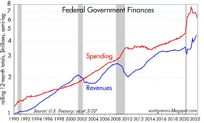
Chart #1 shows the 12-mo. rolling sum of federal spending and revenues, plotted on a log scale to emphasize rates of change (i.e., straight lines reflect a constant rate of growth). Revenues have surged and spending has dropped from outrageously high levels, but spending is still miles away from what formerly would have been termed “normal.”
Chart #2
Federal revenues (Author)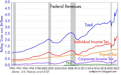
Chart #2 shows the composition of federal tax revenues. All sources of revenue have improved, but individual income taxes account for the lion’s share of improvement for the federal fisc. This in turn has been driven by a huge recovery in the number of people working, rising incomes, inflation, and surging stock prices (some of which translates into capital gains taxes).
Chart #3
Federal Budget Surplus/Deficit % of GDP (Author)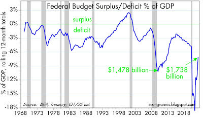
Chart #3 shows the federal budget surplus or deficit as a percent of nominal GDP, with dollar amounts shown for two periods. The deficit has shrunk dramatically in the past year or so, but it is still at levels (relative to GDP) that in prior years would have been considered unimaginably high.
Chart #4
Federal government finances % GDP (Author)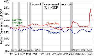
Chart #4 shows spending and revenues as a percent of GDP, in addition to the post-war average for each. Note that revenues have recovered to their post-war average but spending remains extraordinarily high.
Chart #5
Government Spending vs. Unemployment (Author)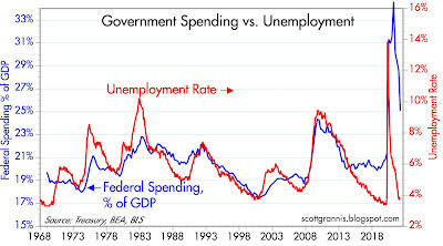
Chart #5 compares the unemployment rate to federal spending as a percent of GDP. It should be pretty clear that spending is largely driven by the unemployment rate, which is another way of saying that Congress attempts to alleviate the pain of recessions by spending lavishly. In the case of our recent Covid-lockdown recession, Congress effectively went berserk and over-spent ridiculously. Spending is still in la-la land, and by an order of magnitude which goes a long way to explaining why we have so much inflation. Why? Because the surge in spending was largely financed by money printing, as I have documented repeatedly with my charts of M2 growth.
The last thing this economy needs is more spending (affectionately referred to by politicians as “stimulus”). If there’s a silver lining to the Biden/Harris ‘incompetence cloud’, it’s that Congress is unlikely to be able to muster the votes to authorize yet another round of “stimulus.”
Long-time readers and supply-siders know that government spending never stimulates. It’s just a headwind for the economy because government is commandeering the economy’s resources and effectively wasting them. The government can never spend money as efficiently and as effectively as the private sector can.
Editor’s Note: The summary bullets for this article were chosen by Seeking Alpha editors.
Be the first to comment