

nanako75/iStock via Getty Images
The market has been in a pickle. It must crash PEs, or it must crash earnings. That, at any rate, is how I felt at the beginning of the year, when I wrote a series entitled “The Death of Irrational Exuberance“:
Over the three closest [time] horizons discussed…(2024, 2030, 2040), the broad stock market indices do not look promising. Tech looks least promising of all. Energy, the yang to tech’s yin, looks much more promising, although it could suffer significantly in any short-term or cyclical sell-off. Commodities, although largely unimpressive and likely ripe for a fall in the coming two years, have a fair chance of outperforming equities over the longer term, as do Treasuries.
Since then, we have seen a significant slowdown in markets, with the S&P 500 (NYSEARCA:SPY) down 20% and tech-heavy indices down even more. A recent mainstream bad-case scenario seems to suggest the risk of another “easy 20%” decline, putting the S&P 500 well below 3000.
But does another 20% decline matter? Would 30% matter? It is hard to see why it would, if one also accepted the mainstream position that stocks inevitably go up over “the long run“. If stocks are destined to go up in the long run, then what good is a 20% decline in the great scheme of things? It would be pointless for investors, especially retail investors who have no need of impressing or outperforming their peers, to try to pick up bear-stamped nickels in front of the bull-driven steamroller. It is really only in a world in which there is such a thing as long-term risk to the downside that such warnings matter.
We do not hear much about the prospect of -60% returns in the mainstream financial press nor the risk of multi-decade bear markets. But, those are the types of risk we may be facing, which is why I think that people like Jamie Dimon might be correct about the possibility of further significant declines in the indexes but also that a 20% decline is less important than what might follow such a decline.
To put this another way, in January of this year, if someone were warning of an outside risk of a 20% decline over the next six to nine months, this really would not matter much, if the markets were also expected to bounce right back. It really only matters if there is going to be another -20% in the six to nine months after that, at the end of which you are told there might be another -20% tacked on. And, then what about when you get to the end of the third tranche of 20% declines? Presumably, you might be told another -20% is possible. Better than asking yourself whether you can handle a 20% or 30% decline, you might want to ask yourself how many 20% declines you can stomach when trying to gauge your own risk tolerance.
Chart A. Markets can go through multiple 20% declines without ever touching bottom. (Author calculations)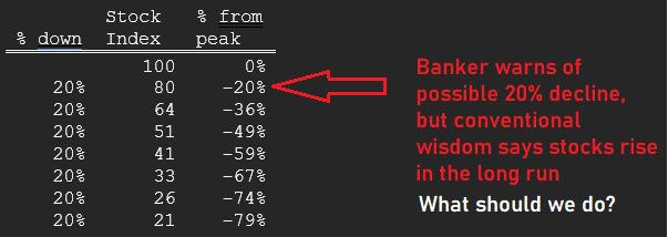
In this article, I want to revisit the long-term state of the market to show, quite simply, that, whatever the next short-term moves turn out to be (say, 20% in either direction), the long-term pressure remains to the downside. The -20% move year-to-date sounds like a lot, but this hardly puts a dent in the long-term imbalances propelling the current bear market. To understand these imbalances, it is necessary to understand the relationships between inflation, growth, yields, and PE ratios. Although I have written about these relationships a lot, I want to reiterate, for myself as well as readers, why this bear market has potential to fall much lower over the next months, years, and even decades.
Long-term imbalances
Many investors and analysts focus on “real interest rates”, the spread between an annual inflation rate and a given bond yield, when they try to pick apart markets, partly due to theoretical reasons and partly due to the observation that interest rates and (consumer) price inflation tend to track one another. Inflation was high in the 1970s, for example, and so were interest rates. In 2020, inflation was low, and so were interest rates.
This is probably not quite right, however. Long-term consumer inflation tends to track the earnings yield on stocks. Bond yields tend to track the earnings yield, too, but in a different fashion. As the Fed has raised the underlying level of inflation over the last century (as illustrated by the green light in the following chart), the long-term rate of inflation has tended to rise to a level just below that of the earnings yield (the blue line).
Chart B. Inflation tracks the earnings yield. (Robert Shiller; University of Michigan; St Louis Fed; World Bank; S&P Global)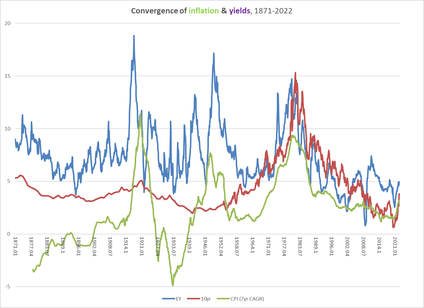
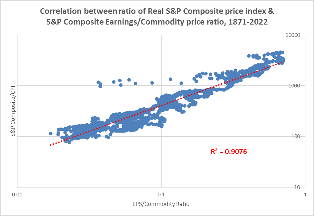
This is also found in the relationship between absolute real prices of primary commodities and the earnings yield, to the degree that the ratio of corporate earnings to primary commodity prices “predicts” the real prices of equities. (This was probably the root of what Keynes called “Gibson’s Paradox” and is illustrated in the following two charts).
Chart C. Real commodity prices track the earnings yield. (See “Inflation and Yields: The Evolution of Gibson’s Paradox and the Revolution in Prices”) Chart D. Real stock prices are highly correlated with the ratio of earnings to commodity prices. (Shiller; Warren & Pearson; University of Michigan; S&P Global; World Bank; St Louis Fed)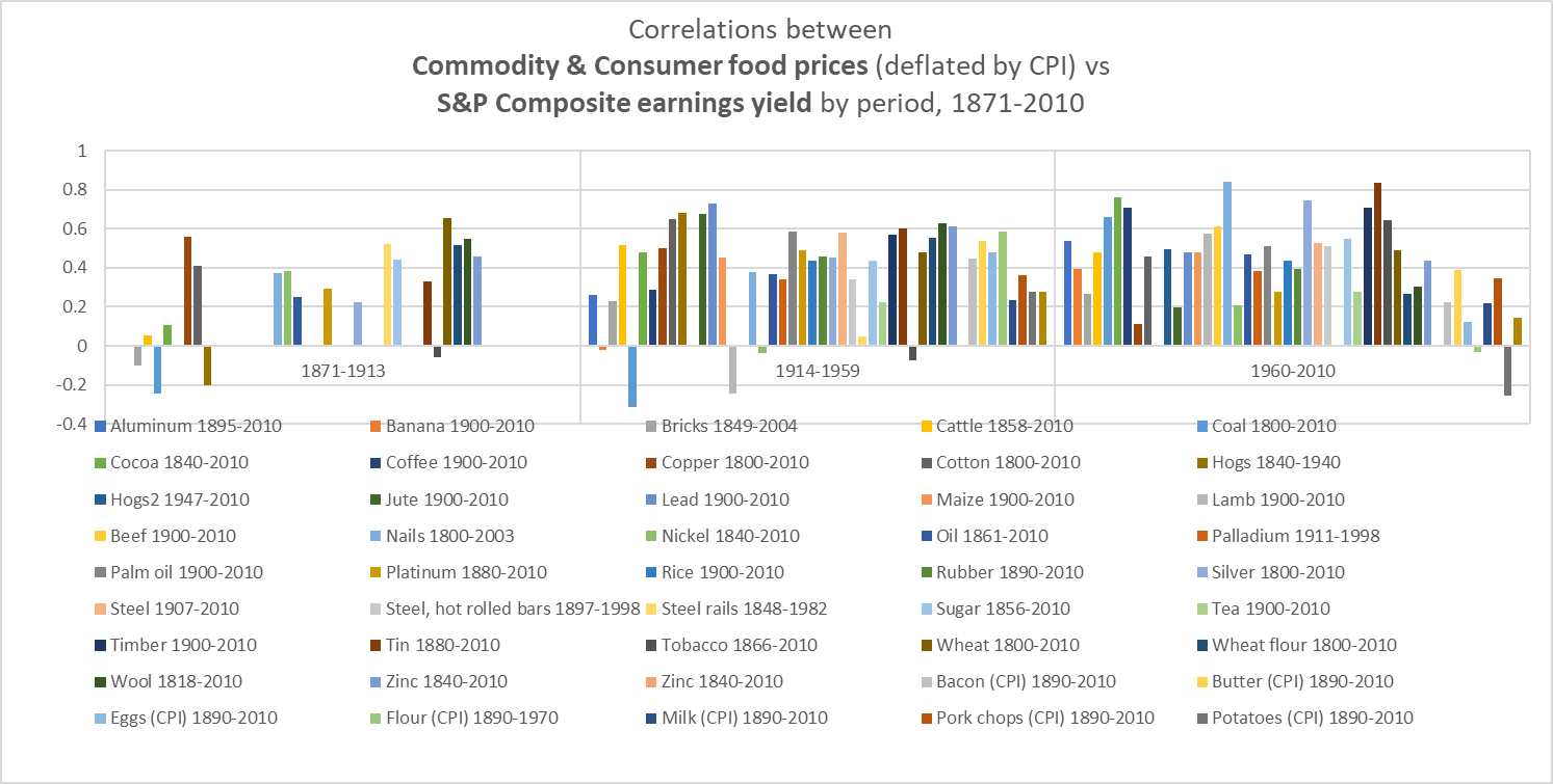
This sums up the problem that much market commentary is focused on right now: the Fed is expected to kill off inflation without seriously undermining the economy and corporate profits. That has only been partially accomplished thus far. Commodity prices have come down over the last six months, and earnings remain relatively high, but consumer inflation remains high, too. Historically speaking, all else being equal, it will be hard to reduce the level of inflation so long as stock prices fall faster than earnings, but quite significant deviations can build up over time.
The Earnings Yield
The point is that the earnings yield is at the center of the inflation universe. This is true for consumer inflation, commodity inflation, and, as we will see momentarily, even the rate of earnings growth.
Long-term consumer inflation has almost never broken above the level of the earnings yield, as you can see in Chart B above. Long-term commodity inflation occasionally breaks above the level of the earnings yield, but the tendency, historically, has been to remain just below it.
Chart E. Commodity inflation tracks the earnings yield. (Shiller; Warren & Pearson; St Louis Fed; World Bank; S&P Global)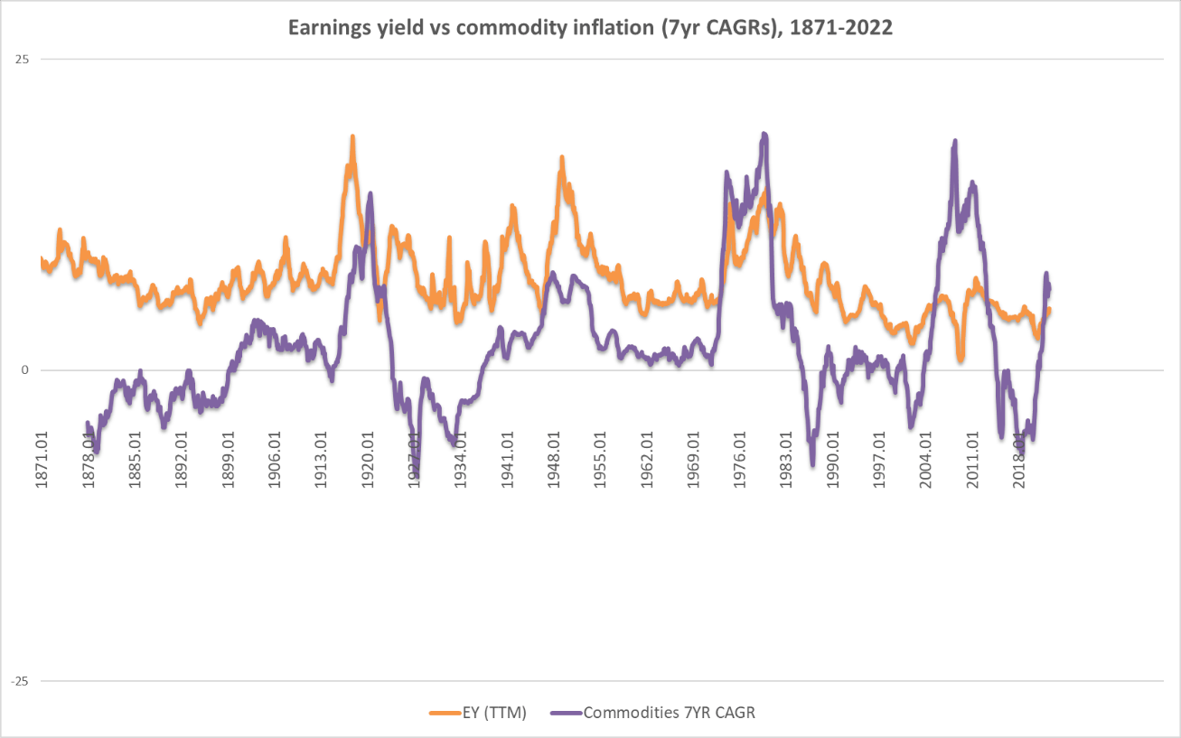
In three out of four of the commodity supercycles of the last 150 years (1910s, 1940s, 1970s, and 2000s), stocks endured “secular” bear markets, “because” commodity prices rose faster than the rate of earnings growth. Since the depth of the Depression in the early 1930s, earnings have grown at a near-constant rate, albeit with a few cyclical wrinkles thrown in.
Chart F. Earnings grow at a near-constant rate since Great Depression. (Shiller; S&P Global)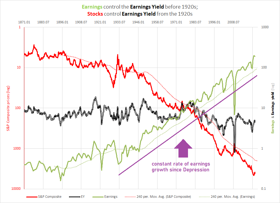
But, if you scratch beneath the surface a bit, you will find that long-term earnings growth also tends to track the earnings yield. As the earnings yield and commodity prices rose in the 1910s, 1940s, 1970s, and 2000s, earnings growth did, too. Earnings also tended to experience bursts of growth between these high-yield/high-inflation supercycles, such as the early 1900s, the 1920s, the late 1960s, the late 1990s, and the 2010s. These episodes marked the conclusions of often quite impressive stock market booms followed by “secular” bear markets. On most occasions, the earnings boom occurred during a commodity bust, and this “imbalance” was “resolved” through a decline in the rate of earnings growth (sometimes initially severe) being followed by a revival in the rate of consumer and commodity inflation.
Chart G. Earnings growth spikes during commodity booms and tech booms. (Shiller; S&P Global)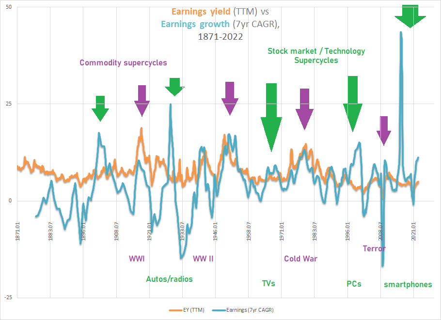
Prior to the late 1990s, the rise in the rate of growth of earnings above the level of the earnings yield was not frequent. Since that time, however, earnings growth has stuck quite close to the earnings yield’s level and remained above it for some time, which is almost mathematically inevitable as long as the earnings yield continues a long-term decline while earnings remain on a near-constant rate of structural growth.
Shiller’s PE10 Ratio & The PEG Ratio
This interaction between earnings growth, the earnings yield, and subsequent stock market returns has been described by Robert Shiller in more conventional fashion using his PE10, or Cyclically Adjusted P/E (CAPE), ratio, which takes an inflation-adjusted price and divides it by an inflation-adjusted ten-year average of earnings. Setting aside the inflation adjustments, the difference between Shiller’s PE10 ratio and the earnings yield we have been using thus far (calculated by trailing twelve-month earnings) is precisely the long-term rate of earnings growth: E/E10÷ E/P = P/E10. A long-term rate of earnings growth divided by the earnings yield produces Shiller’s PE10.
For whatever reason, historically, these spikes in earnings growth, sometimes caused by sudden surges in earnings and sometimes caused by base effects, occur near the conclusion of stock market booms. PE-expansion and earnings growth occur simultaneously, unlike during the secular bear markets where PEs contracted as earnings grew. These spikes in earnings above the level of the earnings yield also have tended to coincide with technology booms in the stock market. For more on some of these relationships, see Conjunction & Disruption: Technology, War, And Asset Prices.
Chart H. Mathematically, Shiller CAPE is a ratio of earnings growth and the earnings yield. (Shiller; S&P Global)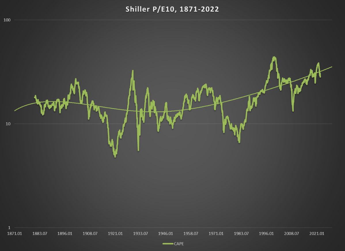
Another (somewhat) orthodox way of representing these relationships is in the form of the PEG ratio. In the typical expression of this concept, if the rate of future growth of earnings is expected to exceed the current PE ratio, then that asset is priced below “fair value”. If the rate of growth is expected to be below the PE ratio, then the asset is priced above fair value. As I showed in The Death Of Irrational Exuberance, this traditional formulation does not really fit the history of the S&P Composite. The S&P has almost never realized a PEG ratio of 1, yet it has nevertheless produced a very high rate of long-term returns, high enough to create a myth of stock markets always going up in the long run.
Using the 150-year history of the S&P Composite, I estimated the fair value boundary for the index (which has to be expressed in log terms and can be found in Part 4 of “The Death of Irrational Exuberance”), but one thing I found in that series is that the equilibrium level of the PEG ratio-or the ‘fair value’ level, if you prefer-had shifted. Over the last 30 years, returns have needed less earnings growth than they did in the previous 120 years. Notice, for example, in the following chart which shows the realized PEG ratio in purple (and on an inverted scale) and subsequent 10-year price returns in green, that the green line has been significantly and consistently above the purple line since the 1980s. We will look at this relationship again later using 7.5-year rates of return.
Chart I. The ratio between future earnings growth and current PE anticipates subsequent returns. (Shiller; S&P Global)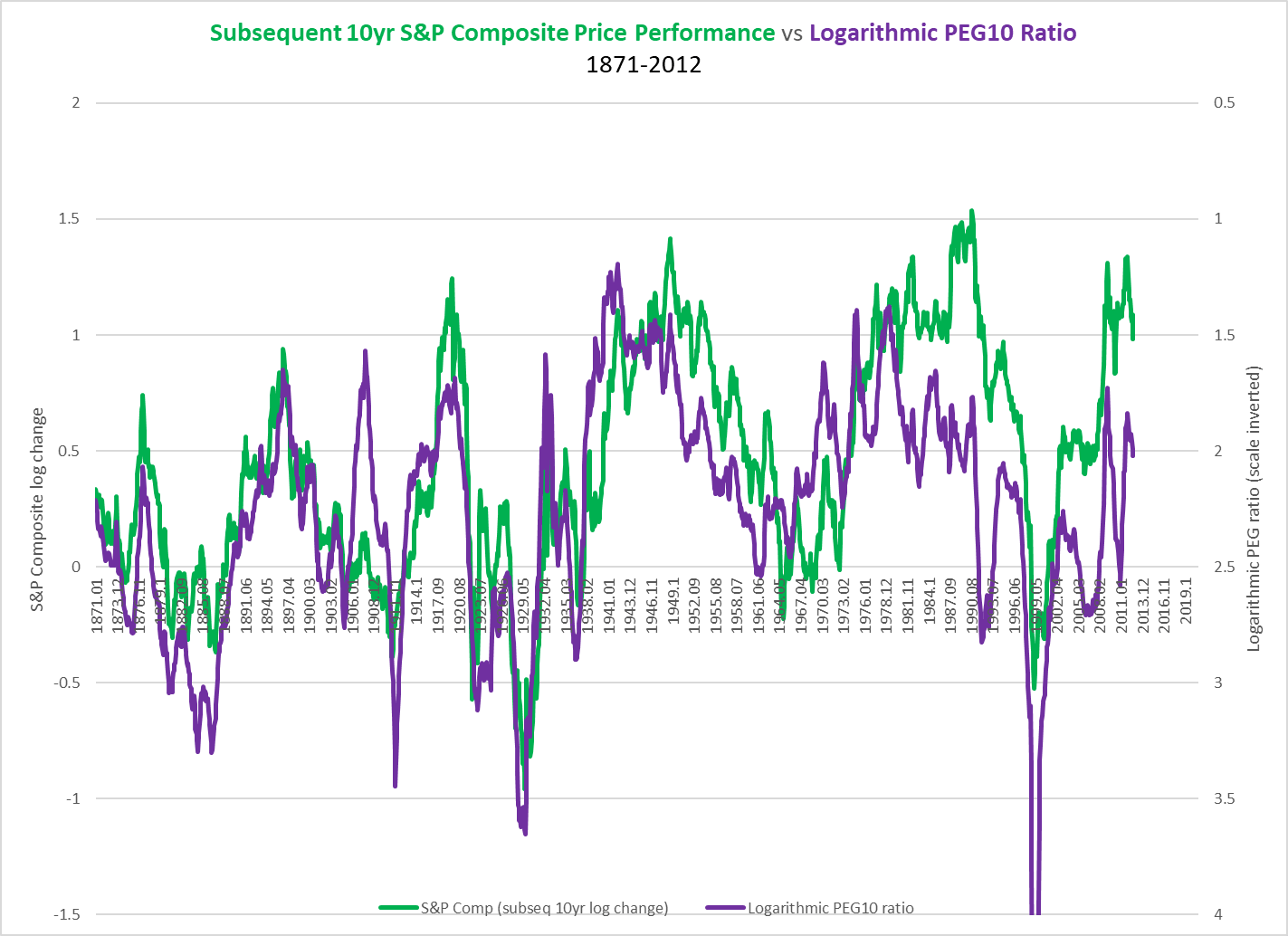
Where realized earnings have fallen below the level implied by the PE ratio (thus raising the level of the realized PEG ratio as in 1929 or 1999 on the chart above), the stock market still crashes, but stocks have tended not to fall as much as they used to.
My hunch, based on reasons discussed below, is that this is unsustainable and that these purple and green lines need to reconverge around the pre-1980s equilibrium level. That can only occur in three ways: significantly lower market returns, higher rates of earnings growth, or some combination of the two. Perhaps the most straightforward way of presenting this problem is the long-term averages of the CAPE ratio. The CAPE ratio has remained at historically unprecedented levels for decades.
Chart J. Shiller’s PE10 has risen as stocks have needed less earnings for high returns. (Shiller; S&P Global)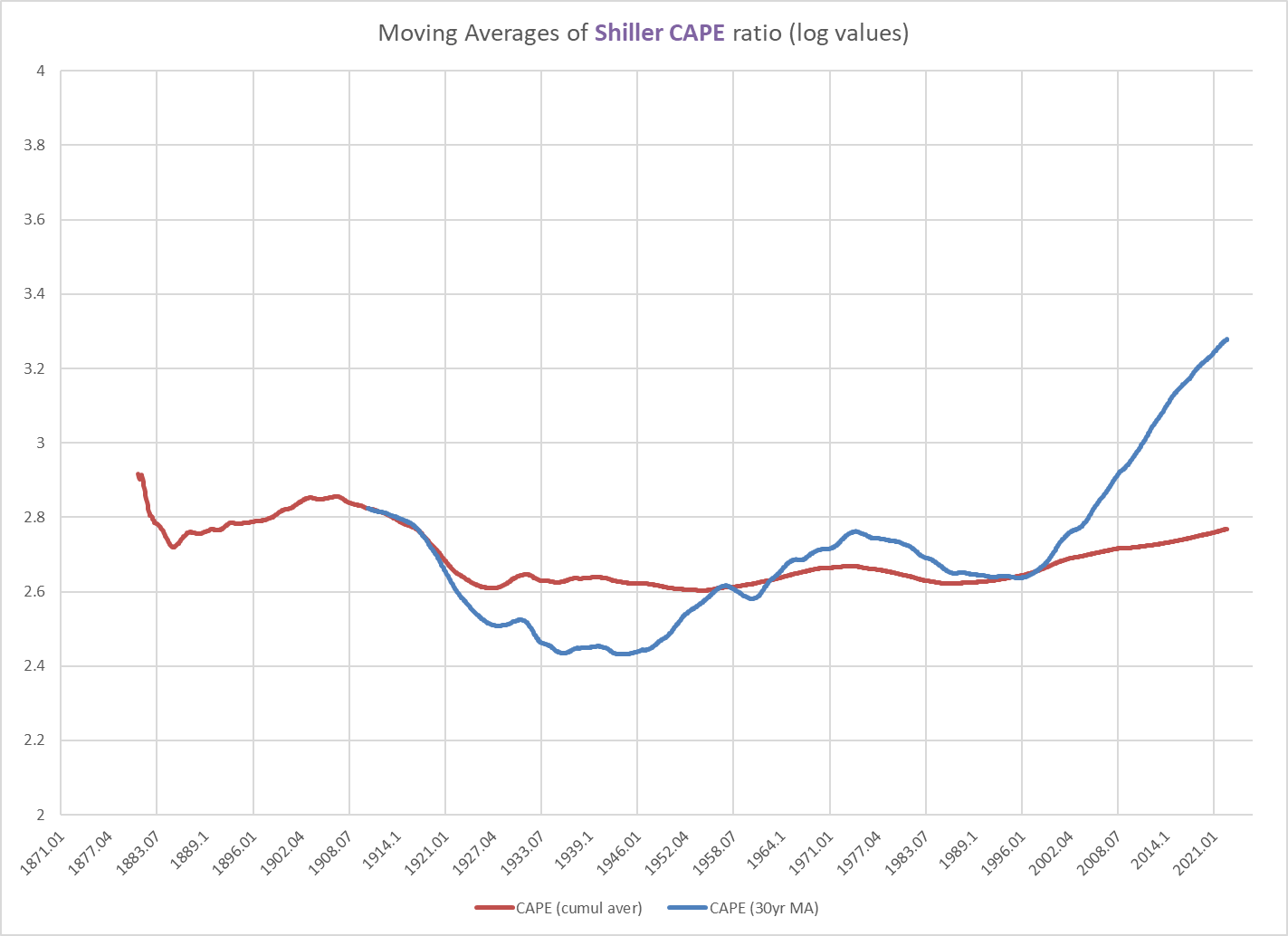
As I discussed in “Conjunction and Disruption”, this exceptionally high level in market returns relative to earnings is probably linked to unprecedented levels of globalization, high levels of geopolitical stability after the Cold War, and a clustered series of innovation supercycles. As we saw earlier, this was also linked to unusually low inflation, especially commodity inflation.
Structural Changes
Almost all of these tailwinds are now becoming headwinds, however. Globalization is unravelling not only under the pressure of the populists who have railed against it but under the pressure of globalists who have risked the foundations of global trade in order to suppress the power of states and politicians, foreign and domestic, who have challenged the direction of global order. In order to protect the current global order, for example, it is deemed necessary to block semiconductor technology being sent to China, to reshore or friendshore production, to block some players from the international financial system, and so forth. In the wake of the crushing of the democracy movement on Tiananmen Square over 30 years ago, the answer to such blatant illiberalism was more trade, not less. Today, the answer to illiberalism is to cut it off from the global system. Everybody is simply done with the post-Cold War order; nobody is pining to go back.
At the same time, we are at the saturation phase of the current innovation supercycle in smartphones that kicked off two decades ago. The product is fully mature and everybody in the world has one; and when a saturation phase is done, the intervening period between that and the onset of a new saturation phase of the next supercycle is usually one of lower stock market returns, greater global/ideological instability, more war, and, eventually, higher levels of consumer and commodity inflation. Again, the intertwining of war, technology, and markets over the last 200 years was outlined in detail in the “Conjunction and Disruption” series.
Chart K. Commodity prices have tracked global deaths in conflict since at least the Year 1800. (Max Roser; US Census, Historical Data, Chapter E; GYCPI; University of Michigan)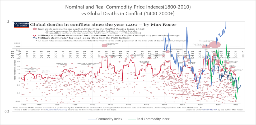
The attitudes in all of the major capitals of the Northern Hemisphere are now bent on confrontation with both domestic and international forces. Populists see a deracinated global capitalism dissolving national identities and values while technocratic elites see bigoted populists threatening a burgeoning cosmopolitan order. Look at Poland, for example. If a populist Russia is the West’s current bogeyman, Poland has been the most intense supporter of confronting Russia. At the same time, the populist Polish government is locked in battle with liberal forces domestically, which are backed by the main powerbrokers in Brussels and civilized opinion in the capitals of Western Europe. Friend and foe are spread out across the globe like black and white pieces in a game of go.
Global political disintegration resembles game of go. (Wikipedia)
The eagerness to reshore will almost inevitably result in overall lower levels of growth and/or higher prices. If this pressure was already building with the growing populist wave of the 2010s, Covid only accelerated it while sharpening the bitterness between East and West, city and country, populist and globalist, not to mention sharpening the sense of urgency to finish off the other side once and for all.
The long-term results are likely to be lower, more volatile growth with higher but more volatile inflation (that is, higher than it was in the 2010s).
Key indicators of bear markets
Let’s go back to the relationship between the historically realized PEG ratio and subsequent returns.
Chart L. Stock price returns have been higher than historical PEG ratio equilibrium would have predicted. (Shiller; S&P Global)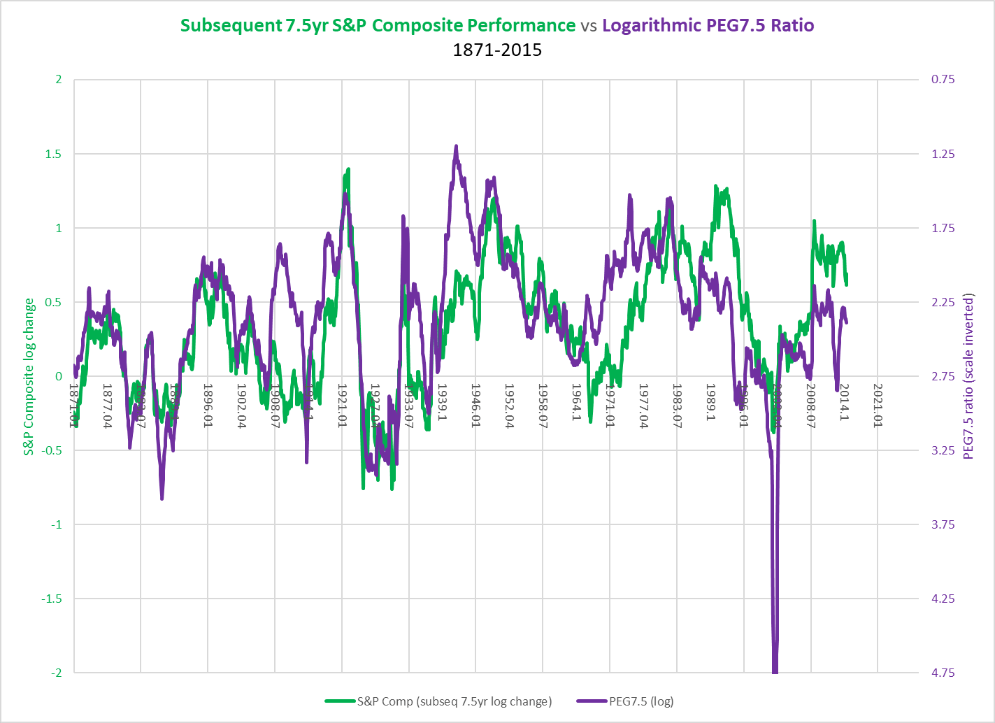
Earlier, we talked about the way the green line in the chart above has remained above the purple line since the ’80s and ’90s, emphasizing the way in which stocks have risen above the levels that historical levels of earnings growth would have suggested, and I argued that this was likely due to the nature of the post-Cold War world. Now, I want to shift the focus back to the anticipation of the periodic “secular” bear markets that have occurred over the last century.
These realized PEG ratios (the purple line in the chart above) show that where earnings have fallen below the level that PE ratios had suggested earnings growth should have been, stock prices have responded by crashing. When earnings growth has crashed, this-all else being equal-pushes up the PEG ratio, pulling the purple line down the chart. Historically, where the realized PEG ratio was >2.75, long-term price returns (in this case, 7.5 years) have tended to be <0. If inflation was hot, as it was in the 1910s and 1970s, the PEG ratio might not even have had to have risen to that 2.75 threshold to produce negative price returns.
By my estimates, based on historical extrapolations of the relationships between initial PE values, subsequent earnings growth, and price returns, earnings need to grow 5.25%-6.5% per year over the next decade simply for the market to remain in place (roughly 3850 on the S&P 500) by 2032. That is roughly the level at which earnings have grown since the Depression. In order for the market to move significantly higher over the next decade, earnings growth would likely have to be much higher.
How likely is that kind of earnings growth to materialize? Coming on the heels of an earnings boom, a tech boom, and an energy shock, this does not seem especially likely.
Returning to our earlier point about the relationship between earnings growth and the earnings yield, on many of the occasions in which long-term earnings growth rose above the earnings yield, the spread between the two collapsed over subsequent years, and this was matched by a significant decline in long-term stock market price returns (see the green line below). In other words, these losses were generated by extended earnings disappointments, often punctuated by cyclical earnings shocks. It is not just that high PEs have historically been unsustainable, it is the combination of high earnings growth and high PEs that has proven unsustainable and resulted in “secular” bear markets.
Chart M. Spikes in earnings relative to earnings yield has historically been followed by long-term bear markets. (Shiller; S&P Global)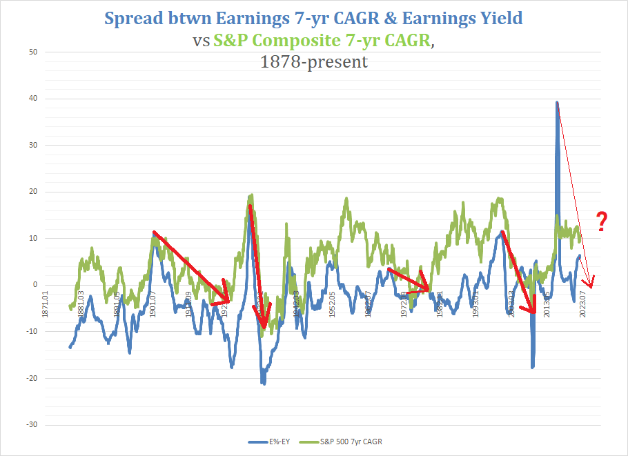
Some of the occasions in which earnings growth rose above the earnings yield were not followed by stock market collapses (such as the peak in the spread in 1952 in the chart above). It appears that, for whatever reason, the market is interested not only in the spread but in the correlation. When the correlation between growth and the yield has gone negative (see the following chart), there has tended to be a sharp correction in the growth-yield spread. The correction typically did not end until either the spread had been reduced to very low levels (as in the Depression of the 1930s) or the correlation had been restored to levels much closer to 1, as in the 1950s. Often these two conditions coincided, as in 2009.
Chart N. Breakdowns in correlation between earnings yield and long-term earnings growth only occur when earnings growth rises above the earnings yield. (Shiller; S&P Global)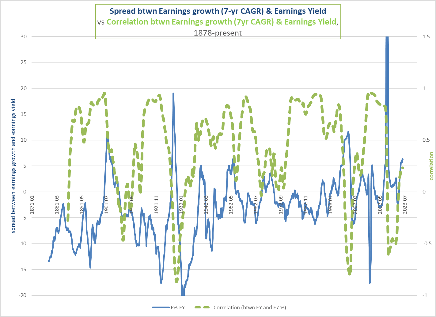
All of the Great Earnings Disappointments of the last hundred years were anticipated by this breakdown in the correlation between earnings growth and the earnings yield, and they all preceded “secular” bear markets.
Chart O. Breakdown in correlation between growth and yield historically followed by growth falling short of expectations. (Shiller; S&P Global)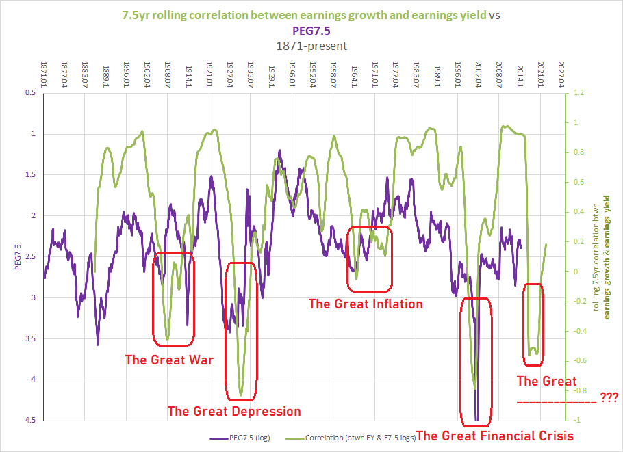
Recall that Shiller’s CAPE ratio is a much more orthodox description of this relationship between earnings growth and the earnings yield (E/E10÷E/P = P/E10). The chart below shows again that there is a tendency for the correlation between growth and yield to break down at the same time that CAPE is spiking.
Chart P. The CAPE has historically peaked when the correlation between earnings growth and the earnings yield has failed. (Shiller; S&P Global)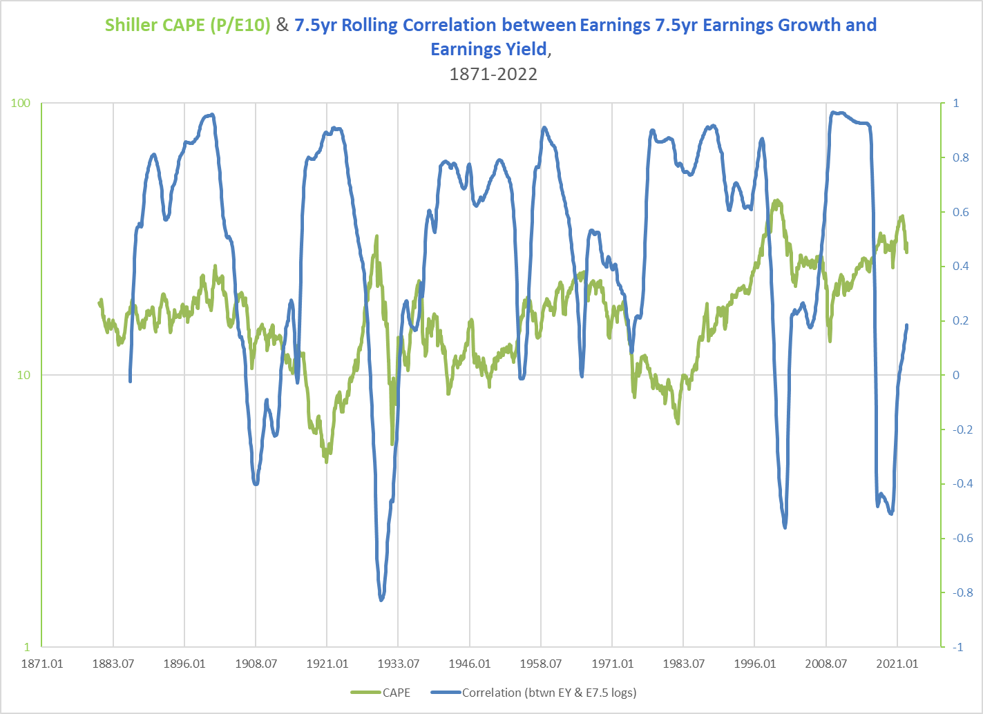
Earnings fall short of the levels of growth needed to sustain the prices at their valuation highs. And, as long-term earnings growth disappoints (caused often by sudden deep collapses), stock prices tend to follow. Thus, this interplay between rates of growth and levels seems to permit the anticipation of “secular” bear markets, as the chart below suggests.
Chart Q. The correlation between growth and yield appears to anticipate future returns. (Shiller; S&P Global)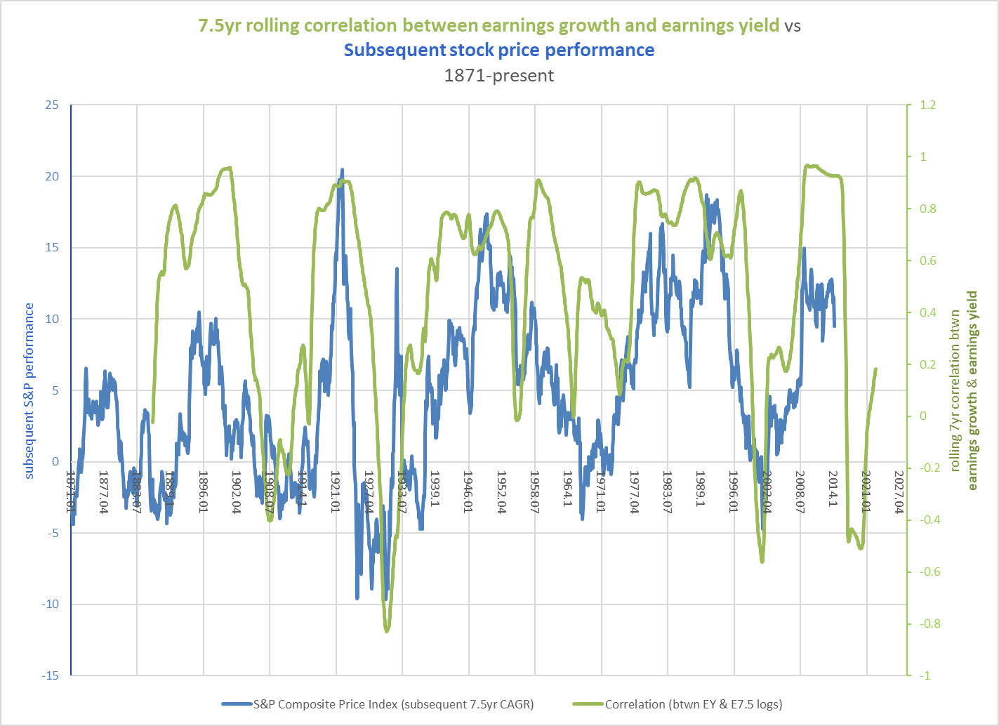
These “secular” bear markets often tend to see a decade or more of subdued returns. Where the correlation between growth and yield has approached 0, price returns have often been flat for 14 years or longer (as in 1929-1954).
Chart R. The correlation between growth and yield appears to anticipate returns well out into the future. (Shiller; S&P Global)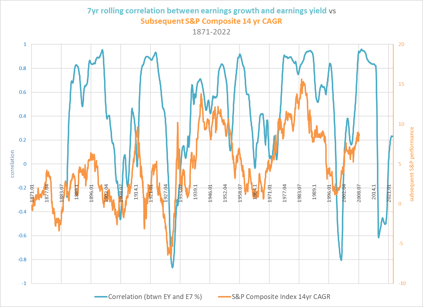
Earnings growth disappoints, but since the Depression, this has taken the form of sharp cyclical earnings recessions followed by a restoration of the 6% growth trend-a cyclical downturn followed by merely trend growth, which is well below the rates promised by the valuations that preceded the downturn. This results in an extended bear market. But, in the case of the interwar years of the 1920s and 1930s, earnings simply collapsed. There was a revival off of very deep lows from 1932, and this ultimately set the stage for the 6% growth rate that we are so accustomed to now, but earnings growth was so far below the levels promised by the 1929 PE ratio that markets never recovered, even though PEs remained quite high throughout much of the Depression.
By some strange coincidence, not only do these earnings booms coincide with rising PEs at the conclusion of “secular” bull markets, but these particular earnings booms tend to coincide with tech booms, as well. In “Conjunction and Disruption”, I attempted to illustrate that waves of transformative innovations proceed from stage to stage (from scientific discovery to innovation to standardization to diffusion) in nearly lockstep with developments in yields, inflation, and global stability. In the stock market, this is met typically with an incredible outperformance by tech stocks-normally tied in with that particular innovation supercycle-in the final years of a general PE expansion. The 1920s and 1990s were classic tech market booms that were followed by tech catastrophes. The Nasdaq 100 fell 50% (mathematically, that is three consecutive 20% declines) from its 2000 peak to its next cyclical peak in 2007, for example.
I covered the history of the relationships among sectors and between relative performances and overall market performance in A Primer On Long-Term Sector Rotations And Where We Are Now. The following chart is a simplified illustration of those relationships.
Chart S. “Secular” bull markets almost always end with tech booms and energy busts. (Fama-French)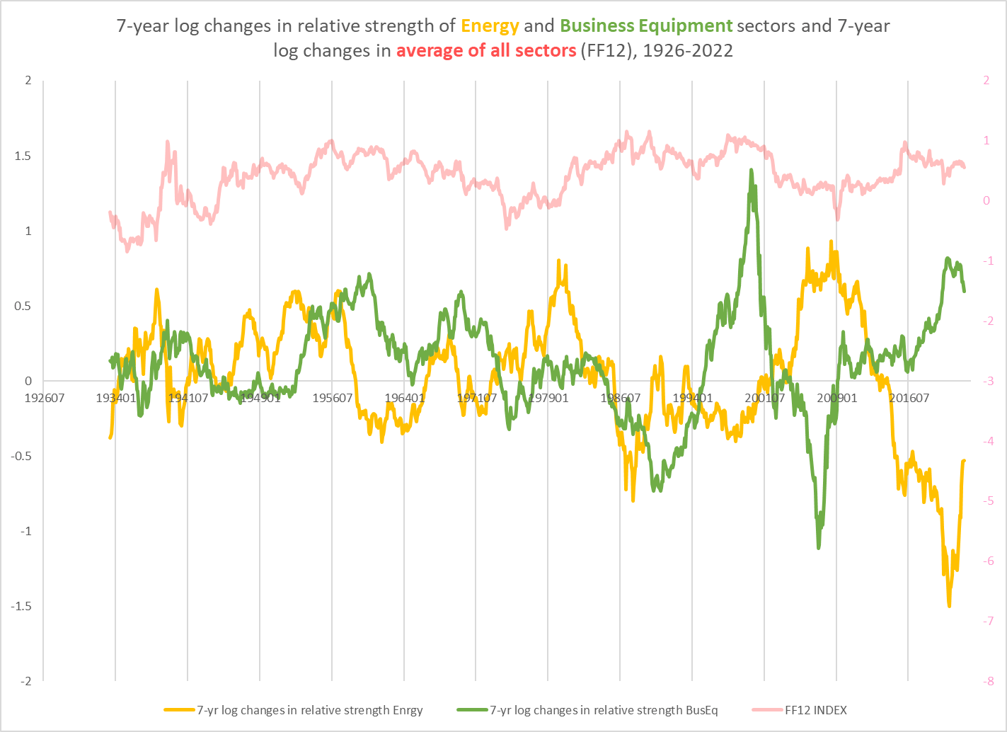
The green line shows the seven-year log change of the Business Equipment sector in the Fama-French 12 sector series relative to an average of all those sectors (which is closely correlated with the S&P Composite). In my piece earlier this year on the Information Technology sector ETF (XLK), I showed that this Business Equipment sector is the effective equivalent of the XLK (85% of the XLK stocks would be classified as Business Equipment stocks in the Fama-French system). Anywhere the green line is above the zero bound, that suggests that tech stocks were outperforming the market. The primary periods of outperformance were the 1950s-1960s, 1990s, and late 2010s-2020s.
The Fama-French series only go back to 1926, so it is impossible to use the data set to show seven-year rates of change in the 1920s, but the three years for which we have data (1926-1929) suggest a similar tech-stock boom (see the black line in the chart below).
Chart T. Tech booms have typically been followed by broad-based market busts (Fama-French)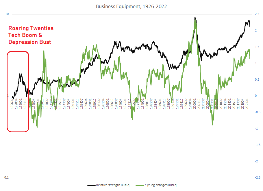
Academic studies have suggested a tech-stock boom of even greater magnitude in the 1920s (see “The Stock Market Boom and Crash of 1926-1933: An Applied Time Series Investigation“) led by auto- and radio-related companies like RCA and GM, the consumer tech giants of their generation. For the last century, tech-stock supercycles have coincided with S&P Composite earnings supercycles that diverged from the direction of the earnings yield. The green line in the chart above shows seven-year log changes in the Business Equipment index since the 1930s. Each of these episodes resulted in absolute, long-term negative price returns in this sector and of roughly similar magnitudes in the subsequent respective decades (i.e., the 1930s, 1970s, and 2000s). Note, too, that this was not necessarily because the booms were “Tulip Manias”. These booms were generally centered around the transformative technologies of that particular innovation supercycle.
What brought these tech-stock booms to a halt? It is not easy to say. What they seemed to have in common, apart from the characteristics described throughout this article, are transitions out of a long-term energy crash. At the point of a transition in the long-term momentum of energy prices, commodity prices-energy foremost among them-have tended to spike. This appears to trigger a crash, but even if energy prices crash alongside the market, they tend to revive more vigorously than the sectors (most notably tech) that dominated when energy was weak. There is also a simultaneous build-up of divergence in sectoral returns that really only appears to be released through a general downturn led by tech while energy, basic materials, and industrials remain relatively robust. The progression is fairly standard: a build-up in long-term sectoral dispersions with tech and energy on opposite ends; a cyclical energy/commodity spike; a general, cyclical crash in stocks led by tech; and then a general, cyclical revival led by energy, basic materials, and industrials.
Tech stocks typically do not really regain their footing until a second cyclical downturn that generally occurs seven to eight years after the market peak. I have illustrated this below using the relative performance of the Nasdaq 100 and the S&P 500 price indexes.
Chart U. Tech busts tend to last no less than two market cycles. (Stockcharts.com)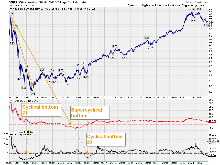
As I pointed out in January, all of the conditions that precede bear markets had been met except one-an inverted yield curve-and that no longer appears to be an obstacle. An exceptionally high PE ratio, an overabundance of profits, a tech market outperformance, imbalanced long-term performances across sectors generally, a cyclical energy resurgence that seems to be marking the beginning of a shift in the long-term momentum of the sector. Since then, the bear market, particularly in tech, has materialized. Not only that, but commodity prices have fallen: industrial metals cycles have historically been strongly correlated with earnings cycles, and we have seen both of them decelerate. Gold, as a leading indicator of the market cycle, has also pointed to continued disinflation in earnings and commodities going into 2024.
At the same time, global geopolitical stability has deteriorated sharply. As bad as the situation in Europe is, it appears that it will have to get worse-for at least one side, if not both-before it will get better. Asia is even more of a powder keg: China and its North Korean satellite are on a collision course with the West, Southeast Asia, and democratic East Asia over the South China Sea, Taiwanese self-determination, and the role of Japan in Asia. On a domestic level, most noticeable in Western democracies, there is a breakdown in basic consensuses about political and social values. Climate change, sexual mores and rights, reproductive rights, gender norms, immigration, familial norms, racial and ethnic tensions, free speech rights and norms, the legitimacy of elections, political violence, covid restrictions, and so forth. There are very large minorities on each side of these questions that believe that the answers are so clear and obvious that there is nothing worth debating and that the other side can therefore only be motivated by the most sinister of motives.
How bad can it get?
The chart below shows the price performances of the Fama-French 12 sectors, an equal-weighted average of those sectors (somewhat like the ETF EQL), and the S&P Composite relative to their respective 10-year highs (with the useful fiction that 1926-1929 highs were decadal highs for all of these factors).
Chart V. The last three “secular” bear markets saw -40% declines or more. (Fama-French; Shiller; S&P Global)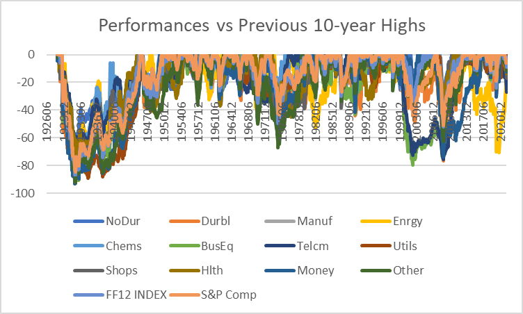
I have done the same for 30-year intervals in the next chart.
Chart W. Bear markets can last for a very long time. (Fama-French; Shiller; S&P Global)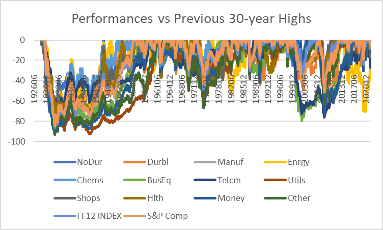
The only real difference between these two charts is that the second one shows how long the Great Depression was for equities, if measured from their Roaring Twenties’ peaks. We only have three “secular” bear markets to look at over the last century. In each of these cases, the S&P Composite fell by more than 40% from its previous peak. If we are in a fourth “secular” bear market, and this one adheres to that -40% (or more) pattern, then that would be rather close to three 20% declines according to the table shown at the beginning of the article. So, possibly two more 20% declines from current levels (3850 as I write this), and likely worse for tech-heavy indices.
But, things could get much worse. They could go much lower than -40% and they could remain there for decades. The presumption is that central banks would never allow that to happen again, and that does not seem unreasonable, but even the US going into inflationary overdrive for World War II did not return equities to their 1929 levels. One thing I have tried to show repeatedly in my writings is that we can be pretty sure that the Fed has driven prices up across every measure over the last century, but we do not know quite how. Inflation flows into different sectors of the economy, different asset classes, and different regions at different rates, but perhaps even more profound than its price effects are its impact on real economies, geographies, industries, technologies, companies, individuals, and patterns of behavior-not merely in terms of lump sum GDP measures but structurally and indefinitely. Inflation is not merely a price phenomenon; it is a real phenomenon.
That creates a paradox in which the Fed may (purely accidentally) create real socioeconomic phenomena that more than offset its ability to manage prices. Therefore, I do not think we can simply conclude that the Fed has limitless power to both create inflation and direct it to wherever it wants. If it did, it could solve the problem of income inequality all by itself. Nor would it be struggling to contain consumer inflation now. Nor would it have struggled to boost inflation before the pandemic. Nor would it have allowed the GFC to happen.
A future Nobel laureate told Milton Friedman famously, “Regarding the Great Depression. You’re right, we did it. We’re very sorry. But thanks to you, we won’t do it again.” That should not be read to mean that it is impossible for major indexes to be down 80% and to remain at ultra-low levels for very long periods.
Is there a pivot trade to be made?
A lot of hopes appear to be pinned on the Fed pivoting away from a hawkish trajectory and thus restoring the bull market of yesteryear. With Treasury yields stabilizing or even declining, this would presumably encourage a decline in the earnings yield (i.e., support PE expansion). History suggests, however, that trading the PE multiple is really only likely to work if the Fed fails to substantially reduce inflation. If inflation is broken, then we ought to trade earnings themselves, not an intuition of a connection between Treasury yields and PEs.
In the charts below, I have plotted the earnings yield alongside earnings and the S&P Composite price index relative to their respective 10-year peaks over the course of each of the “secular” bear markets of the last century (1930s, 1970s, and 2000s). Each of these bear markets had somewhat different inflation profiles. The 1930s were infamously deflationary, the 1970s infamously inflationary, and the 2000s reflationary. What I want to illustrate is that, in the high-inflation 1970s, with profits remaining rather swollen throughout, it was better to trade the ratio of stock prices to earnings (the yield or the PE, whichever you prefer) whereas in the 1930s and 2000s, you would have done better to track earnings themselves. Why might I say that after emphasizing the importance of the earnings yield for anticipating markets, and especially “secular” bear markets? Because we are shifting our focus here from long-term outcomes to short-term, cyclical outcomes. Market relationships change depending on scale.
Let’s start with the Depression of the 1930s. The earnings yield was very volatile but was essentially unchanged throughout the decade. Substantial spikes in the earnings yield were good entry points into the market, it is true, but the most parsimonious tactic would have simply been wait for earnings to bottom.
Chart X. In a deflationary market, trade earnings. (Shiller)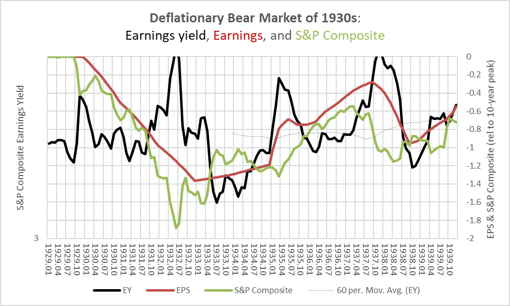
The 1970s were different in a number of ways. The cyclical bear markets of the period (1969-1970 and 1973-1974) led declines in earnings (and thus drove up the earnings yield initially), but by the time earnings had started to decline, much of the downside in stock prices had already been realized. Stocks tended to rally as earnings fell (thus driving down the earnings yield). This all occurred against the “secular” backdrop of rising yields and inflation. This chart uses the same scale as the 1930s chart, so perhaps the most salient feature of the 1970s is how mild the bear market was relative to what happened in the 1930s (at least in nominal terms).
Chart Y. In an inflationary market, trade the yield. (Shiller)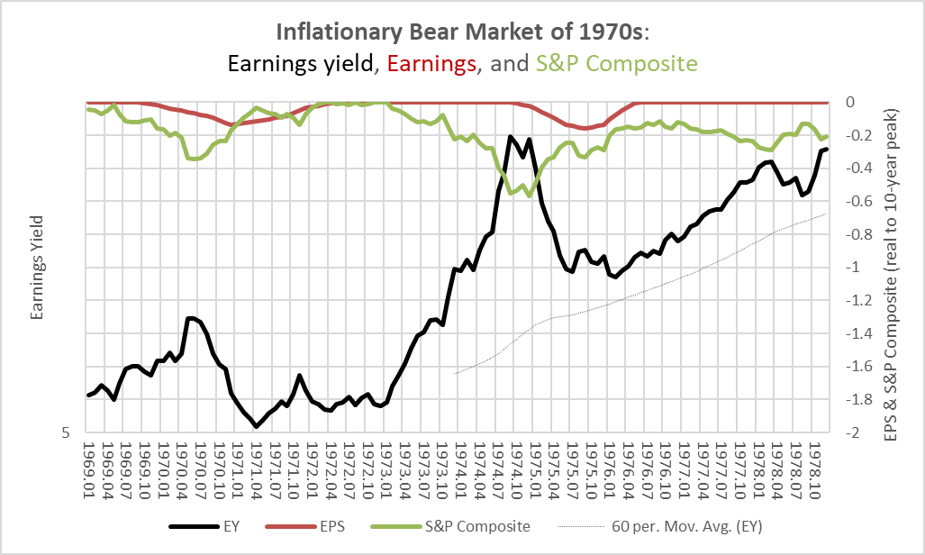
The high inflation damaged the ‘P’ end of the PE ratios while it supported the ‘E’ end. It is this 1970s scenario that the “pivot trade” seems to be anticipating. Again, the underlying assumption would seem to be that the Fed will fail to break the back of inflation. Not only that, but if you are anticipating such a failure and you are expecting the Fed to pivot, then you must think that the Fed is going to simply throw in the towel. Otherwise, you would expect the Fed to keep ratcheting up rates, further damaging PEs.
To repeat: in order for the pivot trade to work, you would most likely have to hold two assumptions simultaneously, that the Fed will fail to rein in inflation and it will stop trying. One way that might happen is if something “broke” in financial markets before the real economy was undermined. But, if that is the scenario the pivotists are waiting for, they are presumably anticipating something substantial enough that it would ripple throughout financial markets, including equities.
There is one other scenario, perhaps. The Fed and the markets could mistakenly conclude that inflation had been defeated, with the result that inflation would soon reignite, thus leaving the market within a high-inflation structure. Ultimately, however, this is a slight variation of the basic pivotist assumptions that the Fed will both fail to defeat inflation and will, one way or another, throw in the towel.
In the 2000s, the earnings yield was itself driven primarily by earnings themselves, while stocks kind of tagged along. Cyclical peaks in the earnings yield (such as in 2001 or 2006) were not good places to step into the market (quite the opposite). One would have done better to track earnings momentum.
Chart Z. In a reflationary market, trade earnings. (Shiller)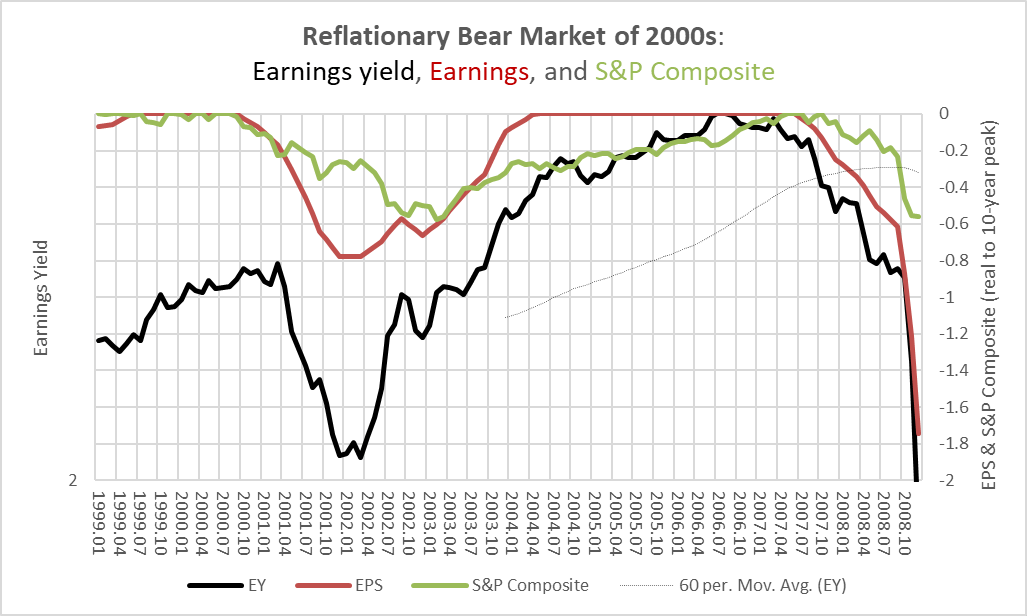
In terms of inflation, there are no clear parallels between today’s market and previous markets, but there are some similarities between the 2000s and today, particularly in the mixture of inflationary and deflationary fears. Commodity prices were exploding but they were exploding off of very low levels. Consumer inflation began heating up in the middle of the 2000s, but it was still nothing like the 1970s. Similarly, we have had very hot levels of commodity inflation but off of very low levels. Bonds have seen an unprecedented bear market, but this is off of exceptionally low yields. Telling someone in the 1970s that the worst bear market in Treasuries would occur when bond yields went to 4% probably would have seemed insane.
I think that a) there is a good chance we are still in this inflationary twilight zone wherein short-term oscillations appear to contradict long-term rates of change, b) that we are shifting away from that twilight zone in fits and starts, and c) we are essentially in the back half of a reflationary cycle within a that larger transition to higher yields and higher levels of background inflation. That suggests to me that the balance of risks lie towards a deflationary shock in earnings more akin to what happened in the 1930s and 2000s. That suggests that we should be focusing on the trajectory of earnings rather than the prospects of a pivot.
In the chart below, I show how these factors have performed over the course of the current decade. If we are indeed in a “secular” bear market, stocks have not come close to the lows they reached in previous bear markets. The mildest bear market (in nominal terms) in the 1970s saw much greater declines than we have experienced thus far. Similarly, earnings remain quite robust.
Chart AA. Thus far, the market has stuck with an inflationary script. (Shiller; S&P Global)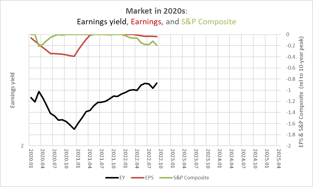
Thus, under any “secular” bear scenario, there is likely substantial more downside to go. If the relatively high inflation we have been experiencing this year persists, that is likely to limit the downside somewhat and a pivot trade might be expected to pay off. If inflation is going to break, bringing earnings down with it, then it would be better to wait for earnings to bottom than to anticipate a Fed reaction.
Most measures of consumer inflation are beginning to decline, especially the most cyclically problematic one, nondurable prices. But services inflation tends to lag, and it is hard to imagine that series breaking down until goods inflation comes down substantially more.
Chart AB. Cyclical inflation appears to be peaking. (St Louis Fed)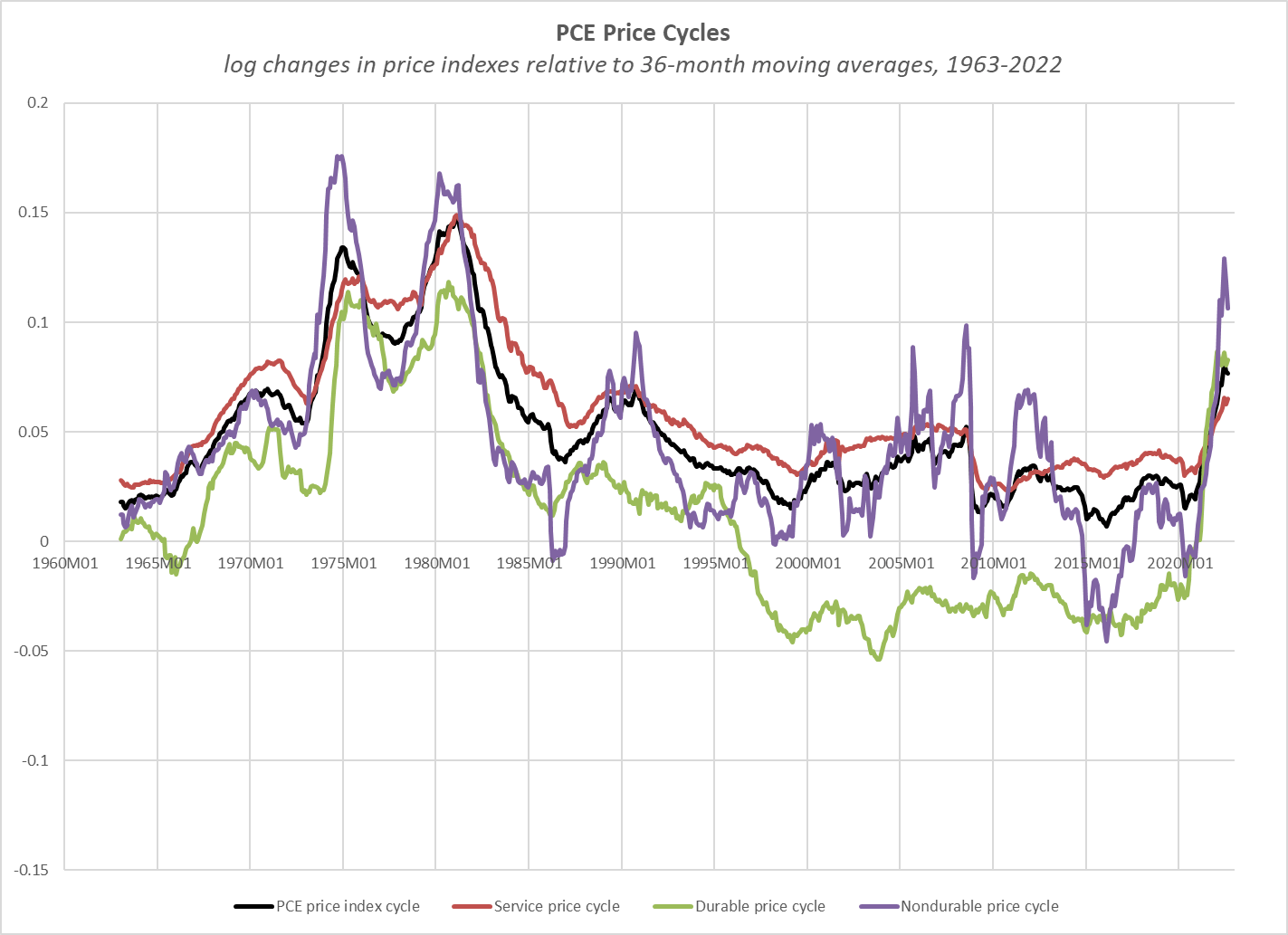
The long-term rates of change in prices, as shown in the following chart, tend to be a bit more reliable when trying to ascertain the underlying direction of inflation. From this perspective, there is not much reason to be enthusiastic about an imminent, decisive break in inflationary forces.
Chart AC. The inflation baseline appears to be higher than it used to be. (St Louis Fed)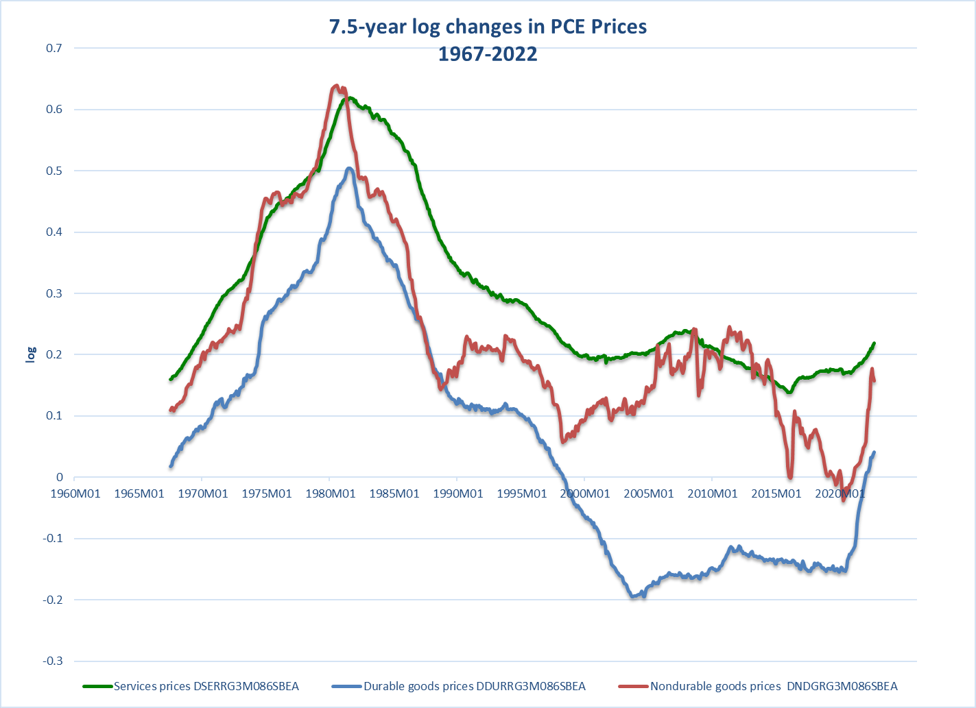
This points to elevated yields (relative to the extreme lows of the last decade) for some time to come.
The middle-of-the-road scenario, therefore, is likely a combination of higher yields (bond and equity) and downward pressure on inflation and earnings. There may be shocks along the way. Geopolitical surprises, for example, may produce inflationary shocks, but growth is likely to be prone to occasional negative shocks which will ultimately limit the potential of inflationary shocks. Stocks are likely to get squeezed in the process.
Conclusion
At the beginning of the year, I was expecting markets to be pulled down by a stronger bout of deflation. We have had some of that, insofar as commodities have sold off and earnings have started to slide. But, the primary factor, thus far, has tended to be rising bond and equity yields backed by sustained levels of consumer inflation.
Looking forward, however, it is not clear that these themes will remain dominant in coming quarters. If the underline level of inflation is likely to remain above its pre-Covid levels and this is likely to prevent yields from declining too much, we are still in the very early stages of what appears to be a “secular” bear market driven by the gaps between unsustainably high PEs and unsustainably high levels of growth. Under such circumstances, markets have historically seen much more substantial declines than we have seen thus far this year.
The chances are that things need to get a lot worse before they get better. At the beginning of the year, 2500 on the S&P 500 seemed a reasonable target to achieve within the next two years. That still seems to be the case, but with risks for something even worse, depending on what we see happen in the real economy.
Although goods production has sharply decelerated in the US, the service sector has been growing at a pace not seen in twenty years, as Americans engage in a consumption binge making up for the opportunities lost during the worst stages of the pandemic.
Chart AD. The most cyclical elements of the economy are decelerating, but the service economy is booming. (St Louis Fed)
This is likely unsustainable, too, as service-sector growth has been in a long-term state of decline.
Chart AE. The service sector is probably not far behind other sectors. (St Louis Fed)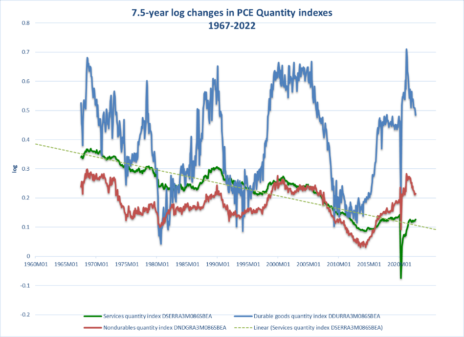
The central issue in this market, however, is that it is very unlikely that earnings are going to grow at a rate fast enough to do anything more than maintain current stock prices over the remainder of the decade, and there remains the risk that they will fall enough to pull prices well below that level. Playing “the pivot” is a way of gambling on the ability of the Fed or markets to maintain the unusual conditions of the last thirty years in which yields have been held low (or, PEs high) and earnings growth strong.
History suggests that one or both of these conditions are likely to break and that stocks have one or two more 20% declines left in this market before we should start to anticipate a real bottom in the market. Tech stocks remain most under threat, as the long-term sector rotation remains in play.
Under such conditions, it is probably best to remain short the market (using ETFs like BTAL or DWSH). An overall short position could be augmented with long positions in energy and Treasuries. Alternatively, one could simply hang out in cash until the worst of the current cyclical downturn is over.
Markets are likely to be depressed for the remainder of the decade. It is probably best to let those forces work their way through markets rather than trying to get ahead of them by anticipating a restoration of a bull market by the Fed.
Be the first to comment