

Pgiam/iStock via Getty Images
Sector BPI is a unique investing model that makes use of market volatility within the eleven (11) sectors that make up the U.S. Equities Market or more specifically, the S&P 500. To begin to understand how this investing model works, one needs a brief introduction to Point and Figure (PnF) graphing.
The following data table comes from a Bullish Percent Indicator spreadsheet set up to record information available from StockCharts. The right side of the table identifies if the sector is bullish or bearish at the end of the week. If there is an X in the right-hand column of the Point and Figure graph of a given sector, the sector is bullish. If there is an O in the right-hand column the sector is bearish. The X’s and O’s provide a broad and quick view of how the different sectors are performing. This data comes from PnF charts available from StockCharts.
The left side of the data table is more precise, and this information is what is used to manage a BPI Sector portfolio.
- If the percentage of bullish stocks, within a given sector, drops to 30% or below, a Buy signal is triggered. Check the dark green background.
- If the percentage of bullish stocks, within a given sector, rises to 70% or higher, a Sell signal is triggered, but we do not immediately sell as the sector ETF may rise higher. Instead of selling immediately, a Trailing Stop Loss Order of 3% is placed on the sector ETF in an effort to lock in profits. Sell signals are designated by the red background.
- If the sector jumps into the 80% over-bought zone a 2% TSLO is set. Should the percentage of bullish stocks move into the 90% over-bought zone, a 1% TSLO is set.
ITA Wealth Management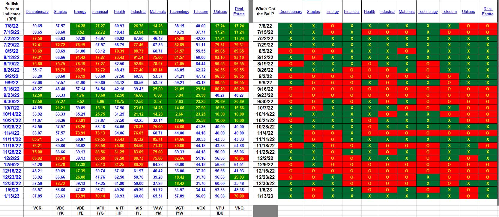
The BPI Sector Model has not been back-tested and it is nearly impossible to test considering the variabilities tied to the TSLO selling price.
If one uses the closing price the day after a buy signal is generated and a 3.0% TSLO is placed the day after a sell signal is triggered, here are a few examples of what to expect. These are example calculations of recent events.
- VCR lost 3%.
- VDE gained 3.3%
- VFH gained 11.9%
- VGT lost 4.3%
- VNQ gained 3.3%
Assuming the Trailing Stop Loss Orders took place as anticipated, the losses would not be greater than indicated and the gains are likely be higher as the price of the ETF is free to increase. Therefore, the above percentages are a worst-case scenario.
The following screenshot shows the current makeup of a portfolio that is currently being managed using the BPI Sector Model.
BPI Model Portfolio (ITA Wealth Management)
The green arrow points to the maximum percentage allocated to a given sector. The percentage is 70% of the annualized volatility using three years of historical data. The red arrow points to the percentage the security currently holds in the portfolio.
Both Internal Rate of Return and Jensen Performance Index data is tracked for all portfolios managed at ITA Wealth Management and that data is available free of charge.
While there is inadequate historical data to draw any meaningful conclusions, the Carson portfolio over the past year has an annualized Internal Rate of Return of +6.0% while the SPY ETF lost 14.9%. This data runs from 12/31/2021 through 1/13/2023.
The current Jensen Alpha or Jensen Performance Index is 10.1 where anything above zero is considered positive. A value of 10 is outstanding and likely not to be maintained.
If interested in the BPI Sector model, leave a comment for more information.
Be the first to comment