

Avalon_Studio/E+ via Getty Images
A Look Back
In preparation for these quarterly Investor Letters, we pull together thoughts and an outline. Almost left off the list of potential topics was anything to do with COVID. Fortunately, the pandemic seems more behind us than ahead. There will certainly be flare-ups of the virus as variants evolve; however, the variants seem milder, and our health care community has a better handle on patient treatments.
In the first quarter of this year, the chart below shows crude oil is up more than 27%, and as the month of March got underway, crude oil prices more than doubled from the same time a year earlier. Higher energy prices can be a headwind for economic growth, as discussed in more detail below. Commodity prices in general have been on the rise, and the CRB Commodity Index is the second-best performing asset class from those displayed on the chart. The other positive performance category is the Pure Value investment style, while the Pure Growth style is the worst performer.
Q1 2022 Total Return By Asset Class (Author)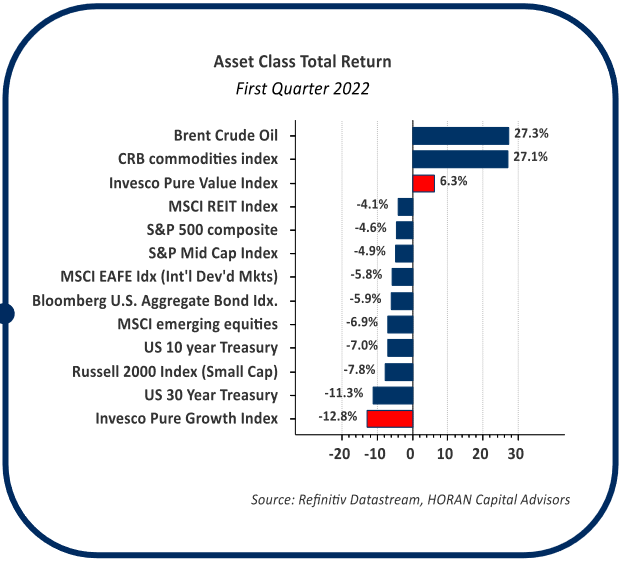
The broader equity categories turned in negative results in the first quarter. U.S. large-cap stocks, as measured by the S&P 500 Index, held up the best at a decline of 4.6%. Bonds performed worse than many of the equity categories, despite typically being viewed as a safe haven investment. The Bloomberg Aggregate Bond Index was down 5.9% and long-term U.S. Treasuries were down 11.3%. From a sector perspective, Energy and Utilities were the only positive sectors, up 39.0% and 4.8% respectively. Utilities seemed to benefit from investors reducing bond allocations and reallocating to “bond-like” stocks. Technology, Consumer Discretionary and Communication Services were the worst-performing sectors, in part due to the large representation of growth stocks in these sectors.
S&P 500 Total Return By Index Sector (Author)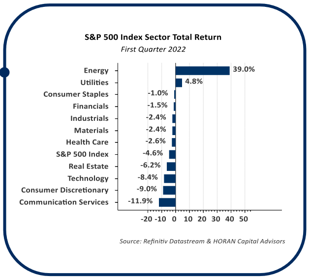
We Have Liftoff
The worst-kept secret in the quarter was the Federal Reserve embarking on a tighter monetary policy. The Fed increased the Fed Funds rate by 0.25%, or 25 basis points, in March. There are six remaining scheduled Federal Open MarketCommittee meetings this year and the Fed Funds’ futures market is expecting increases at each of those meetings. The Fed’s desire to lift interest rates is driven by the higher level of inflation which now seems to be systemic in the economy rather than transitory. A goal with higher interest rates is to slow the economy to reduce demand; hence, slowing the rate of growth in prices.
The effort to slow the economy and not tip it into a recession is not an easy task to accomplish, as history has shown. The shape of the yield curve gives investors clues about the likelihood of a recession. The yield curve is a line that shows interest rates on U.S. government bonds for given maturities. Typically, long–term interest rates are higher than short–term interest rates. However, as this Investor Letter is written, on April 1, 2022, short–term rates have a higher interest rate than long–term rates, as measured by the U.S. 2–Year Treasury and the 10–Year Treasury. When this occurs, it is said the yield curve is inverted, i.e., the 2–year yield becomes greater than the 10–year yield. The line on the top chart shows this relationship, 10–year yield minus 2–year yield, and the spread is now negative. The significance of an inverted yield curve is the fact every U.S recession in the past 60 years has been preceded by an inverted yield curve. According to a Federal Reserve Bank of San Francisco paper, “[an inverted yield curve] was always followed by an economic slowdown and, except for one time, by a recession.” The grey bars on the top chart represent recessions.
Yield Curve Spread (Author)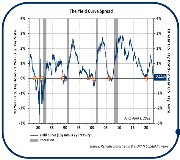
Although recessions tend to follow yield curve inversions, historically, the recession began from 6–24 months after an inversion. Additionally, as seen in the table below, according to Brian Levitt, Global Market Strategist at Invesco, “the median return of the S&P 500 Index from the date in each cycle when the yield curve inverts to the market peak is 19%.” In short, an investor does not need to panic, but be aware the market may continue to experience elevated volatility during the rate hiking cycle being pursued by the Federal Reserve.
Inverted Yield Curve Significance (Author)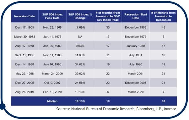
Consumers Feeling Inflation Impact
Complicating the Fed’s attempt to tame inflation are the higher prices occurring in the energy and food space. When the Bureau of Labor Statistics (BLS) reports monthly data for the Consumer Price Index (CPI), the report includes an inflation number that excludes food and energy inflation, commonly called Core CPI. One reason CPI is evaluated without food and energy prices is the sense the Fed does not have direct control over food and energy price levels. For example, the Fed obviously does not have control over weather’s impact on the food supply, and oil prices are influenced by the decisions of other oil-producing countries. Creating an inflation category that excludes food and energy makes sense; however, food and energy account for a large portion of the consumer’s budget so should not be dismissed entirely.
In a recent survey, Rasmussen Reports surveyed participants about the impact rising gasoline prices are having on spending in other categories. As the top chart shows, 64% of consumers stated they are spending less money on other things this year because of rising gasoline prices. In other words, the higher gas prices are resulting in demand destruction in other areas of the economy. With consumers accounting for 70% of economic activity, this effect likely leads to a slowing of economic activity.
Higher Gas Prices Resulting In Demand Destruction In Other Areas (Author)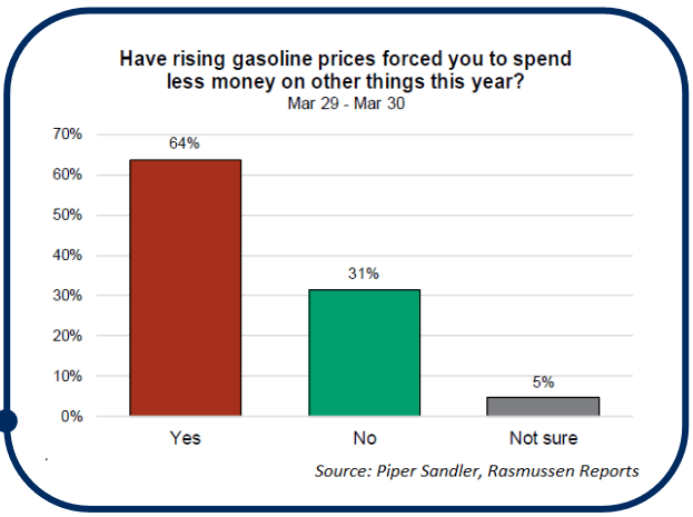
Consumers have also felt the squeeze in the housing market, which is an area the Fed does have influence over. It is no secret real estate has seen dramatic price increases in the last two years. Low housing inventory and record low mortgage rates fueled price increases. As the Fed increases interest rates and allows mortgage-backed securities to runoff its balance sheet, mortgage rates likely increase, making it more expensive to finance a home purchase. Although not the only factor driving prices, higher mortgage rates could impact the prices consumers will be willing to pay for new homes. The bottom chart illustrates the relationship between housing prices and mortgage rates.
Housing Prices And Mortgage Rates Relationship (Author)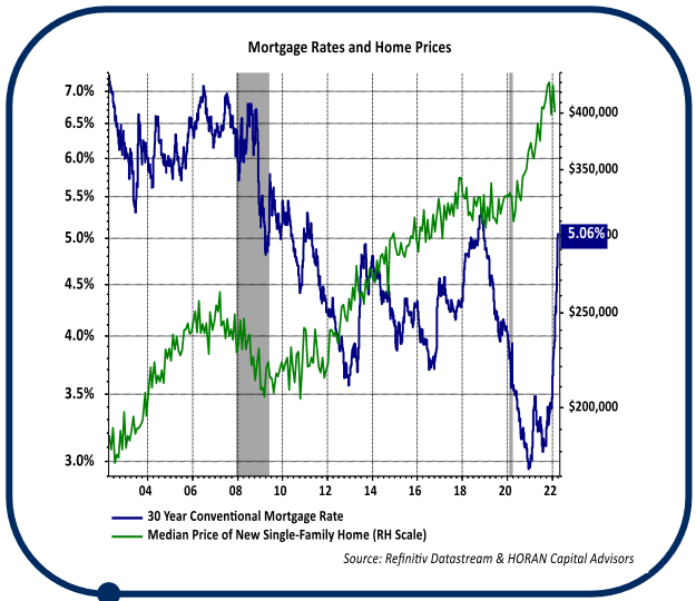
Employment Market
The labor market continues to favor those seeking employment. Beginning February 2010, the economy added 22.7 million jobs up to the start of the COVID pandemic in February 2020. Due to the pandemic shutdown, 22.4 million jobs were lost in the brief period from February to April 2020. The recent March 2022 nonfarm payroll report shows 21.1 million jobs have been added back to the economy from April 2020 to March 2022. Despite this near-full recovery in jobs from the pandemic low, there remain a record 11.2 million job openings. This compares to just 5.9 million unemployed individuals. Consequently, those seeking employment would seem to have the upper hand.
Due to the tight labor market, wages have been moving higher. Wage growth is driven not only by a favorable labor market for job seekers, but from higher inflation too. Typically, wage growth tends to trail inflation, as was the case in the 1970s/1980s high inflation period. The near chart shows this effect. Some strategists believe this higher wage growth was beneficial to employees, and partly this is true. However, the impact on real wages is negative, and therefore consumer spending power is reduced when overall inflation is higher than wage growth. This is the predominant concern showing up in surveys, as noted earlier.
Average Hourly Earnings Growth Vs. Inflation (Last 50 Years) (Author)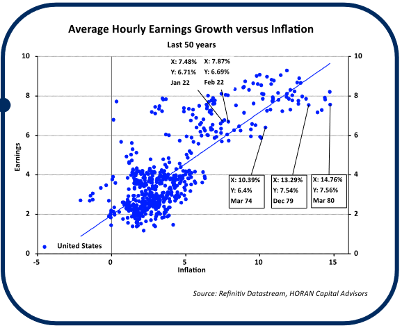
The Balance of the Year
With the Fed intent on reining in inflation via higher interest rates and a reduction in the Fed’s balance sheet, a midterm election year and the unfortunate humanitarian crisis resulting from the Ukraine/Russia conflict, additional market volatility is likely over the next several quarters. Investors should keep in mind though, nearly 63% of S&P 500 stocks are already down more than 10% from their 52-week high. The market tends to react favorably to corporate earnings growth, and earnings for S&P 500 companies are expected to growth 9.6% in the next 12 months. Certainly, there is much one can be concerned with, keeping in mind though, the market generally likes to “climb a wall of worry.”
Thank you for your continued confidence and support in HORAN Capital Advisors and we are always available to answer your questions and discuss our outlook further. Please be sure to visit us for company news, reports, and our blog.
Editor’s Note: The summary bullets for this article were chosen by Seeking Alpha editors.
Be the first to comment