


Andrii Yalanskyi/iStock via Getty Images
Thesis
Recent market corrections have pushed the valuation of the tech sector to a more reasonable level after a long bull run. In particular, the Invesco QQQ ETF (NASDAQ:QQQ) and Nuveen Nasdaq 100 Dynamic Overwrite Fund (NASDAQ:QQQX) may pique the interests of growth and income investors, respectively, under their current conditions.
As seen from the chart below, judging by its dividend yield, the QQQ fund currently provides a yield of 0.73%, 14% above its four-year average level of 0.64%. Obviously, QQQ investors do not invest in the fund for its income. But if we use dividends as a measure of the fund’s owners’ earnings, its current dividend yield does signal a sizable valuation renormalization and better total return potential ahead.
As a byproduct, other funds based on QQQ also become attractive. The QQQX is a notable example. It currently provides a dividend yield of 8.87% as seen, a whopping 46% above its four-year average of 6.06%. Such yields are quite attractive both in relative and absolute terms and should get the attention of income investors.
Therefore, it is the goal of this article to examine both funds more closely. And in particular, I will benchmark their current valuation and yields against their historical valuations and risk-free interest rates. And you will see that in the end, the results still show concerns for either income or growth purposes.
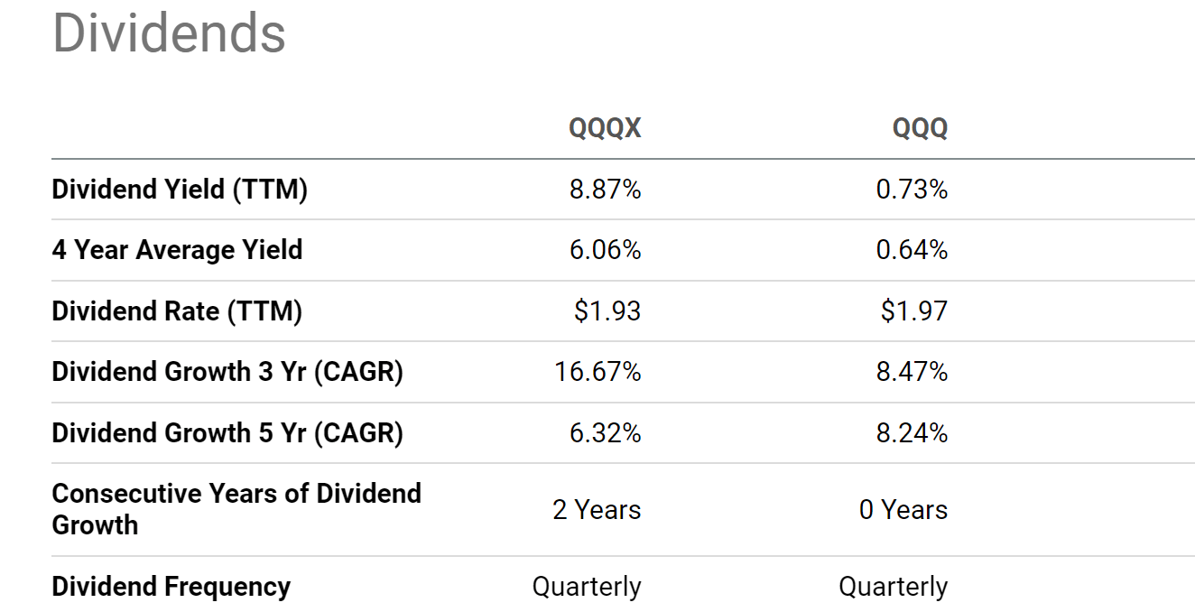
Source: Seeking Alpha data
QQQ and QQQX: basic information
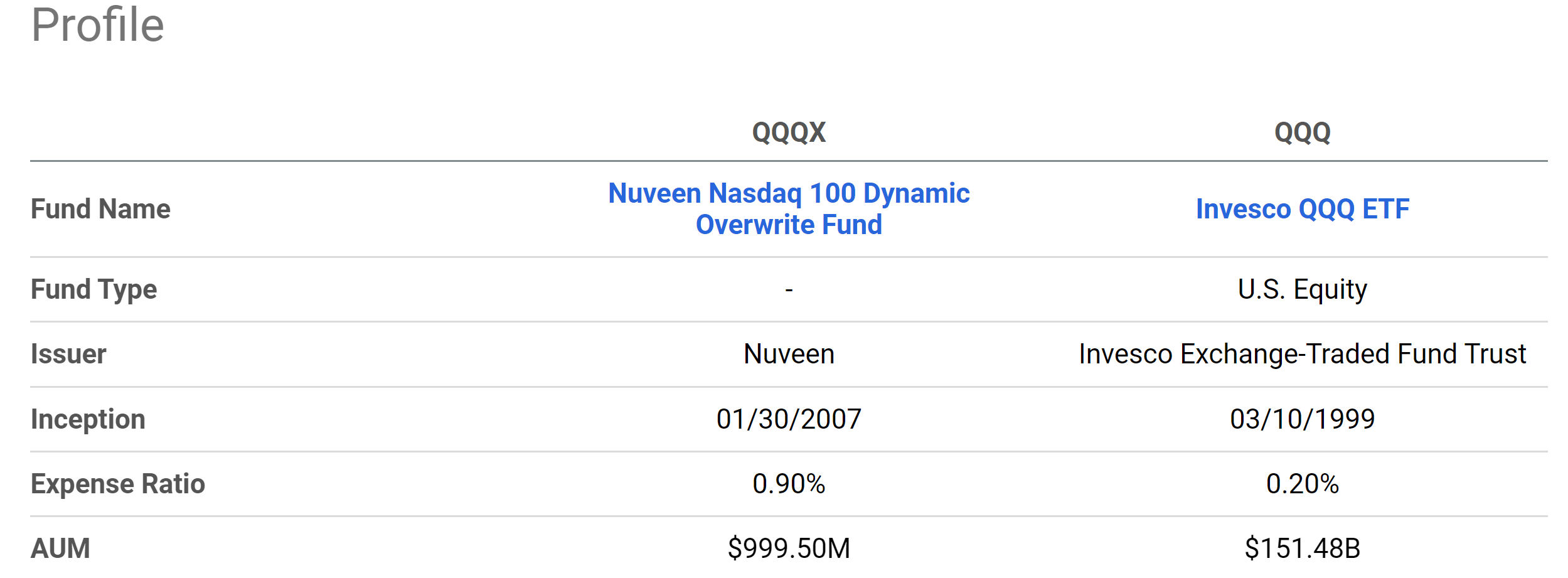
QQQ is one of the most popular tech funds and needs little introduction. For readers who are not familiar QQQX, the following chart shows its basic information relative to QQQ. QQQX is a much smaller fund with an AUM of about $1 billion (compared to QQQ’s $151B). As a CEF fund, QQQX also charges a higher expense ratio of 0. 9% compared to QQQ’s 0.2%.
Source: Seeking Alpha data
More importantly, QQQX and QQQ follow different strategies. QQQ is simple: it tracks the Nasdaq-100 Index. While QQQX adds twists by writing covered calls. According to its fund description (slightly edited with emphasis added by me):
The Fund invests in a U.S. equity portfolio that seeks to substantially replicate the price movements of the Nasdaq 100 Index, as well as selling call options on 35%-75% of the notional value of the Fund’s equity portfolio (with a 55% long-term target) in an effort to enhance the Fund’s risk-adjusted returns. The strategy will consider the Fund’s tax position and employ techniques to improve after-tax shareholder outcomes.
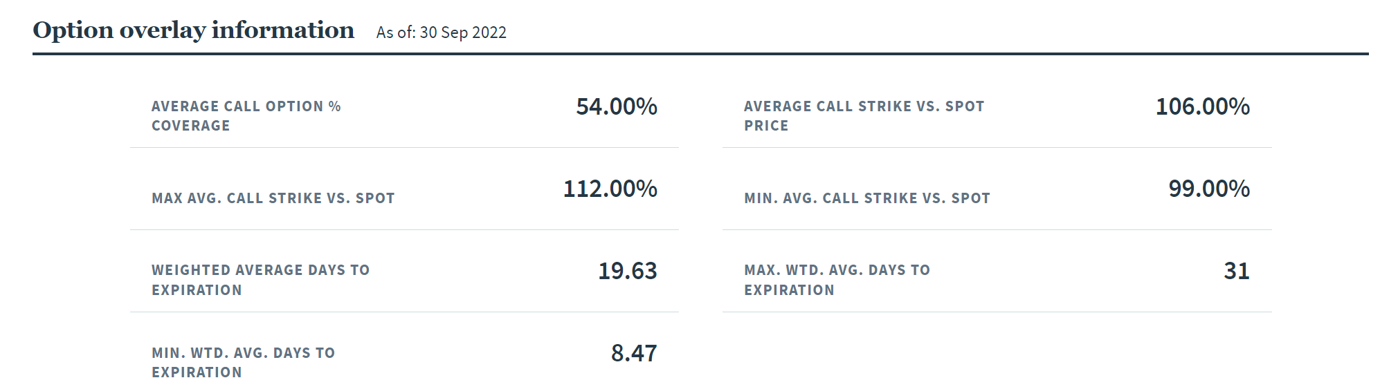
Hence, in other words, QQQX assets can be viewed as a combination of QQQ and the calls that it writes. To wit, as seen in the chart below, currently, its average call option coverage is at 54.00%, quite close to its long-term target of 55%. And its weighted average days to expiration is between 8.47 days to 31 days. With the surges in market volatilities recently, it could write call options at a higher premium and hence resulting in the higher dividend yield aforementioned.
Source: QQQX fund description
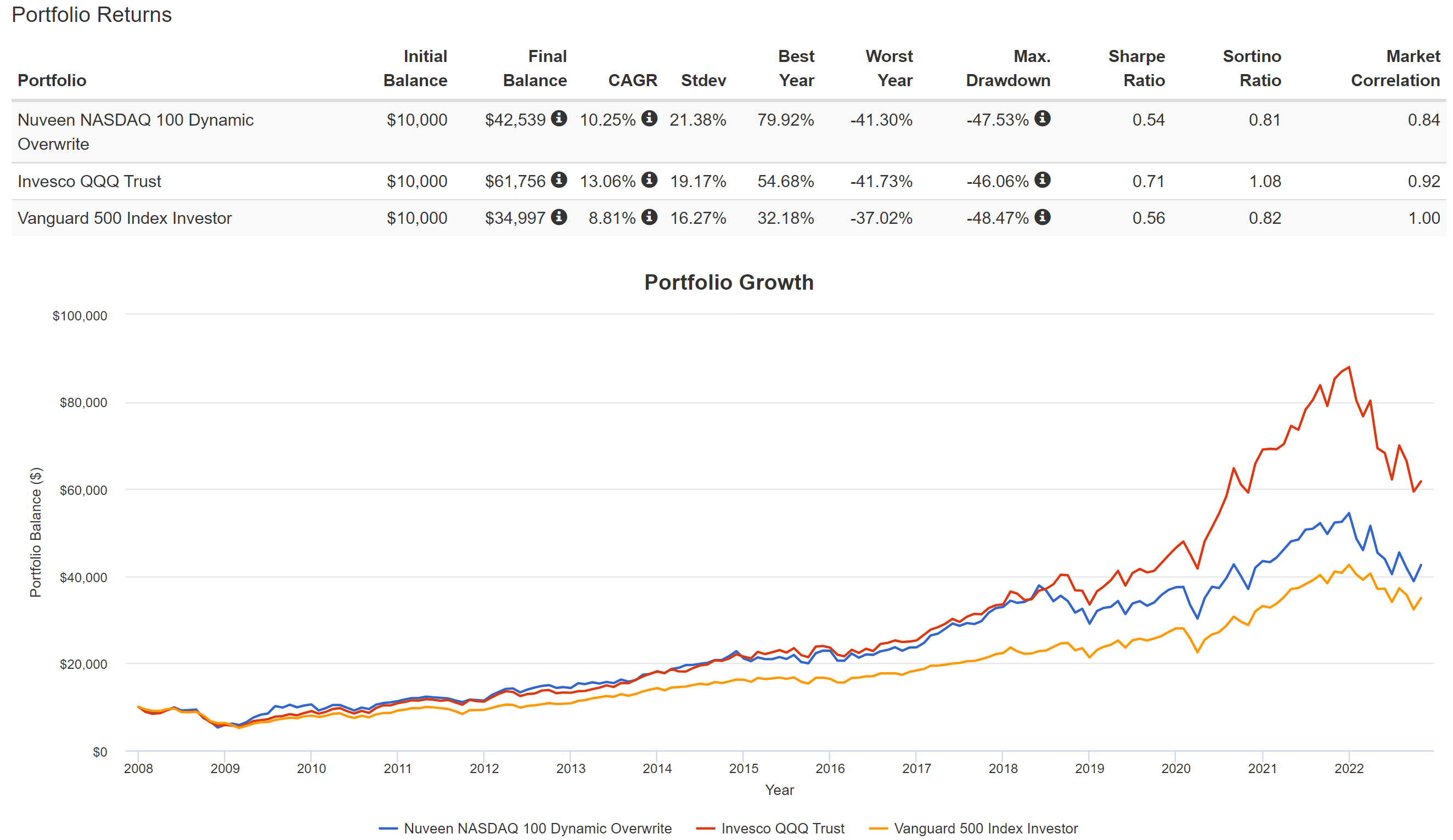
However, the use of call options does come at a cost. It is essentially trading some of the growth potentials for current income, as you can see from the following chart. Both the QQQ and QQQX funds have delivered healthy returns in the past (since QQQX’s inception in 2012).
And you can see that QQQX’s 10.25% CAGR is in the mid of the QQQ fund (13.08% CAGR) and the S&P 500 (8.81%). Also, note that QQQX and QQQ have demonstrated very similar volatility risks overall in the long term. After all, about half of their assets entirely overlap. In terms of standard deviation, QQQX’s volatility has been on average 21.3%, slightly higher than QQQ’s 19.1%, and both are higher than the S&P 500’s 16.27%. In terms of worst-year performance, QQQ and QQQX were quite close (both around -41%). And finally, in terms of maximum drawdowns, they were also similar (-47.5% for QQQX and -46% for QQQ).
Source: Portfolio Visualizer
QQQX yield spread
In the remainder of this article, we will benchmark the valuation of both funds relative to their historical levels and risk-free interest rates. We will start with QQQX by benchmarking its dividend yield against the 10-year treasury rates. Details of the approach have been provided in our earlier article. In summary,
- The common PE or Price/cash flow multiples provide partial information or are simply not applicable like in the case of QQQX.
- Dividends provide a backdoor to quickly estimate the owners’ earnings. Dividends are the most reliable financial information and least open to interpretation.
- The dividend yield spread (“YS”) is based on a timeless intuition. The risk-free rate serves as the gravity on all asset valuations and hence the YS always measures the risk premium investors are paying relative to the risk-free rates.
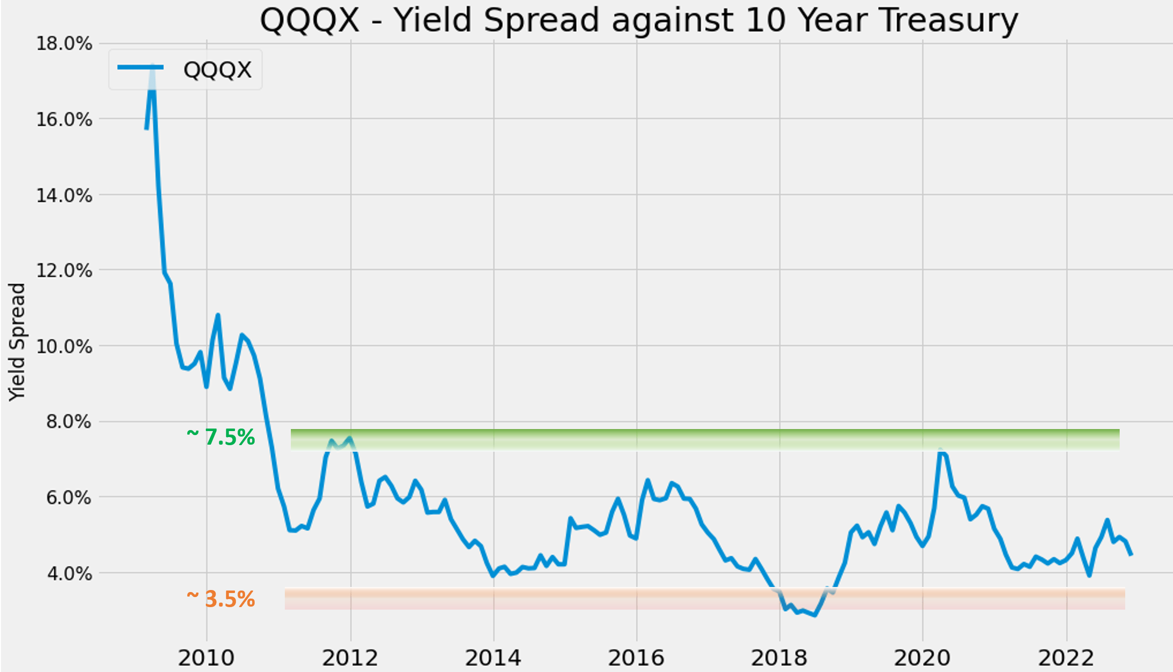
Under this background, the chart below shows QQQX’s YS relative to the 10-year treasury rates. As seen, the YS peaked at around 18% in 2020 (in the aftermath of the 2008 great financial crisis). The spread then stabilized afterward between a range of 3.5% to 7.5% since then. As mentioned, QQQX is yielding 8.87% now and 10-year treasury rates hover around 4.15%, resulting in a YS of ~4.72%. It is close to the lower end of the spectrum, thusly signaling a high-risk premium in my mind.
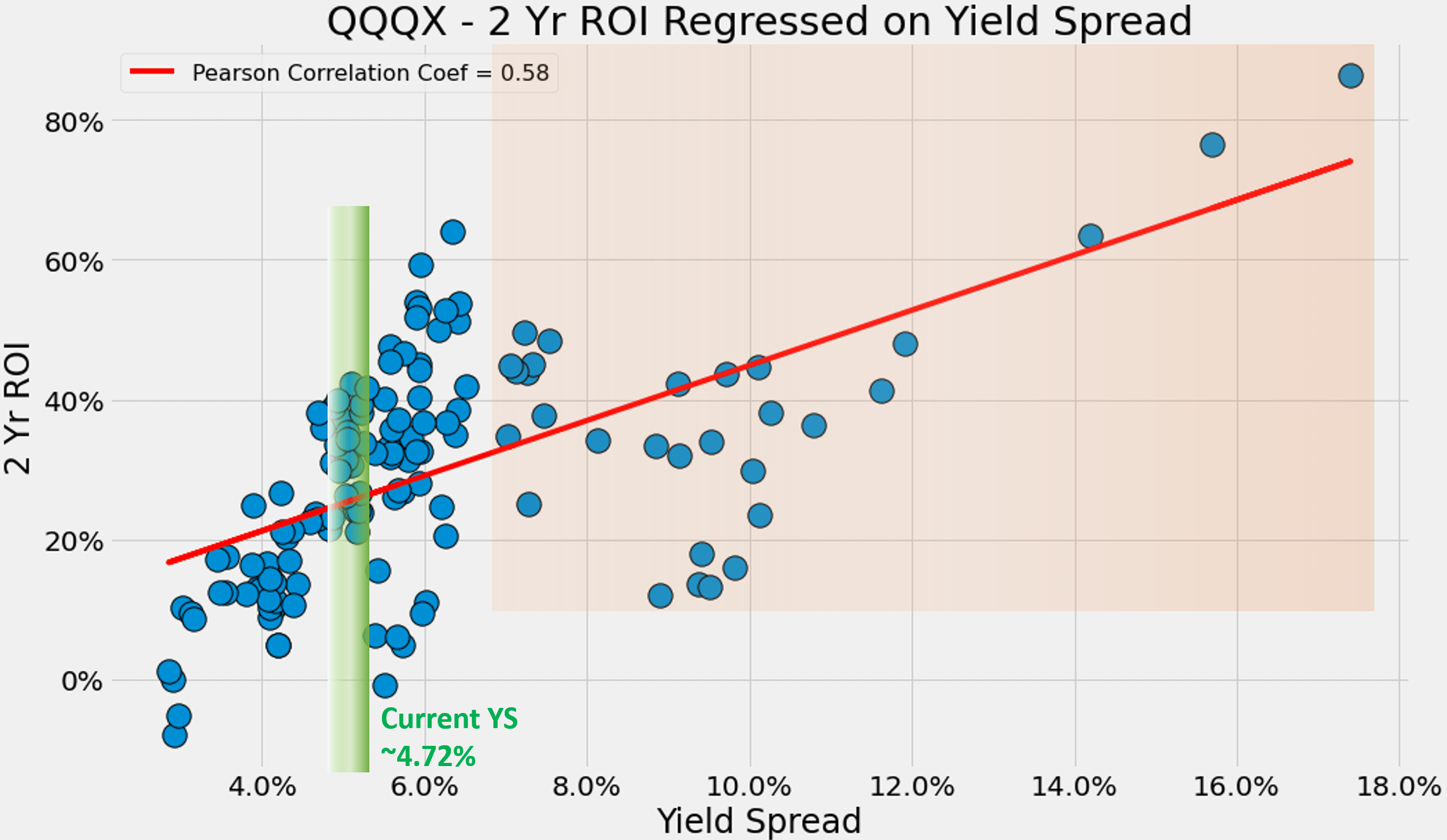
The 2nd chart shows the effects of such risk premium. As seen, its short-term returns are closely correlated with the YS. The chart shows the 2-year total return on QQQX (with both price appreciation and dividend income combined) regressed on YS. The correlation coefficient is quite strong at 0.58. And you can see the current YS of 4.72% has delivered mixed 2-year returns in the past.
Source: Author based on Seeking Alpha data
Source: Author based on Seeking Alpha data
QQQ’s picture is even more concerning
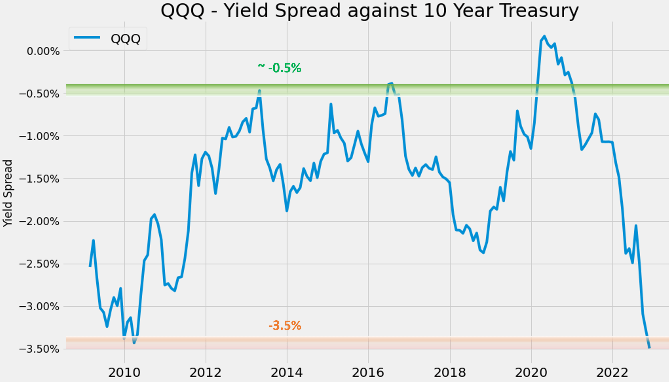
The picture for QQQ is even more mixed. The chart below shows its YS against risk-free rates too. The YS between QQQ and the risk-free treasury rates has also been bounded and tractable, just like QQQX, over the long term. The YS has been fluctuating in the range between about -0.5% and -3.5% most of the time. And you can also see that in the case of QQQ, its YS is not only near the thinnest level since 2008 but almost exactly AT the thinnest level. With QQQ’s yielding 0.73% and 10-year treasury rates hovering near 4.15%, the YS is -3.42%.
Source: Author based on Seeking Alpha data
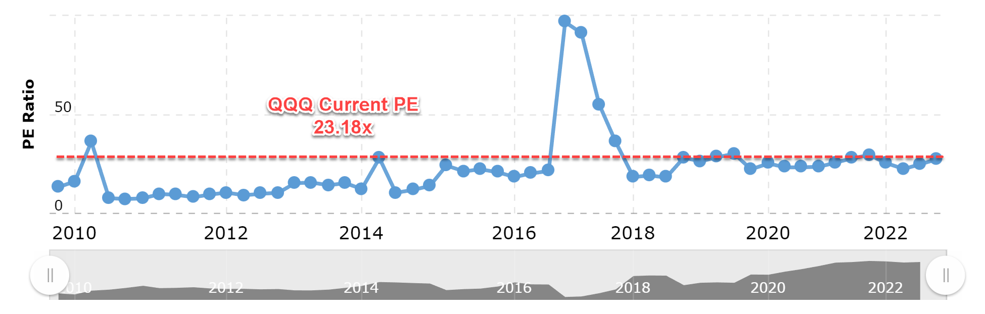
In terms of PE, the picture is also concerning. The chart below displays the current and historical PE multiples for the Nasdaq 100 index in the past 12 years since 2010. As seen, the Nasdaq PE ratio is now 23.18x as of this writing. Such a PE ratio is still near the peak level since 2012 as you can see, leaving little margin of safety.
Source: Macrotrends
Risks and final thoughts
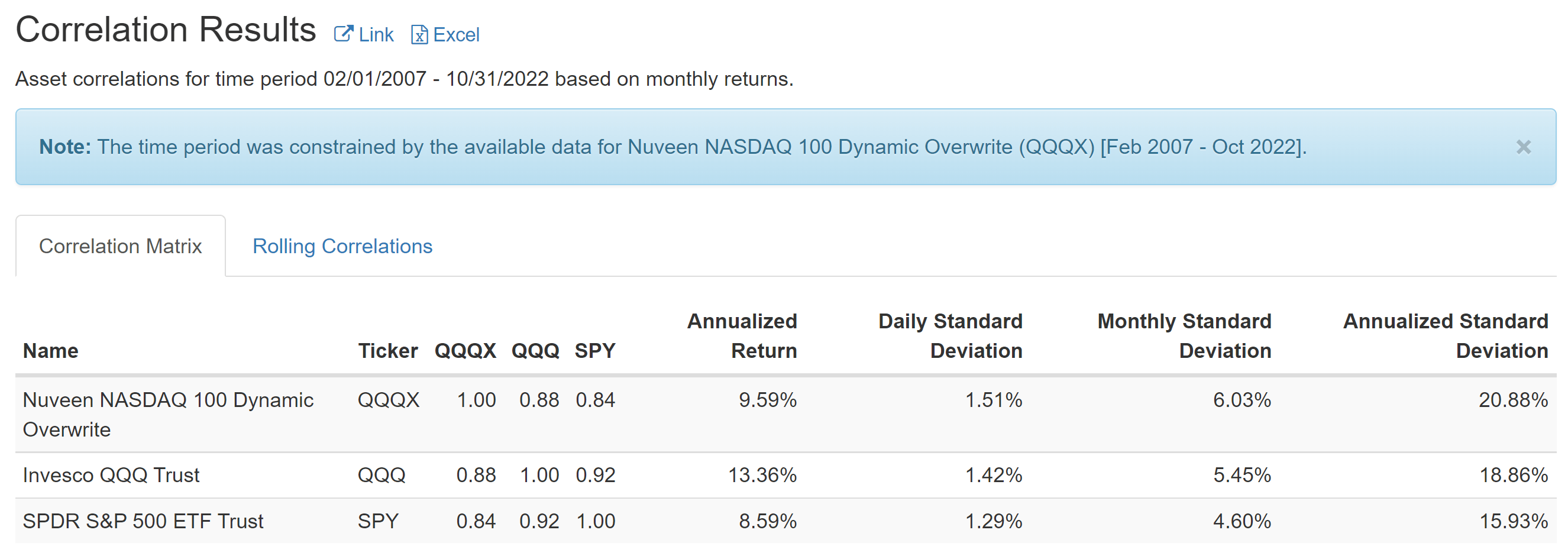
QQQ and QQQX largely face the same macroeconomic risks, including inflation, the possibility of a recession, and continued interest rate hikes. As seen in the chart below, both funds are closely correlated with the overall market. QQQ has a correlation coefficient of 0.92 against SPY (used here to approximate the overall equity market). And QQQX has a slightly lower correlation of 0.84 against SPY due to its use of options.
In particular, interest rates act as the gravity of all assets’ valuation and QQQ and QQQX are no exception. Continued interest rate hikes would further stretch their already-thin YS as aforementioned and put more pressure on their valuations. And in QQQ’s case, there is still a lot of room for valuation correction given its currently 23.2x PE.
Source: Portfolio Visualizer
To sum up, recent market corrections have normalized the valuation of the tech sector to some degree. Judging by dividend yields, QQQ’s valuation is about 14% below its 4-year average, and QQQX is about 46% lower. However, the picture is more complicated than on the surface once we benchmark their valuations relative to risk-free interest rates and their historical track records. Judging by PE ratios, QQQ’s current valuation is still elevated. And judging by their YS spread against risk-free interest rates, both funds’ YS is close to the thinnest level in more than 1 decade (especially in the case of QQQ). As such, I feel either growth or income investors still should exercise caution with both funds at this point.
Be the first to comment