

Pgiam/iStock via Getty Images
We believe in the theory of contrary opinion. The Sentiment King focuses on investor sentiment and investor expectations, and this article is part of a continuing series of articles (here) on how to use investor activity in exchange-traded funds (“ETFs”) to help determine the direction of the stock market. Since Proshares has over 130 ETFs with more than $50 billion in assets – many with 2X and 3X leverage – it is the perfect fund family to use for these purposes.
RWM – ProShares Short Russell2000
On October 7th RWM had 23.8 million shares outstanding with total assets of $614 million. It’s the 17th largest of over 130 ETFs.
ProShares Fund Table (Michael McDonald)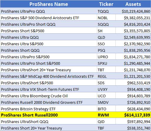
ProShares says the following about RWM:
“ProShares Short Russell2000 seeks a return that is -1x the return of its index (target) for a single day, as measured from one NAV calculation to the next. Due to the compounding of daily returns, holding periods of greater than one day can result in returns that are significantly different than the target return and ProShares’ returns over periods other than one day will likely differ in amount and possibly direction from the target return for the same period. These effects may be more pronounced in funds with larger or inverse multiples and in funds with volatile benchmarks. Investors should monitor their holdings as frequently as daily. Investors should consult the prospectus for further details on the calculation of the returns and the risks associated with investing in this product.”
RWM Graph
This graph shows the entire price history of RWM since inception. It started with an adjusted price of $280 in January 2007, and it’s currently at $25.73 as of October 7th. This is primarily due to the long-term bull market that began at the lows of the financial crisis of 2008.
NAV of RWM (Michael McDonald)
Outstanding Shares of RWM Grow Too Fast
The graph below plots IWM, which is the ETF that represents the Russell 2000, against the number of shares outstanding in RWM back to inception.
Historically, rapid increases in the number of shares outstanding of RWM occur at major market bottoms. At these moments it acts as a contrary opinion indicator and highlights when “too many” investors are expecting lower prices. We’ve indicated with arrows on the graph three times when this happened in the past
On October 7th there were over 23.8 million shares outstanding, which is a new record. We believe this is a strong indication that both the S&P 500 and Russell 200 will move higher, and RWM will move lower.
RWM Shares Outstanding (Michael McDonald)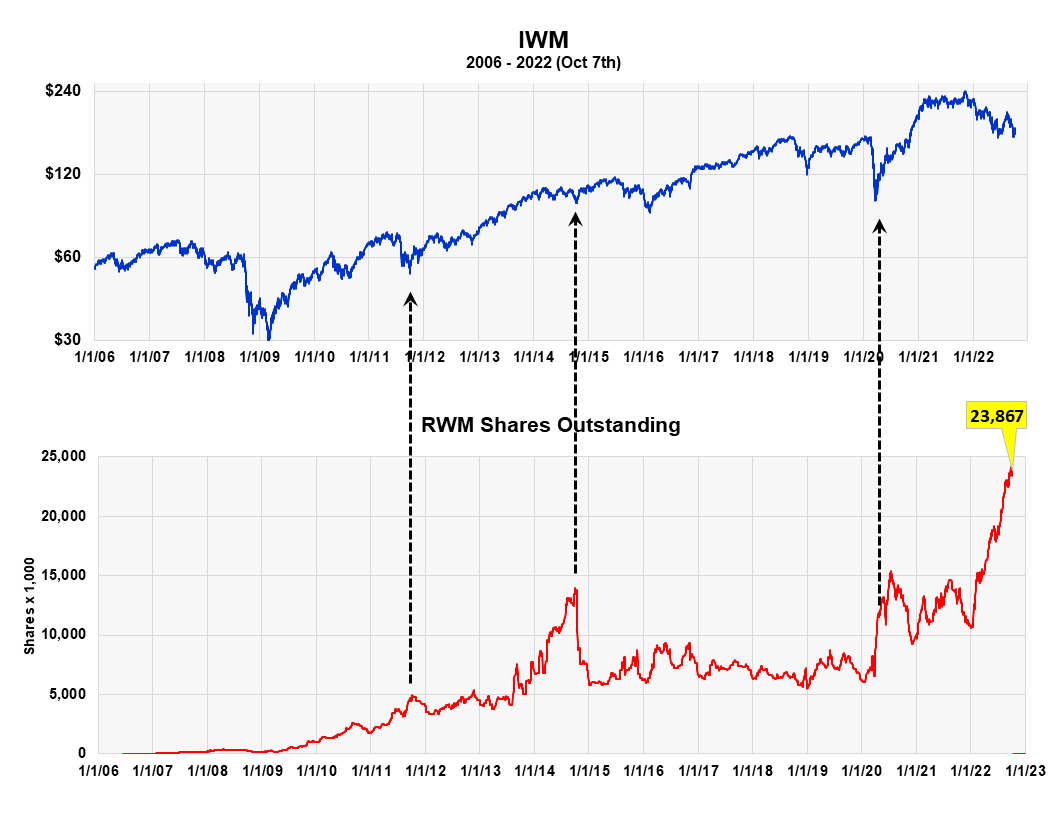
RWM Dollar Assets Approaching Levels of March 2020 Bear Market Bottom
The graph below compares the Russell 2000 against total dollar assets in RWM. It’s sometimes a better metric to compare because the number of shares outstanding is affected by price splits, which occur quite often in bear funds.
It shows that investors and speculators have more money positioned toward bearish expectations for the Russell 2000 than they had at the bottom of the market in 2020. It’s our opinion that this, like the previous chart, is another positive indicator for higher stock prices.
RWM Dollar Assets (Michael McDonald)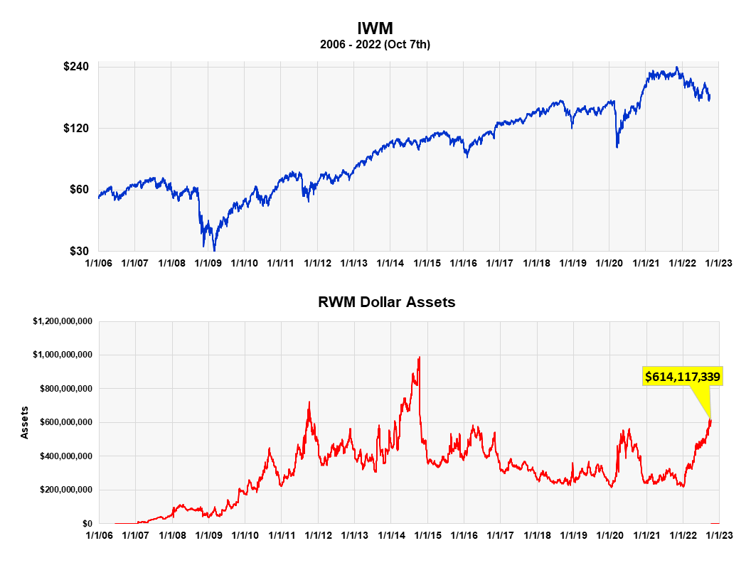
Market Low Confirmed by Ratio of Bull and Bear Assets in ProShares ETFs
The ProShares bull to bear asset ratio is another way we measure investor sentiment or investor expectations. It takes the dollar value in all the ProShares bull funds and divides it by the dollar value of all the bear funds. At the market top in December, there was over 10 times more money in bullish ProShares ETFs than bear market ETFs. It is now down to a little over two.
It’s a contrary opinion indicator. For example, it clearly shows the surge of money into ProShares bull funds from September to December of last year, right before the start of the bear market. The ratio went from 6.5 to 10.5. Extremely bad timing.
Ratio of Assets in ProShares bull and bear funds (Michael McDonald)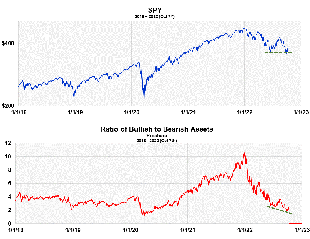
What’s important now is the fact that the ratio went to new lows as the S&P returned to the price lows of May. Notice the broken green lines in the graph. It’s flat for stocks and slanted lower for the ratio. This means that even more ProShares investors believe the market’s headed lower than at the May low. This again is what you want to see if you’re a contrarian. It suggests stock prices should move higher over the intermediate term.
An Important Caveat
While I’m not so worried about the American economy dragging down the stock market, I am worried about the risk of a global financial crisis doing it, triggered by the actions of narrow-minded central bankers focused on just their own economy. While central banks are looking after their own economies, no agency is looking after the well-being of the entire global financial system. This is a serious issue which I explain in the article I just wrote on the Puts and Calls ratio (here).
Be the first to comment