

JLGutierrez
Peak inflation appears to have arrived. Now, the central bank narrative has shifted from the pace of tightening to the terminal rate required to bring inflation down to the targeted level.
Key points
- The arrival of peak inflation. The long-awaited peak in inflation appears to have arrived – belatedly. Upside inflation surprises throughout 2022 have extended the timeline of the peak and eventual easing of inflation.
- Are conditions restrictive yet? The policy narrative has shifted to a focus on whether conditions are restrictive enough to eventually bring inflation back to 2% targets. Taming inflation may take longer than markets expect.
- Post-COVID secular forces at play. The level of the nominal Fed funds rate that is adequately “restrictive” depends both on the inflation outlook and the outlook for real rates. What do structural economic changes mean for the “neutral” real rate?
Throughout 2022, expectations for peak inflation have continually disappointed. Now, signs are emerging that we’ve reached peak inflation. As we look ahead, the likelihood of bringing inflation down to the targeted 2% depends on whether policy is sufficiently restrictive.
History suggests that this may take longer than markets expect. The level of policy rates required to conquer inflation will have great implications on market returns and the durability of the 60/40 portfolio.
The arrival of peak inflation
The long-awaited peak in inflation appears to have arrived – belatedly. Throughout 2022, expectations for inflation have serially disappointed. Now, the contour of expectations remains the same but with a delayed end point.
Figure 1 highlights the evolution of consensus market inflation expectations. For the majority of the last 18 months, consensus views on inflation expectations have reflected a gradual decline to a pre-COVID level of 2-2.5%. For each successive miss in inflation failing to reach its peak, expectations for the peak and gradual decline of prices have simply moved further out in time.
Figure 1: A delayed timeline for the peak and decline in inflation
Consensus market inflation expectations
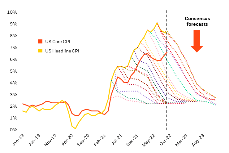
Source: Bloomberg, as of 9/30/2022.
Little has changed in the consensus outlook for the trajectory of inflation. This view is largely fueled by bottom-up forecasting for each component of inflation readings. The individual component pieces have clear rationale and data driving expectations for price declines.
The first of which are supply-constrained goods categories that accounted for the initial surge in inflation and “transitory” narrative. Shelter and Owners’ Equivalent Rent (“OER”), the housing components of the Consumer Price Index (“CPI”), come next as prominent contributors to eventually easing inflation.
These categories impact CPI readings with notable lags to more recent data that show new rental leases starting to fall. Furthermore, the lagged impact of significant increases in interest rates slowing the housing market should lead to further future declines in the category. Used cars, airfares, semiconductors – the data and analysis surrounding each of these components is encouraging and fuels the consensus outlook.
This all comes with one wrinkle. While goods prices appear to be normalizing and playing to script, services inflation – much harder to forecast through comparable bottom-up techniques – remains stubbornly high. Figure 2 highlights goods versus services inflation, with services inflation showing signs of acceleration.
Figure 2: Services inflation continues to accelerate and proves difficult to tame
Goods versus services inflation
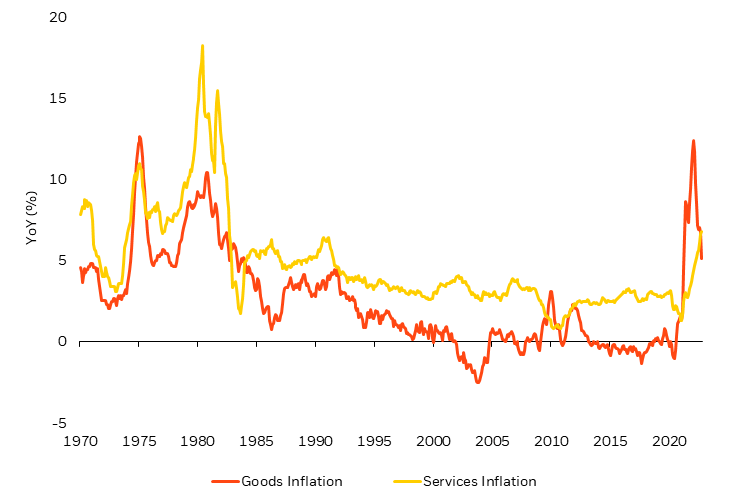
Source: Thomson Reuters, as of 10/15/22. Goods inflation: US CPI – Commodities Less Food & Energy SADJ. Services inflation: US CPI – Services Less Energy Services SADJ.
Good for earnings, bad for inflation
Persistent services inflation reflects the pricing power that companies discovered post-COVID. In this sense, the resilience we have seen in earnings – good news for stocks – parallels challenges in the narrative for steadily declining inflation – bad news for the inflation outlook.
The ability for companies to pass on higher prices reflects the ability of consumers to absorb these costs. This is partly explained by consumers drawing down on pent up savings from the COVID-19 crisis and stimulus. But equally, it reflects the significant power that workers also discovered following the pandemic.
Figure 3 shows historic labor market tightness through the vacancy to unemployment ratio. Since COVID-19, labor scarcity has remained at the root of the dramatic increase in wage compensation growth. This underlies the alternative to the consensus inflation view, with the beginning of a wage-price spiral potentially reflected in stubbornly high services inflation.
Figure 3: Labor scarcity reflects the post-COVID pricing power of workers
Job vacancy to unemployment ratio
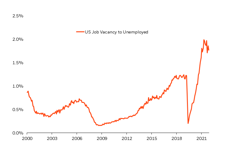
Source: Bloomberg, as of 10/31/22.
Are conditions sufficiently restrictive yet?
The potential that we have reached peak inflation brings about an evolution in the policy narrative for the U.S. Federal Reserve (“Fed”). It is no longer about the pace of increases in the policy rate, but rather what level of the terminal rate will result in conditions that are restrictive enough to bring inflation back down to the 2% target.
Remarkably, little in what we have seen from policy tightening to date has had much of an impact on the inflation outlook. As previously mentioned, the declines from peak inflation reflect mostly the supply-constrained goods categories and the lagged impact from housing (where the effects of tightening have been most significant in the real economy).
But the “long and variable lags” in monetary policy and the idea that policy has only now moved from accommodative into restrictive territory suggest that we may not see the impact on inflation for another 12-18 months.
That trajectory appears reflected in consensus expectations, yet it leaves a lot of uncertainty as to where the Fed’s terminal rate will end up and whether that rate will deliver sufficient restriction to tame inflation.
Will the terminal rate be enough?
Market expectations for the terminal rate hover around 5% by May of 2023 (Figure 4). At this point, the market expects the Fed to have had success: restrictive policy brings increased unemployment and engineers a recession. Importantly, the market expects inflation to decline and quickly be met with lower policy rates without a material lag.
Figure 4: Markets expect policy rates to act fast against inflation
U.S. Federal Reserve Implied Policy Rates
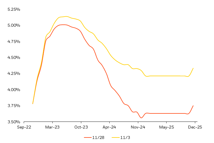
Source: Bloomberg, as of 11/25/22.
But do policymakers agree? Fed Chairman Jerome Powell’s unwavering commitment to conquering inflation suggests otherwise, stating that “history cautions strongly against prematurely loosening policy” and “we will keep at it until the job is done”. 1
Powell is referring to the lessons from the inflationary recessions of the 1970s and early 1980s. One argument that supports the Fed’s potential to avoid the same inflationary outcomes this time around is that they’ve learned from the experience (and mistakes) of the past.
As Powell and several Fed committee members have reiterated, the costs of reining in inflation that wasn’t sufficiently controlled in the initial attempt far outweigh the costs of having conquered it the first time.
This is because once inflation bleeds into inflation expectations (or more accurately inflation behavior), it’s very difficult to re-anchor those expectations at lower levels of inflation. What would appear to be a simple solution of letting 2% long-term inflation expectations increase to 3 or 4% is actually a difficult proposition.
Why? It diminishes central bank credibility, which is required in order to keep expectations anchored and at the heart of what we understand the inflation-setting dynamic to be.
Despite today’s central bankers’ benefit of hindsight, the errors of their predecessors are not so easily avoided. The eventual declines in inflation in the recessions of 1970, 1973, and 1980 significantly lagged the policy tightening of the time.
The policy tightening itself may have been delayed, but once underway, delivered the level of restriction required to do the job. And that job resulted in the expected job losses across the economy.
The error was not in failing to raise rates, but failing to keep rates high enough for long enough – which is easier said than done. In all three historical episodes, rising unemployment put pressure on the Fed to cut policy rates, to which it succumbed (Figure 5). This was even true during the first recession with Paul Volcker as Fed Chairman, who is known for later “keeping at it” and eventually restoring price stability in 1982.
Figure 5: Job losses have historically put pressure on the Fed to ease conditions
Inflation, policy rates, and unemployment in past inflationary recessions
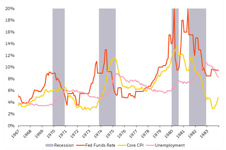
Source: Bloomberg, as of 11/25/22.
The challenge for the Fed today is to get rates to a level that’s sufficiently restrictive to slow the economy, absorb the political pushback to signs of “success” (rising unemployment and a slowing economy), and keep rates restrictive for long enough to ensure a durable decline in inflation.
In addition, the decline in inflation needs to ensure declines in inflation expectations. The market believes the Fed’s success in the former (causing a recession) and sufficient progress on bringing down inflation, will lead to a traditional “Fed pivot,” aimed at fighting the recession that was just created.
However, the potential for more sticky inflation alongside rising unemployment may present a more challenging picture – both for policymakers and markets.
Historically, inflationary recessions have diminished the impact of short-term rate cuts, and reduced the response in falling interest rates at the more economically impactful long end of the yield curve. This lack of long-end rate declines can undermine the traditional role of duration in portfolios to deliver positive returns during recessionary periods.
Secular forces in a post-COVID world
Considering the impact of post-COVID secular themes, the level at which the Fed is expected to stop raising interest rates, or the terminal rate, may prove to be insufficient. The level of the nominal Fed funds rate that is adequately “restrictive” depends both on the inflation outlook and the outlook for real rates, or inflation-adjusted interest rates.
In the consensus view, a 5% terminal rate coupled with 3% inflation by 2023 implies a 2% real Fed funds rate. Relative to the post-GFC world where the equilibrium real rate fell close to zero (Figure 6), this new implied rate would be associated with 200 basis points of positive real rates.
Figure 6: Historical estimated “real” neutral rates
Laubach Williams estimate of real neutral rates
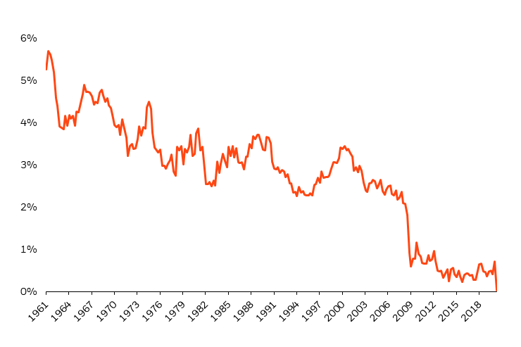
Source: Measuring the Natural Rate of Interest – Federal Reserve Bank of New York as of 6/30/20.
Such a positive level of real rates would be considered restrictive relative to history (Figure 7).
Figure 7: Expected terminal rates and inflation imply restrictive real policy rates
Real Policy Rates and Recessions
Source: Bloomberg, as of 9/30/2022.
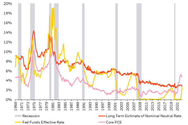
The neutral level of real interest rates may also be increasing with the forces at play in a post-COVID world. The long decline of real neutral rates in the pre-COVID period reflects dominant structural characteristics of secular stagnation. Broadly, this shows in the excess supply of savings over the surfeit of investment demand. But, both sides of that equation may be shifting.
For example, significant changes in China’s economic model and relations with western economies are impacting the degree of globalization of trade flows. As companies may shift from a “just-in-time” to a “just-in-case” supply chain model, favoring reliability over cost-efficiency, the reduction in global trade may reduce the amount of global savings held in dollars, which in the past held down real rates.
Significant investments needed to fund the energy transition further add to increased investment demand. Additionally, the demographic acceleration of aging populations in advanced economies and China represent a structural transformation in the global labor picture from one of surplus to one of scarcity.
Whether these factors are putting upward pressure on real interest rates will be seen in how the economy responds. A higher rate of inflation may be an indication of a higher neutral real rate. Post-GFC, meagre economic growth rates followed substantial policy accommodation, suggesting a lack of interest rate sensitivity of the economy.
This factor may contribute similarly to less economic slowing from the current policy stance of restrictive policy, and hence a much greater degree of tightening necessary to reduce inflation.
Though the consensus view expects a steady decline in inflation and a Fed pivot to modest cuts in the second half of 2024, the substantial uncertainty suggests a need to remain balanced in portfolios to the potential alternative outcomes.
Implications for portfolio construction of higher cash rates and less bond ballast
Negative stock and bond returns in 2022 reflect the effects of the Fed’s tightening response to inflation and the resulting recession risks. An additional casualty is the loss of the long-held perception that bonds hedge stocks.
Clearly, when inflation is the underlying cause of market losses, bonds lose their hedging efficacy. Figure 8 highlights the rolling three-month correlation of daily stock and bond returns which has turned significantly positive as both asset classes lost money this year.
Figure 8: Stock/bond correlation is now significantly positive
Rolling 3-month correlation of U.S. stocks and bonds
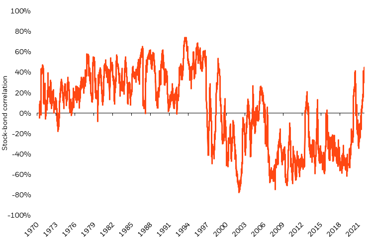
Source: Bloomberg, Federal Reserve as of November 25, 2022. Notes: The return of bonds are based on the daily return of 5-year zero-coupon Treasury bonds from 1971 to 2022. Stocks are represented by the S&P 500 Index from 1971 to 2022. Index performance shown for illustrative purposes only. You cannot invest into an index. Past performance is no guarantee of future results.
What are the resulting implications for portfolio construction? We illustrate the considerations of positive stock/bond correlation using some simple stylized portfolio construction examples.
Consider a hypothetical three-asset portfolio of stocks, bonds, and cash, and the question of what the optimal portfolio allocation is when the correlation between stocks and bonds turns positive.
Figure 9 highlights the interaction between stock/bond correlation and portfolio risk for three hypothetical portfolio allocations: a 60/40 stock/bond portfolio, a 60/30/10 stock/bond/cash portfolio, and a 60/20/20 stock/bond/cash portfolio. When the stock/bond correlation is negative, portfolio risk is lowest for the portfolio with the highest allocations to bonds.
Figure 9: As the stock/bond correlation turns positive, cash becomes a better risk reducer
Portfolio risk under varying stock/bond correlation levels
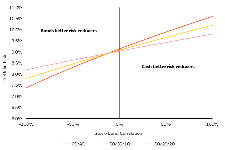
Source: BlackRock calculations. Portfolio risk reflects a 4% assumption for bond volatility, a 15% stock volatility and 0% cash volatility.
However, as the stock/bond correlation approaches zero and higher, portfolio risk is lowest for the portfolio with the highest allocation to cash. This is seemingly intuitive, as cash is always a zero-correlated asset (its price doesn’t move), and from a risk reduction perspective, the zero correlation of cash is preferable to any positive correlation from bonds.
Note that this perspective only considers portfolio risk, not expected portfolio return. So, while cash may be the better diversifier under a zero or positive stock/bond correlation, using cash may not be ideal for portfolio construction due to its impact on returns. Low (or zero) rates on cash can drag on expected returns and diminish the appeal of cash as a portfolio holding.
However, with significantly positive yields available on cash today, we need to consider not only stock/bond correlations for optimal portfolio construction, but additionally the expected return differences between bonds and cash. The next two figures highlight this perspective.
Figure 10 highlights the expected return per unit of risk for our three hypothetical allocations (60/40, 60/30/10, 60/20/20) assuming a 3% difference in bond returns over cash returns (an estimate of what we may have expected with zero interest rates).
Due to the higher expected returns on bonds compared to cash, the 60/40 portfolio dominates the portfolios with cash allocations for each level of stock/bond correlation.
Figure 10: When cash offers no yield, the 60/40 prevails
Sharpe ratios by stock/bond correlation with 3% expected outperformance of bonds over cash
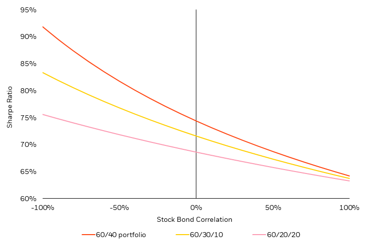
Source: BlackRock, as of 11/30/2022.
Now, consider the impact on portfolio efficiency (e.g., the portfolio Sharpe ratio) when the return advantage for bonds over cash falls from 3% (as shown in Figure 10) to 1% as shown below in Figure 11.
Figure 11: When bond vs. cash returns narrow, diversification grows in importance
Sharpe ratios by stock/bond correlation with 1% expected outperformance of bonds over cash
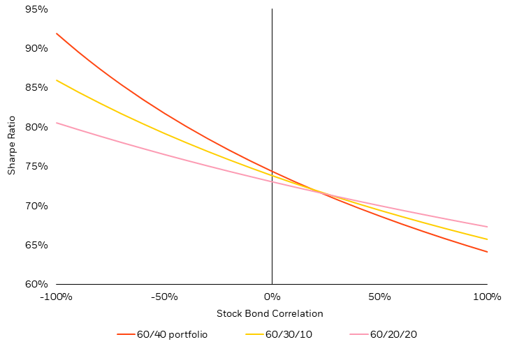
Source: BlackRock, as of 11/30/2022.
With lower expected returns of bonds over cash (Figure 11), the portfolio Sharpe ratios are nearly equal at zero stock/bond correlation. When cash returns start to become competitive with bond returns, and bonds no longer offer clear diversification to the portfolio (represented by a significantly negative stock/bond correlation), cash starts to become a better portfolio allocation relative to bonds.2
To state this another way, when cash offers no yield, bonds are almost always a better portfolio choice. Even with a positive stock/bond correlation, bonds offer a higher return per unit of risk for the portfolio.
But as higher yields on cash narrow the expected return differential, bonds require more of a negative correlation expectation to stocks to maintain portfolio attractiveness relative to cash.
In the past, the strongly negative correlation that bonds offered stocks during stock downturns reflected the bond market pricing in the willingness and ability of the Fed to aggressively cut rates in response to a recession.
On average, that translated to around 500bps of rate declines (and a significant ramping up of quantitative easing “QE” and flattening of the yield curve when the zero lower bound got in the way).
50bps of cuts, not 500bps
Today, inflation undermines the willingness and ability of the Fed to respond so forcefully to such a recessionary scenario. And though the market prices in a “pivot” in Fed policy to cutting interest rates around 50bps in mid-2023, that is not the same thing as the market expecting the Fed to cut rates to the full extent of typical recessionary policy stance (over 500bps).
To expect that would be to say that the Fed is going to try to ease policy to stimulate the economy in response to a recession that it created to fight inflation. As a result, a zero correlation may represent a more reasonable expectation going forward for stock/bond correlation.
Implications for investors
The loss of negative stock/bond correlation and the rise in expected returns of cash has made cash a more attractive asset for portfolios relative to bonds. Cash is the most general “zero correlated asset,” but any investment strategy approximating zero stock correlation can be thought of as an alternative portfolio diversifier to bonds.
When considering alternatives with expected zero equity correlation, the expected alpha determines the attractiveness relative to cash (and bonds). And defensive alpha strategies delivering both negative correlation to stocks and positive expected returns over cash represent even more favorable alternative portfolio diversifiers in this environment of zero to positive stock/bond correlation.
Conclusion
Market focus has shifted from identifying the long-awaited peak in inflation to determining whether conditions are restrictive enough to bring inflation back to the target level.
The potential for more sticky inflation and rising unemployment alongside the “long and variable lags” of monetary tightening present a challenging picture – both for policymakers and markets. Will the implied terminal rate bring down inflation as soon as markets expect? Will policymakers remain committed to conquering inflation despite expectations of a Fed pivot?
These questions will continue to impact portfolios and the 60/40 investment framework that investors have historically relied on. The potential for alternative outcomes to consensus expectations may lead to continued pressure on stocks and bonds and require investors to look for other sources of portfolio diversification. While peak inflation may be behind us, the question remains: now what?
1 Source: Bloomberg, as of 8/26/2022.
2 Note that a 1% bond-cash expected return difference is roughly what we might consider over the 2023 horizon. For cash, a 12-month CD offers 4% yield. Treasury bonds yield 3.5% currently, and – based on market expectations for a Fed pivot next year – a 25 bps decline in longer term yields adds around 1.5% in price appreciation for a 5% total return to bonds. Lower return expectations for bonds push down the bond allocation (and vice versa).
This post originally appeared on the BlackRock Blog.
Be the first to comment