

SimonSkafar
Investment Thesis
MYR Group (NASDAQ:MYRG) is yet another pick-and-shovel company that can benefit from big investment packages dedicated to rebuilding and green transition. It has a strong balance sheet and attractive growth in both reportable segments. However, the company does not pay dividends, so the only win for the investor is from a stock price increase, which is yet to be decided in the nearest months after the post-2020 rally. Wait for a pullback or monitor your stop loss.
FY 2022 Results
MYR Group finished the financial year 2022 on a very strong note, reaching some of all-time highs in the financial metrics. They reached record annual revenues of $3 billion, with record highs in both the Transmission & Distribution (T&D) and Commercial & Industrial (C&I) segments, as well as a record high EBITDA of $175.8 million and strong free cash flow of $90.4 million. Growing from $1.4 Billion in revenues in 2017, MYR Group boasts a 16.5% CAGR.
Financial results 2022 (Investor Presentation Q4 and Full FY 2022)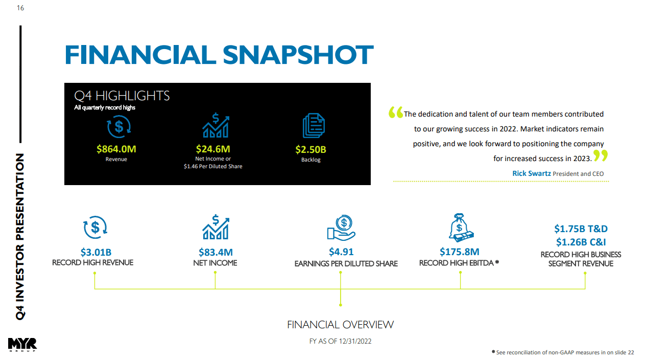
The financial results of 2022 are in line with rising trend lines with reference to revenues, EBITDA, backlog, and EPS for a number of recent years.
Long-term trends (Investor Presentation Q4 and Full FY 2022)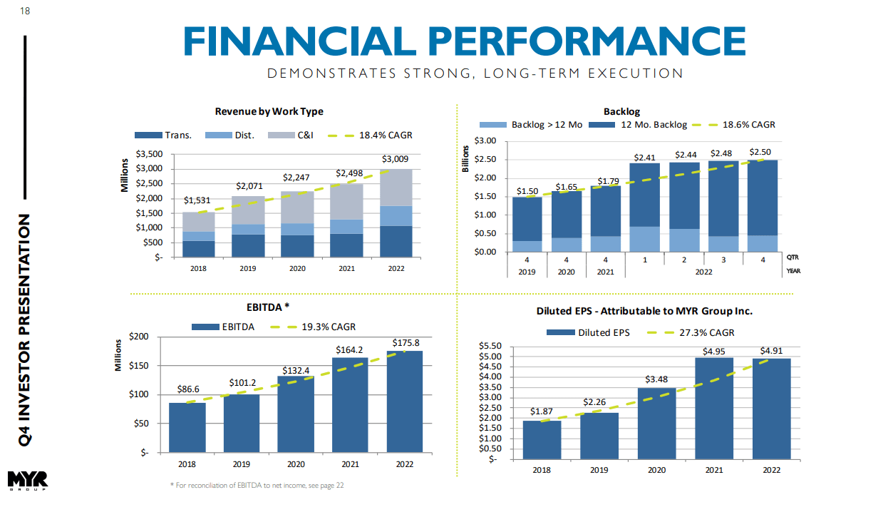
MYR Group lags slightly behind EMCOR Group (EME) when it comes to a 3-year average ROIC (19.6% for EME and 17.4 for MYRG), but is more profitable than MasTec (MTZ, 12.4%), Quanta Services (PWR, 10.7%) or Dycom Industries (DY, 6.8%), according to comparison provided by MYR in the latest investor presentation. However, the differences in capitalization and size of revenues between MYR Group and these companies need to be noted.
MYRG has a strong balance sheet with $349.3M in availability under a $375.0M credit facility, and a funded debt to EBITDA leverage of 0.23x.
Growth Drivers
MYR Group delivers electrical infrastructure and commercial and industrial projects throughout the United States and Canada, with 65 offices across these two countries. In January 2022, the company completed the acquisition of Powerline Plus Companies. Reportable segments of MYRG are Transmission & Distribution (T&D), which primarily consists of small to medium-sized projects, with some larger transmission, HVDC, and utility-scale solar projects, usually under long-term Master Service Agreements; and Commercial & Industrial (C&I). Growth for both of these segments is driven by the replacement and modernization projects of the old infrastructure as well as the transition to clean energy. The management cites the 2023 construction outlook released in January by the Dodge Construction Network which projects an 8% expansion in power and utility spending, up to $56.4 billion in 2023 as demand on the US electrical infrastructure increases and the need for viable clean energy sources grows. The T&D segment has been growing at a 5-year CAGR of 18.2%.
The C&I segment has been growing at a CAGR of 18.6% for the same period and has been driven by repeated contracts from clients in data centers, clean energy; healthcare, and transportation (including electric vehicles and light rail infrastructure) sectors. MYR has a solid backlog in this area, although the visualized number does not include a recently won large-scale solar project in Southeast Texas with a total project value in excess of $200 million. As the management underlines, solar projects offer also a higher margin than typical traditional C&I projects. The C&I segment is the one where supply chain disruptions have been mentioned the most often since both inflationary pressures and supply problems have had a steady impact on bringing new projects to contract. Ironically, this plays to the MYR’s strengths, as seemingly clients choose contractors who offer quality over multiple stages of construction projects and access to suppliers. Both segments will benefit from both the Infrastructure Investment and Jobs Act (IIJA) as well as the Inflation Reduction Act (IRA).
The clean energy market is very strong especially when it comes to energy storage and solar projects, while in healthcare big contracts have been executed in Western Canada, Southern California, and Colorado. The subsidiary Western Pacific Enterprises has built substantial portions of Vancouver and Edmonton Skytrain. It is known that Vancouver has ambitious plans to continue expanding the Skytrain and WPE is engaged in several pursuits that could expand Group’s footprint in transit. Other opportunities in Canada include water treatment facilities and electrical upgrades for petroleum facilities and LNG projects. In the C&I segment, mainly the tax incentives on both state and federal levels as well as raised environmental portfolio standards are driving the new investments. A simplified view of the MYR Group’s clean energy transition scope can be appreciated on the slide below.
Clean energy schema (Investor Presentation Q4 and Full FY 2022)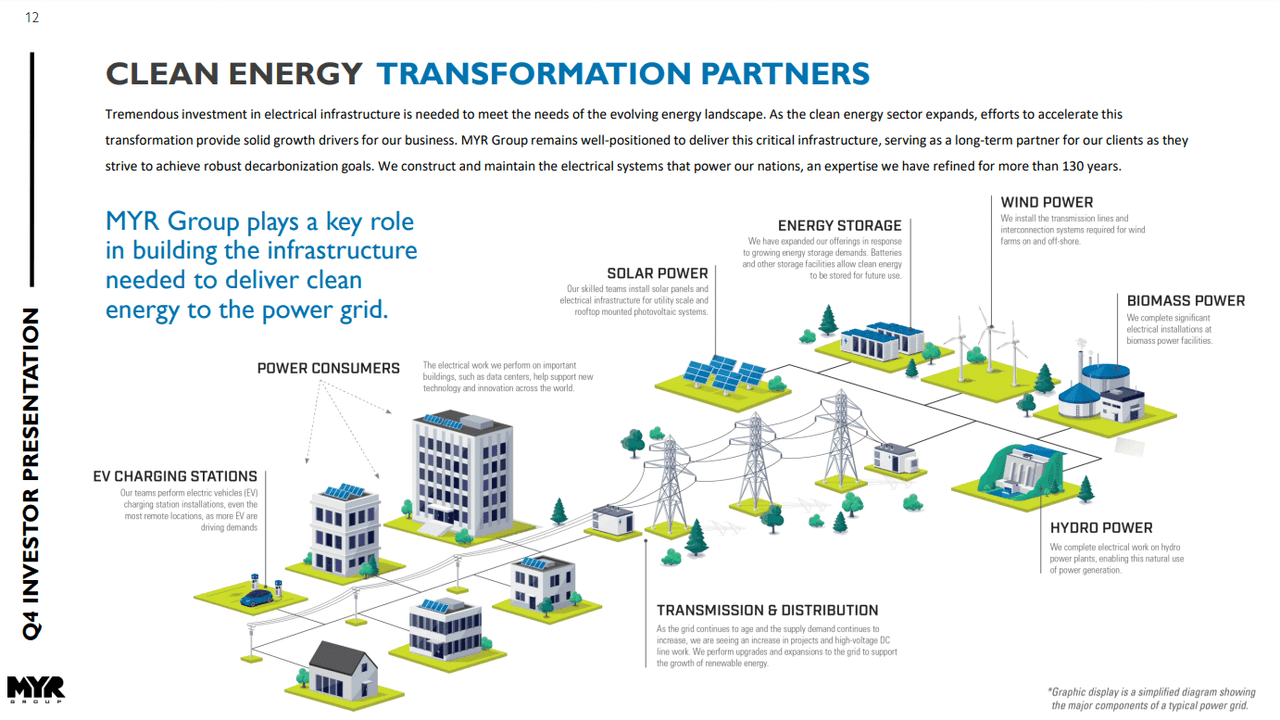
Risks
Most lumpiness can be seen in projects where the client starts to have budget constraints. As well, difficult access to materials due to supply chain problems may mean delay and/or cost increase. As the management notices, they are still not out of the woods on this front. Obviously, the type of projects MYR Group executes is also affected by any inclement weather conditions.
Technical Analysis – Explanation of My Toolbox
I will analyze MYR Group from a perspective of a number of technical analysis tools and show the screenshots on the monthly and weekly Heikin Ashi candles charts – each timeframe presented through two separate sets of indicators – which I will complement with a simplified daily Renko chart to reflect the short-term price momentum
The first chart setup (I will call it Chart 1) uses Bill William’s Alligator indicator and Awesome Oscillator, as well as Ichimoku Clouds and On Balance Volume indicator line. For fundamentals, I show the quarterly revenue trend which I use for quick visual triage.
The Alligator technical analysis tool uses three smoothed moving averages that are based on thirteen, eight, and five periods, called also Jaw (blue line), Teeth (red line), and Lips (green line), respectively. Due to the smoothing of each moving average, the Jaw makes the slowest turns and the Lips make the fastest turns. The Lips crossing down through the other lines signals a short opportunity while crossing upward signals a buying opportunity.
William’s Awesome Oscillator (AO) is a market momentum tool that visualizes a histogram of two moving averages, calculated on median prices of a recent number of periods compared to the momentum of a larger number of previous periods. If the AO histogram is crossing above the zero line, that’s indicative of bullish momentum. Conversely, when it crosses below zero, it may indicate bearish momentum.
As for the Ichimoku Cloud – I am not using a full set of lines of Ichimoku lines, only the Leading Spans A and B, whose crosses dictates the color of the cloud and whose individual lines provide levels of the strongest support and resistance lines. Ichimoku averages are plotted into the future which in its own right provides a clearer picture but have no predictive powers.
On-Balance-Volume (OBV) indicator is a volume-based tool and is supposed to indicate the crowd sentiment about the price. OBV provides a running total of an asset’s trading volume and indicates whether this volume is flowing in or out, especially when viewed in divergence with the price action.
The second chart setting (Chart 2) uses 2 moving averages (10- and 50-period), volume, and volume’s 20-period average. On the screenshot from top to bottom, you will see the Composite Index Divergence Indicator (CIDI), which I learned from the book of Constance Brown, as well as J. Welles Wilder’s Directional Movement Indicator (DMI). I also use MACD (Moving Average Convergence Divergence) which is well known to everybody: I seek crossovers of MACD and signal, as well as above/below the zero level.
CIDI comes from a combination of RSI with the Momentum indicator. For more literature, see Brown’s paper or read her book. CIDI has been developed to solve the problem of RSI not being able to show divergence. I personally use the CIDI’s crossover above and below its slow and fast-moving averages, as well as the position of the averages against each other.
As for DMI, I skip the ADX line because it doesn’t give me anything. Instead, I focus on the crossovers of the Positive Direction Indicator DI+ and Negative Direction Indicator DI-. When the DI+ is above DI-, the current price momentum is upwards. When the DI- is above DI+, the current price momentum is downwards.
On the use of Heikin Ashi candles and Renko boxes, I use them as tools for trend reversal and continuation identification. Renko charts do not have a time scale and they are built on price movements that must be big enough to create a new box or brick. Similar to Heikin Ashi, Renko charts filter the noise.
The Long-Term Trend
For the long-term trend analysis, I use monthly charts. As we can see in Chart 1, the stock is shot above its all-time high of $121 levels from November 2021. The monthly Ichimoku Cloud has raised its both lower and upper edges. The Alligator’s lines have recovered from a flat period in the second half of 2022. AO is growing as well since February. We can see the OBV line growing steadily and reaching a new high.
Chart 2 – Monthly (TradingView)
In Chart 2 we can see that the momentum indicator as MACD is currently crossing its signal from below. Also, CIDI has crossed above its both slow and fast averages, and the fast one (green line) is bottoming and making an upwards turn. The monthly DI+ is the only indicator on the monthly scale that would presage an upcoming pullback since the positive blue line has made a downward turn. The drop of the volume below its 20-month average may also indicate a loss of steam at this time of the rally. The nearest support line could be expected around the level of $112 (thick purple line).
Chart 2 – Monthly (TradingView)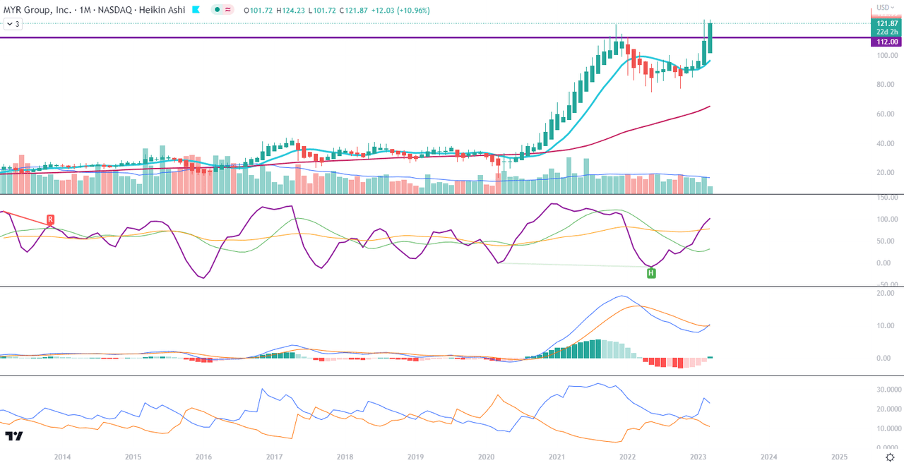
The Mid-Term Trend
For the mid-term trend analysis, I use weekly charts. I added another horizontal S/R line, this time at the level of $98 which is overlapping with the upper edge of the Ichimoku Cloud when it was still red. I would be cautious if the price starts dipping below this level too often. This could be the level of distribution if the tide changes. We see the green developments for the current Cloud levels, Alligator’s lines, AO and OBV, but there is almost no way that there is no profit taking coming soon.
Chart 2 – Weekly (TradingView)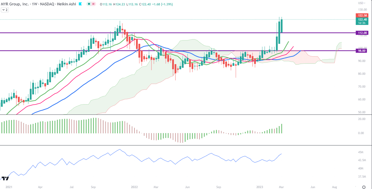
In weekly Chart 2, we can see that although CIDI is on top of its averages and MACD is above the signal, the slopes have been sharp recently, suggesting a coming change on this scale. Not necessarily for the long term but simply a reaction to the nearly 30% breakout since the week commencing 20 February. The weekly DI+ also made a turn downwards, just like on a monthly scale.
Chart 2 – Weekly (TradingView)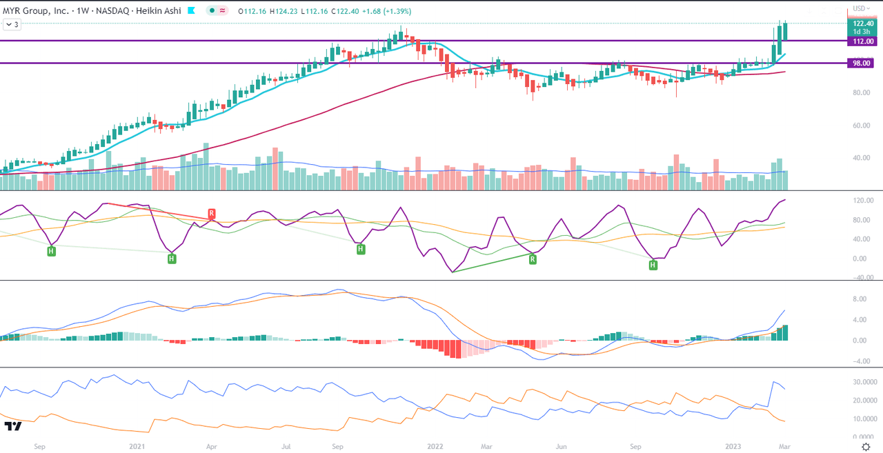
Price Momentum
The Renko chart on a daily scale indicates the continuation of the uptrend which started end of February. This is when MACD crossed above its signal. The trend may need to return to the nearest S/R line and bounce off it in order to continue. For those who can have MACD set up on the Renko chart, watch out for the reversal of MACD.
Renko daily (TradingView)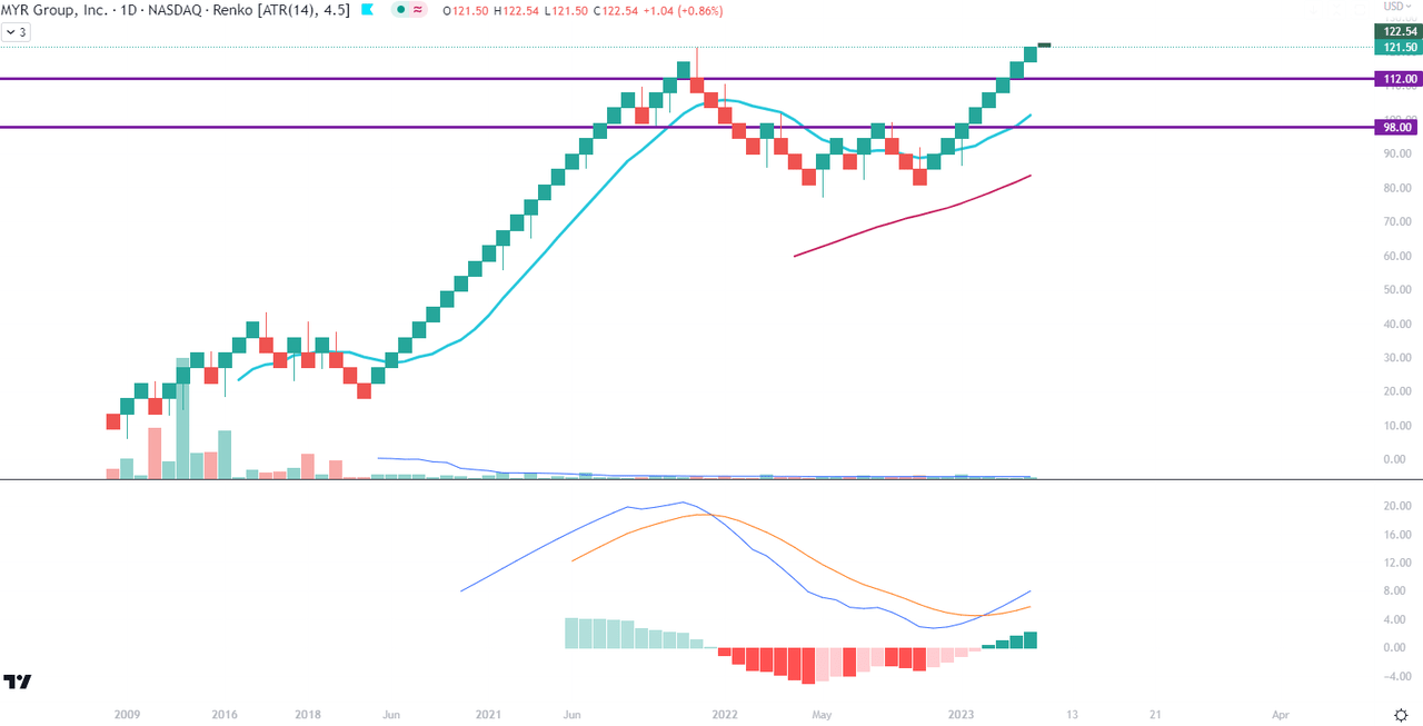
Conclusions
MYR Group is not a top headlines stock but it has steadily increasing revenues and long-term growth drivers behind it. As long as an investor is willing to ride on a potential new wave of price appreciation, this can be a profitable move. However, given a huge rally since 2020, I would caution against greediness and monitor big reversals on the top.
Be the first to comment