

Pgiam/iStock via Getty Images
We believe in the theory of contrary opinion and the Sentiment King focuses on studying and measuring investor sentiment and activity. This article is part of a continuing series of articles (here) on how to use investor activity in ETFs to help determine the direction of the stock market. Since ProShares has over 130 ETFs with more than $50 billion in assets – many with 2X and 3X leverage – it is the perfect fund family to use for this purpose.
QLD – ProShares Ultra QQQ
NYSEARCA:QLD is one of a number of 2x ProShares ETFs (the Ultra Series) that goes double-long a major market index, in this case the Nasdaq QQQ. It has 67.3 million shares outstanding and total assets of $2.327 billion. By assets, it’s ranked 5th of 136 funds in the ProShares family.
Asset Ranking of ProShares Funds (Michael McDonald)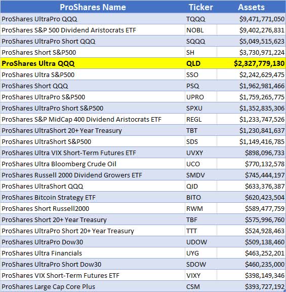
ProShares writes the following about QLD:
ProShares Ultra QQQ seeks a return that is 2x the return of its index (target) for a single day, as measured from one NAV calculation to the next. Due to the compounding of daily returns, holding periods of greater than one day can result in returns that are significantly different than the target return and ProShares’ returns over periods other than one day will likely differ in amount and possibly direction from the target return for the same period. These effects may be more pronounced in funds with larger or inverse multiples and in funds with volatile benchmarks. Investors should monitor their holdings as frequently as daily. Investors should consult the prospectus for further details on the calculation of their returns and the risks associated with investing in this product.
QLD Graph
This graph shows the entire price history of QLD since inception on June 19th, 2006. It started with an adjusted price of $2.19 and it’s currently at $34.59. This is a gain of 1,479% and is due to the 2x leverage, low interest rates and the long-term bull market that began during the financial crisis of 2008.
Historical NAV of ProShares QLD (Michael McDonald)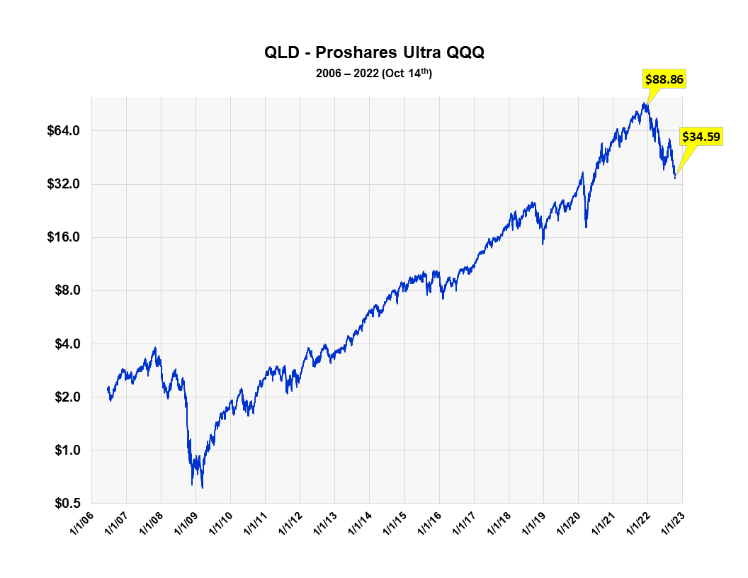
At the beginning of the year the fund was at $88.86. During the bear market it has fallen 61% to $34.59. It should be noted that the current price has retraced back to the highs made right before the start of the pandemic in February of 2020.
Purchasing Levels of QLD
How do you measure investor buying in ETFs? Looking at sales like one does any stock is insufficient, since it doesn’t specify how much is from investor buying. With stocks, sales do represent the amount of buying, since buying and selling amounts are always equal. But with ETFs they aren’t. If there are more buyers than sellers of an ETF, the fund creates more shares for the excess buyers. If there are more sellers than buyers, they retire the excess shares.
So, sales numbers alone don’t tell you how much money is going into or out of an ETF; you must combine sales with changes in the number of shares outstanding to determine that. Once this is done, multiplying the number of shares being purchased by the fund’s NAV yields how much money is going into the fund on a daily basis.
Measuring the dollar amount going into a fund is not the best measure, however. What’s better is the amount of money going into the fund divided by the total assets in the fund. Producing a ratio allows for historical comparisons; absolute values don’t. The current purchasing ratio for QLD is 8.3%.
Purchase Levels in QLD (Michael McDonald)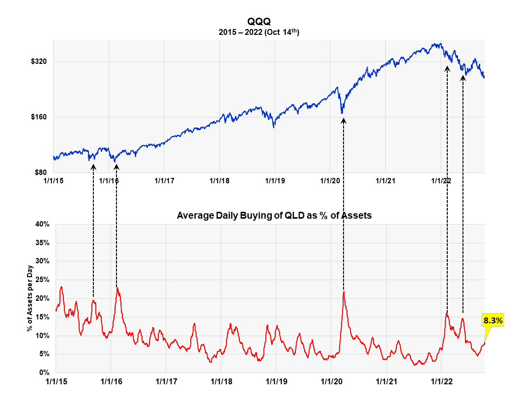
As the graph shows, the current purchasing ratio is measurably less than all major intermediate and bear market lows since 2015. This seems to reinforce the idea that the final shoe hasn’t dropped yet to this bear market and further price declines are needed to finally bring in more buyers to QLD.
The situation is a little confusing, however, since it’s counter to what so many other ProShares funds seem to indicate, as well as other sentiment indicators. If one believes in the historical QLD data, the obvious conclusion would be that the bear market is not over and probably won’t be over until investors in QLD begin to buy again as they have in the past.
The History of Outstanding Shares in QLD is Confusing
The graph below plots QQQ against the number of shares outstanding in QLD. When more investors enter the fund then leave it, the number of shares outstanding increases. When more investors sell the fund then buy it, the number deceases. It’s currently at 67,300,000 shares.
Graph of QLD Shares Outstanding versus the QQQ (Michael McDonald)
While it is normally very useful to graph the growth or contraction in number of shares outstanding of most ProShares ETF – as you can see (here) and (here) in two previous ProShares articles – it has little value here. The number appears little changed over the last five years and there are unexplainable spikes or noise in the data, which makes it suspect. Because of this we can’t use SO in QLD to confirm or contradict the conclusion of the previous purchasing level graph. We are including it here for completeness.
The Ratio of Bull and Bear Assets in ProShares ETFS
The ProShares bull to bear asset ratio is another way we measure investor sentiment or expectations. It’s a contrary opinion indicator. It takes the dollar value in all the ProShares bull funds and divides it by the dollar value of all the bear funds. At the market top in December there was over 10 times more money in bullish ProShares ETFs than bear market ETFs. It is now down to a little over two.
For example, the graph clearly shows the surge of money into ProShares bull funds from September to December of last year, right before the start of the bear market. The ratio went from 6.5 to 10.5. Extremely bad timing. The current ratio is two to one, which is much closer to the bear market lows of 2020.
The ProShares Bull to Bear Asset Ration versus the SPY (Michael McDonald)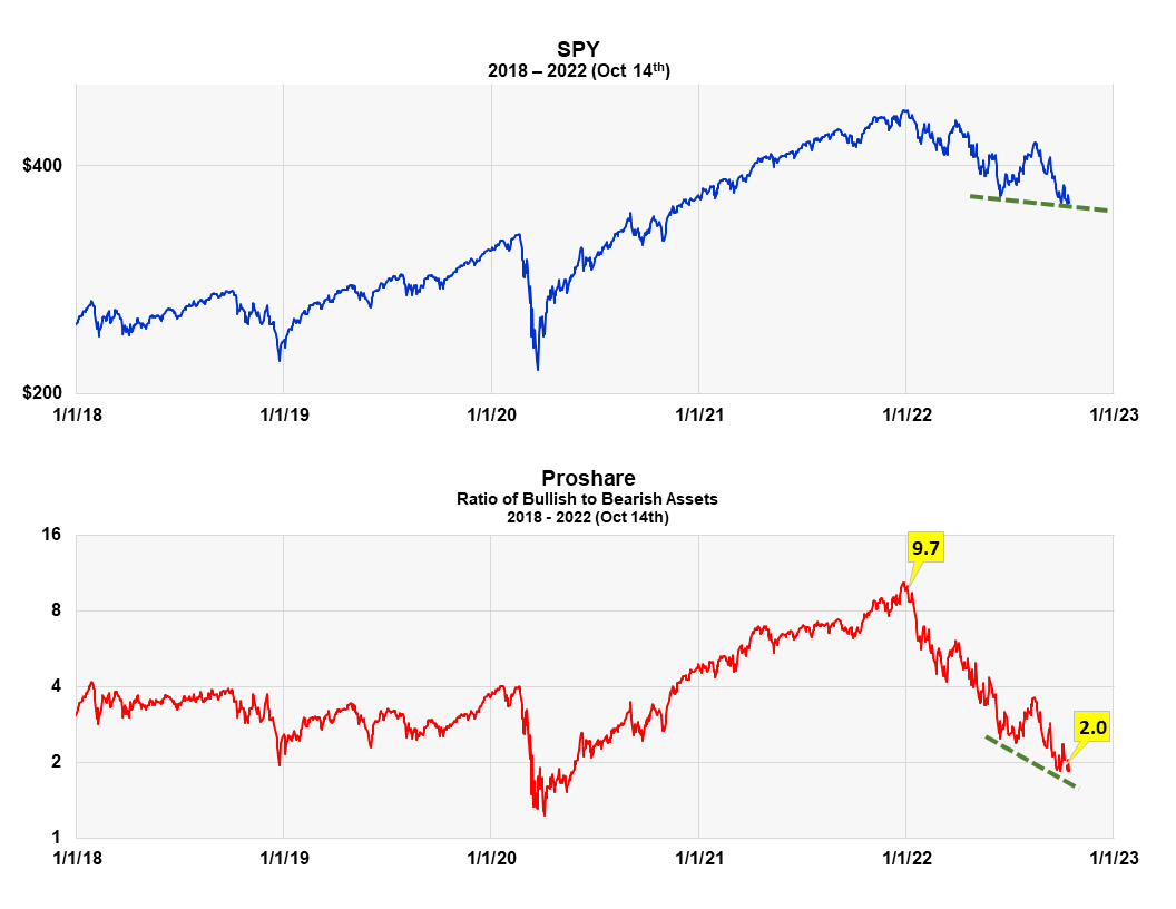
What’s important now is that the asset ratio went to new lows as the S&P just slightly broke below the price lows of May. Notice the two broken green lines in the graph. It’s flat for stocks and slanted lower for the ratio. This means that even more ProShares investors believe the market’s headed lower than at the May low. This again is what you want to see if you’re a contrarian. It suggests stock prices should move higher over the intermediate term. This idea is just not yet confirmed by metrics on investor activity in QLD. It is confirmed, however, by the Master Sentiment Index, which is registering the most extreme bearish reading in 17 years. If you are a contrarian, this is positive.
The Master Sentiment Indicator at Its Most Extreme Reading
The 16-year chart below plots the Master Sentiment Index, which is a composite index made from seven established sentiment indicators, against the S&P 500 SPDR ETF (SPY). The seven indicators include the total puts to calls ratio, the equity puts to calls ratio, the American Association of Individual Investors survey, the NAAIM survey, Hilbert sentiment statistics, investor activity in the ProShares S&P short fund (SH) and the CME commitment of trader data. All the information below is as of October 14th. The MSI is designed to signal long-term market trends; it is not a short-term indicator.
The Master Sentiment Indicator versus the SPY (Michael McDonald)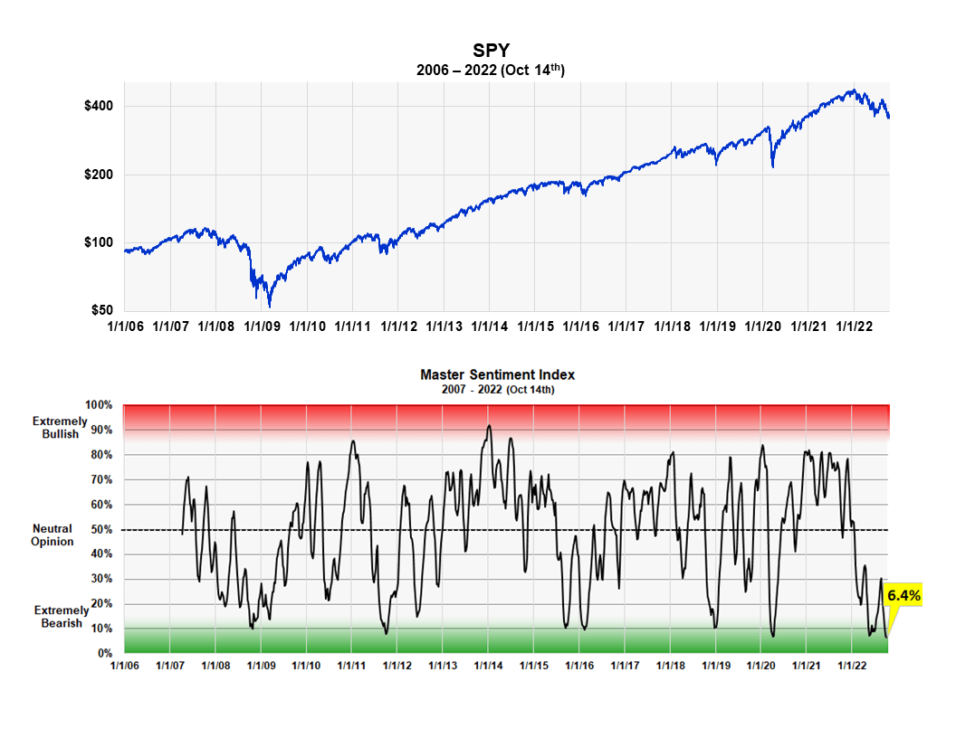
It is easy to see the correlation between major market bottoms and extreme levels on this index. The current reading of 6.4% is the same as last week and is the lowest reading over the last 17 years. If you are a contrarian this is highly bullish for the stock market.
An Important Caveat
While I’m not so worried about the American economy dragging the stock market down much further, I am worried about the risk of a global financial crisis doing it, triggered by the actions of narrow-minded central bankers focused on just their own economy. While central banks are looking after their own economies, no agency is looking after the well-being of the entire global financial system. This is a serious issue which I explain in the latter section of the article (here) I just wrote on the Puts and Calls ratio.
Be the first to comment