

hitforsa/iStock via Getty Images
IWD strategy and portfolio
The iShares Russell 1000 Value ETF (NYSEARCA:IWD) has been tracking the Russell 1000 Value Index since May 2000. IWD has 852 holdings, a distribution yield of 2% and an expense ratio of 0.18%.
As described by FTSE Russell, the underlying index measures the performance of a large cap segment of the US stock market. It includes companies with lower price-to-book ratios and lower expected growth values. It represents about half of the total market value of the Russell 1000 Index. IWD turnover was 17% of the average value of its portfolio in the last fiscal year.
IWD invests mostly in U.S. based companies (98.4% of asset value). Large and mega-cap companies weigh about 69%, mid-caps about 27% and small caps about 4%. Hereafter, I will use a Russell 1000 index ETF (IWB) as a benchmark.
As expected, IWD is cheaper than IWB regarding usual valuation ratios, reported in the next table.
|
IWD |
IWB |
|
|
Price/Earnings TTM |
15.21 |
18.95 |
|
Price/Book |
2.2 |
3.5 |
|
Price/Sales |
1.65 |
2.22 |
|
Price/Cash Flow |
10.91 |
14.12 |
The top 3 sectors are financials (20.2%), healthcare (16.9%) and industrials (10.5%). Other sectors are below 9%. Compared to the Russell 1000, the fund massively underweights technology, and to a lesser extent consumer discretionary. It overweights all other sectors, especially financials.
IWD sector breakdown (Chart: author; data: iShares)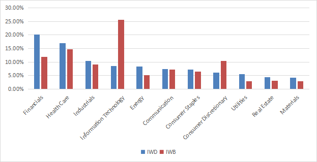
The top 10 holdings, listed in the next table with valuation ratios, represent 17.9% of asset value. The heaviest one weighs less than 3%, so risks related to individual stocks are low.
|
Ticker |
Name |
Weight |
P/E TTM |
P/E fwd |
P/Sales TTM |
P/Book |
P/Net Free CashFlow |
Yield% |
|
Berkshire Hathaway, Inc. |
2.95 |
N/A |
21.97 |
2.35 |
1.53 |
34.99 |
0.00 |
|
|
Johnson & Johnson |
2.44 |
24.90 |
17.80 |
4.95 |
6.38 |
76.54 |
2.53 |
|
|
Exxon Mobil Corp. |
2.4 |
8.95 |
7.84 |
1.18 |
2.47 |
10.30 |
3.31 |
|
|
JPMorgan Chase & Co. |
2.06 |
11.41 |
11.72 |
2.89 |
1.57 |
5.10 |
2.96 |
|
|
Chevron Corp. |
1.86 |
10.30 |
9.42 |
1.54 |
2.21 |
13.38 |
3.14 |
|
|
Pfizer Inc. |
1.5 |
9.80 |
7.86 |
2.91 |
3.14 |
15.82 |
3.14 |
|
|
Bank of America Corp. |
1.33 |
11.44 |
11.35 |
2.79 |
1.22 |
4.19 |
2.44 |
|
|
Walmart, Inc. |
1.15 |
47.35 |
25.35 |
0.69 |
5.75 |
469.89 |
1.46 |
|
|
Meta Platforms, Inc. |
1.13 |
11.76 |
13.56 |
2.81 |
2.67 |
12.61 |
0.00 |
|
|
Cisco Systems, Inc. |
1.08 |
17.97 |
14.00 |
3.91 |
5.08 |
29.19 |
3.06 |
Surprise! META is now a value stock per the underlying index. Would you have believed it 12 months ago?
Performance
Since inception (5/22/2000), IWD has outperformed IWB by a short margin of 20 bps in annualized return, but its maximum drawdown is deeper by almost 5 percentage points (see next table). Volatility (standard deviation of monthly returns) is close to the benchmark.
|
Total Return |
Annual Return |
Drawdown |
Sharpe ratio |
Volatility |
|
|
IWD |
367.64% |
7.09% |
-60.47% |
0.42 |
15.59% |
|
IWB |
348.24% |
6.89% |
-55.68% |
0.4 |
16.04% |
Data calculated with Portfolio123
In fact, the difference in total return between both funds may not be significant. IWD has alternately beaten and lagged its parent index:
IWD vs. IWB since July 2000 (Portfolio123)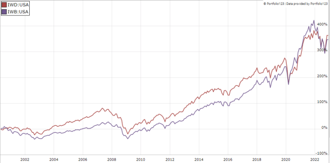
In 2022, IWD beats IWB, but it slightly lags the Avantis U.S. Large Cap Value ETF (AVLV) and the SPDR Portfolio S&P 500 Value ETF (SPYV).
IWD vs. competitors and IWB in 2022 to date (Portfolio123)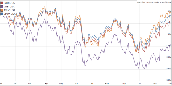
Comparing IWD with my Dashboard List model
The Dashboard List is a list of 60 to 80 stocks in the S&P 1500 index, updated every month based on a simple quantitative methodology. All stocks in the Dashboard List are cheaper than their respective industry median in Price/Earnings, Price/Sales and Price/Free Cash Flow. An exception in Utilities: the Price/Free Cash Flow is not taken into account to avoid some inconsistencies. Then, the 10 eligible companies with the highest Return on Equity in every sector are kept in the list. Some sectors are grouped together: energy with materials, communication with technology. Real Estate is excluded because these valuation metrics don’t work well in this sector. I have been updating the Dashboard List every month on Seeking Alpha since December 2015, first in free-access articles, then in Quantitative Risk & Value.
The next table compares IWD performance since inception with the Dashboard List model, with a tweak: here, the list is reconstituted once a year to make it comparable with a passive index.
|
Total Return |
Annual Return |
Drawdown |
Sharpe ratio |
Volatility |
|
|
IWD |
367.64% |
7.09% |
-60.47% |
0.42 |
15.59% |
|
Dashboard List (annual) |
974.52% |
11.12% |
-56.41% |
0.62 |
17.31% |
Past performance is not a guarantee of future returns. Data Source: Portfolio123
The Dashboard List beats IWD by about 4 percentage points in annualized return. However, IWD performance is real, whereas the model simulation is hypothetical.
IWD fundamental weaknesses
Why is the difference so large? Most value indexes have two shortcomings in my opinion, and IWD is no exception. The first one is to classify all stocks on the same criteria. It means the valuation ratios are considered comparable across sectors. Obviously they are not: you can read my monthly dashboard here for more details about this topic. A consequence is to overweight sectors where valuation ratios are naturally cheaper, especially financials. Some other sectors are disadvantaged: those with large intangible assets like technology. Companies with large intangible assets are those with a business model based on massive R&D, or a strong branding, or large user databases, or operating in a field where competition is limited by an expensive entry ticket. All these elements are not correctly reflected by valuation ratios.
The second flaw is using the price/book ratio (P/B), which adds some risk in the strategy. Intuitively, a large group of companies with low P/B contains a higher percentage of value traps than a same-size group with low price/earnings, price/sales or price/free cash flow. Statistically, such a group has a higher volatility and deeper drawdowns in price. The next table shows the return and risk metrics of the cheapest quarter of the S&P 500 (i.e. 125 stocks) measured in price/book, price/earnings, price/sales and price/free cash flow. The sets are reconstituted annually between 1/1/1999 and 1/1/2022 with elements in equal weight.
|
Annual Return |
Drawdown |
Sharpe ratio |
Volatility |
|
|
Cheapest quarter in P/B |
9.95% |
-72.36% |
0.48 |
21.05% |
|
Cheapest quarter in P/E |
11.25% |
-65.09% |
0.57 |
18.91% |
|
Cheapest quarter in P/S |
12.62% |
-65.66% |
0.6 |
20.46% |
|
Cheapest quarter in P/FCF |
12.23% |
-63.55% |
0.61 |
19.05% |
Data calculated with Portfolio123
This explains my choice of not using P/B in the Dashboard List model.
Takeaway
IWD implements a methodology classifying Russell 1000 stocks in value and growth subsets based on fundamental ratios, and invests in the value subset. The heaviest sector is financials, with over 20% of asset value, followed by healthcare and industrials. Regarding historical performance, IWD is a bit ahead of the Russell 1000 since inception. It beats it in 2022, but slightly underperforms other large cap value ETFs. This fund may be part of a tactical allocation strategy, switching between value and growth depending on market conditions. However, it has not met expectations of bringing significant excess return to its parent index on the long term. I think the underlying index has two weaknesses: it ranks stocks regardless of their industries, and one metric adds some risk in the methodology. An efficient value model should compare stocks in comparable sets (sector, industry), and avoid putting too much weight on the price/book ratio.
Be the first to comment